:quality(75))
:quality(75))

:quality(75))
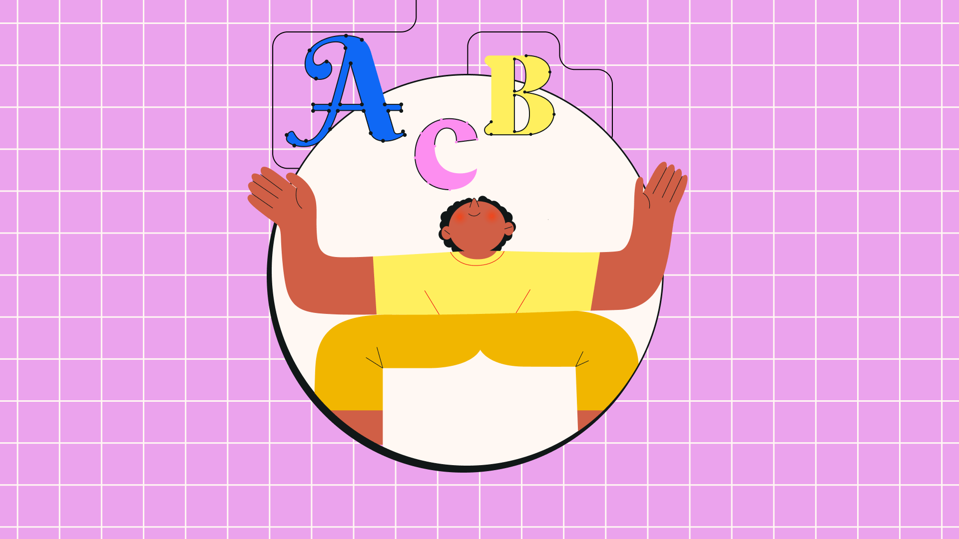
It should come as no surprise that we view graphic design as a vital aspect of marketing.
In our fast-paced and visually-driven world, effective marketing requires more than just well-crafted content. You might only have a few seconds to grab your audience’s attention, and eye-catching design is your best bet to do just that.
This is true for every aspect of marketing, from advertising campaigns, to digital marketing strategies, to your online presence like social media profiles.
As well as capturing the attention of potential customers, graphic design is a key tool in helping you create and maintain a consistent brand identity. With it, you can build up a visual identity that's in line with your brand’s messaging, products, and personality.
As we’ll explain later in this article, maintaining a consistent brand image is vital for creating a base of loyal customers, improving brand reputation, and ensuring the long-term growth of your business.
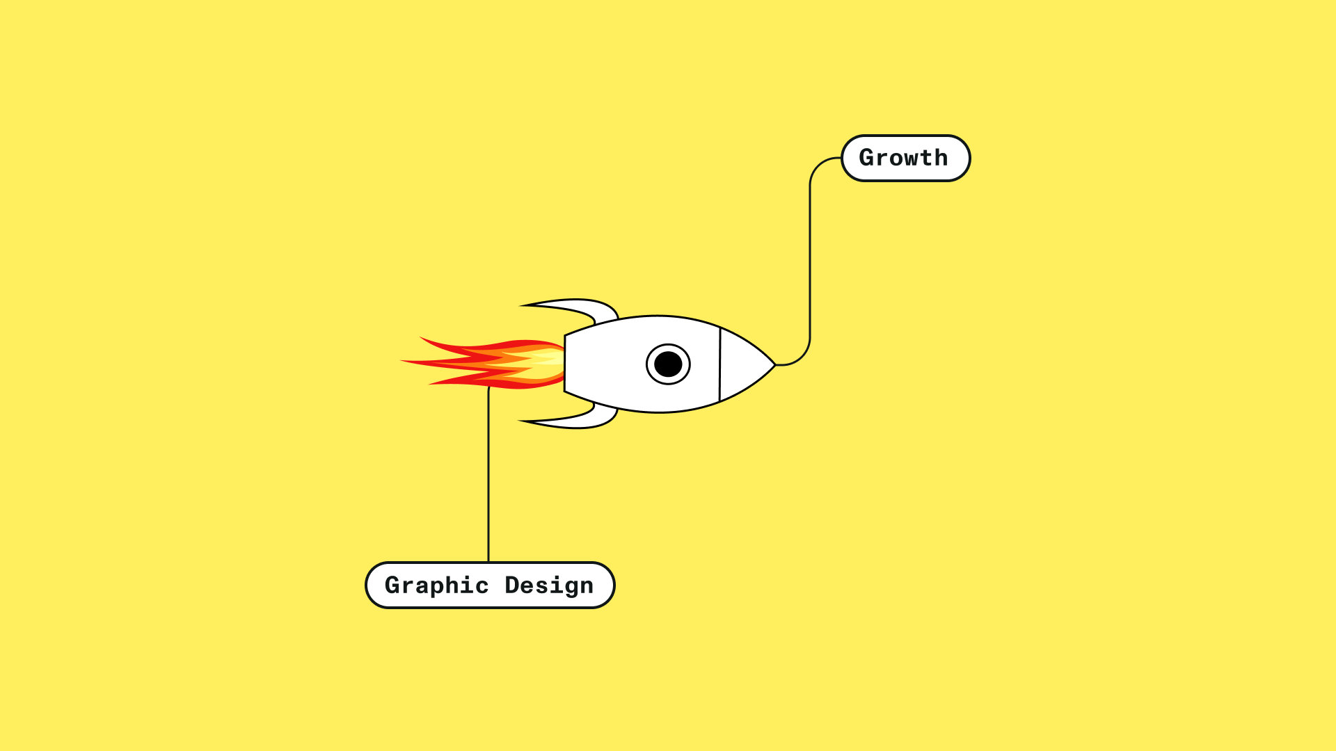
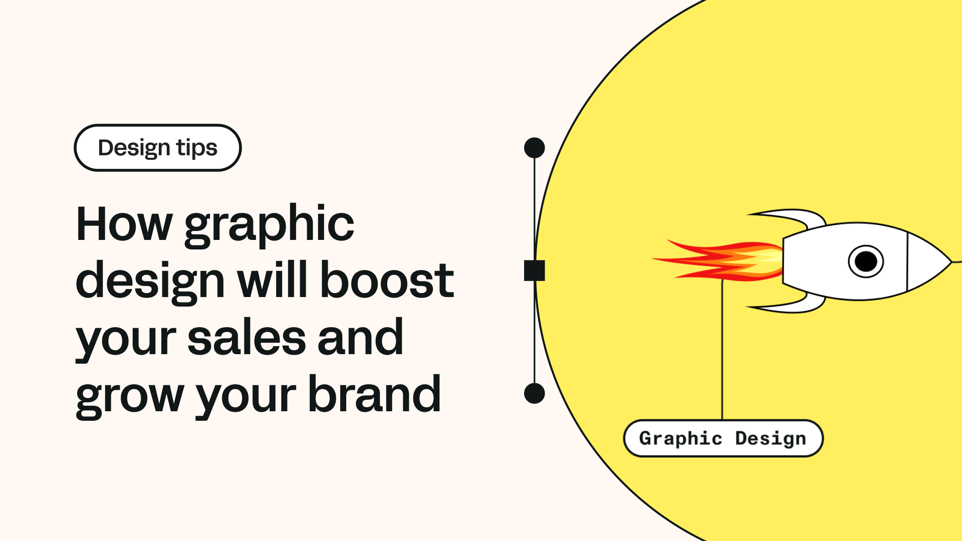
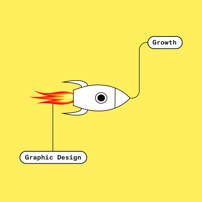
But here’s the takeaway we're really driving home today: investing in graphic design as a marketing tool can hugely increase your sales rates.
With the right techniques, your marketing materials will suddenly become more appealing, more powerful, and more convincing to potential customers and current customers alike.
We’ll show you how to use clever graphic design techniques, developed with a helping hand from consumer psychology principles, so that the resources you invest in your brand’s graphic design strategy can concretely boost your sales rates.
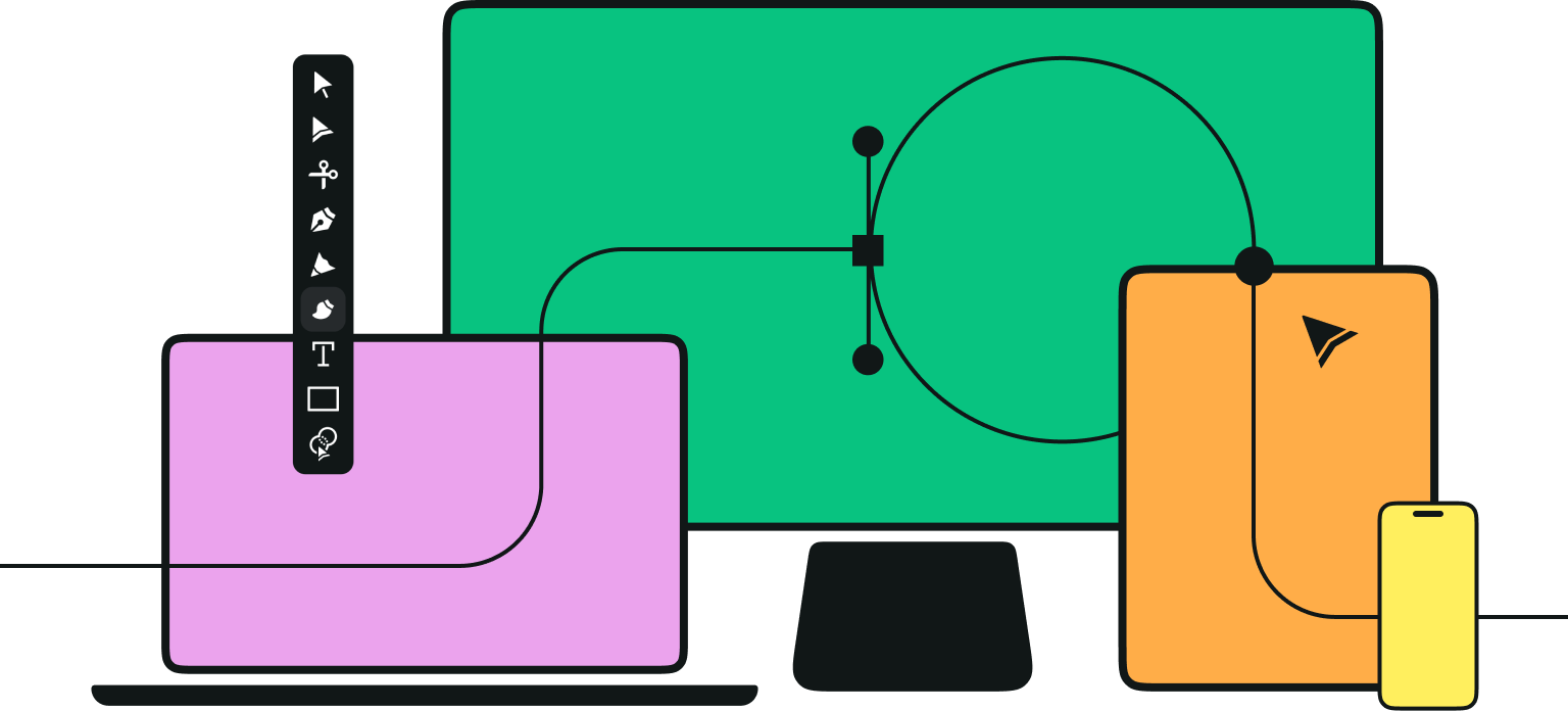
Jumpstart your ideas with Linearity Curve
Take your designs to the next level.
What is graphic design in business marketing?
In the world of marketing, graphic design refers to creating visually appealing and impactful designs that effectively communicate your brand's message, values, and offerings to your target audience.
Graphic design comes into play for practically all of your marketing assets, such as product packaging and business cards, as well as your digital marketing assets and social media content.
It involves various visual elements, like typography, color palettes, imagery, and layout design, all of which contribute to your brand’s overall messaging.
How can graphic design improve my brand’s performance?
In a saturated market, standing out from the competition is crucial.
Strong graphic design gives your brand a distinct visual identity for that all-important competitive edge. A well-designed brand can attract attention, build credibility, and leave a lasting impression on potential customers. Let’s dive into the specific ways graphic design will improve your brand performance.
First impressions
Humans are visual creatures, and first impressions matter.
High-quality and visually appealing designs will captivate your audience's attention, and will be the first signal they get to keep paying attention to your brand. Engaging visuals will create positive associations with your brand from the start, increasing the likelihood of interactions and conversions from prospective customers into actual sales.
Better communication
When it comes to convincing your audience of your brand’s value, words are not your only communicator.
Graphic design is a powerful tool for effective communication, and visuals can often convey complex information even more concisely and effectively than language alone. With well-designed graphics, you can simplify your brand's message, easily highlight your key points, and guide your audience toward a desired CTA.
Brand identity
Graphic design plays a vital role in how you shape your brand's identity.
Consistent use of logos, color schemes, and other visual elements helps to create a recognizable and memorable brand. Cohesive design elements across all marketing channels instill trust, reinforce brand recall, and foster a sense of loyalty among customers.
Unleash Your Creative Potential in Design
Discover the endless possibilities of illustration in design. Learn how our tools can help you create stunning, unique designs effortlessly.
Not to mention that your visual design is essentially an extension of your brand's personality. Let’s take typography as an example: your copy itself is only communicating a fraction of the message your audience receives. Your font choices massively affect the tone of voice viewers read your copy in, and so form a huge part of your brand’s identity. A cursive font might give your brand a more down-to-earth, authentic feel, while serif lettering can communicate a modern and professional tone. And the possibilities become endless when you start playing around with bold fonts, italics, and placement of the lettering on the page.
See what other brands are doing to get inspired (these playful summer fonts are a good place to start) and test out different variations to find what fits your brand identity. And if nothing is quite hitting the spot, you can design your own fonts from scratch with our Fontinator tool.
Let’s talk about psychology
So as you can see, there’s more to good design than meets the eye.
Professional designers know how to make their work as effective as possible to achieve the desired outcomes for your brand. Make no mistake: this is a science as well as an art. With the help of some basic psychological principles, you can steer your designs in the right direction to get customers more engaged and make conversions more likely. Here are just a few of the psychological principles graphic designers might draw on.
Color psychology
Skilled designers are aware that different colors can have a profound impact on a viewer’s emotions, and can elicit specific responses.
With a knowledge of the psychology of colors, you can alter your designs to strategically influence your audience by guiding them toward specific emotional responses.
For example, red is often associated with energy, passion, and urgency, and can be used to create a sense of excitement or to encourage action. It can therefore be effective in designing attention-grabbing call-to-action buttons or promotional banners. On the other hand, viewers immediately connect the color green with nature, growth, and harmony. It’s an ideal color base for brands focused on sustainability, wellness, or organic products, as it tends to evoke positive, calm emotions.
There’s plenty to learn about color theory, and we’ve barely scratched the surface here, so check out our deep dive into color psychology to see how you can incorporate these ideas into your designs.
Visual hierarchy
Having an understanding of visual hierarchy can help you guide your viewer’s attention and highlight the essential message within your design.
By using elements like size, contrast, and placement, you can visually create emphasis and direct the audience’s focus. This is especially important with digital marketing campaigns, where the aim is to get the audience to take immediate, direct action.
Take email marketing as an example: your emails should have a natural flow, starting with an eye-catching headline in a larger font size or a bold typeface. This will immediately alert the viewer of the email’s most important information, and hopefully engage them to keep reading. You should also keep in mind that most emails are skimmed, not read in-depth, so make sure the most important info and images are bold and eye-catching.
Get creative with our ready-to-use templates.
Linearity Curve offers templates for every social media platform and various use case templates for posters, business cards, slides, app store screenshots, and more.
You can check out this post for more on using images in your email marketing campaigns. Lastly, make external links and calls-to-action more appealing by using contrasting colors and larger buttons, and try making them an interactive part of the design.
Read our in-depth blog post on all things layout design for a more detailed look into the ways you can alter your layout to increase audience engagement.
Gestalt principles
The gestalt principles are based on the psychology of perception, and provide a basis for understanding how humans perceive and interpret visual information.
By incorporating these principles into your designs, you can create graphics that are scientifically backed to be visually appealing, easy to understand, and convincing. One of the most important principles is that of similarity, which suggests that using similar colors, shapes, or fonts creates visual coherence and automatically groups related elements. This can be especially effective when designing infographics or illustrating product features.
For more on how to use these principles to encourage a desired outcome from the viewer, take a look at our blog post on the role of the gestalt principles in user experience design.
A few bonus tips…
Just because we like you so much, here are a few extra tips on how to create the most effective visual content for your brand.
Keep things simple
In the world of design, less is often more. Instead of clashes of bright colors and cluttered graphic elements, aim for clean and minimal designs that focus on a single powerful message. Simplicity enhances the readability of your design, improving visual communication and ensuring that the most important eye-catching visuals stand out.
A/B testing
The best way to assess how effective your visual materials are is to experiment with test audiences. Conduct A/B tests by creating variations of your designs and measuring their performance. This data-driven approach helps you refine and improve your visual designs based on actual audience preferences and behaviors.
Use online tools
There’s a whole world of online design tools out there to help you create high-quality designs, even with minimal graphic design experience. Aside from our very own graphic design tools (which we must say are pretty hard to beat), here’s a list of some of our favorite design software tools to get you started.
Hire external talent
If your budget allows, consider collaborating with an external design team or freelance designer to help you improve your visual branding or marketing campaigns. Graphic design professionals will bring expertise, fresh perspectives, and a keen eye for design principles to help you achieve the business success you're after.

Wrapping things up
So there’s your overview of the huge role graphic design plays in encouraging your audience to engage with your brand and make purchases. Hopefully we’ve inspired you to incorporate some of these ingenious consumer psychology principles when designing your brand identity and marketing materials.
For more marketing advice, read about the top online marketing software to help you grow your business, and see how you can use Linearity Curve's tools to create the compelling and attractive visuals your brand deserves.
Jumpstart your ideas with Linearity Curve
Take your designs to the next level.
Share this!
Adí Aviram
Adí is an SEO developer working for Linearity in Berlin. Her hobbies include drawing comics, yoga, swimming, infinite scrolling, and birdwatching.