:quality(75))
:quality(75))


:quality(75))
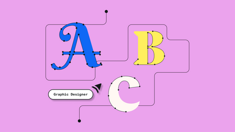
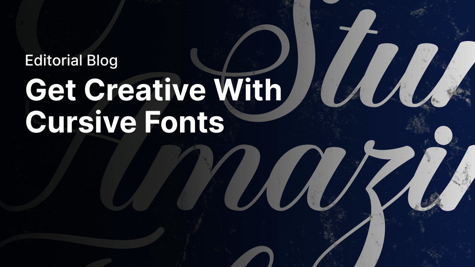
Does anyone else remember learning to write in cursive growing up and thinking "I will never use this again."
Yeah, us too.
 Matt Vergotis
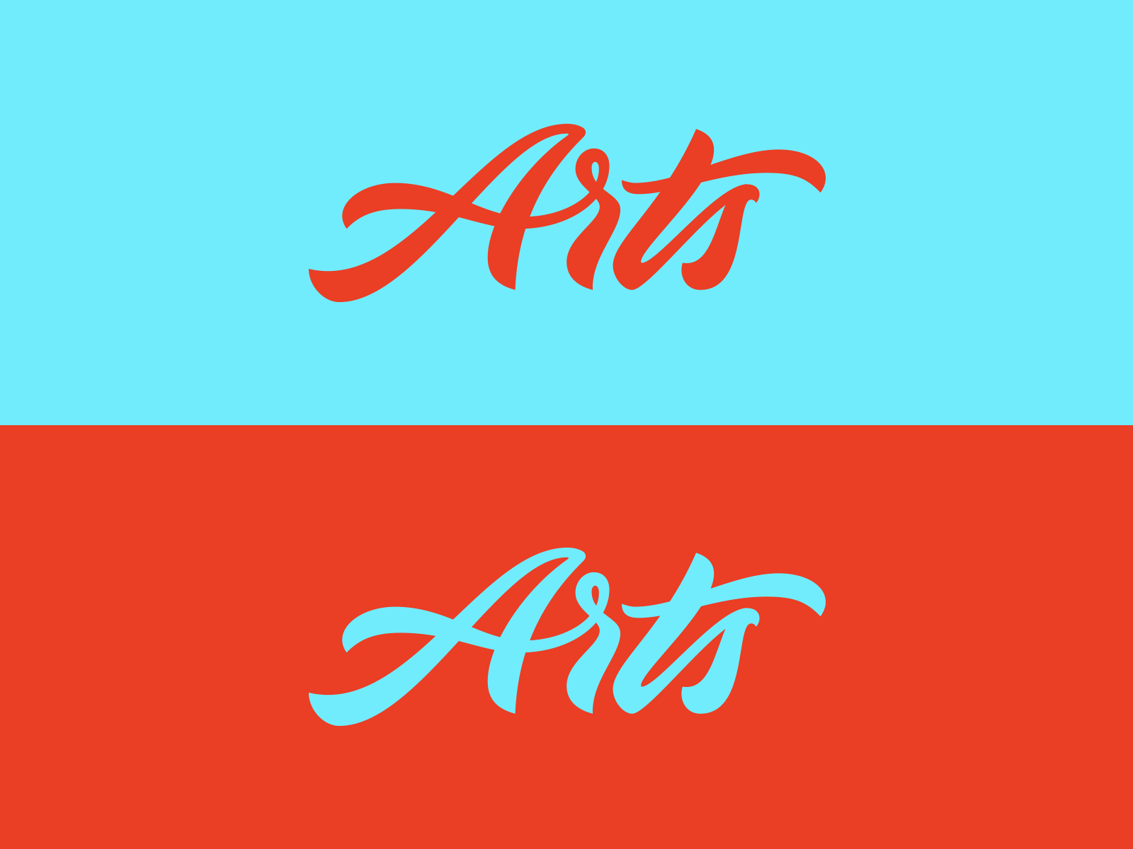
Well, it turns out we might have judged this form of writing too quickly. With the popularity of hand lettering and typography on the rise, cursive writing has become popular as well.
And we’re here to reclaim this classic font style and make cursive forms cool again.
We’ve been known to be defenders of bad fonts, but hear us out here. Cursive can be cool and edgy when you use it the right way!
And we’re here to help you do just that. In this article, we’ll talk about the history of cursive fonts, how to use them, and how to customize and save fonts to use in your Vectornator designs.
First, let’s get back to the basics and talk about what a cursive font is.
Jumpstart your ideas with Linearity Curve
Take your designs to the next level.
What is a cursive font?
So, yeah, you probably know what cursive writing is, but let’s really examine this penmanship style.
Before discussing how to use cursive letter forms, we want to get into the nitty-gritty of what sets cursive writing apart from other writing styles.
Cursive writing was created to be a smoother, faster way to write. Your hand flows easily on the page when writing cursive because you don’t have to lift your hand between each letter.
Beautiful brush-script fonts evolved from necessity. For example, if you have a pen that frequently leaks ink, it’s more practical to write in cursive because you barely need to lift your pen from the page. Fountain pens have largely been replaced by contemporary writing utensils today, however cursive hand-lettering typefaces remain popular.
Cursive fonts are decorative fonts written in an upward, downward, and/or slant motion. Throughout an entire typeface, readers will find no spacing between letters, and each letter connects to the next.
Ty Fortune
Cursive calligraphy fonts have historically been used for event invitations, menus, and other decorative documents.
They can be printed out or drawn onto paper to create beautiful artwork. The letterforms of this type of font appear more natural than other types because they mimic handwriting.
Some people find these letters easier to read for that reason. Many educators teach cursive writing to students so that each generation can learn how to write in cursive correctly.
However, cursive writing isn’t something that everyone is taught to read, so it's often considered a more complex font to digest compared a regular sans-serif script.
Many such elegant fonts are available, ranging from casual handwriting fonts to block printing style, italicized script, calligraphy, brushstroke, and even stencils.
You might think cursive fonts and script fonts are the same thing. While they are super similar, there are some slight distinctions we should make before we move forward.
What is a script font?
Script fonts are created with fluid strokes similar to a handwritten stroke. This can be casual or formal. Formal scripts are what you often see in invitations, digital signatures, and official documents like diplomas and certificates
Teddy Derkert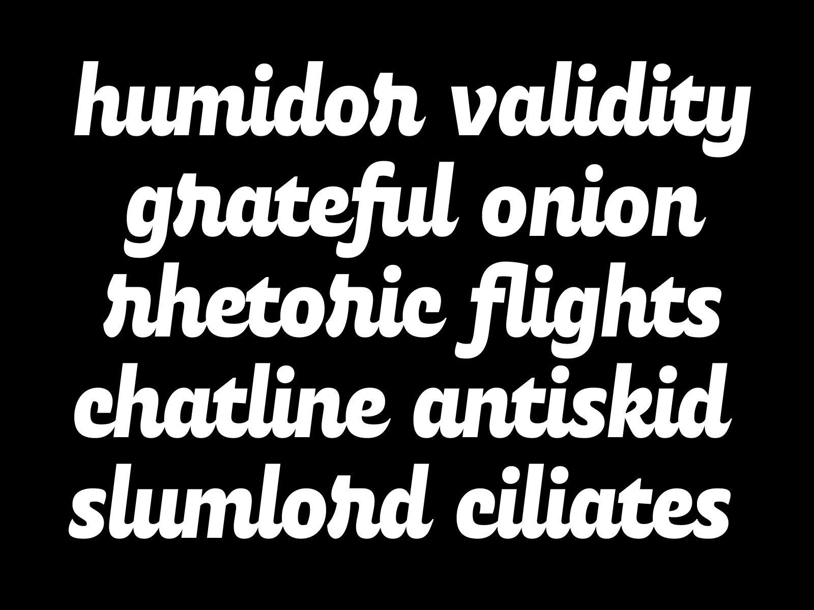
Modern cursive font is more of a brush lettering style, and the smaller letters might not always be attached.
Cursive is one of the oldest forms of writing—let’s talk about the history behind it and when it was first used.
History of cursive fonts
The term cursive is derived from the French word “cursif” and a Medieval Latin term “cursivus,” which translates to “running.”
Early forms of cursive were used in ancient times by the Egyptians, Romans, and Greeks. However, the first popularized form of cursive script is credited to 15th-century Italian Niccolo Niccoli.
During this time, there were no typewriters, printing presses, or computers, and all documents were handwritten in a calligraphy style cursive script. This includes books, letters, and any other written form of information.
Personalize Your Typography with Custom Fonts
Learn how to customize fonts in Linearity Curve to give your designs a unique touch. Our guide makes it easy to modify and personalize typography to your style.
Today, a digital brush-style font mimics the classic style of writing that was long the dominant form. This everyday form was pretty universal. But people still wanted to have fun with their cursive styles, and that is where the earliest forms of decorative fonts and lettering styles that we know today originated from.
If you’re new to lettering and want to learn more, check out our hand lettering guide for beginners.
The cursive style of penmanship became common amongst nobles who wanted to show off a bit. They started signing a wide range of important papers using fancy cursive scripts instead of just signing at the bottom right corner.
This new form of handwriting expanded the diversity of cursive-style calligraphy and led to an increasing demand for those who had superior hand lettering skills.
During this time, each person had their own unique cursive handwriting style. Some writers used large, swooping loops like today’s beautiful brush-style script fonts, while others wrote using smaller glyphs. Some started at one end of the page and went across, while others started at the top left side and continued down to the bottom right.
Like the first hand lettering artists, people today have designed and created their own unique fonts. As technology has advanced, computer software programs have also developed to help you design your own customized cursives easily.
Linearity Curve (formerly Vectornator) is one of the platforms where you can create contemporary style designs for your own fonts (more about this later).
With an increase in digital fonts and digital lettering, there are countless options for those who want to use a cursive font. And there is a ton of freedom for those who are adventurous enough to use their own.
Speaking of which, let’s get into the fun stuff and look at some examples of our favorite cursive fonts.
Cursive font examples
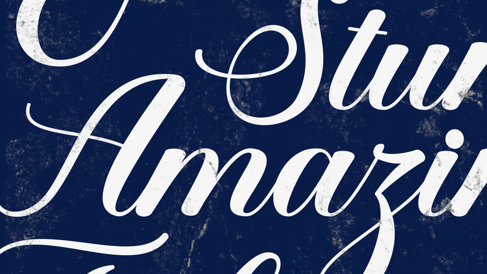
Cursive fonts are some of the most popular and earliest forms of writing. These fonts can be ethereal fantasy fonts, funky retro fonts, or artistic styles that recall the historical styles of penmanship.
Each font family has been created by a designer with its own unique look and specific style. Here’s an example of what a font family looks like.
Jeremy Vessey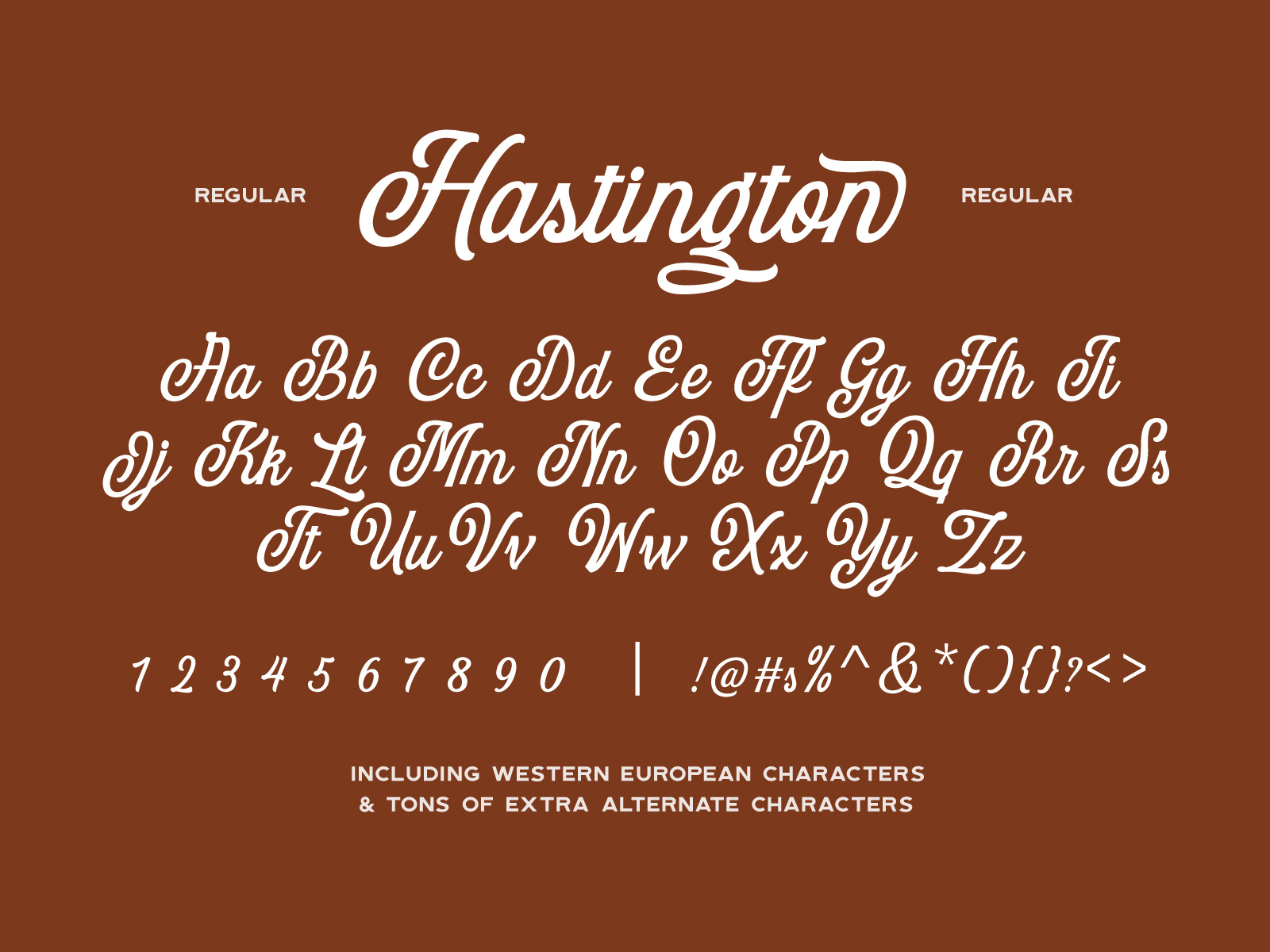
In this font family, you can see the uppercase and lowercase versions of each letter, as well as numbers and symbols. As you can see, there is a great deal of care and distinction put into each different font.
Here are some examples of popular cursive fonts and common font families. You’ll likely recognize some of these featured fonts and have probably seen them on various forms of media.
- Debby is a hand-drawn brush typeface that can make your designs look natural and effortless. Debby uses an irregular and bouncy letter combination and conveys youth and energy in any document.
- Beattingvile is a creative cursive font with stylistic alternates and swashes. This font was created by Garisman Std and works well for branding, label design, and apparel.
- Bombshell Pro is an elegant and classic font. The most distinctive feature of this calligraphy font is connections between letters that add a twist to the characters.
- Vegan Style is a handwritten font that is bold and charismatic. Billy Argel created this cursive brush typeface in 2018.
- Shink is a highly stylized script font full of swirly alternates. Shink is a very distinct and sophisticated, but it’s also totally legible.
- Hickory Jack is a smooth cursive font that was created in 2016 by Brittney Murphy Design. The Hickory Jack font family has over 350 glyphs and two weight options: standard and thin.
Keep in mind—there are significant differences between bold fonts, italicized fonts, and normal fonts. When you change the emphasis on a font, it can drastically shift how the font looks. The default or "normal" fonts are how the font was designed to look.
Sometimes these font families come with an option for bold or italics, but you should always use the option included in the font family rather than the bold or italics setting on your program. There’s usually a big difference.
:quality(75))
:quality(75))
You should also pay attention to OpenType fonts. OpenType is an extension of TrueType, a standard that allows fonts to be displayed on more devices, browsers, and applications. These technologies help to avoid the appearance of damaged fonts or cursive fonts that don’t scale properly. You don’t want these beautiful curves to look jagged.
Now that you’re familiar with common cursive fonts, let’s talk about how to use them.
5 tips for using cursive fonts
Cursive characters are perfect for decorative designs like invites or menus, but they’re also commonly used in cursive signature fonts, marketing materials, and web design.
This style of penmanship is incredibly flexible, but there are some basic things to keep in mind when using it.
Here are our top five tips on how to best use and customize your cursive fonts.
But, hey, who doesn’t like to break the rules sometimes? Be creative with your cursive fonts, and if you can break some of these rules and still create some rad designs, we’re here for it.
Treat these tips like overarching suggestions for how cursive font should typically be used, but don’t be afraid to get creative.
1. Be cautious with kerning
Kerning is the process of controlling the spacing between characters. Adjusting kerning is a great way to create emphasis.
Having a lot of space between letters can be a great visual tool, just as removing kerning can add a level of detail to a piece. But don’t play around with kerning too much when it comes to cursive font, since this style is typically about connections between characters.
As we know, cursive is a font that was created with the concept of removing spacing between letters. Messing with kerning in a cursive font design can ruin the integrity of the design and it may end up looking strange.
However, this isn’t an unbreakable rule. You can, of course, slightly adjust kerning to have more space between letters like the design above. Just be careful not to go overboard.
2. Don't use all caps
Cursive isn’t the most straightforward font to read. Employing block letters or using a cursive font in all caps is best used in moderation, as it detracts from the beautiful letters in the lowercase format.
Using block letters also ruins the ability to connect cursive letter symbols. So, overall, using all caps cursive designs is a big no for us.
Side note: The same goes for overusing bold fonts - this will make cursive even harder to read.
3. Know when to use it
Again, cursive is often hard to read. Because of this, you have to be mindful when you use it.
If you’re creating, say, a life-saving instruction manual for airplane evacuation, maybe don’t use a font that is notoriously hard to read.
Matt Naylor
The same principle goes for a résumé design that you want people to read quickly or easily. Cursive might not be the best pick there.
Try out a sans serif font or a more simple font instead!
4. Don't mix and match
We love cursive fonts, don’t get us wrong. But don’t go overboard using them too much. Unlike serif fonts, you generally can’t mix and match cursive fonts. You’ll want to watch out for strange punctuation characters and alternate characters, too. They’re usually not as well refined in cursive fonts.
You can mix a serif or sans serif font with a cursive font. But using two cursive fonts will often look mismatched.
Dingbat Co.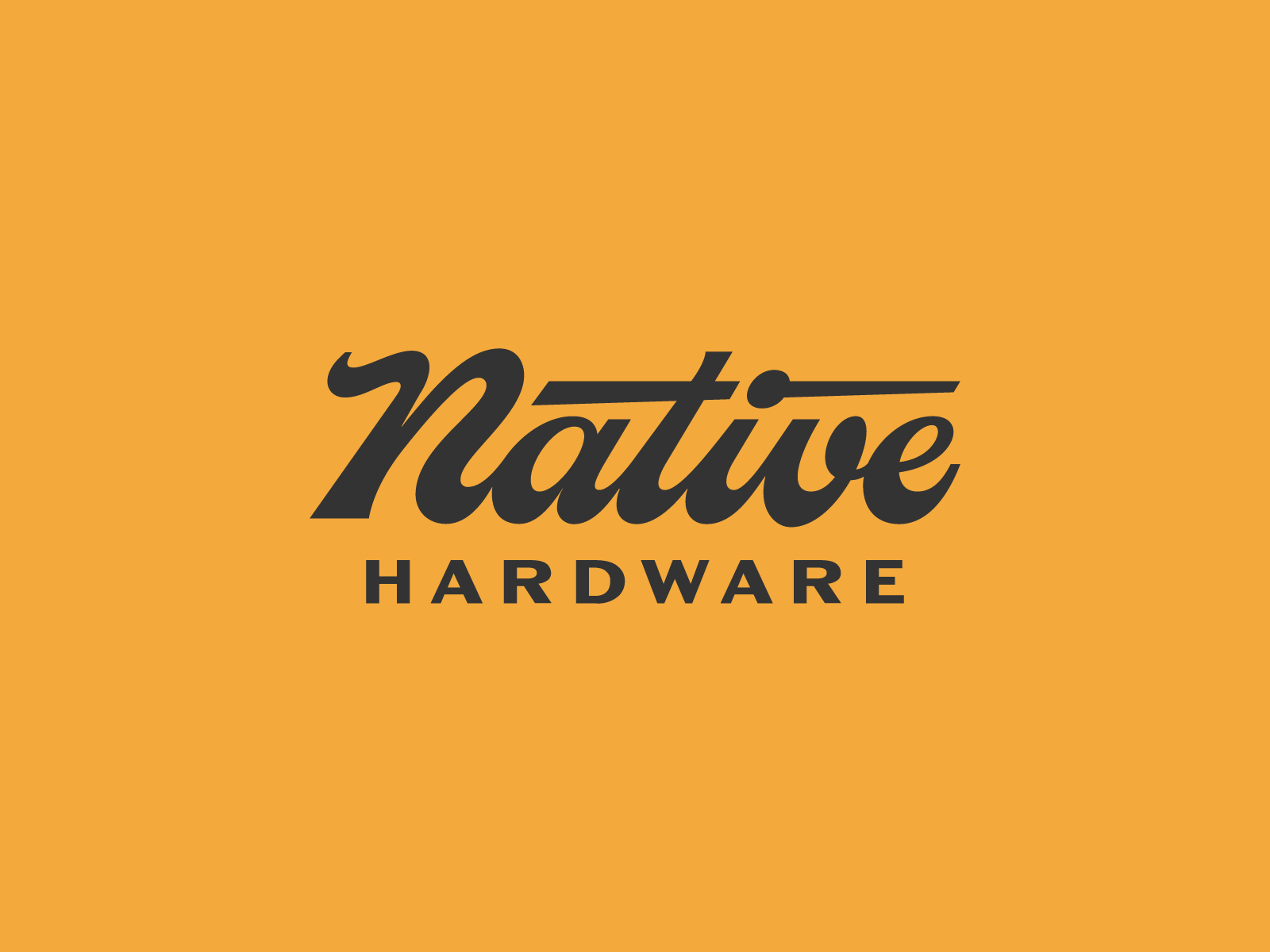
As a general rule, you’ll want to pair cursive fonts with a more legible font.
5. Customize it
One of the best things about cursive fonts is that they are highly customizable, and it is easy to make them unique.
One way to change your cursive font to be your own is to adjust and add alternate glyphs.
Finally, let’s talk about how to create and use cursive fonts in Linearity Curve (formerly Vectornator).
Using and customizing fonts in Linearity Curve (formerly Vectornator)
We’re crazy about fonts here at Linearity.
We have an expansive collection of fonts readily available for you to use in Vectornator. But if you want to create your own or customize existing fonts and lettering designs, we’ve got you covered there, too.
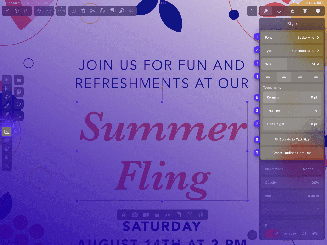
Once you’ve got some text to work with, you can customize your text settings by selecting your font, styling it with bold, italic, or underline, and changing the font size.
But if you want to take things a step further, you can adjust the Kerning, change the tracking, and even convert your text into vectors.
Ready to create brand assets that pack a punch?
Visit our Academy for free fonts design courses.
For a more detailed look into our text capabilities and information about how to fully customize your text, check out our Learning Hub. There is so much you can do to make your fonts unique.
Now, let’s talk about our font tool, Fontinator.
The deal with Fontinator
No, it’s not a superhero who saves people from bad fonts. Although that would be cool...
Fontinator is a tool that helps you create, customize, and organize your own library of custom fonts.

With Fontinator, you can import any font files and install them on your iOS system. Your custom fonts will then work on any app that supports custom fonts like Pages, Keynote, and your favorite design app: Linearity Curve (formerly Vectornator).
You can preview your fonts, admire your font family list, and add and delete fonts to your liking. Plus, you can open any installed font directly in Vectornator and jump right into work!
Let’s talk about how to do that. Don’t worry—it’s pretty simple.
How to install custom fonts
.png)
- Download Fontinator from the App Store (Or go to your Vectornator Gallery > Settings > Font Library.)
- Open up Fontinator, tap the ⊕ button, select the font file you want to work with, and click install fonts.
- Download and install your profile.
- That’s it! You’re all set up and ready to use your fonts.
For a more detailed tutorial and tips on how to use Fontinator, check out our Learning Hub.
After adding custom fonts to Fontinator, don't forget to install a new profile to update your font library in Linearity Curve (formerly Vectornator) and other supporting apps.
Wrap up
Cursive fonts often have a reputation for being a bit fancy or too dainty. But we’re here for the revitalization of this fun and creative script!
You can be bold and unique with your cursive fonts, especially when using Linearity Curve (formerly Vectornator) to personalize and create your fonts.
With cursive, you can traverse the realm of modern, old-fashioned, retro, and refined. There isn’t one set way to use this font style, so we encourage you to get creative with it.
We can’t wait to see what you come up with. Don’t forget to follow us on socials and tag us in any fun cursive designs you create.
Jumpstart your ideas with Linearity Curve
Take your designs to the next level.
Share this!
Ben Barnhart
Ben is a Content Lead for Linearity living in Berlin. His hobbies include board games, cooking, reading, and writing.