:quality(75))
:quality(75))


:quality(75))
Did you know bees can't see the color red but can see some purples that humans can't? This phenomenon is called bee's purple and is linked to the different areas of the light spectrum they can see versus what humans can see. It makes you wonder what other colors might be out there that we, as a species, are missing out on.
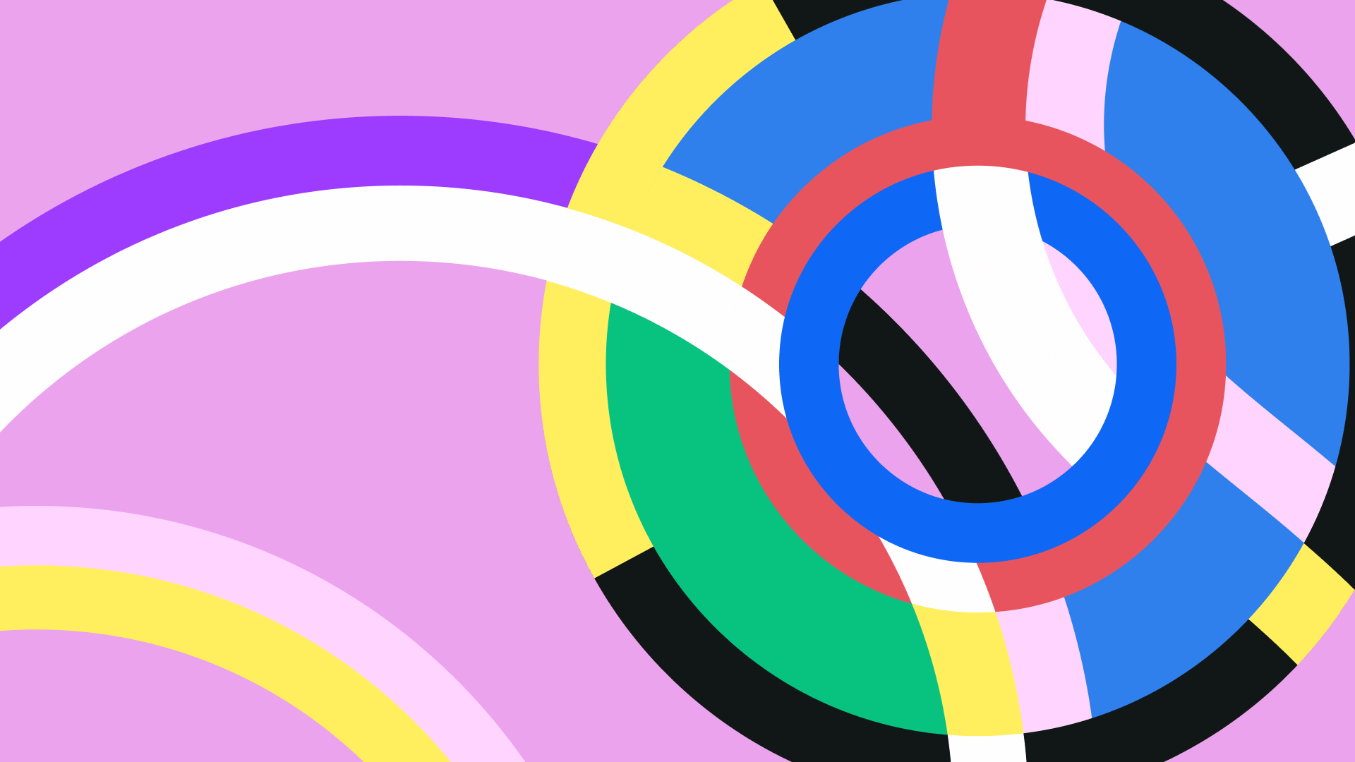
Have you ever looked at an artwork made with cool colors and felt calm? Or seen one made with warm colors and felt the energy and passion of the artist come off the page? This feeling, in essence, is color psychology.
We base many of our daily decisions on the colors we like and those we find around us. Think of the joy you experience finding that outfit in the color that suits you best. Compare this to how you feel when you enter a building with dark walls and low light. All these small elements affect our daily lives, although we rarely think about them.
Jumpstart your ideas with Linearity Curve
Take your designs to the next level.
What is color psychology?
Color psychology is the phenomenon where color influences human behavior, emotions, and perceptions. We all have instinctual connections between specific colors and the feelings they evoke. However, these connotations vary between cultures and personal experiences.
Color psychology primarily involves color theory. How colors interact with each other largely influences how we perceive them. There are various relationships between colors, such as primary, secondary, tertiary, and complementary. How these colors are juxtaposed can influence how they're perceived and affect the viewer.
Colors have been used for millennia to evoke certain feelings. Humans have used color association in ancient practices in Greece, Egypt, and China. They used color to create associations with gods in their pantheons, especially linking them to natural elements, light and dark, good and evil.
Colors were even used to treat health issues in Ancient Egypt and China, as they believed the colors helped stimulate specific areas in the body - this is still used today in certain holistic treatments.
Colors hold different meanings and associations for cultures around the world. Often associated with specific events and rituals, the symbolism can vary dramatically from country to country.
Western cultures often associate white with purity, innocence, and cleanliness, while they use black with power, sophistication, and mystery. Black is often seen as a mourning color worn to funerals.
Eastern cultures associate white with death and mourning, so the color mostly worn to funerals is white. Red is also an essential color in Eastern cultures, symbolizing good luck and happiness. It is often used at weddings and other celebrations.
Some Native American cultures also strongly associate color with their rituals and ceremonies. They often use red to signify the sun's life-giving power, while green is seen as a symbol of growth and renewal.
Overall, it is clear that color holds many meanings and associations for people worldwide and is an essential aspect of cultural communication and expression. It is crucial to consider the cultural context when using color in design or marketing, as different colors can have different connotations in different cultures.
Colors have always fascinated humanity, but it's only been relatively recently that we've started understanding the color spectrum.
The most significant leap forward was that of Sir Isaac Newton when he realized that the light around us is not just white but a combination of different wavelengths. This theory led to the creation of the color wheel and how different colors are attributed to specific wavelengths.
The start of color psychology
Although the development of the color theory was purely scientific, others still studied the effects of colors on the human mind.
The first exploration of the relationship between color and the mind is the work by Johann Wolfgang von Goethe, the German artist, and poet. In his 1810 book, Theory of Colors, he writes about how colors elicit emotions and how these differ with the hues of each color. The scientific community didn’t widely accept the theories in the book due to it being mainly the author's opinions.
Expanding on Goethe's work, a neuropsychologist named Kurt Goldstein used a more scientific approach to see the physical effects of colors on the viewer. He looked at the different wavelengths and how longer wavelengths make us feel warmer or more excited while shorter wavelengths make us feel cold and relaxed.
Goldstein also did studies on motor functions in some of his patients. He hypothesized that color might help or hinder dexterity. The results showed that red made tremors and balance worse, while green improved motor function. While these studies were scientific, they’re not widely accepted since other scientists have yet to be able to replicate the results.
Another thought leader in the field of the psychology of color was none other than Carl Jung. He theorized that colors expressed specific states of human consciousness. He was invested in using color for therapeutic purposes, and his studies focused on finding the hidden codes of colors to unlock the subconscious.
In Jung's theory, he divided human experience into four parts and assigned each a specific color.
- Red: Feeling
Symbolizes: blood, fire, passion, and love - Yellow: Intuition
Symbolizes: shining and radiating outwards - Blue: Thinking
Symbolizes: cold like snow - Green: Sensation
Symbolizes: earth, perceiving reality
These theories have shaped what we know as color psychology today, and have aided in describing how we experience colors.
While some of Goethe's work has been validated, many pioneers' research has yet to be discredited. But being discredited doesn’t mean their work was not impactful - they’ve motivated several modern scientists to dig deeper into the enigma that is color psychology.
How colors affect people
When you see a product that’s colored pink, what gender do you associate with it? Have you ever considered why? Ironically enough, the assignment of pink to girls is a relatively recent development.
Pink was initially seen as another iteration of red and therefore linked to boys. Pink was seen as more robust than blue due to the connection to red. At the same time, blue was considered a calm and dainty color.
Ready to create brand assets that pack a punch?
Visit our Academy to learn how to use color palettes.
Only after World War II, when uniforms were more commonly made from blue fabric, the color began being associated with masculinity. The color pink was generally assigned to more feminine traits in 1930s Germany.
Another interesting fact about pink is its effect on the human brain - one specific tone, especially - Baker-Miller Pink. Also known as "drunk tank pink," Baker-Miller pink is a particular shade of pink believed to have a calming effect on people. It was first used in the 1970s by Dr. Alexander Schauss, who claimed that exposure to the color for extended periods could reduce aggressive behavior and increase feelings of calmness and relaxation.

Since then, Baker-Miller Pink has been used in various stressful settings, including prisons and hospitals. It has also been banned in school locker rooms, as the effects have been used to alter the energy levels of visiting sports teams.
However, the scientific evidence supporting the effectiveness of Baker-Miller pink as a calming agent is mixed, and more research is needed to understand its effects fully.
Modern ideas on how color affects us
Modern studies continued on the same trajectory as earlier studies. The main topics discussed in the field today are the effects of color on the body, the correlation between colors and emotions, and behavior and color preferences.
The methods used today differ from older studies. Many more tools are available to researchers, and guidelines are stricter to ensure the studies stand up to scientific scrutiny.
While studies on color preferences are less scientifically rigorous, many studies on the physiological effects of colors involve variables such as measuring the heart rate, blood pressure, and brain activity to see the effects of different color wavelengths. It has consistently been proven that red spectrum colors have stimulating effects, while the blue spectrum is calming.
When looking into the popularity of colors, it doesn't come as much of a surprise that the most popular colors, when ranked, are the brighter and more saturated ones. Dark colors tend to rank lower, with the least favorite ones being brown, black, and yellowish green.
Behavioral responses to colors are a tricky area of study to navigate. One of the methods used by researchers involves using a list of adjectives with which test subjects need to pick one of two opposing words that they think best describes a color. The average responses give a general idea of the attitudes toward different colors.
Some other, more involved, studies are conducted to see how different colors influence people in decision-making environments. One study revolved around the differences in retail behaviors when the background color changed. One of the stores had red walls while the other one’s walls were blue.
This study in the Journal of Consumer Research showed that customers were more willing to buy items in a store with blue walls. The red-walled store showed that customers who browsed and searched less were more likely to defer a purchase and more likely to buy fewer items due to the environment being more overwhelming and tense.
Although these studies show specific reactions in controlled environments, it helps us understand that the different responses to colors depend on the environment and culture.
How different colors influence us
Red is a fascinating color regarding the effects it elicits. The impact of red on the performance of individuals varies widely depending on the situation.
One study in the Journal of Experimental Psychology looked at the influence of color in a more academic setting, giving some participants black, green, or red participation numbers. On average, the ‘unlucky’ ones who were given the red numbers performed 20% worse on their tests.
In complete juxtaposition, red can be an asset in an athletic setting. A study was done during the 2004 Olympics looking at the uniforms worn in four different types of martial arts. The participants were either given red or blue uniforms. Out of the 29 weight classes, 19 were won by participants in red. This trend is also reflected in other sports, such as soccer.
Researchers are still trying to understand why this advantage exists. Some theories suggest that the historical association of red with war, aggression, and passion might influence the players to be bold with their actions.
Another theory is that the color could be intimidating to the opposition. Although the mechanics of this phenomenon are still being determined, what is certain is that it does deliver impactful results.
We may not realize it, but color leads us to make judgments. These judgments are shown especially in the area of fashion. Research by Leatrice Eiseman showed significant patterns in the biases that color can create.
When looking for colors that will make positive impressions in the workplace, the answers are green, blue, brown, and black. The color green leads to a feeling of freshness, energy, and harmony.
This is especially good when working at a desk job, which requires more vitality to get through the day. The color blue is linked to intellect and stability. This leads to more trust in the workplace. Both blue and black convey authority, with the color black having the added benefit of exuding elegance.
In contrast, the worst colors to wear to work are yellow, gray, and red. Red is seen as an aggressive color and is correlated to higher heart rates. The color might give off an antagonistic effect. Gray is seen as unassertive and lacking energy.
The color might be better paired with another color to counteract its effects. On the other side of the spectrum, the color yellow might be a happy one; however, it might be too energetic for a work environment.
In a more general sense, the color shown to stimulate concentration and productivity is green. Coloring your work desktop with a shade of green might help reduce strain on the eyes and create a more comfortable work area. Similarly, green and blue are good candidates for your office walls, reducing anxiety in a pressured environment.
Even social media is color driven
Humans have always been drawn to more saturated colors. This is evident when looking at the phenomenon of photo filters - especially in apps like Instagram and TikTok.
While this is already an interesting fact, it also shows that the interactions are predisposed toward photos using warmth, exposure, and contrast.
When considering the effects that these modifications have, the warmer colors create a brighter and more lively feeling which seems more attractive to viewers to interact with. It also leaves a longer impression on the audience.
Exposure is another way to create more vitality in a photo. Editing the light balance in pictures can help to bring out dull and dark colors. This effect needs a fine touch since over-exposure might wash out the colors, and under-exposure could darken the image.
Building on the exposure, the contrast in a photo is also essential. The function of these filters will sharpen the dark and the light areas. Images with more contrast appeal to us more as they’re more visually interesting.
The play of light and the boldness of colors add to how we make meaning of the world in ways we don't even realize. We tend to be attracted to specific elements of color in the world around us. Understanding these elements can help us make more sense of the world around us.
:quality(75))
:quality(75))
Knowing what computer theme or office color could boost your productivity and shield you from excessive stress in a fast-paced working environment could be a big bonus.
And in a world where engagement fuels the algorithm for your social media, altering the balance of colors in your posts might make them more attention-grabbing and urge viewers to stop, look and interact with them.
But when looking at colors, the most significant field utilizing its powers is still the arts. Art and marketing make daily use of the effects that color can conjure. Both these fields rely on the viewer's responses to create interaction and, in turn, market value.
How artists and designers use color psychology
While color has been a force in cultures since we started creating pictograms, some colors were always more readily available than others. The older the imagery, the less variety in colors was used.
Blue was initially a very rare pigment to obtain. The primary way that ancient civilizations had to make blue was by grinding lapis lazuli - a rare and expensive resource. The ground-up stone was even said to have been what Cleopatra used as blue eyeshadow.
A development in Egypt led to the creation of the first synthetic pigment - Egyptian blue. This pigment was invented around 3500 BCE and was used to color ceramics and create a pigment to paint with. They used ground copper and sand and then fired at an extremely high temperature to make a vivid blue.
Egyptian blue was often used as a background color for art throughout the Egyptian, Greek, and Roman periods. As the Roman Empire collapsed, the recipe for this pigment vanished into obscurity. This led to the color blue becoming one of the rarest colors to paint with.
The rarity of blue meant that any artwork created before the 20th century with blue pigment in the paint was either created by a highly regarded artist or commissioned by a wealthy patron.
Our association with the color purple and royalty also happened due to the difficulty in obtaining the pigment. The only source of purple came from a type of snail that had to be processed by extracting a specific mucus and exposing it to the sun for controlled periods.
The sheer amount of snails needed to make purple dye made this pigment only available to royalty. This exclusivity created a permanent bias in our view of this color, even today.
During a fortuitous expedition of the British army into Africa in the 1850s, a scientist made a groundbreaking discovery to make purple dye.
William Henry Perkin was trying to synthesize a substance called quinine; his efforts, unfortunately, were unsuccessful. But while trying to clean up with alcohol, Perkin found the brown slime turning into a very pigmented purple stain. He named this dye “mauveine.
Perkin also saw the business opportunity this could bring and patented his invention, opening up a dye shop and continuing to experiment with synthetic dyes. This foray into synthetic dyes made colors like purple accessible to the masses.
A turning point in art came from the invention of synthetic dyes and pigments. These advancements gave artists a wider variety of colors to experiment with and enabled them to capture each historical period's zeitgeist more accurately.
Today, art historians often analyze art by looking at the techniques and colors used. The types of color pigments used can help with dating an art piece and understanding what the artists tried to communicate with their work. Color psychology is foundational for analyzing art history.
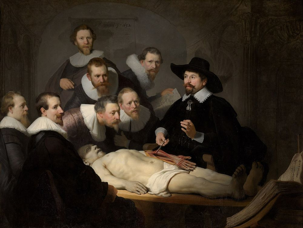
Old masters contrast and chiaroscuro
From the 14th to the 17th century, certain colors were still limited because of the available pigments. The main recorded artistic movement during this time is broadly known as the Renaissance. It included the Italian Renaissance, Northern Renaissance (with the Dutch Golden Age), Mannerism, and early Baroque and Rococo movements.
These movements occurred when painters often worked in limited light - leading to the artworks containing high contrasts within the imagery. The term used for this was chiaroscuro (“light-dark”). Two of the artists who used this technique are Rembrandt and Caravaggio.
The contrast between colors draws the viewer in, and warmer colors create a feeling of intimacy and passion often mirrored by the subject matter.
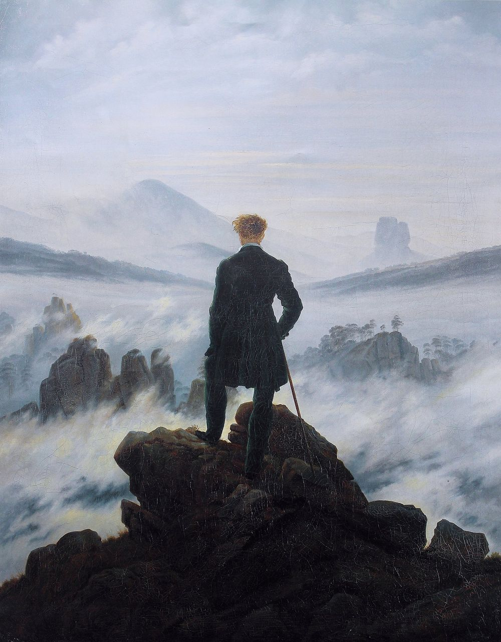
Romanticism and a return to natural tones
After the Renaissance, the world tried to counteract the empirical attitude of the time by overcorrecting to the emotional side. The major movement that followed was Romanticism.
This period focused on the power of nature and emotions and was dominated by artists such as JMW Turner, Eugène Delacroix, and Théodore Gericault.
The artists of the Romanticism art movement created sweeping, dramatic images that used a wider variety of colors. This was the same period when Johann Wolfgang von Goethe researched the connection between colors and emotions.
Romantic art played on how colors evoke emotions in the viewer. These artists used contrasts, color psychology, and specific colors to play on the viewer's perception of the scene. The colors used were an homage to humanity’s connection to nature, commonly reflecting elements of medieval art.
Often, one specific area is the focus of the artwork and is either made the focal point by adding a patch of bright color to a darker painting or a dark area in an artwork with lighter tones. The tonal values used in this movement were generally more grounded and reminiscent of nature.
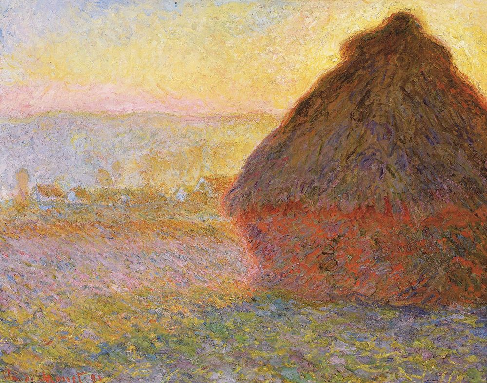
Impressionism and pastels
With the discovery of synthetic colors available to be purchased, artists began exploring the possibilities of color combinations more.
Impressionism was the next step away from the rigid logic of the Renaissance, building on Romanticism and infusing their art with more feeling. The dreamy nature of these artworks can be attributed to the use of lighter, sometimes almost pastel, colors applied in visible brushstrokes.
Looking for more cool drawing ideas?
Check out our list of 25 easy tutorials.
With the expanded palette and the added portability of paint in tubes that started in this era, artists began to go out into nature to paint - a movement called painting en plein air. The new colors allowed them to capture nature scenes in different lights and seasons, sometimes painting multiple versions of the same landscape in different color palettes.
Expressionism, fauvism, and complementary colors
The period between 1904 and 1920 took an entirely new approach to art. Artists abandoned the Impressionists' natural colors and soft, natural imagery and embraced all bold elements. The colors started moving towards the unnatural, and the paint application was made using thick layers and broad strokes. This prompted the period known as Expressionism.
In the Expressionist period, color was used to approach topics full of emotion, especially feelings of horror and fear - and even some happier topics. One of the most well-known artists in this movement is Edvard Munch. This art period homes in on emotions instead of objectively replicating reality.
A subcategory of the movement was that of Fauvism. This name originated as a negative comment due to the ‘unfinished’ nature of the art and translated to "wild beasts." The artists in this movement, such as Henry Matisse, often utilized the effects of complementary colors and used highly saturated versions to increase the impact. They used the emotional connotations of colors to call forth the relevant emotions in the viewer.
One of the pioneers of the Expressionist movement was Pablo Picasso. While he’s most well-known for Cubism and the abstract nature of his work, Picasso had quite a few different stylistic periods. One of these periods is his Blue Period between 1901 and 1904.
The paintings during this period primarily consisted of a blue monochromatic color scheme. His use of blue and green colors started after a friend's death, influencing the colors, melancholy subject matter, and darker hues he used in his work. Picasso wanted to communicate the feelings of hopelessness of the social outsiders he focused on in his work during this period.
The importance of color in abstract expressionism
The field of Abstract Expressionism built on that of the Expressionists but used their colors in ways that broke entirely from the constraints of realism.
The first division of the movement was the action painters such as Jackson Pollock and Willem de Kooning. They relied on wild strokes of color to create improvisatory artworks.
Jackson Pollock is incredibly well known for his artworks that were made using splotches of paint that dripped from the can or trailing a brush overloaded with paint around his canvas.
Jackson Pollock - Number 1A (1948)
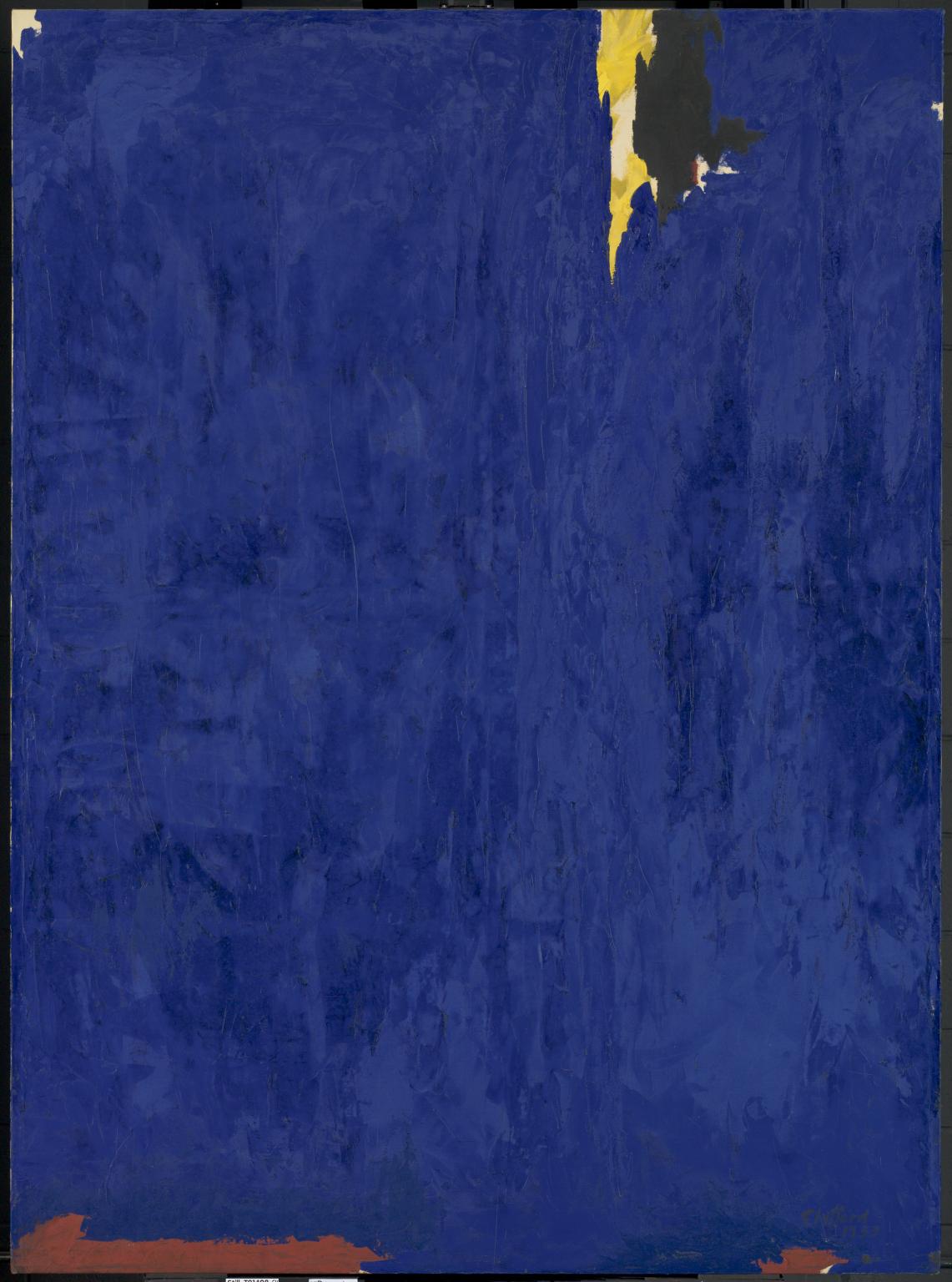
In opposition to the wild gestures of the action painters, artists such as Mark Rothko, Barnett Newman, and Clyfford Still also emerged during the Abstract Expressionist period.
These artists used specific color palettes to help create the feeling they wanted in their viewers. The artists mentioned all fall into the category of color field painting, where the art consists of large areas or blocks of single colors.
While monochromatic themes and gradients are often used, another way to pick colors is by using the color wheel and looking at which colors form a triad or square color harmony. Color harmonies help create a good balance between colors, but one dominant color is usually chosen to be prevalent in the composition based on the overall feeling of the work.
Complementary colors are also often used to create stark contrasts in art. Since these colors are on opposite sides of the color wheel, they’re often used to play off two different energies in one image.
The pure forms of these contrasting colors are not always the ones used. Subtle varieties in the hues can create depth and add character to what could otherwise result in very harsh imagery.
Mark Rothko and Anish Kapoor are two fascinating examples of artists using colors in Abstract art to challenge the viewer.
Rothko used color, especially red, to turn the viewer's thoughts inward. His paintings are exceptionally large, ranging upwards of 2.4 x 3.6 meters (roughly 8 x 12 feet). The size forces the viewer to take in and experience the effect of the colors in a very intimate way.
In today’s world, this type of art still continues. Anish Kapoor is taking color theory to a new level today. In 2014 Surrey NanoSystems created a new product - the antithesis of color: A color that reflects almost no light (absorbing 99.965% of visible light) and is known as Vantablack.
Kapoor has bought the copyright to the color, and while color is usually used to conjure stronger feelings, Vantablack creates a sense of emptiness and silence.
Anish Kapoor has created art with this color, calling it Void Pavillion V (2018).
Pop art's primary colors
Around the 1950s in Britain and America, the new Pop art movement emerged. This movement capitalized on the illustration style of comics and popular culture that didn’t match traditional art values. The graphic style and avant-garde subject matter that showed more secular imagery and appealed to a much younger audience were heavily criticized by academics.
The color palette that was popular during this period was primary colors. These colors were used to create flat blocks of color without any gradients.
In the early 20th century, artists used art to comment on modern post-war society. They used the imagery of mundane objects in absurdist colors to convey the message of breaking away from traditional values and conformity. Two of the best-known artists of this period are Roy Lichtenstein and Andy Warhol.
From pop art to op art
In the 1960s, a new art movement emerged. This movement took inspiration from the Abstract Expressionist movement but created its own style. This movement was called Op Art and focussed on creating abstract works based on patterns and later colors that stimulate the eye.
Op Art started as purely black-and-white designs meant to trick the eye using foreground and background patterns that create optical confusion. Only later did the artists in this movement start using color to create even more optical illusions.
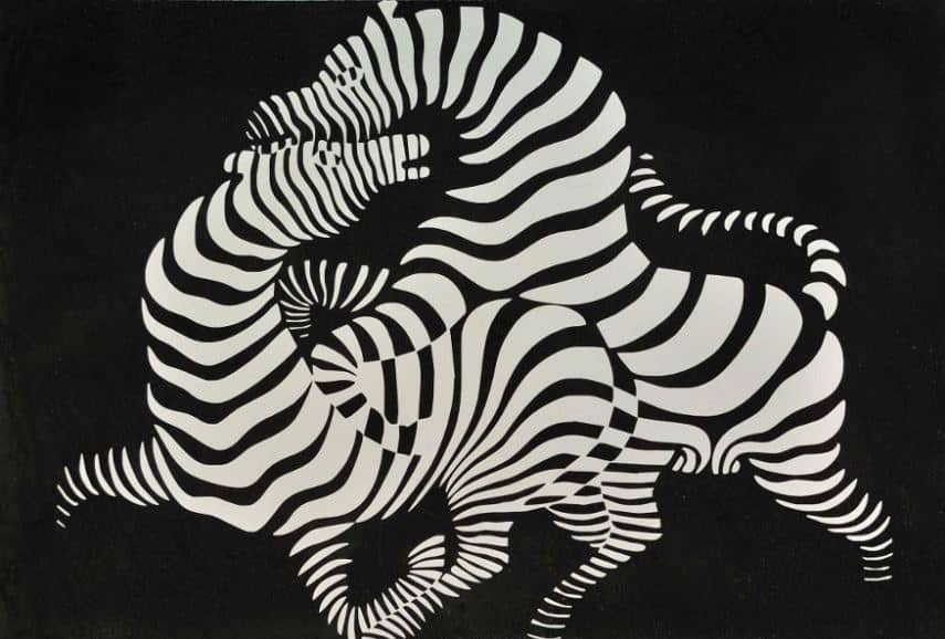
One of the earliest examples of this movement dates back to 1938 by Victor Vasarely (The Zebras), but it wasn’t until the 1960s that Op Art became a phenomenon.
The most well-known artists of this period include Richard Anuskiewicz, Victor Vasarely, Bridget Riley, and François Morellet. Each of these artists tackled the optical elements in different ways. One example is the use of opposite colors to confuse the viewer’s eye, as seen below in the work of Op Art pioneer Richard Anuskiewicz.
Into the digital art world
Today, the majority of the art we see around us consists of digital designs. But while we might think this is a relatively new development, digital art started in the 1960s.
The first vector-based digital drawing program was developed by MIT’s PhD candidate Ivan Sutherland in 1963. While still only able to draw linework in black and white, this pioneered the way for all the design programs we use today.
During the 1980s, computer production started adding color displays for home setups. This opened up the possibilities for artists to start experimenting with color on newer, more intuitive drawing programs. Computer Generated Imagery (CGI) was used for the first time in film industries, a notable example of this being the feature film Tron (1982).
The 1990s saw the birth of Photoshop, which took a lot of inspiration from Mac Paint. We also saw the solidification of Microsoft Paint, CorelDRAW, and various other programs still in use today.
The evolution of digital art has opened up the possibilities of what we can create. Digital art is used in many industries that utilize the versatility of the medium to its fullest extent.
Ready to create brand assets that pack a punch?
Visit our Academy for free art design courses.
Art and the use of color in modern installations have become an immersive experience. While augmented reality and virtual reality have been infiltrating the gaming industry, using different color palettes to set the mood for different scenarios, another type of experience has also become more popular: interactive exhibits.
Sketch Aquarium is one interactive art example where kids are encouraged to draw their own aquarium animals, which are then scanned and digitized to join other creations in a virtual tank. The experience is a tranquil activity as the blue of the virtual aquarium surrounds them while still stimulating their curiosity and creativity.
The world’s largest interactive art building is the Mori Building Digital Art Museum, developed by teamLab Borderless. This houses five large spaces with digital displays created to evoke different emotions in the audience, depending on whether it’s the colorful flower displays, the peaceful cool-toned waterfall displays, or even the magical floating lanterns that change colors.
Digital art today is free of the formal limitations of traditional art. Even when mimicking traditional art methods, the tools can still be manipulated in ways physical art can’t.
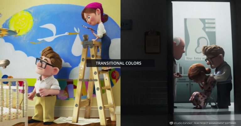
Colors can be created and modified to suit the atmosphere the artist wants to create. An excellent exploration of this is the way that Pixar uses color in their movies. Although color psychology is clearly depicted in Inside Out (2015), another example is the saturation of colors and the different palettes they chose for various scenes in the movie Up (2009).
The role of color in design
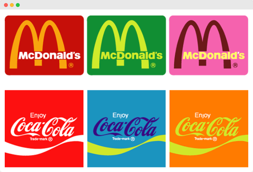
Design draws on many of the same sources as art - using color to convey each company's different values and brand identities. Some of the most recognizable brands today take people's inherent color connotations and use them to draw customers to their products.
Blue is seen as a calming, trustworthy color. These connotations have led many healthcare, technology, and finance industries to use blue to gain customers’ trust. Unsurprisingly, blue is one of the most-used colors in logos.
The naturally stimulating effect of red leads to this being a frequently used color in the food industry. Think of companies like Coca-Cola, Red Bull, KFC, Burger King, and McDonald's (although they also use the optimism of yellow to further their marketing image).
Red is also seen as a color promising entertainment and stimulation. The brands with red logos we often use for entertainment are Youtube, Pinterest, and Netflix.
Green in the marketing industry is used to send a message of environmentalism, charity, and money, and is associated with wellness in general. We trust the green images of the recycling sign and Animal Planet to be benevolent. And companies like Starbucks, Spotify, and Xbox are known to help us relax.
The pure simplicity of black is one of the most accessible colors used in design. It creates the impression of timeless elegance that some premium brands prefer. Black logos are not limited to any industry.
Luxury fashion brands like Chanel, Prada, and Gucci prefer the understated nature of black. At the same time, the color also represents sports brands like Adidas, Nike, Puma, and the sports gaming company EA Games, creating the impression of being high-end.
There are many other colors used in logos - each one supporting the marketing agenda behind it. While the orange colors of Amazon and FedEx lend themselves to the freedom and excitement of a new package, the browns used in M&M's and Nespresso show you their warmth and earthy nature.
Regarding user interface and user experience (UI/UX) design, color affects how the user views and interacts with your product’s app screens and web pages.
Color psychology has been shown repeatedly to influence consumers’ responses to calls-to-action (CTAs). But how do UX designers and marketers know which of their designs will drive the most customer conversions? The answer lies with A/B testing.
Design teams test different versions of the same CTAs by splitting them between visitors to the website. The analytics of the audience’s reactions to these designs show them which call-to-action to use.
In a test by Hubspot, they knew that green and red each had their connotations and were curious about which color button customers would click on. They reasoned that green was a more positively viewed color, making it the favorite.
In UI/UX design, red draws attention and creates a sense of urgency. However, just because this test resulted in red being the better option, don’t assume it’s a universal fact. The perception and preferences of color in marketing have myriad contributing factors.
Always make sure to test your color options with your own audience before changing them. You might be surprised at the outcome and learn more about your customers.
Viewing life in all its hues
The use of color for specific purposes has been around since ancient times. What’s interesting is how little our uses for specific colors have varied over the centuries - even across cultures that have disappeared and reformed throughout history.
Now and then, discrepancies across cultures pop up. One example is the Western idea of white signifying purity and its use at weddings, while in some Eastern cultures like China and the Koreas, it’s connected to death, mourning, and bad luck. That’s why it’s essential to know the meaning behind your choices in color in the context and market you want to use it.
The history behind the psychology of color is extensive. Sadly, much of the literature on this subject is still divided. Small areas of study have been shown to stand up to rigorous testing. Personal preference plays an essential role in our associations and decisions with colors. Hopefully, some recent studies will shed more conclusive light on this matter.
This was also tied to all the developments in creating pigments and colors previously unavailable to preceding generations. This solidifies our associations with color and the emotions we connect to them. The natural evolution of the usage of color in art would lead to its application in marketing and design.
Take a look around you. Look at the items you chose to fill your life with. How many of these items were created in shades that help them appeal to their markets? While we don’t always actively notice the colors around us that marketing teams painstakingly picked out, we do take note on a subconscious level.
These colors influence our daily lives, some of them in small ways (which brand of coffee to buy), and some might be more impactful (the office wall color impacting our mood).
Now that you know how to pay attention to the variety of hues around you, you can use this to your advantage. Try using Linearity Curve to see which colors fit your illustrations and designs best and how altering a hue here and there could create an entirely different emotional response.
Jumpstart your ideas with Linearity Curve
Take your designs to the next level.
Share this!
Benjamin Barnhart
Ben is the Principal Copywriter for Linearity, living in Berlin. His hobbies include board games, cooking, reading, and writing.


