Even though all logos, no matter the type, are a combination of images and strong typography, each type of logo has its own flavor and uniqueness. While each logo is different in its own way, there are seven main categories:
1. Emblems
2. Pictorial marks (or logo symbols)
3. Wordmarks (or logotypes)
4. Monogram logos (or lettermarks)
5. Abstract logo marks
6. Mascot logos
7. Combination marks
Jumpstart your ideas with Linearity Curve
Take your designs to the next level.
Let's take a closer look at each category.
1. Emblems
What's an emblem logo?
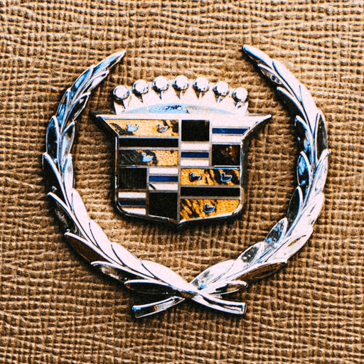
An emblem is a logo that features text, a symbol, or imagery inside a geometric shape.
Advantages of emblem logos
- They are memorable
- Give a traditional feel to your brand
- Give an official look to your brand
Disadvantages of emblem logos
- It may not look so good when resized to a smaller resolution
- Hard to read when placed on a billboard
As these logos have more of a traditional feel, this type of logo is often used by organizations, universities, government agencies, etc. Think of the Harvard logo, the Yale logo, NASA, or the NFL. All of them are emblem logo types. Some popular brands choose this type of logos as well, such as Starbucks or MasterCard.
Emblem logos are very popular with the auto industry too. Some automobile companies like Ford and BMW use emblem logos. Lately, some companies have decided to modernize the traditional emblem look with entirely new or updated logo designs that are more appropriate for the 21st century.
KIA, for instance, used to have an emblem logo, but they decided to update it to a Wordmark logo this year. Their new logo resembles a handwritten signature.
Another reason why some brands decide to update their logos is an increase in popularity. Once some brands become popular enough that people recognize them even with an image or symbol, they remove the brand’s name from their logo.
A perfect example is Starbucks who, in 2011, decided to maintain the core elements of their brand but removed all the text from their logo, turning it into a symbol logo.
2. Pictorial marks
A logo reduced to its symbolistic meaning is called a pictorial mark or a brandmark.
Some examples of brandmark logos are Apple, Twitter, Nike, Target, and McDonald’s.
Advantages of pictorial marks
- Conveys ideas through a symbol
- Recognizable if the brand is popular
- Scalable (especially if you opt for a vector logo design)
Disadvantages of pictorial marks
- Not the best option if you do not have a strong brand recognition
If you want your audience to associate your brand with this type of logo design, the logo design does not have to be a literal representation of your business identity. However, it still needs to include distinctive symbols that you can use as visual representations of your brand.
Become a Logo Design Pro
Master the art of logo design with our comprehensive course. Perfect for all skill levels, learn to create memorable and effective logos for any brand.
As mentioned earlier, popular brands such as Starbucks have changed their logo from an emblem to a symbol once they were established on the market.
If you're starting out, you can still use this type of logo. However, you'll also need to use a wordmark associated with the symbol until your broad audience becomes familiar with your brand and what you offer. Once you reach the point where the symbol of your logo is recognizable enough that you don't need the wordmark, you can follow Starbucks’ example and remove it.
3. Wordmarks
Advantages of wordmark logos
- They are simple
- Easy to mix with other design elements
- Easily recognized
- Perfect for new businesses
Disadvantages of wordmark logos
- It only works well with short brand names
- You may need to update the font to keep up with new trends
The wordmark logos are a powerful type of logo design. The definition of the logotype is straightforward as they are made up of the company's name. You won't find symbols, graphic patterns, or emblems in a logotype. The main feature of the logotype design is its typography.
The whole identity of your brand will be created by the style and color of your fonts. That is why it is crucial to find typography that works well for you and represents your brand very well. Then you can select a color or several colors that represent the feel of your brand.
Some wordmark logo examples are Coca-Cola, Disney, Google, Subway, and Jeep.
This type of logo is perfect if you are just starting out and unsure what symbol would best represent you. Moreover, having your brand’s name as a logo will get your brand's name out there and help people make the connection to your brand immediately.
4. Monogram logos
If you want to reduce your brand's name to an acronym, lettermarks, or letterform logos are a great way to do it.
You can easily create the logo by taking the initials from each word of your brand's name. There's only one part left to think about: Typography.
Advantages of monogram logos
- Perfect if your brand has several names which you can use to create the acronym
- Looks professional
- Easy to recognize
- Scalable (if you choose the right font)
Disadvantages of monogram logos
- Hard to recognize if you are new to the market
- You may need to place the full name beneath it until it is safe to remove it
Since the logo will be made only of an acronym, you will need to choose a custom typeface that is easy on the eyes. You should also make sure that the typeface is legible when scaling down.
Examples of famous brands that use lettermark logos are HBO, CNN, H&M, IBM, and the BBC.
5. Abstract logo marks
Instead of being a recognizable image - like an apple or a bird - as the name suggests, the abstract logo design does not include recognizable images but abstract geometric forms and abstract elements.
Advantages of abstract logo marks
- They are unique
- Instantly recognizable
Disadvantages of abstract logo marks
- Not the best type of logo for new brands
This geometric form will help you condense your brand into a single, distinctive appearance. Examples of famous companies and organizations that use abstract logo types are Pepsi, BP, Adidas, and Olympics.
This abstract logo mark should convey a particular message and represent your brand. You should also keep an eye on the colors you use, as they can also help make the design even more memorable.
If your business or product is new on the market, it can be risky to use this type of logo to represent you because you will first need to have a solid base of people who recognize your brand.
6. Mascot logos
Advantages of mascot logos
- Evoke a fun and friendly vibe
- Easy to recognize
Disadvantages of mascot logos
- Hard to renew and change the character
- It can’t be used for brands that aim to send a professional message
When you think of a mascot, do sports events come to your mind almost immediately? Mascots at sporting events are fun to look at. They create a warm dynamic that also involves the audience.
Ready to create brand assets that pack a punch?
Visit our Academy for free marketing design courses.
Mascot logos evoke a similar vibe with positive associations. They involve an illustrated character of a real person, an imaginary person, or a non-human entity. More often than not, mascot logos are colorful and fun. They give you a warm feeling and make you feel more connected to the brand since people will be more attracted to the character representing your company.
Mascot logos are often used for sports teams, beverage companies, and food brands. KFC, Pringles, Wendys, and Cheetos are well known for their famous mascots.
7. Combination mark
As its name suggests, the combination mark logo is a combo mark of various kinds of logo designs.
The best thing about this type of dynamic mark is that you can mix multiple types of logo design if you cannot decide on a single image, symbol, or abstract form.
Advantages of combination mark logos
- Perfect for new businesses
- Easy to edit in the long term
- It gives you the freedom to be as creative as you wish
Disadvantages of combination mark logos
- It may look overloaded if it combines too many logo types
Want to use a symbol but are afraid that you will confuse potential customers and won't be easy to recognize? Then you can easily combine the symbol logo with an abstract symbol, words, or acronyms.
You can use a combination of typography or a combination of wordmarks as well. Mix and match with different types of logos until you feel strongly about a final version that will work best for your brand. Some examples of combination mark logos are Domino’s Pizza, Taco Bell, Pizza Hut, Puma, and Adobe.
We recommend a combination of logos if you're unsure about the first six logo types we mentioned. However, no matter which kind of logo you decide to use, spend some time researching and ensuring that no other brand uses a similar concept.
How to make your own logo
Now that you're familiar with all the different logo types, it's time to make your own logo!
And there's no better vector tool for logo-making than Linearity Curve (foremrly Vectornator)! This saves you the cost of logo design by an external agency.
You can even sketch your logo design on pen and paper first and then use Curve's Document Scanner to import your design into curve and turn it into a sleek vector logo.
Once you've created your design, share it with us on social media or on the Linearity Community! We can't wait to see what you'll make.
Get started
with Linearity today.
Jumpstart your ideas with Curve.
Share this!
Ben Barnhart
Ben is a Content Lead for Linearity living in Berlin. His hobbies include board games, cooking, reading, and writing.


:quality(75))
:quality(75))

:quality(75))

:quality(75))
:quality(75))
