:quality(75))
:quality(75))


:quality(75))


The restroom pictograms, the 1972 Olympics, Adidas, and The Beatles’ White Album: Brutalist graphic design has led to some of the most iconic and memorable designs of all time. It’s the avant-garde movement that changed the urban landscape forever.
When you think of the Department of Home Affairs, IRS, or other institutional buildings, what do you see in your mind's eye?
Probably a big, heavy gray building that reminds you of long queues on a Saturday. Do you see black-and-white printed documents with grids and checkboxes, spreadsheets, people wearing uniforms, and a website without any CSS embellishments?
A complete lack of a sense of culture and warmth? That's all part of Brutalism.
Brutalism in graphic design is a trend that features big, heavy modern fonts, futuristic and heterotopic visuals, stark color palettes, and striking images.
Before we deep-dive into Brutalist graphic design, let's first look at the history behind Brutalism as a movement.
Jumpstart your ideas with Linearity Curve
Take your designs to the next level.
What is Brutalism in design?
The development of Brutalism can be seen in different periods of early twentieth-century Modernism. Modernism was the macro-movement that followed the Enlightenment and Romanticism periods and focused on progress through urbanization.
Modernism is a philosophical and artistic break away from traditional (European) form and encompasses everything from primitivism to capitalism to socialism – it's sometimes referred to as the age of the '-isms'.
The Modernist focus on the future and socio-economic development captured the imaginations of artists and designers, along with the new technologies that were rapidly emerging at the time. It was all about the avant-garde: innovation and newness.
The Cubists, Futurists, and Vorticists were already imagining new realities in their art and design before the First World War, with their works featuring strange robotic performances and poems, portraits and landscapes made up of geometric shapes, surreal industrial scenes, and themes depicting movement and progression.
They were inspired by machines, cars, cities, air travel, and other rapid travel and communication prospects.
New technologies were continuously being incorporated into the architecture. After the wreckage of the First World War, many new Modern buildings and monuments were built. A particular strand of Modern architecture, called Constructivism, influenced what is known as Brutalism today.
The Constructivists in the 1920s Communist Soviet Union were influenced by Bauhaus, Futurism, and especially the early work of the Swiss-French architect and urban planner Le Corbusier. Charles-Édouard Jeanneret-Gris, or Le Corbusier as he was known, made many proposals to demolish traditional, historical buildings and erect new Modern cities.
Le Corbusier's style was known for the use of pilotis: steel or concrete pillars that would raise and support the building while freeing up the structure to take on new forms since the walls were no longer load-bearing.
Using poured concrete, his method made it possible to mold the various parts of the building and then essentially assemble them. It revolutionized architecture because it didn’t require skilled labor and the materials were affordable and highly accessible.
It changed the urban landscape forever.
Le Corbusier's Modernist vision was in line with the Soviets' vision of using architecture to realize the "new Socialist utopia" that would materialize Communist ideals and ways of living.
The strictly functional housing built in the Soviet Union was a cost-effective way to house millions of people displaced by the wars and fulfill the Communist state's promise of free housing for workers.
It was a progressive, no-nonsense approach to design that emphasized utilitarianism. This inspired architects elsewhere in the world to do the same.
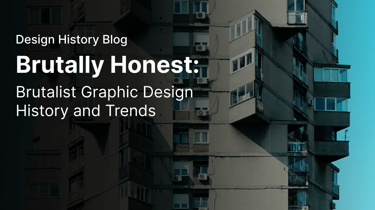
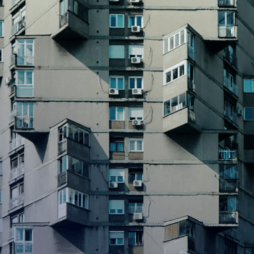
However, these buildings were not pretty to look at. Without any fancy façades, homely face brick, exposed wooden beams, lacework, or even a lick of paint, Brutalist architecture was a complete break away from the colorful traditional structures of Soviet countries like Russia.
The style sought to expose everything about a building: nothing is hidden or plastered over.
In other words, in Brutalism, the value of any design is in its usefulness. What you see on the outside is what you get on the inside, following the philosophy of honesty in form.
Brutalist architecture focused on the best use of resources. One of the main attributes of concrete is that it can be poured into molds and cast into pretty much any shape.
The molded shapes could be infinitely replicated, making it possible to create "modules" – basic structures that could be assembled in any number to form a whole.
Form follows function
The modular, unpainted buildings that emerged in the mid-twentieth century did away with color and fuss.
The concept of "form follows function" predates Brutalism. The American architect Louis H. Sullivan, known as "the father of skyscrapers," first coined the phrase in his essay, The Tall Office Building Artistically Considered (1896). You could almost say that it was the birth of the office space as we know it today.
Learn From the Legends of Graphic Design
Delve into the lives and works of the most influential graphic designers. Gain inspiration and insights from their groundbreaking contributions.
Form follows function means that before you start designing something, you need to think about its purpose and then bring that purpose from the inside out in your design.
We can see the principle of "form follows function" coming through in Brutalism. This is key to understanding its influences, especially in today's digital design, which struggles to define what exactly Brutalism is.
Of particular importance in bridging the gap between Brutalist architecture and Brutalism in graphic design is the Art Brut ("Raw Art") movement of the 1940s.
Jean Dubuffet was the main proponent of the Art Brut movement in the creative arts. Also known as Outsider Art, Art Brut is naïve (or untrained), non-academic, or even crude creative work.
Dubuffet's raw, expressive work was inspired by psychology and the creations made by those on the fringes of society (prisoners, the mentally ill, children, the elderly, and the disabled).
You might be wondering how the two seemingly disparate "bruts" link to each other?
Both Brutalist architecture and Brutalist art focus on raw authenticity, the inherent qualities of materials, and cutting loose from the traditional forms of their particular disciplines.
Why is it called Brutalism?
Besides the term Art Brut coined by Dubuffet, the French phrase Le Corbusier used for raw concrete is le béton brut. Swedish architect Hans Asplund used the term Nybrutalism ("New Brutalism") in 1949 when describing a rectangular, face-brick home in Sweden with exposed I-beams and concrete floors (the Villa Göth).
Although Asplund was the first person to use the term, it was popularized by British architectural critic Reyner Banham when he wrote about the architectural work of Alison and Peter Smithson in his seminal article, The New Brutalism, in 1955.
Two years before Banham's article, the Smithsons, together with the artists Nigel Henderson and Eduardo Paolozzi, and civil engineer Ronald Jenkins, held the pivotal exhibition Parallel of Life and Art in 1953.
Dubuffet's work was also featured in the exhibition, and the Smithsons are noted as referring to his work in describing the New Brutalism of their architectural projects.
Since the work by these architects and artists was such a harsh contrast to historical design trends, people took the "brut" and critiqued their work as "brutal".
Brutalism in graphic design
The nature of Brutalism is that it's never really clear-cut since it stems from such a diverse background in design, as we've already seen earlier in this article.
But, based on the philosophy of Brutalism in architecture and art, we can point out an aesthetic style applied to graphic design and digital design that can be called Brutalism:
- A strong concept that breaks out from traditional or popular design trends
- Modularity or repetition of design elements
- Rough, unfinished, or "draft" look
- A play in texture and scale
- Simple, heavy sans-serif fonts, often capitalized
- Using typography as a structural element
- The strategic use of white space and bold colors
- A mixture of black-and-white photography with graphic elements
- An underlying Pop aesthetic
- Staying true to the material and application of the design
The Brutalist style incorporates bold shapes and lines to create a memorable, powerful image that leaves a distinct impression on the viewer or user.
This style has arguably had the most profound effect on graphic design as a discipline since many of the principles of good design fall into the categories of Brutalism listed above.
Whereas the works of Art Brut could become muddled, messy, and confusing (Banham mentions artistic influences such as Jackson Pollock, Karel Appel, Alberto Burri, and Magda Cordell), the Brutalist style in graphic design follows more closely the architectural aesthetic of clean lines, monumental perspectives, and blocks of color.
Famous examples of Brutalist graphic design
Brutalist fonts are sans serif and bold. A Brutalist color palette is limited and striking.
Brutalist designers play with scale and perspective while preserving a level of flatness in their visual design to bring a sense of monumentalism. These designs also tend to be highly functional.
Let's look at some famous examples of the Brutalist trend in graphic design.
The Beatles album cover
Known as the "White Album," the Beatles' 1968 self-titled album was packaged in a white cover with the band's name embossed off-center in Helvetica font. Each album of the five million copies also had an edition number playing on the idea of scarcity and value.
This oversimplified design was different from The Beatles' previous album covers, which were usually very colorful and featured various types of visual content.
It also signaled a change in their career as a band, as they were moving towards breaking up and continuing their solo careers in the seventies.
The album cover was designed by Richard Hamilton, credited as the founder of the British Pop art movement. Before it was called Pop art, Hamilton, together with other artists, worked under "the New Brutalism" banner.
The 1972 Olympic Games In Munich
The corporate identity created for the 1972 Olympic Games by German graphic designer and typographer, Otl Aicher, features bold graphics and typography, recolored photographic elements, and an incredibly well-designed set of pictograms.
Aicher's pictograms are clever, simple, and instantly recognizable icons that helped Olympic spectators and athletes find their way around Munich.
These pictograms would later be incorporated into and inspire signage around the world.
Obama 2008 electoral campaign
Street artist Shepard Fairey is most (in)famous for his Andre the Giant graffiti, which features a cropped stenciled image of a face with the word "OBEY" in bold capital letters.
His work is inspired by Soviet Socialist propaganda, which is a style he adopts to subvert contemporary fascism and capitalism.
He created a range of posters to show support for the 2008 Obama campaign, which quickly gained popularity. He accurately portrayed the public sentiment the campaign was rallying for that his designs were used in an official capacity.
Through the resourcefulness of graffiti, the Pop art element, and Fairey's signature stencil-style bold graphics, this work can be seen as a great example of Brutalist graphic design today.
Keep calm and carry on
Although now adapted and emblazoned on a myriad of coffee mugs and t-shirts, the Keep Calm and Carry On design was originally created as part of a set of slogans meant to improve British morale during World War II.
Ready to create brand assets that pack a punch?
Visit our Academy for free marketing design courses.
This clean design features a monochromatic background, a flat design of the Tudor Crown, and the motto in a sans-serif font called Caslon Egyptian.
With these Brutalist elements, the design has been a source of inspiration for many different applications.
Adidas
The Adidas brand has been trusted by professional athletes since the 1930s. The original Adidas logo featured the image of a shoe suspended between two vertical lines extended from the brand name.
However, the most well-known version of the logo features three thick diagonal lines that form the shape of a mountain.
The three lines show progression and symbolize rising above challenges. The logo uses the ITC Avant Garde font, which is a bold sans serif.
Adidas' branding incorporates four essential principles which make it so iconic: simplicity, versatility, a strong message, and maintaining constant awareness.
These principles pull through from their digital design to the architectural design of their stores.
Brutalism in web design
Brutalism in web design is a more recent trend that echoes the functional look and feel of the early internet.
Also called Digital Brutalism, Pascal Deville first described Brutalism in web design in 2014 after noticing a trend in websites made by young designers that sought to stand out from the unimaginative, copy-and-paste styles of theme-based websites that dominate the internet these days.
Deville sees a three-way split in the design decisions made under the umbrella concept of Brutalist web design: Purists who like to keep things as basic as possible, UX-minimalists who generally want to focus on conversions, and anti-ists (or artists) who are making creative, chaotic and confusing digital works of art through the medium of web design.
Brutalist websites often lack CSS styling as a metaphor for using raw materials (HTML code).
This might look like a lack of concern for user-friendliness or visual appeal, but the growth of this trend proves otherwise.
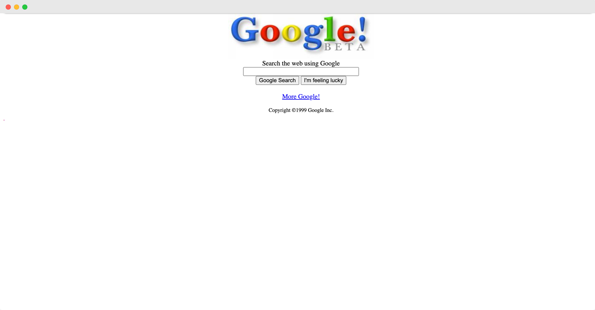
The digital interfaces of the nineties and 2000s, like one of the first versions of Google (below), were byte-sized and very limited in their visual styling – only enough to get the job done!
We see this Brutalist trait coming through in new websites with stripped-down design and navigation, only the information and functionality you need to use the site, "raw" blue links, and no interactive content like parallax scrolling or CSS animations.
Examples of Brutalist websites
Let's look at some contemporary websites that are examples of Brutalism in web design.
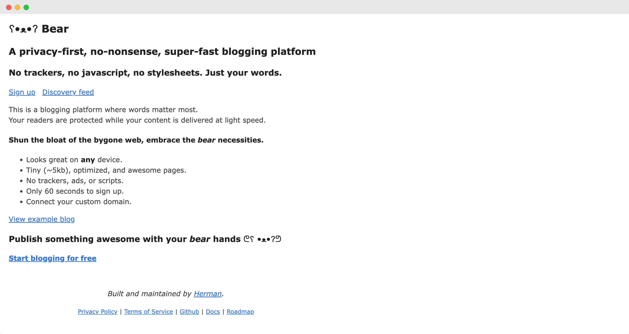
Bear
A play on words, Bear is a bare HTML site that's also a platform for bloggers who want to create free, no-nonsense blogs with no ads or trackers.
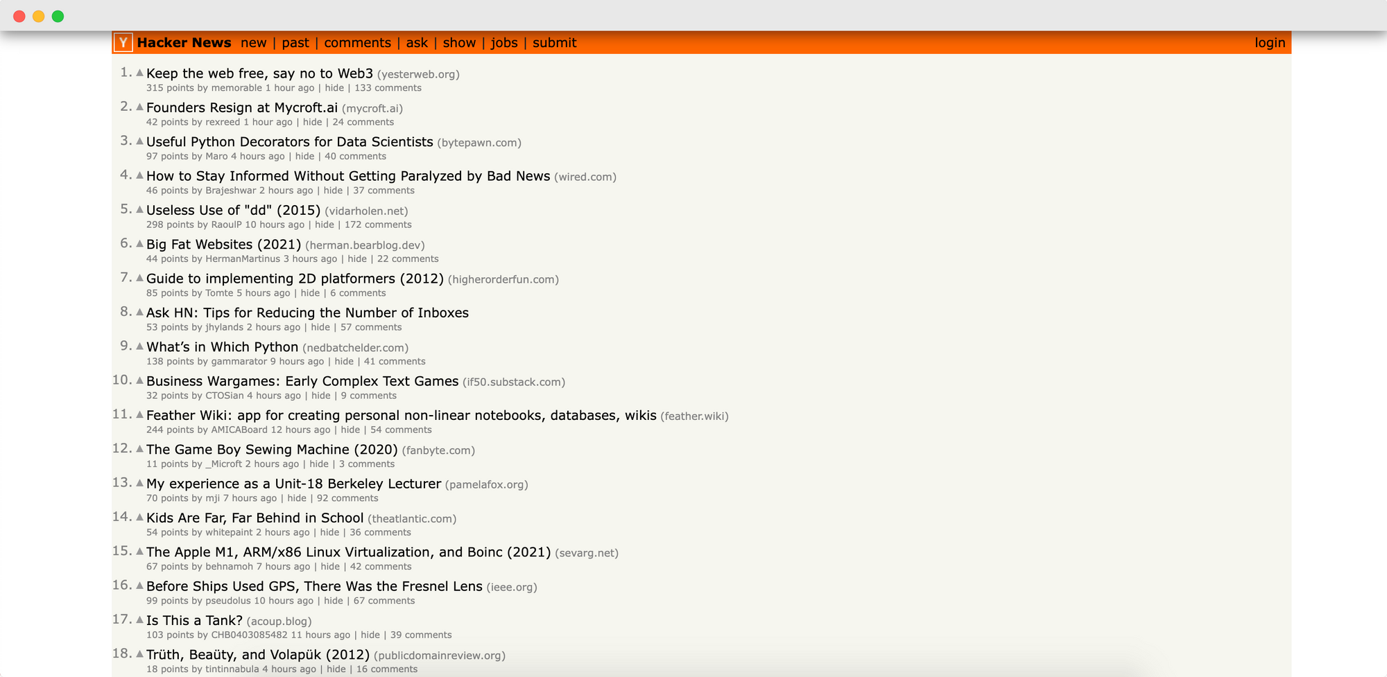
Hackernews
This unassuming tech news site by startup incubator, Ycombinator, sees about 10 million views per month.
It's a simple blog setup with an upvote system that pushes the most-voted article up to the first position for each day.
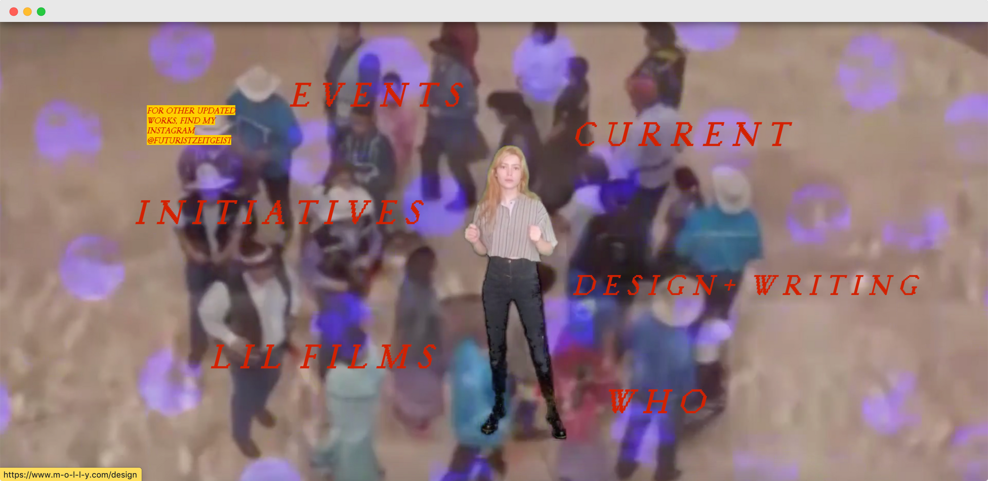
molly
A personal portfolio website featured on Brutalist Websites, molly is a 'home for her virtual self' that edges more towards the anti-ists category described by Deville.
This site features a playful overlapping of GIFs, video backgrounds, and scattered menu links in retro web fonts.
What are the benefits of Brutalist web design?
Depending on the Web Brutalist style you're going for, there are some cool benefits to Brutalist sites:
- A fresh look that distinguishes your website from the rest of the "boring web" (theme-based sites)
- No ads!
- A faster website since you don't have so much code to run or images to load
- A sense of originality and authenticity
- Easy to mix it up by changing colors and graphic elements
What are the disadvantages of Brutalist web design?
Again, depending on the graphic design elements and coding that you use, Brutalist websites may not be as helpful from a business perspective:
- SEO implications in terms of code structure, images, or not having enough text (or repetitious text) that hinders the appropriate indexing of your site for a high ranking in search results
- Readability and UX issues
- The risk of losing your visitors' or readers' interest if there are walls of copy or nothing pointing them in the direction they need to go next
To mitigate these disadvantages you need to consider some practical points without sacrificing your creative design choices.
Try and emphasize certain parts of your website to lead your visitor to more relevant content. You should always keep the user journey in mind (even if you're trying to break away from traditional or trendy website design).
Get creative with our ready-to-use templates.
Linearity Curve offers templates for every social media platform and various use case templates for posters, business cards, slides, app store screenshots, and more.
Remember, your website is not only a work of art; it's also a practical tool for your brand/portfolio and your target audience!
Translating web Brutalism into graphic design
What's really interesting and fun about Brutalism translating to the internet is that Digital Brutalism has also influenced graphic design.
Clip art, emoji, dingbat icons – you can see these elements combined with large fonts and photographs in many recent events posters and other graphic art.
Today, Brutalism can also be a mixture of different genres that defies neat categories and the traditional concepts of good design (confusing, we know!).
What's the difference?: Brutalism vs. Anti-Design
While there's usually a strong focus on communication and functionality in Brutalism, the recent developments in website design that we've just looked at have irked UX/UI designers to the point of being branched out as a separate movement called Antidesign.
Antidesign is individualistic, chaotic, and anarchic. It doesn't stick to any rules.
Antidesign looks for ways to disrupt the status quo and make critical comments on social order through complexity and "ugliness".
Where Brutalism is ultimately rooted in reform and building a new social order, Antidesign aims to deform, deconstruct and create discomfort. But, why?
Antidesign is not as negative as it sounds. It's really about exposing agendas and, especially on the web, waking us up and making us aware of the underlying structures of what we take at face value.
You could think of Antidesign as a way to protest with graphic and web design.
An Antidesign website or visual will look broken and confusing, often layering information and linking to irrelevant sources. It will most probably have grammatical errors, missing pieces, and an overall lack of cohesion in the design.
What's the difference?: Brutalism vs. Cyberpunk
Brutalism is futuristic and heterotopic, whereas Cyberpunk is futuristic and dystopic – the future we feared, where technology has taken over our lives and an evil corporation (or robots) rule the world.
Cyberpunk is more of a science fiction movement portrayed in literature, movies, and games. You can recognize it by the technological excesses and digitizing almost everything.
Most importantly, in a Cyberpunk dystopia, a centralized political power controls access to resources, and people are policed into the social order.
Cyberpunk has a distinct visual language: neon lighting, high-tech gadgets, futuristic fashion, robots everywhere, flying cars, and otherworldliness.
The future dystopia features a virtual reality, beat-up electronics, a lack of natural resources, mass crime, and heaps of junk.

Think of George Orwell's 1984, the movies Blade Runner and 5th Element, and Ernst Cline's Ready Player One. There are many more examples, but you catch the drift!
Brutalist architecture often features in Cyberpunk backdrops, so, understandably, people confuse the two. Just remember that Brutalism doesn't intend to bear a gloom message, whereas Cyberpunk highlights what went wrong with the world in the future.
Brutalism is all about raw materials and authenticity; Cyberpunk is about excesses and avatars.
What's the difference: Brutalism vs. Flat Design
Flat design is a particularly illustrative trend that features two-dimensional (or flat color) designs.
Flat design is very versatile since it's equally suitable for corporate identity, web visuals, children's books – pretty much any digital design you can think of.
We can't imagine a Brutalist children's book design as being visually appealing to its target audience!
Although both may share a minimalist approach (depending on the application of the design), Brutalist designs are most often functional and impressive. In contrast, Flat design tends to be soft and light-hearted.
The Flat style brings everyday life and imaginative scenes alive in cartoon mode and is usually keenly expressive of human emotions.
What's the difference: Brutalism vs. Minimalism
Perhaps the most difficult distinction to make is the difference between Brutalism and Minimalism, especially in art, graphic design, and web design.
It's helpful to remember that these two movements stem from different discourses.
Brutalism, as we've discussed in this post, has its roots in Socialist idealism, utilitarian architecture, cross-discipline collaboration, and Outsider Art.
Minimalism stems from Eastern philosophy and aestheticism, as well as a movement in Modern art that sought to emphasize the materiality of art objects (through total abstraction) as opposed to playing to the elitist tastes of the art market at that time.
There are still some overlaps, but fundamentally Brutalism strives to express a social ideal, whereas Minimalism strives for an individualistic aesthetic or philosophical ideal.
Is Brutalism misunderstood?
Since the first Brutalist buildings made their appearance, the design style was critiqued for being "ugly", "hideous," "nasty," "uninviting," "cold," and even "grotesque." This is mainly because it came to symbolize Communist ideals, which were threatening modern democracy.
Since Brutalist architecture has often been employed for large-scale public housing, it has also tended to be the victim of vandalism and urban decay (raw concrete doesn't age well!).
In graphic design, the Brutalist style has become recognized as a legitimate design style and even incorporates elements of the negative connotations people have with the architectural style.
We've also seen how Digital Brutalism is used to create exciting and even chaotic experiences online.
:quality(75))
:quality(75))
The irony of Brutalist design
In striving for functional perfection – a utopian living space for humans – Brutalist design often misses an essential ingredient in utilitarianism: people.
People are social and emotional creatures who look for warmth, connection, belonging, and feeling special. In its stark monumentalism and breaking away from traditions, especially in architecture, Brutalism can come across as oppressive and anti-social, which is generally very off-putting.
The proof: many Brutalist buildings have been abandoned, vandalized, or demolished.
Brutalism: there is hope
If we look at some of the first examples of Brutalist buildings and visual design, there's also a certain poetic quality that they possess – almost like a story of hope.
After the World Wars, people's lives needed rebuilding on a low budget with material scarcity. If you think about it, it's designed at its finest: seeking the most resourceful, elegant ways to solve contemporary problems.
Brutalist architecture was decoupled from traditions and achieved some of the most inspiring engineering feats. It also made it possible for millions of people to be housed in densely populated areas instead of living on the streets or not living at all.
Brutalism signals a return to raw authenticity, innovation, and an appreciation for the materials at hand. Today, we can see Brutalist optimism not only in architecture but also in graphic design.
Brutalist graphic design has brought about some of the most valuable strategies for effective communication and original expression.
Try your hand at Brutalist design following the principles we looked at earlier in this post and see how you can create forward-thinking, imaginative, and memorable artworks with limited resources.
Jumpstart your ideas with Linearity Curve
Take your designs to the next level.
Share this!
Sharné McDonald
Sharné is a contributing writer to the Linearity Blog. She has 10+ years' experience in graphic design and marketing and holds a Master's degree in Art Education.