:quality(75))
:quality(75))

:quality(75))
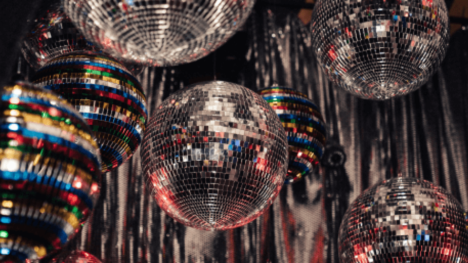
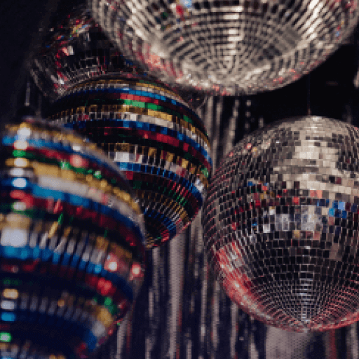
The 1970s are famous for bell-bottoms, roller skates, and disco balls, but it was also an era of progressive cultural change and technological innovation.
Along with portable cassette players, the first digital wristwatch, and Apple Computer 1 (Apple’s earliest product), new devices for typesetting were introduced. The Letraset and the Visual Graphics PhotoTypositor techniques emerged and provided greater freedom for designers. Creatives began breaking the conventions of typography with more irregular and varied letterforms. As a result, the lava lamp-inspired bubble lettering and free-form font swashes that capture the era were born, and continue to be popular typography choices today.

Bold color and pattern also featured as ‘70s design trends. The psychedelic influences from the 1960s continued well into the next decade, but as diverse social movements and new music genres evolved, so did visual art. The introduction of jazz, funk, and disco gave the ‘70s its distinct look. The “Me Decade” flaunted warm colors, thick wavy lines, paisley patterns, flower power motifs, and much more.
Fans of the ‘70s know that the era was all about pushing the limits of design. From attention-grabbing posters and psychedelic vinyl covers to fashion fads and colorful interiors, the dizzying designs of the time defined the energy of the decade. Whether you love or hate the far-out aesthetics of the ‘70s, there’s no doubt the iconic decade made a lasting impression. And many of today’s graphic designers are looking back to the colorful era for inspiration.
Want to capture the ‘70s retro vibe in your graphic designs? Right on!
Read on to learn about some of the retro styles of the decade, and how you can recreate them in Vectornator.
Jumpstart your ideas with Linearity Curve
Take your designs to the next level.
Steller ‘70s design trends that capture the radical era
Free-form typography
The ‘70s were huge for typography. As we mentioned earlier, new technologies meant that designers had a lot more control when it came to lettering. Type artists moved away from the rigid typographic styles that reigned in the ‘50s and early ‘60s and began experimenting with spacing and hand-drawn letterforms. You could say that fonts began free-flowing just like the hippies of the era.
Letraset
Dry-transfer lettering sheets made by a company called Letraset meant that all kinds of fonts and elements could be transferred onto a designer’s page. The user would simply lay the pre-made film onto a sheet of paper and carefully rub the front of the sheet with a blunt pencil or ballpoint pen. Once the sheet was removed, the permanent “transfer” was revealed.
Letraset sheets were cheap and accessible, which meant they were used by both professional and amateur graphic designers, architects, and artists during the ‘60s, ‘70s, and ‘80s. Some of the most iconic fonts from the ‘70s came from Letraset designer Colin Brignall. He designed Aachen Bold, Italia, Octopuss, Superstar, and many more.

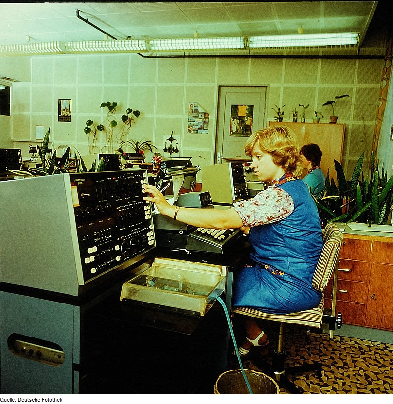
Phototypesetting
Phototypesetting is an old method of setting type that uses a photographic process to generate columns of type on a scroll of photographic paper. Although this method was eventually replaced by computer software, it was revolutionary for graphic designers in the ‘70s.
The PhotoTypositor, manufactured by Visual Graphics Corporation, used large negative film strips with characters next to each other. Users lined up the character they wanted to be printed with a lens, and it was then projected onto photographic paper. This allowed for custom adjustments to the kerning of the characters, and the device even had different distortion lenses that transformed letters into abstract forms.
Through experimenting with these new technologies, three main typography trends emerged during the ‘70s:
Swirling swashes
A swash is a typographical flourish that exaggerates the serifs of a character. They were first seen in the decorative Art Nouveau design elements of the 19th century but were revived in the ‘70s. Swirling serifs and elaborate ligatures brought letterforms to life, capturing the eccentric “look at me” attitude of the era. This style of font is perfect for evoking a good vibe and making your designs stand out among the rest.

Groovy Bubble Fonts
Bubble fonts were one of the graphic design trends we predicted for 2022, but the typography style originated long before now. Hand-drawn, bubble-like shapes were a rebellion against the neat, sans serif International Typographic Style of the ‘50s. The free-from trend was all about creating soft, curved shapes that captured the playful mood of the time.

'70s Disco Fonts
Disco is a subculture and genre of dance music that emerged in the ‘70s from the nightlife scene in the United States (think ABBA, Donna Summer, and Chic). Inspired by the neon lights at the parties, these multi-line, all-caps fonts instantly evoke the vibrant energy of the ‘70s. They’re great for creating shining headlines that grab attention.

Inspired to create your own funky lettering?
At Vectornator, we’re big fans of free-form lettering, which is why we made it easy for today’s designers to create custom fonts using our software.
You can use the Camera Import feature to pull your physical lettering sketches into Vectornator, and then you can use the Brush Tool and the Pen Tool to turn your sketched characters into crisp and infinitely scalable vectors. You can also transform digital Procreate sketches into vectors by simply importing your file into Vectornator. You can trace your characters by hand using the Pen Tool, or for a quicker workflow, use the Auto Trace tool.
Once you’ve designed your custom alphabet, you can use an app like iFontMaker to compile your characters into a font file that can be saved and used again later.
Comforting colors
When you think of the colors of the ‘70s, the warm and inviting mustard yellow, burnt orange, and earthy tones come to mind. Compared to bright colors in '60s psychedelic design, the colors of the ‘70s were pretty toned-down, but perhaps that was due to the social climate of the time.
By the mid-70s in the U.S., people were recovering from the turmoil of the Vietnam War, and many championed for peace and a sense of calm. Additionally, the country was going through an oil crisis and rising inflation, so design trends changed to reflect a new fondness for nature and an awareness of environmental concerns. In fact, the first official Earth Day was on April 22, 1970.

Nature-inspired colors like Avocado Green and Harvest Gold were prominent of the era, especially in '70s interiors, appliances, and even fashion. However, outside the comfort of peoples’ homes, graphic design featured cheerful colors that reflected the radical movements of the time. For example, the Rainbow flag—a celebrated symbol of the LGBT community—was designed in 1978 by artist Gilbert Baker. These multicolored stripes were embraced by graphic designers, who repurposed the rainbow hues as vibrant elements in posters, packaging, film posters, album art, and more.


Want to create a ‘70s-inspired color scheme? Here’s our blog post on how to embrace a natural color palette. And if you’re more into vibrant rainbow hues, learn how you can create and save your own color choices in Vectornator.
Ready to create brand assets that pack a punch?
Visit our Academy to learn how to use color palettes.
Photography
While the ‘50s and ‘60s relied on illustrated imagery in advertising, the ‘70s embraced photography. Illustrations didn’t completely disappear, but photos of real people were often used in combination with hand-drawn elements and illustrative fonts. However, rather than hire beautiful models and perfect housewives to promote a product—like those depicted in illustrated ads of the ‘50s—marketing agencies opted to depict “real” people that represented authentic consumers.
Seeing everyday people vouch for a product in an ad became the norm, but the ‘70s also saw the beginning of celebrities endorsing brands.

If you’re inspired to create graphics with photos, discover how you can play around with imported images in Vectornator in our Learning Hub.
Bold shapes
While there were plenty of busy designs during the ‘70s, there was also a minimalist movement that had been going strong since the ‘60s. Graphic designers and illustrators such as Saul Bass, Rudolph de Harak, Deborah Sussman, and Jerzy Flisak were famous for communicating complex ideas through flat, bold shapes. These artists explored the potential of abstraction, geometry, and color, creating Postmodern layouts that brilliantly capture the times.


To recreate this style of illustration in your designs, it’s super easy to draw, edit, and combine rectangles, circles, polygons, straight lines, stars, and spirals using Vectornator’s Shape Tool.
'70s patterns
Just as designers were using simple forms to create representational motifs, others were using the same techniques to create fun patterns from repeated shapes. By combining swirling lines, geometric shapes, and overlapped circles, designers created some seriously mesmerizing patterns that demand attention.
These trippy patterns appeared in the wallpapers, upholstery, and lampshades of ‘70s homes. But pattern was also huge in graphic design, and was often used as backgrounds in posters or to fill in simple motifs.


Nature wasn’t only influencing color trends—it was also an inspiration for pattern designers. “Flower power” and paisley patterns were big in the ‘60s and continued to be popularized by the hippy movement during the ‘70s. Paisley in particular became popular due to the Beatles’ association with the pattern, along with its close association with psychedelia.

Did you know that it’s easy to create geometric patterns in Vectornator? Check out how you can do so in the video below.
If you’re feeling psyched about the ‘70s style, why not create your own graphic designs and illustrations that pay tribute to the era?
Don’t forget to tag us on socials. We can’t wait to see your groovy creations!
Jumpstart your ideas with Linearity Curve
Take your designs to the next level.
Share this!
Emma Taggart
Emma is a Content Writer for Linearity in Berlin. Her hobbies include making ceramics, roller skating, drawing, and 2D animation.