:quality(75))
:quality(75))

:quality(75))
As a designer, few briefs can be as fun as designing a music festival poster. From the poster's design to the many offshoots of your design, such as social media and website elements, all the way to swing tag design and pamphlets, the festival poster is really the beating heart of the festival identity itself. But no pressure.
Often, a lot of information needs to be communicated on an eye-catching poster—the list of performers, ticket information, event details like venue, dates, times, etc. But finding ways to squeeze it all onto a single page that still looks good is also half the fun.
We scoured the web for some of the most inspiring music festival posters of the last decade to get your creative juices flowing. From Indonesia to Brazil, the list is a tour through the world of design and music. It’s also a masterclass in branding and finding ways to keep your message consistent with a brand guide without losing your design flavor.
We’ve also put together a short guide on how to create your own music poster design using Linearity Curve. Our intuitive yet powerful graphic design software makes creating good design easy and more efficient than ever.
If you haven’t tried Linearity Curve yet, we'll show you how you can master the art of the festival poster in a few simple steps—and have fun while you’re at it.
Jumpstart your ideas with Linearity Curve
Take your designs to the next level.
Poster design fundamentals
When it comes to the craft of music festival poster design, your approach requires you, as the designer, to wear both your artistic and strategic hats.
With so much to communicate, getting set up can become quite overwhelming. Over the decades of music festivals, there have been so many iconic designs that offer powerful lessons in how to make the best posters possible.
Express the festival identity and spirit
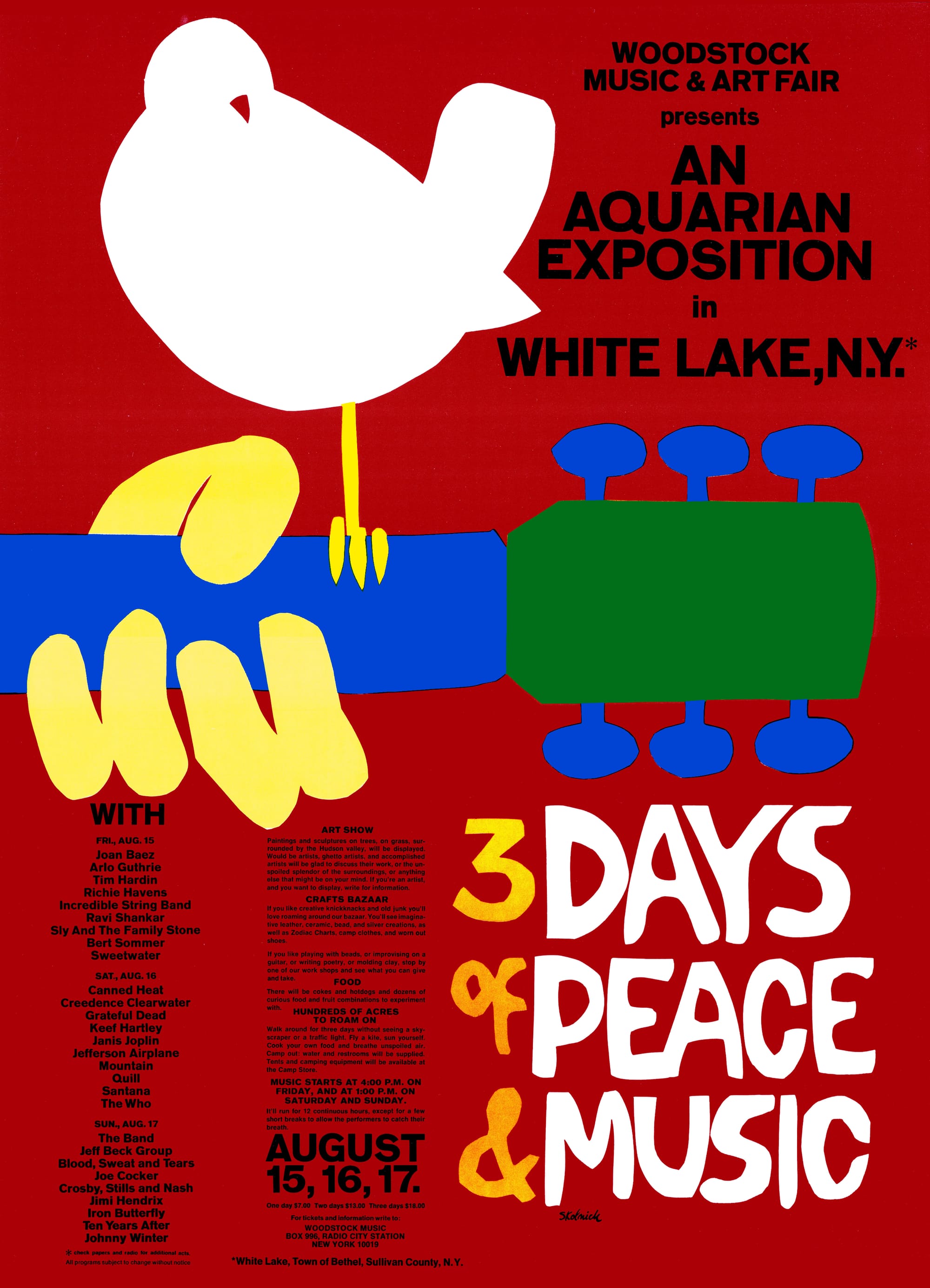
No deep dive into music festival poster design could begin without kicking off with Arnold Skolnick's iconic poster for Woodstock 1969.
Symbolizing so much of what the infamous musical festival has come to represent, Skolnick’s design features an illustration of a dove sitting on a guitar neck against a blood-red background, using a style inspired by the paper cutouts of Henri Matisse. Capturing the ‘peace and love’ philosophy of the time so simply and elegantly, the poster encapsulated the counterculture movement of the 1960s.
Watch Skolnick’s story of the poster in the video below, which takes a fascinating look at what has become one of the most famous images in pop culture history.
Fast forward to the festivals of our time, Coachella's posters use similarly simple designs, but that reflect the more carefree Coachella audience. Barely changing its format over the last 20 years, the design incorporates the massive body of performer lineup text above a background of illustrated mountains, gradient sky, and palm trees.
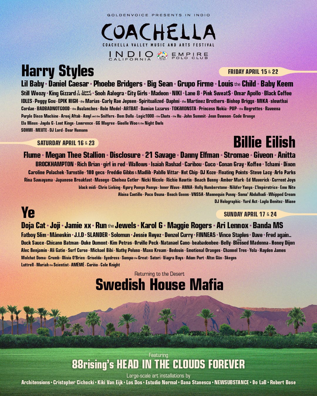
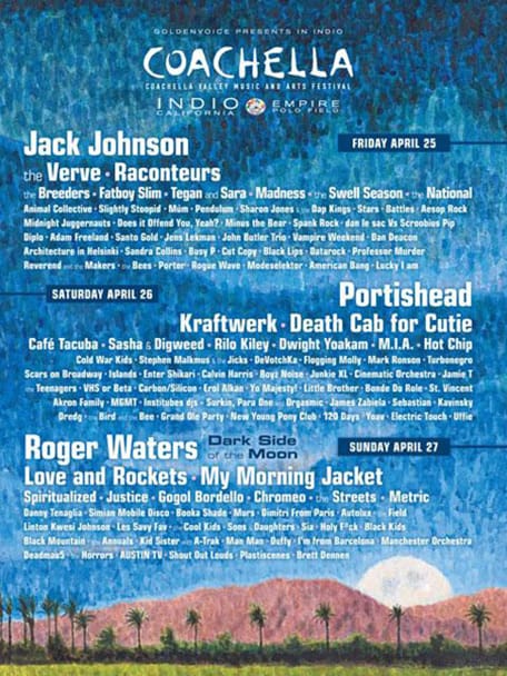
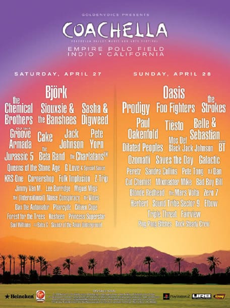
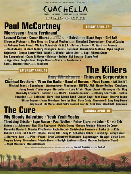
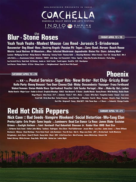
While the designs aren’t quite as poetic as the Woodstock posters of the past, they certainly manage to communicate all the essential information and stay on-brand.
Organize information logically
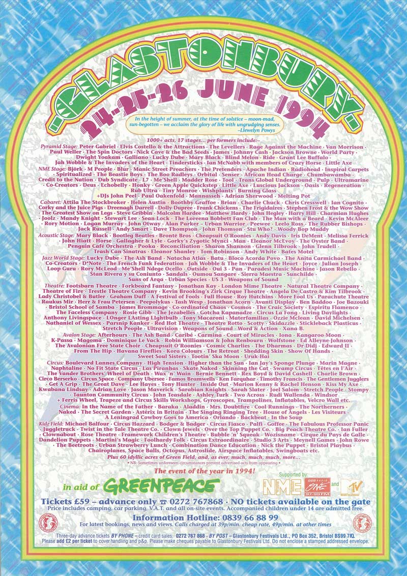
The 1994 Glastonbury Festival poster looks more like a page out of a manuscript than a poster, and is an excellent example of organizing a huge amount of information.
Its reams of text, quite a lacy logo design, and layering of patterns, frames, and transparent overlays draw the eye into the page. It compels you to read the information presented. This text-based design shows that there’s no point in being afraid of varying font sizes. But it also reminds us that information hierarchy is key, along with keeping your font choices minimal.
Master color, illustration, and typography
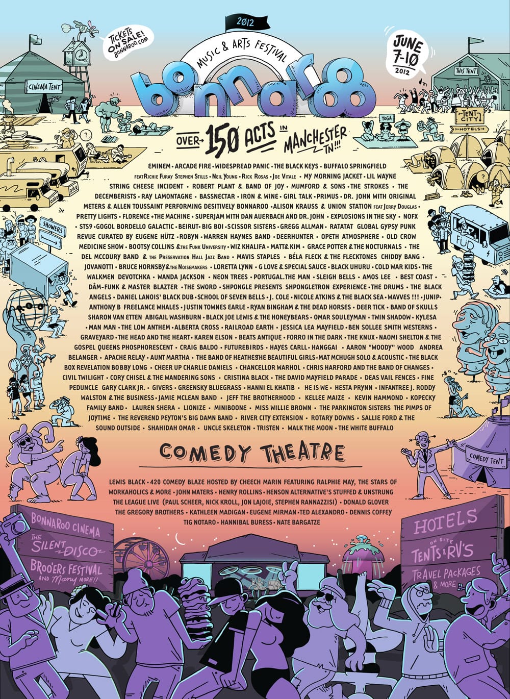
Balancing color, illustration, and typography is the only way to win at the music festival poster design. For example, the poster for Bonnaroo 2012 features vibrant, psychedelic colors and whimsical illustrations that feel part “Where’s Wally?” and part comic strip.
Using outlines that grade from deep purple to sky blue, the huge amount of illustration manages not to overwhelm the text information. The poster’s use of hand-drawn typography also feels fresh but remains familiar and connects perfectly with the hand-drawn illustrations.
:quality(75))
:quality(75))
Great design is all about embracing what other designers have done and pushing yourself to go further. Here are some contemporary poster designs from around the world that nail the music festival design brief. The actual lineups are also full of inspiration for your next design playlist, so be sure to take notes for your next poster.
6 music festivals killing their poster design game
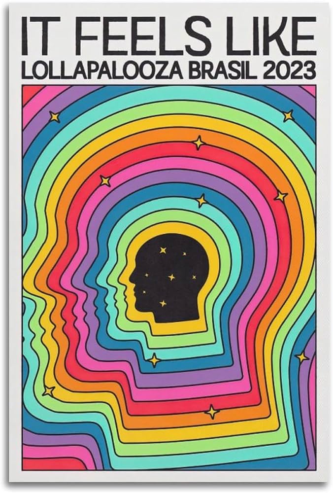
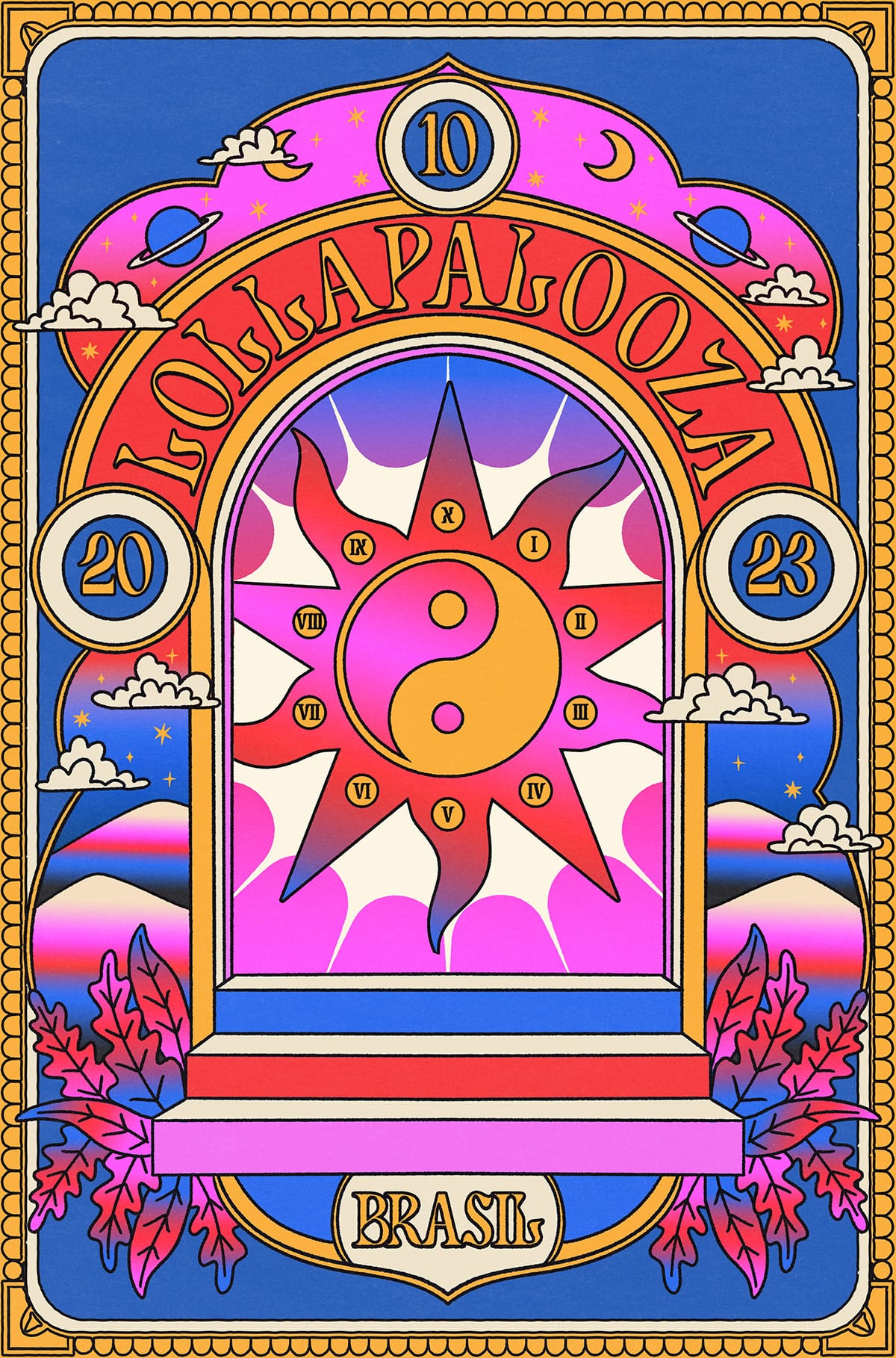
1. Lollapalooza, Brazil
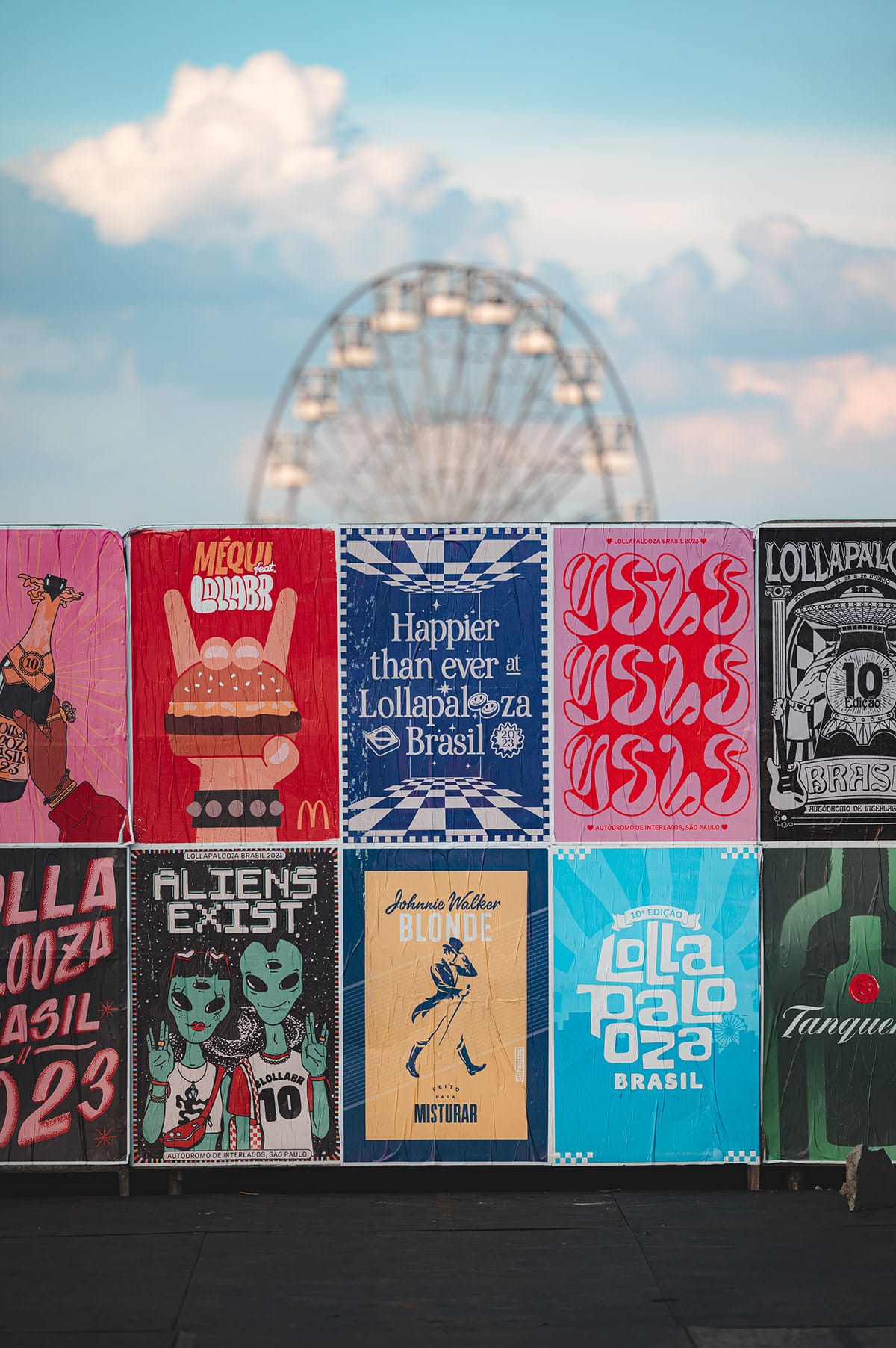
Lollapalooza, initially conceived in 1991 as a farewell tour for Perry Farrell's band Jane's Addiction, has evolved into one of the world's most iconic and enduring music festivals. Known for its diverse line-up and celebration of alternative culture, Lollapalooza has expanded globally, hosting events in countries like Brazil, Germany, Argentina, and France.
Each poster is uniquely tailored to the host city, incorporating local flavors and cultural elements, making each one a distinct representation of Lollapalooza’s global footprint. These designs not only advertise the event but also capture the essence of Lollapalooza's dynamic approach to music and art, making each poster a collectible piece of cultural memorabilia.
One of our favorite examples is the work of Bea Souza, who created over 35 posters for Lollapalooza Brazil 2023. These posters were used throughout the festival's expansive 600,000 square meters, ranging from public spaces to backstage areas, Lolla Lounge, and Lolla Comfort.
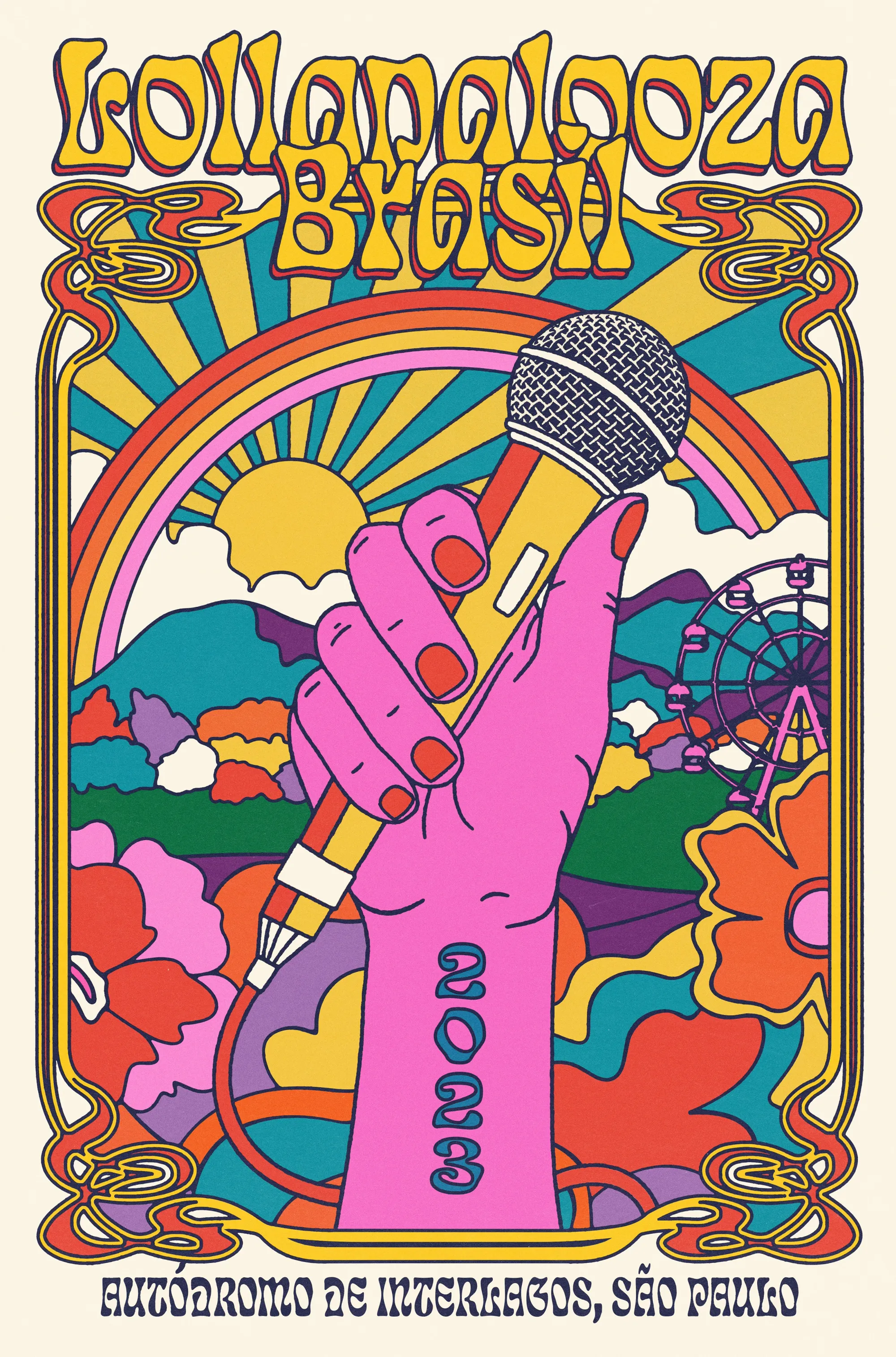
“I drew inspiration from vintage, modern, and psychedelic styles and aimed to connect with young people who love pop and alternative culture. I also created exclusive illustrations for the headliners and co-headliners, including blink-182, Tame Impala, Billie Eilish, Lil Nas X, and Rosalia, to engage the audience and enhance the immersive experience of the event. With over 300,000 visitors and 79 artists performing, Lollapalooza Brasil is one of the most significant music festivals in the country. This festival inspires events worldwide, and it was an absolute honor to contribute to the visual experience of the 10th edition.”—Bea Souza, on Behance
2. Synchronise Fest, Indonesia
Indonesian illustrator and designer Rakhmat Jaka Perkasa created an extraordinary visual identity for the 2022 edition of Synchronise Fest. Held annually in Jakarta, Synchronize Fest is an annual multi-genre music festival on a national scale that invites tens of thousands of audiences to enjoy live acts across six stages around the city for three days and nights.
Rakhmat's work for the festival set the perfect tone for the event, with its almost-comic-book lithograph style blending with distinctive illustrative elements, hand-drawn typography, and a color palette that we just can’t get enough of.
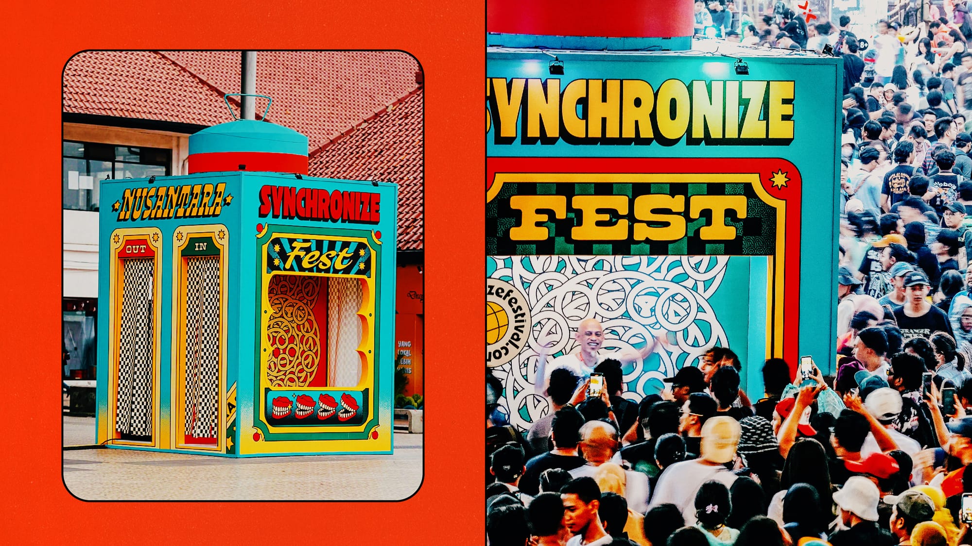
The work is also a great example of how the base of your poster design can extend across every aspect of the festival experience. In this case, Rakhmat’s designs even became actual architectural installations—the stuff of design dreams.
Oppikoppi, South Africa
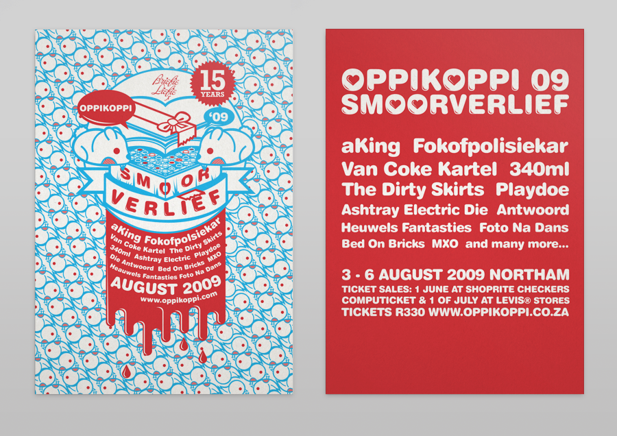
Oppikoppi is South Africa’s biggest music festival. For their fifteenth edition, the fest worked with Johannesburg-based designer and illustrator Matt Edwards to create one of our favorite poster designs. Oppikoppi is visited by tens of thousands of people. Voted as one of the top ten festivals in the world, Matt says he was ecstatic when asked to do the campaign in 2009.
“The thing that made that year's festival so exciting was the fact that because it was the 15th year that it was taking place it was given the status of a Heritage Monument. The theme was ‘Smoorverlief’ which means puppy love in Afrikaans, one of South Africa’s official languages. I chose candy colors and went for a sort of bubblegum roc- and-roll take on teenage love.”—Matt Edwards, Designer and Illustrator on his website
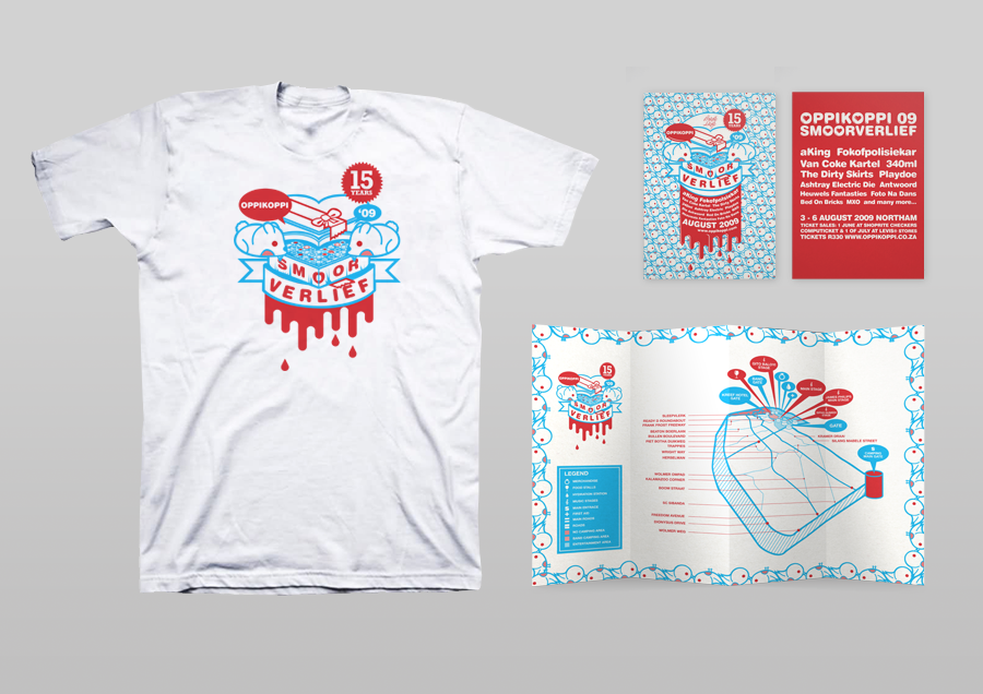
The campaign's rollout included posters, flyers, t-shirts, and cute speech bubble stickers featuring romantic lyrics taken from the songs of the bands performing. It also included an A5 magazine, a website, billboards, street pole advertising, various light box advertising, an illustrated editorial in the South African version of Vice Magazine, TV adverts, and more.
Chiang Mai Street Jazz Festival, Thailand
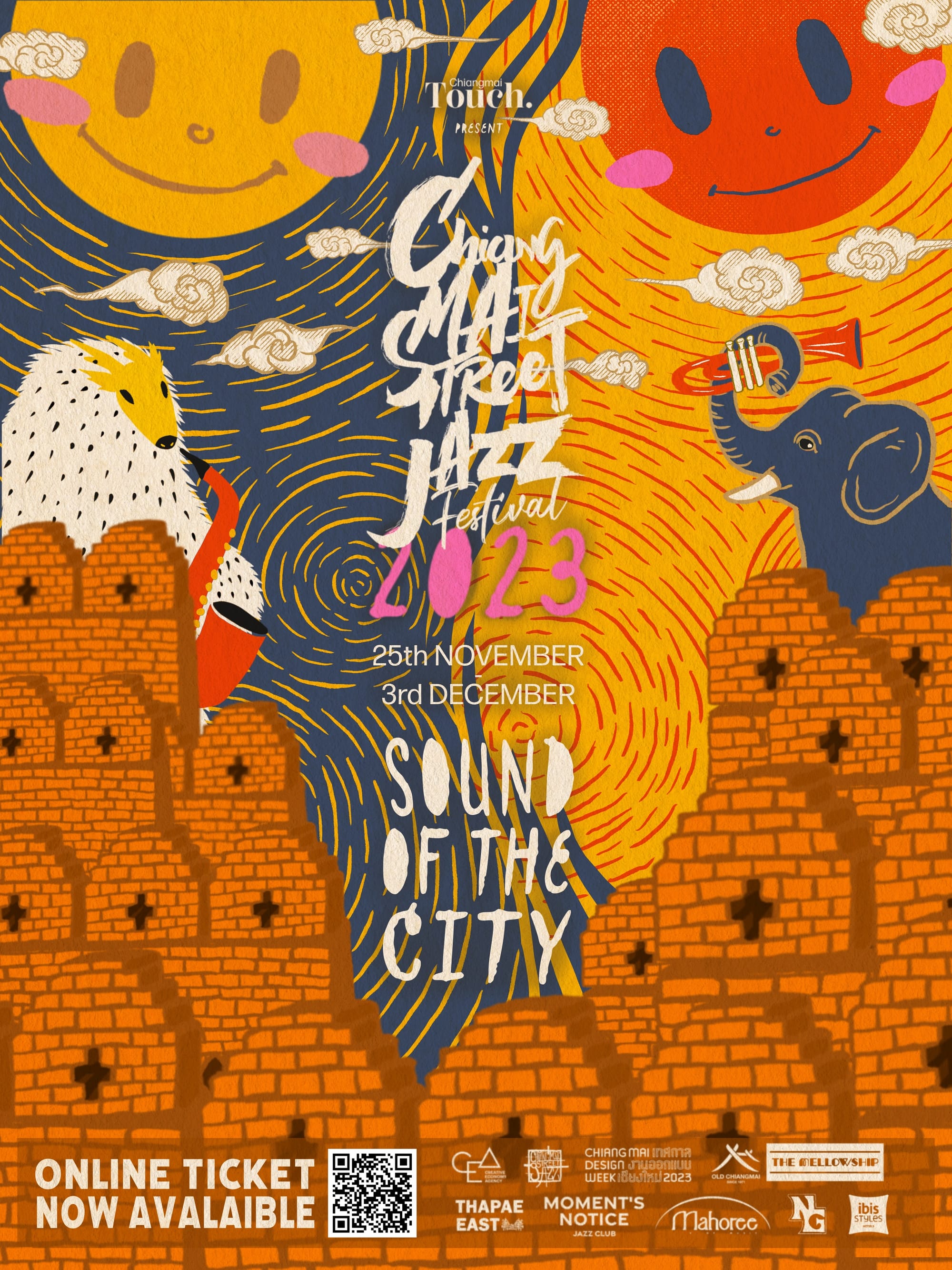
Thailand’s Chiang Mai Street Jazz Festival is a 9-day celebration of Jazz that takes place across the city. For the 2023 edition of the festival, Thai designer Sarisa Kojima was brought aboard to create the identity for the event.
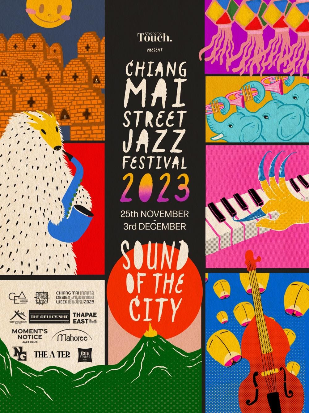
The organizers' mission of wanting to ‘invite everyone to dream of a future where everyone moves to the same rhythm, celebrating the unique pace of life in Chiang Mai’ set the brief. It became a collection of posters that capture the sense of myth and marvel at the heart of Thai culture.
Shenzhen Fringe Festival, China
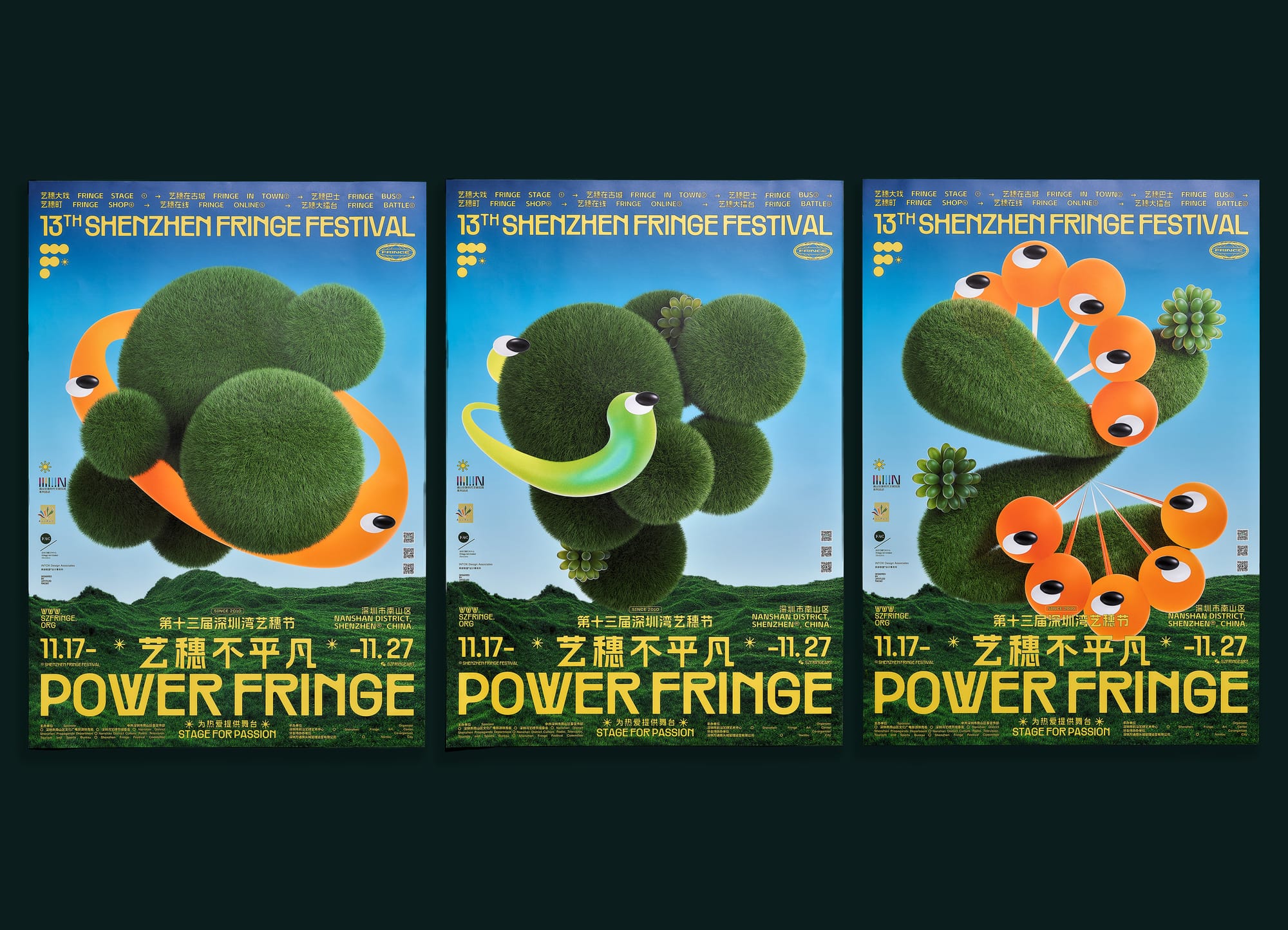
The 2022 Shenzhen Fringe Festival was themed "Fringe Marathon," and set out to capture the spirit of artists persistently pursuing their goals. The design by Au Chon Hin draws inspiration from the first letter of Fringe 'F' creating unique and charming 3D F creatures that play with typography in such an interesting way.
“The visual identity of this year's festival centred around typography. We hope to bring out the diversity and uniqueness of arts and performances offered around the city by the festival.”—Au Chon Hen, designer on Behance
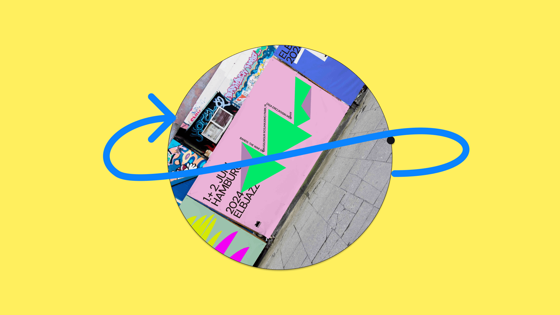
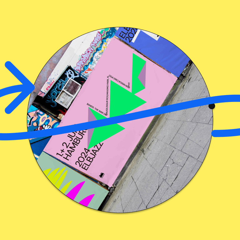
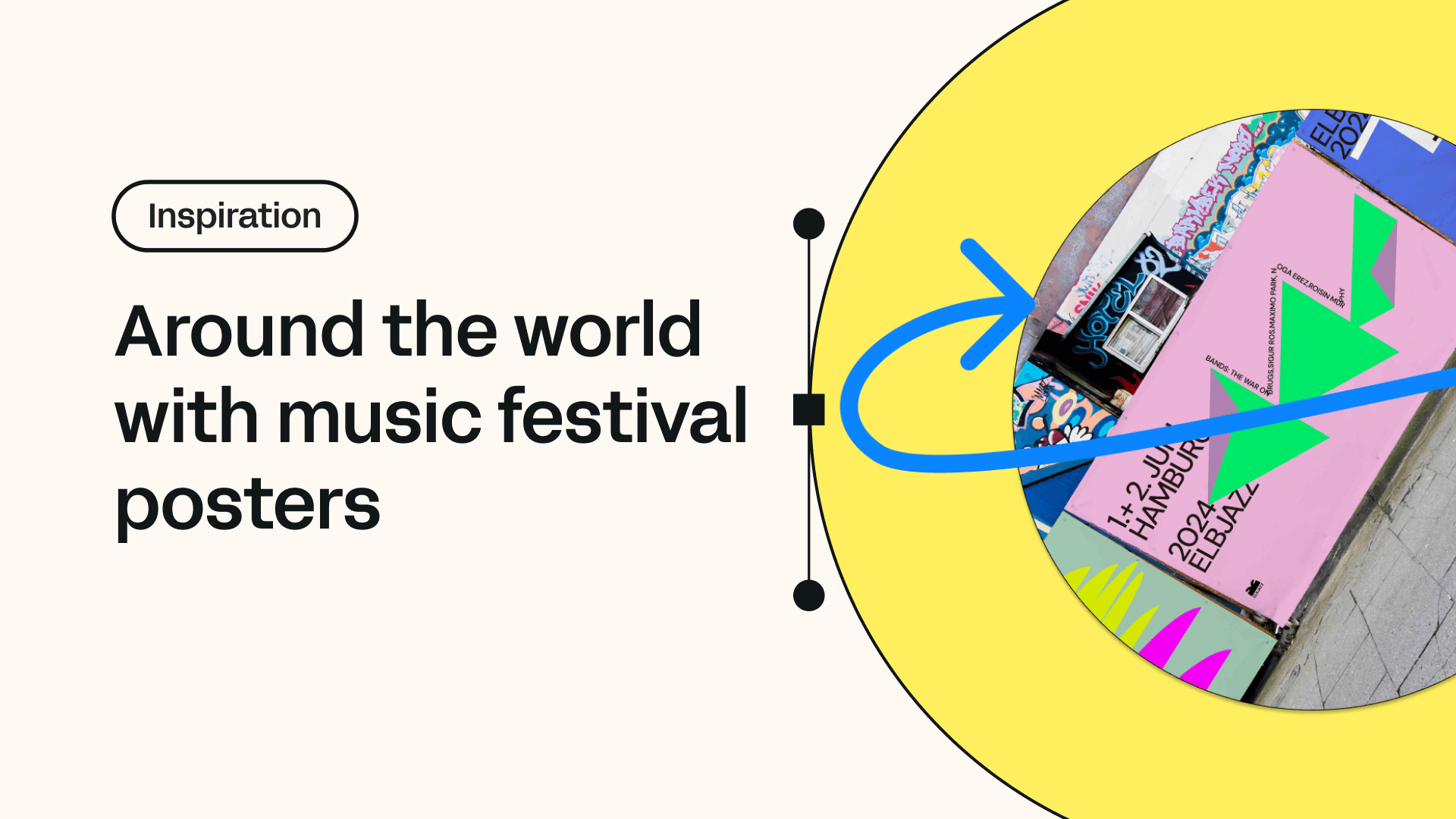
Elbjazz Hamburg, Germany
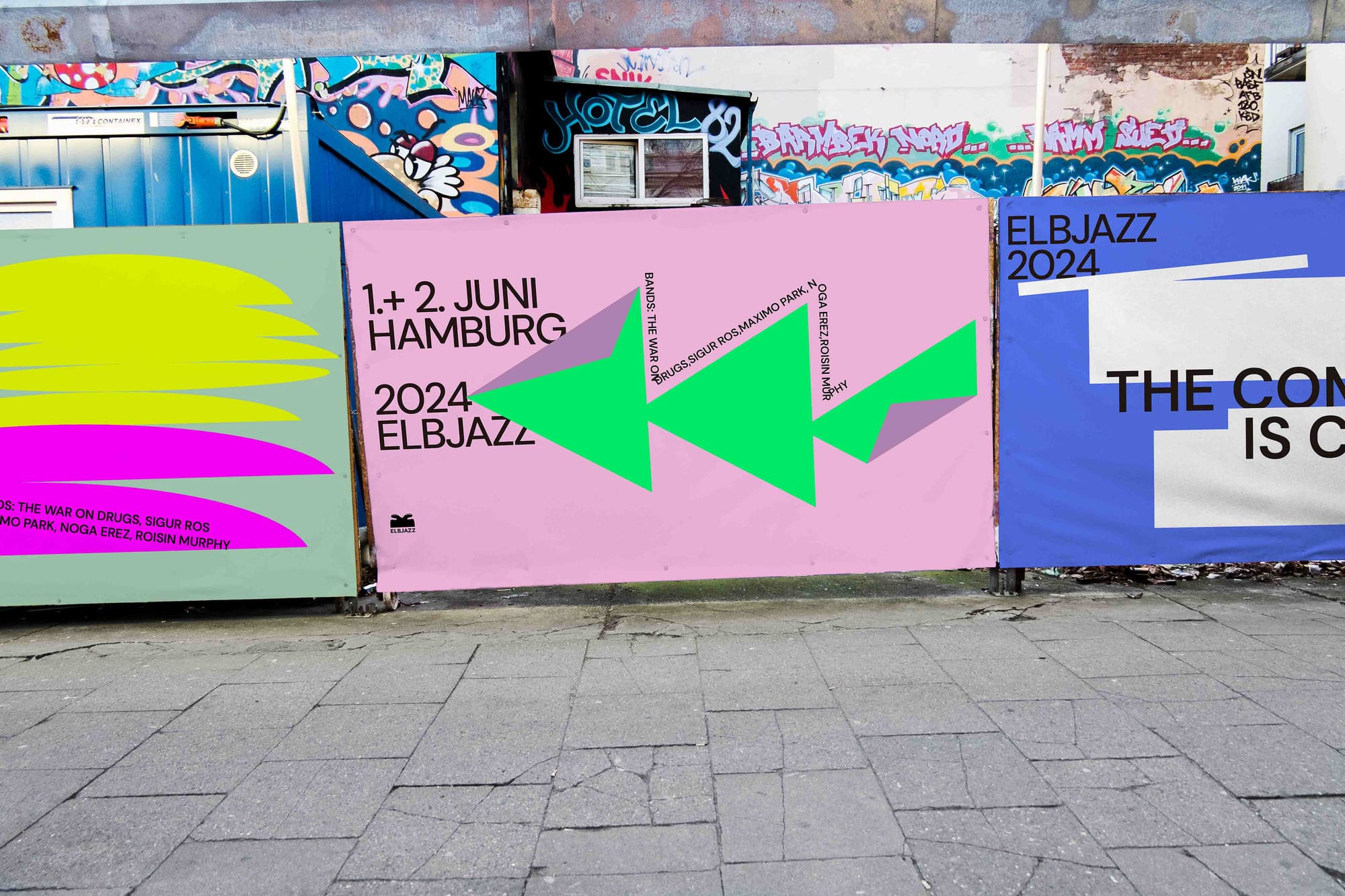
Designer Hanqui Lu has transformed the look and feel of the Elbjazz music festival in Hamburg with her contemporary take on poster design. The Matisse cut-out-inspired look and feel lifts the deep illustrative effects of the previous examples into more of a gallery or museum aesthetic. Using clean lines, bold colors and crispy-clean typography the design works to set a refined but still edgy style.
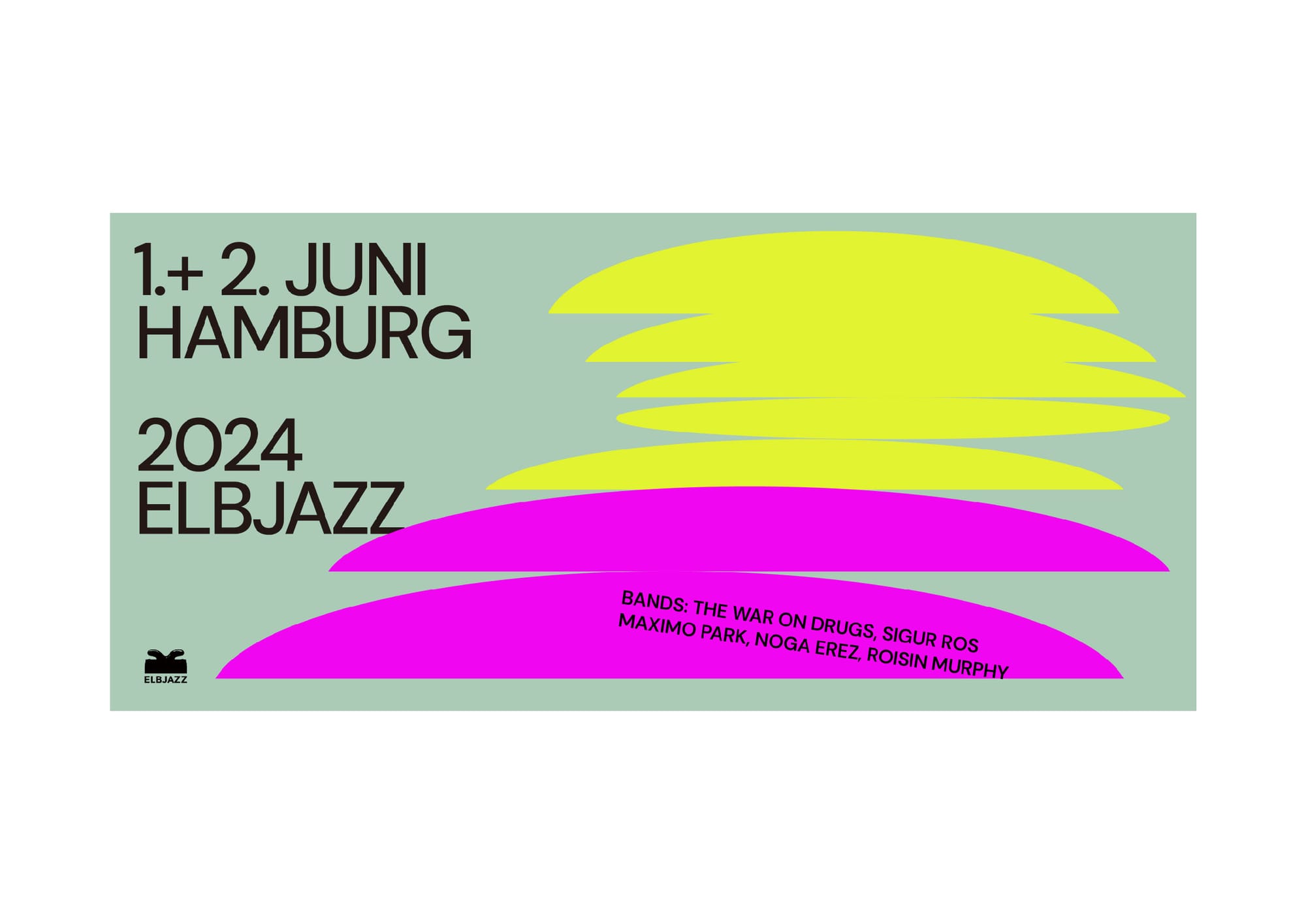
“The goal for the 2024 edition of the festival is to attract a wider audience,” Lu explains, and so the visual identity set out to communicate that change is afoot, she says.
Inspired? Motivated? Let’s make your own music festival poster and join the long line of great designers who went before you.
Design your own music festival poster in a few clicks
Linearity Curve is an extremely powerful vector design and layout tool that empowers you to create any design from scratch. But let’s fast-forward the design process by downloading one of the platform’s thousands of pre-designed templates. Things are extra optimized this time because, among all the other stunning templates, we have a pre-designed music festival poster template for Linearity Curve.
Download a poster design template
The music festival poster template has been crafted to provide a strong foundation with a balanced layout. You can customize it to match the specific identity and vibe of your festival.
It includes placeholders for text, images, and other design elements, making it easy to update with your own content. Download it below. It’ll automatically appear in your Linearity Curve Home Screen Gallery.
:quality(75))
Update brand colors
Customize the template by introducing your festival's new brand colors.
Open the Color Picker tool in Linearity Curve and replace the default colors with your own palette. Ensure these colors are used consistently throughout the poster to maintain a cohesive look.
For instance, you might use a vibrant color for the background and a contrasting shade for the text to ensure legibility.
Customize fonts
Next, update the fonts to better reflect your festival's tone and style. If your festival is modern and youthful, you might opt for bold, contemporary typefaces. If it's more traditional, classic serif fonts can convey this heritage.
Import your chosen fonts into Linearity Curve and apply them to the existing text elements. Adjust the font size and spacing to ensure the text is impactful yet easy to read.
Replace images with your own
Now, replace the placeholder images with high-quality photos relevant to your festival. These could be images of past events, featured artists, or thematic visuals that resonate with the festival’s atmosphere.
Ensure the images are scaled and positioned to complement the overall design without overwhelming the text and other critical information.
Finalize and export
Once your customized poster is updated, ensure every element is aligned and maintains the visual hierarchy that communicates the elements of the festival.
Once you’re happy, use Linearity Curve’s Export function to save your design in the appropriate file format for printing or digital sharing.
Bring it all together
If this hasn’t made you want to run out and get tickets to the next festival, we hope it’s inspired you to start getting excited about designing your own festival-style posters.
With the basics behind you and a firm understanding of the best poster design principles, you’re now only a step away from tackling the exciting challenge of creating a music festival poster that stands out.
Your goal: produce a visually appealing poster that effectively communicates the essence of the festival and resonates with potential attendees. By mastering the integration of typography, color, and visual hierarchy, and by drawing inspiration from iconic festival posters of the past, you can create a design that captures the vibrant spirit of the event.
Whether you're a seasoned designer or new to the scene, Linearity Curve’s intuitive features and extensive libraries make designing easier than ever. There’s also more where that came from. Why not try Linearity Move, Linearity’s new animation platform, and make your poster come to life.


Frequently asked questions
What are the most common mistakes in festival poster design?
Common mistakes include overcrowding the poster with too much information, using fonts that are difficult to read, and failing to create a visual hierarchy that effectively guides the viewer through the content. Another frequent error is not aligning the design with the festival's identity, resulting in a poster that feels disconnected from the event it promotes.
How can I make sure my poster is readable from a distance?
To ensure your poster is readable from a distance, use large, legible fonts for the main elements, like the festival name and headline acts. Keep the color contrast high between the text and the background to enhance visibility. Prioritize the flow of information by placing the most important details at the top or in the center and scaling other details down accordingly.
Consider printing out a few variations of the design to find the optimal layout and contrast.
Are there any legal considerations I should be aware of when designing a music festival poster?
Yes. Consider copyright and trademark laws when designing your poster. Ensure you have the rights to any fonts, images, or other assets you use. Also, get permission for the use of artists' names and likenesses if they’re prominently featured. It's wise to consult with legal counsel to avoid any potential infringement issues.
Share this!
Garreth van Niekerk
One of GQ's 'Young Creatives To Watch' and described as a "Creative Force" by the Sunday Times, author, designer and marketer Garreth van Niekerk is a contributor for Linearity in Johannesburg.

