:quality(75))
:quality(75))


:quality(75))

A few years ago, you may have begun hearing a lot of buzz about something called “dark mode.” Google Trends data show that worldwide searches for this phrase began to rise in late 2018 and peaked in October 2019, soon after dark mode was first introduced for iOS and Android.

This design functionality has proven popular with many users. A survey published on Medium showed that 82.7% of participants had used dark mode on their devices.
Research from Android Authority and Polar revealed similar results, with 91.8% and 95% of participants respectively declaring their preference for dark mode.
Designers might be curious about dark mode’s recent explosion in popularity. What exactly is “dark mode,” where did it come from, and why are users suddenly so interested in it?
Below, we’ll explore what dark mode is, how it’s used today, and what its pros and cons are. We’ll also provide imagery and screenshots of dark mode. Understanding why some users prefer dark mode can help inform your digital design decisions.
Jumpstart your ideas with Linearity Curve
Take your designs to the next level.
What is dark mode?
Dark mode is exactly what it sounds like—a dark color scheme for the UI of websites and apps.
Think about the “classic” appearance of a text-based UI (for example, a word processing app, such as Microsoft Word or Google Docs). Typically, these apps use dark-colored text on a white background, mimicking the look of handwritten text on a white page.

You can think of this color scheme as “light mode.” Light mode is everywhere online. In fact, you can see it right here on the Linearity blog.

Dark mode is the opposite color scheme: light-colored text on a dark background.

Many apps now make it possible to switch between light mode and dark mode. Some users enjoy switching between the two just to change things up, or to adjust their device’s visibility at various times of day.
Dark mode may also be called “night mode”. However, on some devices, night mode is different from dark mode. While dark mode implies a dark-colored UI, night mode may simply dim the screen or use warmer tones to emit less blue light at night time.
A brief history of dark mode
Although the recent surge of interest in dark mode is new, the concept itself isn’t new at all.
Check out this photo of a Zorba 2000 computer, manufactured by Telcon Industries in the 1980s:

Back then, dark mode wasn’t a deliberate design choice, but a necessity. Early computers used CRT (cathode ray tube) monitors, which at first weren’t sophisticated enough to light up the entire screen at once.
By the 1990s, technology had evolved, and desktop computers featured newer CRT monitors with a full array of colors. Today, we no longer use CRT monitors at all—they were eventually replaced by plasma displays, and then LED and LCD screens. On these displays, color isn’t a limiting factor.
Over time, the light-colored themes we’re familiar with today came to dominate digital design. Since computer UIs were originally designed to mimic familiar physical objects (files, folders, the “recycling bin,” and so on), it makes sense that the image of dark text on light paper would play a major role in digital aesthetics.

Although bright design continues to be widely popular, dark color schemes have now come back in fashion with the rise of dark mode.
Get creative with our ready-to-use templates.
Linearity Curve offers templates for every social media platform and various use case templates for posters, business cards, slides, app store screenshots, and more.
Where is dark mode used?
You can enable dark mode for an app, a web browser, or an entire operating system. Here’s how dark mode is used across a range of digital media:
System-wide dark mode: Android and iOS (iPhone)
Both Android and iOS devices offer a system-wide dark mode option. With system-wide dark mode, the dark mode color scheme applies across the entire operating system of the mobile phone, including all compatible apps.
Here’s how to activate system-wide dark mode in Android and iOS.
Dark mode is available in Android 10 and later versions. Open your “Settings” app, choose “Display,” then toggle “Dark theme” on.

iOS: You can use dark mode in iOS 13 and above. To activate it, tap the “Settings” app, scroll down and choose “Display & Brightness,” then select “Dark mode.”
System-wide dark mode doesn’t work with all mobile phone apps. Only certain apps are supported. On Android phones, system-wide dark mode will work with Google’s own apps, like Docs, Drive, and Gmail, as well as many popular third-party apps like WhatsApp and Facebook Messenger.

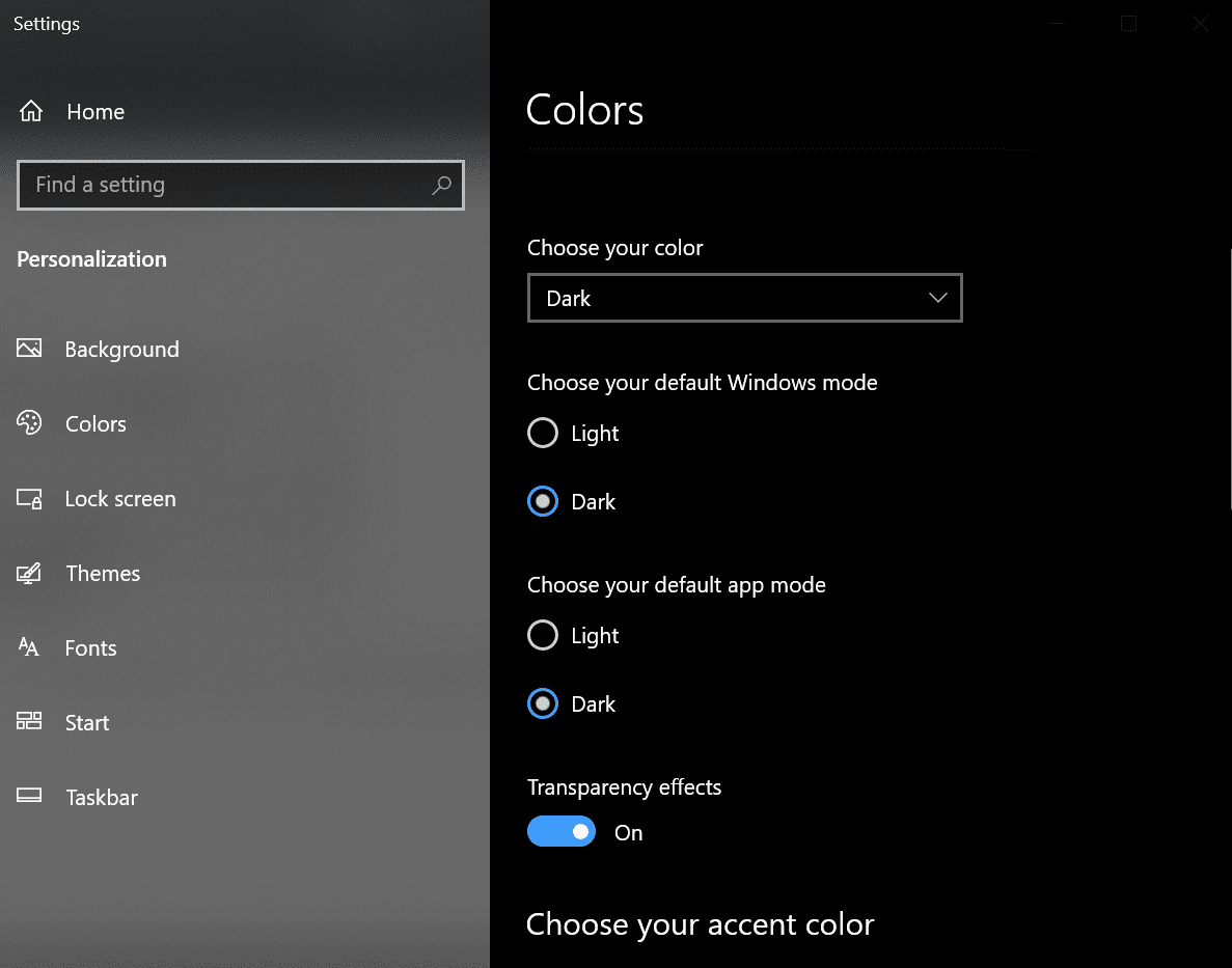
System-wide dark mode: Windows 10 and macOS
System-wide dark mode isn’t just for mobile devices; both Windows 10 and macOS offer it as well. Here’s how to access it.
Windows 10: Right-click on your desktop to bring up a system menu, then click “Personalize.”

Select “Colors” on the screen that comes up. Under “Choose your default app mode,” select the “Dark” option.
macOS: To activate dark mode in macOS, click the Apple logo in the top left corner of your screen to open the system preferences, then click “General.” You should see the option to switch to dark mode in the “Appearance” section.
Dark mode for individual apps and software
Some people may not want to use system-wide dark mode, preferring instead to turn it on and off in individual apps (or they may not be using an OS that supports system-wide dark mode). Fortunately, many apps come with their own separate dark mode.
For example, in Google Docs on Android, users can tap “Settings” and then “Choose theme,” then select the “Dark” option. This will turn dark mode on for Docs only.

Some software can be used together with system-wide dark mode to make parts of the screen even darker. For example, Windows 10’s system-wide dark mode makes web browsers like Google Chrome dark at the top, but the content below is still light-colored.

Users who want a more “complete” dark mode can use a Chrome extension along with their system-wide dark mode to enhance the dark effect.

Why dark mode is important for designers
So why should you, as a designer, care about dark mode?
Depending on the field you work in, dark mode may be very relevant to you. While dark mode is most directly connected to UI design, any type of designer can learn something from the “dark mode" concept.
:quality(75))
:quality(75))
Making light designs compatible with dark mode
If you’re a website or app designer who has already created a light-colored UI, keep in mind that some users may want to view your design with their dark mode setting turned on.
Depending on how your website or app is configured, users may or may not be able to access it in dark mode.
If you’re concerned about how your interface will look in dark mode, it’s worth working together with your developers to make sure your design looks clear and readable, regardless of the user’s browser and operating system settings.
Using dark mode as design inspiration
The growing popularity of dark mode also brings up some interesting aesthetic questions. For one thing, it challenges the paradigm of making digital interfaces look like their analog equivalents.
Although it may seem natural to make browsing the internet feel like reading a book, there’s no reason this has to be the case.
If you like the concept of dark mode and see its design value, you could always make dark-colored design a permanent fixture of your websites and apps. To see an example of this, check out Linearity's homepage, which is dark mode inspired.

Dark-colored interfaces offer certain advantages over light-colored ones, which is why many users prefer them. However, there are also some disadvantages to consider. We’ll dive deeper into these in the next section.
The pros and cons of dark mode for designers
Dark mode and color psychology
Some designers favor light color schemes over dark ones because of the emotions dark colors can evoke.
In Western cultures, black and gray are sometimes seen as “negative” colors, associated with death, depression, mystery, or evil. The color black is associated with mourning, a tradition originating in Roman times but popularized during the Victorian era.

However, dark colors are also associated with luxury and elegance. Western formal wear is typically black or dark-colored (think tuxedos, business suits, and the “little black dress”). Luxury cars, clothing, and other high-end goods are often dark-colored as well.

Dark colors are associated with luxury because dark-colored dyes were originally very expensive to produce. For example, the ancient Romans considered purple the color of royalty. They produced purple dye by boiling thousands of marine snails, a costly and time-consuming process.
Much later, in the Middle Ages, Europeans used “oak apples” (a bulbous growth found on oak trees) to produce black dye. Because of the dye’s expense, black became the favored color of Spanish aristocrats and wealthy Dutch merchants in the 15th century.
So how can these insights inform your use of dark colors? When considering whether to adopt a dark design for your UI, think about how you want to position your product.
If luxury is one of your key brand attributes, a dark color scheme might be a good choice. But since dark colors can be polarizing, it might make sense to let the user choose for themselves.
Dark mode and eye strain
Beyond aesthetics, there are many other reasons why some users prefer dark mode. One frequently-cited reason is eye strain.
With the growing prominence of digital technology in our societies, the average person now spends a major portion of their day staring at screens. In fact, the average US adult spends over 10.5 hours daily in front of a screen. This has led to increasing concern about eye health.
Some users claim to find dark mode more comfortable for their eyes, but can it really reduce eye strain?
There is currently no conclusive scientific evidence that dark mode can reduce the risk of eye strain. In fact, dark mode can actually make it harder to see by causing your pupils to dilate. This is especially true in brightly-lit conditions. However, in low-light conditions, dark mode may be somewhat beneficial for eye strain.
Experts recommend not worrying too much about dark mode when it comes to eye strain. Instead, users should take regular breaks from the screen, or use artificial tears to prevent their eyes from drying out.
Dark mode and readability
Dark mode shouldn’t affect readability for most users.
Readability depends primarily on color contrast. A high contrast ratio between text and background color makes the text more readable. This is why the Web Content Accessibility Guidelines (WCAG) recommend a minimum contrast ratio of at least 4.5:1.
You can meet the WCAG standards using either light mode or dark mode. Here are some examples from WebAIM.org:


One thing to keep in mind is that very high contrasts between text and background color can cause eye strain. An example would be using pure white (#FFFFFF) text on a pure black (#000000) background, or vice versa.
Whether you’re designing for dark mode or light mode, try to use a balanced color contrast that’s easy to read without being jarring.
Ready to create brand assets that pack a punch?
Visit our Academy for free dark design courses.
Dark mode and accessibility
Unfortunately, dark mode creates an accessibility challenge for users with myopia or astigmatism. This is due to an effect called “halation” (from the word “halo”), which causes light text on a dark background to appear foggy or blurry for these users.
To keep your apps and websites accessible for everyone, consider offering users the choice to switch between light mode and dark mode.
Dark mode and sleep
Some users like to enable dark mode at night before they go to sleep. The purpose of this is to cut down on exposure to blue light before bedtime.
Blue light has been shown to disrupt sleep patterns by suppressing the secretion of melatonin. It may also cause other negative health effects, although its exact impact on our health and sleep is still disputed.
Dark mode isn’t the only way of cutting down on blue light; users can also dim their screen, for example. However, a well-designed dark mode can indeed reduce the amount of blue light users are exposed to.
Dark mode and focus
While some companies have claimed that dark mode can improve focus and concentration, research doesn’t back this up.
There is, however, one way in which dark mode might improve focus. “Screen flicker” has been shown to affect concentration, even when the flicker is too slight to perceive. A dark background may eliminate or lessen this flickering, improving concentration.

Dark mode and battery life
A final claim that’s often made about dark mode is that it improves battery life. This is true, at least for some types of devices.
This is because OLED screens light up colored pixels only, while leaving the black ones turned off. For OLED phone users who’ve enabled dark mode, this means a dramatic increase in battery life each day, and a greater longevity for their battery in the long term.
The “darker” the dark mode, the more battery will be saved on an OLED screen. A study from XDA Developers found that dark modes which used a pure black color saved a tiny bit more power than ones that used dark gray in their design.
However, the difference between the two was only 0.3%. So if you’re unsure whether to use pure black or dark gray in your designs, battery life might not be a major consideration.
Summary: all the pros and cons of dark mode
Pros of dark mode
- Dark colors can symbolize luxury and elegance.
- Dark mode may decrease eye strain in low-light conditions.
- Dark mode can decrease blue light exposure, which may improve sleep quality.
- Dark mode can improve accessibility for individuals with light sensitivity.
- Dark mode may lower or eliminate screen flickering, potentially increasing focus.
- Dark mode improves battery life on devices with OLED screens.
Cons of dark mode
- Dark colors can evoke negative emotions connected with sadness, mourning, or depression.
- Dark mode may increase eye strain in brightly-lit conditions.
- Dark mode can cause halation for individuals with myopia or astigmatism, making text less readable for them.
- Dark mode may lower reading comprehension and focus.
- Dark mode does not improve battery life on older devices without OLED screens.
Conclusion
As you can see, there’s no simple answer to the question “is dark mode a good thing?”
At the end of the day, it really boils down to personal preference. Many users love dark mode, quite simply because they find it cool. Others find it unappealing or difficult to use.
And, as always, don't forget to try out Linearity Curve (formerly Vectornator). It's the perfect tool to test your new Dark Mode UI designer ideas!
Jumpstart your ideas with Linearity Curve
Take your designs to the next level.


Share this!
Dalia Goldberg
Dalia is a contributing writer to the Linearity Blog.

