:quality(75))
:quality(75))


:quality(75))
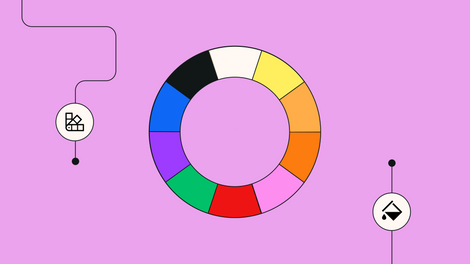
How to create a unique color palette
23 min read
Sign up and get 23% off on Linearity Pro yearly plan!


Linearity runs on iPadOS 14 & iOS 14 and later, or macOS Big Sur and later (with native M1 support).
Get started for free
All the tools you need for truly great design.
Copyright © 2024 Linearity GmbH. All rights reserved