:quality(75))
:quality(75))


:quality(75))


There are several techniques that designers can use to make typography stand out in their graphic design projects. Kerning is one of them. So let’s dive deep into the kerning rabbit hole to learn how we can create better designs by using this simple tool.
Being a good designer calls for a keen eye. You might also say that perfectionism is part of the job. While this attention to detail might not be understood in other trades, this exact quality sets designers apart.
Following this logic, every nook and cranny of your design needs attention—even the spacing between two letters. While your clients, or anyone who is not a professional designer, might not understand the nuances of kerning, they will surely be able to see a bad kerning job, especially if it spells disaster.
And it does not stop there. Sometimes a font’s default kerning isn’t ideal for certain glyph combinations, so you’ll want to adjust it manually so the spacing between all the letters looks consistent.
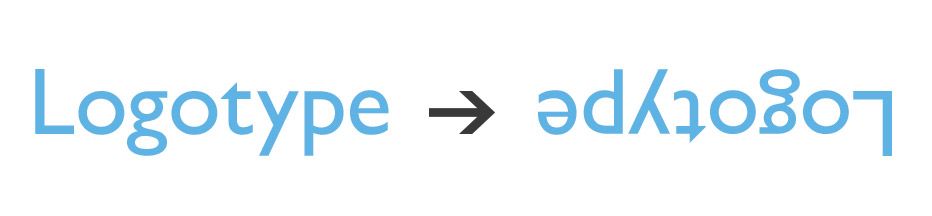
Type does this magic trick on our eyes that looks like an optical illusion. If you were to distance the spacing between all letters of a word equally from each other, it wouldn’t look evenly spaced. That’s because each letter has a unique shape and a particular amount of negative space.
So it’s important to note here that kerning is a visual exercise; it’s about the perceived amount of space between letters rather than the distance between them. It involves adjusting typography to look right rather than creating mathematically equal spacing.
Only through practice will you be able to develop an eye for the spatial awareness of characters. And you’re in the right place for that! Let’s start with the theory.
Jumpstart your ideas with Linearity Curve
Take your designs to the next level.
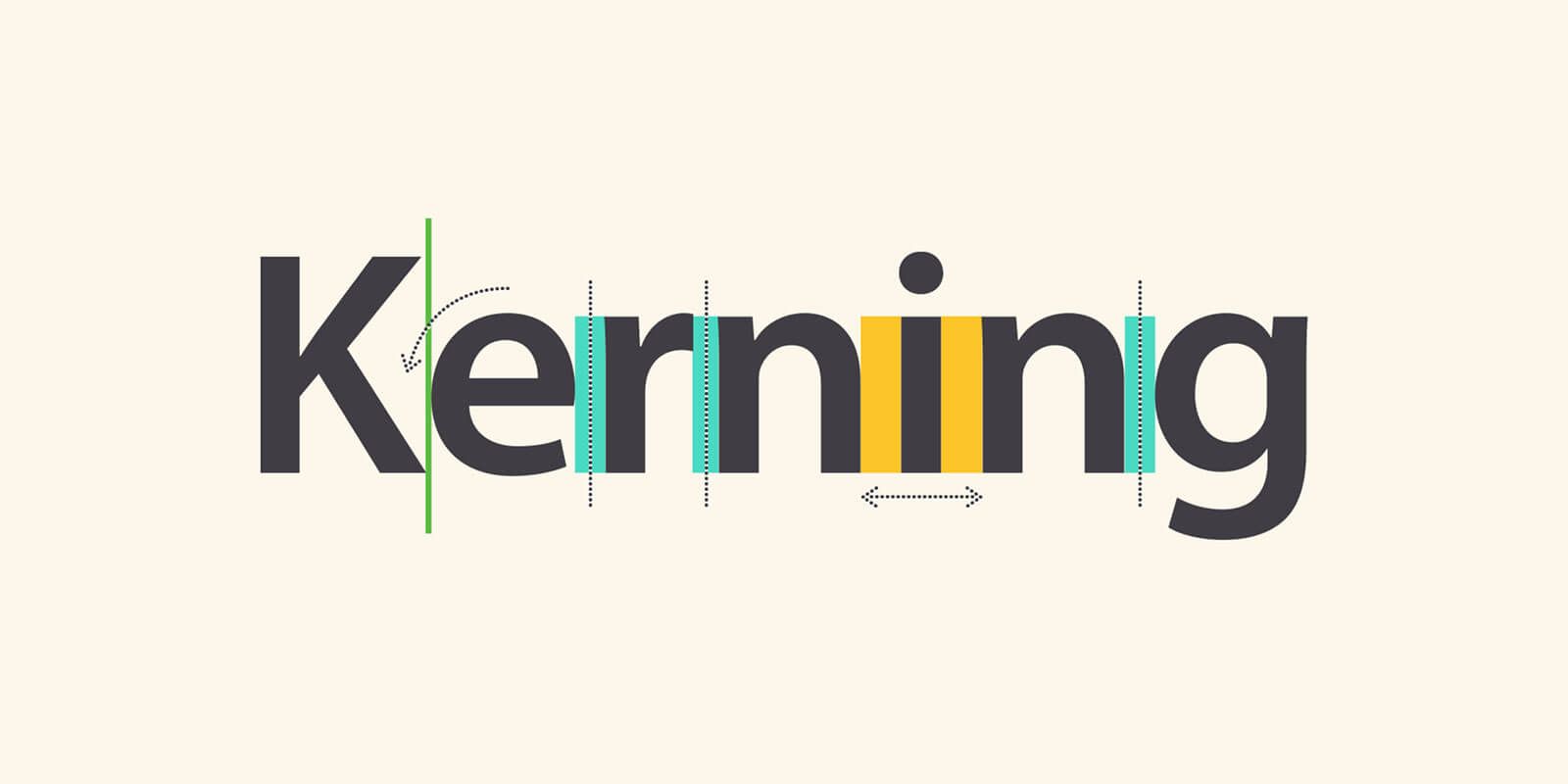
What is kerning?
Kerning defines both a process and a term. It’s the name given to the spacing between characters. But it is also the act of adjusting the space between characters to make text look better, more eligible, or both.
There are several techniques that designers can use to make typography stand out in their graphic design projects. Kerning is one of them. So let’s dive deep into the kerning rabbit hole to learn how we can create better designs by using this simple tool.
While you can rely on the predetermined kerning of the fonts, you are using, adjusting kerning gives us designers much more control when creating.
But remember that you do not have to adjust the kerning of all your design elements.
Do i have to kern all type, all the time?
Definitely not. While designers consider kerning in most projects, it should be your secret weapon in typographic compositions with large headlines and blocks of copy.
While in other instances, when you are working with large amounts of body copy, the default kerning settings should suffice. Theoretically, no kerning problems should be visible at typical body copy sizes like 10, 11, or 12 points. Besides, going through a page full of text and kerning letters one by one would take way too long. Who has time for that?
Here are some more specific examples of when kerning is going to be your best friend:
1. Headlines
Headlines are usually the focal point of many designs so they speak volumes of the aesthetic of your overall layout. Headlines need to be excellent to draw attention.,
First, all the letters in your headline should be spaced in a way that looks and feels right. Never leave the spacing between the letters in a headline untouched.
But you can also express emotion through kerning. Clustering letters close together may give the impression of something dynamic, while letters that have a generous amount of space in between provide the feeling of a calm and peaceful atmosphere.
2. Typographic logos
A logo is probably the most critical place where designers need to flex their kerning muscles.
Take a particular font and add an interesting kerning to it, leaving you with a beautiful logo. It’s that simple. Yet the challenge lies in choosing fonts that connect with the brand, knowing when to stop, and making it look effortless.
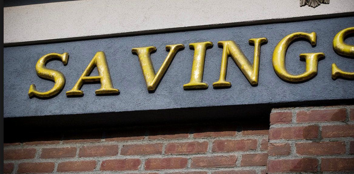
3. Signage
Kerning is also essential when creating the signage for your business or clients, as it can impact how clear your message appears.
What if the font has already been kerned?
With the magic of type tech, many current fonts come with special rules that the designer of that particular type already predetermined for metric kerning. A majority of types have these settings built-in.
Do they all? No. How can you tell?
For one, the actual font file that you download has that in its description in many cases.
But there are also nifty tools out there like Wakamai Fondue where you can drop your font in, and it’s going to tell you if it’s been metrically kerned or not.,
Create Your Own Spooky Font
Get into the spirit of eerie and mysterious designs. Follow our step-by-step guide to crafting a spooky font perfect for Halloween and other thematic projects.
Plus, some tools allow you to toggle the metric kerning on and off, depending on the nature of your project. Keep it on for body copy and subtitles. The designer who made the type, and therefore defined the metric kerning settings, spent a lot of time with each letter and has intimate knowledge of what looks good. Use that to your advantage.
But again, with logos and headlines, you’re better off taking the wheel because you have more intimate knowledge of your project and better understand its requirements.
Types of Kerning
So then, there are five types of Kerning:
Metric Kerning
Relies on the character-spacing information inside the font. When you use this kerning, you see the font the way the type designers initially intended. Metric kerning usually uses kerning pairs, which are included with most fonts.
Optical Kerning
It relies on adjusting the spacing between adjacent characters in accordance with the letter shapes. Some fonts include robust kern-pair specifications (as mentioned above). But when a font has only minimal built-in kerning or none, or if you use various typefaces or sizes in one line, you may want to use the optical kerning option.
Contextual Kerning
Refers to the adjustment of space on more than two consecutive characters. As you kern, you may notice that the spacing of a specific letter may depend not only on the preceding letter but also on the one following it.
Automatic Kerning
Refers to the default spacing of a typeface
Manual Kerning
It is when a designer overrides the automatic kerning to create custom kerning.
Why kern?
The challenge of good design is to convey your message as clearly and as quickly as possible. It’s not just about creating something visually appealing. Kerning is a tool that designers use to increase the clarity of their message. The tiniest change can immediately influence the impact of a piece of content.
Plus, kerning can convey elegance and sophistication and give insight into how much care a brand shows to detail. Designing a logo is part science and part art, and every single millimeter can spell beauty or disaster. How you space your type can instantly change how people perceive your brand.
If we understand the history of kerning, there’s a straightforward explanation as to why we’ve been doing this since the olden printing days. Each letter used to be carved individually into wooden blocks. So, in essence, each letter is surrounded by a box which now has become all but invisible with digital fonts. Yet it still exists.
Sometimes these boxes would create too much space around a character depending on its shape, so in the past, typographers would physically cut notches into the wooden blocks to help the letters come together in a more beautiful way.
That’s how old-school kerning used to happen. Luckily, today the process is less complicated and can be done in seconds.
Science or sensibility?
However, kerning is not an exact science.
Experiment with what feels right in your design. But also keep in mind that whatever you kern might not be limited to a computer monitor like the one sitting in front of you. It’s important to understand the content of your typography and where your design will live. Will it be printed, is it meant for a mobile ad? Knowing this will also affect your kerning decisions.
Vectornator is now Linearity Curve.
Learn more about our recent rebrand and how we chose our new colors.
How to kern kike a pro
1. Watch out for problematic letter combinations
If we think of the invisible box analogy before, you can easily notice how some letters (especially ones that have strong slants) require your attention when kerning.
Because these so-called problematic letters do not fill their box edge to edge, or they fill up a lot of the upper part of the box, but almost none of the lower part, they leave behind very noticeable gaps.
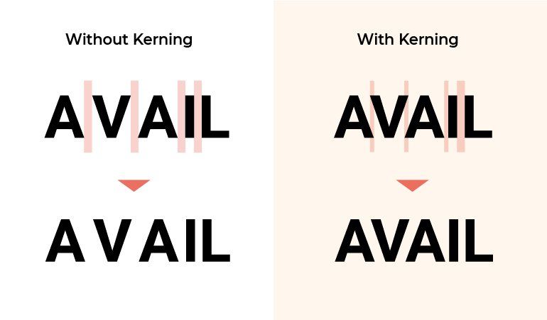
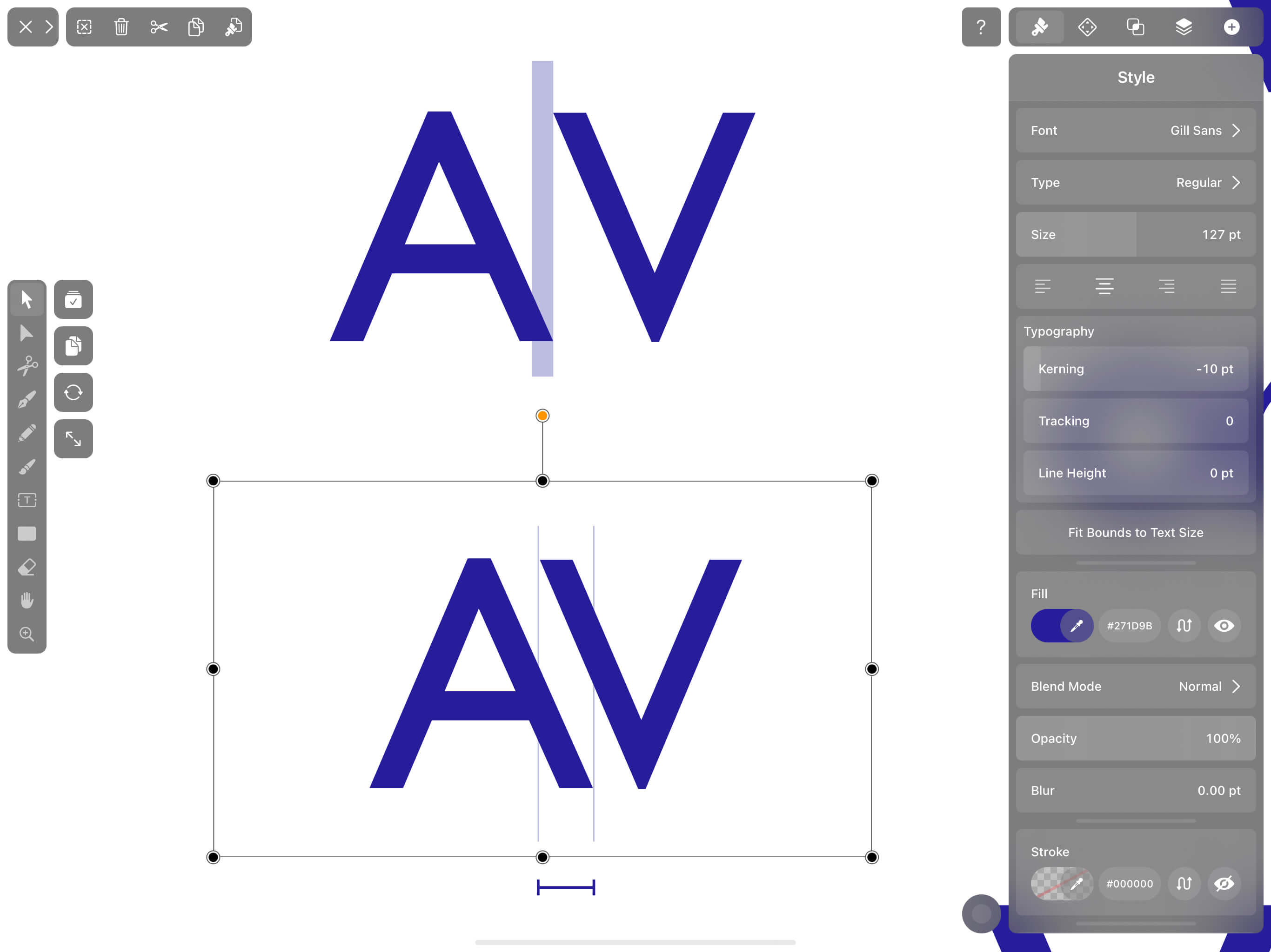
So it may come as no surprise that "V" and "A" is the most common letter combination that requires kerning. You’ll be amazed at how this small detail can impact your overall aesthetic.
Other diagonal-sided uppercase letters like "W" and "Y" fall into the same category. But so are:
- Letters K, W, Y, F, L, and T
- Words spelled in capitals
- Capital letters combined with lowercase letters
But that does not mean that lowercase letters by themselves don’t need your attention. As you practice, you’ll understand how important kerning is for round pairs of characters positioned next to each other like "oo;" or adjacent straight-sided character pairs like "nm;" or a combination of both, like "no."

f one of these letters or letter combinations falls in the middle of the sentence, make sure you check how it interacts with letters on both sides. Leading us into our next tip.
2. Kern in groups of three
Some letters like "b" or "p" are like a double-edged sword. They have both a straight, slanted side but also a curved side. These types of characters are best dealt with in groups of three.
Some designers even go to the extent of covering all the other letters of a word with the exception of the problematic three in order to focus on the issue. You can cover them with a rectangle or place them on different layers that can then be hidden.
This technique has a dual purpose. First, it helps to isolate problem areas. But it also takes away the meaning of the word so you’re not distracted by it.
3. Flip it
Here’s another super helpful trick that will help you focus on the negative space between letters rather than the meaning of the word itself. You read it in the title. Flip it!
It can be hard to spot the areas in your character that need kerning just because your brain focuses on what the letters say. So play with your perspective, rotate your text, and now your brain can zero in on the space between letters much easier.
4. Understand perceived space
It seems like every letter needs kerning—upper case letters. Lowercase letters.
But what you need to understand is that, conceptually, the case is of no importance. What truly matters is the amount of negative space that these letters create between them.
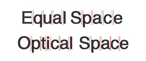
Some experts recommend that you think about this negative space like an hourglass filled with sand. The volume that this hourglass contains should, in theory, be equal between each adjacent letter for your type composition to look neat. The distance between the letters does not make the most mathematical sense, but volume does!
:quality(75))
:quality(75))
That is why two straight letters need the most space in between them. A straight and a round letter need slightly less to look equivalent because they have more negative space volume between them. And two round letters need somewhat less than that. It helps to visualize this, so check the examples below.
Although you by absolutely no means need to measure surface and volumes with a formula, you can keep this concept in mind to better visualize perceived space and achieve consistent visual spacing, especially when you’re unsure how to go about it.
5. Know that size matters (in Kerning)
We talked before about how you should not kern small fonts. As that will take hours to do, plus, your careful kerning work will likely be undone with a 12pt-sized font. Rely on optical or even automatic kerning here.
But the problem goes more profound when you have bigger fonts. Because a kern job at 24pt. Is going to look a lot different at 40 pt. The biggest takeaway here is never to kern before you’ve selected your final typeface and your final font size, otherwise,you might have to start again from scratch when changing either of these two variables.
So when you’re working on a typographical design that will appear on a business card or a shirt, you have to kern it separately. Kerning issues are more visible in larger size, so be sure to spend more time there.
6. The goldilocks syndrome
Not too big, not too small, you need to kern just right.
Text that is too tight will be hard to read, especially in small sizes. Lowercase "r" and "n" can look like an "m" when they're too close together.
Readability and legibility are your top concern as a designer, so when in doubt, a general rule of thumb is to kern letters slightly looser than tighter in order to avoid any opportunity for misinterpretation. However, there is a disadvantage of over-kerning as well, as that can come at a high risk of damaging your brand’s reputation.
Our brains are trained to perceive a wide space after a particular letter as the signal that the word has ended. Don’t make the mistake of over-kerning and giving your readers an unpleasant surprise when looking at your design.
While there's an "i" in design, sometimes you’re better off asking someone else to evaluate your font. If they have issues getting to the point of your message, your kerning needs work.
7. Don’t kern first
This should probably be our first tip. In terms of the design process, kerning actually comes last in your typography-related tasks.
Devote prior attention to other types of typography spacing first, like tracking and leading. While kerning refers to adjusting the spacing between letter pairs, tracking refers to the overall letter spacing in a word or in a selection of letters, be it a paragraph, or an entire page at once.
Leading is the vertical spacing between lines of type.
Kerning practice
What’s learning a design skill without practice!
While you can just go in Vectornator and kern away until you feel you’re got it right, we suggest starting off slowly. Especially if you’re just honing your kerning skills and you need objective, unbiased feedback.
So we suggest you go to Kerntype for your first assignment. Play around with the position of the characters in order to create an aesthetic spacing. When you think you’re finished, just click on "Done." You then get immediately and objectively graded (hey, we need to have a thick skin as graphic designers), and you can even compare the solution with your own work.
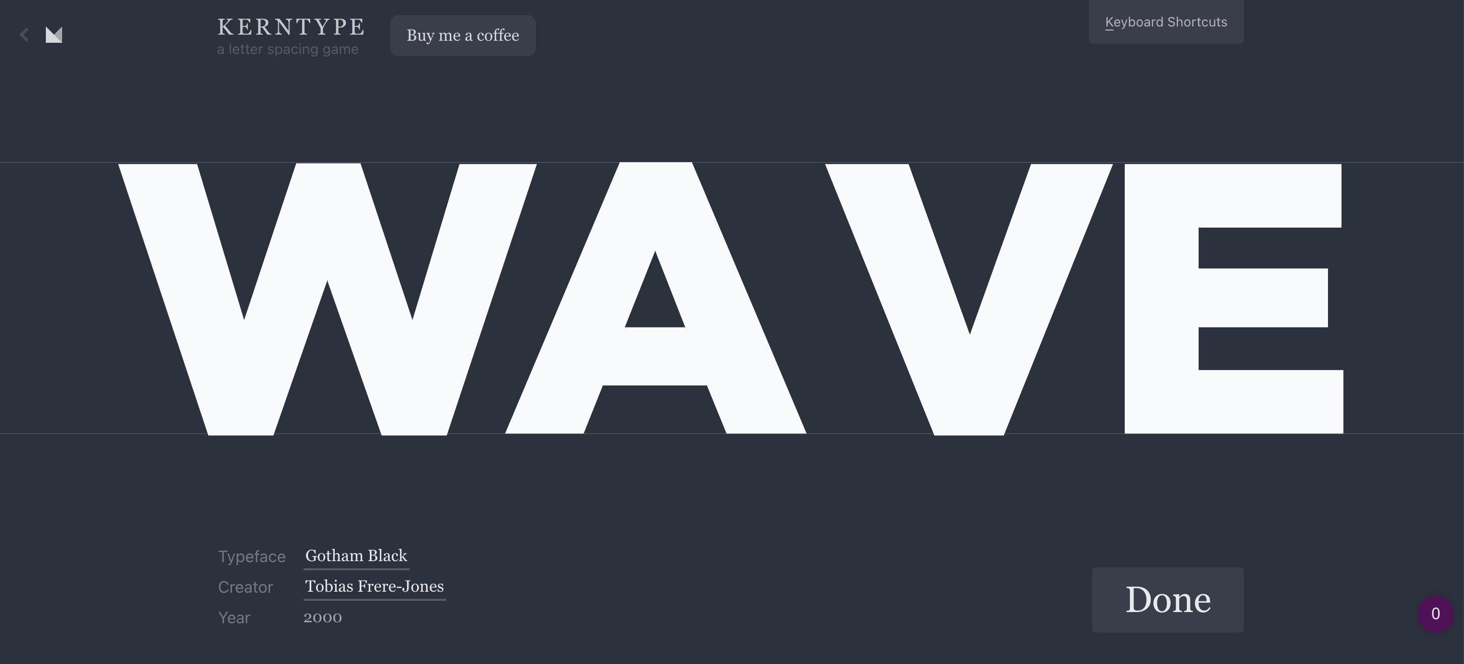
All we can say is - practice, practice, practice. We mentioned a few times along the way that kerning is not a science, but for the sake of learning, some simple letter combinations as the ones proposed by Kerntype can be considered more mathematical in their spacing.
Kerning can create the most bang for your buck on big, visible typography like headlines, banners, or logos. So it’s worth paying a lot of attention to something so seemingly minute. Use Vectornator for your next typographical design. And be sure to tag us when you’re posting it on social media as we love to support your work!
And that’s all the basic kerning information you need to get started. There are a few other tools you have to master to bring more polish and even character to your typography. Use kerning alongside leading and tracking to achieve the best possible results. And check out our next tutorial to keep learning ->
Jumpstart your ideas with Linearity Curve
Take your designs to the next level.

Share this!
Ben Barnhart
Ben is a Content Lead for Linearity living in Berlin. His hobbies include board games, cooking, reading, and writing.