:quality(75))
:quality(75))


:quality(75))

Calling all digital lettering nerds! It’s time to talk about mastering this art form. No more lettering for beginners—you’re ready for the real deal.
Welcome to the master class in digital lettering. If you’re a beginner, turn back now.
We’re joking; if you’re new to your lettering journey, we also created a hand lettering guide for beginners. Go check that out and meet us back here when you’re ready to become a master of the craft.
If you’re looking for a master guide to becoming a lettering expert, you’re in the right place.
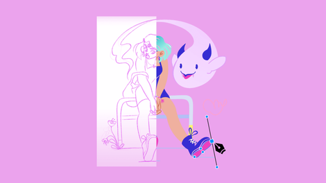
 Ana Tsoy
Alright. advanced digital letters—let’s get started.
Since you’re a pro already, you know that creative lettering is an art form that has been popular for decades and has gained more popularity in recent years. The art of lettering can be used for different purposes such as branding, logos, product packaging, and more.
The main objective of this art form is to create a design with letters that is visually appealing and memorable. In other words, it's all about creating something that captures people’s attention. What used to be strictly a written form has recently become a popular digital art. With graphic design software like Linearity Curve (formerly Vectornator), lettering is not limited to print; you can now use digital lettering art for website design, social media platforms, and app design.
Digital letting is created through digital drawing, 3D graphics, animation, motion graphics, video editing, and more. As you read further and explore more creative lettering ideas, you will find that there are many ways that you can master this art form.
This article will discuss the anatomy of letters, key lettering terms, examples of digital lettering that we love, digital lettering tips, and a refresher on how to use Linearity Curve to create digital lettering designs. Let’s get started with the anatomy of letters.
Jumpstart your ideas with Linearity Curve
Take your designs to the next level.
The anatomy of typography
To learn how to draw letters, let’s first make sure we understand how they are constructed.
Using the basic concepts of anatomy, we can create a structure that breaks down each part of a letter. In this way, lettering works just like the human body, with different components making up the whole.
As a lettering artist, you must have a firm grasp of this concept. Check out this video to see a visual demonstration of the anatomy of letters.
The basic structure of letter fonts are made up of three parts:
- Body
- Tail
- Extremities (ears, arms, legs)
Each one of them has specific functions that make up the letter. Let’s discuss each of them individually.
Body
The “body” represents the base or foundation where the other two parts sit upon. A body typically consists of four strokes: downstroke, midline, ascender, and descender.
Spine
In typography, the “spine” is the primary curved stroke. The “spine” is the crux of a curved letter like the portion of the letter S highlighted above.
Tail
A “tail” in typography is similar to the tail you see on animals, like a cat or dog. This portion of a letter extends out from the bottom, like in the letter Q. This curved descender (more about descenders later) is typically decorative
Leg
Like a human leg, a typography leg is the part of a letter slanting downwards, like the section of the letter K in the image above. One important thing to note about a “leg” is that it is attached at the top and unattached at the bottom.
Arm
The exact opposite of the typography “leg” is the typography “arm.” In typography, the arm is the part of the letter that extends up. Again, the arm is attached on one end and not on the other side.
Ear
Like a typical ear, and typography “ear” sticks out from the top of a letter. An “ear” is a decorative detail on certain letters, like the “g” in the image above.
Shoulder
A typography “shoulder” is the arch or curve in certain letters like h, m, and n.
Typography terms to know
Typography is an art form with its own language and terminology that you’ll need to know to become an expert at creating and discussing lettering designs.
Just learning these terms will increase your awareness of letters and how they are constructed. To discuss fonts and typography, you’ll need to be an expert at the terms that other artists use to describe the shapes of letters.
Create Your Own Spooky Font
Get into the spirit of eerie and mysterious designs. Follow our step-by-step guide to crafting a spooky font perfect for Halloween and other thematic projects.
But don’t worry, we’ve gathered up all the most important terms for you to know and explained them below, with some images to help you understand better. So, let’s get into it with three essential terms to know: baseline, cap height, and character height.
Baseline
In typography, the “baseline” is the invisible line that letters rest on. We see this line on lined paper, and you are likely familiar with the concept of using this line to base where to write your letters.
Cap and character height
The term “cap height” refers to the height of a capital letter, hence “cap” height. Character height refers to how tall a letter is.
X-height
Similar to Cap height, the “X-height” measures the height of all lowercase letters in a font family.
It is called this because it is the letter x that these measurements are based on.
Crossbar
A bar is a single stroke drawn vertically to create letters like F or E. A crossbar is drawn horizontally to connect letters like H or A.
Stem
A “stem” is the main body of a letter in typography, like the highlighted portion of the letter T above.
Ascender and descender
In typography, the “ascender” is the part of the letter that extends upward from the body of a letter. Directly opposed to this, a “descender” is the part of a letter that extends downwards from the main body.
Counters
“Counters” are closed areas in letters like B and A. An area that isn’t fully closed is considered an “open counter.”
Tracking
In typography, “tracking” refers to how you increase or decrease the spacing between letters.
Swash
A “swash” is a decorative mark or serif used primarily for uppercase letters, as seen in the letter B above.
Tittle
Bet you didn’t know that the tiny dot above the lowercase letter J or I has a name! The small mark above these letters is called a “tittle.”
Ligature
“Ligature” is an extra fancy typography term that refers to joining two letters together to form one character. You primarily see “ligatures” in fancy script or cursive writing.
Terminal
For letters without a serif, the end of a letter is called a “terminal.”
Vertex
In lettering, the outside-most point on the top or bottom of a letter where two strokes meet is called a “vertex.”
And that’s a wrap on the terms you need to know! Whew, that was a lot. Luckily, there’s no test at the end of this.
Take your time learning these terms, and revisit this page when you need a refresher. Plus, there are even more terms out there that you can use when talking about lettering and font. Use this as an essential guide to get you started, but don’t shy away from researching and learning more.
For now, we’ll take a nice break to look at some lovely design examples.
Examples of digital lettering
One of the most important things you need when starting a lettering project, or any new art project, is inspiration. There are tons of resources for you to use online, but here are a few examples of lettering works that we love to get your creative juices flowing.
The designers below have mastered the art of using lettering fonts to create a design. We’re sure you’ll find lots of lettering inspiration below.
Without further ado, here’s our first example.
Van Huynh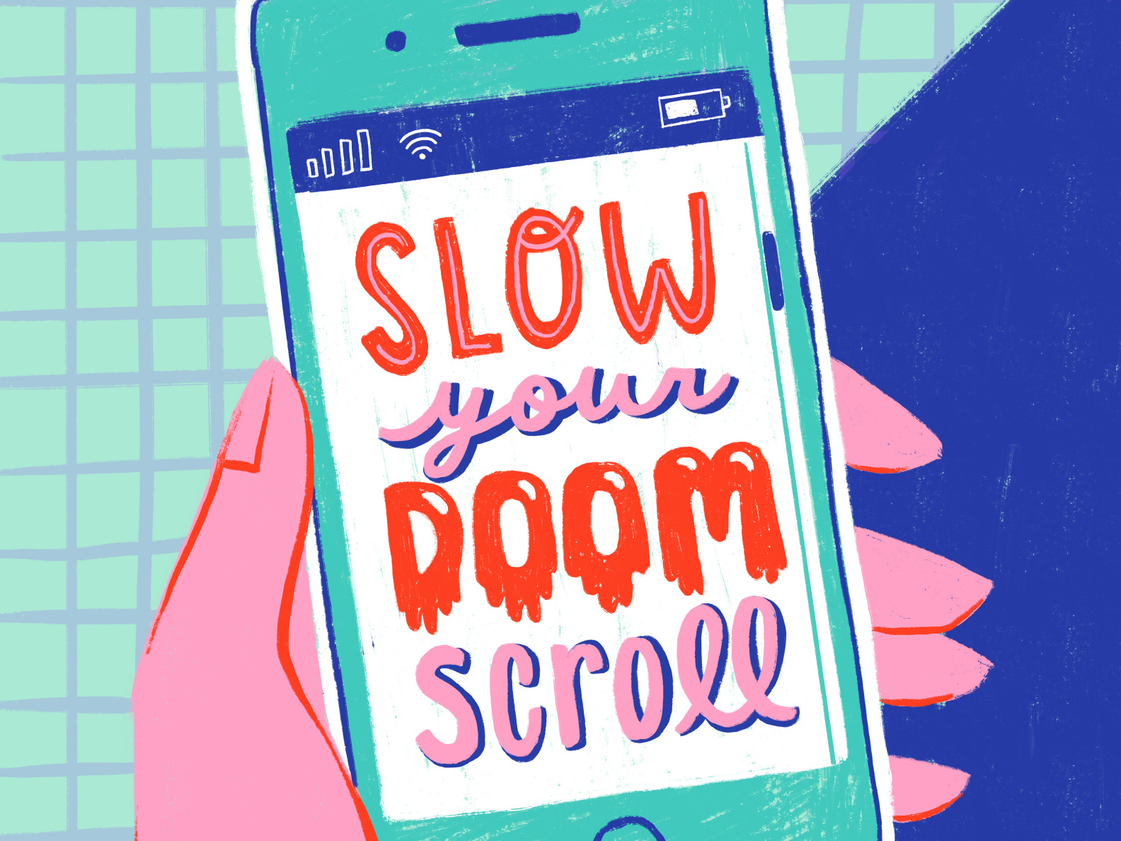
How fun is this design? We love the variety of lettering styles and colors. Also, who isn’t guilty of doom scrolling? We know we are. The cool techy background and unique lettering style in this design are so fun and really stand out.
Mel Cerri
We love the creative 70s flair on this design. Plus, all the funky shapes create such a fun contrast. With the bright colors and 70s style, this lettering design is totally unique.
Jessica Molina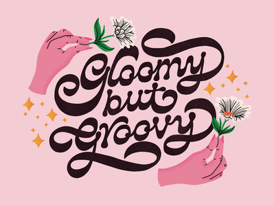
This is an excellent example of using cursive lettering and modern calligraphy to create an energetic, retro design. Calligraphy typography sometimes gets a boring reputation for being only used on menus and invites, but it can be fun when you do it right.
Jeff Rogers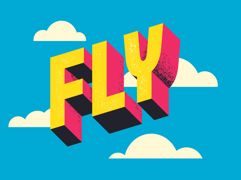
This is an excellent example of using 3D elements to make your lettering project stand out. The bold colors and boxy shape of the letters make this design eye-catching and modern.
Ale Hernández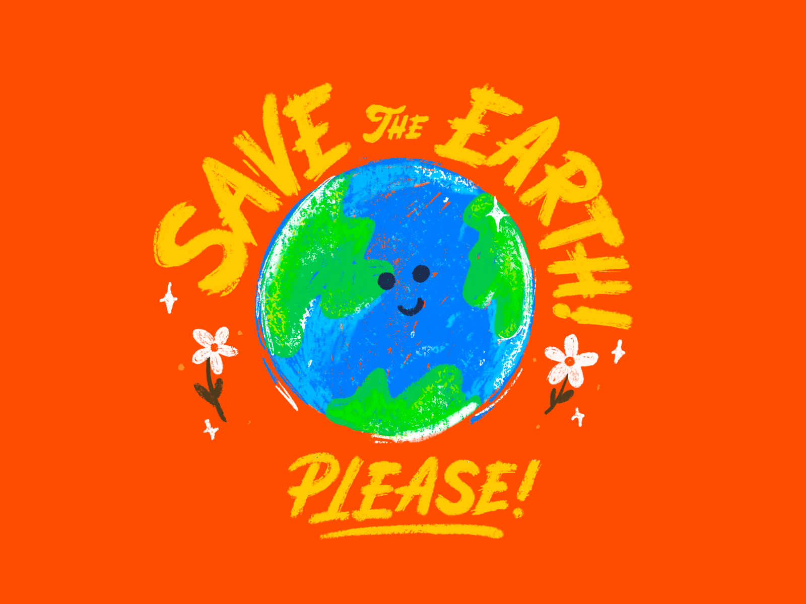
We love this brush lettering style. Plus, the sketch drawing of the earth adds a lot of dimension to the lettering piece. This is an excellent example of how you can combine styles and symbols to create a stunning design. Lettering with brush pens is trendy in digital design; you’ll find that brush lettering practice is one of the most common that you’ll see online.
Now, let’s brush up on some lettering basics and go over our top five design tips for digital lettering.
Digital lettering tips
So far, we have covered everything you need to know about advanced lettering practice; now, it’s time to get into the world of digital lettering. Decorative lettering has been popular on social media and in graphic design.
Ready to create brand assets that pack a punch?
Visit our Academy for free master digital lettering courses.
Digital lettering is an art form that has taken off lately and is particularly interesting to graphic designers. Creating beautiful letter styles online is simple with Linearity Curve as your tool.
Here are our tips for mastering this art.
1. Start with the basics
The first thing you should do when learning digital lettering is to master the art of lettering in general.
Try using lettering worksheets and practicing with hand drawn lettering tools to get a feel for decorative lettering as a whole. Start with simple lettering and try out more advanced lettering tools as you progress.
Ian Barnard
Then, it’s time to take things digital. Get familiar with basic software tools like Linearity Curve (formerly Vectornator). These programs let you open and work with vector files.
With vector software, you can easily resize, rotate and edit any type of artwork without losing quality. This helps you to keep control over your artwork while working on it.
2. Be creative
As we talked about before, one of the most critical aspects of digital lettering, and marketing in general, is creating something unique and memorable.
You should always avoid using standard fonts or stock images in your graphic designs. Instead, be creative and create works that are distinctive to your style and fit modern design trends.
Folio Illustration Agency
Remember that if your lettering design does not look like anything extraordinary, it will likely fail to attract new customers. And don’t be afraid to be colorful!
There are so many different color palettes that you can play around with. For example, you might enjoy experimenting with a natural color palette, pastels, bright tones, and dark and stormy tones.
There is no limit to how much experimentation you can do with your lettering projects; we recommend going above and beyond to create unique designs.
3. Get inspired
Inspiration is hard; we get it. Sometimes you’re just stuck.
And that is especially true when you’re learning to master a new art form. It can be hard to continuously create unique and distinct designs.
That’s what we’re here for. We have some great examples above of designers who have mastered the art of digital lettering.
Kristen Brittain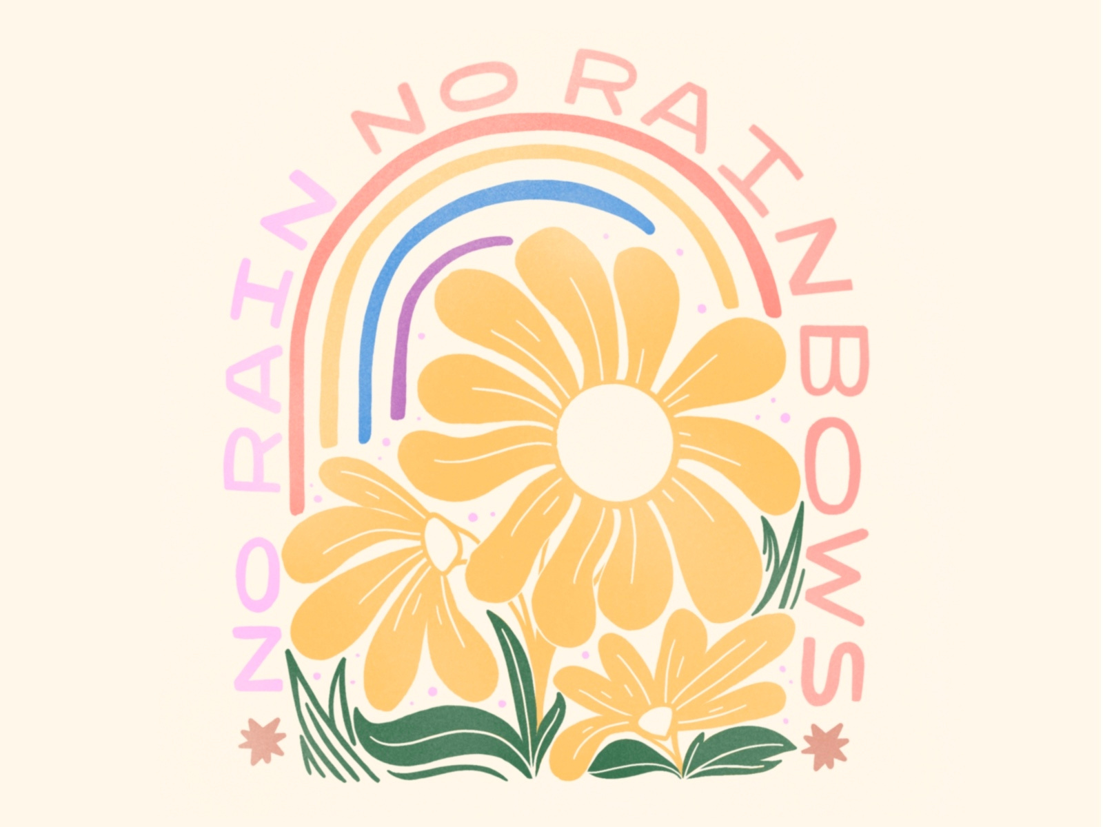
Use their work as inspiration for your own, but make sure that you make these trends your own and really customize them to be completely original.
Also, make sure to check out Pinterest, Behance, and Dribbble for more ideas. It’s also a great idea to follow lettering artists that you admire on social media to get a grasp of how they create their art.
Following other artists you admire is a great way to get inspired, and because they will continuously be posting new work, it’s easy to stay motivated.
4. Don’t overcomplicate things
If you’re a hand lettering artist looking to take your work digital, don’t overcomplicate this process for yourself.
Ana Tsoy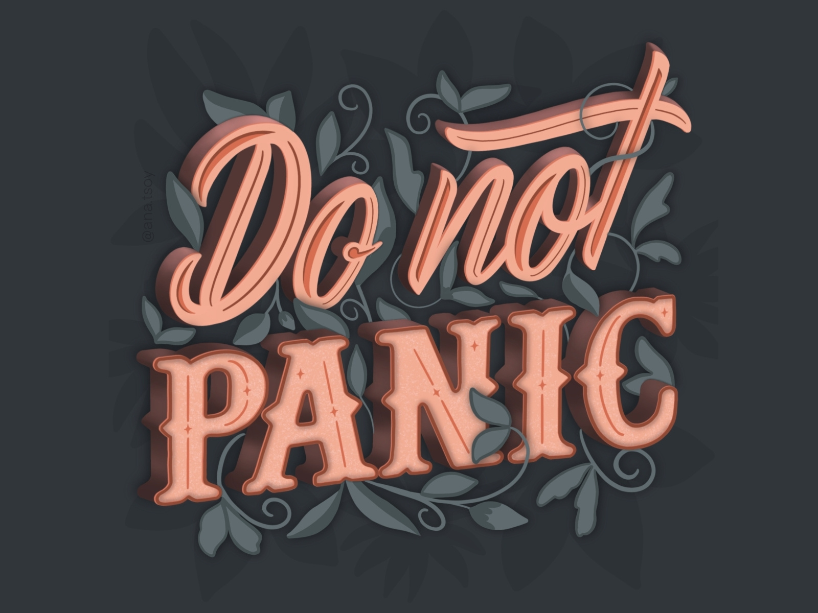
Start by importing your existing designs and customizing them to be digital works of art. This process is much easier than starting from scratch.
Also, be aware that design software can be hard to learn for beginners. If you start out in a program like Adobe Creative Cloud, you could spend weeks learning the software before you even create a single design.
That’s why we created Linearity Curve to be easy to use but still able to produce advanced designs.
After all, nothing is worse than spending lots of time learning new software that takes hours to create instead of minutes.
5. Get feedback
Like any other artistic practice, you need to get feedback to improve your art. Whether it comes from your coworkers, friends, or an online community, feedback will help you hone your skills and get better.
Caroline Pronske
Make sure to ask some questions to get feedback that is especially useful and constructive. Here are a few ideas of questions you can ask:
- How did this design make you feel?
- What did you enjoy most about the design?
- What was your first impression?
- Did you find it easy to decipher the text?
- What could be improved about this design?
Be ready for feedback that might be critical of your art; that is how you learn. And be sure only to implement parts of the input that make sense to you and feel consistent with your work.
Now, let’s get into the nitty-gritty and talk about using Linearity Curve to create digital lettering designs.
How to use Linearity Curve to create digital lettering
Now that you know everything there is to know about lettering let’s talk briefly about how to do it in Linearity Curve.
We’ve covered this topic a few times before (links), so let’s keep it simple; after all, you’re a digital lettering expert now. This is simply a refresher on what you likely already know, not a step-by-step lesson.
First, check out this video created by a lettering expert who just so happens to also be a Linearity Curve expert: Will Paterson. He shows how you can use Procreate and Linearity Curve together to create perfect vector letterforms. We think you’ll find his videos helpful if you haven’t seen them already.
Creating lettering designs in Linearity Curve is simple.
With our Pen Tool, you can quickly draw a beautiful design using your finger or stylus and make changes in just a few simple steps.
If you have some lettering designs you’ve created on paper that you want to make digital, you’re in the right place. Linearity Curve is perfectly equipped to help you do just that.
You can convert sketched designs on paper into digital vectors in just a few taps with our Auto Trace tool. Press one button and instantly have your lettering project brought to life in vectors. Then, you can edit these designs however you like.
For more information and a more detailed tutorial, check out our Lettering Learning page.
Congrats, digital lettering expert!
You made it through our expert guide to digital lettering! Now, we’re honored to crown you as a digital lettering expert officially.
By now, you should be comfortable with recreating beautiful letter styles, the anatomy and key terms related to typography, and how to create digital lettering projects with Linearity Curve.
Your lettering journey is never-ending, and you’ll find that there is always more to learn. We recommend following us on socials if you want to learn more.
We’re constantly posting new tutorials and inspiration, so you’ll never run out of resources to learn more about graphic design and lettering.
And, as always, if you create a lettering design in Linearity Curve that you’re proud of, post it on socials and tag us. We’d love to boost your work on our social media channels!
Jumpstart your ideas with Linearity Curve
Take your designs to the next level.
Share this!
Ben Barnhart
Ben is a Content Lead for Linearity living in Berlin. His hobbies include board games, cooking, reading, and writing.