:quality(75))
:quality(75))


:quality(75))
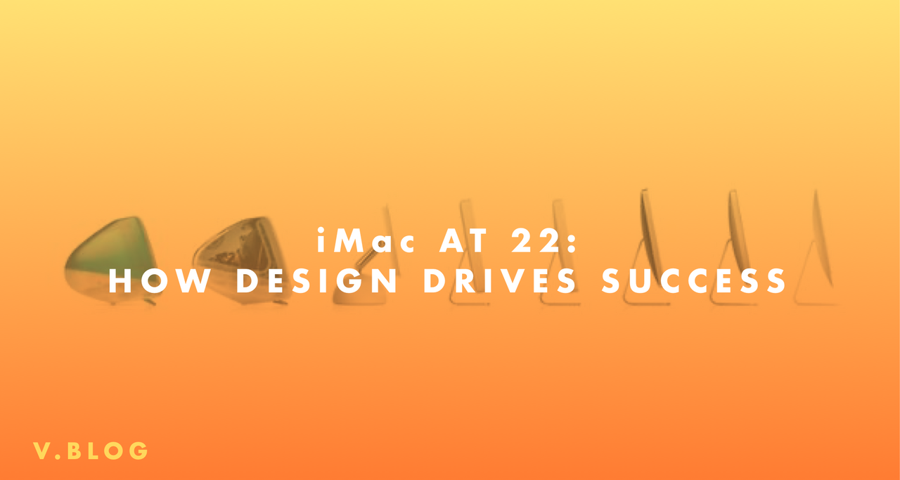
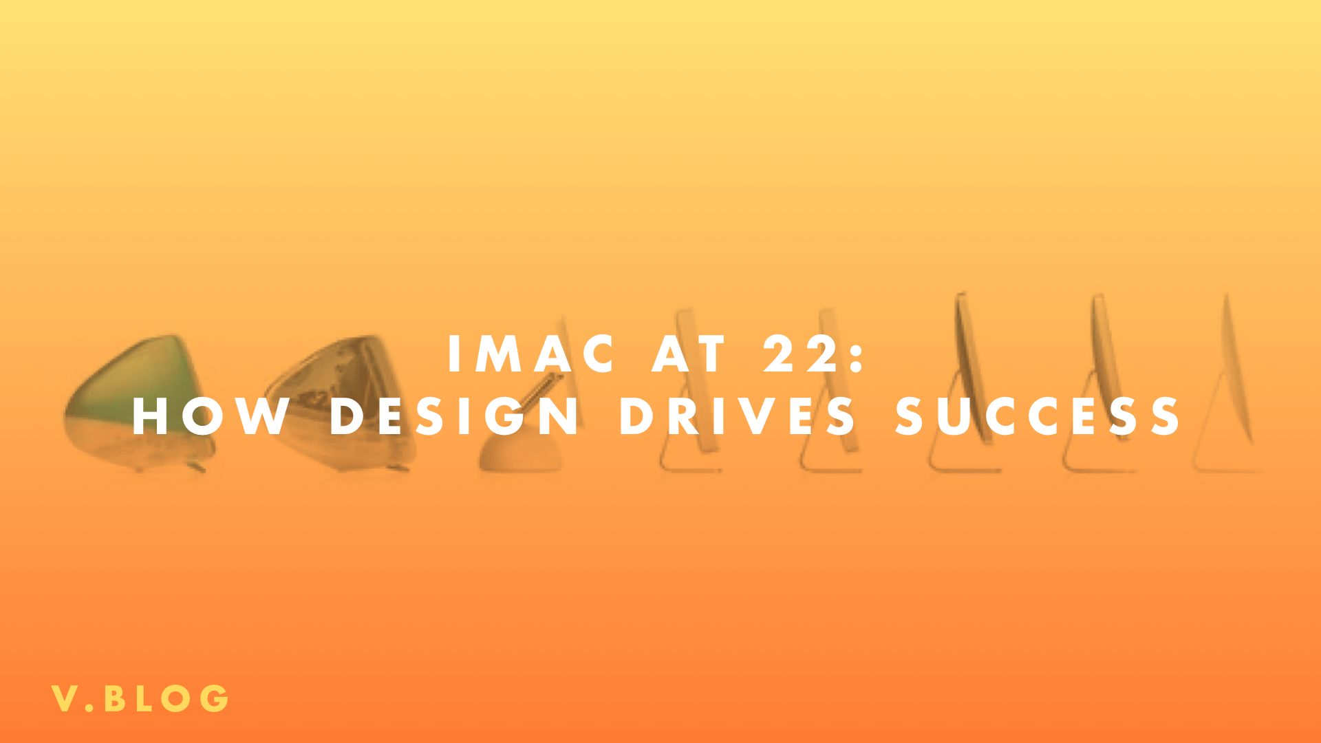
Design has always been at the heart of Apple’s products. The iMac was no different. 22 years ago, Steve Jobs got on stage in San Francisco to introduce the Apple iMac to the world.
The first product to be launched since Jobs’ return to the company he founded, the iMac G3 catapulted Apple out of certain demise and into the global limelight. Apple was back competing in a market that was heavily dominated by Microsoft’s Windows. Not only did iMac change the way consumers looked at computing and create the course of Apple’s unmatched success for years to come, it also made huge strides in the way consumers looked at and perceived computers! This paradigm shift can be felt even today.
Jobs combined this revolutionary product with strong, standout visual communication principles that had never been experienced before. It was communication based on three major principles that would continue to shape their narrative in the years to come. In many ways, these design principles were the engine behind the iMac’s success.
Jumpstart your ideas with Linearity Curve
Take your designs to the next level.
Beauty:
The iMac’s design was unconventional, to say the least. With the Microsoft dominated landscape offering dull and unremarkable beige colored computers, the iMac decided to step in the opposite direction and bring product design to the forefront with a first of its kind, colorful, all-in-one system aimed at the everyday consumer.
Designed by the legendary Sir Jonathan Ive, its entire internal hardware was housed in a covering made of translucent plastic that later came in 13 different colors, having been introduced on stage in the color “Bondi Blue”. Some of the other colors included Tangerine, Rube, Sage, Blue Dalmatian and Flower Power, offering customers an unprecedented choice to customize their product’s aesthetic.

The iMac also left behind the industry standard right-angled box design in favor of a curved, smooth design that encased its 15-inch CRT monitor display and everything else within it. Then VP of Design Ive had pondered “What computer would the Jetsons have had?” when designing the iMac G3.
Ditching the corporate favored beige boxy design, Apple released the first colorful computer with beauty and aesthetics in the forefront and epitomized this priority in their product slogan “Sorry, No Beige.” To cap it all off, Jobs even emphasized the importance that design played in the G3’s conception, remarking the following during the product launch presentation:
“It looks like it's from another planet – a good planet. A planet with better designers.” – Steve Jobs
Simplicity:
Of course, beauty alone was not going to make the iMac a success. While it certainly helped Apple make a splash, the previous principle also needed to rely on a solid footing in the product’s core functionality. At that same product introduction conference "Macworld" in 1998, Jobs remarked
Their goal was defined from the start by what the emerging consumer wanted: a computer to get on the Internet simply and quickly.
This simple consumer trend was decisive for Apple, which saw a turn in the market from corporate users to an emerging group of average consumers thanks to the Internet’s quick adoption into the mainstream. They pivoted their product to embrace the Internet with open arms, so much so that the "i" in iMac stands for Internet (amongst "individual", "instruct", "inform" and "inspire" as well). They knew their consumer well and went all out in making a product that would deliver their desire, and also be good enough to sit at every desk in Silicon Valley.
Ready to create brand assets that pack a punch?
Visit our Academy for free marketing design courses.
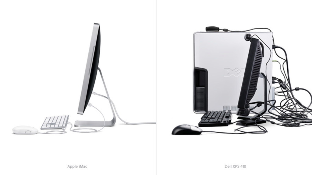
Simplicity also shaped the design of their product; a huge point of disagreement was the absence of a floppy drive, which were universally accepted well into the 2000’s, in favor of (the now beloved) 2 USB ports. It seems that Apple had adopted the “trend killer” persona well in its early days!
This minimal design was what really set apart the iMac from its competition, who favored a plethora of serial ports for all kinds of compatibility. All the pesky wiring and unnecessary plugs were hidden away behind the screen’s colorful plastic casing, with a very limited number of outlets for the wires to lead out of, making your desk much more neater and well organized.
This principle introduced by Jobs early on was based on the goal that Apple users should get the results they wanted without worrying about the means used to get them, which would continue to inspire the creation of future products for years to come.
Identity:
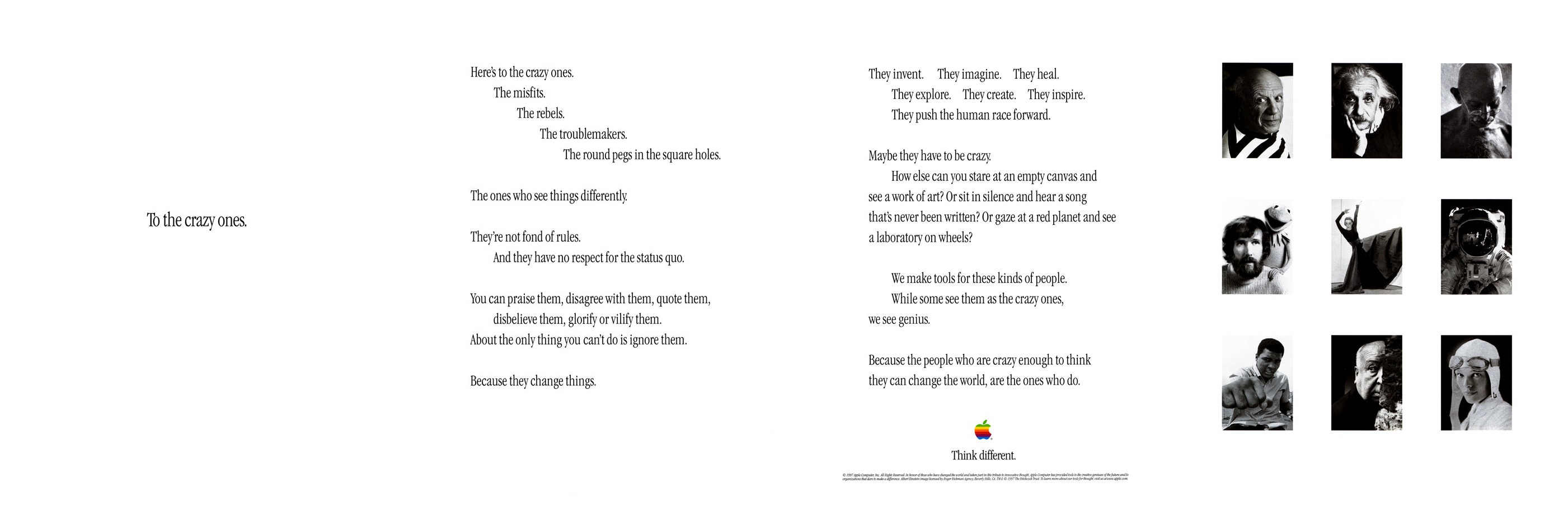
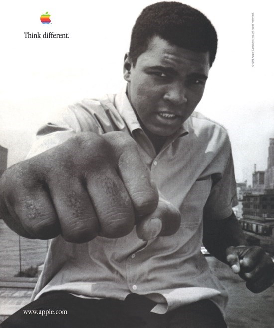
A year before the launch of the iMac, Apple had made good progress towards positive brand perception with their “Think Different” campaign. Through their powerful visual storytelling, Apple positioned itself amongst the greatest thinkers and leaders of society like Martin Luther King, Gandhi, Albert Einstein, Bob Dylan i.e. those who dared to think differently. So when the iMac was finally introduced, the stage was all set for Jobs to introduce and position their new machine as a revolutionary computer like none other, destined for history.
With the success of the iMac, also came the brand’s line of "i" named products: the iPod, iTunes, iPhone, iPad, iWork etc. Apple had seamlessly integrated itself with the growing popularity of the Internet, while simultaneously helping create their own identity of products with Internet capabilities. The rewards of this naming strategy, first thought up by Ken Segall for the iMac, the brand would continue to reap for every product launch down the line.
This identity campaign was so successful for the company that even before the success of the iMac, their stock price had tripled in the 12 months since. When the iMac was finally launched in 1998, it went on to sell 280,000 units within six weeks, becoming the best seller in that season and ushering in Apple’s return to profitability with over $300 million in earnings.
Decades later, words like “revolutionary”, “historical” and “defining” are still used to describe their products today, even when they are just software upgrades onto the same hardware.
While it may seem that the company was always destined for success from the above, that wasn’t always apparent to everyone around them. Hiawatha Bray of the Boston Globe had characterized the iMac as “too odd to succeed”, also describing the absence of a floppy drive as “an astonishing lapse from Jobs, who should have learned better”. Her thoughts were also echoed within the industry, with many failing to see why such a radical design change would be adopted by the market suited to its simple beige colors and right angles.
However, Apple stuck to their principles and used them as a guide to reach their audience directly. With the iMac and this communication, Jobs relaunched Apple and laid the foundations for their products and communication of the next 20 years at Cupertino, even improving and reinventing the same products with success.
Apple’s core principles of beauty, simplicity and identity are all interlinked and contribute to how they shape their overall communication for their audience. The importance of these core principles is utmost important; they are derived from your end goal and ultimately are what your entire communication and work relies on. Without these principles as guiding forces, you run the risk of achieving objectives without any central structure to rely on.
As a designer, or even a brand, a fixed set of principles lets you channel your ideas and creative forces towards a common goal. This goal can be as simple as creating a design language that speaks to your target audience, or as ambitious as designing a computer to change the outlook of personal computing forever!
Jumpstart your ideas with Linearity Curve
Take your designs to the next level.
Cover Image by High Snobiety.
Share this!
Ben Barnhart
Ben is a Content Lead for Linearity living in Berlin. His hobbies include board games, cooking, reading, and writing.