:quality(75))
:quality(75))


:quality(75))

The internet and social media have been incredible for spreading images quickly across the globe. But with this incredible reach comes the risk of unauthorized use and replication of your designs—often without your name or organization being credited.
As a photographer, graphic designer, UI/UX specialist, web designer, or marketer, how do you safeguard your creative assets while maintaining their aesthetic appeal?
Enter the image watermark.
An effective watermark should be visible enough to assert ownership yet subtle enough not to detract from the design it protects. Whether branding a portfolio, securing online content, or ensuring your designs remain uniquely yours, getting your watermarking right ensures your creative work can safely travel the internet.
We know you may be worried about ruining your assets, but this guide will walk you through creating a custom watermark from scratch that aligns with your style. In a couple of simple steps, we'll show you how Linearity Curve can equip you with the tools and knowledge to protect your work confidently.
Watermarks: the artist’s signature for the digital age
From their origins in 13th-century quality assurance for fine papermakers, watermarks have remained a symbol of professionalism and authenticity for contemporary creators—an artist’s signature for the digital age.

More recently, marking creations with either text, such as your name, brand name, or logo, has also evolved into a social media trend. You may have seen users adding faux watermarks to their images, not for protection but to emulate the look of professional content.
We’re unsure if we’ll hop onto this trend soon. But it does show a growing appreciation for the visual cues of authenticity and the cachet of branded content among digital audiences.
For instance, the infamous “Getty Images” watermark has become a statement of pride and professionalism. It's not just a defensive strategy. It's a badge of creativity and authenticity.

For creators navigating the complexities of digital content sharing, understanding and embracing watermarking is about protecting your work. It's also about joining a larger conversation on content value and authenticity, so why not add your mark to the history of digital content?
Let’s get started with our easy watermarking tutorial.
Jumpstart your ideas with Linearity Curve
Take your designs to the next level.
Create a new Curve document
Launch Linearity Curve, navigate to the File menu in the Action bar at the top and select New. You could also create a new document straight on your Linearity dashboard by selecting the + icon.
Choose the most suitable canvas size in the Artboard template menu that opens next.
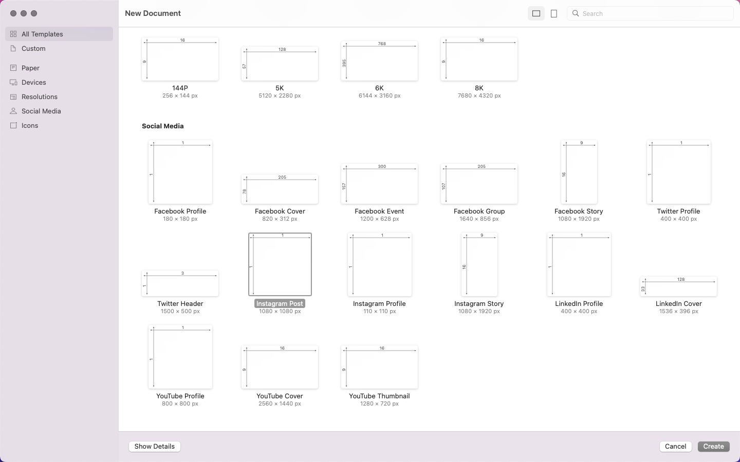
While watermarks should be adaptable to various backgrounds and formats, begin with an Artboard that mirrors the common dimensions of your projects. This could be a 1080 x 1080px square (often used for social media), or select a landscape or portrait option that suits most screen sizes. You’ll see many options in the templates menu.
If you’re going square, select the Instagram Post template, already sized at 1080 x 1080px.
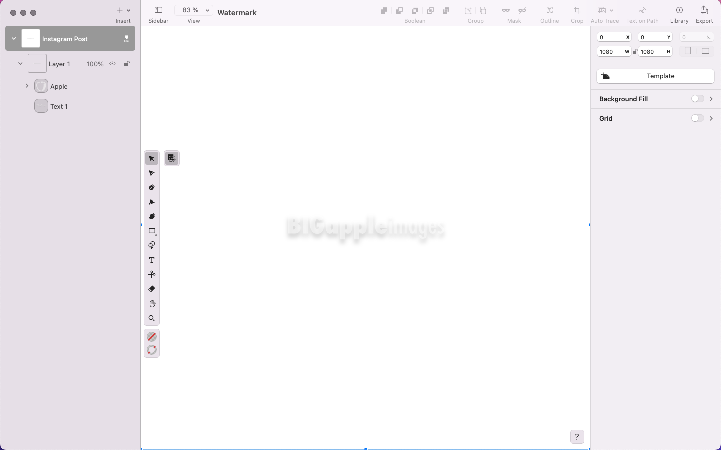
Your blank Artboard will open once you’ve selected your preferred size.
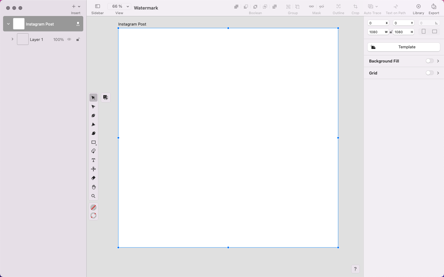
We’ll be working with semi-transparent elements in this tutorial, so change the Background Fill of your document to a color that will allow you to see your text clearly while you’re working.
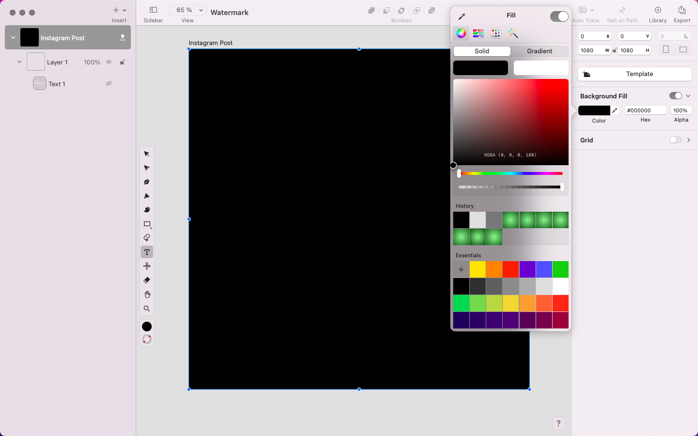
To do this, select your Background layer in the Layer Panel on the left of your screen. Then, head to the Background Fill section in the Style Tab on the right-hand side of your screen and toggle it to the ‘on’ position.
In the dropdown menu that appears, select the white square in the color box and choose your preferred color. The default black Fill color offers great contrast against white text, so select black in the color palettes section of that menu.
Determine your watermark style
Before diving into the design, consider what you want to do with your watermark.
Is it for brand recognition, copyright protection, or both? Also, ask yourself where you’re likely to position it most commonly on your projects. It’s good to keep the position consistent to give your portfolio a uniform look.
This choice can affect your watermark’s size, shape, and complexity. A watermark for photographs, for example, might be more discreet than one for digital art.
The upside of a text watermark (often the brand's name, website, or copyright statement) is that it's straightforward and easy to create. Consider if you want it to be your full name, initials, or your business name.
Is your watermark logo-based? A logo watermark is often clearer on an image and immediately associates the design with your brand. This might be the way to go if you already have a strong visual brand identity.
Some designers and brands combine text and logo elements for a more comprehensive watermark. This approach can be very effective, but be careful with your design to ensure clarity and visibility. Consider these options if you’re going that route:
- Font and color: For text watermarks, select a font that represents your brand's style and is legible in various sizes. Simplicity works best. The color should be consistent with your brand, though you might need to adjust it depending on the background of your content.
- Simplicity vs. complexity: A simpler design can be more versatile and less distracting, while a more complex watermark might convey a stronger brand identity. More complexity also makes it more difficult to copy your work or use parts of it for image compositing. Balance is key.
- Reflecting your brand: Your watermark is an extension of your brand. It should align with your brand's voice, tone, and aesthetic. Whether you choose a minimalist text watermark or a more elaborate logo-based design, ensure it communicates your brand identity effectively and consistently across all your content.
Once you’ve done the groundwork, you can move on to designing your watermark.
Add your watermark text
For this tutorial, we’ll combine text and logo elements.
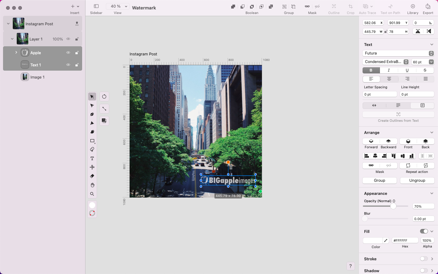
To start with the text element, select the Text Tool in the Toolbar on the left of your screen (or try the shortcut by pressing T on your keyboard and clicking anywhere on the Artboard). A bounding box containing the word Text will appear on your Artboard.
The content-aware Text Panel will appear inside the Style Tab when the Text Tool is activated.
Click on the bounding box and start typing to add text to the document with your keyboard. Add your brand name, signature, or any other words you want to include in your watermark.
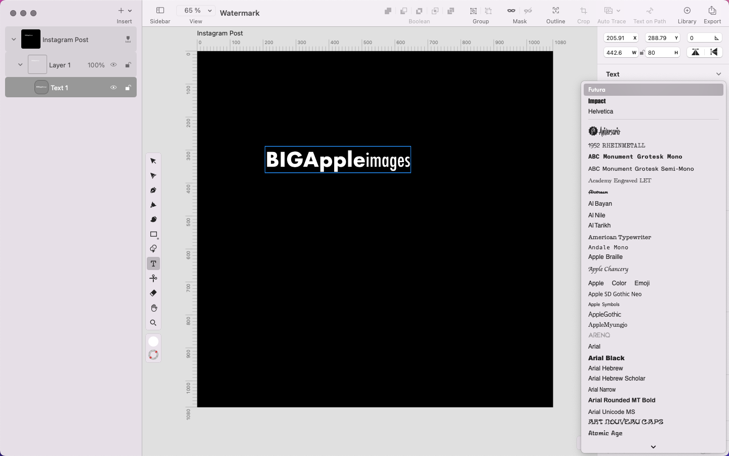
Go ahead and customize the text in the Style Tab panel. Select your fonts in the Font Picker, experimenting with font styles like bold or italics.
The Font Picker section shows you the three fonts that you’ve recently used at the top of the list. You can easily find any font you want by scrolling up or down or by tapping on a letter on your keyboard to jump to the fonts that start with that letter quickly.
We selected the Futura typeface and used various styles of this single font in one logotype. This creates a uniform look while adding interest with font variations.
Add your logo icon
Add a graphic element to your watermark representing your brand or the content you're protecting.
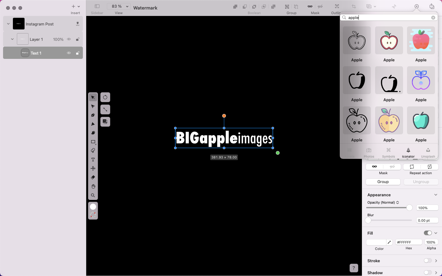
For this tutorial, you can use our Iconator Library. It gives you access to over 80,000 royalty-free icons that can be used for free in all your projects.
To find the Iconator Library, head to the Action bar at the top of your workspace and select the + icon. This will open the Libraries popover menu. Click on the Iconator Library icon in the bottom tab of the menu.
Type a query into the search bar to find the icon you think will work best for your project. Spend some time exploring, then double-click the icon you like, and it’ll automatically appear on your Artboard.
Combine your watermark icon and text
Experiment with the placement of your icon and text. Use the Selection Tool and try placing the icon above the text, to the side, or even integrating the text into the icon. The goal is to create a watermark that can be recognized at a glance.
You can also resize the icon and text while keeping their aspect ratio intact by selecting your elements and dragging on the green circle—the Aspect Ratio Handle—at the bottom-right of your selected element’s bounding box.
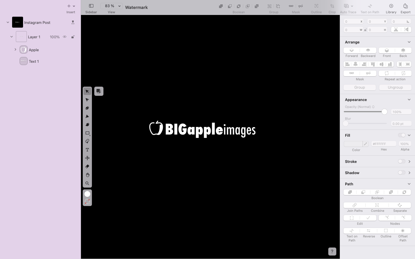
You might want to place your icon and logotype on a single line so that they can be used discreetly or multiplied many times over a single image background without becoming overwhelming.
Set your color and opacity
To ensure your watermark blends well with various backgrounds while remaining visible, adjust the Opacity.
A general guideline is to aim for an opacity level that allows the watermark to be noticed without distracting from the main content. Choose a color that stands out against light and dark backgrounds, or consider using a neutral color like white, black, or gray. We stuck with the default white color.
You can change the colors of your text by editing the Fill and Stroke options in the Style Tab.
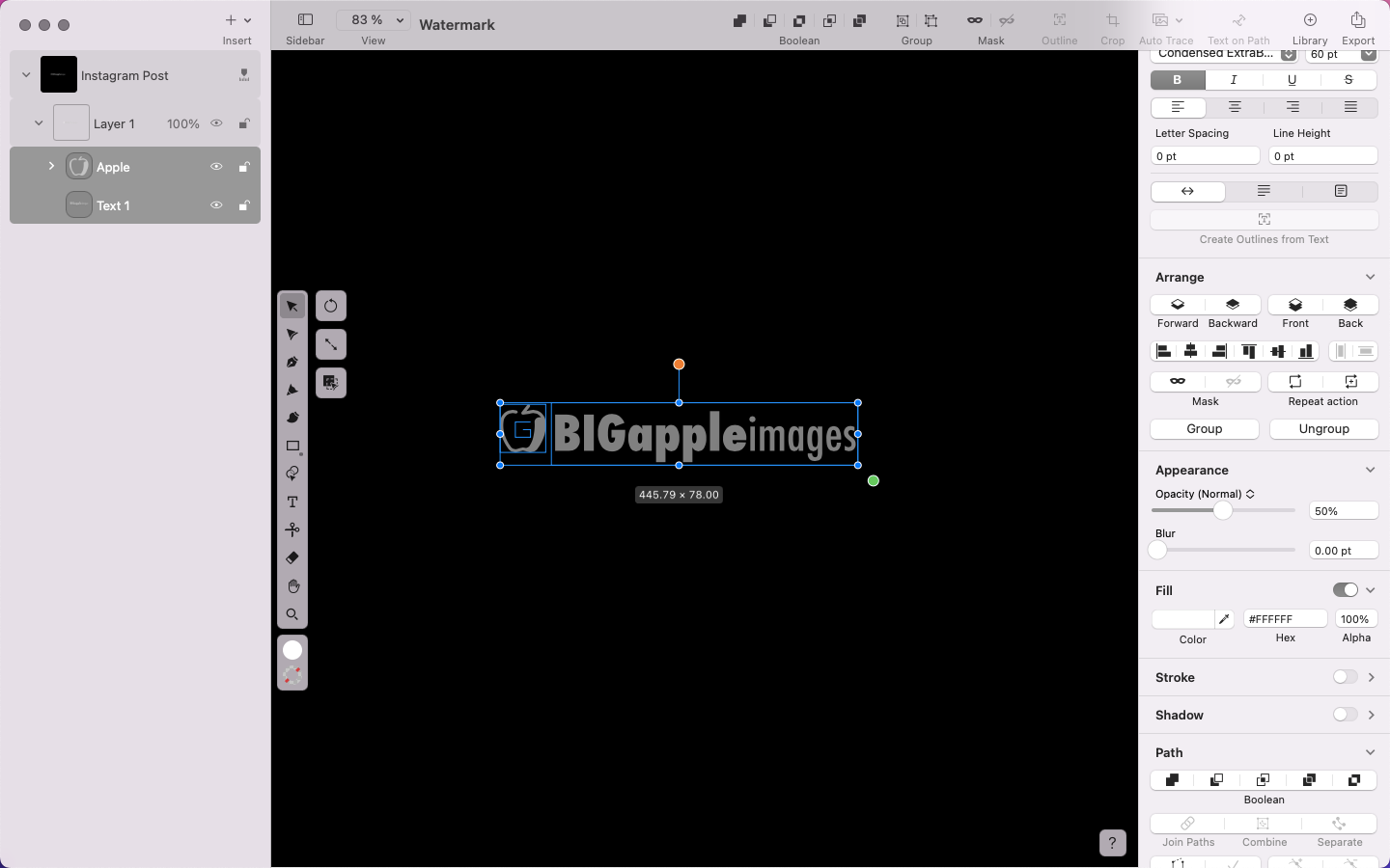
Once you’ve selected your Fill color, change the opacity of your Fill by opening the Appearance section of the Style Tab and adjusting the Opacity Slider by dragging it. You can also manually input the Opacity percentage. Most photographers recommend keeping it to around 50% Opacity, but do what works best for your images.
Though the instances are very few where we would suggest adding a Drop Shadow to your project, it may be worth a try when creating a watermark. A drop shadow could improve legibility, depending on the size and complexity of your watermark elements.
To do this, toggle the Shadow option in the Style Tab and adjust the settings to your preference.
Preview your watermark
Before finalizing your watermark design, preview how it appears over different types of content. A quick way to test this is by dropping an image onto your Artboard and seeing how it looks.
We used Linearity Curve’s integrated Unsplash Library. You can find it by following the same steps to use the Iconator Library in Step 4. Search for an image and drag and drop it onto your Artboard, or double-click to add it.
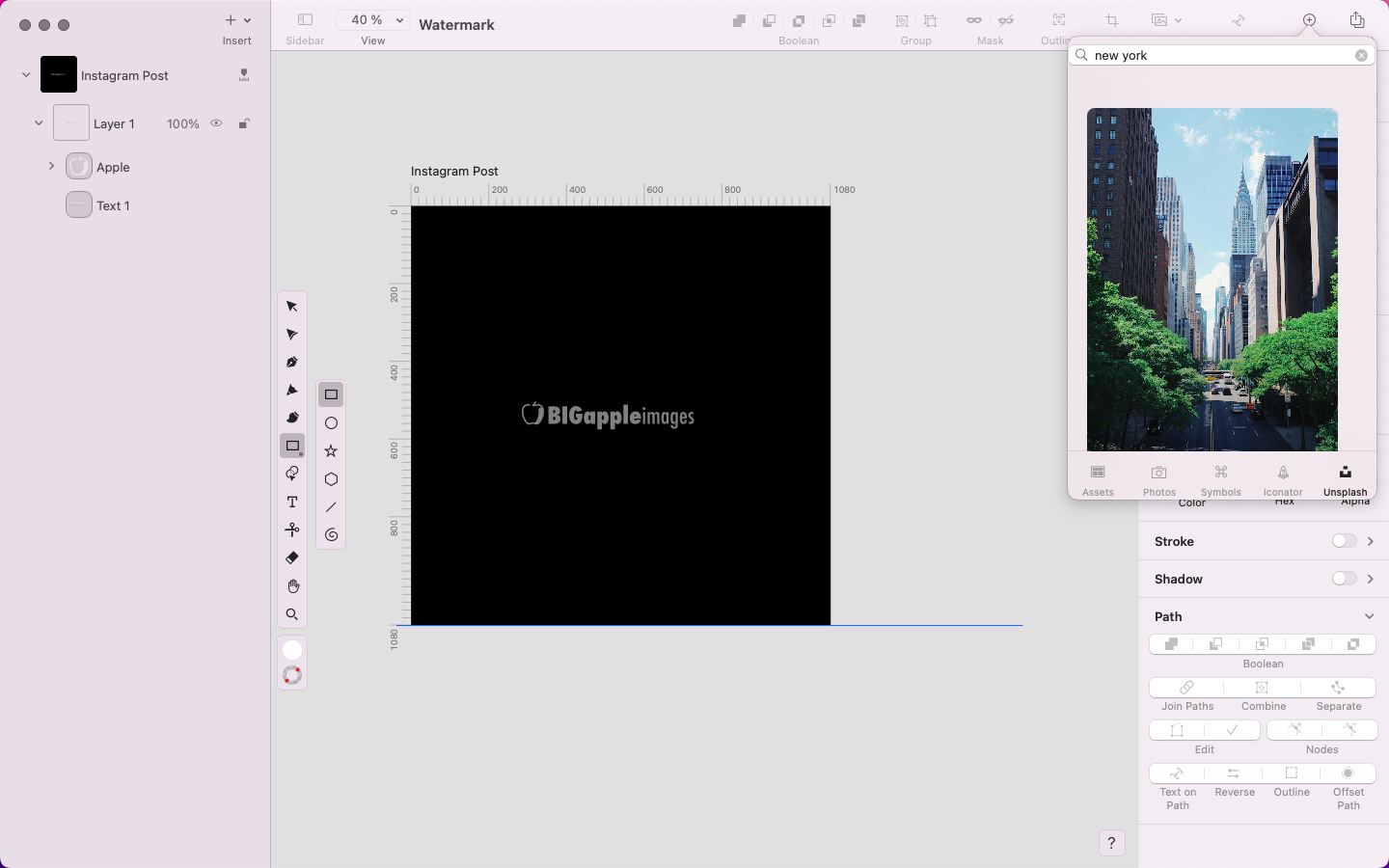
The image may hide your watermark due to its ordering in the Layers Panel. To adjust this, move your image beneath your text and icon layer by selecting the image layer in the Layer stack and dragging it to the bottom of the stack. You’ll see your watermark now appear as an overlay on your image.
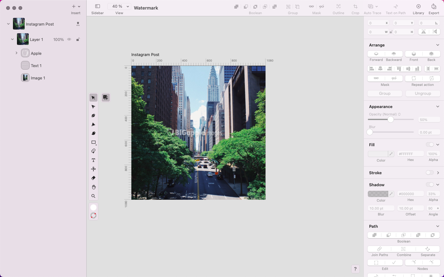
Place your watermark over various images or designs that represent the types of content you'll be watermarking. Choose images with diverse colors, textures, and compositions to ensure your watermark looks good in different scenarios.
Ensure the icon and text are visible without blending into the content or becoming too distracting. Adjust the Opacity if necessary to strike the right balance between visibility and subtlety.
Export and add your watermark to your Assets Library
Once you've perfected the design and placement of your watermark, you can delete the test images. Select the image layer in the Layers Panel, right-click on the layer (or use ⌘ + click), and choose Delete. Now, your watermark should be visible on your background layer.
Add your watermark to your Assets Library by clicking on the + icon in the Action bar to open the Library popover menu, then select the Assets icon. Select the + icon in this menu to add your watermark file to your Library. This gives you instant access to your watermark in any Curve file you’ll be working on.
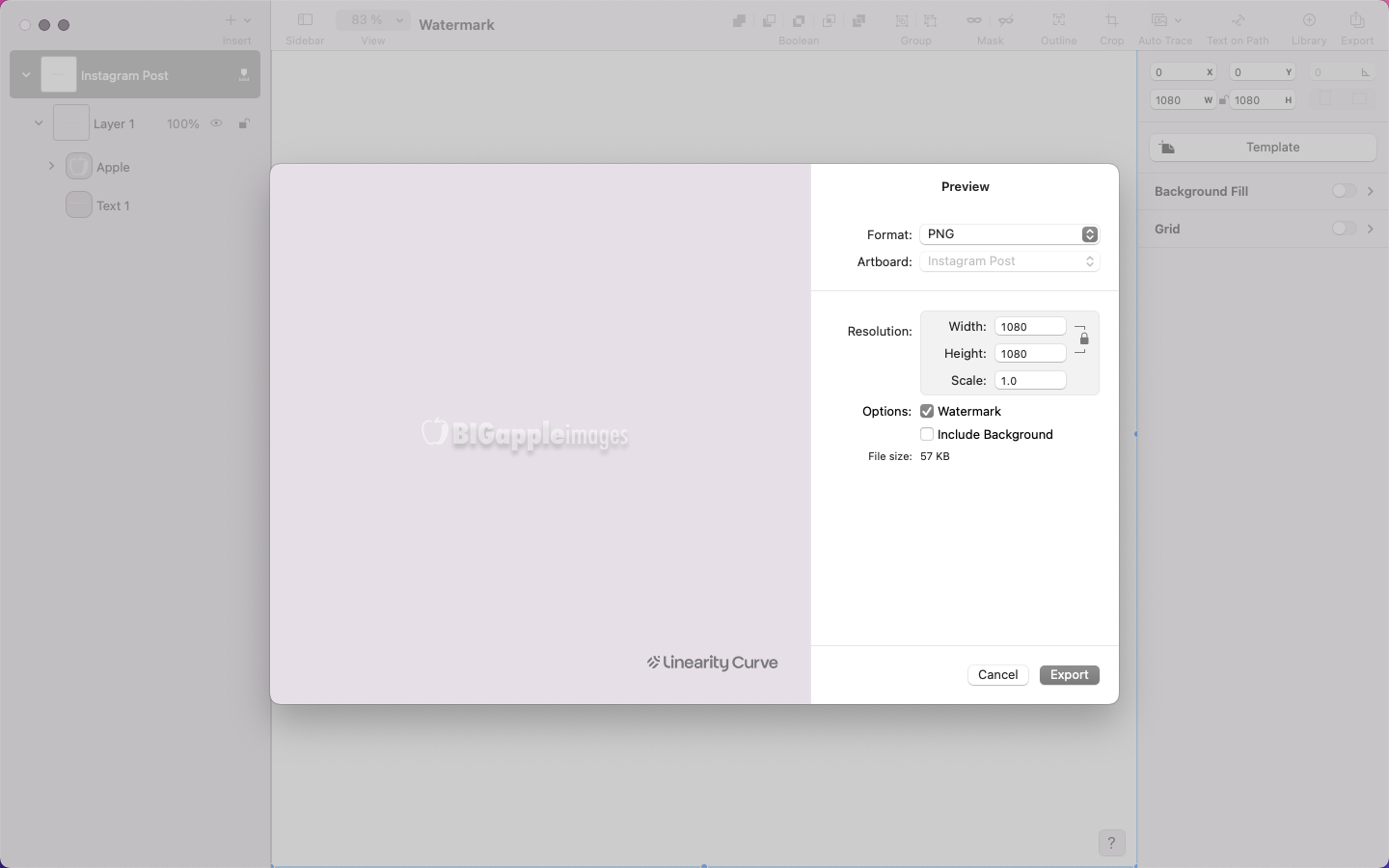
Now, let’s save your watermark as an image in a format that preserves its transparency and flexibility, such as .png.
Go to the File menu in the Action bar and select Export. Choose the .png format, and select the Watermark option below that, which is optimal because it supports transparency. This allows the background to remain see-through while the watermark remains visible, without any visible border or background color.
Working in video formats and want to protect your work? Why not try Linearity Move to create an animated watermark for your projects?


Make your mark
Just like that, you’ve created your very first watermark, ensuring that all your hard work is protected and acknowledged going forward. You’ve officially joined a long line of creative makers and innovators who have put their stamp of pride and ownership on their work.
Now that you’ve made your mark, it’s easy to share your work with us so we can celebrate with you.
Making a watermark is just a small taste of what’s possible with Linearity Curve, so sign up for your account and explore the rest of our tutorials to see how simple it is to kickstart your creative process.
Jumpstart your ideas with Linearity Curve
Take your designs to the next level.
Frequently asked questions
Why do I need to use a watermark for my digital content?
Watermarking your digital content helps protect your work from unauthorized use or theft by clearly identifying you as the creator or owner. They also enhance brand recognition and credibility, providing a visual stamp of authenticity on your content.
What types of content should I watermark?
It's a good practice to watermark any digital content that you share publicly or that holds value to you. These include photographs, illustrations, graphics, videos, and documents. Adding a watermark can deter unauthorized use and ensure your ownership is acknowledged whenever your content is viewed or shared.
How do I choose the right design for my watermark?
Consider elements representing your brand identity or personal style when designing your watermark. This may include incorporating your logo, brand name, initials, or a symbol that reflects your work. Strive for a design that is easily recognizable and complements the content it accompanies without overpowering it.
Is there a standard size or placement for watermarks?
There's no one-size-fits-all answer to this question, as the size and placement of your watermark may vary depending on the type of content and your personal preference. A common practice is to place the watermark in a corner of the image or video where it's visible but doesn't obstruct the main subject. Experiment with different sizes and placements to find the best for your content.
Can I remove a watermark from someone else's content?
Removing a watermark from someone else's content without permission is considered copyright infringement and is illegal in most jurisdictions. It's important to respect the rights of content creators and obtain proper authorization before using or modifying their work. If you come across watermarked content you'd like to use, contact the creator to inquire about licensing or usage rights.
How can I protect my content beyond using a watermark?
In addition to watermarking your content, consider implementing other security measures such as copyright notices, digital rights management (DRM) tools, and legal agreements like licenses or contracts. Regularly monitor your content online and promptly address any instances of unauthorized use or infringement.

Share this!
Garreth van Niekerk
One of GQ's 'Young Creatives To Watch' and described as a "Creative Force" by the Sunday Times, author, designer and marketer Garreth van Niekerk is a contributor for Linearity in Johannesburg.


