:quality(75))
:quality(75))


:quality(75))
From posters to app mockups and social media posts, typography holds a place of vital importance in any design project. To master it, you should know some crucial concepts like baseline, ascenders, and descenders. These make up the ABCs of your typography. To help you cover these basics, here is a detailed guide covering the definition of descenders and how they affect your design, with some standard descender fonts from which you can get inspiration.
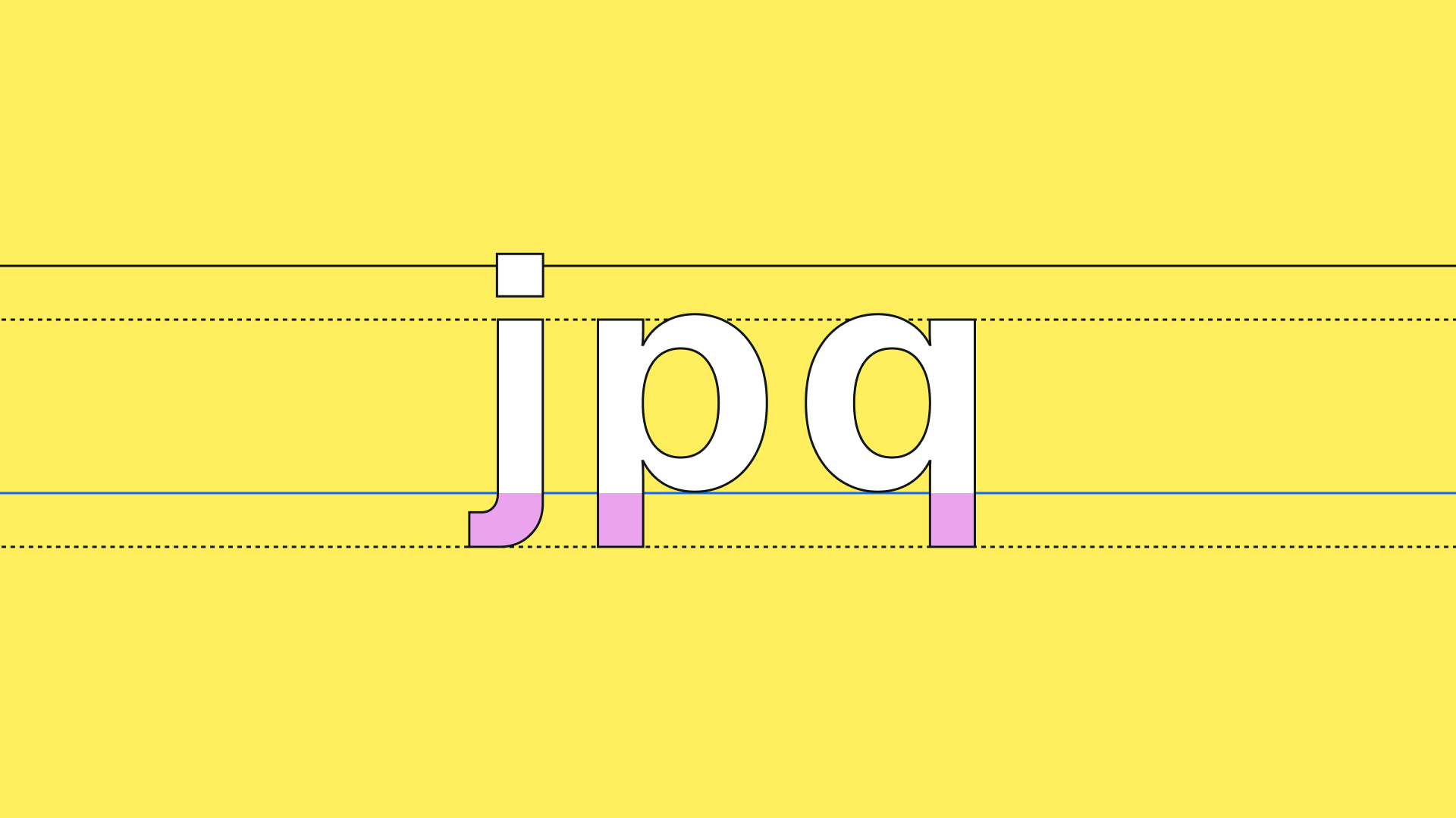
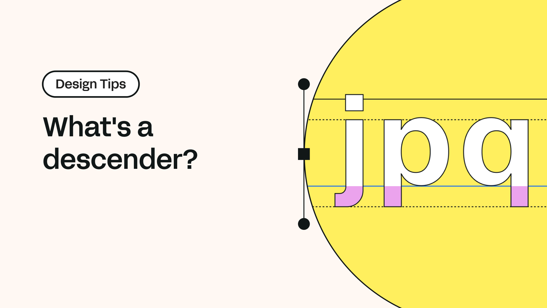
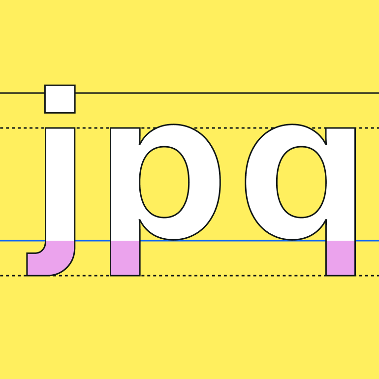
A descender is the portion of a letter that descends below the baseline.
Jumpstart your ideas with Linearity Curve
Take your designs to the next level.
Descender (dɪˈsɛn dər.) Now there's a new word of the day! But don't worry, you don't have to pull out your dictionary or thesaurus. In this article, we'll learn all about them.
The baseline of a font is the invisible line upon which text ‘rests’ when you type. Another concept helpful to know before we dive deep into this topic is the "x-height."
X-height refers to the distance between the baseline and the mean line of lower-case letters in a specific font. Typically, this is the same as the height of the lowercase letter 'x,' and that’s where it gets its name.
Where can you find descenders?
You can find descenders everywhere in your typography if you’re paying attention. Most descenders belong to lower-case characters, such as g, j, p, q, and y. However, capital letters can also have descenders depending on the font, most often the letters Q and J.
And they can also appear on numerals, typically on the numbers 3, 4, 5, 7, and 9.
While many letters can slightly extend over the baseline, this is commonly known as an overshoot, which is different than a descender - they aren't synonyms. The overshoot is the slight curve below the baseline that you see for round letters such as ‘o’ when compared with flat letters such as ‘x.’
Types of descenders
Not all descenders are the same. If you look closely, the descenders of letters j, y, and Q are shaped more like a slight curve. For this reason, they are called “tails.”
The descender of the letter g is usually more of a loop, while the descenders for letters p and q are almost always a straight vertical line. However, you’ll notice that this might not hold true for all fonts.
Using descenders in design
Any typographical work will require your undivided attention when it comes to descenders. Because there is ultimately one significant thing for which you should be on the lookout: crashing descenders.
Crashing descenders occur when a descender from a character on one line touches the ascender of a character on the line below or touches an uppercase letter. As you might have guessed, an ascender is the part of a lowercase letter (such as b) that rises above the mean line.
If your descenders and ascenders crash together and overlap, it makes your copy look untidy, awkward, or very hard to read. A designer’s forbidden territory
Ultimately, good design means creating something that not only looks good but also conveys a message in the most efficient way possible.
And don’t make the rookie mistake only of considering lowercase letters when checking for descenders. As mentioned, in typography, even some capital letters, numbers, or special characters can have descenders that you should consider in your overall aesthetic.
Discover the Role of Descenders in Typography
Unravel the concept of descenders in typography. Learn how these critical elements affect the style and readability of your text designs.
The tricky thing here is that descenders vary a lot between typefaces. Some extend well below the baseline, while others only extend a short distance. The deeper the descender, the higher the space between text lines needs to be to accommodate it.
When considering a new font, try typing out a few example sentences so you can see how the descenders interact with the ascenders. This is especially critical when choosing the font for your body text.
Fonts with long descenders
1. Aerotic calligraphy
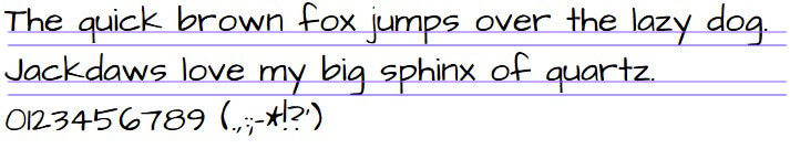
Calligraphic fonts are harder to use in your design. Because of their long descenders, they are harder to read and, therefore, not the best choice for body text. But they can make an excellent choice for invitations or cards.
2. GretchenHello
GretchenHello is a typeface that looks like it was done with a calligraphic pen. And it almost has a medieval or old English aesthetic to it. It has tall ascenders and long descenders that give it a certain elegance. But this also means it’s not the easiest to integrate into your design.
3. Architects daughter
Architects Daughter incorporates the graphic, squared look of architectural writing, combined with the natural feel of daily handwriting. You can create interesting designs with it for a logo or packaging, or use it as a simple text overlay to any background image.
Fonts with short descenders
Personalize Your Typography with Custom Fonts
Learn how to customize fonts in Linearity Curve to give your designs a unique touch. Our guide makes it easy to modify and personalize typography to your style.
1. Kaleko
This one is a stylish and simplistic font that you can use for every part of your design. With a shallower x-height and relatively short ascenders and descenders, it is more economical with space and better suited for unabridged body text. It's a versatile, modern sans, highly legible, and looks great when blown up in size.
2. Passion one
This is an excellent example of a bolder font that serves well in headlines. Since it’s so thick, be mindful of the negative space between letters as you adjust the kerning for this font.
3. Philosopher
Philosopher is one of the most well-known fonts with short descenders. The font is interesting and not all that complicated. So it can be used to write headlines or body copy.
Fonts with no descenders
That is correct. Some fonts do not have descenders. When you’re running out of space, try using these.
1. Crushed
Crushed was designed initially as a headline typeface. Featuring a condensed body width, Crushed is unique as it’s tossing the traditional lowercase aside for characters that match the cap height.
2. Unica one
Unica One is a condensed sans serif font. It’s especially great for headlines, yet short texts can accommodate it too. Readability and simplicity are some of the virtues of this unique typeface.
3. Permanent headline
This is a font with history! Designed by Karlgeorg Hoefer in 1968 as an extension to Permanent, it is sometimes referred to simply as Headline. It looks fantastic for logos and headlines for print media, and it’s a massive space-saver because of its lack of descenders. Another unique feature of this font is the fact that it does not come in any other formats, like italic or bold.
That's it! These are all the basics you need to know about descenders. We hope we inspired you to take your next typographical design project to the next level!
Read our next Design Tip if you want to continue learning.
Jumpstart your ideas with Linearity Curve
Take your designs to the next level.
Share this!
Ben Barnhart
Ben is a Content Lead for Linearity living in Berlin. His hobbies include board games, cooking, reading, and writing.