:quality(75))
:quality(75))


:quality(75))
Nostalgia is one of the strongest tools in the designer's toolbox.
With this powerful psychological tool, artists can create a sense of familiarity and fondness for their work.
It’s the reason we enjoy old music our parents used to play around the house or rewatching movies from our childhood.

It’s no surprise that, in 2021, retro designs were one of the top trends of the year. With the chaos of the pandemic, everyone was striving to get back to the good old days.
This article will discuss the essential design elements of vintage logos, give our design tips, and teach you how to make a vintage logo using Linearity Curve (formerly Vectornator).
Some key factors make up a good vintage logo. Let’s talk about them.
Jumpstart your ideas with Linearity Curve
Take your designs to the next level.
What makes a good vintage logo?
We consistently find that the main features in logo design are typography, brand color schemes, and graphics.
Let’s talk about how these features are used in vintage logo design:
- Typography: decorative, ornate, and funky typefaces are typical in vintage design. For a retro 70s look, go with a funky font. For a truly vintage look, go with a decadent cursive font.
- Color palette: retro color palettes often include tans and muted colors. Black and white designs are also standard in vintage logos.
- Graphic design aspects: use images that remind people of the past or their childhood. Summer camp, vintage cars, and swing sets are just a few examples.
You don’t have to include all of these elements in your logo to make it a good vintage design. You can use just one or two and will still end up with a great vintage logo.
Why create a vintage logo?
Following contemporary design trends is a staple of good design work. The best graphic designers can track trends and stay up to date while remaining unique and distinct with their look.
The rising popularity of retro design that we’ve seen in the past few years isn’t going anywhere. We expect to see retro designs in graphics, fashion, and media for the foreseeable future.
Vintage aesthetics are everywhere lately. Remakes of old shows, 70s fashion style, and mid-century modern interior design is taking off.
Jumping on board with this trend, especially if it fits your branding, is a no-brainer.
You can use a retro logo design on your business cards, design for labels on products, on your website, and more.
Vintage logo design inspiration
Sometimes a brilliant design hits you out of nowhere, and you are inspired to create something unique and groundbreaking.
But we find that ideas don’t always flow freely for every single piece you make. Sometimes you get stuck and need some inspiration.
Whether you're a freelance designer or a design professional working for a design agency, you need the inspiration to help you brainstorm design ideas.
Become a Logo Design Pro
Master the art of logo design with our comprehensive course. Perfect for all skill levels, learn to create memorable and effective logos for any brand.
A great place to find new ideas for designers is to look at the work that other creatives are making. We gathered up this list of inspiring designs created by designers that we love.
You might pull ideas from several designs to create your own piece. Whether it's the vintage color palette, accent color, or heavy typeface, these retro vintage designs are full of inspiration.
True Spark by Konstantin Reshetnikov
 Konstantin Reshetnikov
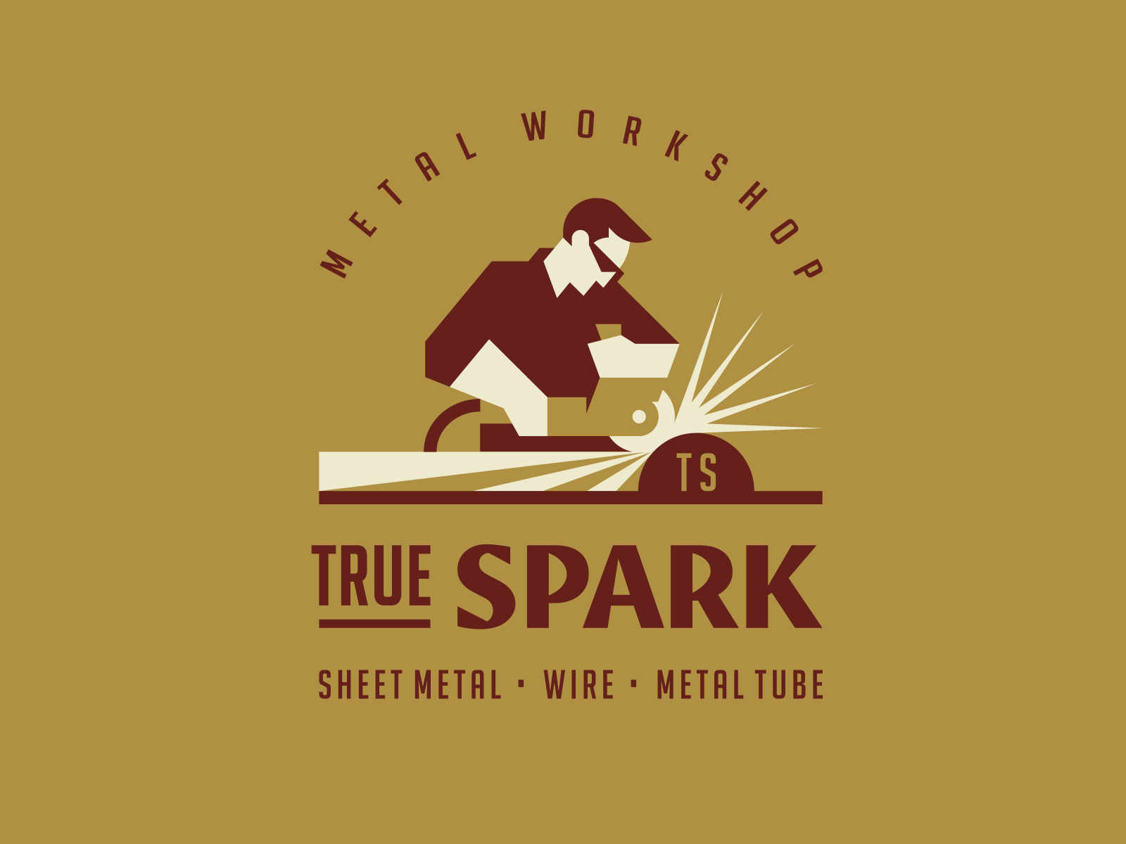
The first example on our list embodies the principles of vintage design perfectly.
It has a creative typeface, muted vintage color palette, and a nostalgic design element.
The young man working in the image has a retro appearance, and the colors in this logo perfectly match the vintage aesthetic.
Stackstone and Timber by Amit Botre
Amit Botre - Spin Design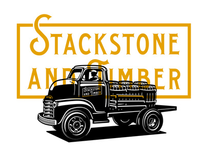
The mustard yellow accent color in this piece stands out against the dark car graphic in the foreground of the logo.
Plus, the vintage work vehicle with the company’s name on the side is a great touch.
Accent colors are a great way to create emphasis and dimension in a logo.
Work Horse by Travis Pietsch
TravisPietsch.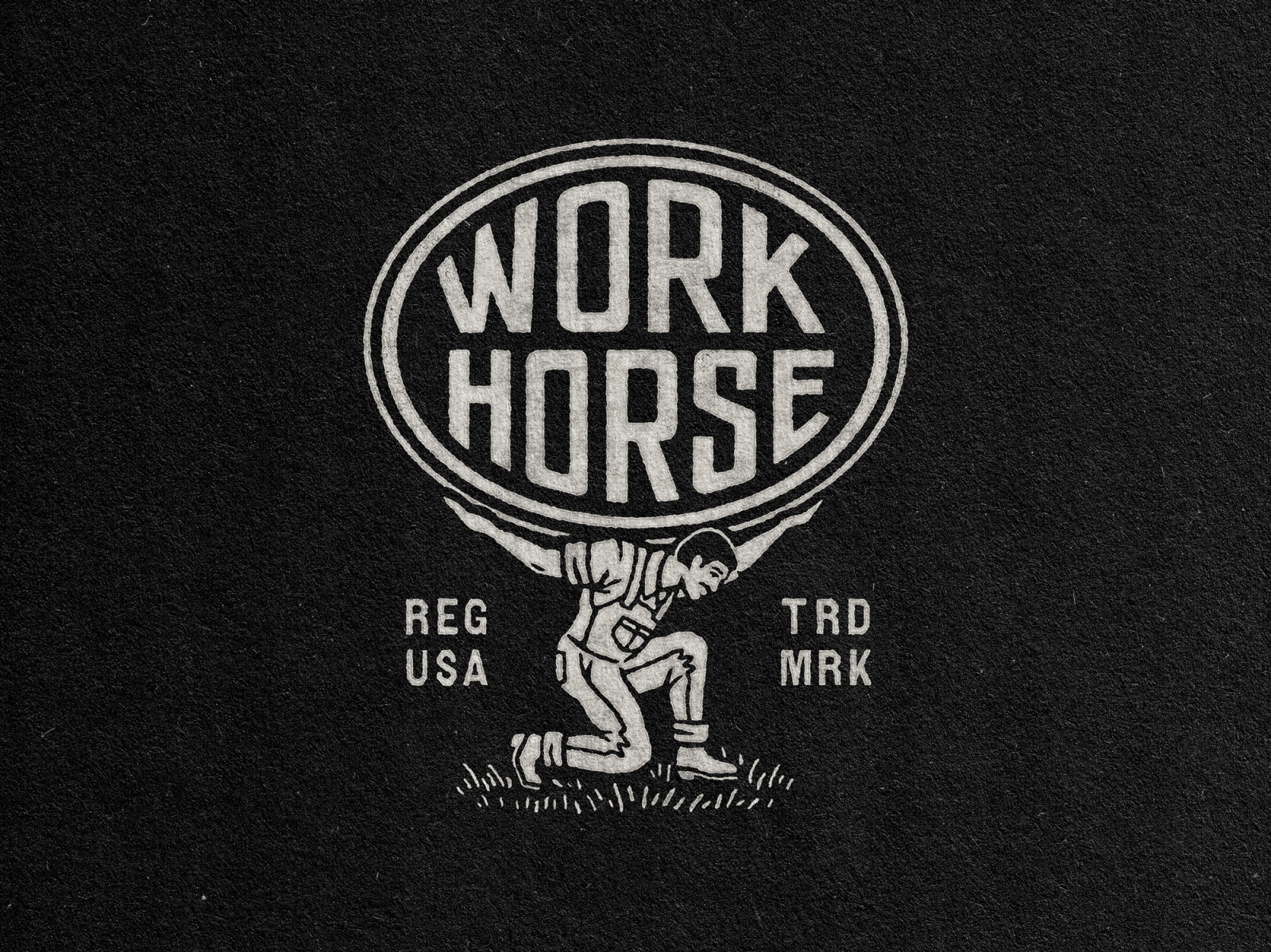
The dark color scheme contrasts with the pops of light color in this design creates a stark juxtaposition.
This logo design for a D.C. based design agency is a perfect example of vintage design. Simple, yet classic. We love the vintage figure holding up the name of the company.
This is the first of two designs by Travis Pietsch on this list. He has a great eye for vintage design.
Hank’s Hemp by Rise Wise
Rise Wise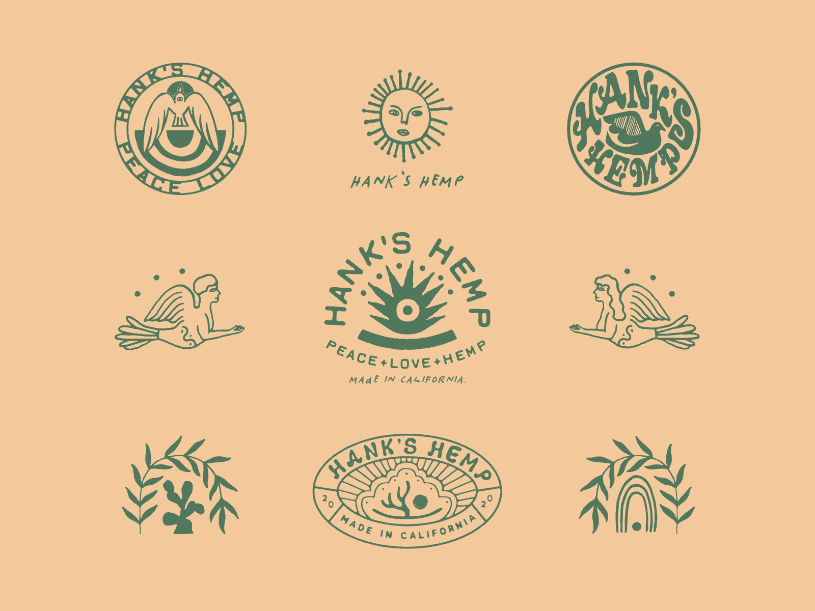
This logo created for a company called Hank’s Hemp that designs hemp apparel for kids perfectly embodies their brand.
This isn’t just one logo design, but a multitude of concepts. It’s a great example of what the creative process behind a logo design looks like.
The logo looks natural and uses green to symbolize a connection to nature. Using carefully curated colors in your design can create a certain emotional response in your audience.
House of Swell by Ulysses Design Co
Ulysses Design Co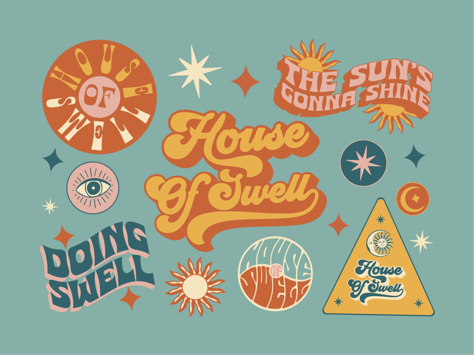
This selection of vintage logos for the brand House of Swell created by Ulysses Design Co sticks out with its distinct and creative color theme.
House of Swell is a lifestyle brand dedicated to making you feel warm inside and out. These logos embody that philosophy with the color palette and funky theme that they selected.
The colors are muted, as is fitting for vintage designs, but they still appear bright.
Kings Langley Press by Anastasia Kurilenko
Anastasia Kurilenko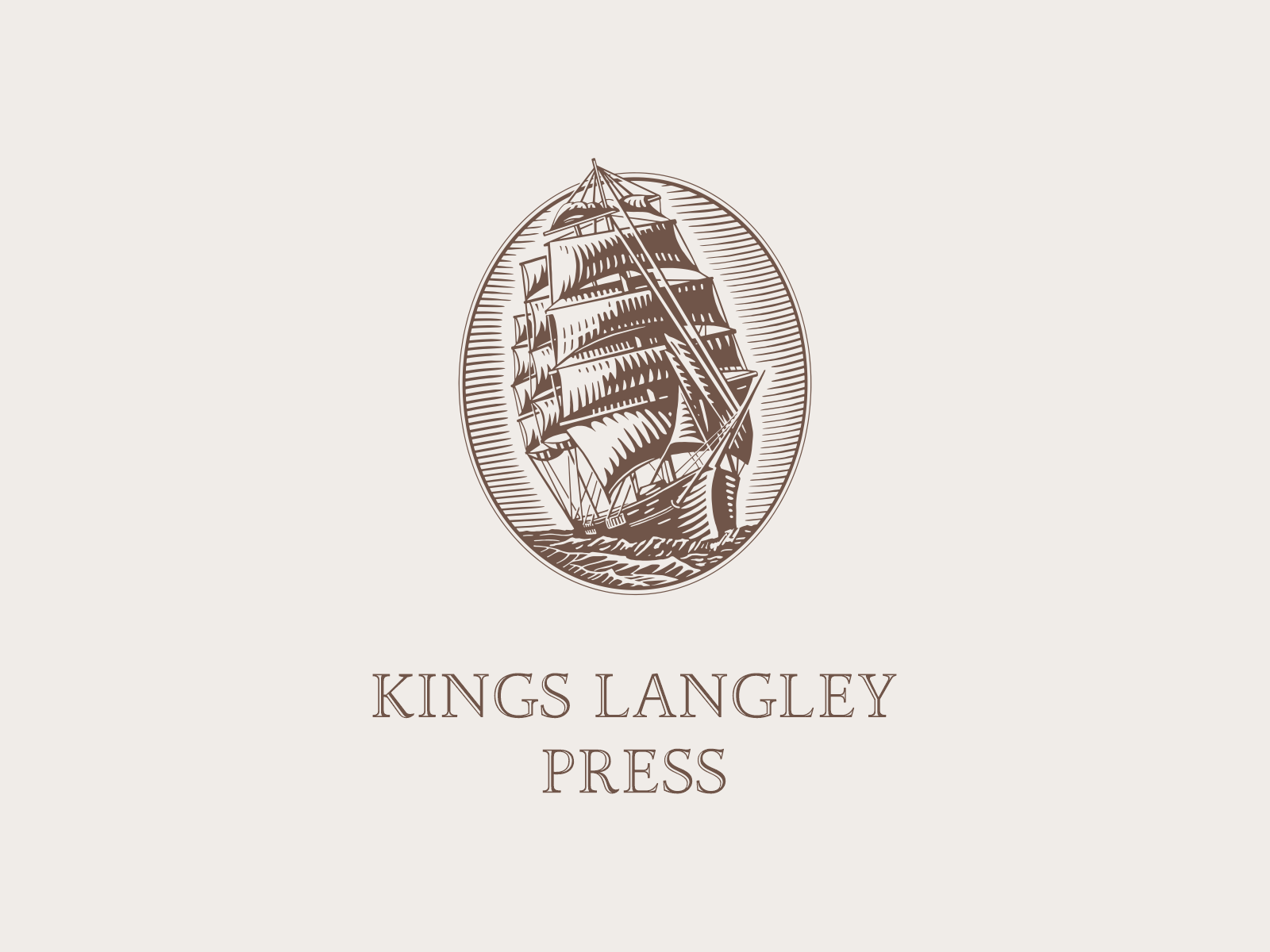
This design is classic vintage.
The designer gave a bit of background on the logo, saying that the ship was selected to signify the spirit of adventure and discovery that can be found in books.
The logo is reminiscent of the title page of an old book with the font style and color scheme.
We think the designer hit it out of the park with this one.
Catawba Clothing Co by Amit Botre
Amit Botre - Spin Design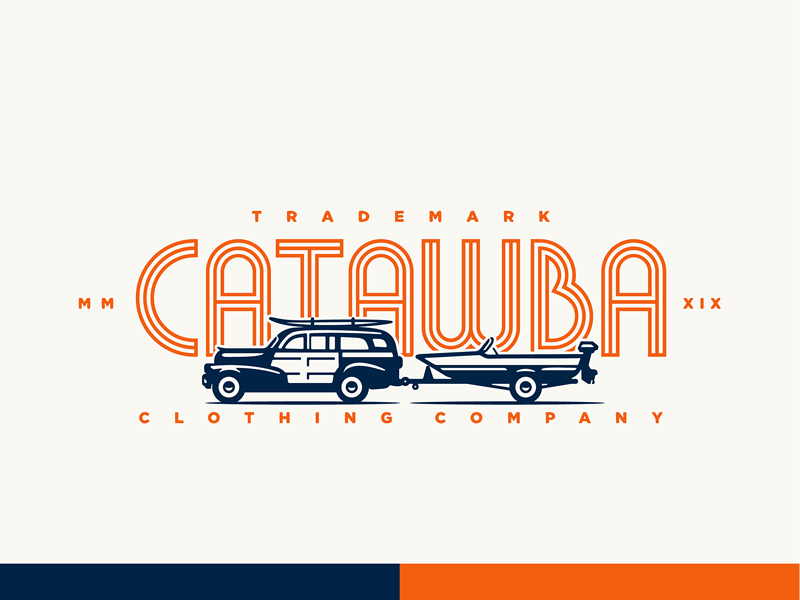
We love the vintage blue colors and the nostalgic car design in this logo.
This design was also done by Amit Botre, who was featured earlier in our list. He often uses vintage cars in his vintage designs, and we think it works great.
This design is reminiscent of childhood vacations and family beach trips.
Black Cabin Workshop by Nick Stewart
Nick Stewart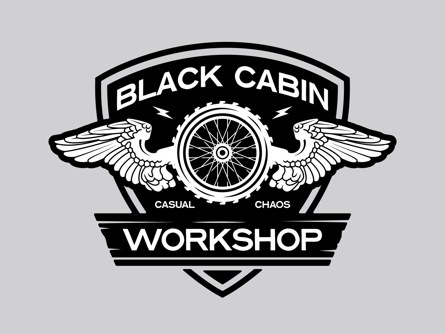
Another black and white design for the list. This one perfectly embodies a car workshop.
The rich black colors contrast with the stark white in a brilliant way.
We love the phrase “casual chaos” that is included alongside the company name. It paints a clear image of the company without taking up too much space that it overshadows the business name.
Mellow Dog Rescue by Ulysses Design Co
This is another collection of logo concepts done by Ulysses Design Co, this time for a dog rescue.
The font and muted colors are what give this design its vintage aesthetic. We love the abstract dogs and sun and the way that they are shaped around each other.
Ulysses Design Co kills it with vintage designs.
Tranquil Vista Campground by Travis Pietsch
TravisPietsch.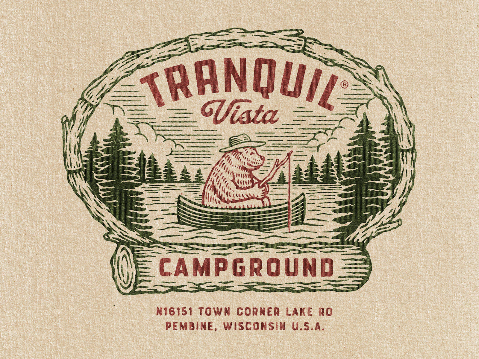
This nostalgic scene of a bear rowing in a boat is the perfect example of a vintage logo for an outdoor brand. In this case, a campground.
Again, the color green was used to create an earthy, natural aesthetic that fits this brand perfectly.
The bear in this image brings up old memories of Smokey the Bear and the vintage ad campaigns that made him a cultural icon.
If you’re ever in Wisconsin, this campground looks charming and peaceful. Check them out.
How to create a vintage logo with Linearity Curve
That wraps up our vintage logo examples, so let’s talk about how you can create your own vintage logo.
Curve makes the design process easy. Our design software is simple to use and perfect for beginner logo designers. We have hundreds of fonts, powerful editing tools, and design templates.
Ready to create brand assets that pack a punch?
Visit our Academy for free logo design courses.
Here are the basic steps to create your own vintage logo:
- Find inspiration: the list above is a great place to start, but also check out your industry and your competition to see what they’re doing to make sure your logo is comparable (and hopefully, better). Finding inspiration is a vital part of the design process.
- Ensure brand consistency: make sure your logo will fit the branding guides you have for your business. If you don’t have brand guidelines, create a few simple things that your brand stands for and some standards for what you think your look and feel should be.
- Decide how your logo will be used: make a list of the things you want to place your logo on. This will likely include your email signature, website, collateral, and more. Use our design templates to ensure that your logo is sized correctly for each item you wish you use it on.
- Create a rough concept: this can be done with pen and paper or in the Curve software. Try using our Pen tool for your draft. Our Pen Tool can help you start your design by creating Bézier curves (or paths) to easily draw shapes.
- Digitize your design with Curve: use your best sketches to create a few concepts in Curve. You can use our integration with Unsplash to find free stock photos for the background of your design. Or, you can create shapes and graphics using our Auto Trace function and Gesture Controls.
- Create a unique typeface: One of your logo’s essential features is a distinct typeface and lettering for your business name. Use our lettering capabilities or Fontinator to create artistic fonts for your logo.
- Ask for feedback: ask your coworkers, friends, or anyone who will listen for some feedback. Ask them questions like what impression do you get from this design? Which design stands out the most to you? And how does this design make you feel?
- Create a final draft and download the digital files: Refine your design using the feedback you received and use our easy save feature to save and print your digital files.
Now that you’ve got a beautifully designed logo, you can start distributing it on your collateral and digital resources.
We can’t wait to see the brilliant logos you come up with!
Jumpstart your ideas with Linearity Curve
Take your designs to the next level.
Share this!
Ben Barnhart
Ben is a Content Lead for Linearity living in Berlin. His hobbies include board games, cooking, reading, and writing.