:quality(75))
:quality(75))


:quality(75))
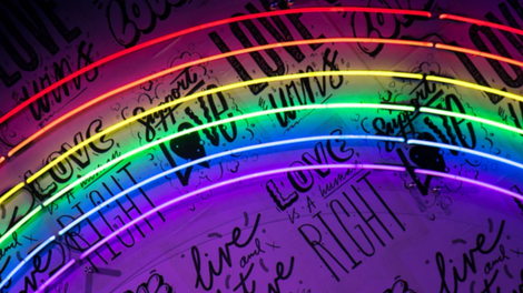
From newspaper headlines to books, postcards, and billboards, typographic elements are all around us.
With so many different typefaces and fonts, it's easy to forget that each one is suited to a specific end use, and designers should choose from them carefully.
.jpg)
Sometimes, the style of a typeface can evoke a more powerful message than the words themselves. But this isn't an accident—the designer behind it makes specific typography choices so that they can make the right impact in their design.
In some cases, designs feature typography that already exists in a software's library, while others include unique letter art that the designer has created themselves.
 Greg Christman
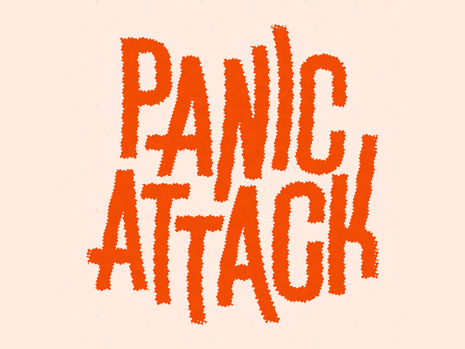
In this article, we will describe different typographic elements and their importance in design. And we'll also lift the lid on the five main types of typography and in which cases you can use them.
By the end of this article, you'll know how to choose the best font for your designs and how to create your own typefaces from scratch.
Jumpstart your ideas with Linearity Curve
Take your designs to the next level.
What is typography?
Typography dates back to the 11th century, and is the art of arranging type to make a design look appealing, clear, and legible.
Ross Bruggink
When it comes to typography, you will have to keep in mind the length of each line, the sizes of the points, the spacing between the letters, and the space between pairs of letters.
Today, typography is mainly associated with printed works and digital design. However, in the last decades—with the internet boom—the art of typography has received greater attention.
Today's web designers and type designers have an abundance of types and font options at their disposal, making it harder to select the one that fits best.
At the same time, this abundance has created the need to design custom types and fonts to allow designs to stand out.
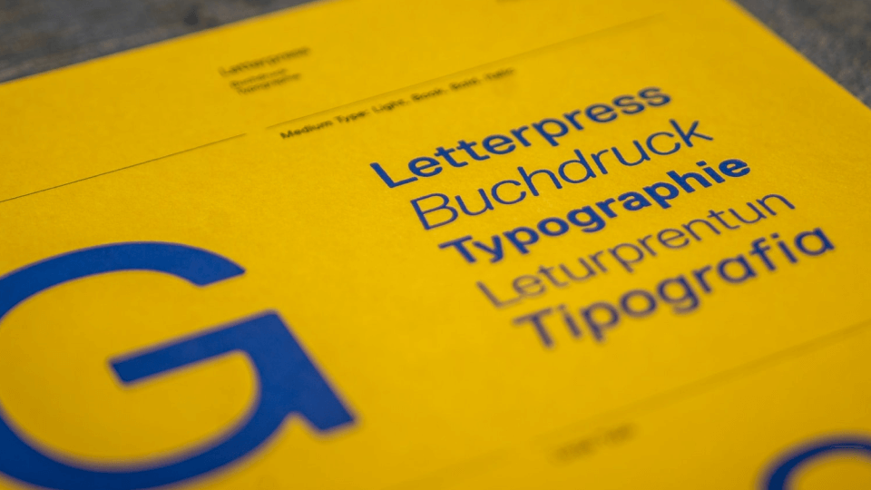
What's the difference between a font and a typeface?
There’s often confusion when using the terms "font" and "typeface" since they are treated as synonymous at times. We’ve been mentioning font and type quite a few times now, so let’s break it down to explain the difference between them.
The typeface, or as it is often called, the type family, is a collection of fonts related to one another. For instance, a typeface can be Roboto, and its fonts can be Roboto thin, Roboto light, Roboto regular, Roboto medium, etc.
Therefore, each variation of a typeface is called a font. Font refers to the variation of a type’s weight, width, and style.
What are the main types of typography?
There are five main types of typefaces: serif, sans serif, script, monospaced, and display. Types such as serif and sans serif are usually used for body copy. Sometimes, serif and sans serif typefaces are also used for headlines.
Let’s take a look at these typs in more detail, one-by-one.
Serif

The most classical typefaces out there are usually serif typefaces. Not only that, but serif typefaces are also the most original fonts since they date back to the Romans, who used to flare the endings of letter lines at the top and bottom.
Serif and sans serif can often be mixed up as they both contain the word, “serif.” If you have trouble differentiating them, look at the little “feet” at the top and bottom of each letter.

If you see those little “feet,” that means the font is a serif typeface. Times New Roman is the most famous serif typeface out there. These fonts are present in our daily lives in almost all the books we own or newspapers we read.
If you are a logo creator, a serif typeface will be your best friend. Serifs look great on the eye, and that's why they're often used for logos and print copy. Serif typefaces are also perfect for long body text since they are easily readable.
Master the Art of Kerning in Design
Delve into the essentials of kerning with our comprehensive tutorial in the Linearity Curve Academy. Learn how subtle adjustments can significantly enhance your typography.
Sans Serif
As explained earlier, sans serif typefaces are the ones that lack those little “feet.” Even though they originated back in the mid-nineteenth century, they became popular in the modern era, during the Twenties and Thirties.
Even nowadays, this style of typeface is considered one of the most modern choices if you want to select a typeface that looks clean and efficient.
Even though serif typefaces are pretty legible, sans serif typefaces can be even more legible because they look much cleaner.
If you need to pick a readable typeface in all sizes, then san serif is the way to go. You can use this style of typeface for super small displays, large billboards, headlines, and logos.
For digital screens in particular, a sans serif typeface is the most popular option.
Slab Serif

Slab serifs (also called square serif, Egyptian, mechanistic, or antique) are typefaces with large, impressive serifs.
This type of serif typeface is characterized by thick serifs that grab attention from miles away.
Therefore, if you need to emphasize a part of text or headline, slab serif is recommended.

This style of typeface dates back to the 19th century when it was used for pamphlets, aiming to “yell” the message from far away and still be visible enough to be read.
Later, the slab serif evolved into gentle forms that are perfect if you need a font that works for long paragraphs.
Nowadays, we can see several refined modern versions of this typeface. Nevertheless, even now, this typeface still evokes an artsy feel and vintage vibes. Slab serif will work incredibly well if you need to select a font that can instantly attract attention.
Script Fonts
Ever looked for a font that mimics cursive handwriting? Script fonts can make your wishes come true. This style of typeface is split into two categories: formal and casual.
Formal scripts bring back that 17th and 18th-century vibe. They are some of the fanciest scripts out there and would work great for wedding invitations or book covers (especially romantic ones).
Use this style of typeface wisely. If you overuse it, the whole concept of its formal fancy look might vanish. However, if there is one type of font that will never go out of style, it is a script font.
Casual scripts, on the other hand, are more legible than formal scripts. Originating from the twentieth century, casual scripts have a more “laid back” feel.
They are perfect for logos, pamphlets, and anything that needs a casual font to go with it.
Handwritten

As its name suggests, this type of font mimics the natural flow of handwriting. Yes, they are similar to script fonts.
However, unlike script typefaces, handwritten typefaces lack the “structure” and are harder to read.

This style of typeface would work best for posters, social media images, book covers, and headlines.
Handwritten types bring a unique touch to the way each letter looks, and allow brands to express their stories in a more personal way.
Why is typography important?
While it might seem like typography is just a matter of choosing stylish fonts that go well with your design, in reality, typography is much more than that.
It is a crucial element to any graphic design you need to create and an essential component of user interface (UI) design.
Taras Migulko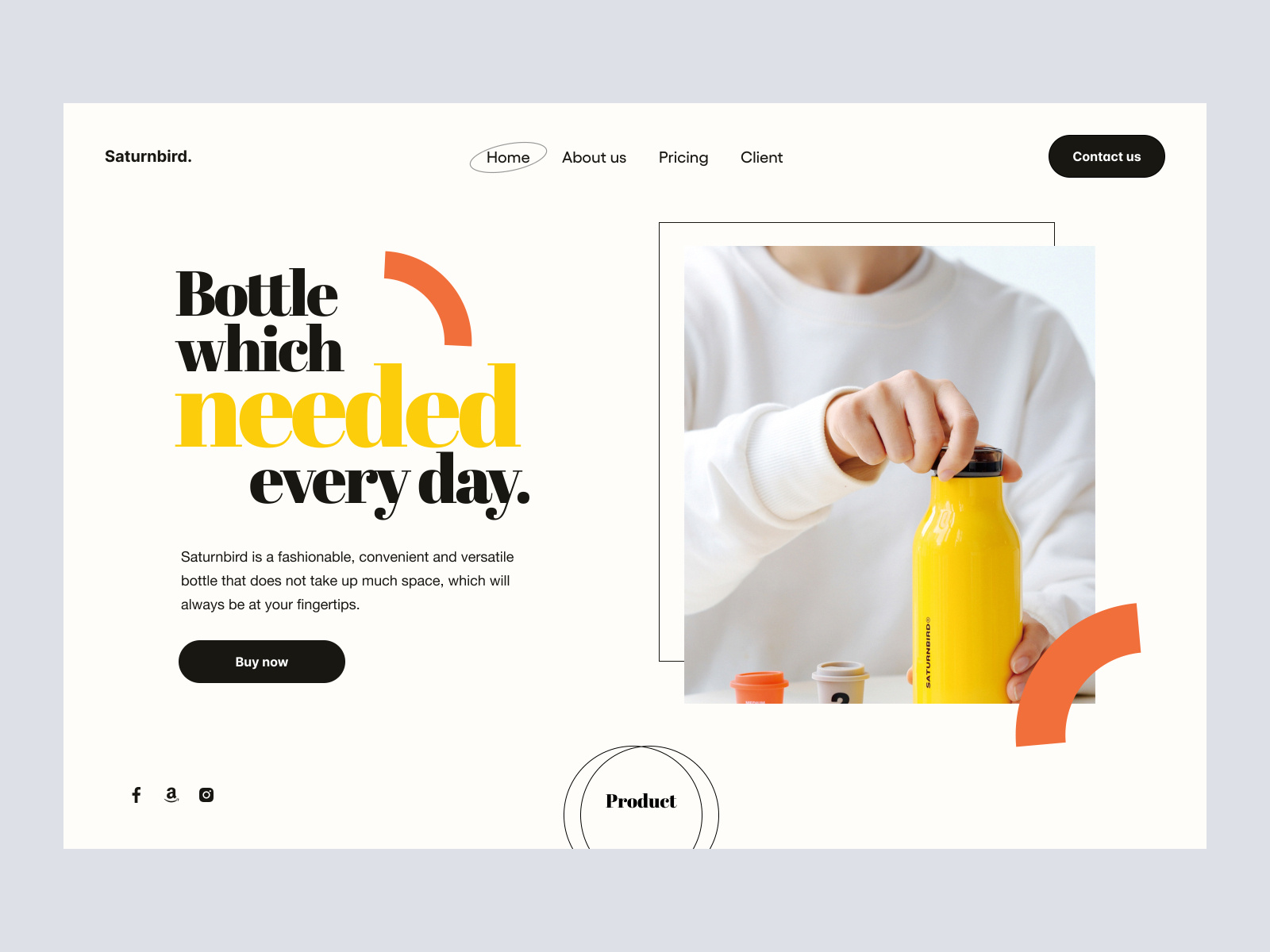
The right type design will help set a brand’s tone or a message you want to transmit to the viewers. Besides UI, typography is also needed to ensure a great user experience (UX).
Great typography can guide the user and inform them along the way.
Now, let's take a look at the reasons why typography is essential.
Typography can grab and hold a reader’s attention

Visuals are essential when it comes to grabbing readers’ attention. But the truth is, it is the textual content that brings people to your website and makes them stay.
So that's why you should find the right balance between graphics and the text.
Some visitors may stay on your website for less than a minute and bounce to another page. Some may last longer and read what you have to offer. Content and typography can play a crucial role in how long you hold the reader's attention.
The use of suitable typography that fits your brand and the image you aim to communicate will grab your readers’ attention and retain it.
The text you use for your website, logo, visual, or ad graphics should be visually stimulating and memorable.
Typography can make your brand recognizable

More often than not, the typeface you choose and the font you select for your brand will make people associate your brand with that particular type and font.
Once that level of association is reached, any product you introduce will be instantly connected with your brand image and values.
The same goes for the type and font you use for logo design. It can make the logo memorable and link it with your brand very well if you have chosen fonts that are unique, true to your brand, and memorable.
Ready to create brand assets that pack a punch?
Visit our Academy for free typography design courses.
Typography reflects professionalism

Let’s circle back to the importance of retaining the viewer's attention. When you select typography that conveys your professionalism, that will instil trust in your brand.
How often have you seen logos, book covers, and websites that use the wrong typeface, making the brand look unprofessional?
How often have you landed on a website and bounced right back just because the use of fonts and typefaces made the company look like a scam?
They say don’t judge a book by its cover, but we often make up our minds on a product or brand based on its visuals and typography.
The truth is, sometimes we judge books by their covers, so make sure you use appropriate typography to gain the trust of customers and retain that trust later on with excellent customer support.
Typography can help people trust the content you provide

While the world is recovering from a pandemic, the fight against the fake news and misinformation continues.
Typography can play a crucial role here as well. Why? Because of the way the information is presented. A strong, professional font can help readers to trust a website or news source and the information it provides.
So, typography, in this case, can help viewers feel more secure and trust the information you publish.
Typography can influence decision making
Connected to the point above, the more trust you can transmit through the correct typeface and font selection, the higher the chances you can “persuade” people to buy your products and services, read your website, and so on.
The same goes for the typeface and font you choose for your logo if the logo includes any text.
A great logo will help your brand become more recognizable and influence people to check out more about your brand and what you offer.
A few tips on how to choose the best type and font
Selecting a suitable typeface and font can be challenging, considering the overwhelming number of options you have in front of you.
However, there are some details you should pay closer attention to so that you make the right choice.
Pick a type and font that best represents the brand
Whether you need a font for a logo, packaging, or an official website, try to select a typeface and font that goes well with the personality of the brand and the message you want to convey.
If the message is serious or you need to relay important information, stay away from decorative fonts.
The less stylized, the less distraction there will be so that the viewers can remain concentrated on the message and not the art behind the type and font.
Pick a feeling you want to convey
Yes, fonts and typefaces can also evoke a feeling. A summer font, for instance, brings back a fresh, bright feeling, making the viewers reminisce about sunny weather, blue water, and palm trees. This can immediately put them into a “summer” mood full of energy to explore new places or chill at their favorite beach.
Luxury and comfort can also be conveyed through text. For example, a script font would be perfect for the menus of a fancy restaurant or hotel.
Test test test
If you are still unsure about the feelings you want to emulate when people land on your website or see the logo you have created for the first time, try to organize small workshops with your team to discuss this.
Before making a final decision, you can also test if the entire strategy works with a small sample of people who have not seen your brand or products before.
Later on, you can also gather helpful feedback from real users and update the typeface and font accordingly.
Think ahead of time

When choosing the most suitable typeface, it is vital to consider if the type you have selected will stand the test of time.
Thinking about this ahead of time will ensure that you do not make any drastic changes in the years to come.
Take Cartier, for instance. Their logo was designed in 1900, meaning it has not changed for over 12 decades.
Here are some other famous logos that you can use as an inspiration while designing your first or next logo. To make it easier for you, here are also the main types of logos.
Extra tips
No matter what kind of letter art you're creating, keep an eye on the key elements of typography:
- Type alignments
- Visual hierarchies
- White space
- Type sizes
- The space between lines
- The space between characters
- The space between baselines
You might also need to consider whether you need a larger type for the capital letter or the entire collection of letters.
After analyzing different lettering styles, you should decide whether you need a typeface with serifs or a typeface without serifs. Always make sure the one you select goes well with your user interface design.
Feeling inspired to create a custom typeface?
If you are looking for a digital typography, hand-lettering, and calligraphy tool, Vectornator should be your go-to.
Our powerful and intuitive free tool empowers you to create your own high-quality lettering designs. You can use our Camera Import feature to pull your physical pencil lettering sketches into Vectornator, and then you can use the Brush Tool and the Pen Tool to turn your letters into crisp, fluid vectors.
Once you've created all the characters in your new typeface using Vectornator, you can use an app like iFontMaker to compile them into a font file that can be installed and used on all your devices!
If you make your own custom font in Vectornator, be sure to show it off and tag us on social media!
We can't wait to see what you'll make!
Jumpstart your ideas with Linearity Curve
Take your designs to the next level.
Share this!
Ben Barnhart
Ben is a Content Lead for Linearity living in Berlin. His hobbies include board games, cooking, reading, and writing.