:quality(75))
:quality(75))


:quality(75))
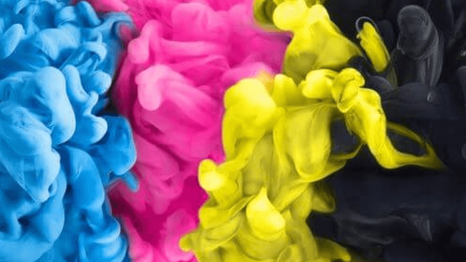
Here’s a question you might have asked yourself—why can’t I use RGB for print?
Well, you technically can, but there are a few reasons why you shouldn't. Today we'll be looking at the differences between RGB color and CMYK color, how to use them, and what it means for your designs.

Jumpstart your ideas with Linearity Curve
Take your designs to the next level.
What does RGB stand for?
RGB stands for the three primary colors—red, green, and blue—and it’s the color model of choice for designs that are meant to be seen on a screen.
Like web or UX/UI design, icons, thumbnails, covers, ads, and so on.
So all the graphics in this article were designed with the RGB color mode. But how does that work exactly?
The science behind RGB
The screen you are reading this article on is made up of millions of little dots called pixels.
The color of these pixel manipulates how the light on the screen is conveyed in order to create the color of the words and images that you are seeing right now. And each pixel in itself is divided into 3 subpixels; one red, one green, and one blue.
The way that these subpixels are activated in varying intensities will define the color that the pixel takes.
And because RGB values are displayed in a range between 0 - 255, it means that there are 256 levels of each of the three colors that can be combined together to create a hue on the spectrum between black and white.
This results in 16,777,216 different colors that can be represented in the RGB color space. Which is a much higher number than what the human eye can perceive.
While it’s super hard to pinpoint an exact number, as human perception differs from one person to another, BBC estimates that "the average number of colous we can distinguish is around a million."
So the age-old question, "can all colors be described with RGB?", is a hard one. Because technically the answer is "no," since there are a finite number of hues that RGB can reproduce. But this finite number is a lot more than the visible color spectrum and what the human eye can perceive, so then, subjectively the answer is "yes." Since we cannot see more colors than what RGB shows us.
How RGB colors are formed?
The RGB color mode combines different quantities of red, green, and blue light to form just about every other color you can imagine.
Designers can control properties like saturation and value by modifying any of the three source colors.
Let’s start with some basics. If only the red and the blue subpixels are activated at 255 intensity, the resulting color is cyan. So then the RGB value for pure cyan is:
R: 255 | G: 0 | B: 255

And if all 3 subpixels are mixed together at maximum intensity, then the result is white light. Therefore, white looks like this:
R: 255 | G: 255 | B: 255
This is different from what we learned in art class, that’s because we need to think about biology instead. It’s not about mixing different pigments on a color palette, but rather understanding how the cone cells in our eyes perceives color when simultaneously stimulated.
On the opposite side of the spectrum, the RGB value for the color black is:
R: 0 | G: 0 | B: 0
This means that there is 0 red light, 0 green light, and 0 blue light. Or in other words, there is a complete absence of light, resulting in a pure black color.
Because of the way the colors are formed, RGB is also known as an additive color model. All colors start with a black pixel, and then colors of light are added to create the perfect hue.
Ready to create brand assets that pack a punch?
Visit our Academy to learn how to use color palettes.
When to use RGB?
In short, RGB is meant for any designs that will be viewed on a digital screen.
But that does not stop at your laptop, tablet, or phone. This also applies to TVs, cinema screens, and camera displays.

Use RGB for any of the following projects:
- Web design
- App design
- UX/UI design
- Digital graphics
- Social media content
- Digital Adds
- Thumbnails
- Covers
- Profile Pictures
- Icons
- Infographics
- Digital Photography
- Digital Designs
- Digital Logos
- Digital Images
- All video content
As a result, the best file formats for RGB are .jpg, .png, .gif, .pdf, as well as any design software-specific files like .figma, .sketch, and also .vectornator, if your design is meant for digital use.
What does CMYK stand for?
CMYK stands for cyan, magenta, yellow, and key, as in black.
It’s called key because of the key plate, and the fact that black is the main color used to define your image, by providing depth and shading. Whereas the other colors create different hues depending on how they are mixed.

This term derives from the printing press days and is used for anything that is printed with ink.
Books, magazines, cards, posters, any printed material you can imagine.
The way a printer works is by starting with white paper, and then applying single consecutive layers each color one by one until the desired color is achieved. Each color is applied with a different printing plate, meaning that CMYK printers have four different plates, each with its own pigment.
:quality(75))
:quality(75))
The science behind CMYK
If you look with a magnifying glass at a printed image, you will notice how it’s made of tiny dots of ink that are either cyan, magenta, yellow, or black.
The bigger the dot of a certain color, the more that color is represented. And because the colors are semi-transparent, when combined in various proportions, they create the full spectrum of the color wheel.

As opposed to RGB, CMYK uses a subtractive model.
All colors start as blank white, and each layer of ink reduces the initial brightness and absorbs light in a way to create the preferred pigment.
For example, if you completely overlap a magenta and yellow dot, or more precisely, subtract yellow from magenta, you end up with a bright red color. If you subtract yellow from cyan, you would end up with green.
But what happens if you combine cyan, magenta, and yellow together? You end up with a dark brown color. That is the reason the fourth color (aka black) was added to this model; in order to remove light completely from the image and display the color in its purest possible form.

Interestingly enough, printing experts recommend you combine all colors (cyan, magenta, yellow, and black) on top of each other in the below proportions in order to get rich black. Setting everything to 100% is a bit overkill, since you’ll end up having way too much ink on the paper
C: 75% | M: 68% | Y: 67% | K: 90%
But you should use plain black for text, as it will look dark enough against the usual white paper. Plus, if any of the cyan, magenta, yellow, and black printing plates are even ever so slightly misaligned, then you’ll end up with a colored shadow.

As you may have noticed, the CMYK colors are represented in percentages, from 0% to 100%. So if you want to get pure blue, you have to combine:
C: 100% | M:100% | Y: 0% | B: 0%
When to use CMYK?
The CMYK color model is required for any design that is meant to be physically printed in ink. So rely on it for the following type of design projects:
- Posters
- Magazines
- Business Cards
- Stationary
- Stickers
- Physical ads
- Flyers
- Brochures
- Any type of merch like T-shirts, mugs, caps, and so on
- Packaging
- Menus
- Signs
- Book covers
And the list goes on.

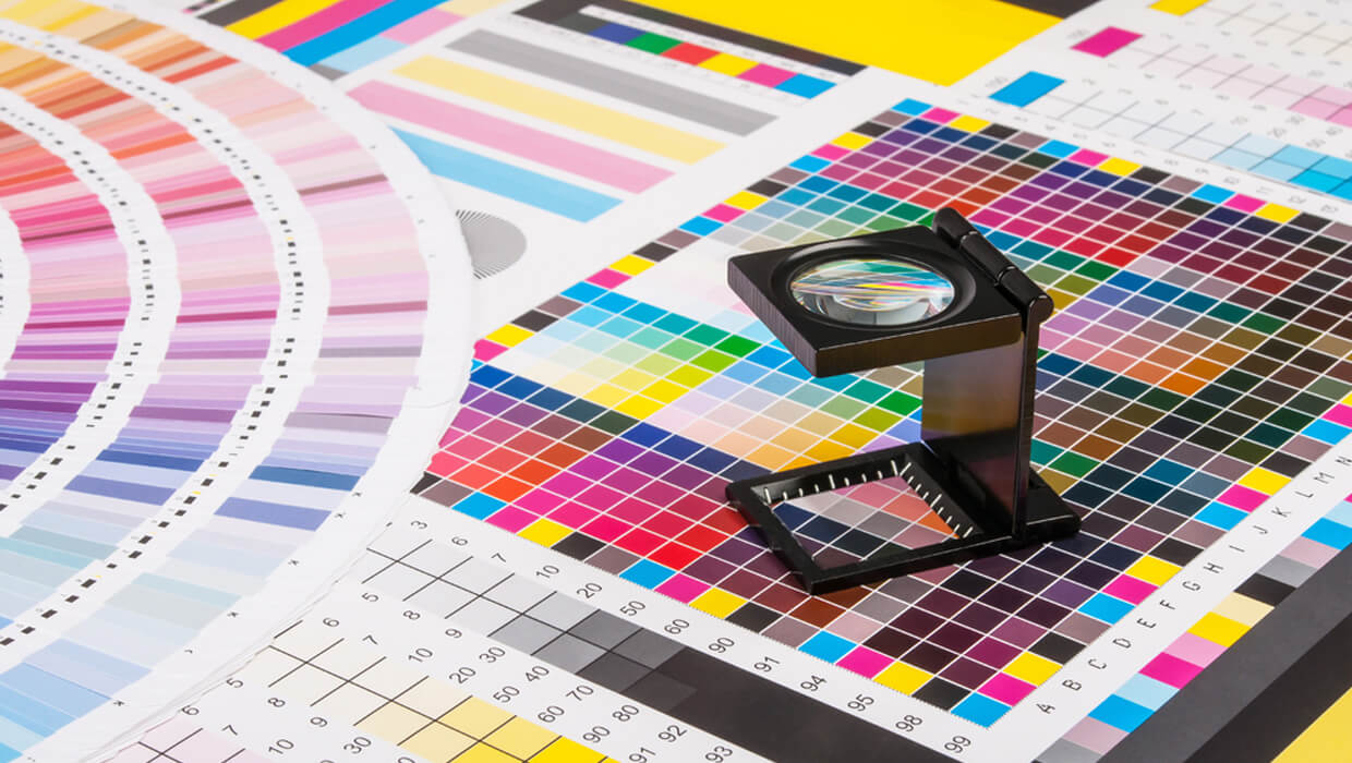
It comes as no surprise that a PDF file format will be your best bet for any printed material.
It’s what most printing companies will require when you hand in the final print file.
Moreover, when working with print files, the best type of graphics you could possibly choose are vectors. They make for excellent candidates because they look great no matter the resolution or zoom.
Bonus: pantone colors
If you want your print file to contain an exact hue that is outside the CMYK color gamut, then there is the possibility of sport-printing and using Pantone colors instead.
A Pantone color is a specific numbered color in the Pantone Matching System® that is accurately defined in order to facilitate precise and consistent color-matching, across multiple production runs, printing vendors, or machines.
Ready to create brand assets that pack a punch?
Visit our Academy to learn how to use color palettes.
You might have heard about the Pantone color of the year, for example.
As opposed to CMYK, where each color is separated into the four main colors and mixed one by one using four different printing plates; the sport-printing process involves the printing company mixing the color using predetermined, published color formulas and applying it separately on an extra printing plate.
But this accurate color match process is not cheap. The more Pantone colors you need, the more expensive it will get!
There is a special subset of Pantone hues that can be reproduced using CMYK colors.
But most of the 1,114 Pantone spot colors are simulated using 14 base pigments mixed in specified amounts. Allowing the Pantone system to create more special colors, such as metallics, fluorescents, and pure saturated colors which are impossible to achieve in CMYK.
But if RGB can render millions of colors, can they reproduce Pantones? Definitely. Since 2001, the Pantone brand has been providing translations of their colors with RGB values, so you can check them out digitally as well.
Why does color mode matter?

Because the RGB scheme has a greater range of colors, CMYK cannot produce brighter colors.
These hues are beyond the CMYK range and will come out darker and more dull when printed than what you see on your display.
When designing, one of the biggest mistakes you can make is not converting your file in the appropriate color mode for your project.
Documents shown in CMYK mode will always show up precisely on-screen as they will do when printed. RGB colors, however, will not necessarily appear in print as they do on-screen and you may end up having a very shocking surprise when seeing your final product!
But the low number of shades produced by the CMYK model comes with its advantages. They are easier to standardize, which means that printing companies keep all of your products looking perfectly consistent throughout the print run.
There are so many minute variations possible in the RGB spectrum, that it's close to impossible to guarantee consistency of colors across a printing project.
How to view CMYK colors on your screen?

In Linearity Curve (formerly Vectornator), there is a super simple switch that you need to turn on in order to view your files correctly for the print process.
Access the Quick Settings in the upper left corner by clicking on the gear icon. Go to CMYK Preview and use the switch to toggle the CMYK Preview Mode. Once turned on, you'll see your document in CMYK colors.
You can perform the same action as you are exporting your file in .pdf, .jpg, or .png. Just as a final check that everything looks right.
And there you have it. This is why you should not use an RGB file for print. Next time you are designing a sticker, or a tattoo flash, you will know how important it is to set your color profiles right.
If you want to experiment with these color modes, you can download Linearity Curve (formerly Vectornator) for free! If you create anything with our app, tag us on socials to get featured. We love seeing where your creativity takes you.
Jumpstart
your ideas with
Linearity Curve
Take your designs to the next level.
Share this!
Lavinia Aparaschivei
Lavinia is a contributing writer to the Linearity Blog.


.png)