:quality(75))
:quality(75))


:quality(75))
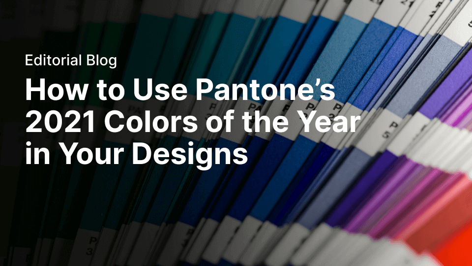
What does Pantone color mean?
Pantone is a color company. But what does that mean?
It isn’t a paint company or a design firm.
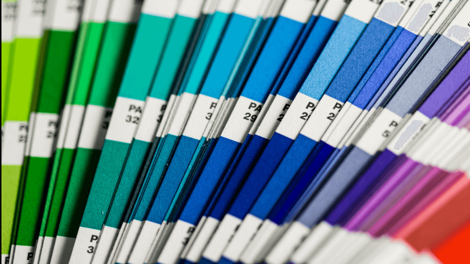
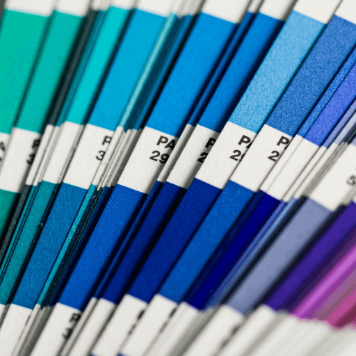
Pantone is most famously known for its popular color-matching system, the Pantone Color System. It was developed in 1963 as an answer to the complicated problem of matching and standardizing colors in the printing and manufacturing industries.

The Pantone color-matching system has become the most widely used color matching system in the world, offering users a sort of “color bible” that ensures that people across the world are all using the same colors in their printed material and designs. This is especially crucial in the manufacturing and design industries, where color accuracy is a vital part of successful design.
So when a designer uses a number code to refer to a specific color, they can rest assured knowing that the printer or manufacturer they are working with knows exactly which color they are referring to, and will be able to reproduce that color perfectly in the final physical product.
Pantone also has a separate branch, known as the Pantone Color Institute (PCI). The PCI is a color consultancy firm that specializes in predicting color trends and helping companies, designers, and marketers choose exactly the right color palette and shade for their brands and products.
Jumpstart your ideas with Linearity Curve
Take your designs to the next level.
What is the Pantone color of the year?
Every year for the past two decades, the color experts at the PCI have chosen a Color of the Year.
This color is chosen every December by a secret committee of representatives from many different nations and is meant to represent and reflect the feeling, character, and mood of the upcoming year expressed through color harmonies. Often they take inspiration from fashion, current events, or nature's intrinsic colors like greenery or living coral.
The Pantone Color of the Year is a force to be reckoned with; creating many wide-ranging and trendsetting influences in the design industry and the product design world, including fashion, home furnishings, and industrial design, as well as product packaging and graphic design.

There are many factors that go into their decision each year. The committee takes the time to consider all aspects of global society when making their decision; from the recent trends in the fashion and marketing industry to the major natural and political events of the past year.
In 2000, the first year of its existence, the Pantone Color of the Year was PANTONE 15-4020 Cerulean Blue; a cool blue tone described as “the color of the sky at dusk.” Since then, past years’ colors have included PANTONE 15-5217 Blue Turquoise, PANTONE 17-1463 Tangerine Tango, and PANTONE 18-3224 Radiant Orchid.
Ready to create brand assets that pack a punch?
Visit our Academy to learn how to use color palettes.
In 2016, the PCI broke their own tradition by choosing two Colors of the Year: 13-1520 Rose Quartz and 15-3919 Serenity. This was the first time that two colors had been chosen for the same year. But it wasn’t the last time that a color combination would be in the year’s spotlight. The VP of the PCI had this to say in 2016:
"Colors we select to be the Pantone Color of the Year are reflective of what is taking place in our culture. These are not just a flash in the pan, but rather serve as an expression of a mood and an attitude on the part of the consumers. A color that gets selected is a color that will resonate around the world; a color that reflects what people are looking for, what they feel they need, that color can help to answer."
- Laurie Pressman, Vice President of the Pantone Color Institute
Every year since it was introduced, the Pantone Color of the Year has set the tone for the year to follow in the worlds of fashion, decor, design, and branding. Time and time again, they have shown their skill at capturing a particular moment in time in the form of a specific color.
What is the Pantone color of the year 2021?
Normally, the PCI chooses just one color of the year. But in both 2016 and 2021, they chose two. For 2021, they chose Pantone 13-0647 Illuminating and Pantone 17-5104 Ultimate Gray. The first of 2021's chosen colors, Ultimate Gray, is a neutral color meant to evoke images of practicality and solidity, while the second color, Illuminating, is meant to bring a feeling of beauty, optimism, and warmth to the year. Together, the bright yellow stands out alongside the calming, warm gray.
“The union of an enduring Ultimate Gray with the vibrant yellow Illuminating expresses a message of positivity supported by fortitude. Practical and rock-solid but at the same time warming and optimistic, this is a color combination that gives us resilience and hope. We need to feel encouraged and uplifted, this is essential to the human spirit.” - Leatrice Eiseman, Executive Director of the Pantone Color Institute
Together, Pantone intends for the combination to bring a message of “happiness supported by fortitude” to this upcoming year. Pantone’s full explanation of this year’s colors can be found here.
The Pantone color system
The Pantone Color of the Year 2020 was 19-4052 Classic Blue, a sophisticated shade of deep blue that conveyed dependability and steadfastness; a firm foundation for the new decade. Each year, the new chosen shade from the Pantone color system sets the tone for the year ahead.
Each color system approaches the concept of color in a different way.
Pantone colors are each defined as singular units, which are created from 13 different pigments to form an extremely specific shade.
CMYK, in contrast, is a simpler system used mostly for print work. The name itself comes from the four different colors used by most printers: Cyan, Magenta, Yellow, and Black.
Ready to create brand assets that pack a punch?
Visit our Academy for free marketing color design courses.
RGB is used mostly in digital contexts, as it refers to the three types of light that digital screens use to create colors: Red, Green, and Blue.
RAL is the most niche color system and is mainly used in contexts where color needs to be physically coated onto an object, such as a car or a bicycle. It's used mainly because it accounts for things like glossy vs matte colors, as well as metallic colors.
How can the Pantone colors of the year be used?
But how can these colors be used in your designs? Beyond just importing the colors themselves into your color palette, how can these colors be used in a way that harmonizes with Pantone's vision?
Whether in illustration, graphic design, or decor trends, here are a few examples of how designers have been using them so far this year:
Oksana Lehaieva
This artist used the two base colors in her illustration but also included complimentary neutral and gray shades to give her piece a sense of depth.
L'Occitane
L'Occitane used a similar yellow in their packaging, providing a vibrant background for their embossed illustrated lines. The silver-gray of the lettering gives a softer edge to the product design; highlighting its serene qualities.
Huge Inc.
Huge Inc. created these mugs that mimic the look of an iconic Pantone color swatch. The two colors of the year get combined together into one beautiful mug.
Although normally color swatches are considered to be tools for designers to use as independent colors, sometimes the color wheel naturally lends itself to color harmonies on its own.
It takes two to make the 2021 Pantone Color(s) of the Year – @pantone x @hugeinc. Read more via @nytimes.https://t.co/GD5zViAAgT pic.twitter.com/n2SUJ1NWPm
— Huge (@hugeinc) December 10, 2020
Fossan Design
Here, Fossan Design showcased the gray and yellow shades of the colors of the year in a mesmerizing floral fabric collection.
Pantone color institute
Here, Pantone themselves cleverly showcase their color pair naturally occurring in the natural elements of the world in the form of painted yellow lines on an open road. The yellow reminds us of solar power in a certain way. Whether your travel destination is a mountain or a sandy beach, you'll always have these colors' message of strength with you: Positivity supported by Fortitude.
Sofa Surfing Event Poster
Here, the designer used the colors of the year as the foundation of their event poster!
Davin and Nathan textile design
This textile print design studio used the colors of the year in a striking floral painting. Desaturated gray flowers contrast with the vibrant yellow guache in the background.
Designer, Iryna Pakhomova
This artist used the new colors of the year to create a surreal sense of space in this piece. Here, the hopefulness of the cheerful yellow greatly outweighs the gray.
JATAesthetic
This painting, titled "Edification", shows off this year's reliable color combination in a beautiful way. It's clear that this year's colors will stand the test of time.
Jessica Moritz
This artist layered the vivacity of yellow together with different shades and tones of gray to create a feeling of confidence and subtlety.
Pantone fashion design contest
The colors of the year are particularly interesting for fashion design, and Pantone knows it. For designers in the US and Canada, they ran a fashion design contest earlier this year. Keep an eye out for the Pantone Color of the Year 2022 Fashion Design Contest that will surely be coming soon!
It's clear that the applications and uses for these Colors of the Year are nearly endless, and help to provide designers with a deeper understanding of color theory. Will you be using these colors in your upcoming designs? If you do, use the hashtag #Curve to let us know!
Jumpstart your ideas with Linearity Curve
Take your designs to the next level.
Share this!
Ben Barnhart
Ben is a Content Lead for Linearity living in Berlin. His hobbies include board games, cooking, reading, and writing.