:quality(75))
:quality(75))


:quality(75))
Design moves fast. Really fast. What’s amazing today might not necessarily be what’s “in” tomorrow.
While it’s great that we all get cool updates to our apps, interfaces, and phones, there is an issue. Some of our most beloved design trends have passed away. May they RIP. Remembering some of them gives me a strong feeling of nostalgia.
Jumpstart your ideas with Linearity Curve
Take your designs to the next level.
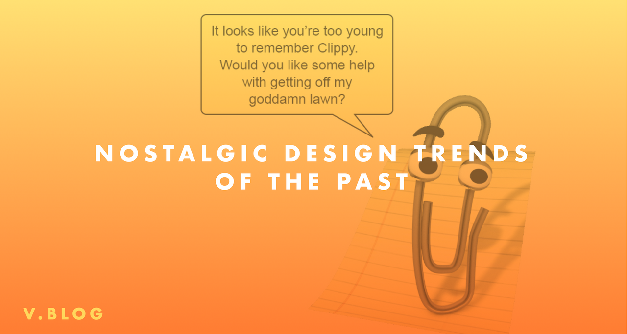
Everyone has fond memories of interacting with Clippy the cute Office Assistant that lived in our Microsoft Word documents. Of course, not all memories of these long-gone trends are in a positive light. On the other side of the love-hate spectrum, I’m sure I’m not the only one that still gets angry thinking about the notoriously long waiting time just staring at Apple’s “Spinning Wheel of Death” on their old white 2010 Macbook Pro. But even those frustrations associated with these design elements of the past make us think fondly about how we interacted with our interfaces.

Experiencing nostalgia leaves us with a warm, fuzzy feeling. That’s why designers and marketers are so set on capitalizing on it. Nostalgia plays a powerful part in branding, web design, product development, social media trends, and immersive brand experiences.Nostalgia allows companies to tap into consumers’ memories and create positive associations with their products and brand. In today’s world, this means both more conversions and social media buzz. Who doesn’t want that?This got our team at Vectornator thinking.
We made a list of all of the design trends of the past that is going to leave you feeling nostalgic by the end of this article!
Clippy

Let’s get this one out of the way first. Love him or hate him, Clippy is a legend. He was Microsoft’s answer to making Word more user-friendly. Although some may have found his presence annoying, the cute paperclip avatar was always ready to help you with whatever you were working on! Sure, Clippy wasn’t very helpful and that’s why he was ultimately removed from Office 2007 onwards but he still has got us thinking about the past!Gone but not to be forgotten, as Clippy still appears in memes.
Word art

Does WordArt ever make things look better?[/caption]This trend is a real blast from the past. For some reason that can not be scientifically decoded, all High School powerpoints from the late 1990s to early 2000s had to have this incredible work of art. Rumour has it that this design trend was apparently the only way to get an A on your class project and a pat on the back from your not so tech-savvy teacher.Although hideous, many people even today associate using Word Art for school work and class PPT presentations.
Ready to create brand assets that pack a punch?
Visit our Academy for free marketing design courses.
Websites: under construction pages

In this race for every company, school, brand and sometimes even people to have a website in the 2000s, everyone was in a hurry to secure their domain name. What about the content you may ask? Doesn’t matter!This was the birth of the concept of Under Construction web pages which are now looked upon in the web design community as a whole. While this embarrassing chapter of under construction logos on websites has closed, it still contributes to defining design trends from yesteryears.
Old typefaces

Arial was the most popular font that was released in 1990 and still is one of the default choices for many. I’m sure less of you know or recognize fonts like Art Deco and Alpengeist that came out over the next couple of years. These alongside other old typefaces absolutely dominated the old days.Although now there's a lot of cool fonts that exist which provide the retro feel remind us of the 90s!
Skeuomorphic design

Skeuomorphic Design belongs on this list. Its designs that mimic their real-life counterparts. This took a lot of designers by storm. Everything from calendars, notepads, calculators on a digital interface was immediately changed to a skeuomorphic one. It’s still prevalent and popular till today!
Vaporwave design

This was the go-to design strategy for people trying to make their illustrations look futuristic. Now that it’s 2020, it has been given the retro-futuristic title.
Naturally, the futuristic effect was well exploited by a lot of companies. This aesthetic and design trend allowed a lot of brands to appear prepared for the future and ready to take on the world.
That brings our list to a close. Let us know what makes you feel the most nostalgic when it comes to design!
If you’re reading this, chances are that you are interested in the profession. We urge you to download our graphic design software that will help you get started on the right path! You can also check out our tutorials on our Youtube channel!
Jumpstart your ideas with Linearity Curve
Take your designs to the next level.
Share this!
Ben Barnhart
Ben is a Content Lead for Linearity living in Berlin. His hobbies include board games, cooking, reading, and writing.