:quality(75))
:quality(75))


:quality(75))
Nature can be incredibly comforting and healing. We all feel better when we spend some time outside, so why not incorporate some natural elements into your graphic designs?
With the craziness of this past year, going outside hasn’t been as easy as it once was. This might be one of the reasons that there has recently been an increased interest in natural color palettes and nature-inspired design.

Artists are bringing the “outside” into their art and designs, and we are totally here for it.
As a designer, you can enable your audience to travel outside through your work by using nature-inspired color palettes. This article will discuss natural color palettes and give some examples of designs with beautiful nature-inspired color schemes.
The beautiful colors and calming nature of these designs will definitely leave you feeling inspired and ready for a hike.
Jumpstart your ideas with Linearity Curve
Take your designs to the next level.
Why design trends matter
Natural color palettes are incredibly trendy right now. But why do design trends matter?
It comes down to so much more than just keeping up with what is popular. As a designer, being aware of popular trends can help you come up with new design ideas and enhance your skills.
Design trends also tell us a lot about what is happening in the world. For example, the trend of natural designs has likely evolved from the global pandemic that defined much of 2020 and now 2021.
Responding and adapting to this trend means that your work will likely be more popular and well-received.
The ability to stay up to date with trends can also give you an edge over designers who stick to the same style. The best designers are constantly evolving their style and learning new skills.
.jpg)
Plus, you might end up using awesome color combinations that you wouldn’t normally think of. If your classic color scheme uses muted or dark colors, but you notice a trend encouraging pastel colors or bright colors, you should try it out! Always be looking to try out new things. Your design skills will thank you.
Now, let’s discuss how you can use this natural color palette trend in your designs.
How to use color palettes in design
Color palettes, similar to color schemes, are a collection of colors. Often, these color choices are paired together because they are complimentary or share color families.
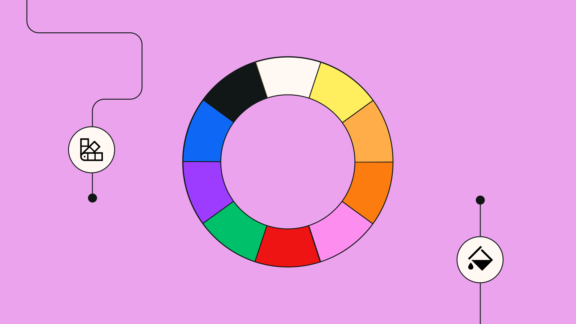
Let’s brush up a bit on color theory and talk about the colors of the rainbow, the color wheel, and complementary colors.
The color wheel organizes colors around a circle and demonstrates the relationships between primary colors, secondary colors, and tertiary colors.

First, let's do a quick rundown of some basic color palette theory, just in case you need a refresher.
There are four main types of color palettes:
- Monochromatic Color Palettes
- Analogous Color Palettes
- Complementary Color Palettes
- Triadic Color Palettes
The basic rainbow colors are red, orange, yellow, green, blue, indigo, and violet.
The most common color companions or complementary colors are:
- Red and green
- Yellow and purple
- Orange and blue
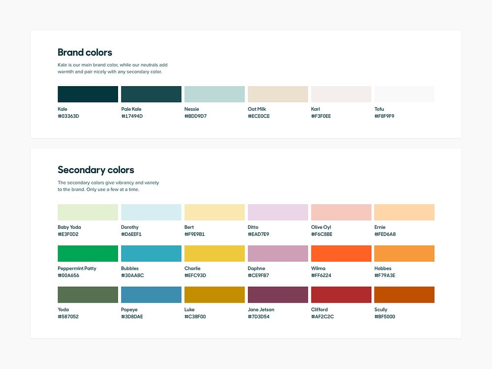
Often brands create some sort of color palette to define their brand, known as brand colors. These colors are then used across their branded material, such as their website, logo, ads, and designs.
Here’s an excellent example of what a brand’s color palette design can look like.
Now that we’re familiar with color palettes and have brushed up on our color theory, let’s get more specific about what a natural color palette is.
What is a natural color palette?
A natural color palette is a bit of a vague concept. There are a variety of colors that you will see in the wild: neon orange, vibrant purple, and lime green.
But, nature-inspired colors can also be earthy tones, neutral colors, or a brown color palette. There is a massive range of colors that could be considered a natural color palette.
Ready to create brand assets that pack a punch?
Visit our Academy to learn how to use color palettes.
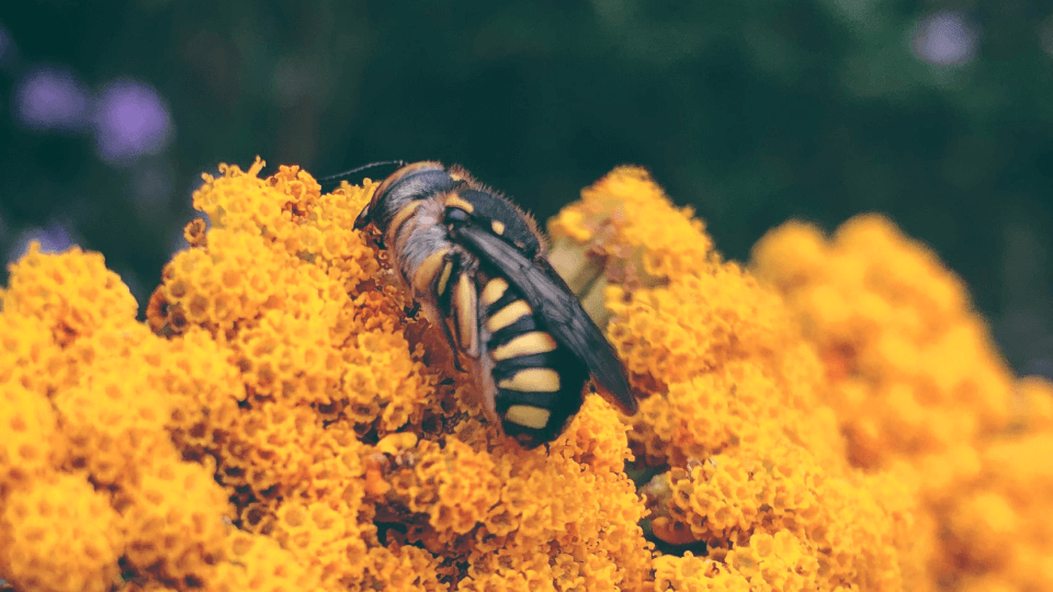
Think of lush forests, the rich green color of moss, vibrant citrusy colors, the orange hues of rocky deserts, or the vibrant color of wildflowers. There is tons of color inspiration in nature and a vast collection of colors you can use in your natural color palette.
Here are some examples of the themes and colors found in nature-inspired color palettes.
Popular colors and themes of natural color palette
There are so many color variations and color families associated with nature. Below, we’ll go over some of the most common palettes that we see.
Keep color in mind when you look at the examples, and think about which palette suits your design set best.
The traditional colors that you most often see in natural color palettes are tan, green, and white. But there is not one singular color palette that is considered the definitive natural color palette. There is a lot of variety within nature.
Here’s some examples of a few essential natural color palettes with the most common colors you see in nature.
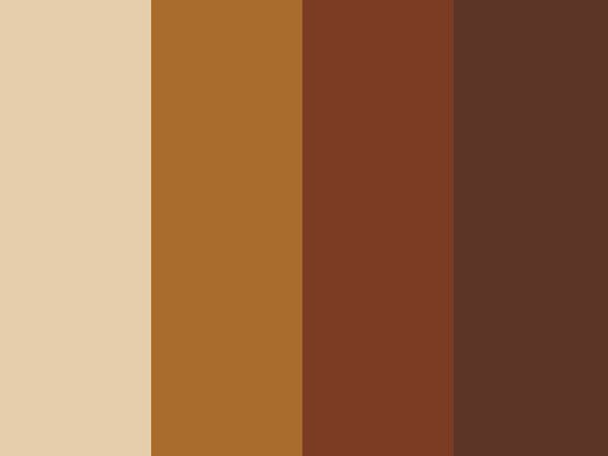
Variations of the color brown come up a lot in nature: dirt, tree trunks, and sand to name just a few. Here’s an example of a brown color palette ranging from light copper to dark chestnut.
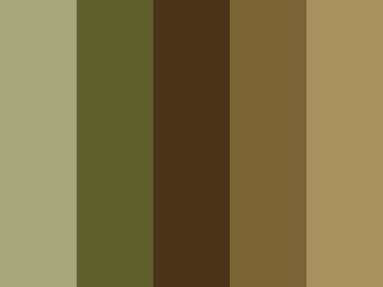
A common theme or palette for natural designs is ‘the colors of the forest.’ This includes fresh green colors, deep mossy colors, and woody browns.

You can also consider using stormy or sea colors in your natural color palette. Colors you often see in the sea or when it is stormy are ash grays and a palette of blues with blue undertones and gray undertones.

Another exciting palette to consider is citrus tones. These crisp colors include vibrant yellow, blood orange, and lime green.
Berry tones are another interesting take on the concept of a natural color palette. You can use bright cherry red, peachy orange, or grape purple.

Now, let’s take a look at some examples of how designers use a natural color palette in their designs.
:quality(75))
:quality(75))
Examples of designs with natural color palettes
Now that we’ve covered how and why to use a natural color palette, let’s look at some designs with nature-inspired palettes.
Hopefully, these design experts who found inspiration in nature can be a source of inspiration to you as you try to create a design with a natural color palette.
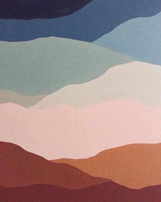
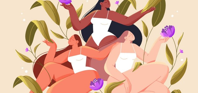
The blue flowers and abstract shapes in this image stand out among the natural tan color in the background. This is a great use of a natural color palette paired with a nature-themed design.
The blue in this image looks like a strong, bold color against the neutral background.
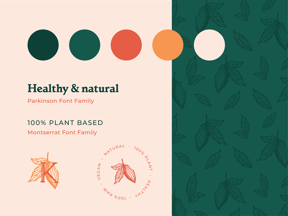
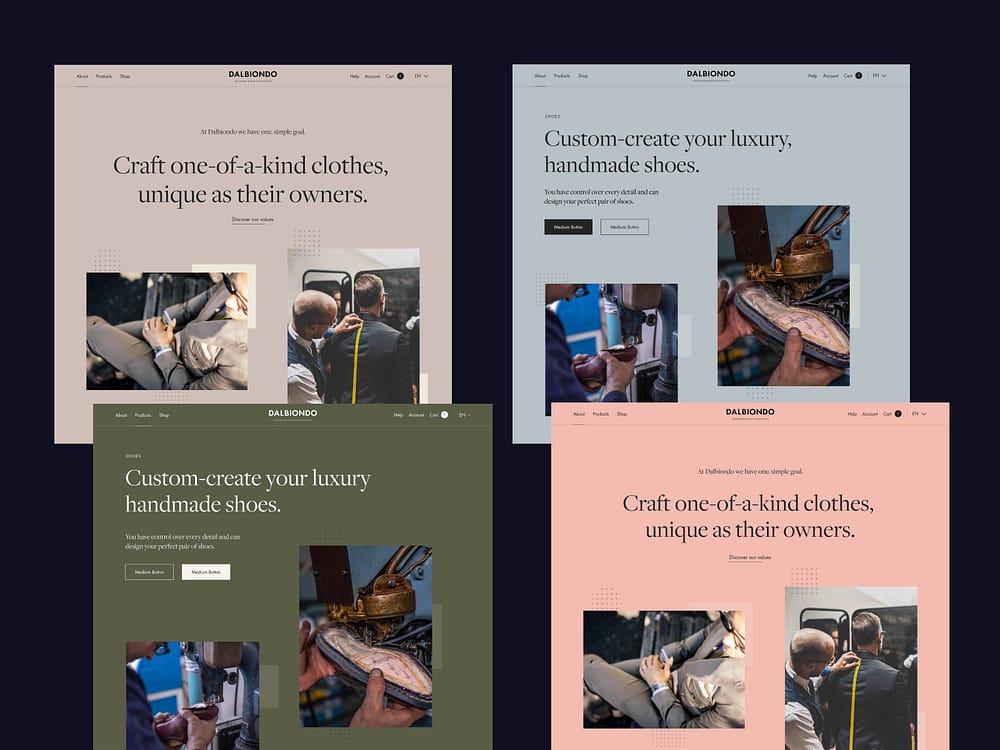
This is a great example of brand guidelines that use a natural color scheme. There are a few bright colors which are grounded by the tan and green colors.
You can tell from these guidelines and words on the image that this is a natural, holistic brand, and their chosen colors fit their brand perfectly.
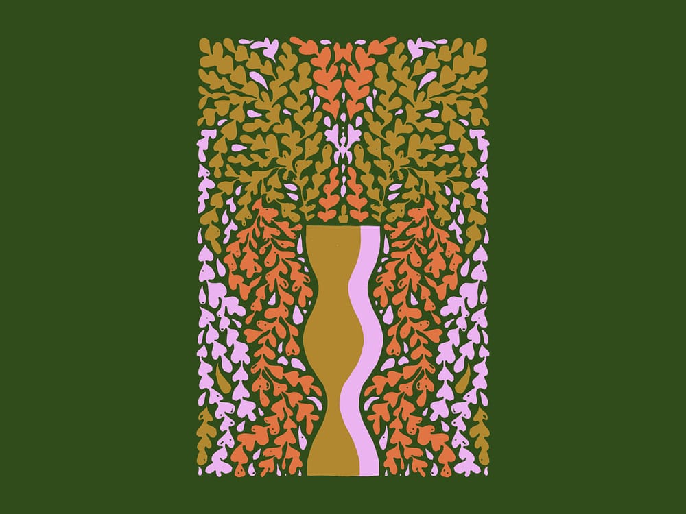
This beautiful design was created using nature-themed objects. The earthy tones in this image perfectly complement the design.
This design uses a more vibrant color palette while still remaining natural. The design and the color scheme are beautiful examples of using nature to inspire design.
We love this natural color palette mood board. Both the design and the fashion incorporate a natural color palette.
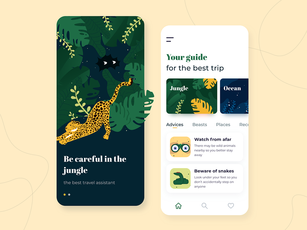
This mobile app mock-up is another amazing example of how varied natural color palettes can be. The bold colors and forest imagery used in this design are an exciting departure from some of the more muted designs above.
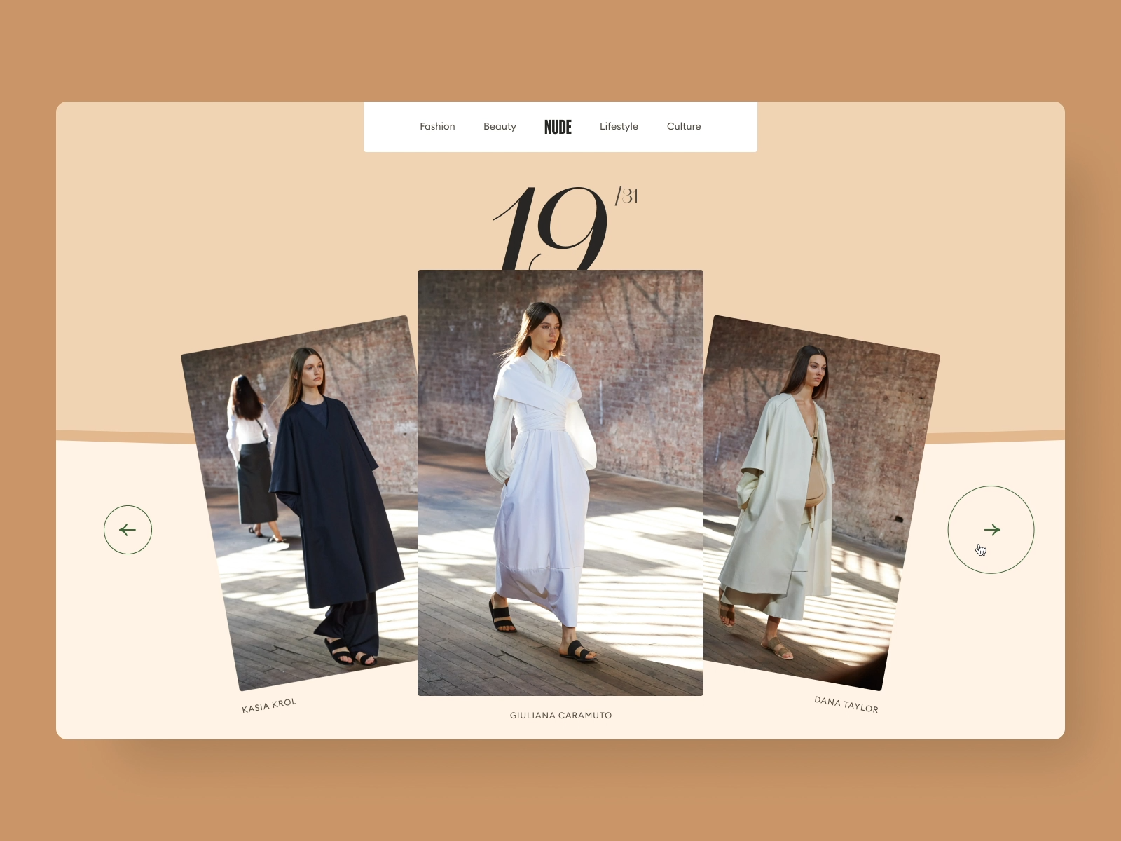
This website mock-up for a fashion brand uses natural colors to emphasize the way the clothes themselves are crafted. We love the website design and the colors that the designer selected.
This sort of color palette can be used for brands that want to remind their audience that they are natural and sustainable.
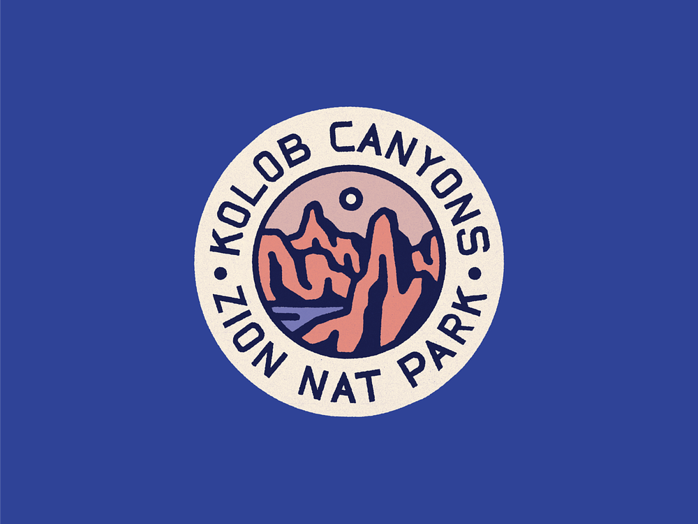
This final example is another way to emphasize the sentiment behind a brand using a natural color palette. In this case, the design was done for Zion National Park.
The colors perfectly represent the natural themes and spirit of the park and remind the viewer of the colors commonly found in this desert landscape.
Ready to create brand assets that pack a punch?
Visit our Academy for free marketing design courses.
Wrap up
A color palette reflective of the moment in time that we are in is a magical thing. With more people craving nature-inspired designs, it’s a perfect time to break out your natural color palette.
Hopefully, this article has inspired you to create your own natural designs. Download Linearity Curve today and start designing!
Follow us on socials and mention us in posts with your designs. We love to see your color visions come to life!
Jumpstart your ideas with Linearity Curve
Take your designs to the next level.
Share this!
Ben Barnhart
Ben is a Content Lead for Linearity living in Berlin. His hobbies include board games, cooking, reading, and writing.


