:quality(75))
:quality(75))


:quality(75))
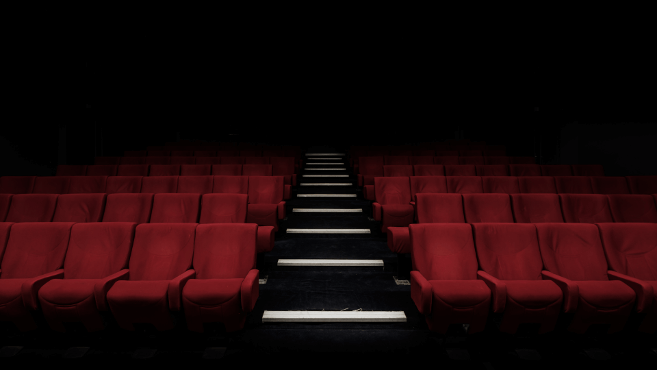
What first comes to mind when you’re asked to think about the James Bond movies?
If you’re anything like us (slightly nerdy, graphic-design obsessed, etc.) there is a very strong chance that you’ll think of the opening title sequence where you’re looking at the silhouette of Bond down the barrel of a gun, before he turns and shoots you, causing blood to run down the screen. This moment is absolutely iconic and defines the franchise. That is the power of good title design.
Jumpstart your ideas with Linearity Curve
Take your designs to the next level.
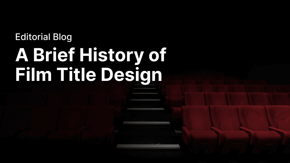
The titles do more than just reveal the names of the film and the main people who brought it to life, they set the tone and mood of the whole story and establish expectations for the audience. From their humble origins as static cards at the start of silent movies, film titles have evolved to become an art form in their own right, and are a vital component of all movies and TV shows. This is the story of how they got there.

Enjoying the silence
The evolution of film titles stretches all the way back to the earliest history of cinema – the silent film era.
As there was no sound, the best way to convey details to viewers and provide context for what was happening was through the use of lettering cards. These cards were known as inter-titles or a title card and they were vital in enabling the audience to follow the narrative and understand what was happening on screen.
These letter cards were created by lettering artists, and the focus was on making the text clear and legible, and for the cards to be easy to produce. The classic look of white text on a black background became the standard as it simply looked better in black and white movies when projected. The lettering itself was also kept very simple and was either mono-stroke letterforms or characters with small serifs. The same style of hand-illustrated lettering cards were also then used for the main film title art.
In these nascent days of the movie industry, the main concerns for film titles were more practical than artistic. The purpose was to convey screen credits such as the movie title, director, movie studio’s name, and main actors, plus any legal, copyright and marketing information that had to be included.
Charlie Chaplin’s The Pawnshop from 1916 is a classic example of film titles and inter - titles from that time – simple white lettering on a plain black background is used for both.
Injecting style and flair
The first real step in the evolution of film titles came when lettering artists stepped away from standard simple forms and started to incorporate illustration and typography that drew inspiration from the prominent art movements of the era. Expressionism, art deco, and art nouveau elements all start to make an appearance in the film titles of silent movies.
There was a further shift in creativity when illustrators and lettering artists started to reflect the nature of the film with the titles. In this approach we can see the origin of modern title design, as now film titles play a major part in reflecting the subject matter and genre of the movie or TV series.
A famous early example of using film titles to convey the content of a film in this way is the original German version of The Cabinet of Dr Caligari from 1920. It’s a pretty disturbing film about a mad hypnotist who makes a sleepwalker commit murders on his behalf. The typography is edgy and sharp and really gives you a sense of the weirdness of the movie.

It’s cool to think of how a very modern title design like that of Stranger Things can be traced back to this time.
Another interesting side note is that in 1929 a new Oscar category was introduced for Best Title Design, recognizing the importance and influence of the artform. Unfortunately, with the advent of sound in motion pictures in 1927, titles were then only used in the opening credits of a film and not between scenes, and the category was quickly dropped.
After the grand arrival of sound in movies, film title design continued to follow the same trajectory and kept on going in this direction through the 1930s and 40s. Relevant typefaces and illustration were mainly used to communicate the genre of a film – haphazard typography let you know it was a slapstick, and bold, ‘wanted’ poster style lettering was a favorite typeface and meant that a Western was incoming. Film title artists also started to get more creative with the styles of lettering, mixing fonts, using shadows, and also incorporating more illustrations and images.
Then from the 1950s onwards, the art of movie title design really came into its own.
The game changes
It might seem strange to us now to consider TV an existential threat to the movie industry, but back in the 1950s when televisions were just starting to make their way into people’s homes, there was a real sense that it could spell the end of cinema. All of a sudden the movie studios had a fight on their hands, and it led to some very significant changes.
TV companies had started to get professional graphic designers to make the opening sequences for their shows. Good graphic design is able to lend an extra finesse and edge to the production of titles. The film industry realized this and followed suit. Soon, independent filmmakers started bringing in original ideas on how to create title sequences, developing techniques and styles that had never been seen before.
It heralded a brand new era for movie title design. Some of the biggest names to ever be associated with film title design emerged in this period – Maurice Binder, Saul Bass, and Pablo Ferro. If these names don’t ring a bell for you now, the films they designed the title sequences for definitely will.
It’s all about the bass
As far as pioneers go, Saul Bass is right up there as a legendary title designer.
He used a whole host of different techniques in his film title sequence design – typography in motion, montage, live action, cut-out animation and more. He first rose to fame through his title sequence for The Man with the Golden Arm in 1955, a film about a jazz musician’s struggle to beat his heroin addiction. A somewhat difficult story to portray in a title sequence, Bass did it masterfully by using an illustration of a crooked and misshapen arm as a visual element to represent that of a drug addict, and then using lines as a graphic element to represent the heroin needles.
Bass is also well known for his work on the title sequences of a number of Alfred Hitchcock’s movies, including Psycho, Vertigo and North by Northwest, with the latter being singled out for praise on account of its use of kinetic typography. He enjoyed a long and illustrious career, working all the way through to the 1990s when he created the title sequences for Martin Scorsese’s Goodfellas and Casino, before he passed away in 1996 at the age of 75. Bass and his work remain hugely influential to this day.
The era roars on
Maurice Binder is also rightly considered to be one of the foremost title designers of his time.
He’s best known for creating the James Bond title that takes the perspective of looking at Bond down the barrel of the gun. Binder created it for the first James Bond film, Dr No, in 1962, and a variation of the sequence has been used in the titles of every Bond movie since, making it one of the most iconic title sequences of all time. Now that is a legacy.
Ready to create brand assets that pack a punch?
Visit our Academy for free marketing design courses.
Alongside Bass and Binder, Pablo Ferro is the other major name in film title design to emerge in the 1950s and 60s. Ferro was entirely self-taught, teaching himself animation from a book. He began his career as a freelance designer in New York, working with major players like the legendary comic creator Stan Lee, before going on to found his own company in 1964.
Ferro garnered praise and attention for his film title design work as soon as he burst onto the scene, and in his early works he developed the styles and techniques that he would become famous for. For the title art sequence of Stanley Kubrick’s Dr. Strangelove, Ferro hand lettering a custom typeface over the footage of a plane refueling in midair. This hand drawn style stood in stark contrast to the sharp, clean graphic design of Bass.
Another technique that Ferro pioneered was the use of split-screen, or multi-screen, images, often also employing the use of quick cuts. He first displayed this style in 1968’s The Thomas Crown Affair, and it was considered revolutionary at the time. His career as a graphic designer soared across four decades and resulted in the creation of more than 100 hundred title sequences.
Harnessing computer power
From the 1970s onwards, we start to see the impact of computer-aided design on film titles.
The advent of new technology and software enabled title designers to combine multiple techniques more easily, allowed for more experimentation, and pushed the boundaries of what was possible.
While limitations definitely force people to come up with creative solutions, which is something that film title designers were already adept at, the new possibilities presented by computers really allowed for more experimentation and boundary pushing. Title designers were suddenly able to combine animation, cinematography, graphics, special effects, typography, and more with ease.
By the 1990s, you could see the influence of film title design pioneers on a new generation. Kyle Cooper is the leading example of someone who drew inspiration from early film title designers like Saul Bass and Stephen Frankfurt. Cooper says that his approach is to "dig under the celluloid and tap into the symbolism of a film". This type of depth really shines through in his work.
Cooper’s first title design was for 1995’s Seven, which went on to receive great critical acclaim. For the typography, he hand-etched the lettering into a black scratchboard, giving it a more organic feel. This was then distorted further during the post-production process. This use of digital and analog techniques was like a meeting of the old school and the new school.
Since this first outing, Cooper has gone on to become the new go-to guy for motion picture title sequences. He now has over 350 credits to his name, including work on not only major films and TV series, but also video games.
Coming full circle
Where Kyle Cooper has taken influence from previous title designers and created new and wholly original ideas, other contemporary title designers have taken more direct inspiration from the classics. This isn’t to say that these new title designs are derivative or unoriginal, if anything, they are refinement and extension of the foundations laid by the work that first emerged in the 1950s and 60s.
The title sequence for Steven Spielberg’s Catch Me If You Can by Paris-based graphic designers Florence Deygas and Olivier Kuntzel from 2005 is a great example. It is unmistakably influenced by Saul Bass through its use of spot colors, silhouettes, and smooth lines. This sequence has been made using modern technology, so it is able to push the style of Bass even further to make it more than a simple homage.
Another good example of this reimagining and development of classic titles can be seen in the opening sequence for David Fincher’s Panic Room. The production of this sequence took more than a year to complete, and involved both the visual effects house ComputerCafe and title sequence company, The Picture Mill. The titles clearly take inspiration from those of North by Northwest, but they take the game to a whole new level. The white lettering floats in the air above various parts of New York City, and it even casts shadow on the city below. This attention to detail is incredible, and once again shows how you can take a previous idea and develop it in a way that pushes it to a whole new level.
Conclusion
From their humble origins as static frames at the start of silent movies, film titles have evolved to become an art form in and of themselves.
Early pioneers like Saul Bass and Maurice Binder revealed the true potential of good film title design, showing how when it is done right, it can define a film to the point where the typography and titling become the marketing identity and even logo of the film.
Now modern technology has enabled film title design to reach new heights, and the possibilities are limitless. Title sequences can now do more work than ever before. They convey mood, provide narrative, reveal subject matter and set the expectations of the audience. Whether you’re an expert or not, we all know a great title design when we see it. Maybe it’s time that the Academy brought back that Best Title Design Oscar category.
Are you an animation fanatic? At Vectornator, we're totally obsessed, too. Check out our previous blog posts on The 7 Greatest Stop Motion Moments of All Time and Studio Ghibli: The Japanese Animation Powerhouse That Conquered the World. And keep your eyes peeled for more animation content in the near future!
Jumpstart your ideas with Linearity Curve
Take your designs to the next level.
Share this!
Jonny Tiernan
Jonny is a contributing writer to the Linearity Blog.