:quality(75))
:quality(75))


:quality(75))

Our color choices in art and design are vital to the creative process and end result.
The colors you pick for a design play a massive role in the final outcome. Color influences communication, and every single color says something.
Have you studied some of the theories and history behind color psychology? If so, you're familiar with how different colors are associated with particular meanings. It has to do with how the human brain associates colors with feelings and ideas.
Experimenting with different color techniques can help you become a more well-rounded creative communicator. Being skilled in color arrangement will also enable you to offer your clients diverse design options.
Some of the color arrangement techniques you can implement include:
- Primary color scheme
- Warm and cool colors
- Complementary color scheme
- Analogous color scheme
- Triad color scheme
- Tetrad color scheme
- Monochromatic color scheme
We'll explore how to get the most out of a monochromatic color scheme in your designs.
Jumpstart your ideas with Linearity Curve
Take your designs to the next level.
What are monochromatic colors?
The Tate art museum defines monochrome as follows:
This makes sense, especially when you break the meaning of the word down to its Greek roots:
- Monos = “one”
- Khroma = “color”
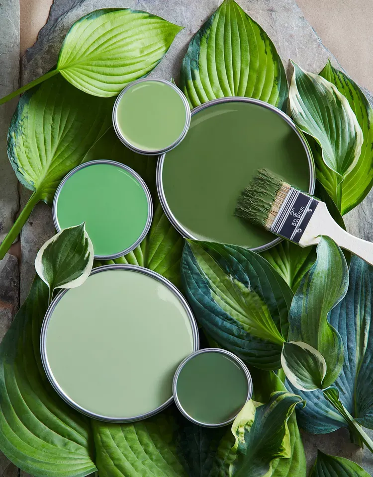
But one color can have many variations. Monochrome colors are all the varieties of a single hue—the tints, shades, and tones.
A monochromatic color scheme will range between lighter, darker, and more or less saturated versions of the base color or hue. So before continuing, let’s catch up on some color theory.

Ready to create brand assets that pack a punch?
Visit our Academy to learn how to use color palettes.
Quick catch-up on color theory
Hues, tints, tones, shades—what's the difference, and why does it matter? Let's elaborate on some of these to understand how to make a monochromatic color palette.
Hue
The hue means the color, what we would typically call "red," "blue," "yellow," etc. In a rainbow, each distinct color is a different hue.
Painters understand “hue” as the purest form of a pigment when dealing with paint color—the base color before it’s altered by white, black, or gray.
In RGB or Hex color spaces, a hue is determined by the dominant wavelength of a color. In RGB, hues are represented by the combination of Red, Green, and Blue values, while in Hex, they're represented by a six-digit color code.
Tint
Pastels are tints. Tints are created by adding white to a hue.
This process lightens the color, making it less intense and softer to the eye. In RGB, adding a tint involves increasing the values of Red, Green, and Blue towards 255 (the maximum in an 8-bit color space), while in Hex, it requires moving the color code toward "#FFFFFF" (white).
Shade
A shade is the result of adding black to a hue. This darkens the color, making it deeper and more intense.
In RGB, shading is achieved by reducing the values of Red, Green, and Blue, moving towards 0 (black). In Hex, it involves moving the color code toward "#000000" (black).
Tone
Refers to a color’s vibrance. A tone is produced by adding gray (a mixture of equal amounts of black and white) to a hue. This process reduces the color's intensity or saturation, creating a more subdued and less vibrant color.
Creating a tone in RGB and Hex color spaces involves adding and subtracting color values—adding white and subtracting black values to the base hue.
When working with RGB and Hex colors, remember that they're digital color spaces designed for screens. Colors in these spaces are generated by light, and the mixing model is additive—meaning that the more color you add, the closer you get to white light.
By understanding and manipulating these elements, you can create a variety of harmonious colors from a single hue, giving depth, dimension, and contrast to your monochromatic designs.
The beauty of a monochromatic color scheme lies in the subtle nuances that can be achieved through the interplay of tints, shades, and tones, providing endless scope for exploration and creativity.

Each segment on the color wheel above represents a single hue's color family. There are subtle differences between each hue variation, making up a monochromatic color palette.
The outer layer shows pure colors or hues. The next layer shows tints of the hues after white was added (they're lighter than the hue). The following layer shows the shades after adding black (darker than the hue).
The innermost layer shows the tones of each hue after gray was added (they're less saturated than the hue).
Mastering monochrome graphic design
Creating visually appealing monochromatic design requires practice, experimentation, and an understanding of color theory. Here are some key aspects to consider when working with monochromatic colors:
- Depth and dimension: Place different tints, shades, and tones of your base color next to each other to create a sense of depth and dimension.
- Contrast: Even within a monochromatic scheme, contrast is key. Use contrasting shades to emphasize elements and create focal points.
- Texture and pattern: Monochromatic designs benefit from the use of textures and patterns. These can break up the color field and add visual interest.
- White and black: Don't forget about the power of white and black. They can help create sharp contrasts, add clarity, and make your monochromatic designs pop.
You can wield a monochrome color palette to create impactful visuals, especially for editorial designs and social media posts.
Steps to create a monochromatic color scheme
1. Choose your base color
So you’ve decided to use a monochromatic color palette for your design. But which hue must you choose for the base color?
It depends on your communication objectives and the intended audience. If you’re working on a creative project for a personal brand, you could choose your client's favorite color and play with the shades and tones.
If you’re creating graphic design or illustrations for a brand, you want to make the color selection based on the brand’s corporate identity. To make a statement, choose a memorable color that stands out.
:quality(75))
:quality(75))
2. Create your monochromatic color palette
Monochromatic schemes usually consist of three to seven color variations in your one-color palette, with darker shades, lighter tints, and duller tones of the original color.
Contrary to what you might expect, cool colors often look brighter than warm colors. A cool lemon yellow is a bright color compared to a warm medium yellow.
Your chosen color can be a primary or secondary color. You can also choose a tertiary color. There's no limit to your color selection as long as it's a hue that you can alter by adding a range of tints, shades, and tones.
Don't start with a tint, shade, or tone as a base color because it'll limit your color palette.
Play around with creating variations of the single color you choose as a base. Narrow it down to the basic color scheme you feel works best.
Watch the video below to learn how to create a digital color palette using Linearity Curve's (formerly Vectornator) design software.
3. Make your image irresistible
Monochromatic images are beautiful. This illustration uses one intense color found in a moonlit seascape and enlivens it with monochromatic color combinations.
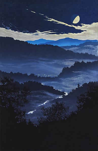
The artist uses a range of tones and shades in blue to bring depth to the artwork by creating the illusion of shadow and silhouette. Contrasted with lighter shades and tints of blue, the monochrome image is dynamically using only a single base color.
4. Play with grayscale
An all-gray design doesn't have to be drab. There are many sophisticated ways to incorporate grayscale into modern designs.
This is also called an achromatic color scheme, meaning it has an absence of color and is purely made of shades and tones. Achromacy and monochromacy are often seen in minimalist styles, creating a strong sense of calm and visual harmony in a variety of design settings.
You could also try combining an achromatic theme with a pop of color for a strong visual statement.
Graphic designer Ramius Aquiler plays with monochrome in grayscale by combining a pop of yellow. Bright and expressive colors contrasted against gray work beautifully together.
Grayscale can be cool, classy, and simple. There are more variations than you’d imagine. You could add an undertone of beige, yellow, or red to create variations of warmer grays or diversify your color options with a sharp contrast between black and white.
Going grayscale can be a good option for print projects, as black-and-white printing is much simpler and more affordable.
5. Add textures
You can create an entire design in just one color by playing with texture or creating the illusion of texture with contrasting lighter and darker colors.
Think of embossing, relief engraving, and repeating patterns. Think in 3D. There are many ways to make an interesting image by applying texture to a limited color palette.

Ready to create brand assets that pack a punch?
Visit our Academy for free marketing design courses.
Monochromatic color scheme examples for inspiration
Inspiration is everywhere. From the calming grays of a foggy morning to the vibrant blues of a sunny day, the natural world is filled with stunning examples of monochromatic schemes.
Take these inspirations into your digital canvas and experiment with the limitless potential of monochromatic design.

It's a versatile tool to bring your designs to a new level of elegance, unity, and sophistication.
Brand identity design
Monochromatic design is perfect for creating visual cohesion. Many design elements make up a brand's visual identity, and color plays a significant role in defining the brand.
When choosing the primary brand color, you’ll start where anything in marketing starts—knowing your audience. Choose a color that resonates with the intended audience and communicates what the brand stands for.
Applying a monochrome technique to brand identity is an effective way to create unity. It'll make designing anything for the brand much easier going forward, as all the colors have already been added to the color palette.
Vibrant, bold designs
In a monochromatic scheme, you can have fun with bold colors such as neon or red.
The benefit of incorporating lighter tints and darker shades of a striking, bold color into a design is that you can make a statement without the design being overwhelming or too bright.
Calming, muted designs
Neutral tones in a monochrome design exude timeless style. This color scheme works well for lifestyle brands and high-end products.
A neutral color palette keeps your design simple, bringing peace and connection to nature. Various shades of beige and brown are gentle and calming, especially when combined with white. Darker shades of neutrals can also be used to create a warm ambiance.
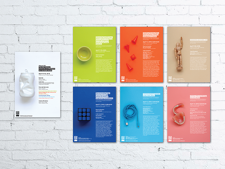
Packaging that pops
Monochrome color schemes have been used for some inspiring packaging designs. This technique works particularly well when packaging products that come in a set. Each item can be differentiated by having its own variation from the color palette, as seen below.
A monochrome look in grayscale can be a suitable packaging solution for affordable printing.
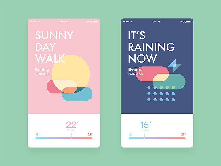
UX/UI design
Color is used as a communication technique in UX/UI design.
Use variations of a single color to show relationships between elements (for instance, subscribe or log-in buttons) or differentiate segments on an interface. In the example seen below, a color scale from blue to orange is used to communicate degrees of temperature.
Simplicity
A monochrome palette is the perfect solution for honing the beauty of simplicity.
Limiting your range of colors simplifies the design process, as you don’t need to combine different colors to please the eye. Monochrome colors always look good together.
Even a bright and vibrant monochrome scheme is simple because there's no stark variation in color. It offers a sense of unity that’s inherently uncomplicated and effortless.

Monochromatic color photography
There's so much you can do with black-and-white photography and color overlays. Monochromatic color photography captures images in one color.
You can combine a monochrome color scheme with photography by intentionally photographing a monochromatic scene or, in the editing phase, by applying a tinted overlay on top of a photograph.
Infographics
A valuable piece of content, infographic design has evolved exponentially in the last few years as more online tools become available for visual data handling. Designers are getting creative and making some striking infographic designs.
Graphic design software tools help non-designers easily create infographics, too. As a marketing designer, it'll be worth your while to learn how to produce captivating infographics.
Wrap up
Baby pink for a bubblegum brand, grayscale with a bright blue accent color, or a range of dark shades in green to create a moody illustration, there are many ways to harness monochrome design.
You can improve your visual communications design by experimenting with monochromatic color photography, post-processing a color image, or using a digital design tool to create a unique monochromatic color scheme.
Ready to try fresh, innovative design software for your next project sprint? Linearity Curve (formerly Vectornator) is powerful and easy to learn.
Jumpstart
your ideas with
Linearity Curve
Take your designs to the next level.
FAQ
Is a monochromatic color scheme just black and white?
No, a monochromatic color scheme doesn't only include black and white. While black and white are considered monochrome, a monochromatic color scheme in graphic design refers to a palette derived from a single base hue and extends to its shades, tints, and tones.
Why should I use a monochromatic color scheme?
A monochromatic color scheme offers harmony, unity, and coherence to your design. This can lead to a cleaner, more elegant, visually appealing design. Monochrome designs can also be used to convey a message or mood effectively.
It can help establish a strong brand identity, as consistent use of specific colors helps customers recognize and remember your brand.
Can a monochromatic design be engaging and dynamic?
Yes. Despite using just one base hue, a monochromatic color scheme can produce a dynamic and visually engaging design.
You can achieve this by varying the shades, tints, and tones, and using patterns, textures, and contrast to add depth and interest.
Are there any specific tools or software for creating monochromatic designs?
Most graphic design software, such as Linearity Curve (formerly Vectornator), Adobe Illustrator, and Photoshop, allow you to create monochromatic designs easily.
They offer tools for choosing color schemes based on a single hue and advanced color manipulation features to create shades, tints, and tones of your chosen color.
How can I choose the best base color for my monochromatic color scheme?
The best base color for your design depends on the message or emotion you want to convey.
For instance, blue might convey trust and calm, red for passion or urgency, and green for growth or tranquillity. Consider color psychology theory and the cultural significance of colors when choosing your base color.
Can I use different saturations in a monochromatic color scheme?
Yes. Using different saturations of the same hue is one way to create variety in a monochromatic color scheme. Varying the saturation creates lighter (less saturated) or more vibrant (more saturated) versions of the base color, giving you a broad palette to work with.

Share this!
Ben Barnhart
Ben is a Content Lead for Linearity living in Berlin. His hobbies include board games, cooking, reading, and writing.


