:quality(75))
:quality(75))


:quality(75))
In this article, we'll explain how the modern color palette evolved, and we'll analyze three popular modern color palettes in particular:
1. The psychedelic color palette
2. The neon cyberpunk color palette
3. The pastel color palette

These popular color palettes are still widely used today and seem to resurface as time passes.
Retro psychedelic colors are featuring again, adding a pop of color to new digital art and online album covers. However, the vibrant colors of the Cyberpunk color schemes that emerged in the 80s have never really died out. And, of course, pastel colors have always been a favorite to create soft, tinted settings.
Let's first take a quick look at the origins of color pigments, from natural clay on cave walls to synthetic coloration in plastics.
Jumpstart your ideas with Linearity Curve
Take your designs to the next level.
The origins of the natural pigment color palette
Every painting, film, video, or digital image has a color palette. The color palette is the color range of the world that the artist has created. It sets the mood and expression of the artwork, but also depth and dimensionality.
The first color palettes known to humankind were created around 40,000 years ago when humans created cave paintings.
These first color palettes created by humans were limited in their hues to earth-toned pigments like yellow, brown, black, white, and several shades of red. These ancient color palettes were created with different types of organic materials found in the artists' natural environments and explain their choice of color.
The Stone Age artists relied on several materials to make neutral colors for their paintings. Clay ocher was the primary pigment and provided three basic colors: yellow, brown, and numerous hues of deep red.
They created different pigments using the following materials:
- Kaolin or China clay (white)
- Feldspar (white, pink, gray, and brown colors)
- Biotite (red-brown or green-brown colors)
- Limestone, calcite, or crushed shells (many colors but most often white)
- Charcoal or manganese oxides (black)
- Animal bones and fats, vegetable and fruit juice, plant saps, and bodily fluids (usually as binding agents and extenders to add bulk)
These were among the first pigments used to create a natural color palette and create a neutral color scheme.

As humanity progressed, the development of pigment and different hues did, too.
Pigments were produced on a larger scale by the Egyptians and the Chinese. The first known synthetic pigment was Egyptian blue, first found on an alabaster bowl in Egypt circa 3250 BC. It was made with sand and copper that was grounded into a powder that could be used to create deep blues that represented the heavens and the Nile.
The striking red vermilion pigment powder (made from cinnabar) was developed in China 2,000 years before the Romans used it. Later premodern synthetic pigments include white lead, which is basic lead carbonate 2PbCo₃-Pb(OH)₂.
The development of organic chemistry diminished the dependence on inorganic pigments and dramatically expanded the color range of the produced pigments, making a more complex color palette available.
The modern synthetic pigment color palette
Around the 1620s, the wooden palette for mixing paints came about. It was a flat, thin tablet, with a hole at one end for the thumb, used by an artist to lay and mix colors.
The opening up of trade routes in the 18th century, combined with advances in technology and science, allowed greater color experimentation.
In 1704, the German color maker Johann Jacob Diesbach accidentally created Prussian blue in his laboratory. This was the first chemically synthesized color, and this primary color is still widely used today.
The isolation of new elements in the late 18th century also provided plenty of color pigments that hadn't existed before.
Alizarin is arguably the most critical organic pigment of the 19th century.
It was found as a colorant in the roots of the madder plant, but researchers in Germany and Britain duplicated it synthetically in the laboratory. The explosion of new pigments during the 19th century and the arrival of railways accelerated this movement.
Bright new colors in portable tubes and the opportunity to travel to different regions helped give rise to some of the world's most beautiful paintings.

With the dramatic expansion of the available color range for artists in the 18th and 19th centuries, a strong resurgence of color theory and color psychology took place. Studying color psychology and the significance of different color combinations gained tremendous popularity in art.
The contemporary digital color palette
With the advancement of digital technology, the art of our current times is mainly created with digital devices. Videos, photos, film, and design software are now the main art mediums, and the contemporary style of how we create and organize digital color palettes has changed dramatically from previous times.
In digital art, we don't arrange our base colors on a wooden palette with a paintbrush. We now sample colors for our color palette by using a color picker or setting the Hex codes in design apps and saving these as paint swatches for later use.
Instead of mixing the base colors with lighter or darker colors with a paintbrush on a wooden palette, we now use blend modes, opacity settings, and HSB or HSV sliders to create new color tones, tints, and shades from our base color.
Ready to create brand assets that pack a punch?
Visit our Academy to learn how to use color palettes.
We can now extract complete color palettes from digital images or import, save and export them. Our color choices are no longer limited by what's available in our environment or our local art stores – we simply change our color preferences based on current design trends.
It's pretty clear that there's been a dramatic change in color palettes with the introduction of synthetic pigment, artificial and colored lighting, as well as the introduction of plastic. We have instant access to various vivid colors and helpful tools for color matching and creating beautiful combinations.
In earlier times, color hues that could easily be found in nature were mainly used in paintings, and the only light sources were natural light, candles, or oil lamps.
Below is an example where you can see how the most commonly found hues in nature are predominantly used in oil paintings before the emergence of artificial lighting.
The 60s and 70s psychedelic color palette
The psychedelic hippie movement was the first emergence of the saturated, contrasting, and bold color palettes of modern times. This modern style could be seen in graphic design such as album covers and posters, as well as other design elements such as brightly-colored midcentury furniture and interiors with splashes of color.
There are a variety of factors that may have influenced these bold colors. First, the consumption of LSD (also known as acid) reportedly caused people to perceive the so-called psychedelic colors during a trip.
Second, the increasing use of colored lighting and artificially colored plastic in everyday household items of modern living. Plastic material could be easily colored in any color imaginable.
Essential for the psychedelic 60s and 70s color palette is bright orange coupled with a warm sunflower yellow. These colors are often contrasted against a saturated royal purple or pink, turquoise blue, tomato red, and lime green.
The colors of this palette consist of primary or secondary colors without any admixture of white, black, or gray (in other words, no tints, tones, or shades). These are the pure hues you find on the color wheel.
Sometimes a more subtle brown or deep green was incorporated into the bright color mix. Generally, the overall tone of the color palette leans toward warm and bold contrasting colors.
There are generally no pastel or muted, desaturated colors in the psychedelic color palette.
If you'd like to try this palette out for yourself, you can download it below and import it into Linearity Curve (formerly Vectornator) to use in your own designs.
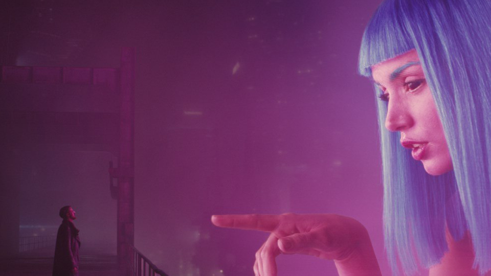
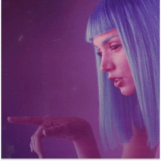
The cyberpunk neon color palette
After introducing artificial lighting at the beginning of the 20th century, the trend of intense fluorescent-colored lighting in the 80s introduced the modern color scheme of neon colors into the color palette of art and design. Neon colors are so intense that it almost hurts to look at them.
These colors are scarce to find in nature; they can be found only in a few cases on the feathers, the fur, or the scales of animals.
One of the rare examples of naturally occurring neon colors is the bright pink feathers of the flamingo. It was no coincidence that the flamingo became the heraldic animal of the neon-obsessed 80s.

Technology was advancing, personal computers were used in the office and at home, and fluorescent lighting became the norm. In the early 80s, the dystopian Cyberpunk genre in literature was born and heavily influenced by authors Philip K. Dick, Roger Zelazny, J. G. Ballard, Philip Jose Farmer, and Harlan Ellison.
The utopian Love, Peace, and Harmony movement of the 60s and 70s suddenly turned into dystopian cityscapes and wastelands with artificial intelligence, corruption, and transhumanism. The cyberpunk genre examines the significance of drugs, technology, and the sexual liberation of society.
Some of the most well-known films, games, and books are the manga Akira (1982), its corresponding anime Akira (1988), Blade Runner (1982) and Blade Runner 2049 (2017), William Gibson's Necromancer (1984), and the Cyberpunk 2077 video game.
The settings of cityscapes are depicted mostly at night, backdropped with a dark color palette featuring bright accent colors that depict bold neon-colored lighting. It's a palette that visualizes the night's darkness and the neon-colored lighting's bold light reflexes.
The night colors are mainly visualized by black, dark blue, purple colors, and dark green color tones. The neon light and reflexes are primarily colored in neon pink, dark pink, white, and neon yellow, and in very few instances, the light source is a bright red or neon orange.
The cyberpunk palette does not favor muted color combinations or gray color tones. The dark colors of the night clash with the intense reflexes of neon lights.
Below, you can see the preview of a Cyberpunk palette created in the Procreate swatches format and is available for download. Since the 4.7.0 Linearity Curve (formerly Vectornator) update, you can import a swatches color palette directly from Procreate via split-screen into Linearity Curve (formerly Vectornator).
If you compare the night scenes of Cyberpunk settings, the overall theme of the color palette is cool. Even the neon lights predominantly emit cool light.
It's very interesting to observe the color palette of the settings of cyberpunk scenes in daylight. The night's predominantly cool colors often switch to warm colors, a desert-like color palette, and even the sky consists of earth-toned colors.
The night is a cool-toned royal blue contrasted with neon colors, and the daytime is a desert wasteland of earth colors that doesn't allow even a trace of blue sky to come through the smog.
If you want to try out a cool cyberpunk palette in your own designs, download the palette file below and import it into Linearity Curve (formerly Vectornator).
The pastel color palette
Do you want to know what the beautiful color schemes of the 80s television series Miami Vice and the softer colors of the candy pastel colors have in common? Then continue reading.
Explore the World of Color Palettes
Unleash the power of color in your designs. Learn how to create and use color palettes to make your projects stand out and evoke the right emotions.
One of the freshest trends of 2022 is the candy color palette with its light colors and vibrant pastels. This is a fun color scheme that creates the sense of a sugary dream away from the harshness of the real world.
Pastels belong to the pale or tinted family of colors. In the HSV color space, they have high value and low saturation. To make a pastel, you take a primary or secondary color and create a tint by adding a generous splash of white to it.
In this type of color palette, pale pink and baby blue are the hero colors, and there's no place for pure primary or secondary colors or a deep shade with black or gray mixed into it.
One of the most significant color heroes of the candy color palette is millennial light pink. In 2006, Acne Studios, the fashion house based in Stockholm, Sweden, started using the toned-down neutralized shade of pink for its shopping bags. The idea of using this soft pink was to create a less intense and more grown-up hue than the famous bright Barbie pink.
But the trend of pastel colors is not brand new. The movement for pastel colors, especially pastel pink combined with pastel turquoise, started in the 1980s.
The NBC television series Miami Vice popularized the pastel trend in men's fashion and decor. It's the ideal color scheme for creating a sense of an endless summer filled with pool parties and pink drinks.
The pastel trend is still visible in the shooting locations for this show, with pastel-colored Art Deco buildings around the Miami area.
As you can see, specific color palettes resurface decades later and revive a certain mood and atmosphere in another timeframe.
Try a candy-colored palette out for yourself! Simply download the file below, and import it into Linearity Curve (formerly Vectornator).
How to manage your color palettes in Linearity Curve (formerly Vectornator)
Select a color
With the Color Picker inside the Style Tab or the Color Widget, you can change the color of the Fill, Stroke, or Shadow of your selected object.
To open the Color Picker, tap the Color Well for any Fill, Stroke, or Shadow you want to change. Drag the point around to pick your color.
:quality(75))
:quality(75))
If you have an object selected, the new color will change immediately when you release your finger/pencil from the picker.
The Hex Field to the right of the Fill Well displays the Hex Value of your selected color. You can manually set a Hex number with the keyboard.
To read more about managing colors in Linearity Curve (formerly Vectornator), visit our Learning Hub, or watch the video below to see how to use our color picker and widget tools.
Set the gradient
In Linearity Curve (formerly Vectornator), you have two gradient options available. You can either select a Linear or a Radial Gradient.
Select your shape, tap the Color Well in the Fill section of the Style Tab or Color Picker to open the Color Palette. You can either choose a Solid Fill option or the Gradient fill option.
When you tap the Gradient button, two Gradient Style options will be available. Tap on one of these options to choose the type of gradient you want to apply to your shape.
You can tap on a Color Slider to set its color via the Color Picker. Updating the color of a Color Slider will immediately update the gradient live in your selected shape.
Import a palette
Since the 4.7.0 update, you can import Color Palettes in .swatches and .ASE formats.
To import a Color Palette in Linearity Curve (formerly Vectornator), tap the + button in the top right corner of the Palettes Tab and then select Import.
Select the Procreate swatches file or the Adobe ASE file and tap on it, and the palette will be automatically displayed in the Color Picker menu.
Create a palette
To add a new Color Palette, tap the button Palettes at the bottom of the Color Widget. To create a new Color Palette in Linearity Curve (formerly Vectornator), tap the + button and then tap Create.
A new empty, greyed-out Color Palette appears at the bottom of the Palettes Tab.
To add new colors to your empty Color Palette, select a new color with the Color Picker or Sliders.
Go back to the Palettes Tab and tap the + button inside the empty palette. A new color swatch will appear automatically inside the palette.
Repeat the process to add more colors to your Color Palette.
Wrapping up
Every style and period has its distinctive color palette. If you want to emulate a particular style or period, you need to be able to analyze and compose the corresponding color palette.
We understand the importance of color palettes, and that's why we've incorporated the option since the 4.7.0 update to create, save and import color palettes into Linearity Curve (formerly Vectornator). You can even save color gradients in the color palette!
With the new color blending technique, you can create your color palette by choosing only two color tones and interpolating the colors in between, thus creating an automatically generated color palette.
Another great feature is importing a reference image and using the color picker to sample and extract the colors and save them as a color palette in Linearity Curve (formerly Vectornator).
Color is a very powerful tool in design, and Linearity Curve (formerly Vectornator) gives you the color tools to master it professionally. An effective color combination communicates your creative intention.
We'll help you master any design styles and make the right color choices - create your own color palettes and share them with us on social media or our Community Gallery.
Jumpstart your ideas with Linearity Curve
Take your designs to the next level.
Share this!
Marion Gerlinger
Marion is a contributing writer to the Linearity Blog.