:quality(75))
:quality(75))


:quality(75))
The minimalist style is always laconic and simple in composition. Even though trends in web design are changing, minimalism remains relevant to this day. The movement has transformed a bit in recent years and moved away from the traditional minimalist approach. But some designers and developers strictly follow the traditional canons. Below, you will find the key features of this design system and some of the best examples of minimalist website design.
Jumpstart your ideas with Linearity Curve
Take your designs to the next level.
Minimalist design concept & key features
The use of additional elements should not distract users. The following features are the traditional areas where minimalism is expressed:
- Color
- Background
- Photo
- Typography
- Contrast
These are the key points that characterize this method of web design.
The key elements of minimal web design
Below you will find a more detailed description of each of the above elements.
Negative space
The main ingredient in minimalist design is the use of negative space. It is used to focus the user's attention on the most important content. This negative space doesn’t need to be white; it can be any full-color background.
Flat design
In classical minimalism, designers avoid using volumetric shapes, effects, and gradients. But more modern minimalistic trends allow for more creativity and vividness even in their designs. So you can often find sites that seem to be created in a minimalist style but with more interesting and experimental elements.
Monochrome palette
Color can distract the user's attention in the same way that a party can distract students from an academic assignment. But in both situations there is a way out: the student can pay to have someone else write their essay, and the web designer can use a monochrome palette. By the way, using a monochrome palette doesn’t mean that you cannot use bright colors. The most important thing is to skillfully develop a color scheme based on one color.
Photos & illustrations
These are used to convey meaning and emotion instead of words. Photos and illustrations with a minimum amount of detail are usually used. If there are too many details in the image, the concept of minimalism will be broken.
Spectacular typography
Minimalist packaging should always come first. Simply put, if a student orders a custom dissertation writing service, but does not arrange the assignment according to the requirements of the professor, then everything will be in vain.
The same happens in web design. It is necessary to correctly design the text so that it is conspicuous. For example, if you highlight the phrase “write my term paper” in a different font, then it will undoubtedly attract the attention of users at first glance.
Ready to create brand assets that pack a punch?
Visit our Academy for free minimalist design courses.
Contrast
Using the contrast between components is an opportunity to emphasize important content. This is a great way to make a simple element sparkle and grab the user’s attention.
Top 20 minimalists design site examples
Below you will find 20 examples of fun minimal designs that are good sources of inspiration.
1. Mociun

This site is interesting not only in the context of design but also in the minimalist presentation of the product itself. Usually, sites from this niche promote luxury that is displayed even in design. But the minimalist approach to the design of this site creates the right contrast for the product.
2. Krown Themes

This is a good example of how text can be the highlight of an entire design. This type of solution makes the design non-trivial and memorable.
3. Platoon Branding

This is a good example of using negative space. Pay attention to how you can highlight text in this way and instantly attract attention.
4. Fllow

Note the unique look of the relatively minimalist palette. A two-tone palette is used here. However, the background color is constantly changing.
5. Iglucraft

This is a good example of how large photos can be used. A special feature is that the photo is not only on the main screen but all over the site.
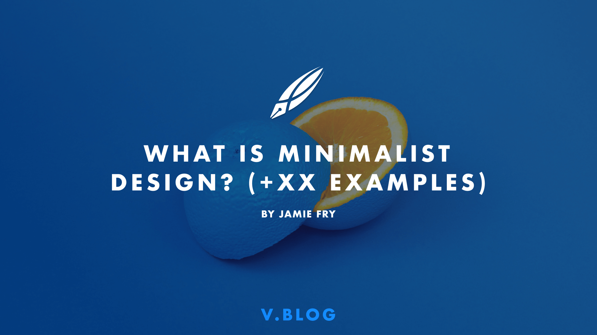
6. Helias Oils

This design is interesting for its repetition of color. It looks simple, but the color scheme supports the product and creates a consistent product and web design. This creates a special appeal.
7. Asos

This is an example of how good minimalistic design can instantly motivate potential customers to buy. Beautiful photos, colors, simplicity, and visual accents are the best that a minimalist style in web design has to offer.
8. Curious Space

This design moves away from the classic block layout, which serves to heighten user interest in each block. Nevertheless, minimalism remains the foundation of this website design, but with an emphasis on the uniqueness of the brand.
9. Pattern

On this site, you can see the awesome use of typography. The fonts create the right accent, but they look simple. Pay attention to the color scheme. It creates an organic feel, and the fonts provide a hand-made impression.
10. Seal-Co
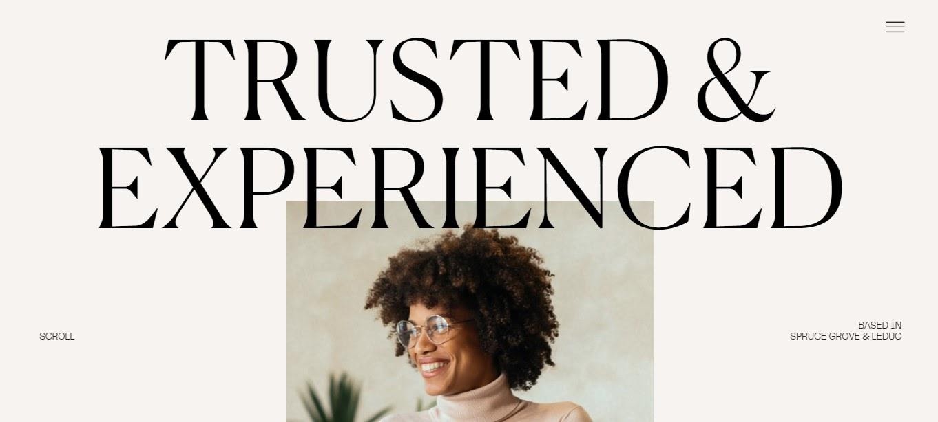
This site is a good example of typography usage. This approach makes up for the lack of other elements and emphasizes the right points. This is a fine line between minimalism, but the design of this site shows how to play it right.
11. Apple

Apple follows minimalist design for several years already and clearly shows that black background is also capable of creating space. A dark color scheme is still relevant in the web design world and is the perfect choice for those who love eye-catching simplicity.
Get creative with our ready-to-use templates.
Linearity Curve offers templates for every social media platform and various use case templates for posters, business cards, slides, app store screenshots, and more.
12. Clock Strikes Twelve

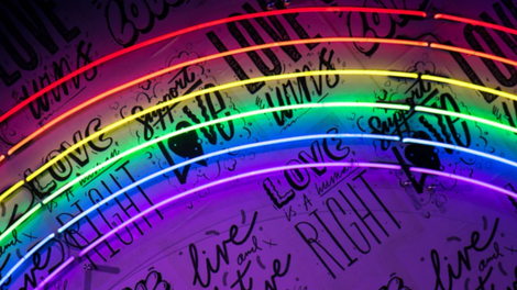
This design is a good example of how dramatic black background and white font can look. Neon objects dilute the darkness and complicate the design a little, which makes it more modern.
13. ETQ

This design is a good demonstration of the role high-quality images play in design. This is a good example of how minimalism is about more than just a white background. Also, the use of high-quality photos makes the design unique and catchy.
14. Huge Inc.
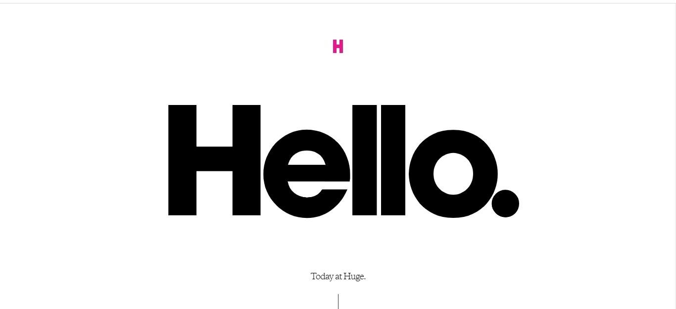
This site is a great sample of the traditional canons of minimalism. Everything is simple, functional, and very memorable. Although the mix of traditional canons and the addition of bright objects is now gaining momentum, this design looks catchy.
15. Ora

This site is a good example of a mix of minimalism and organic. This trend is more relevant for the product or interior design. If we talk about web design, then this is a relatively new direction.
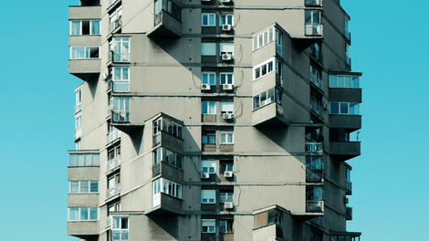
16. A Better Source

Neutral colors that are close to the environment are a new trend in minimalist design. If earlier all shades were cold and had a computer grayness, today the opposite effect is evident. Pay attention to the presence of warm and natural colors, which were not previously prevalent in web design.
17. AHM

If you want something ultra-trendy, but without pretentiousness, then consider the illustrations on this site. The design looks interesting but at the same time as simple as possible. Illustrations can add uniqueness to a design, and even create coziness.
18. Blue Receipt

Functionality is a good addition to minimalism. This site is a good demonstration of this tandem. Pay attention to the color scheme; there are bright colors that smoothly flow into gradients.
19. Cat Person

The use of a minimalist direction in addition to a functional and user-friendly website is an excellent solution for online stores. See how easy it is to read the information, but the use of a white background does not make the design too simple.
20. The Railroad Ladies

This site is a great example of the latest trends. The use of bright colors, white backgrounds, and simple lines between elements is one more approach to follow this year.
Conclusion
As you can see, minimal design is not synonymous with limits. Despite certain rules that define this style, it still has a place for creativity, and the examples that we have collected in this article demonstrate this clearly.
Jumpstart your ideas with Linearity Curve
Take your designs to the next level.
Share this!
Ben Barnhart
Ben is a Content Lead for Linearity living in Berlin. His hobbies include board games, cooking, reading, and writing.