:quality(75))
:quality(75))


:quality(75))
Who else remembers when Kim Kardashian broke the internet with her Paper Magazine in 2014?
Jean-Paul Goude reworked his own Champagne Incident artwork from the 80s for this unforgettable cover image that exploded on social media and on newsstands.
This taught us a valuable lesson. If you can learn to create a truly creative and distinct cover image, you can get the world’s attention.
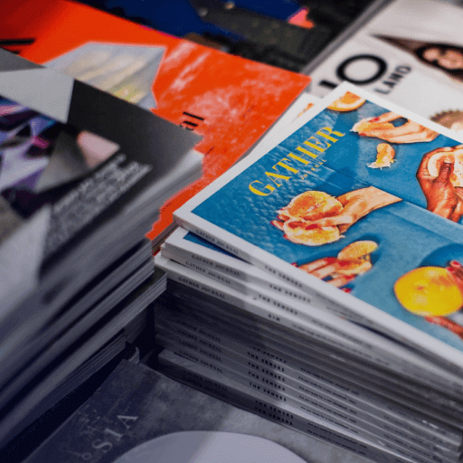
Magazine cover design is an underrated art medium that can be incredibly impactful and unique.
If you want to learn how to design the perfect magazine cover, stick with us. This article will cover the history of magazine cover designs, magazine cover design inspiration, and some design tips to help you create your own.
Jumpstart your ideas with Linearity Curve
Take your designs to the next level.
History of magazine cover designs
Magazine covers have been around since the early days of print media, and they continue to be popular even in the digital age.
The Golden Age of American Illustration, between 1880 and 1960, gave us great advances in printing technology, and with it, more creative publishing art like book and magazine covers.
We’re obsessed with this vintage Vogue cover from 1928, created by Porter Woodruff.
"In this era, publishers and advertisers capaciously demanded from artists to create artworks that would visually communicate with their audiences in exquisite styles that would appeal to aesthetic tastes of the modern-age public." - A History of Graphic Design, Guilty Novin
By 1910, there was a proliferation of both picture periodicals and illustrated weeklies. However, many of these publications lacked sufficient circulation to sustain themselves long-term and subsequently went under after only a short run.
Magazines such as The Century Co.'s Cosmopolitan, McCall's Ladies' Home Journal, Collier's Weekly, and The Saturday Evening Post all appeared in short runs of less than six months.
Others like Harper's Bazaar, Good Housekeeping, and Vanity Fair remained in publication much longer and are still in print today.
As time passed, more people became interested in learning more about fashion, home life, health care, religion, politics, education, travel, gardening, cooking, and other topics from magazines. This led to the creation of a large number of specialized weekly and monthly titles.
That demand hasn’t faltered even with the decline in print media. Magazines have remained in print but have adapted to the digital age by curating a strong online presence.
Magazines often specialize in one niche area and feature images, articles, and news related to that niche.
These diversified interests require different types of visual content—not just photographs but also illustrations, advertisements, cartoons, caricatures, editorial text, and colorful full-page spreads.
This has created a demand for skilled designers who can produce distinctive, eye-catching designs on various subjects, with none so crucial as the coveted magaziine cover image. The cover image is the first part of a magazine that you see, and it's the thing that determines whether you will pick the magazine up or not. So, it’s crucial that you get the design right.
Let’s talk about how you can do that, using the basic principles and elements of design.
What are the elements of a magazine cover?
The elements that make up a stunning magazine cover are similar to those used in other types of graphic communication. We’ve got a few other blog posts covering visual hierarchy and design principles more in-depth, so we’ll just give you a quick rundown here.
Many designers working for magazines have experience designing graphics or advertisements as well. The approach to a magazine cover is much like any other form of graphic design.
It requires careful attention to detail and adherence to the basic principles of design.
Magazine covers are unique enough to warrant their own category. They differ from advertising because they sell ideas about what people should buy instead of selling products directly.
The main goal of a magazine cover is to attract readers by engaging them visually through various forms of illustration and typography.
And while advertisers use visual cues such as typefaces and color schemes to direct attention toward their product, magazine editors aim to do so using layout techniques and images rather than relying too heavily on words.
So, when you're thinking about creating your first magazine cover, keep in mind the following four essential elements:
Four basic elements of magazine cover design
1. Color
Color is the primary element of design that makes art stand out and look cohesive.
When designing a magazine cover, make sure to use brand colors if you’re designing for a brand, and ensure that colors are either complementary or contrasting in an exciting way.
Ready to create brand assets that pack a punch?
Visit our Academy to learn how to use color palettes.
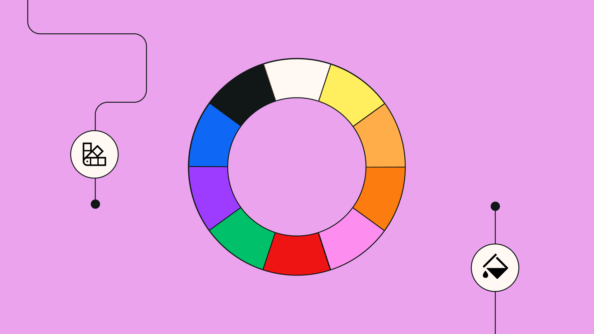
It is also essential to consider color theory and the basics of the color wheel that we all learned in elementary school art class.
Remember that warm colors come to the forefront of the design while cool colors fade into the background. Use this to your advantage.
For a more minimal magazine cover, use muted cool colors. And for a more maximalist approach, use a bold variety of colors.
You’ll notice that more serious news magazines and fashion magazines use specific colors to create distinct brand awareness. Understanding how color choice can impact how the human eye perceives your design is crucial to making sure your design stands out.
2. Contrast
Contrast and color go hand in hand. You can use contrast in your designs to create depth and draw the attention of your audience.
Think of the bright, distinct colors in celebrity magazines like People and US Weekly.
These magazines grab your eye immediately while in line at the grocery store. That’s because they use contrast so creatively that your eye can’t help but see them.
Any prominent element you want to emphasize on your own magazine cover should either be a bold color or surrounded by muted colors to make it stand out.
3. Font
Your approach to typography matters immensely in magazine cover design. The title of your magazine and the text previews of what the edition contains are significant factors in whether or not customers will decide to purchase it.
We love how Glamour Magazine opts for a hot pink font color to stand out on stands. It also fits with their bold branding and dedication to giving lifestyle advice to women.
Take time in selecting your perfect font, and make sure it’s readable while still appearing creative and unique.
4. Spacing and sizing
Spacing and sizing of images and text in your work is crucial.
This might seem obvious, but where you place things and the size they appear in your work will be a huge factor in how your design looks.
Check out this creative spacing in the Fall 2018 edition on GQ. They went with a minimalist approach that created a stark contrast on the page. It’s interesting to look at while not being overwhelming- sometimes simplicity is best.
It’s important to carefully use the space you have on a magazine cover while ensuring that your design isn’t overwhelming and too busy for an audience to be interested in reading.
Iconic magazine covers
If you need magazine cover ideas, look no further: we’ve gathered up some of the best magazine covers of all time.
Whether it’s a serious news magazine like Time or The New Yorker or one of the more casual celebrity magazines like People Magazine, strong images can stick in the collective consciousness for decades.
:quality(75))
:quality(75))
You might be surprised how many of these covers you recognize. Let’s get started with our first example of iconic magazine cover design inspiration.
Vogue, Beyoncé, 2018
All hail Queen Beyoncé. She looks fantastic here, and while it wasn’t her first appearance on the cover of Vogue (it was actually her 4th), it was her most iconic.
Vogue is an American fashion and lifestyle magazine based in New York City. Anna Wintour is the famous editor-and-chief and has been at the helm since 1988.
There are 26 international editions of Vogue, including U.K. Vogue and Vogue Espana.
Vogue uses blocky typography for its title text while still appearing sophisticated. Rather than listing out an array of stories, they simply preview their cover girl, Beyoncé, “in her own words.”
Despite the busy background, Beyoncé’s colorful attire and strong pose help her stand out.
This striking cover image is especially noteworthy because it was the first time a cover image for Vogue had been shot by a black photographer in the magazine’s history.
Esquire, The Passion of Muhammad Ali, 1968
This powerful image packed a big punch... just like its star, famous boxer Muhammad Ali.
Esquire is an American men's magazine based in the U.S. It has been published by Hearst Communications since 1986.
This edition was published right after Ali was stripped of his titles in boxing for refusing to fight in the Vietnam War. It was a contentious photo that perfectly depicts this contentious time in American history.
The art director for this cover, George Lois, opted to depict Ali as a modern-day St. Sebastian, a Christian martyr.
This image is minimalist in its design and features only a few words in straightforward black typography. The picture on the cover speaks for itself.
There were incredibly mixed responses to this cover image, and for that reason, it had to make our list of iconic magazine covers.
National Geographic, 1985
This classic image was an easy pick for this list, as the image on the cover has since become incredibly well-known and famous.
National Geographic is the well-loved monthly magazine of the National Geographic Society. It is one of the most widely read and popular magazines in history. They are known for their adventure shots and images from around the world.
"Afghan Girl" was shot by Steve McCurry and published by National Geographic in June of 1985.
McCurry was taking portraits of Afghan refugees in Pakistan when he snapped this image of Sharbat Gula. Her piercing green eyes are unforgettable. This is easily one of the strongest images on this list.
People, Princess Diana, 1997
Princess Diana is a beloved figure around the world. This image of her beaming at the camera in a crown perfectly displays her public image.
People magazine is a staple of American grocery stores and newsstands. It is an American weekly magazine that focuses on celebrity news and human-interest pieces with a heavy dose of gossip.
This cover image was run as a tribute to Diana immediately following her death. It is the first and only issue of the magazine to run with no cover line.
Ready to create brand assets that pack a punch?
Explore our Academy to access complimentary courses and become a master in design.
People magazine used a subdued background and simply let Princess Diana’s personality shine through. She really was the “People’s” princess.
Fun fact: Princess Diana has been featured on the cover of People more than anyone else in the world.
Time Magazine, The Gun in America/The Gun Under Fire, 1968
This striking image held deep, controversial meaning behind its colorful facade.
Time magazine was founded in 1923 and quickly became America’s leading newsweekly. Time covers international affairs, science, television, books, and trends.
This illustrated cover was created by iconic pop artist Roy Lichtenstein. It was meant to jar the viewer and make an impactful statement about gun ownership in America.
This cover was run in the wake of Senator Robert F. Kennedy’s assassination, which had occurred two weeks prior.
Life, To the Moon and Back, 1969
This image is cemented in our collective consciousness.
Life was an American magazine that was published weekly from 1883 to 1972. They also published occasional special editions until 1978 and moved to monthly publications from 1978 until 2000.
The golden age of Life Magazine was from 1936 to 1972, when it was a staple of every newsstand.
This image is perhaps the most famous of all Life Magazine covers. An iconic image of an American astronaut in space with the caption “To the Moon and Back.”
The great space race captured the entire nation’s attention, and this cover is one of the most famous shots from that historical era, published just two weeks after the 1969 lunar landing.
How to make a magazine cover with Linearity Curve (formerly Vectornator)
Now that you’ve got loads of inspiration, you’re probably itching to create your own. There are countless DIY design software options out there.
We happen to know a great one that is free and easy to use: Linearity Curve (formerly Vectornator). It's an easy way to design your amazing magazine cover and other graphic design projects for free!
Whether you use Linearity Curve (formerly Vectornator), Adobe Illustrator, Adobe Photoshop, or Canva to create your design, we know you’ll come up with something great.
Many of these options provide unique magazine cover templates that will help you make a stunning magazine cover. You might be a little lost about where to start to end up with a successful magazine cover, so here's a basic step-by-step guide to get you started.
- Choose your photo for your cover illustration. You will need at least three different sizes that are 300dpi, 600 dpi, 1200 dpi; this allows you to make any size image work for any sized publication. For best results, use RAW files.
- Customize your cover image with our Pen Tool, gesture controls, and Brush Tool.
- Use some unique fonts to create a title and other text for the cover.
- Pick a color scheme for your cover. This should support the content of your magazine.
- Make sure to use visual hierarchy concepts to emphasize your content.
- Don't use too many different fonts and colors, or your design will look messy and hard to read.
- Get some feedback. Send your magazine cover mockup to people you trust and get their opinion on the design.
- Finalize, save, share, and print your file. Linearity Curve (formerly Vectornator) supports a wide range of file formats for importing and exporting your documents.
And that's it. Creating your own magazine cover is as simple as that.
If you make your own magazine cover and you’re willing to share it with the world, tag us in your posts on social media. We might even share it.
Jumpstart your ideas with Linearity Curve
Take your designs to the next level.
Share this!
Adí Aviram
Adí is an SEO developer working for Linearity in Berlin. Her hobbies include drawing comics, yoga, swimming, infinite scrolling, and birdwatching.