:quality(75))
:quality(75))


:quality(75))

Creating the color scheme for a logo takes a lot of consideration and intention.

There's a lot of variety when it comes to creating logos, and a lot of things that you have to be thinking about at the same time, including:
- What the business owner wants
- What the company is about
- Current color trends
- The meaning of the colors and what you need them to portray
- How you're going to combine colors
There are endless possibilities out there for color combinations, and often when it comes to logos, we can get stuck inside our usual go-to colors and not risk experimenting and breaking out of the box. As a graphic designer, it's vital that you learn to be dynamic with your color palette.
You should take some time to learn about color psychology, so that you are fully aware of what you're communicating through your color choices.
For example, a green color palette conveys tranquility, wealth, and nature, while a blue color schemes serenity, trust, and loyalty. Each color scheme has its own range of meanings that you can deep dive into here. These color associations will affect the impact of your design concepts, so it's important to be familiar with them.
In this article, we’ll explore a few color schemes that make for some irresistible logos so you can discover some new ideas and help you make the perfect choice for your next logo.
Jumpstart your ideas with Linearity Curve
Take your designs to the next level.
Quick Color Theory Class
It all starts with the color wheel. With this handy tool, we can observe primary, secondary and tertiary colors in one glance.

- Primary colors include red, blue, and yellow.
- Secondary colors include green, orange, and purple.
- Tertiary colors combine primary and secondary colors. They include red-orange, yellow-orange, yellow-green, blue-green, blue-violet, and red-violet.
When it comes to combining two colors to create a scheme, complementary color combinations automatically grab attention and naturally enhance one another when placed side by side. Complementary colors appear opposite one another on the color wheel, and are as follows:
- Red and green
- Yellow and purple
- Blue and orange
Half of the color wheel is made up of warm colors, and the other half consists of cool colors. Warm colors include red, orange, and yellow, while purple, green and blue are cool colors.
Two-color schemes
When simplicity is key, using just two colors is perfect for a logo design. It allows you to get creative and make something that makes a statement with color. Check out the two-color combinations that might help you make a perfect choice.
Turquoise and yellow
Turquoise and yellow make a vibrant color scheme that feels fun and light-hearted.
Bright yellow evokes the mood of summer, sunshine, and cheerfulness.
Turquoise is also a vibrant color, but being a cool shade, it is much more relaxing and balances yellow out. The warm-cool color combination will create harmony in your logo design. Bright yellow will also be an excellent accent color to bring through in other design elements for the logo you are creating.
This turquoise and yellow logo is for a food company that creates packages consisting of food products from different regions across the world. The vastly different colors coming together aptly represents how the business brings different cultures together for a vibrant, culturally rich experience.
Turquoise and yellow together might be suitable color scheme for a business pertaining to the beach and seaside, as it brings to mind beach sand and waves.
Blue logos, in general, are used by many famous brands because they are known to establish trust and loyalty. Whether it's a deep shade of blue or a pop of color with turquoise, a blue logo color scheme makes an excellent choice.
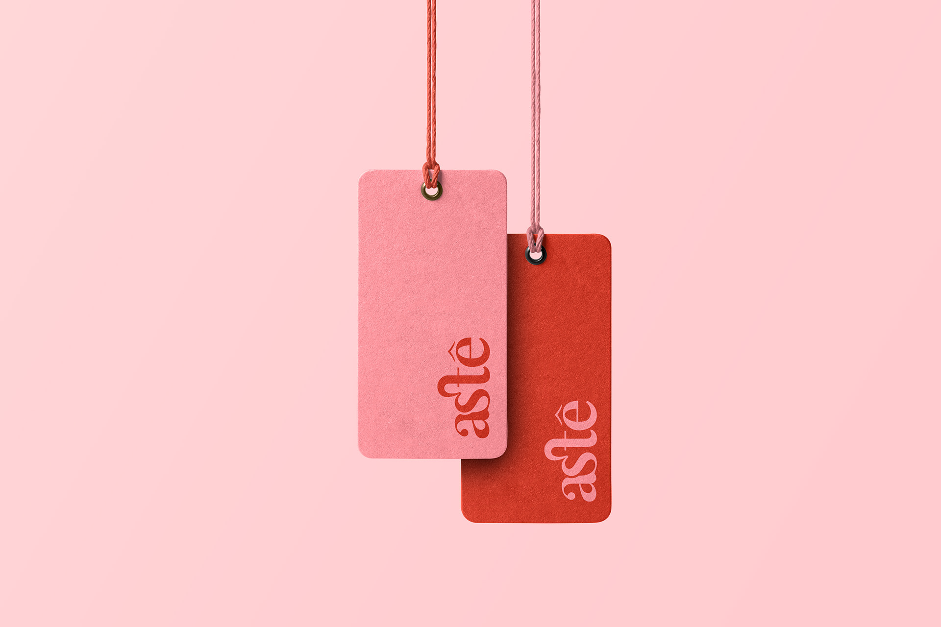
Pink and green
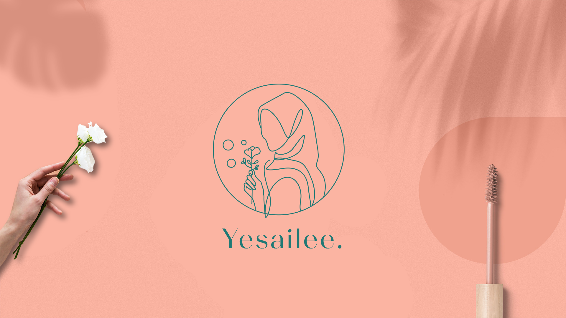
Combining pink and green makes for a dynamic color scheme that is calming and feminine.
The logo exhibited above is for a business that sells organic beauty products for women. In this case, green symbolizes organic, plant-based ingredients, while pink communicates beauty and femininity.
This combination creates a sense of balance and harmony by combining a warm color (pink) and a cool color (green).
A pink and green color combination is incredibly chic and tranquil. We see this combination in nature all the time—pink flowers or blossoms with green leaves, so our brains automatically associate this combination with spring and summer.
Yellow and purple
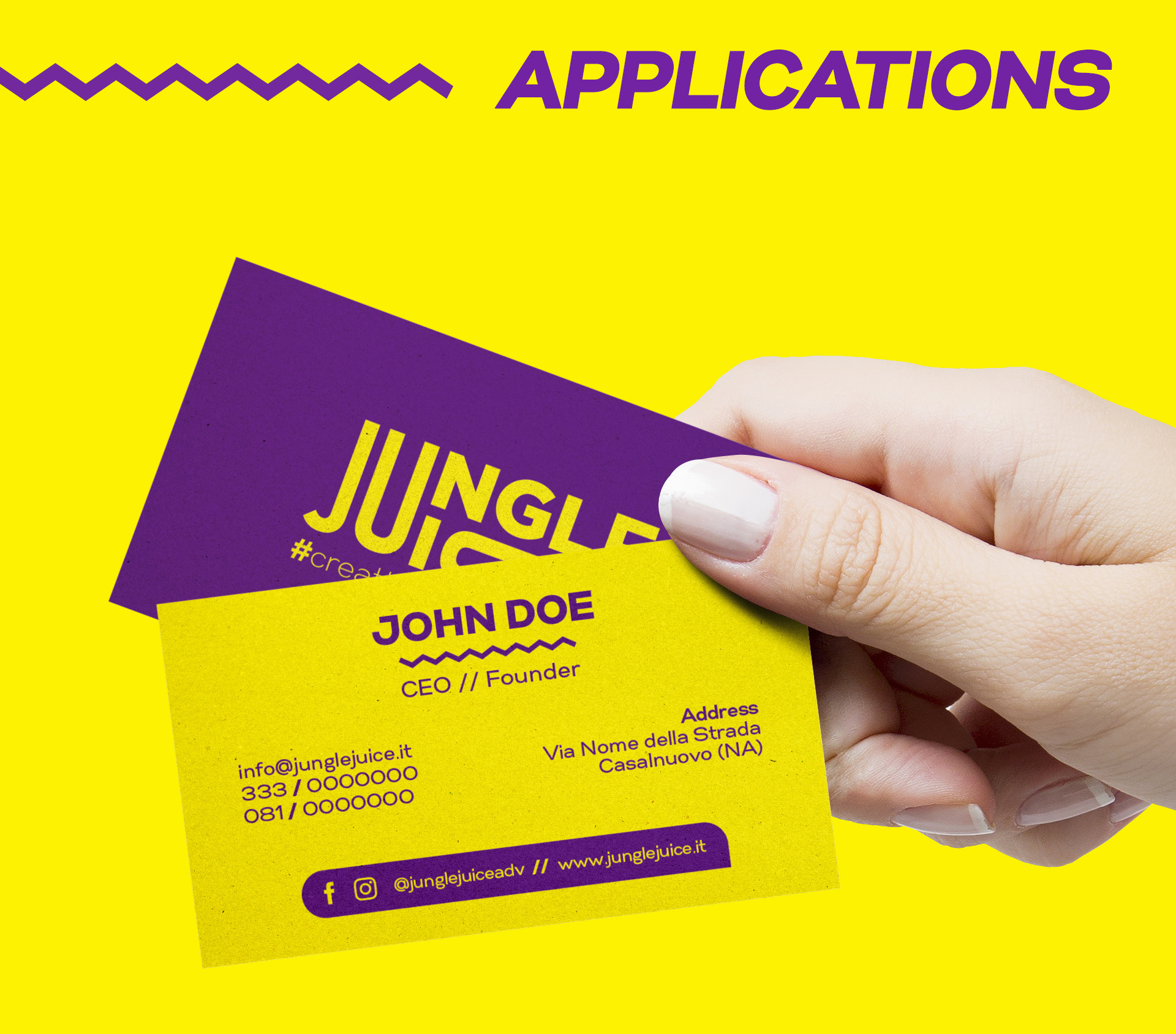
Complementary colors automatically make a statement.
They are the most contrasting colors on the spectrum and therefore enhance one another's vibrance by being placed next to each other.
These two colors also have highly contrasting meanings. Yellow is bright, cheerful, and fun, and purple is deep, regal, and mysterious.
Ready to create brand assets that pack a punch?
Visit our Academy to learn how to use color palettes.
The logo exhibited above is for a creative marketing and communications studio—Jungle Juice. These colors work well for a creative studio because yellow portrays the fun and creative side of things, while purple establishes the business side and a sense of trust.
Orange and brown
If you just talked about orange and brown as a color combination, it might be hard to sell.
It doesn't exactly sound glamorous or chic. But, when you look at them together, you'll realize that these two colors make an excellent combination. Brown neutralizes orange's boldness.
Orange is a fantastic accent color to carry through in other design elements. You can adjust the shades to create a warm and rustic mood out of this color combination that feels like pumpkin spice lattes in august!
Pink and red
Pink and red is a beautiful, feminine color combination that has been really trendy over the past few years.
This women's underwear brand is tastefully packaged in seductive red and romantic pink. It's a great choice for women's beauty and fashion products, as well as some home products and web design.
Green and gold
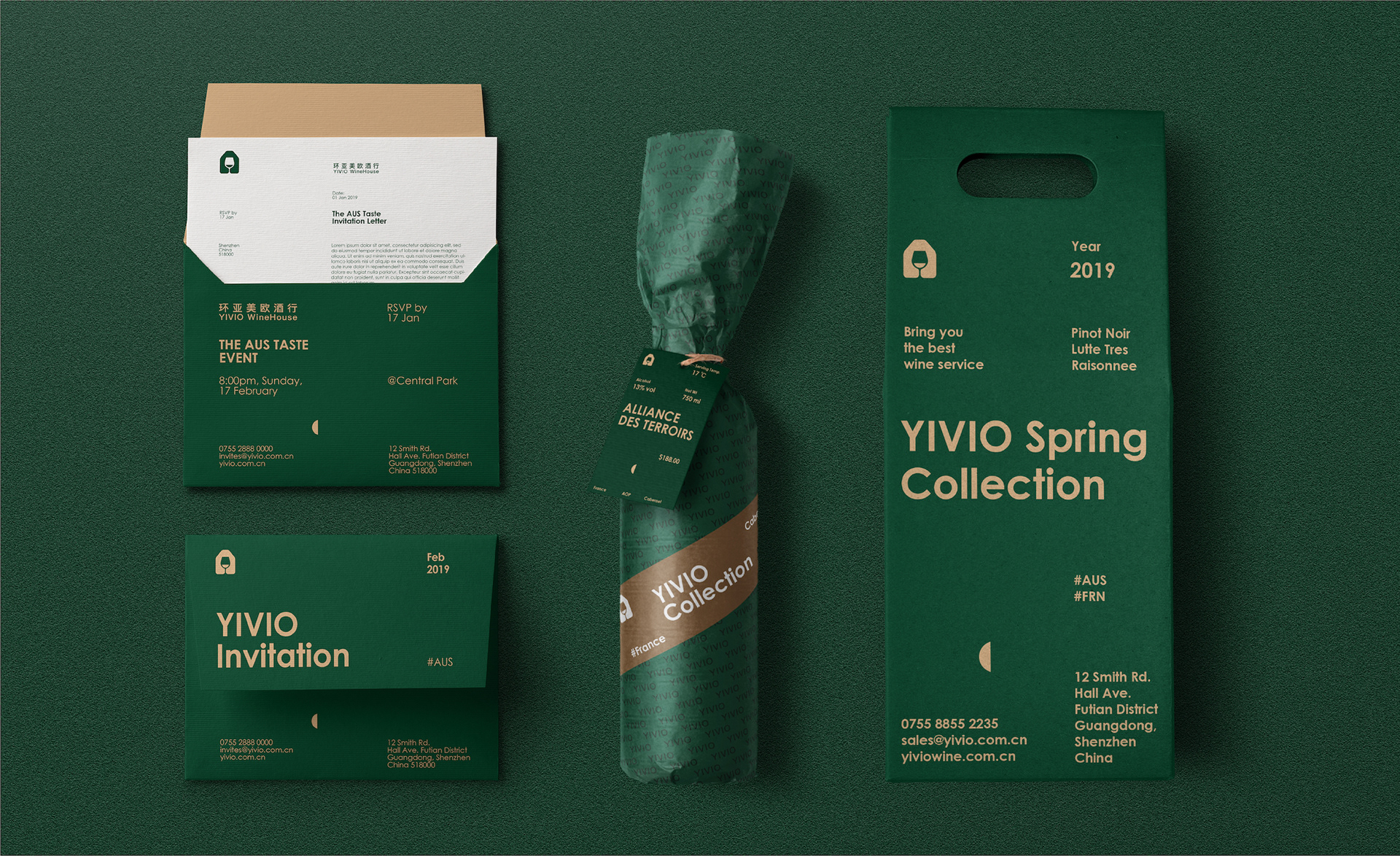
It’s chic. It’s earthy. It’s glamorous, and it’s easy on the eye.
Green and gold is an effective color combination that works well for a wide range of industries from food to beauty, fashion, and beyond.
Green is known to evoke feelings of trust and stability. It is associated with nature and therefore also communicates peacefulness.
Gold is the perfect warm counterpart to green’s coolness. It is the color of wealth and luxury. This is an elegant and mature color combination you can’t go wrong with!
Red and purple
Red and purple are excellent color scheme buddies, especially a deep purple that’s almost black, which can balance out red.
Bright purple in combination with red could be a little too much as these are both bold colors, but it can totally work if a really striking pop of color is what you're going for in your logo design.
:quality(75))
:quality(75))
Tri-color combos
Fitting three colors into a logo can be risky, but if it’s the right combination, you can create an irresistible logo.
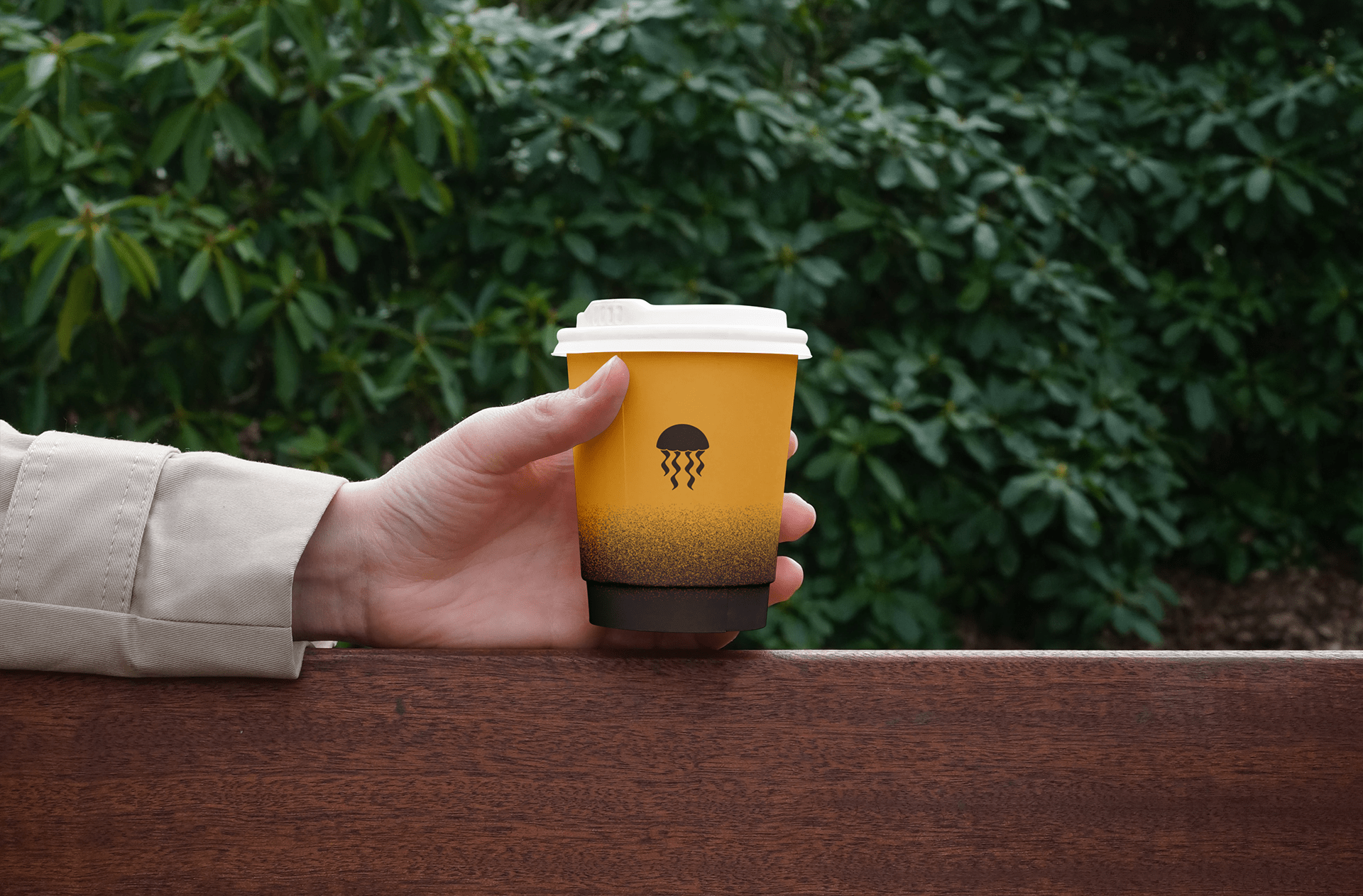
Orange, yellow and turquoise
Well, this is just a splash of summer, isn’t it? Blue and orange automatically make a statement as complementary colors, while yellow throws an extra layer of vibrance into the mix.
Pink, yellow and blue

These three colors make a great combination, especially in lighter pastel shades.
You'll often find a combination like this in the food industry, especially for sweet delights like ice cream, cookies, and doughnuts. It’s a fun and youthful combination worth experimenting with.
Red, green and purple

Since red and green are complementary colors, this combination immediately stands out.
Purple is a cool color like green, which works with green to balance out bold red. But purple also contains red, so it's the perfect middle ground color for green and red creating a diverse tricolor combination that's intriguing and creative.
Blue, yellow and green

This fresh and energetic combination is uplifting and tranquil.
You can experiment with various shades and see how that changes the mood—lime green and turquoise will enhance the feeling of freshness and vibrance, while a dark blue, green, and mustard will appear more elegant in this dark shade form.
Green logos, in general, are a common choice for businesses as green communicates kindness, eco-friendliness, wealth, health, growth, and stability.
Ready to create brand assets that pack a punch?
Visit our Academy for free logo color design courses.
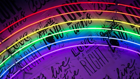
Analogous color schemes
Analogous color schemes have become exceptionally trendy.
This color scheme consists of three similar colors that sit next to one another in the color wheel, for example, yellow, yellow-green, and green, or violet, red-violet, and red. An analogous color scheme makes for a vibrant logo alive with color without being too colorful.
Blue, blue-purple and purple
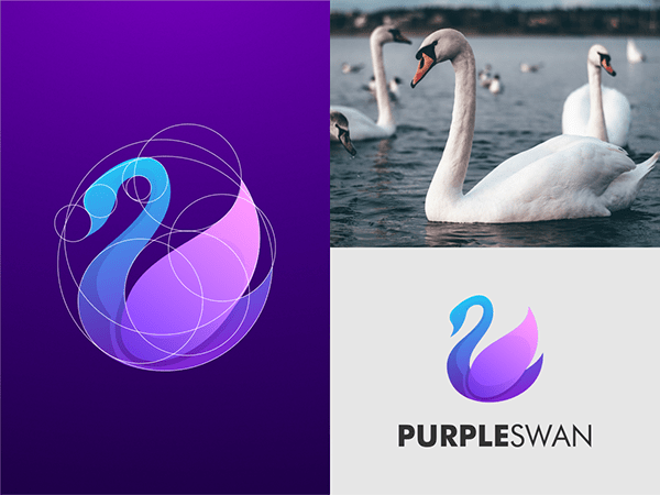
This logo color scheme speaks to the brand’s name and creates a wonderfully tranquil atmosphere through the blue and purple blend of colors.
Both of these colors are peaceful and calming, so they work well together in an analogous color scheme and make for an effective color combination.
If you're working with a blue color palette, you can lean either towards the purple combination or the green combination to create a beautiful analogous color scheme.
Yellow, yellow-green and green

You will have encountered this logo from the well-known brand BP.
The green and yellow sunburst belongs to the famous British multinational oil and gas company. The green and yellow were chosen to represent energy in its many forms.
Go monochrome

A monochromatic color scheme is made up of varying shades of the same color.
You can read all about monochromatic colors here. Monochrome works particularly well for blue and green color palettes. It’s a fantastic way to bring diversity to a logo design without overwhelming it with color. You can also balance out super bright colors like aurora pink or blazing yellow with their lighter counterparts.
Neutral never disappoints

You can never go wrong with neutral.
Combining various shades of beige and brown always looks chic in a logo. It's earthy, tranquil, and non-confrontational.
You can always spruce it up with an accent color like peach or a warmer neutral accent color like burnt umber, or perhaps try a Pantone color of the year, like living coral.
Many eco-conscious brands in the fashion industry are branded with neutral colors and homeware and beauty. A neutral logo will also work with any background color, even if it's a bright color or a black background.
Choosing your color scheme
Hopefully, you’ve got some ideas based on our suggestions above!
It’s always a good idea to play around with color combinations to keep you on your graphic design A-game. There is such a wide variety when it comes to color choices—it's easy to find yourself in a bad logo color combination!
If you are interested in logo design, you should take the time to learn more about great color combinations, get inspired by the designs of famous logos, and learn which technical skills you'll need in order to create a vector logo.
Ok, back to color palettes:
You can always turn to the magical powers of technology to help you with generating color schemes. There are websites that automatically generate aesthetic color schemes and give you all of the color codes, such as coolors that you can spend hours on end playing with!
When choosing your color scheme, remember to first evaluate:
- The meaning of the colors
- What the logo needs to communicate
- What mood the brand is portraying
- How the logo colors will fit into the rest of the brand identity. Imagine how it will look in context, such as on business cards.
If you’d like to share your logo designs and unique color schemes, drop us an image in our DM’s, and we might share it on our socials! Creativity is all about community and collaboration—the more we share, the more we get inspired!
Jumpstart your ideas with Linearity Curve
Take your designs to the next level.
(Image source: Mo. Fahiz)
Share this!
Adí Aviram
Adí is an SEO developer working for Linearity in Berlin. Her hobbies include drawing comics, yoga, swimming, infinite scrolling, and birdwatching.