Has anyone else been obsessively watching lettering videos on TikTok and YouTube? We know it’s not just us because this trend is huge right now.
The art of lettering is a classic art form that has exploded on social media in the past few years, resulting in more and more people becoming interested in this traditional form of art. Like many other vintage trends, lettering is making a comeback.
If you’re new to lettering, the number of resources and tips online can be overwhelming. So, if you’re looking for an ultimate guide to lettering that can help you get started, we’ve got you covered.
Whether you're a newbie to lettering looking for a simple trick to master basic lettering styles or you're an expert looking for fresh lettering styles to add to your designs, you've come to the right place. We’re big lettering nerds, and we’re excited to nerd out about lettering styles.
Jumpstart your ideas with Linearity Curve
Take your designs to the next level.
There are countless styles of lettering and ways to create lettering designs. Don’t let that overwhelm you, though. Take some advice from this inspirational hand lettering design.
While lettering has certainly been taking off lately in the digital world, it’s always been a staple of advertising and marketing.
The marketing industry uses lettering for logos, posters, and billboards. Pretty much any time you see text in an advertisement, a designer has painstakingly selected or created the font.
The wrong font can completely derail a design, while a creative font that fits the look and feel of the design will improve it. If you’re creating a light, refreshing design for a sunscreen brand, you’ll want to use a summer font that is light and fun.
However, many people create lettering art beyond the scope of marketing work. The everyday letterer can use lettering art for practical daily uses like creating day planners, chalkboard art, and stationery design.
A modern lettering artist can create distinct custom lettering designs using many different mediums. Digital lettering is one form of lettering that has become increasingly popular. Graphic designers and artists love that digital lettering can be created on the go and easily used for digital advertising and social media.
In this article, we'll teach you the different ways you can create lettering, the basic lettering styles and give you tips on how to create your own designs with Linearity Curve (formerly Vectornator). And, of course, we'll have tons of beautiful examples to give you inspiration.
Before we get ahead of ourselves, let’s talk about what lettering is.
What is lettering?
So, we all know what letters are and have been familiar with stringing them together into sentences and words since kindergarten. If lettering as an art form is new to you, you might be wondering, how is this any different from just writing out a sentence?
Well, the term lettering is an overarching word for the art of creatively drawing out letters and words. As opposed to just casually writing out text, letterers take their time to create a work of art using letters.
When it comes to graphic design, “lettering” becomes “font” or “typography.” If you’ve used any document software like Word Document or Google Docs, you’re undoubtedly familiar with how selecting and changing fonts can impact the look of a group of text.
Selecting the right font can make or break a graphic design. There are even famous branded lettering fonts that can help you recognize a company immediately, like Adidas’ Avant Garde Gothic Demi or Adobe’s Myriad Pro Bold Condensed.
Creating and using creative fonts is one of the ways lettering has transformed into the digital realm. Whether drawn by hand or created online, creative lettering uses elegant lines and creative flair to make quotes or words into a work of art.
There’s a science to lettering as well, an established typeface anatomy or the anatomy of letters that describe the visual elements that build up letters in a typeface. The anatomy of letters can help you tell one font from another.
We can’t go that deep into the rabbit hole today, but if you want to learn more, check out this guide to the anatomy of letters. We recommend that you familiarize yourself with lettering terminology at some point in your lettering journey because it will make it easier to understand and communicate about lettering.
For now, let’s do a quick dive into the history of lettering.
History of lettering
Letterers have used their creativity to create beautiful designs throughout history. Long before we had printers, the first books were written using creative lettering.
It is believed that the Romans first introduced calligraphy and creative lettering. After this, many other cultures around the world used hand lettering, brush lettering, and calligraphy to create books and artwork.
This art form didn’t disappear completely with the invention of the printing press in 1436. Lettering, like many other art forms, has ebbed and flowed in and out of popularity and has recently become one of many trends that have benefited from going viral on social media.
You’ve likely seen examples of lettering videos on social media (if you haven’t, you should check them out!) These decorative lettering videos are just the newest form of hand-drawn lettering in a long line of lettering art.
Many people have discovered that it is satisfying and comforting to watch artists letter online. Like other trends (ASMR, cooking videos, and more), watching compilations and videos of people working on a lettering project can be relaxing.
Calligraphy is one of the oldest forms of lettering. Let’s break down the basics of calligraphy and then get into the other lettering methods: hand lettering, brush lettering, and digital lettering.
Calligraphy
Calligraphy is the art of creating decorative handwriting or lettering with a calligraphy pen or brush.
Calligraphy dates back to ancient China during the Shang dynasty. It grew to be more common in the Han dynasty (206 BCE-220 CE) as all educated men (and some women) were expected to be skilled at calligraphy.
Calligraphy differs from hand lettering and brush lettering because calligraphy artists traditionally use a pointed calligraphy pen. This pen holds actual liquid ink, which controls the thickness of lines depending on how hard the pen is pressed to the page.
Calligraphy is slightly less focused on individual letters rather than the whole of the calligraphy script. Calligraphy fonts are focused on beautiful curved lines and the delicate flow of letters.
The four major elements of calligraphy are writing technique, structure, composition, and ink use. Calligraphy artists create beautiful letter styles using these techniques.
Calligraphy beginners may opt to try out their calligraphy skills with a different medium until they are ready to use a calligraphy pen. A pencil or pen and some paper is a great way to start practicing if the traditional calligraphy pen is out of budget or intimidating for you.
Hand lettering
Hand lettering is very closely related to but differs slightly from calligraphy because of the deliberate focus on each independent letter.
Hand lettering focuses on drawing out letters individually rather than writing them all at the same time. In hand lettering, every single letter in a word or sentence is an illustration. The beautiful hand lettering designs you see online often take hours to complete, even if it is just one word.
Like other lettering styles, hand lettering takes lots of practice and attention to detail. Luckily, there are tons of resources available online with how-to videos and workbook pages that you can print out and practice on.
We covered the basics of hand lettering in our hand lettering for beginners guide. So, if you're not familiar with hand lettering, go brush up on the basics and meet us back here.
Brush lettering
Brush lettering is one of the preferred hand lettering styles for digital creators. This style creates beautiful designs and is super satisfying to watch.
Brush lettering artists use a brush pen to create decorative strokes and intricate flourishes. Again, this style is quite similar to calligraphy and hand lettering, but the tool you use is what sets it apart.
Get creative with our ready-to-use templates.
Linearity Curve offers templates for every social media platform and various use case templates for posters, business cards, slides, app store screenshots, and more.
This lettering style is recognized and characterized by its thick lines on downstrokes and thin lines on the upstrokes of letters. To create brush lettering designs, you can use an actual paintbrush and ink or try out a brush pen designed explicitly for brush lettering practice.
Again, you’ll want to watch lots of videos and practice a lot before you’ll be able to get the style down perfectly. Don’t be intimidated by the experts you see online; they all started as beginners, too.
Digital lettering
Let’s get digital, digital.
Digital lettering is the most recent adaption of lettering.
Digital lettering designs are created on an iPad or tablet using a digital stylus to hand letter or create calligraphy. With digital lettering, your graphic design software enables you to create a sketchbook on your iPad or device using your stylus as a pen.
We happen to know a great design software (wink wink) that has some awesome features for creating digital lettering.
You can really hone your digital lettering skills by first practicing with pen and paper.
Try out the three lettering methods above and see what you like best, then recreate it with your design software and stylus. Or, you can take a photo and upload it to your design software, then trace the letters- but more about that later.
Now, let’s talk about some different lettering styles you can use in your own practice.
Calligraphy styles
Calligraphy is an art form that has been around for centuries. It’s still popular today for a reason, it’s beautiful to look at and creates incredible designs.
Calligraphy can be broken down into two basic categories: traditional and contemporary. Let’s start with the basics and talk about traditional calligraphy styles.
Traditional calligraphy
There are three main types of traditional calligraphy, classified by the parts of the world from which they originate:
- Western
- Eastern
- Arabic
Each type of calligraphy style indicates the language and style of these different regions. All three styles differ in how they write, and Arabic calligraphy differs in the direction in which words are read and written.
Western calligraphy encompasses English-language handwriting using the Latin alphabet. Eastern calligraphy features diverse Asian alphabets with an emphasis on balance. Arabic calligraphy highlights the Arabic alphabet, which is written from right to left, focusing on proportion.
Modern calligraphy
Get ready for some significant overlaps from here on out. Modern calligraphy style is incredibly similar to hand lettering and brush lettering.
You will probably notice pretty quickly how much the different styles intermix between calligraphy, brush, and hand lettering.
Script calligraphy
Does anyone else remember struggling through cursive handwriting classes on cursive in elementary school while your teacher insisted that you'd use it later in life? Well, maybe they weren't wrong.
Cursive lettering is a sophisticated style that is very common in calligraphy art.
We see this type of calligraphy when artists want to give a design a flowery, refined appearance.
Spencerian calligraphy
Spencerian Calligraphy was considered the go-to style from 1850 to 1925 in the United States.
Spencerian calligraphy is typically distinguished by its "light" emphasis on lower case letters. The majority of the lower-case letters in Spencerian calligraphy do not have a lot of shading or dark hues.
This calligraphy style can be a bit more approachable for beginners because this style encourages and embraces the natural movements of the hand and arm muscles and harnesses that into rapid, fluid lines.
Copperplate calligraphy
Copperplate calligraphy style was standard in the 19th century but was used as early as the 16th century.
Copperplate calligraphy is a style that is relatively similar to Spencerian calligraphy. However, Copperplate style letters are written with darker, heavier lines and more shading where the pen swells compared to Spencerian.
The name Copperplate comes from the style of books in which students used to practice this style: etched copper plates.
Hand lettering styles
Hand lettering and calligraphy are similar but can be differentiated based on the emphasis placed on individual letters rather than the whole of the script.
Creative lettering, known as hand lettering, focuses largely on individual letters, as we discussed before.
There are many lettering styles in the hand lettering sector; we’ll go over the main ones you should know.
With endless lettering styles to try, it’s good to know which ones are most often used.
Sans-serif lettering
Also known as block letters, this is the most basic of the lettering styles.
Sans-serif means without serif. Serif letters are the most recognizable and common form of lettering style. The blog post you’re reading right now is written in a Sans Serif style.
This is the style most lettering beginners start with, and it is also common in digital text because it is the easiest to read with its clean lines.
This lettering style is commonly seen in digital text and kid-friendly content. It’s easy to read and simple in appearance.
Serif lettering
Remember how we said Sans Serif is a lettering style without serifs...well, we'll give you one guess what Serif lettering is. Yep, you guessed it lettering with serifs.
A serif is a slight mark on the end of certain letters that gives letters a distinct flourish.
Serif lettering style is used in the text you see in novels and can be used to create a sophisticated appearance in digital copy or advertisements.
Script lettering
This is another significant overlap with calligraphy styles.
Cursive hand lettering is the same as calligraphy script. Loopy, curving font connected together between letters.
Like we discussed with cursive calligraphy, script hand lettering is perfect for sophisticated and elegant designs.
We often see this style of lettering for wedding invites, menus, and book cover designs.
Vintage lettering
Vintage is a rather vague term, but essentially it refers to anything created 20 years in the past. That means anything from the year 2000 and before is considered vintage.
This includes a groovy 70s style, austere 19th-century style, and any other lettering style that appears antique or vintage.
Using vintage lettering style is perfect for a piece that you want to appear sophisticated or learned. Funky 70s fonts are also super in right now and can be used to give a design a youthful, energetic feel.
Vintage font can be used in vintage logos, web design, or product design.
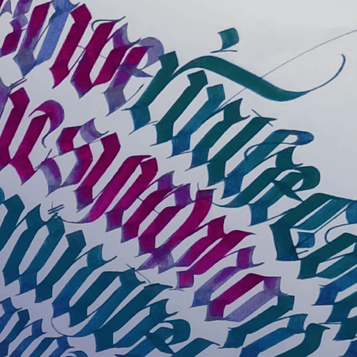
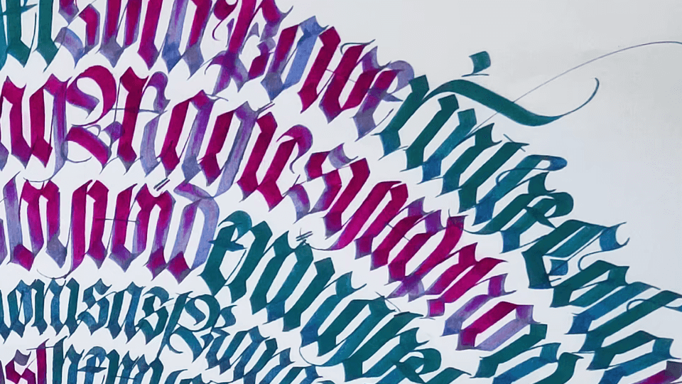
Gothic lettering
Gothic letters are a form of vintage lettering that is distinct enough to warrant its own category.
Gothic lettering, also known as Blackletter style, was a lettering style used throughout Europe from around 1150 until the 17th century.
This style always reminds us of old folktales and fairy tales.
Gothic lettering is distinct in its gothic, medieval appearance. It can be an excellent pick for designs that you want to appear traditional and strong.
Monoweight lettering
Monoweight hand lettering is a lettering style where all letters are given the same weight.
Monoweight hand lettering is fun and easy and is a great place to start your lettering journey. Because Monoweight literally means one weight, beginners find this style to be very approachable.
We see this style a lot in digital lettering and in lettering projects that have exploded on social media.
Graffiti lettering
Most of us are familiar with graffiti; you’ve likely seen it painted on the sides of buildings or objects, especially in city centers.
Graffiti as an art form has become broadly accepted in the past few decades and has been around for much longer. Some of the earliest examples of graffiti can be found in ancient Egypt.
Graffiti has even bled into hand lettering. The graffiti style has a similar appearance to the graffiti you see painted in public places.
Using graffiti style in your hand lettering is perfect for giving a piece a more modern and urban edge.
Now, let’s talk about actually creating your own lettering designs and go over some essential tips and tricks that you’ll need to know.
Ready to create brand assets that pack a punch?
Visit our Academy for free marketing design courses.
Digital lettering design tips
When it comes to hand lettering and calligraphy, there are tons of free resources and workbooks online to help you hone your skills. If you’re new to this type of art, check those out before working on digital lettering.
Here are some tips and things to consider while you work to hone your skills:
- Find inspiration: We’ve got lots of fun examples in this piece, but we also recommend following some lettering artists on social media and checking out designs on platforms like Dribbble, Pinterest, and Behance.
- Focus on legibility: Creativity is key when it comes to lettering, but your work also needs to be legible. Make sure to find a balance between design aesthetics and practicality.
- Consider diversifying styles: Try a mixture of these styles in your design to create contrast and ensure your design is interesting to look at.
- Ensure designs are consistent: While we encourage introducing some diversity in your design, you should also be careful to create letters and phrases that are balanced and consistent.
- Practice, practice, practice: like many other art forms, practicing is essential to hand lettering. You won’t create your best lettering work right away; you’ll need to hone your skills through careful practice.
You can begin lettering by hand with a pen and paper, but eventually, you'll need to use design software to change your letterforms into vector shapes if you want to use your designs in a digital format.
Linearity Curve (formerly Vectornator) is an excellent tool for this. We have a powerful Auto Trace option and Pen Tool that makes transforming your letters into vectors incredibly easy.
So let’s talk about how you can do that.
Digital lettering using Linearity Curve (formerly Vectornator)
Any of the lettering styles used for hand lettering or calligraphy can be recreated using your apple pencil and design software.
If you haven’t used Linearity Curve (formerly Vectornator) for design before, stop right now and watch this awesome video by one of our favorite lettering artists, Will Paterson, for some awesome tips for using Linearity Curve (formerly Vectornator) on your iPad Pro.
Linearity Curve (formerly Vectornator) has tons of free fonts you can use for your designs, but it’s even more fun and unique to create your own. If you do want to try out some of our fonts, check out Fontinator to play around with our font designs.
Linearity Curve (formerly Vectornator) isn’t just for hand lettering or digital lettering styles. With our Brush and Pen tools, you can create fluid vector calligraphy that is easily editable once created.
So, pick your favorite lettering style, and let's talk about doing some actual lettering and how to digitize this process using your favorite design app: we hope it’s Linearity Curve (formerly Vectornator).
Essentially, there are two methods you can use to take your calligraphy, brush lettering, and hand lettering digital:
- You can use a digital pencil to draw directly into a graphic design software like Linearity Curve (formerly Vectornator) using the Pen Tool and Gesture Control.
- You can take a still image of your pen and paper design or a design you created in another software and upload the image to design software, and then trace over the image with our Auto Trace feature.
Here’s another video by our friend, Will Paterson, that goes into more detail about how you can do that step by step. Will specializes in branding and hand lettering and is a great source of inspiration for new digital letterers.
In this video, he gives some awesome tips on how you can use Procreate with Linearity Curve (formerly Vectornator).
As you can see, it’s a lot easier than you might think! You can easily digitize a lettering project in just minutes using Linearity Curve (formerly Vectornator). Then, with our easy export and share buttons, you can upload these designs into your branding kit or social media.
Now, get to lettering! Don't forget to download Linearity Curve (formerly Vectornator) for all your lettering needs, and remember to follow us on socials and tag us in any lettering projects you work on!
We can’t wait to see the awesome lettering designs you come up with.
Jumpstart
your ideas with
Linearity Curve
Take your designs to the next level.
Cover image source: Unsplash
Share this!
Emma Taggart
Emma is a Content Writer for Linearity in Berlin. Her hobbies include making ceramics, roller skating, drawing, and 2D animation.


:quality(75))
:quality(75))

:quality(75))
:quality(75))
:quality(75))

