:quality(75))
:quality(75))


:quality(75))
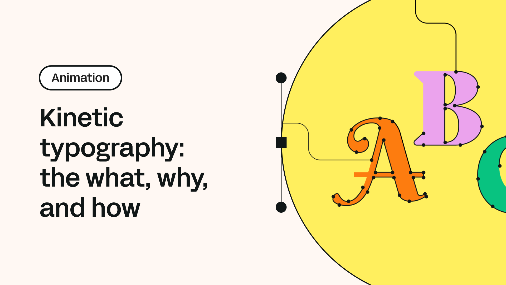
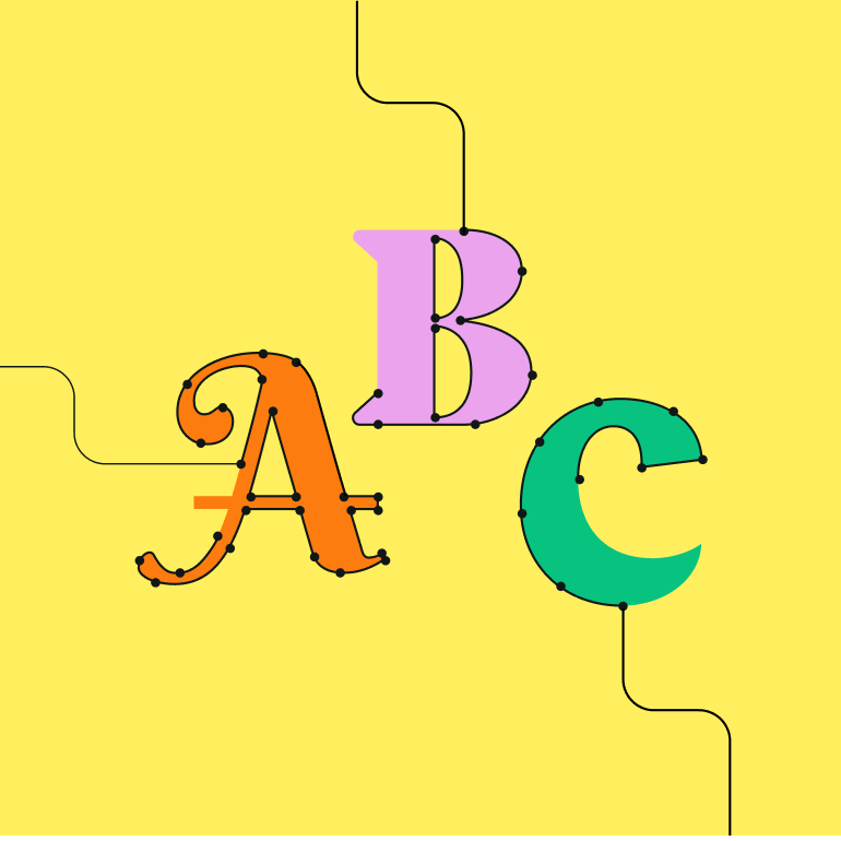
There is more to moving type than meets the eye.
Making type move across a screen isn’t a new phenomenon—it dates back to the 1950s when film title design was an emerging art form—but its popularity has exploded in recent years.
There are more movies and TV shows than ever, which means even more title design and animated typography sequences.
The unstoppable rise of the internet and computing power has led to motion typography being used on websites, in apps, and pretty much everywhere there’s a screen.
Advancing technology and software has made animating typography accessible to many more people.
We’re here to answer those questions and more, so join us as we explore the wonderful world of motion typography.
What’s kinetic typography, and what’s so good about it?
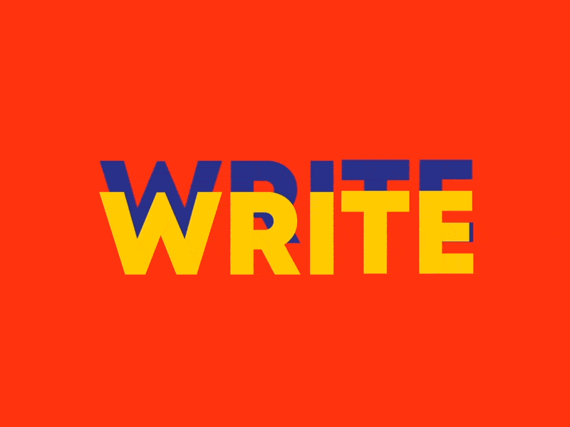
We know the term ‘kinetic typography’ sounds fancy, but it’s a more technical way of saying ‘moving text.’
Kinetic typography is an animation technique that integrates motion with text, which is why it’s also sometimes known as motion typography.
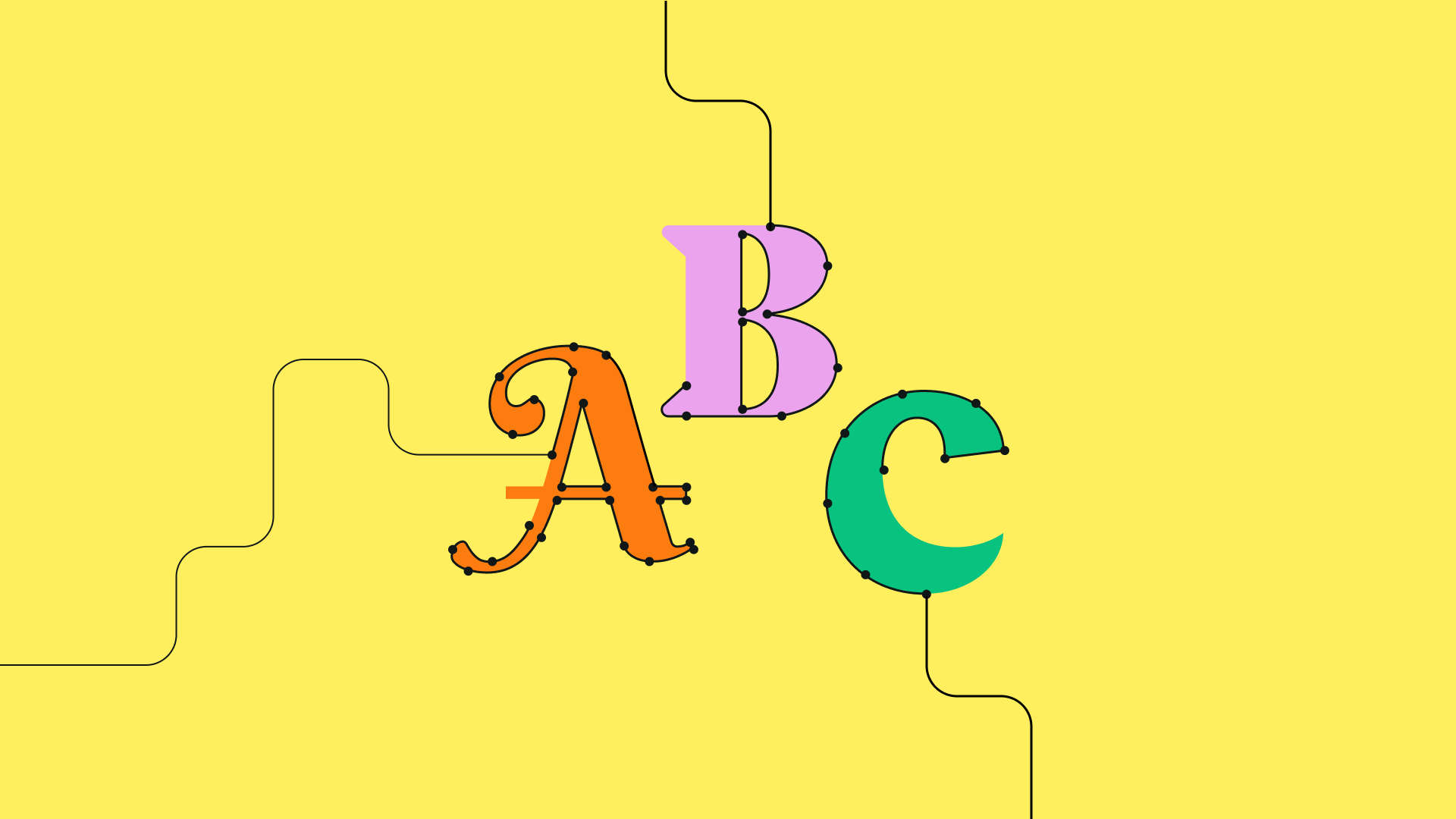
There’s no fixed way in which the text should be animated, and the lettering can shrink or expand, move around the page, change color, undergo distortion, or be subject to any creative techniques that a graphic designer wants to use.
The text animations can be short, simple, or more elaborate and complex.
Manipulating and transforming text with movement can achieve a wide variety of effects—it can create emphasis where it is desired, convey emotion, conjure up ideas, and transform simple text into a powerful message.
Your imagination is the only limit to what you can achieve with kinetic typography.
One of the best things about modern kinetic typography is that it is more accessible than ever, with a lower barrier of entry for anyone who wants to get started.
With the explosion in web design and higher broadband speeds, there are more opportunities to create and deploy cool typography animations.


What are some inspiring kinetic examples?
The earliest example of kinetic type can be traced back to 1959 and Alfred Hitchcock’s feature film North by Northwest.
This groundbreaking kinetic-type title sequence paved the way for motion typography in film and TV title design.
This has now developed into an art form in its own right, and some of the most iconic and amazing examples of animated typography compositions come from this design area.
Over time, animated typography moved from film and TV and started to appear in more and more contexts.
Now, we see kinetic typography in all kinds of info and explainer videos.
Apple: Carbon neutral campaign
A brilliant example of motion typography's effectiveness comes from Apple’s video announcing that all its products will be carbon neutral by 2030.
It uses accelerated typography animation along with hand-drawn style animations, and its use of green as color along with white helps to reflect the core message of sustainability.
In our opinion, this is one of the best kinetic typography videos we have seen.
Catch Me If You Can title sequence
The opening title sequence of Steven Spielberg’s Catch Me If You Can (2002) is a classic example of kinetic typography used to set the tone for the film and introduce the audience to its adventurous storyline.
The renowned title designer Pablo Ferro created the title sequence.
In this sequence, the film's title and credits are dynamically animated across the screen, often interacting with the scenes in the background. The typography mimics the style of 1960s graphic design, showcasing the film's setting in that era.
Another way animated type has proven popular in recent years is in lyric videos. Lyric videos are music videos with the lyrics animated throughout the video.
These videos are often fan-made and uploaded to YouTube. Many of the incredible videos showcase the endless fun and creativity people can express with this animated typography project.
True Detective opening sequence
The TV show True Detective features a memorable opening sequence with kinetic typography that sets the tone for each season.
The shifting text overlays striking imagery, creating a sense of mystery and intrigue.
References to religion, morality, and the nature of evil are woven throughout the opening sequence, reflecting the existential questions that the characters grapple with throughout the show.
Bush: More Than Machines music video
Take the music video for Bush’s More Than Machines, for example. It uses a combination of fonts that reflect the song's mood and tone, and the background color is minimal, which adds significantly to the feel of the video.
The typography is presented quickly and almost jagged-like, further emphasizing the impact the song is conveying.
:quality(75))
:quality(75))
How to create kinetic typography
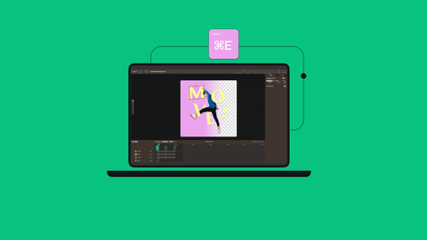
The first thing you’ll need to start creating motion typography apart from a computer is some motion design software.
Free options are available, but we recommend premium software like Linearity Move or Adobe After Effects.
It would also be helpful to learn the rules of typography and how to use text from a graphic design perspective.
There are several graphic design courses that you could take to improve your general ability. Many animation courses are specific to the kinetic type and that you could take to focus on developing this valuable skill.
Considerations for Animating Type:
Audience and Message Alignment:
- Determine who your target audience is and what message you want to convey.
- Ensure the animation style and design elements resonate with your audience and effectively communicate your message.
Animation Techniques:
- Explore various animation techniques such as kinetic typography, motion tracking, or 3D animation.
- Choose techniques that complement the content and enhance its impact.
Typography Selection:
- Select appropriate fonts and typography styles that reflect the tone and context of your message.
- Experiment with font pairing and hierarchy to create visual interest and readability.
Timing and Pacing:
- Consider the timing and pacing of your animation to maintain viewer engagement.
- Use keyframes and easing functions to control the speed and rhythm of the animation.
Visual Consistency:
- Maintain visual consistency throughout the animation to create a cohesive design.
- Ensure that colors, typography, and motion effects align with your brand or project guidelines.
Ready to start experimenting?
As with much of graphic design, it can be very helpful to look around and see how other graphic designers are incorporating kinetic typography and what techniques they use.
The goal isn’t to steal ideas wholesale but to be inspired by what you see and to develop new ways of applying styles or adding twists. It’s also important to get creative and have fun.
If you hope to become a freelance motion designer, creating motion typography will be an important tool in your arsenal. We hope this rundown has helped you grasp the main concepts.
Frequently asked questions
What’s kinetic typography used for?
Kinetic typography, also known as motion typography or animated text, is used for various purposes in multimedia and digital media production, such as:
- Video Introductions and Title Sequences
- Promotional Videos and Commercials
- Educational Content
- Music Videos
- Explainer Videos
- Event Announcements and Presentations
- Social Media Content
What software is best for creating kinetic typography?
Linearity Move is a stellar choice for creating kinetic typography. The platform has various animation features and tutorials that address the needs of many animators and designers.
Adobe After Effects is a good choice, though Adobe Animate and Maxon Cinema 4D are also used.
How can I create kinetic typography?
Start by designing the final frame, lay out the text, and then animate it using keyframes to bring the text in and out of the frame. Linearity Move has a helpful tutorial on animating typography.
Where can I find kinetic typography templates?
Templates are available on platforms like Linearity Move, Sickboat, Motion Array, and Envato Elements, simplifying the creation process.
Sometimes, motion designers and video creators upload their kinetic typography projects as templates or tutorials on video-sharing platforms.
Before downloading or purchasing a template, check the licensing terms, compatibility with your video editing software, and user reviews to ensure it meets your needs and expectations.
Share this!
Jonny Tiernan
Jonny is a contributing writer to the Linearity Blog.