:quality(75))
:quality(75))

:quality(75))
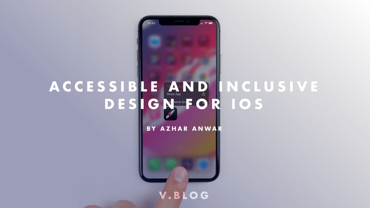
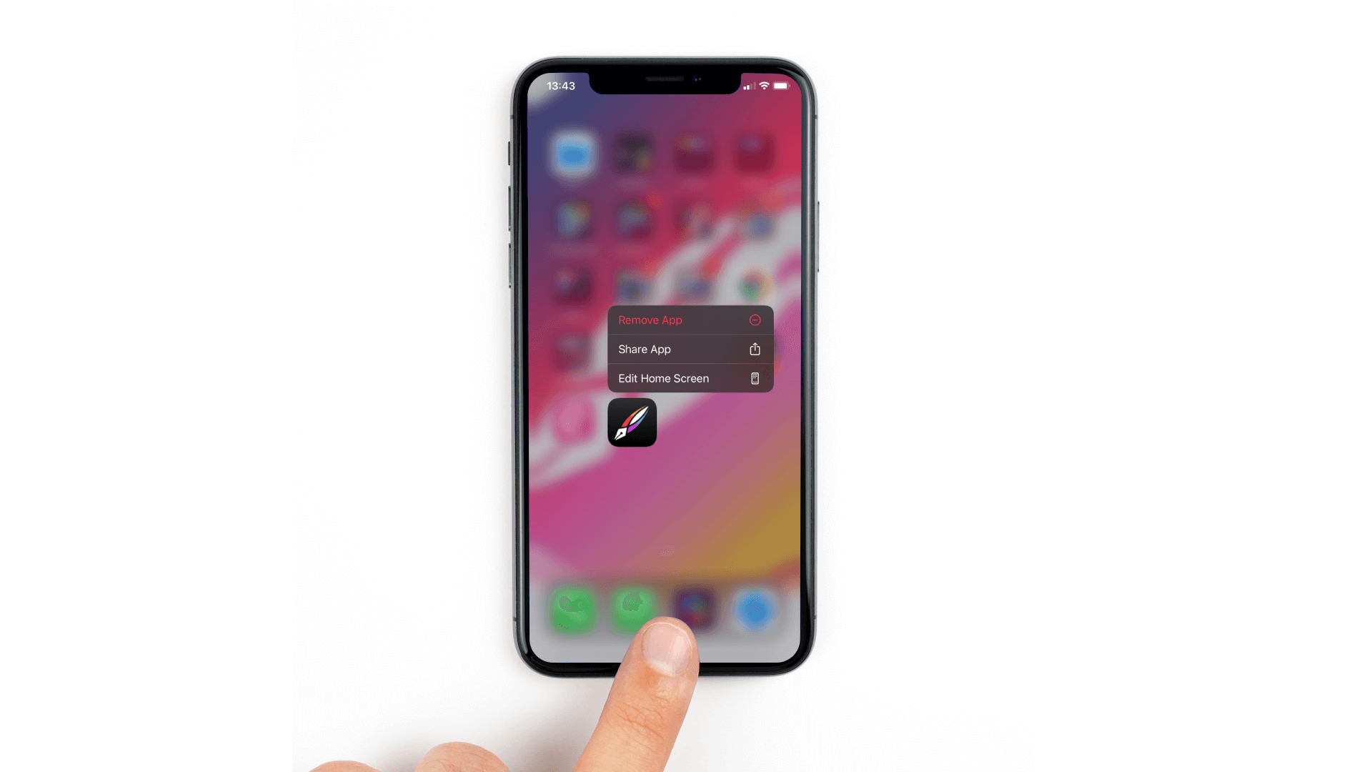
You may have asked yourself, why is accessibility important for your app’s design? Have you ever wondered if blind people can use your app? What features has Apple provided to help people with an impairment interact with their devices? In this article we will take a look at accessibility and how you can make your app easy to use for all kinds of users.
Jumpstart your ideas with Linearity Curve
Take your designs to the next level.
Vision
Users with vision impairments can include people with blindness, color blindness and all degrees of vision loss. This category can also include users whose vision is affected by external factors and don't necessarily have a vision disability.
Apple provides:
- VoiceOver tells the user out loud what is in the touch area.
- Zoom allows the user to enlarge content on the screen using touch gestures.
- Dictation allows the user to input text using his/her voice
- Color inversion/ Smart invert allows users to view content on a dark background. In Smart invert mode the content itself doesn't invert while the UI itself stays dark.

Hearing
Users with hearing loss, hearing impairments but also users that may not necessarily have a hearing disability but want to use accessibility features like vibration in situations where they don't want to make any noise.
Apple provides:
- Closed captioning allows the user to add and display subtitles to media content.
- Visual and haptic notifications make the user aware of alerts and messages via lights and vibrations.
- Type to Siri mode allows users to interact with Siri by typing out commands.

Mobility
Users in this category may have difficulty holding and manipulating the device in a traditional manner.
Apple provides:
- Switch Control allows a user to navigate the screen by sequentially highlighting items and using a physical switch such as, the home button, the lock button and others to select an item.
- Assistive touch allows a user to set up multiple gestures as part of a floating menu that contains these gestures.
- Siri allows users to use their voice to direct Siri to help control apps and devices.

Thinking in terms of accessibility
Accessibility is not limited to users with disabilities. The basic principle of accessibility is to make information available for everyone regardless of their capabilities and/or situation. You should prioritize simplicity and perceivability and examine each aspect of your design to ensure that it doesn't exclude any user.
Simplicity: The quality or condition of being easy to understand to do.
Perceivability: Become aware or conscious of (something); come to realize or understand.
Personalization through standard controls
If you use the standard controls that are part of Apple's UIKit framework to create your app's UI design, text and interface elements, your design will automatically adapt to the user's accessibility settings such as, dynamic type, with Bold Text, Larger Text, Invert Colors, and Increase Contrast.
Text
Text size and weight go a long way in ensuring clarity and readability across your app. Use Dynamic Type and test that the layout of elements at all text and glyph sizes adapts well to the screen. You can download the dynamic type size tables from Apple Design Resources.
Dynamic type lets people pick the font size that is appropriate for them. The user can pick this in the iOS device's accessibility settings.

Avoid truncation
With increased font size you should avoid truncating text, this will ensure that information doesn't get hidden. The user should simply be able to scroll to read all text that wraps around. Truncating text is okay if the user has the option to tap and view the complete text in a separate view.

Maintain information hierarchy
The primary elements of your design should remain towards the top of your screen regardless of text size. Doing this will ensure consistency and communicate a clear hierarchy to the user each time.
Ready to create brand assets that pack a punch?
Visit our Academy for free marketing inclusive design courses.
Font weights
Thin and Ultra Thin variants of fonts can be fun and interesting, you should however prioritize the use of Regular, Medium, Semi-Bold, or Bold font weights because they also have a functional aspect to themselves by being much easier to see, especially at smaller text sizes.

Text contrast
Text that is smaller or has a lighter-weight should have greater contrast to increase legibility. You can use the following guide provided by Apple to decide what contrast ratio and text weight is appropriate based on text size.
Custom fonts
Most app developers use custom fonts to stand out with the design of their app. If you have the need to use a custom font make sure that the font is readable, even at small sizes. Ask your developer to support dynamic type using the custom font to maintain accessibility.
Color
If any part of your app uses color to convery information, make sure you also provide text labels or glyphs to help color blind users understand the information on-screen.
System colors
As much as possible, try to use system colors to create your designs, the text and the views will respond automatically to changes in the device's accessibility settings, for example, Invert Colors and Increase Contrast.
.png)
Color blindness
When you’re communicating an action, a response, or something important, avoid using color as the only visual cue. People with color blindness will have a tough time engaging with your content.

Avoid color combinations that colorblind users find difficult to distinguish. Especially when it comes to a UI control element that has two states. For example, if your app uses a red and green colors to communicate state you can also use shapes for the respective states. You can use a square for one and a circle for the other state.
Contrast
The contrast ratio between text and its background should be at least 4.5 to 1. The ratios become better with larger and heavier fonts as they are easier to read at lower contrast.
Increasing the contrast of visual elements ike texts, glyphs, and UI controls can help imporiove readability of your design. You can test if your design meets the minimum acceptable levels for contrast by using a validator tool that is based on Web Content Accessibility Guidelines(WCAG).
Accessibility tools
Color palette creators and validators
Accessible color palette builder lets you enter up to six colors and review the color matrix to see what colors can be combined.

ColorBox by Lyft Design lets you build an accessible color system algorithmically. It can also sort colors by hue, saturation, and luminosity.

ContrasteApp lets you check text for accessibility based on WCAG rules. Oh, and it's free [:

Color blindness simulator
Color Oracle algorithmically simulates color blindness, allowing you to see designs from the eyes of a color blind person.

Get out there
When researching, verify if your assumptions regarding accessibility are correct. Make the effort to contact associations, and online communities—You'd be surprised by how willing people are to help.
Jumpstart your ideas with Linearity Curve
Take your designs to the next level.
Share this!
Emma Taggart
Emma is a Content Writer for Linearity in Berlin. Her hobbies include making ceramics, roller skating, drawing, and 2D animation.
