Want to earn some money on the side by selling your icon packs? Or do you want to become a fully-fledged icon designer?
You won't get far without knowing the basics.
.jpg)
Before you start working with icons, you need to understand what iconography is. Where does it come from? Where is it going? And why is it important?
We'll cover all of these points in this article. And then we’ll cover all icon types that you can choose from. No matter what your graphic design style is, there will be an icon for you. Afterward, we’ll learn about the principles of good icon design.
And finally, we will provide you with a step-by-step guide that will help you transform your icon vision into an icon reality. It’s a lot to cover, so let’s dive in!
Jumpstart your ideas with Linearity Curve
Take your designs to the next level.
What is an icon?
Consider the way a 'trash can' icon indicates where all of your deleted files go. This icon will mean basically the same exact thing in any language, culture, and to all ages and genders.
So if you think about it, an icon is the most universal language in the world.
Icon history
For all our Latin heads out there, the word ‘icon’ comes from the Latin word ‘eikṓn’ which means ‘likeness,' or 'image’. The modern form of the work dates back to 1565.
It’s mind-blowing how much information icons contain. It’s even more incredible how fast they deliver it. That is why icons have been used for centuries to communicate. What are the first historical icons that come to mind? Hieroglyphics from ancient Egypt. Cave paintings and Viking runes. They're all icons.
But moving towards our millennia, icons became more and more prominent as we started using and needing to communicate with devices. If we focus on a more recent history of icons, it's clear just how much they defined and influenced the development of the concept of User Experience (UX).
If you want to check out a detailed icon history from the very first folder icon to the skeuomorphic ones we see today, check out this amazing website.

Why are icons important?
As the world is getting busier and crazier, icons are a much-needed part of our lives that help to convey messages simply, elegantly, and fast.
Whether you need to find the right app feature, or when searching for the bathroom in a foreign airport, icons save you a lot of time. And not only!
All traffic signs are icons. Imagine being in Japan and not knowing if you can cross the street at a certain point. Icons are literal lifesavers in situations when we all need to communicate in the same language without actually speaking.
If you are a User Interface (UI) designer, using the right icons will make sure that the functionality of your app stays consistent worldwide.
Icons unite the world.
Pretty powerful, isn't it? Now that we know just how important these little symbols are, let’s get to designing them. Although many icons have been created and will continue to be created, there will always be a demand for more. More topics, different colors, different styles, different branding.
So let’s learn how you can feed the beast by creating your own.
Icon design principles
The creation process is the most exciting, and we’re going to get there. But first, we need to cover a few basic principles that icon designers usually follow to create a memorable icon.
Create Your Own Icon Pack with Linearity Curve
Learn to design unique and cohesive icon packs for your marketing needs with our Linearity Curve tutorial. Enhance your visual branding with custom icons that truly stand out.
Pixel perfection
It's not enough to just design eye-catching icons. You need to make your icons scalable, responsive, and suitable for actual devices. Position your icons on a pixel grid to make sure there is no blurriness.
Use a stroke width that is an even number (like two or four pixels), and keep it consistent throughout the icon or icon pack.
If you are rescaling your icon for various applications, you might need to change the design slightly for every size so you’re not left with half pixels that can bring blurriness to your design. This will help you maintain pixel-perfection.

Geometric shapes
Use geometric shapes as often as you can to design your icon. It will give your icons a more powerful, compelling, and organic shape. Plus, it will increase legibility.
Angles
Unless it's a straight angle, try to stick to 45-degree angles in most cases. The result will be crisp, and the perfect diagonal is an easily recognized pattern.
Corners
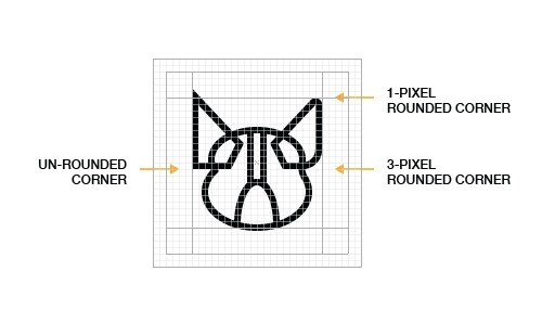
A 2px radius is very common in icon design. It's large enough to clearly define your rounded corners but does not soften the corners so much that your design takes a whole new aesthetic. But it all depends on the personality you want to give your design.
A thinner stroke of just one pixel will look pointier, while three pixels make a very rounded shape, while a 0dp Corner Radius gives you very sharp icons.
Keep it simple
Your icon needs to convey its message at one glance. That is its purpose. It cannot be too abstract, or too complex, because otherwise, it will lose its meaning.
This also applies to its composition - try not to get into too much detail. An effective icon design should be readable in small sizes or big sizes.
Strip your icons of any unnecessary details that don’t help to communicate its concept. Instead, make it heavy and noisy.
White space
In the same vein, make use of white space to give your design more room to breathe. That will help your icon convey its meaning faster.
Perspective
Perspective is hard to read on something as small as an icon. Always try to view the objects of your design straight ahead.
Keep icons consistent
Icon packs need to look consistent throughout, so you need to check that the stroke weights, stroke corners, color palette, level of complex details, spacing, and style elements remain the same across the entire icon set.
So if you use a 2px stroke for your first icon, you need to keep using it throughout.
However, do not read between the lines. Your icons do not need to have the exact same width or height. Instead, they must be individually scaled to ensure uniform visual weight.
Visual weight is the notion that certain common elements can appear to be heavier than others. Like a dark element feels heavier than a light one. It's not an exact science, and it has much to do with individual perception.
Therefore, there are no instruments to measure these forces. Trust your eyes and intuition when you align your icons in a lineup.

Personality
You have to give your icon a personality. There are so many different professional icon sets out there, and you have to stand out as an artist. You can do that with your own drawing style or a unique color palette.
Similarly, stay away from obsolete metaphors, like representing film with an old-school reel camera. The exception is, of course, when that is what the project requires. Stay modern and don't just repeat what others have done without giving it some thought.
Now that we've covered all the principles, let's dive into all the five steps needed in icon design.

Step 1: research
The basis of any creative project, isn’t it? You need to figure out what icon you need to design to represent a certain idea.
Is it meant for a children’s app, a university, or a company? Your design needs to convey that.
If you need to create an icon that represents the object itself, it’s fairly easy. But what if you need to create an abstract icon that represents ‘routine.’ This is where you need to put your thinking cap on and brainstorm the possible symbols you can use. Write down all the associations you can think of to depict the essence or meaning of your icon.

Use a dictionary, a thesaurus, word associations, or Google search, to not only better understand what you need to depict, but also to get inspiration. Harder than it sounds, but you need to simplify the idea of an abstract concept into common objects that relay the meaning in an instant.
Speaking of inspiration, don’t be discouraged if you cannot find a way to represent the concept of your icon straight off the bat. There are many icon designs out there that can provide you with the much-needed visual stimulus.
One of the biggest platforms is Icon Finder, and what’s fantastic about this platform is that it allows you to search for icons in multiple ways.
Step 2: define your style
Designing icons is so much fun! It's made even more enjoyable by the fact that there are so many styles out there to choose from.
- Outlined Icons are created from outlines only. This is the easiest style for beginners to start with, so we recommend it to all fledgling icons designers out there.
- Hand-drawn Icons are a form of outlined icons, but they look like they’ve been hand-drawn.
- Filled-in Icons incorporate colors, shading, gradients, and all that fun stuff. But there are very specific sub-categories depending on how you choose to fill in your icon.
- Glyph Icons are filled in with a solid color.
- Flat Icons, as the name suggests, respect flat design principles in the sense that they have minimal to no shading, shadows, or gradients.
- Skeuomorphic Icons (also called 3D icons) are designed to imitate their real-life counterparts.

Do you consider yourself a minimalist, a flat designer, or do you love skeuomorphic design? No matter your preference, there’s an icon style with your name on it.
But you cannot just consider your own personal style when designing icons. Your decision depends on the general requirements for the type of interface your icons will be displayed on (for example, Apple iOS or Material), as well as the stylistic choice of the particular UI layout for which you are designing. Decisions, decisions.
Step 3: sketch
All designs, simple or complex, start with the most simplest shapes.
It's important to start maintaining a good grid and layout while working on the icons. Download the icon grid file for an easy start.
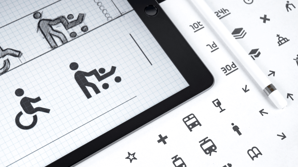
When sketching, understand what major shapes you need to use in order to create your icon content. In order to understand these basic shapes, you can use a reference image, or you can simply start sketching out the main components of your icon in ample strokes.
Ready to create brand assets that pack a punch?
Visit our Academy for free icons design courses.
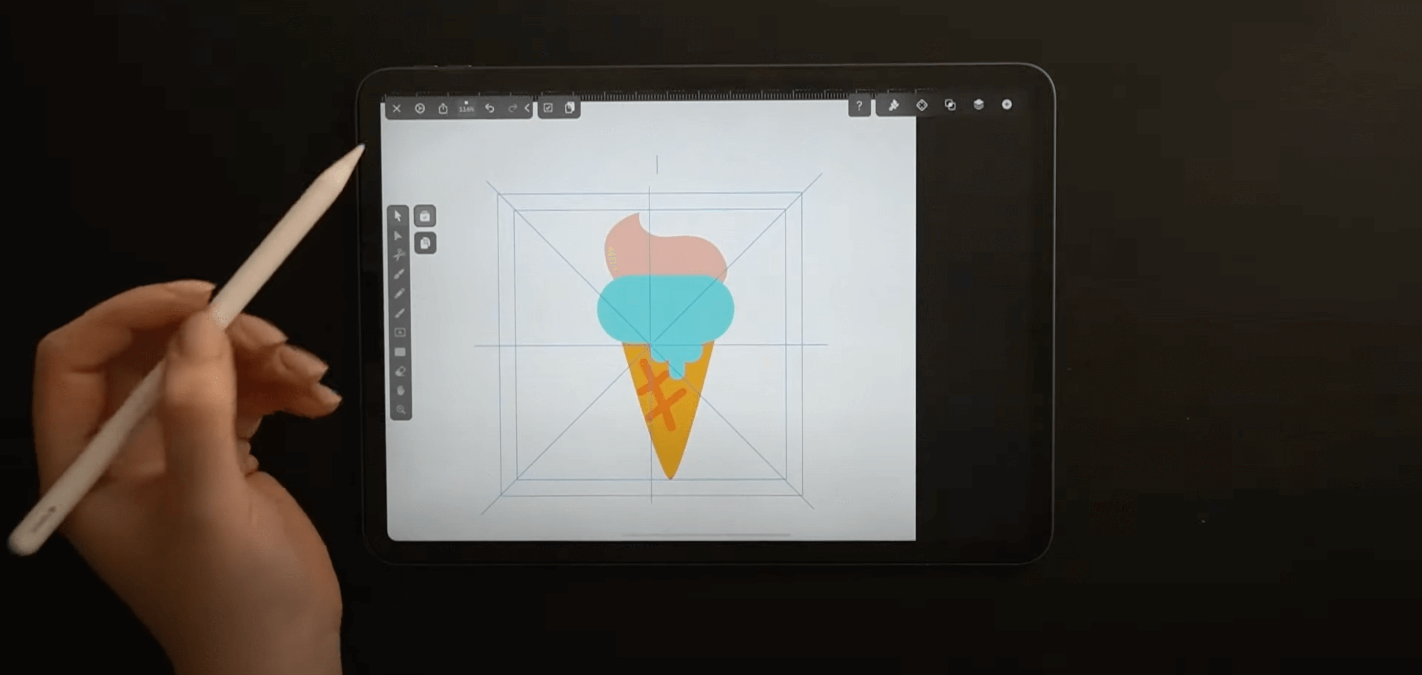
So if we are sketching out an ice cream icon, for example, we know that we are going to use a triangle for the cone and ovals for the scoops and drips.
You can choose to sketch in your own notebook, but Procreate is an amazing pixel-based illustration tool that allows you to sketch digitally. And from there, you can import the file directly into your vector design software, like Linearity Curve (formerly Vectornator), where you give life to your icon.

At this stage, you need to pick a color scheme that represents the character of your icon or the theme of your icon series. We have an entire article explaining how to create a unique color palette that defines your style as an artist. But here are the basics:
- Make sure that your color stays consistent throughout your icon pack.
- Check if every color is visible both on a light background and on a dark background.
- Check if your colors contrast each other. You can verify that by converting your icon to grayscale. If the colors contrast in greyscale, they will contrast in any other environment.
- Color theory is your friend. Choose warm vs cold hues to tell a story.
- Use colors to define a visual hierarchy by choosing just one focus color.
Step 4: vectorize
After you finish your sketch, it’s time to vectorize your icon. In case you didn’t know, all icons are vectors!
Layers
Our top tip is to create a new layer for any new graphic elements that you bring into your piece. Are you adding a grid? Make a new layer. Are you adding the vector lines? That’s right. Make a new layer. Time to color? You guessed it.
Especially when you’re tracing your sketch, it helps to reduce the transparency of the vector layer in order to make it easier to see your underlying work.
Grid
Some artists may find them overrated, but grids come in handy in a few situations.
If you are creating a set of icons, a grid will help you maintain consistency.
Another scenario this is helpful is when you’re creating icons for platforms (iOS or Android) that already have an existing grid. Material system icons, for example, use a 24dp Icon Grid.
Here is the type of grid we are suggesting. The way you create it is easy. Use the Shape Builder Tool to create two squares—one is the maximum height and width of the grid, and one is setting your margins. Bear in mind that your icon does not need to touch all four sides of the margin. Then draw the lines of symmetry.
To make it even easier, you can download our handy-dandy grid template here.

Shape Tool
Just like your sketch, your vector art will not fall far from the tree. It’s also going to be made of the same basic shapes.
You can easily build different shapes by using Linearity Curve's (formerly Vectornator) Shape Tool. You can change the number of sides of your polygon by using the slider that appears once the shape is selected. Or you can access it via the Quick Action menu after the shape is drawn.
There’s also the matter of rounding corners, which is the Corner Radius function. Also available via the slider or the Quick Actions menu.
To keep the aspect ratio of your shape, simply hold the canvas with an extra finger when working on an iPad or pressing down the shift key.
Pen Tool
The Pen Tool is not the easiest tool to master, but it’s essential in vector design. It’s especially amazing for drawing smooth curved lines.
To do so, just tap the canvas at the point where you want to start the curve and drag your pen or mouse until the two handles associated with the point achieve the length you want. Then tap and drag again to see how the curve takes shape.
These instructions sound strange if you have never used the Pen Tool before. But once you give it a try, you’ll know what we mean. And if you have not watched the video at the top of this article yet, make sure you do so. All these steps are explained better visually.
Step 5: export to .svg
Naturally, the final step is exporting your artwork.
You might ask yourself what size your icon should be. That is really less important. A vector is high-quality, no matter the size. One of the main rules to obey when creating icons is that they must fit into a square.
Do you feel more comfortable working with a very specific size? Use any of these default sizes: 16 x 16px, 24 x 24px, 32 x 32px, 48 x 48px, 64 x 64px, 96 x 96px, 128 x 128px, 256 x 256px, 512 x 512px.
But make sure to always check the guidelines or requirements of your particular project, especially if you are designing application icons for iOS or Android.
Icons are .svg files which is a format that is supported by any vector design tool such as Linearity Curve (formerly Vectornator).
Go to File, Export, and select .svg. And that’s it! You now have a brand new original icon.
We hope this tutorial helped you. As simple as they look, icons are not as easy to design. But with all our guidelines, principles, tips, and tricks, you're a bunch of steps closer to doing it professionally.
Share your designs with us and we will feature you on our social media channels. We can't wait to read what you think of this article in the comments section below.
Jumpstart your ideas with Linearity Curve
Take your designs to the next level.
Share this!
Lavinia Aparaschivei
Lavinia is a contributing writer to the Linearity Blog.


:quality(75))
:quality(75))
:quality(75))
:quality(75))
:quality(75))
