:quality(75))
:quality(75))
:quality(75))
Creating a user flow diagram doesn't require years of user experience design (UX) experience. It's a skill that can be learned and mastered with practice, and it's essential for anyone involved in designing digital products.
This guide is designed for those new to user flow diagrams. Whether you're a graphic designer, a marketer, or stepping into UX design, you'll find the process straightforward and the results rewarding.
We'll cover defining your diagram's objective, drawing out the user journey, and refining your design based on feedback.
Let's cut through the complexity and make your first user flow diagram together.
Jumpstart your ideas with Linearity Curve
Take your designs to the next level.
Understanding user flow: a beginner’s primer
User flow is the backbone of user experience design. It outlines the path taken by users from their entry point through to a specific goal, such as making a purchase or signing up.
User flows: to use or not to use?
A user flow or task flow diagram acts as a roadmap guiding every step in the user's journey. Design teams use it to highlight the critical intersections where users must make decisions.
Without a clear user flow, users might find themselves lost or frustrated, leading to higher drop-off rates and lower satisfaction. A well-designed user flow facilitates a smooth, intuitive interaction, encouraging users to complete their objectives and return in the future.
Key components of a user flow
The user always starts somewhere, but the most important thing is the final objective that they're trying to achieve. Before starting your user flow diagram, ask yourself what the user's end goal is: completing a purchase, signing up, reaching a particular content piece, etc.?
With this in mind, you can map out the journey to this final destination using various components.
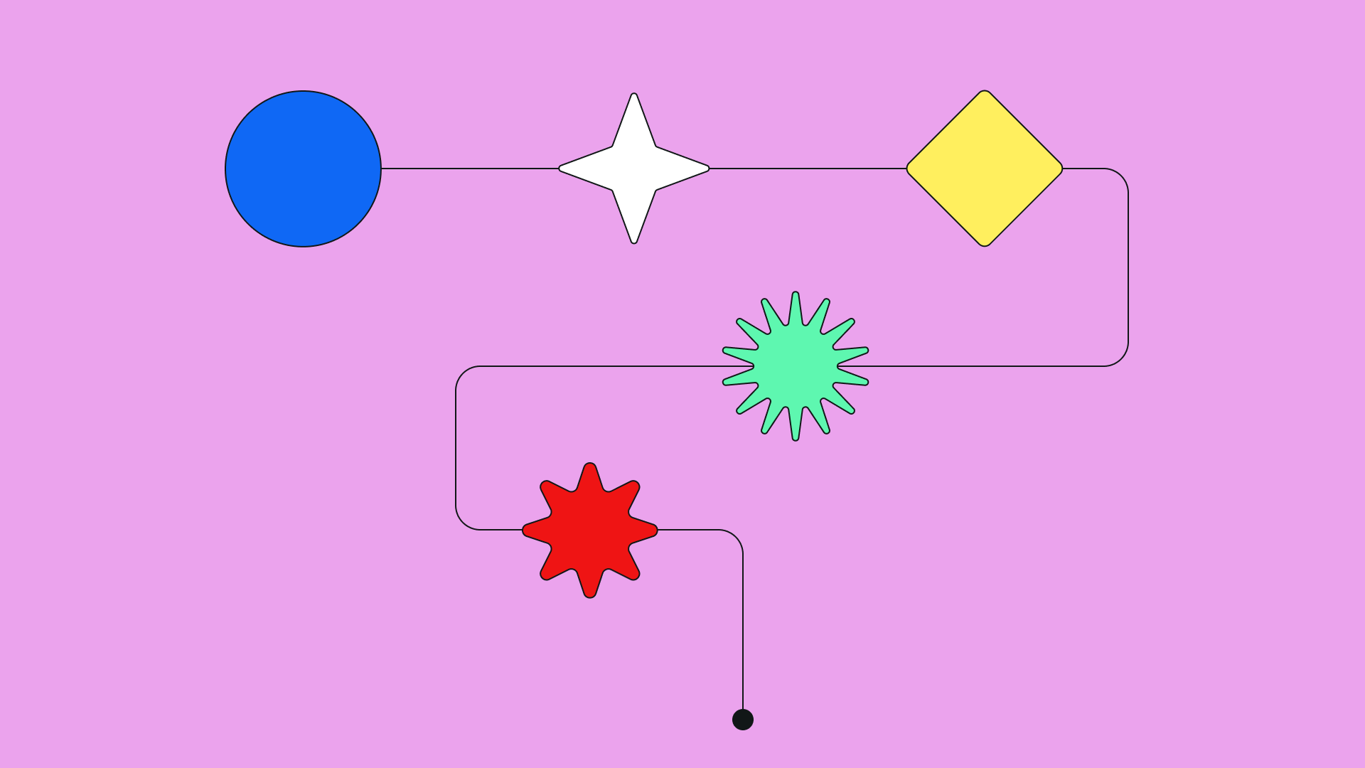
Use simple shapes to represent various user flow diagram components:
- Rectangles for actions
- Diamonds for decision points
- Circles for start and end points
- Arrows to connect points and show the direction of the user journey.
Let's look at a table that explains what each component represents:
| Component | Shape | Description/Purpose |
|---|---|---|
| Start/End points | Oval or circle | Where a user begins and ends their journey. Entry points could be a homepage, a landing page, an app screen, or any other initial interaction point. |
| User actions | Rectangle | Represents steps or actions the user takes, like clicking a button or entering information, or navigating to another page. |
| Decision points | Diamond | Indicates moments where the user must make a choice, leading to different paths. This could be selecting a product category or opting in for a newsletter |
| Direction | Arrow | Shows the direction of the user's journey from one action to the next. |
| Inputs/Outputs | Parallelogram | Represents inputs (e.g., user data entry) or outputs (e.g., receiving a message). |
| Documentation | Document shape | Used to indicate a step involves reading or referencing documentation. |
Your first user flow diagram doesn't need to map out every possible action or outcome. Start with a basic user flow that captures the primary path from entry to goal.
Remember, the goal of a user flow diagram isn't just to create a beautiful chart but to think deeply about the user's experience. You want to make it as seamless and enjoyable as possible. This visual representation helps identify any potential roadblocks or unnecessary steps that could hinder the user experience.
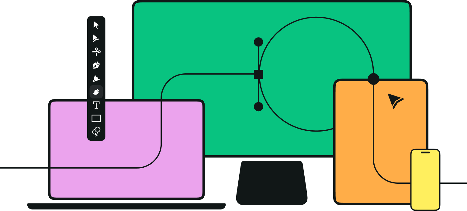
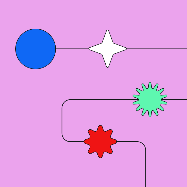
You can also create your own user flow symbols—you don't have to stick to the traditional ones. As long as you provide a diagram key, everyone who will read your UX flowchart will understand it. Try the symbol packs in our free template library:
:quality(75))
:quality(75))
Understanding and applying these user flow principles is a significant step toward becoming a proficient UX designer. Are you ready to craft experiences that resonate with users and meet business objectives?
Let's dive into our step-by-step guide on how to make a gated content user flow diagram.
Create a new document in Linearity Curve
We'll design a user flow diagram using Linearity Curve on iPad, but you can also use it on your Mac or iPhone. If you haven't already, download Curve here.
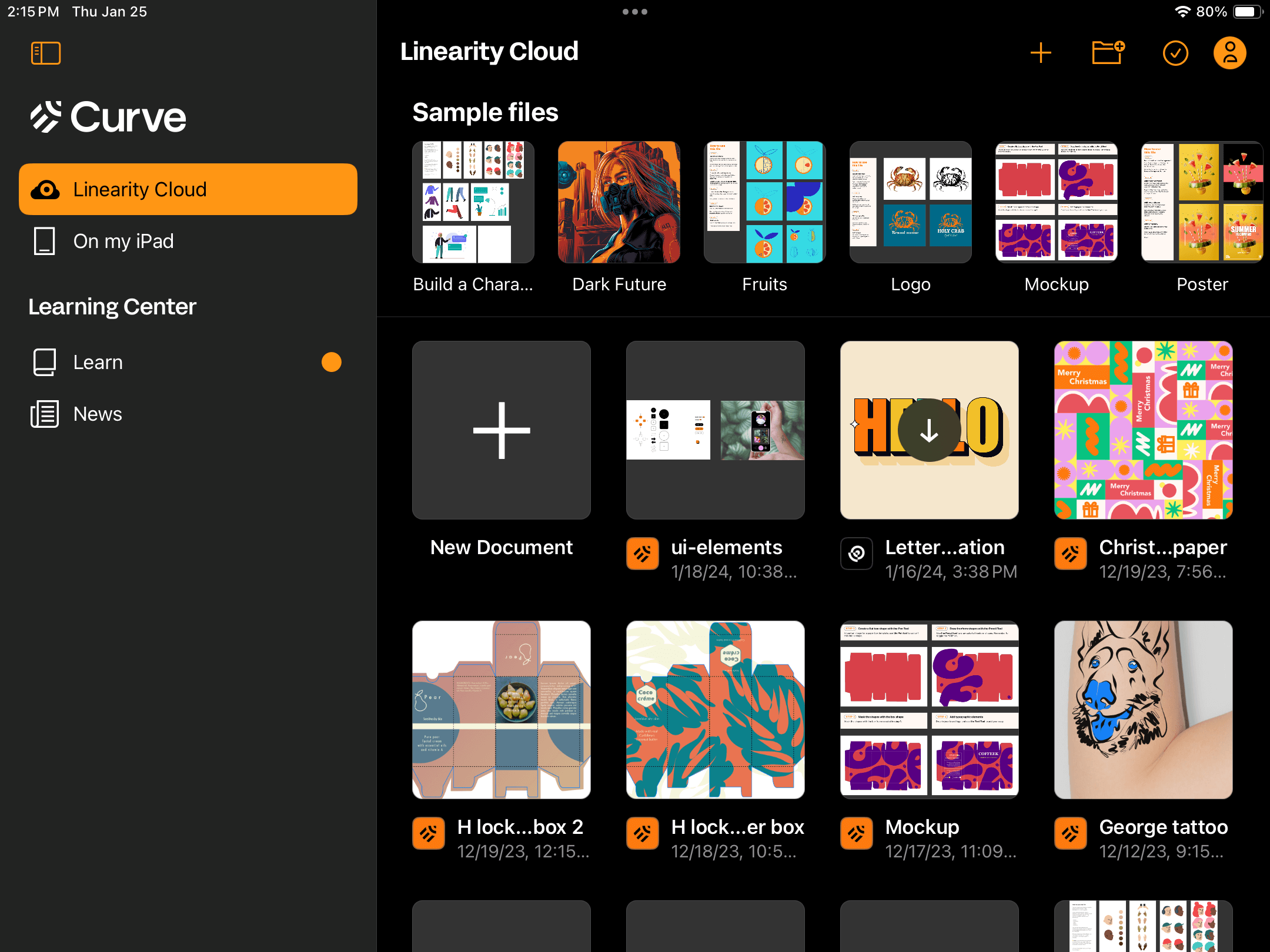
Open Linearity Curve on your device and tap on the + New Document card in the Gallery.
Choose your Artboard size. We chose A3 so we can print it out in a small poster format later.
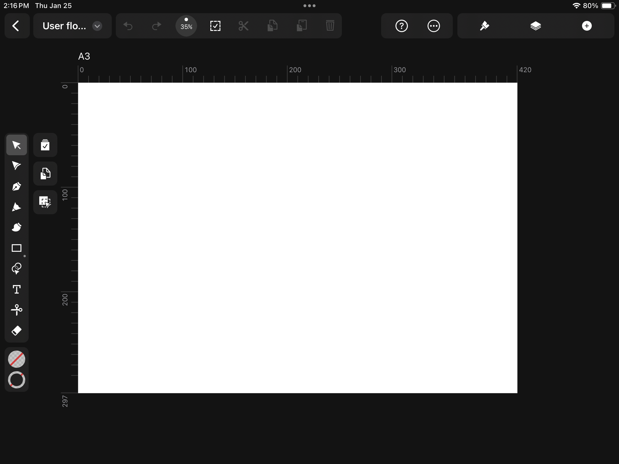
You're all set up.
Set your user's goal
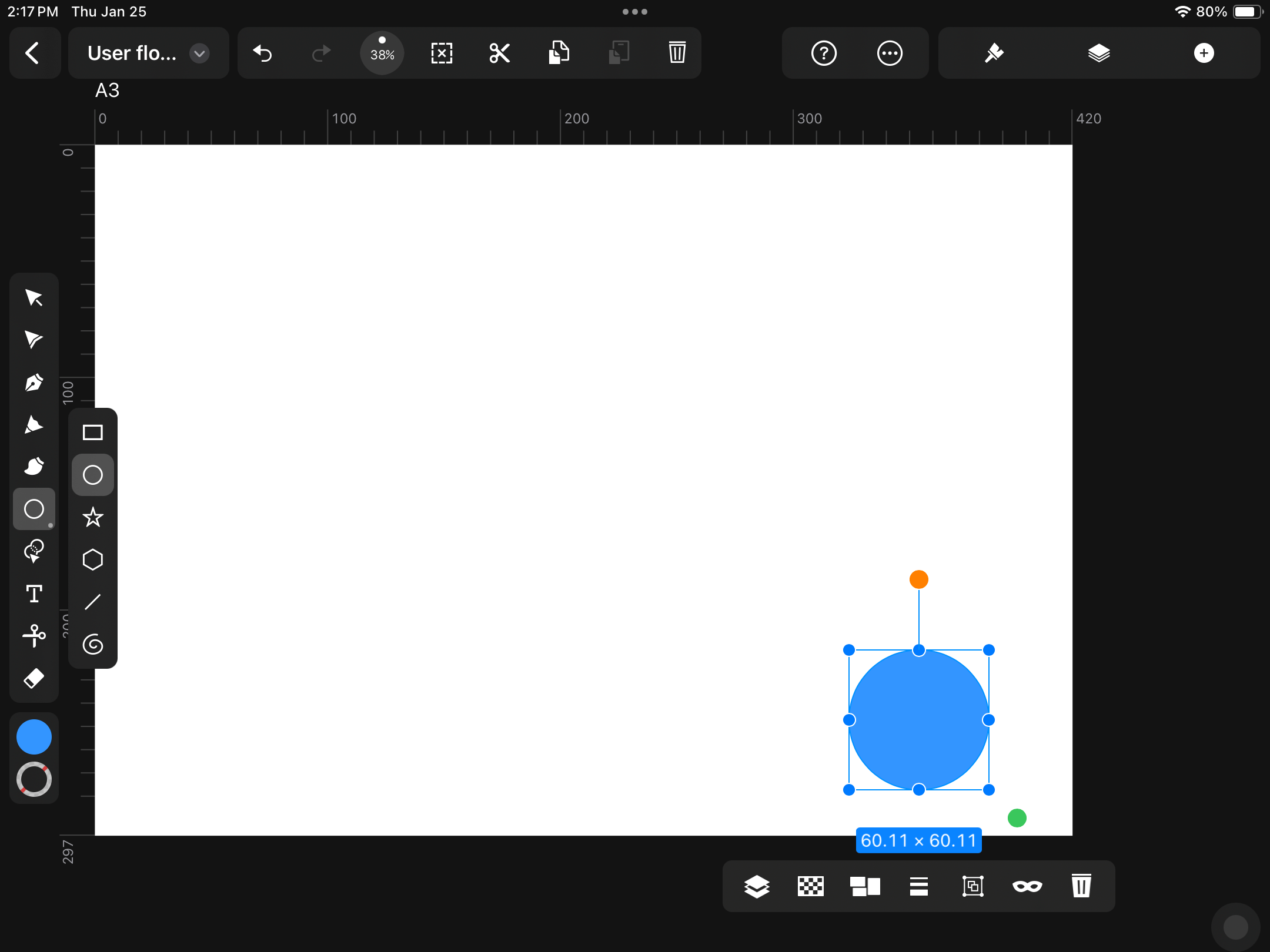
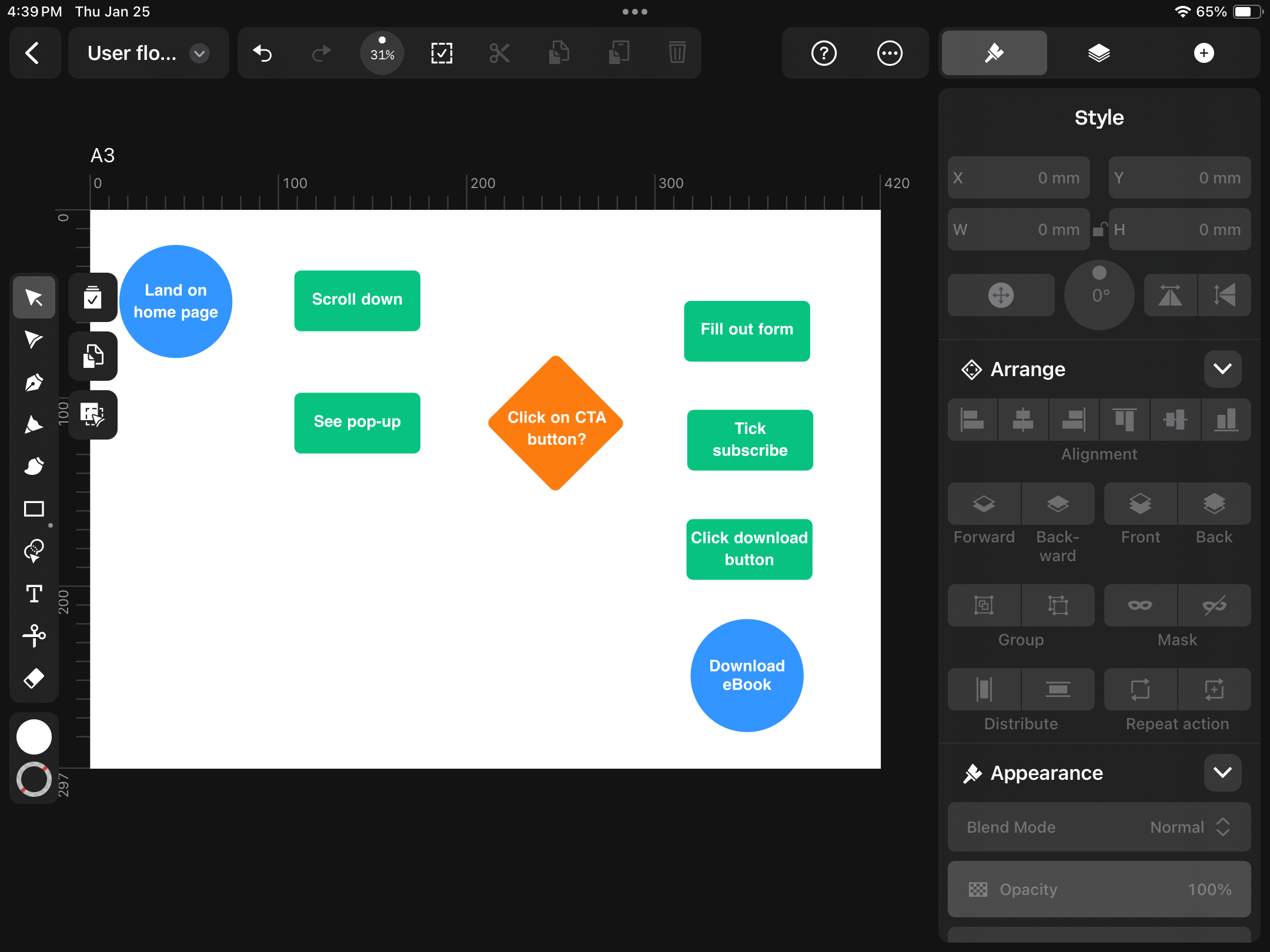
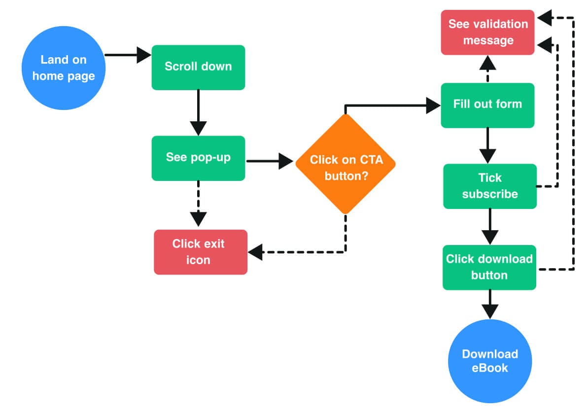
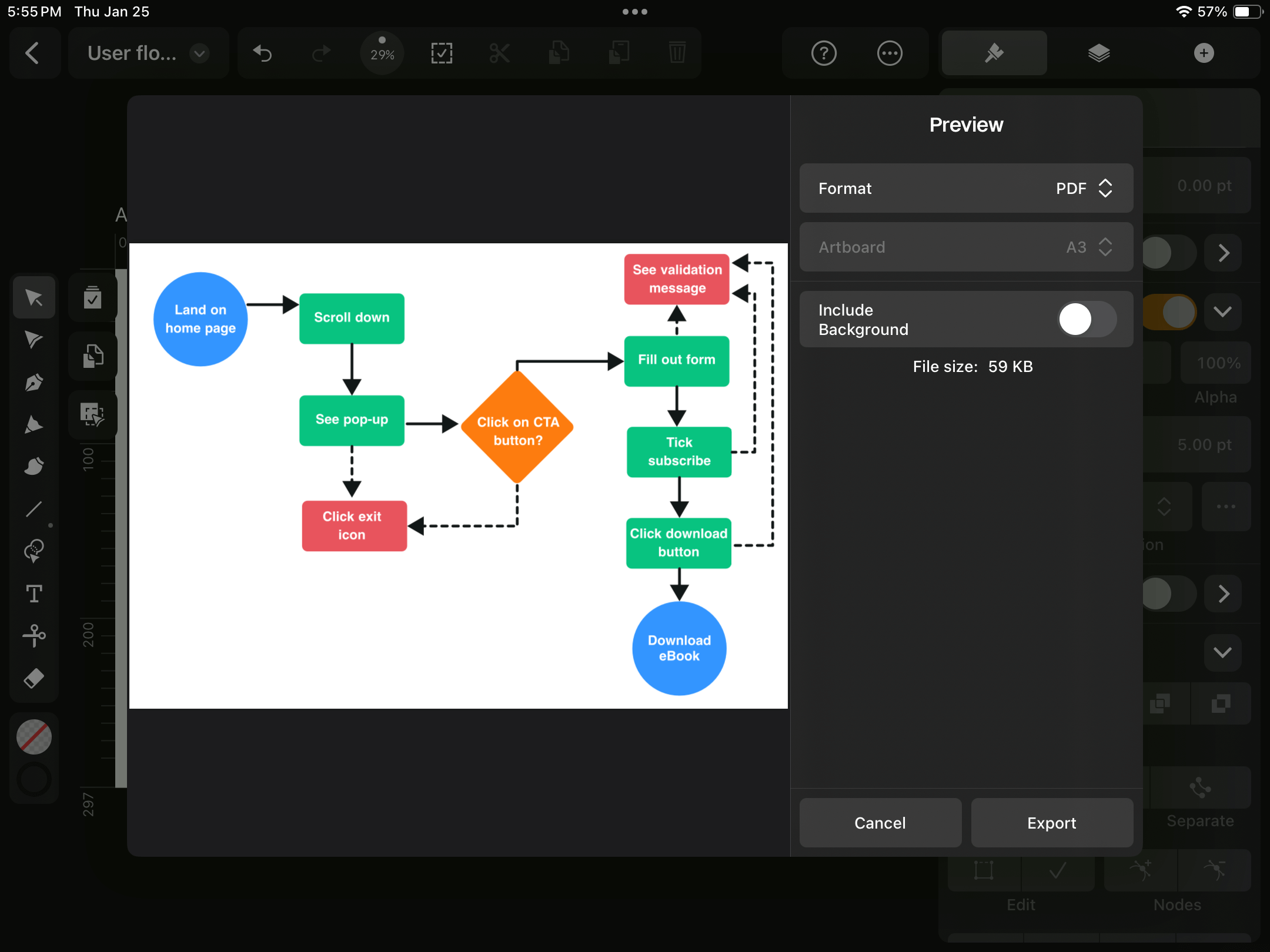
Start with your user's main objective. Our user wants to download an eBook.
Create an oval or circle endpoint using the Oval Tool found in the Toolbar on the left. To create a perfect circle, hold down one finger while dragging the Oval Tool across the screen.
You can change the Fill and Stroke to suit your color scheme.
Select the Text Tool (the 'T' in the Toolbar) and tap anywhere on your Artboard to create a textbox. Type your end goal, i.e. "Download eBook," and place the text over your circle shape.
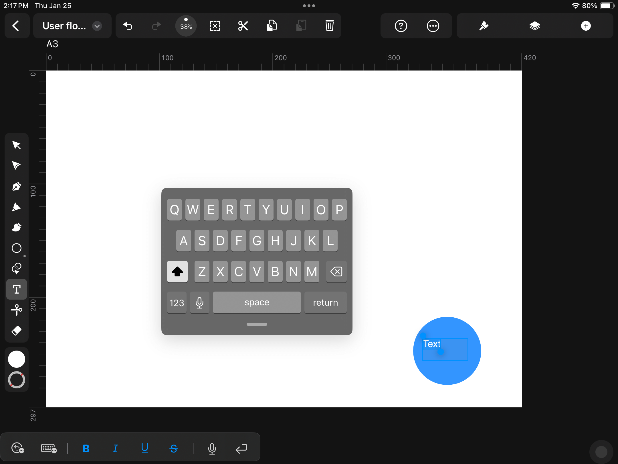
To format your text, open up the Style Tab in the Inspector on the right and navigate to the Text section. Here, you can choose your Font, Font Type, Font Size, and more.
Map out key actions
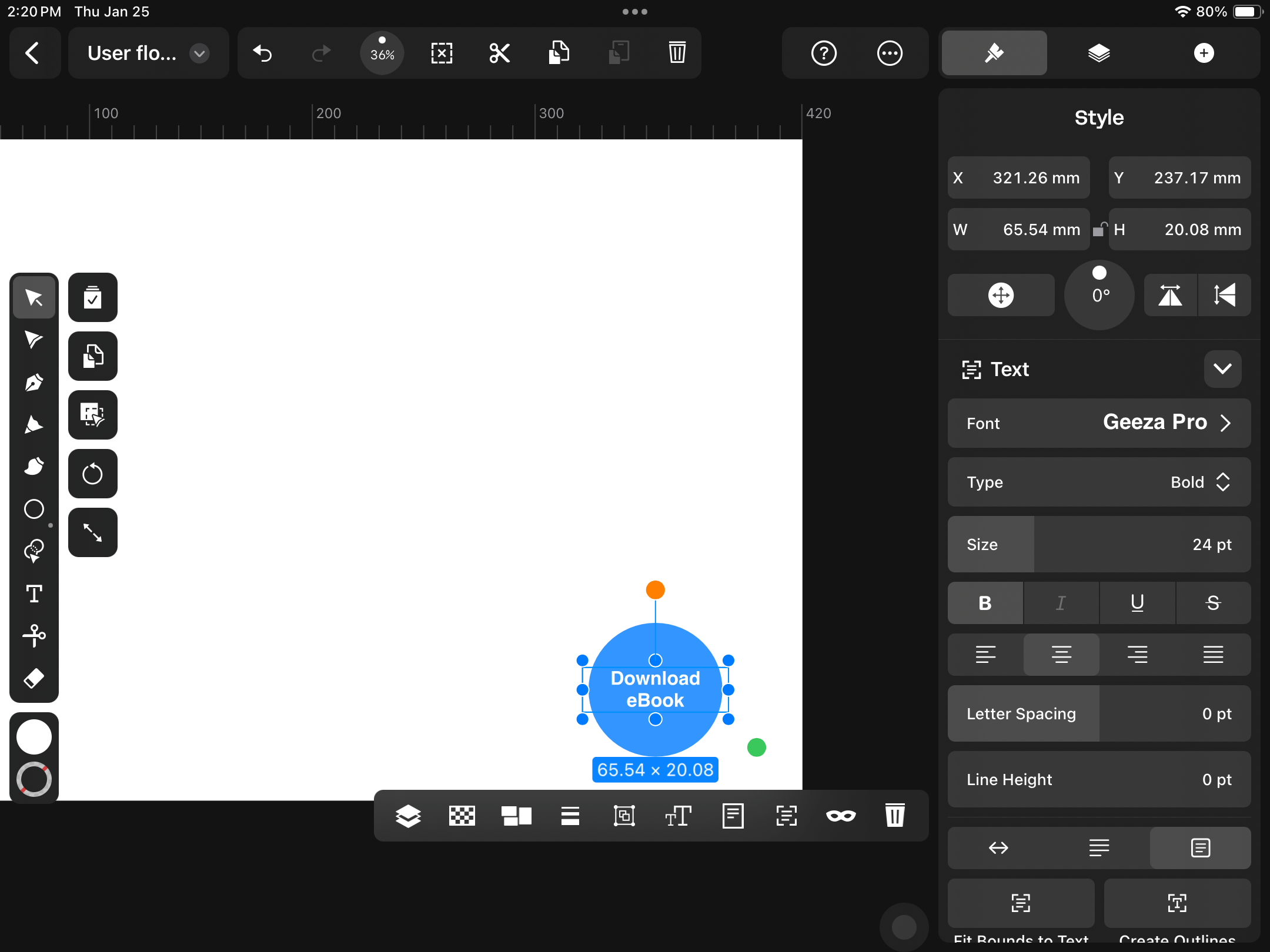
Think from your user’s perspective about how they'll get to the endpoint. What's the first step? Our user's entry point is landing on the home page of our website.
Tap on the Selection Tool in the Toolbar and drag it over your endpoint shape and text to make a selection. Make a copy by switching to Duplicate Mode and dragging it over to the other side of your Artboard.
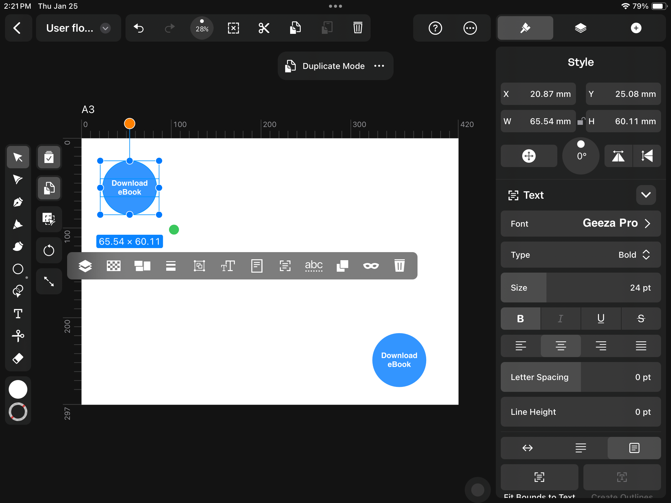
Double-tap on the textbox to edit your text. Type "Land on home page" for the entry point.
Choose the Rectangle Tool and draw a new shape. This is a user action box.
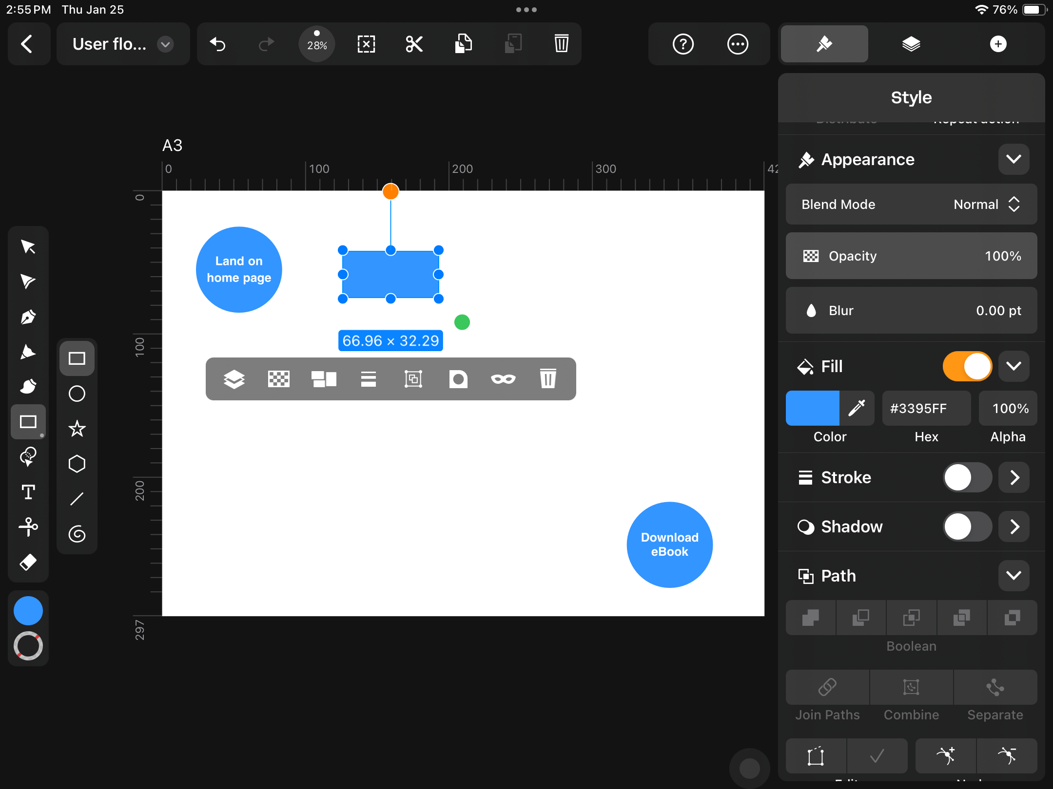
We've set up a trigger on our website to show a pop-up with a "Get the eBook" call to action (CTA) when the user scrolls down.
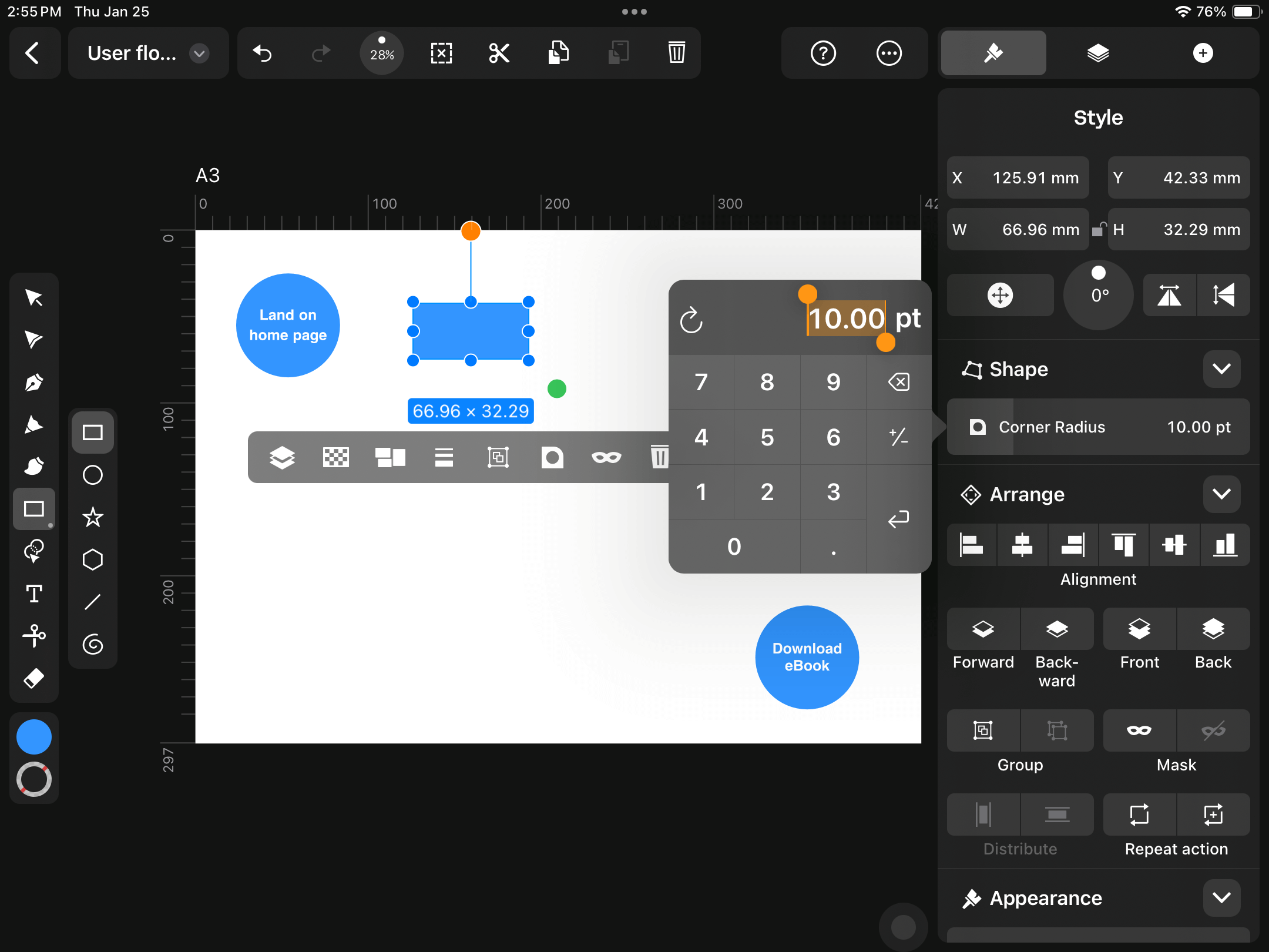
Add a textbox on top of your new shape and type "Scroll down." In the Style Tab, add a Corner Radius of 10pt to round the shape's corners.
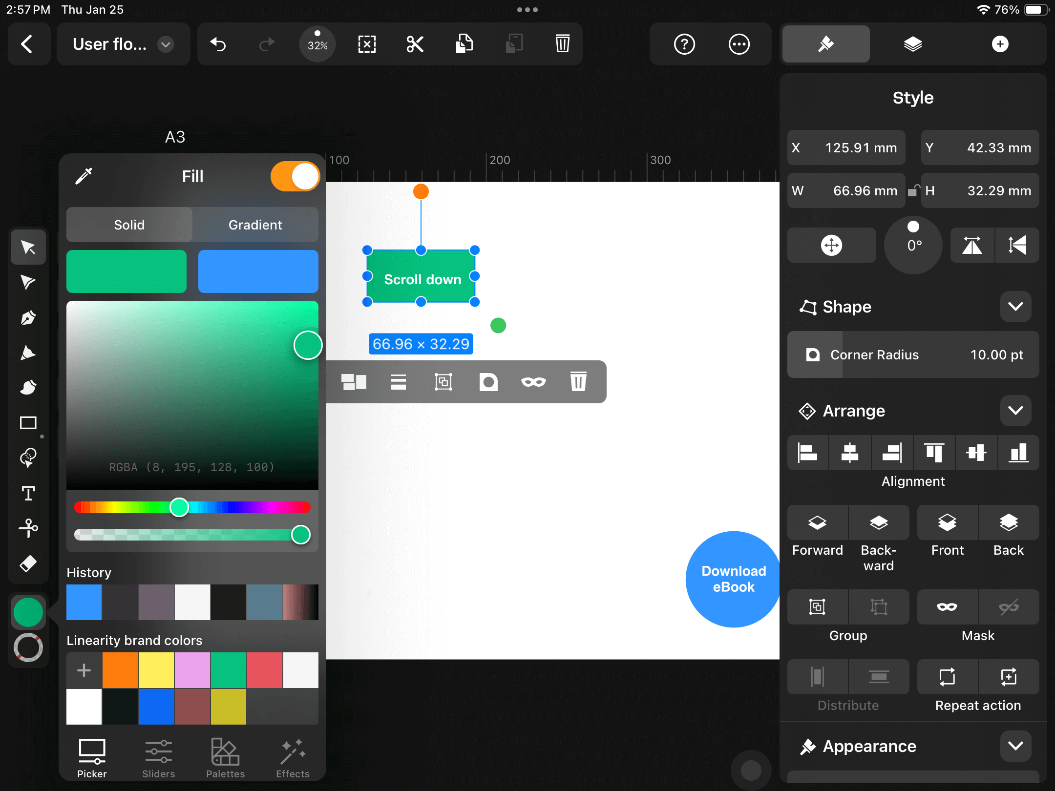
Change the Fill color of the rectangle to emphasize the user action.
Duplicate your user action rectangle and change the text to "See pop-up."
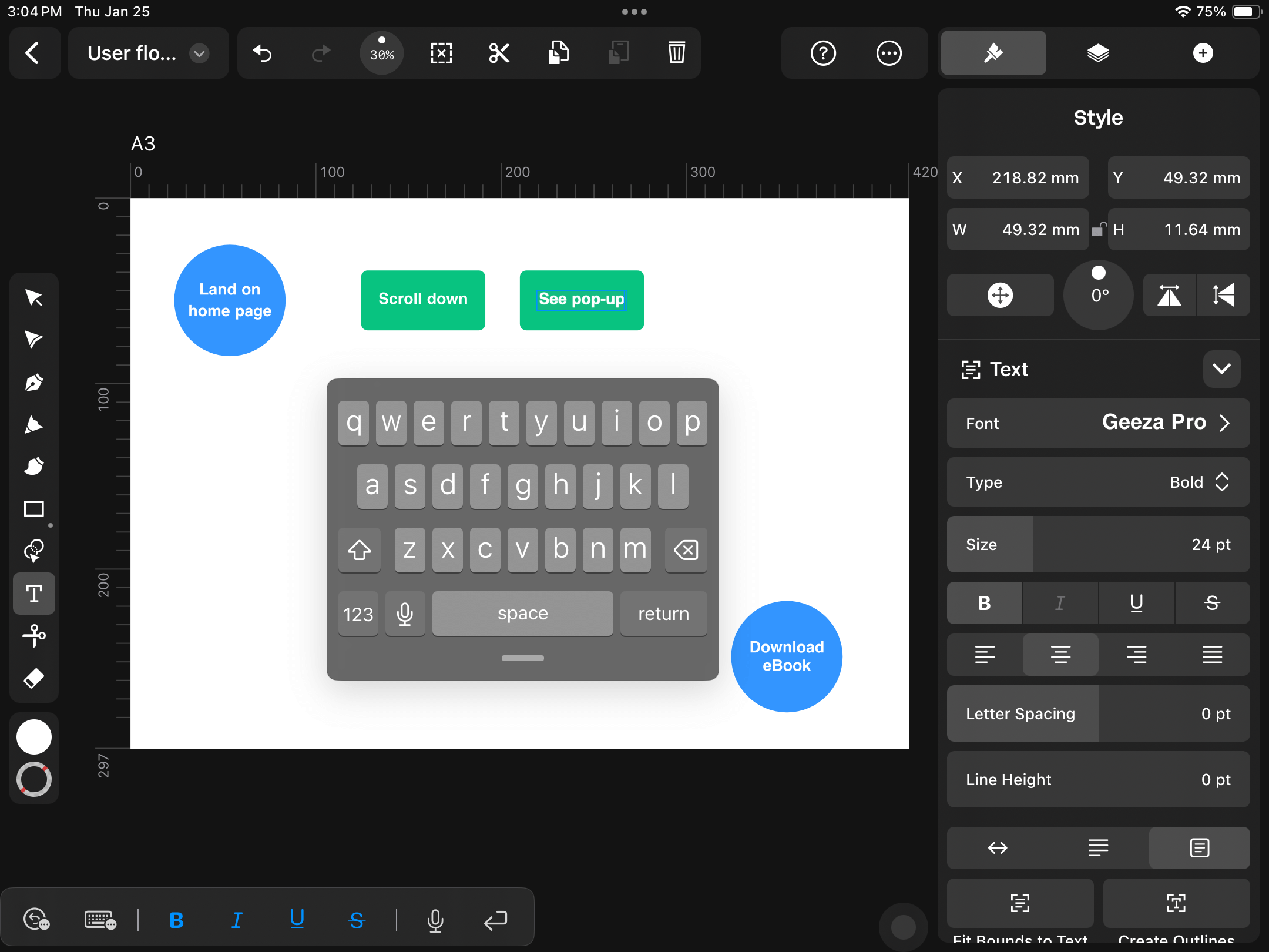
Incorporate decision points
Now that your user has seen the pop-up, they're faced with a decision: to click on the CTA button or to close the pop-up window.
Let's create a diamond shape using the Rectangle Tool. Hold down one finger while you draw to create a perfect square.
Change the Fill color and add a 10pt Corner Radius as you've done with the other shapes.
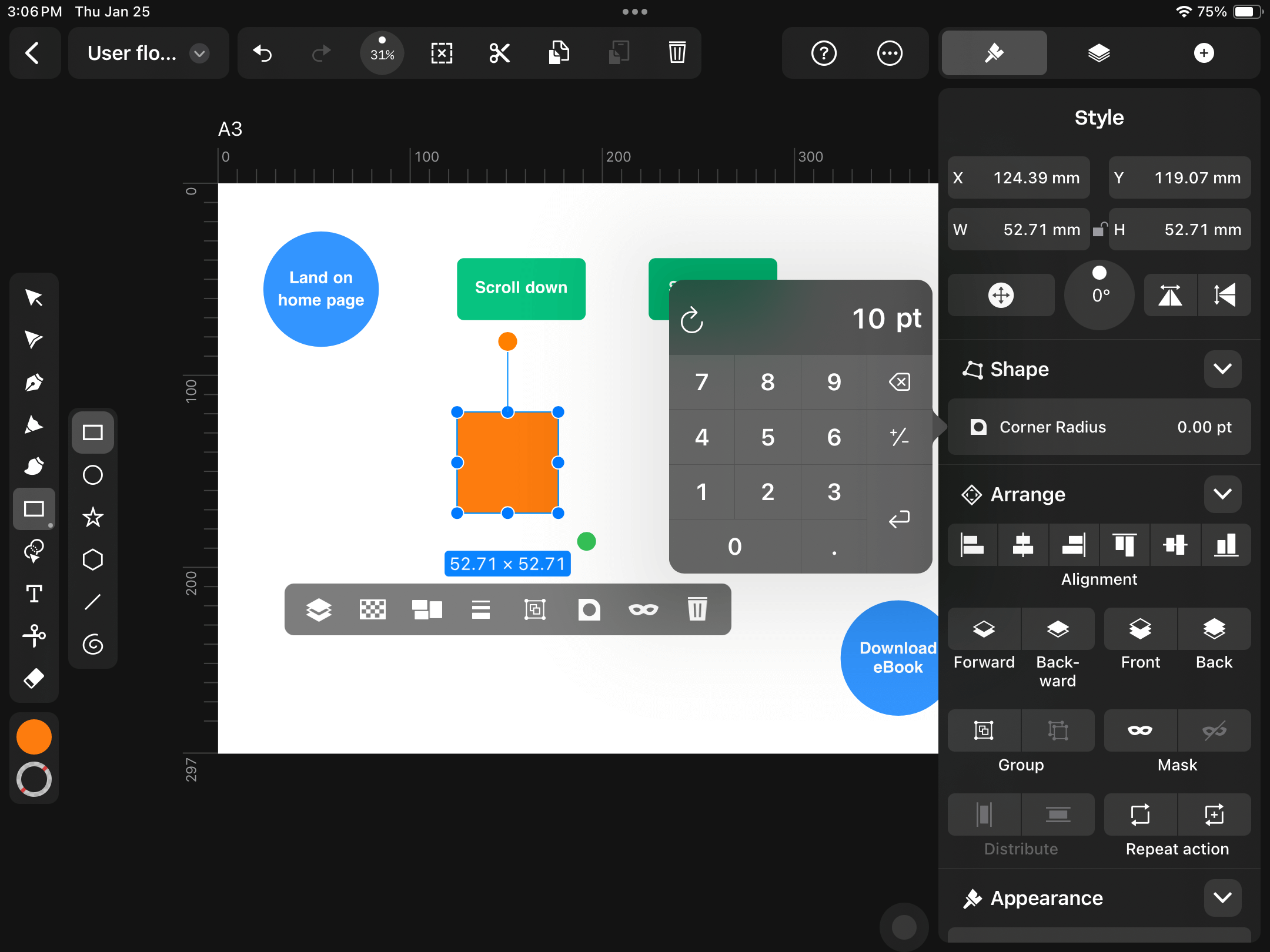
With your square selected, tap and drag the orange handle to rotate the shape by 45 degrees. Another way to do this is to use the rotation control in the Style Tab.
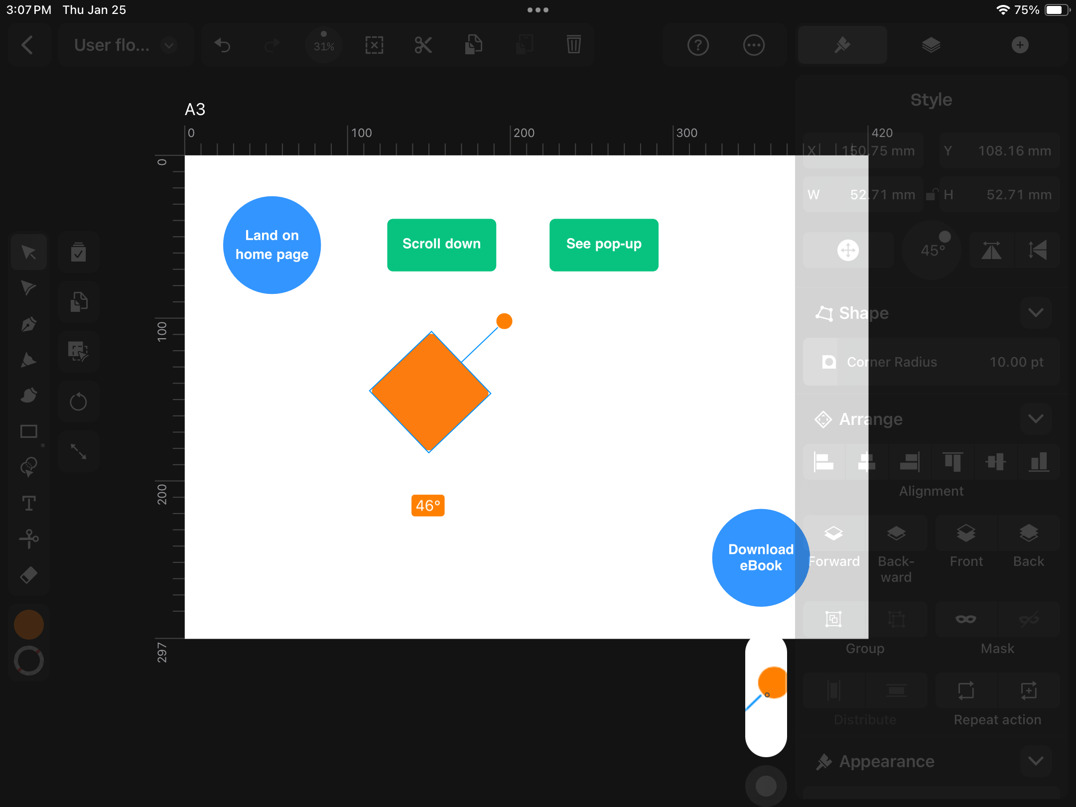
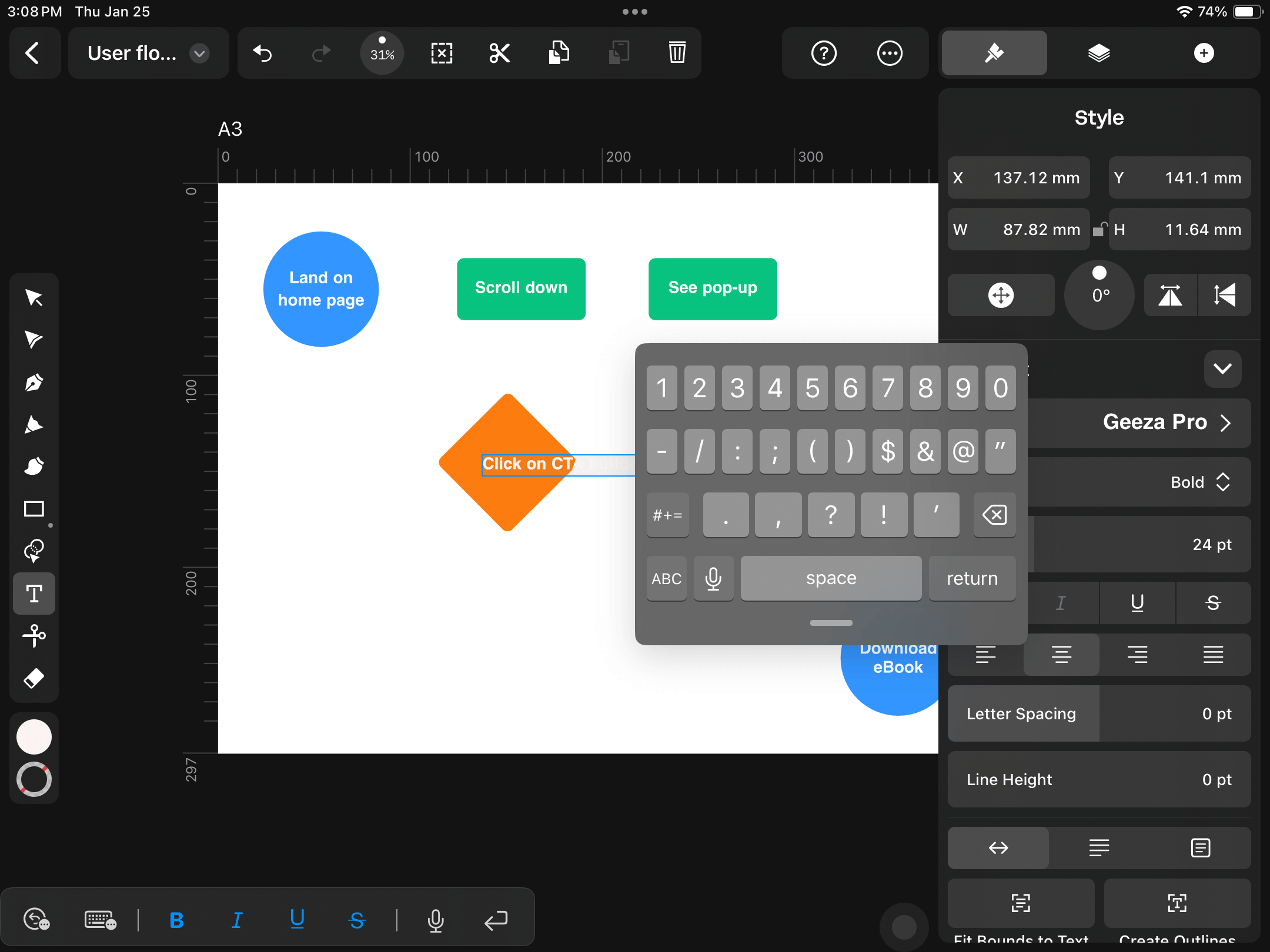
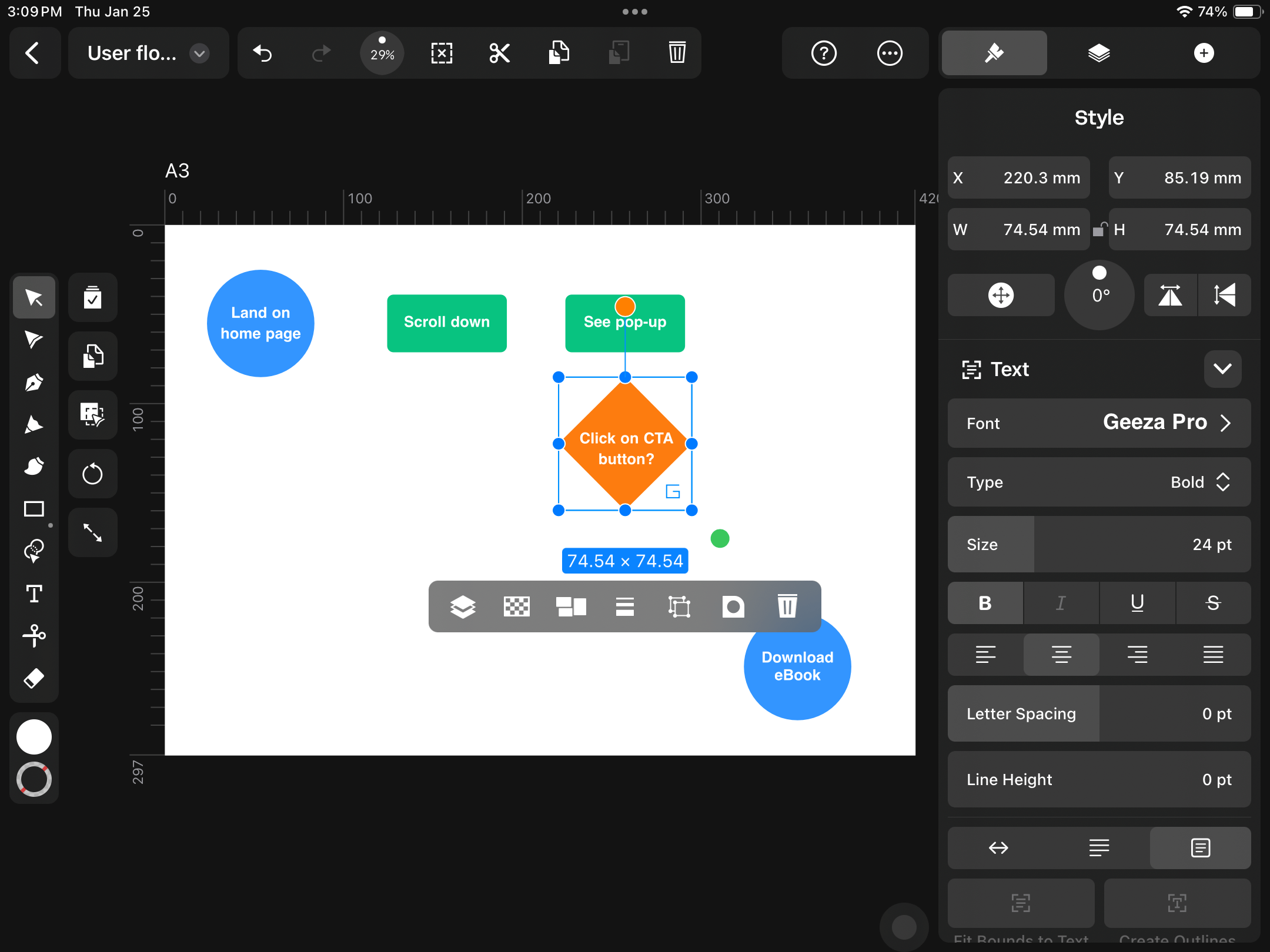
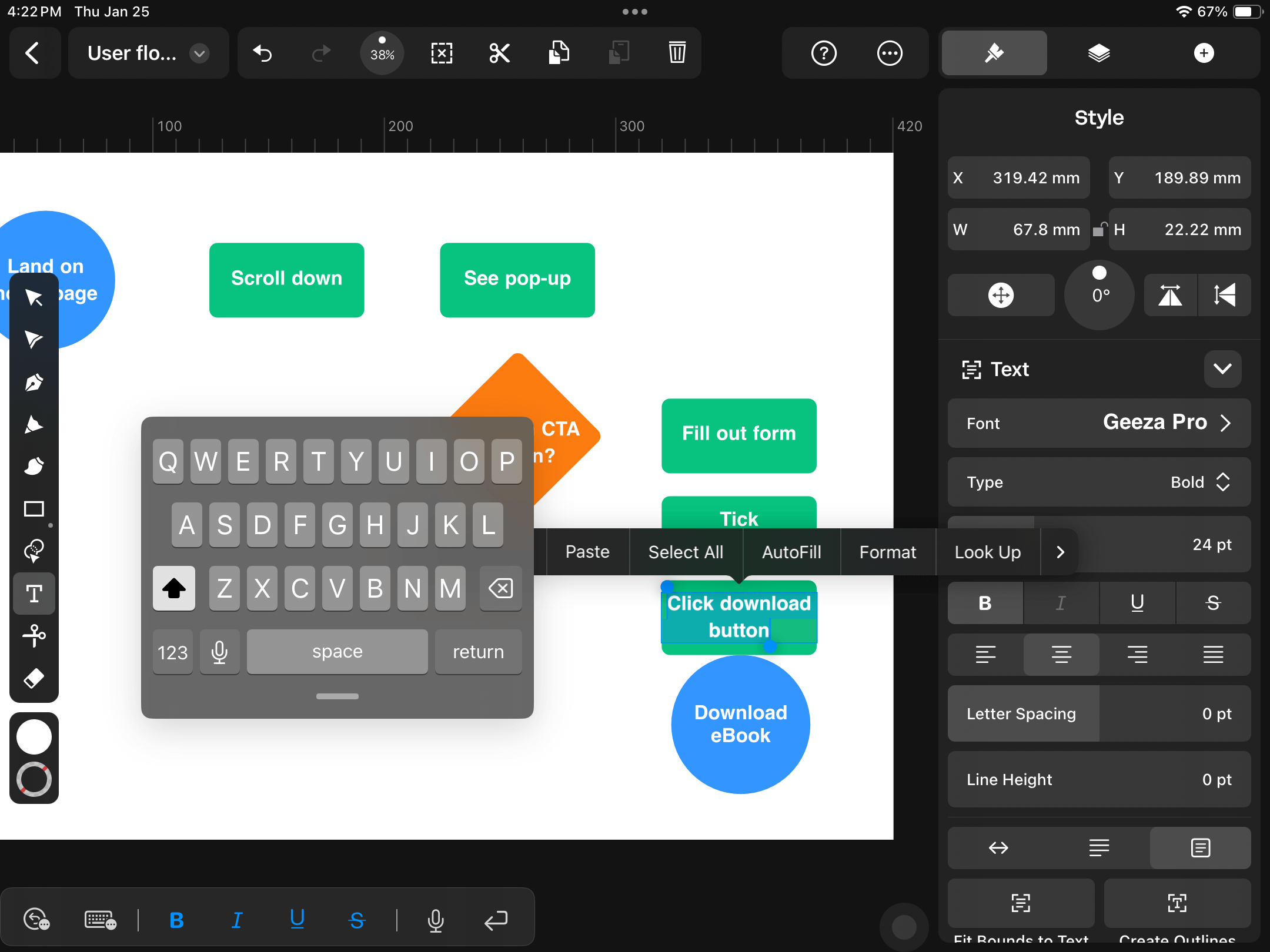
Using the Text Tool, type "Click on CTA button?" and center-align the textbox with your decision diamond.
Alignment is easy with Linearity Curve, as the alignment guides automatically appear while you drag your elements. You can also use the Align options in the Style Tab or Quick Actions Toolbar that appears beneath your selection.
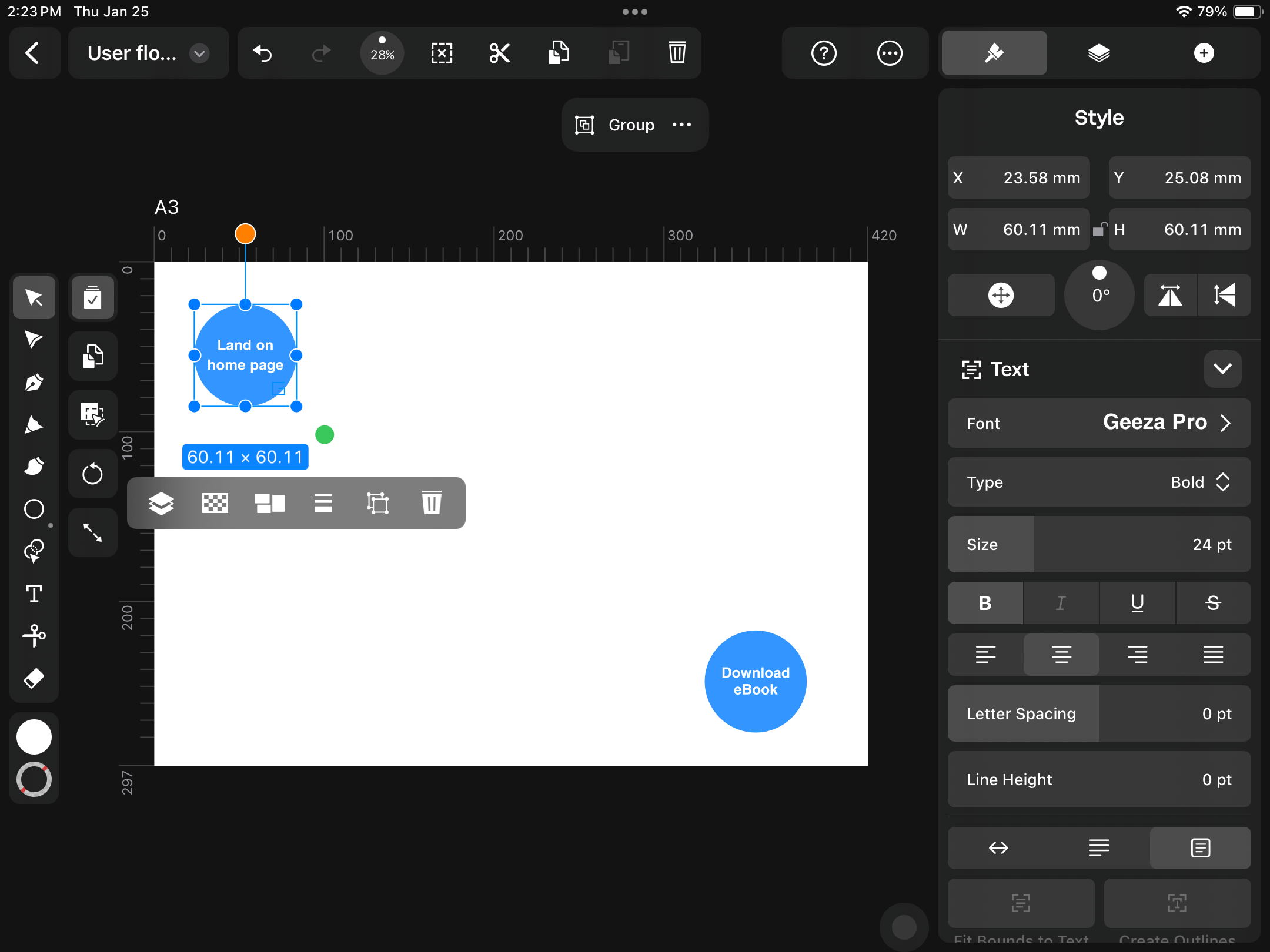
You can also make a Group of each component in your user flow diagram to make it easy to move the shapes and text around.
If your user decides to click on the CTA, what will be their next action? With gated content, you want to capture the user's details so you can contact them later. So, we'll redirect them to a landing page with a lead capture form.
Duplicate one of your user action boxes, double-tap on the textbox, and type "Fill out form."
Duplicate the shape again twice, and create another two user action boxes: "Tick subscribe" and "Click download button."
You've drawn all your shapes, and now you can resize and rearrange them on your Artboard to make your diagram easier to read. Keep in mind that you'll be adding direction arrows in the next step, so leave enough room for these.
Add your user flow direction arrows
You have your start and endpoint, user actions, and user decisions laid out. Now you need to indicate the flow.
In UX design, there are often many routes your user can take. Good UX minimizes the amount of layers and options to make it as simple as possible for the user to reach their goal.
You'll create two types of arrow symbols: 'Yes' and 'No.'
Let's start with the 'Yes' arrows, as these indicate the ideal user flow.
Choose the Line Tool from the Toolbar and draw a line from your start point to the first user action.
Hold down one finger while drawing to snap to 45-, 90-, or 180-degree angles.
With your line shape selected, go to the Stroke section in the Style Tab and tap on the 3-dot menu for more options.
In the Stroke Options panel, you can choose an arrow end to indicate the flow direction.
If your arrowhead is too big or too small for the diagram, you can adjust the size by returning to the Style Tab and changing the Stroke Width.
Use Duplicate Mode to make copies of your arrow and complete your user flow.
To create an arrow with a bend, draw a perpendicular line from the arrow to the shape. Use Multi Select Mode to select both your arrow and the new line shape. Then, scroll to the Path section in the Style Tab and tap on the Join Paths icon.
Use the Selection Tool to adjust the new arrow shape to point in the right direction.
You've added all the 'Yes' arrows. Let's add the 'No' arrows to show what may happen if the user deviates from the ideal flow path.
Create a "Click exit icon" user action box and make the Fill color Red—according to color psychology, red often indicates a warning or danger.
Duplicate one of your arrows and add a 10pt Dash in the Stroke Options section. The dashed arrow indicates an undesirable user action.
Keep duplicating arrows and shapes until you've mapped all the possible negative user actions that could take place. This will help you prepare your user interface (UI) for blockers like unfilled forms or unticked subscribe buttons
Test and iterate your user flow design
User flows aren't static. Even the most well-thought-out customer journey map may need some tweaking after you watch actual users navigate your website or digital product. Getting feedback from real users is called usability testing.
Export your user flow diagram
After every iteration of your UX flowchart, you may want to produce a shareable .pdf or .png file or print it out on paper.
To export your design in Linearity Curve, open the Document name tab in the Action bar at the top of your screen. Expand the Export tab and choose your file type (.pdf is a good option for both print and digital sharing).
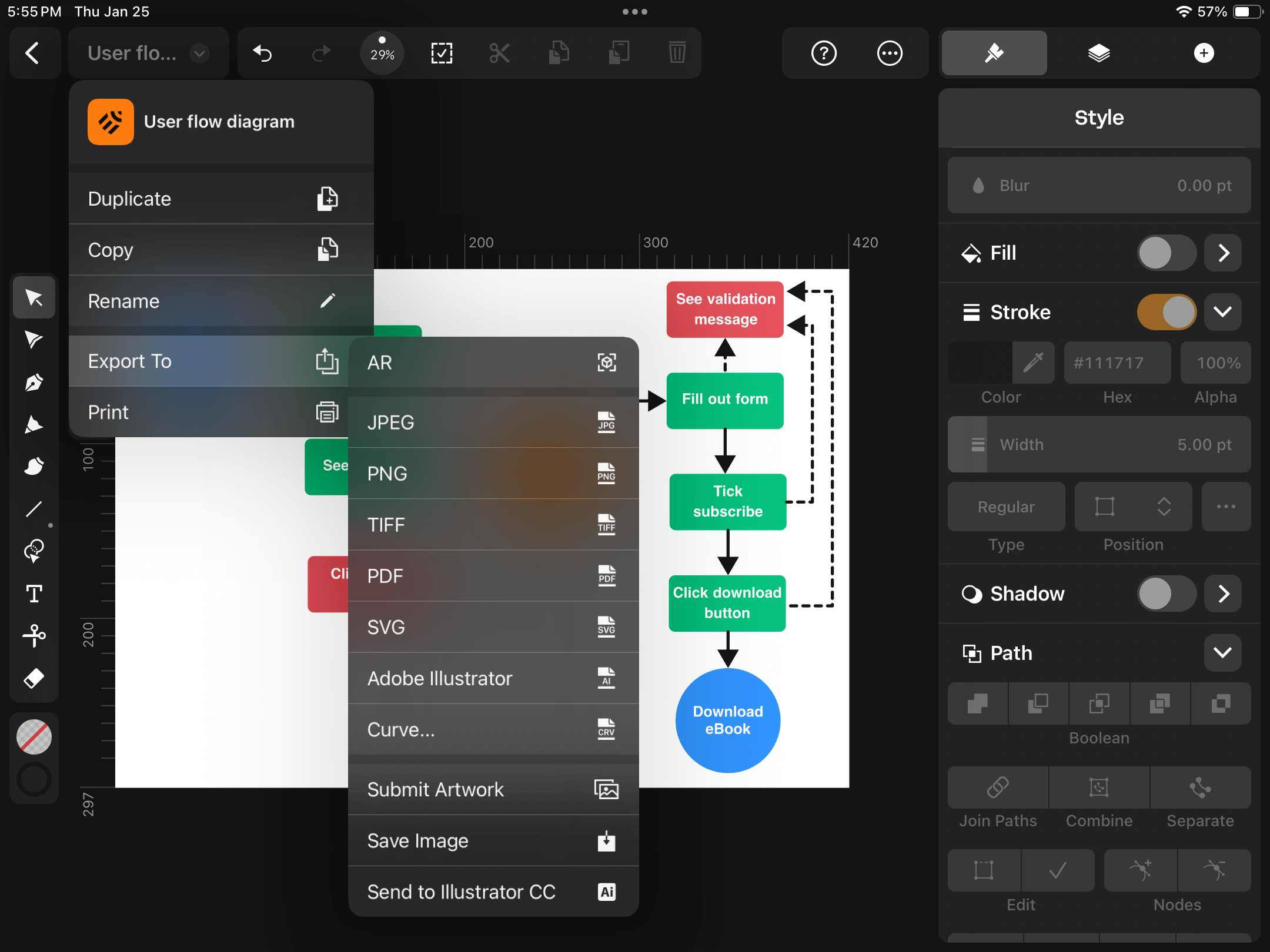
Click Export. And you're done.
Crafting intuitive experiences made simple
By following the steps outlined in this guide, you've learned one of the most critical aspects of UX design: creating effective user flow diagrams. The essence of a great user experience lies in simplicity and intuition.
As you continue to practice and refine your skills, you'll discover more ways to optimize your user flows. Every interaction is a step towards fulfilling your users' needs and exceeding their expectations.
Keep experimenting, seeking feedback, and iterating on your designs. UX design is an ongoing journey of curiosity and improvement. The ultimate goal is always to make the digital world more accessible and enjoyable for your users.
If you haven't signed up for Linearity Curve yet, why not get started for free? Our vector design platform has so much more to offer digital designers: from freeform vector drawing to easy-to-use AI tools like Background Removal and Auto Trace.
Jumpstart your ideas with Linearity Curve
Take your designs to the next level.
Frequently asked questions
What are user flows?
User flows are visual representations of the path taken by users on a website or app to complete a specific task, such as making a purchase, signing up for a service, or finding information.
These diagrams map out every step from the user's entry point through the actions they take, the decisions they make, and reach their final goal. User flows help designers understand and anticipate user behavior, ensuring the design facilitates a smooth, intuitive user experience.
By laying out these paths, designers can identify and remove potential friction points, making the digital product more user-friendly and effective.
How detailed should a user flow diagram be?
Start with a high-level overview that captures the main steps in the user's journey. As you become more comfortable, you can add layers of detail, considering different user scenarios and branching paths.
The level of detail will depend on your product's complexity and the specific needs of your project.
What are the industry standard shapes used in user flow diagrams?
User flow diagrams utilize a set of standard shapes to represent various elements of the user's journey. Understanding these shapes helps in creating clear and universally understandable UX flowcharts:
- Ovals or circles: Often denote the start and end points of a flow, marking where the user enters the flow and their final goal.
- Rectangles: Used to represent actions or steps the user takes, such as clicking a button or entering information.
- Diamonds: Indicate decision points where the user must make a choice, leading to different paths based on their decision.
- Arrows: Show the direction of the user's journey from one step to the next, illustrating how users move through the flow.
- Parallelograms: Sometimes used to represent inputs or outputs within the flow, such as data entry or receiving a confirmation message.
- Document shapes: Can be used to indicate that a step involves documentation or reading information.
These shapes, when used together, form a visual language that makes user flow diagrams intuitive and easy to understand.
By adhering to these standards, designers ensure that other professionals can easily interpret their diagrams. In this way, user flow diagrams facilitate better communication and collaboration within teams and across the industry.
What tools can I use to create user flow diagrams?
Besides Linearity Curve, several tools can be used for mapping out user journeys, such as Sketch, Adobe XD, and online platforms like Lucidchart and Miro. These tools offer various features to suit different needs, from simple diagrams to complex interactive prototypes.
Can I skip making a user flow diagram?
While some UX designers may bypass this step, but creating a user flow diagram before designing your user interface is highly recommended.
It helps clarify your design strategy, align team members, and identify potential issues early in the design process. Skipping it can lead to a disjointed user experience and increased revisions down the line.
How often should I update my user flow diagrams?
User flow diagrams should be living documents that evolve with your product. Update them whenever your team has made significant changes to your application's features, user needs, or business goals.
Regular reviews will ensure your user flow diagrams remain relevant and continue to serve as effective guides for your design decisions.
Share this!
Sharné McDonald
Sharné is a contributing writer to the Linearity Blog. She has 10+ years' experience in graphic design and marketing and holds a Master's degree in Art Education.