:quality(75))
:quality(75))


:quality(75))
For the last years, marketers have been discovering and using the power of data visualization for engagement. Data delivered that way have the potential to grab interest and views easier than most kinds of media.
But how exactly can you explain technical data in a simple and beautiful way? What your strategy has to gain with it? In this post, we will talk about the following topics:
- Making complex data into something simple
- Making complex data into something beautiful
- Understanding why visuals matter
Jumpstart your ideas with Linearity Curve
Take your designs to the next level.
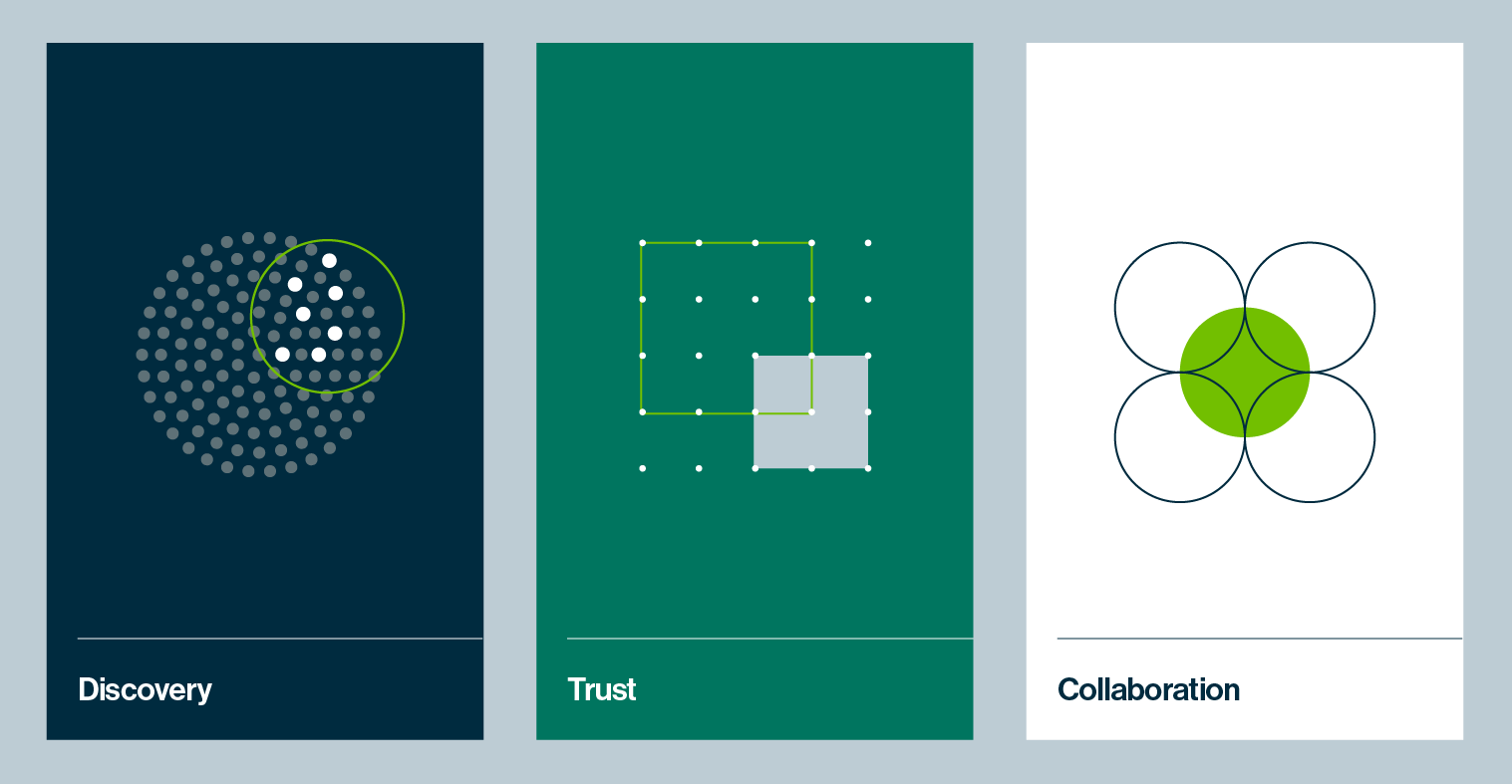
Turning complex data into something simple

We now live in a world of data. That isn't the boldest statement ever, of course, but a lot of marketers forget to think about what it implies in their strategies.
Then we have a paradox — people want more data but in less time. It is because of that scenario that visual content is thriving more than ever.
When you turn complex data into visuals, you create media that can be read fast and easily understood. It is a modern and low-cost way of effective client communication.
The most prominent formats are charts, presentations, and infographics. With them, you can target and label data. You can process a huge amount of information into easy-to-read categories and structures. You can give them context.
The result is the kind of content that is really suited for Digital Marketing and the new expectations from the audience—information that is reliable, easy to understand, and even easier to share.
Transforming complex concepts into something beautiful
A lot of people see the aesthetic aspect of information as something secondary. You, as a marketer, already know how short-sighted this thinking is.
Good design is all about form with function. The right use of colors, shapes, the right combination of elements can make numbers readable in a split-second.
But it is not just about conveying the information. Making beautiful data will create a closer relationship with your audience. They will understand the content faster and identify it as coming from your brand.
That is why simplicity and beauty are both pillars of this strategy. They enable you to communicate with objectiveness and empathy. They do the job of a five-minutes reading in seconds.
When we think about the way we consume information right now, it is the perfect format. Visual, fast, instigating, shareable. You only need to have a goal in mind and know which kinds of visual content can get your strategy there.
Simplify Complex Data with Aesthetic Design
Explore our Academy to learn how to effectively communicate technical data through design. Transform complex information into visually engaging and easy-to-understand formats.
Understanding why visuals matter
You are now probably thinking about how to explain technical data in a simple and beautiful way and insert this kind of content into your strategy. However, before you start, we can talk a little more about why do it.
Yes, it is beautiful. It is simple. But how exactly, talking about marketing results, can this approach help you? Let's take a look at some benefits of data visualization.
Standing out from the competition
Text is really important in a content marketing plan. It is how you educate, communicate, and work your message. But we have to admit that it is the same in every blog and social media.
That is why you should think about both sides of it — beauty and simplicity. Great graphics stick. In a race for visibility, you put your company ahead of the competition.
Getting viewed and getting viral
There is no denying—visual information grabs attention quickly and effectively. It makes people stop more often to click a link, for example.
With a viral aspect, visual content can spread more and bring more opportunities to convert. You can get the reach you need without investing more in paid ads and boosting posts. It is all about efficiency.
Speaking directly to your audience
We talked a little about it in the first topic, but we can go deeper into this discussion. If visual data has something heavily in its favor, it is identity.
With a well-designed brand persona, it is possible to create graphics that not only simplify data but expose it in a way that really communicates with your buyer persona.
Even the types of data visualization your team uses can impact your relationship with the audience. Different kinds of charts resonate with different kinds of people.
So the choice between columns, bars, lines, infographics, and interactions depends on how your audience responds to them.
A sense of identity creates a relationship. As it does with everything, visual data can give you that kind of brand-client connection quicker.
Keeping them coming
If you have a strategy based on attractive, easy-to-understand visual content, your company can become the go-to place on the internet to be informed.
More visits create relevance, which boosts backlinking and sharing, which get you better positions in search results.
It is a virtuous circle that can improve your marketing strategy with a small and simple investment. All you need is to create great graphics from relevant data—and put your identity in it.
Are you doing visual content already? Do you have any questions on the matter? Leave your comment below.
Also, be sure to check out our new Instagram Story dimensions guide.
Jumpstart your ideas with Linearity Curve
Take your designs to the next level.
Share this!
Ben Barnhart
Ben is a Content Lead for Linearity living in Berlin. His hobbies include board games, cooking, reading, and writing.