:quality(75))
:quality(75))


:quality(75))
Graphic design can not be simplified down to a straightforward equation or a plug-and-play solution. However, there are easy-to-understand principles that even the earliest of beginners or non-designers can implement to achieve a successful outcome.
Read on for fourteen essential graphic design tips to help guide you through the complex world of graphic design and create better-looking designs in no time.
Jumpstart your ideas with Linearity Curve
Take your designs to the next level.
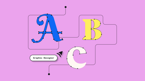
Getting started
Seek out unexpected sources of design inspiration

Researching design inspiration is often a favorite step in the design process and certainly shouldn’t be overlooked. Seeking out inspiration from existing designs can be very exciting and help open your mind to new ideas you hadn’t considered before.
There is a wealth of reference to be seen on various design blogs and in graphic design books. Even the work of industry leaders is at the tips of your fingers on social media platforms. Take it a step further and dig into graphic design history and be inspired by the original design greats and movements in history that helped to shape modern design as we know it today.
How can you keep it original? Ensure you are drawing upon a variety of references and mixing and matching design cues to ensure you are not copying one too closely. For example, if one designer’s work might inspire your choice of fonts, choose alternative references to influence your color palette or your approach to photography or illustration style.
Seek out designs that are unrelated to yours to help create a fresh approach rather than getting stuck in what has already been done. Skip over the typical approach or what competitors have done in the past and look to alternative industries, formats, and content to spark unexpected ideas.
Know your audience
Whenever you are creating a design it is important to consider who you are creating it for. Graphic designers create visual messages and oftentimes that message is intended for a recipient that is very different from you. This may mean making some design choices that appeal to your audience and not your own taste.
Plan your design

While it may be tempting to hop straight onto a computer, dig into design programs, and play around with powerful design tools to begin creating, having a solid plan for your design is an important part of the design process and can often save hours of the dreaded ‘pixel pushing’.
Take some time to consider the format and dimensions of your design and the content you are working with. Will your design need to be portrait or landscape orientation? Where will the design appear? How much space do you have to work with?
Graphic design essentials
Use a cohesive color palette
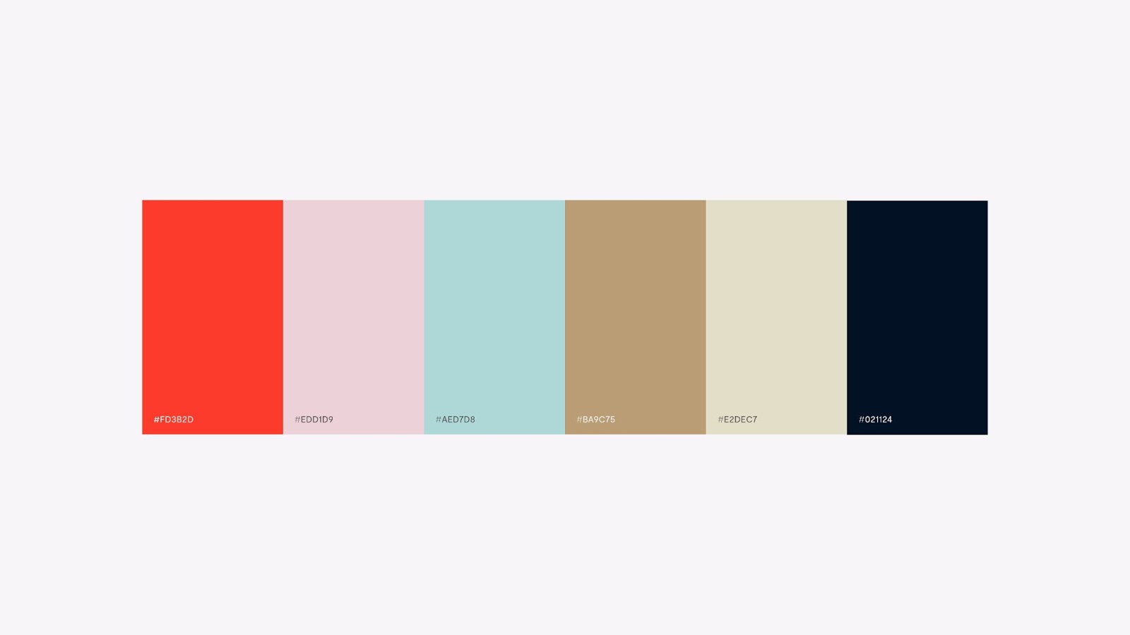
Color is arguably one of the most impactful tools a designer has when wanting to convey a certain tone or message in a design and a consistent color scheme is a must.
It is important to have a basic understanding of the psychology of color. Colors can carry a subconscious message that often relates to our natural environment. For example, blues and their connection to water can convey cool freshness or cleanliness whilst reds remind us of heat, passion, and danger.
Culture plays an essential role in our interpretations of color making it even more important to understand your audience before you choose your colors.
An easy place to begin is the color wheel which allows us to easily see which colors are complementary (opposite on the wheel), analogous (adjacent on the wheel), or triadic (three colors positioned at 120 degrees on the wheel from each other). Each of these relationships can produce pleasing color combinations, however, there are many more pleasing relationships between colors based on their position on the wheel.
Ready to create brand assets that pack a punch?
Visit our Academy to learn how to use color palettes.
Keep it restrained when it comes to selecting colors for your scheme. Choose a palette of 1-3 main colors and then create a set of secondary colors by selecting different tones of your main colors for consistency and simply adjusting the relative brightness or saturation. This will help you achieve enough contrast in your palette. Think of each color as having a ‘volume’ and adjust your tones so that they are not all speaking at the same volume.
It is also important to think about the proportions of your color palette and play around with how much of each color is applied to the design. A design can change dramatically by using your color palette in different ways. Here are a few of our favorite resources to get you started:
Create hierarchy and group elements
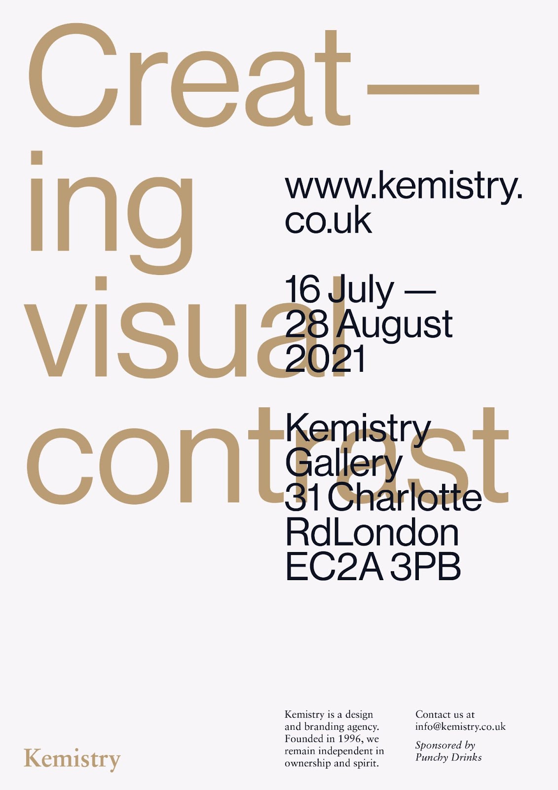
Hierarchy is arguably one of the most important considerations of a successful design. Graphic designers are visual communicators, and hierarchy is the element that assists in the readability of a design or guides the viewer from the most important element through to the final CTA (call to action).
Start by identifying what is the most important message or feature of a design. This should be the most visually dominant and stand out relative to others. The most obvious way to achieve hierarchy in your design is to play with the size or scale of the content. You can also experiment with the application of color or the weight or style of your fonts.
The busier a design the more difficult this can become but a great way to simplify a content-heavy design is to visually group elements together. Look for opportunities in the content to assign the same visual style to elements that might otherwise be unrelated. In the above example, the date, address, and web address have been visually grouped together.
The studio and sponsor information has also been grouped. This allows these groups of information to be read together and works to simplify the overall hierarchy.
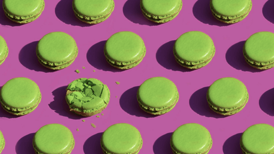
Create visual contrast
Working hand in hand with the design principle of hierarchy is contrast. Just like in real life, when something appears visually different from what is around it our eyes are immediately drawn to it. Therefore, contrast is without a doubt one of the most impactful elements of design and helps to add visual interest or create a focal point.
As with hierarchy, you can generate contrast in your design by applying contrasting colors or tones of colors, by switching up fonts or using alternative styles for different pieces of text, or even contrasting the space amongst elements in your design.
Don’t be afraid of white space

The space between the elements of your design is called ‘white’ or ‘negative’ space. This space isn’t simply the absence of content, but a design choice in itself, and can be used to achieve significant design principles such as the aforementioned contrast and hierarchy.
While it can be tempting to consider empty spaces in your design as wasted, white space can also be one of your greatest assets when used strategically. Try creating space around an element you want the viewer to focus on.
:quality(75))
:quality(75))
An element with lots of space around it is visually separated and uncluttered by the other elements of the design. This space allows it to stand out more and become the focal point.
While white space is loved by pioneers of minimalist design, a movement that centers on the concept that less is more, creating space or moments to “breathe” in a busy, maximalist design can increase its overall impact.
Align your design elements

Alignment is one of the most important considerations in polishing a design. Alignment helps give structure and order to design and without it, your design is at risk of looking like a bad game of Tetris.
Keeping your elements like type, images, and illustrations aligned to one another will ensure a presentable design. Bonus: there are alignment options and tools right in your Linearity Curve (formerly Vectornator) software you can use to help out. Always make sure you have margins to act as a safe space around your page and use them to line up your elements.
Use font families

One of the more challenging aspects of working with typography in design is choosing the right fonts and pairing typefaces that are complementary to one another.
There are thousands of different fonts to choose from and without an in-depth understanding of the anatomy of typography, it can be difficult to know which fonts work well together and why.
To breeze past this challenge, choose a font family that comes with a wide variety of weights and styles. For example, the Futura PT font family comes in a range of twenty-two different varieties from light to extra bold weights, as well as numerous styles from italic through to a condensed version of the font.
Some type foundries have even designed both serif and sans serif fonts that belong to the same font family.
The various options will help you in creating visual hierarchy in your text and you can be sure that whichever you pair, your design will be looking on point.
Be consistent
After considering all these important principles in design, make sure you follow the rules you set for yourself and aim for strong repetition in your design.
Set yourself rules for the sizing, letter spacing, and kerning of type elements such as headers, subtitles, and body copy. Ensure your imagery has the same look and feel. Search for images that have the same tones of color or levels of saturation, as well as similarities in how detailed/busy or abstracted/simple they are.
Be consistent with your color palettes and how you use color and repeat graphic elements where you can.
Consistency in visual elements is particularly important in multi-page designs or when creating social media graphics. Likewise, in web design consistency is King to promote a strong user experience. Repetition is also important in the case of branding where a business will have more than one touch-point with their audience.
A strong brand will be recognizable anywhere the audience might interact with a business; on their website, their business card, their social media channels, and in their physical environments.
Keep it simple
As the old adage says, less is more. Design, in all its styles and applications, is an exciting thing and it can be tempting to build up a design with everything you can think of.
Remember that good design is communication and not just art. Sometimes, too many elements in a design can begin to pull focus and derail the intended message of a design.
Advocates of the minimalist movement in design will say a design is successful when anything unnecessary or arbitrary has been removed. While you don’t need to fully subscribe to that line of thinking, you can still be inspired by their approach and create an eye-catching design.
Unless there is a good reason to throw everything into a design, limit your font choices to a maximum of two and keep your color palette restrained. Not only will it be easier to create your design, but the imposed limitations will streamline and make it easier to promote consistency in a great design.
A few extras
Get hands-on

Our computers are great assistants. Powerful design programs and robust one-click tools are very handy to streamline the creation process and save time in an often deadline-driven industry.
However, there is something to be said for getting a bit more hands-on with our designs. Not only is stepping away from screens a healthy exercise but there are certain handmade elements that bring richness and depth to your design that just can’t be replaced by a digital version.
Ready to create brand assets that pack a punch?
Visit our Academy for free graphic design courses.
Sure, we can emulate brushes, screen printing textures, hand-drawn typography, and paper rips or cutouts, but nothing quite beats the real thing.
With our Auto Trace tool, you can easily create elements by hand to scan or photograph and then digitize them to use in your work with the click of a button.
Seek out a second opinion
Especially true for freelancers, designing solo can be very rewarding but designers tend to eventually become a little bit blinded and sometimes can’t see the woods for the trees.
While it’s exciting to dig into a project from start to finish, without any collaboration or second opinions there might be an opportunity missed. Sometimes a second opinion is all you need to bring an extra bit of magic to your design that you hadn’t thought of.
Be yourself

Designers are the creators of visual messages, and those messages are constantly being shaped by what is happening in the world around us. Changes and trends in popular culture, technology, architecture, marketing, as well as economic changes mean there are always perceivable trends that come and go.
We also live in a world where connecting digitally has never been easier and social media is the ultimate gap-closer. Following #graphicdesign now leads to millions of results from every corner of the globe.
We can connect with and be inspired by the work of creators all over the world, but this same wealth of inspiration may make us more and more susceptible to the influence of trends that we see. These trends are visible everywhere you look from Canva templates to pre-designed assets on Creative Market.
It’s important to remember that there is only one you in the world, you don’t need to emulate anyone else. Embrace your taste and let your unique creative ideas shine through. And if you need a powerful graphic design tool to help you share your creativity with the world, look no further than Linearity Curve (formerly Vectornator).
So as you can see, while you can be inspired by professional designers, successful creations of your own can be achieved by following these straightforward principles of graphic design. Like anything else, graphic design skills take time to hone and sharpen.
By practicing these fourteen graphic design tips, even the most novice of designers can grow, develop, and tell exciting stories with design.
Jumpstart your ideas with Linearity Curve
Take your designs to the next level.
Share this!
Hilary Archer
Hilary is a contributing writer to the Linearity Blog.