:quality(75))
:quality(75))


:quality(75))
Graphic design is both an art and a science.
Nailing the perfect poster design or interface prototype can be a real challenge, but there are a few fundamental principles of design that creatives can use as a guide. From typography dos and don'ts to color theory guides, design rules offer creatives a kind of cheat sheet that they can follow.
These golden rules help graphic artists make designs that are clear and legible, fit for purpose, and create a good user experience. But let’s face it—sometimes it’s fun to break the rules.
Jumpstart your ideas with Linearity Curve
Take your designs to the next level.
No one was ever remembered for sticking to the rules. The most famous graphic designers and artists from history were total rebels and pioneers of change.
And even today, there’s a growing Anti-Design movement of contemporary creatives who are going against the norm and claiming graphic design as an expressive art form. They use clashing colors, ignore alignment, and choose jarring typography combinations. The striking style purposefully rejects basic design principles, but it still takes talent to pull it off.
Plus, you have to know the rules before you can break them.

How to effectively and successfully break graphic design rules
From a young age, children are taught to color within the lines. So it’s no wonder, as a graphic designer, you feel inclined to follow the rules you’ve been taught. It’s ingrained within us. But that doesn’t mean that we should always fall in line.
Feeling rebellious? Here are seven graphic design rules you can (and should) break.
Use a grid
In design, using a grid is a tried-and-tested technique for achieving an organized layout.
It helps designers place their key elements and text neatly, evenly spaced, and aligned to sequenced columns and rows.
There are many grid systems out there, but one of the most famous was first introduced by 13th-century architect Villard De Honnecourt. He devised a grid system merged with the Golden Ratio to create a page layout diagram with margins of fixed ratios. The method empowered designers to create “harmonious” designs, and De Honnecourt’s grid system soon became the industry standard in print design.
Master the Isometric Grid in Your Designs
Step into the world of isometric design. Learn how to effectively use the isometric grid in Linearity Curve to enhance your projects.
The grid system is a useful starting point, but some designers feel it can limit creativity. Too often are the words “organized” and “harmonious” synonymous with “boring.” As an up-and-coming designer, this isn’t the reaction you want.
American graphic designer David Carson is one example of someone known for ignoring grids altogether. During the ‘80s and ‘90s, he experimented with distorted, fragmented, and overlapping typefaces that were almost impossible to read. His innovative work was groundbreaking at the time, and his style defined the “grunge” movement (he’s now known as the “King of Grunge”).
If you’re inspired to think outside the box, why not create designs that defy the grid system? Or use one of the less common grid systems?
You can either opt for a diagonal grid system over a vertical one or throw the entire thing out and scatter your visual elements out randomly but strategically. You still need to be sure that the visual hierarchy is effective. Your most important visual components must stand out to the viewers among the chaos.
Forget guides and rulers—use your creative instinct to play around with the layout and create something extraordinary.
Maintain balance
Grids can also help designers maintain balance in their designs.
Each element, from typography to color, has its own visual “weight.” This should be balanced by other graphic elements according to traditional design theory. Traditional types of balance include symmetrical, asymmetrical, radial, and mosaic.
Symmetrical balance occurs when the visual weight is distributed evenly down the middle of the design.
Sometimes a symmetrical balance can be extremely effective, especially if you’re trying to create a feeling of hyper-balance, professionalism, trust, and order. You’ll often find a perfect symmetrical balance when looking at logos. Think Airbnb or Starbucks.
Asymmetrical balance happens when a design has different visual images on either side, yet those unequal visuals still balance each other out. Think of the rule of thirds. Visuals following this rule will not be symmetrical, but since they play into how we view images, they will still feel as though they are in balance.
Radial balance is achieved by placing objects, colors, or textures at equal distances from the center of a design (think about the structure of the snowflake or mandala).
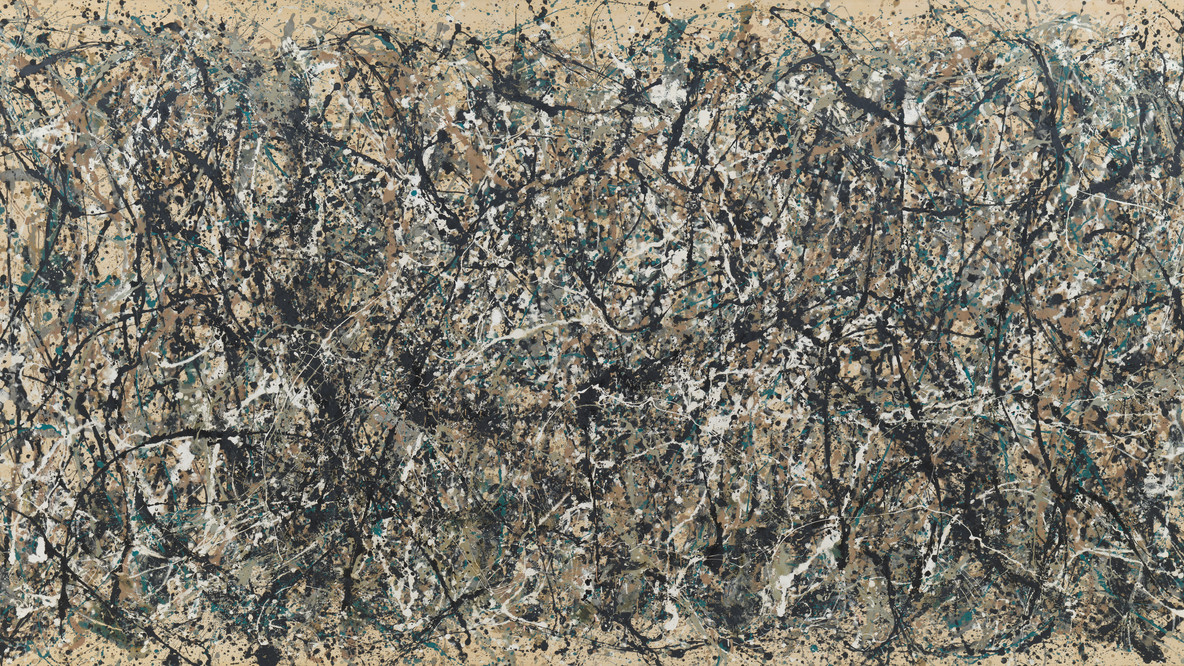
Mosaic balance, or crystallographic balance, results from balanced chaos. A Jackson Pollock painting is a good example of mosaic balance since his composition lacks distinct focal points, but the visual elements (or paint drips) share a uniform emphasis.
Want to break the rules of balance? Discordant balance is a term used to describe a design with no balance. This is not the same as asymmetrical balance. These designs are intended to evoke a sense of unease in the viewer and encourage them to stop and think.
Italian Futurism founder Filippo Tommaso Marinetti became known for shaking up the restrictive rules of balance and typography when he published his first book, Zang Tumb Tumb, in 1914. The poet and graphic designer visualized his experiences during the Balkan War of 1912 by arranging words to look like the sounds of gunfire, grenades, and other weapons.
He captured the chaotic sound of war by using multiple typefaces in different scales, with words scattered randomly around the page. The lack of organized balance visually captures the disharmony and violence of war.
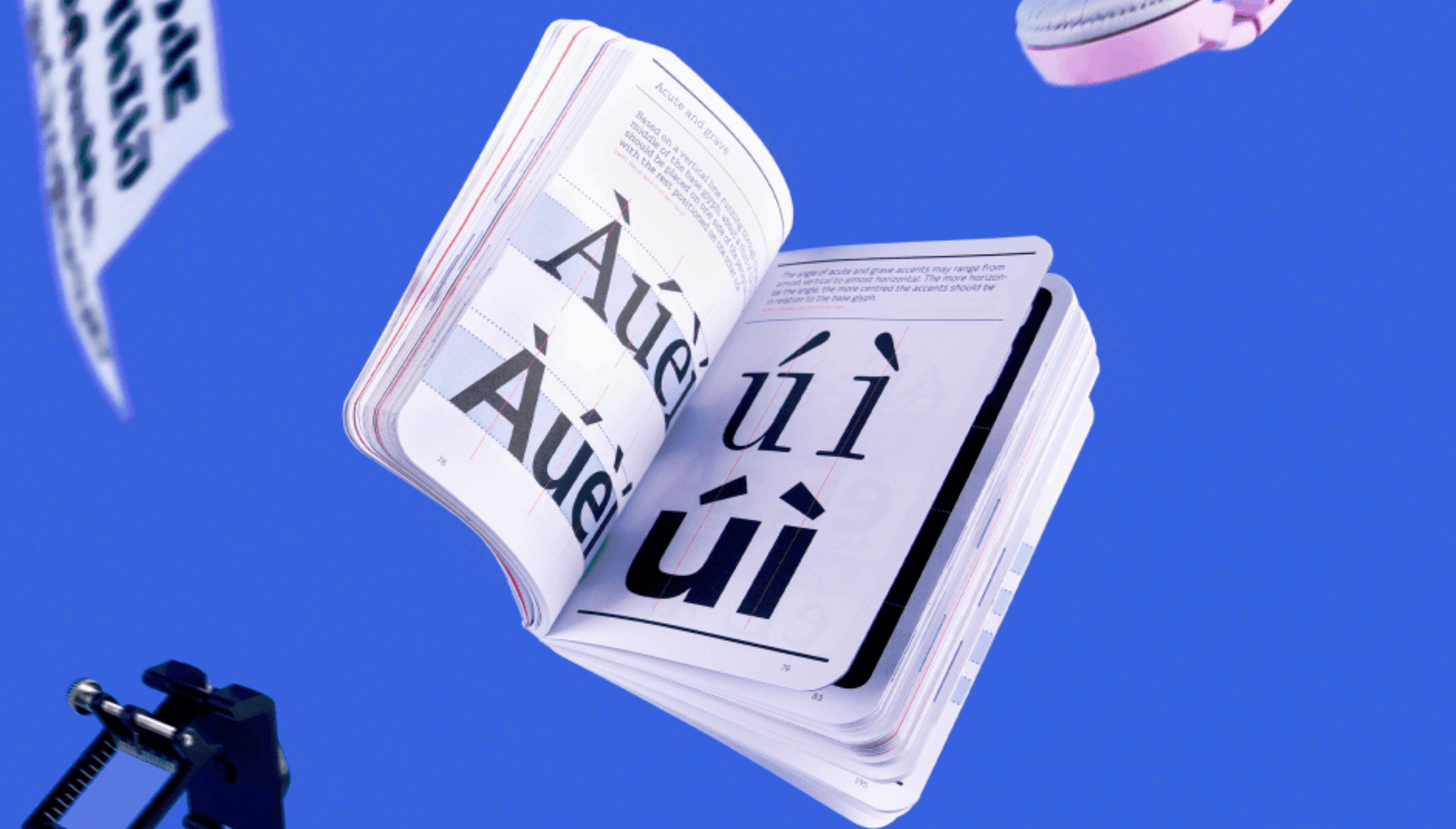
Use a typographical hierarchy
Whether you’ve been to design school or you’re self-taught, you’ve probably heard about using a typographic hierarchy.
This is a system for organizing type within a design so that designers can effectively communicate a message.
Traditionally, there are three levels of type hierarchy—primary, secondary, and tertiary.
- Primary type has the most visual weight and is usually used for headers. Typically, designers choose large and bold fonts.
- Secondary type refers to subheadings, captions, and any part of the design that isn’t quite a heading but not the main body either. It’s designed to create order and guide the viewer through the flow of the design.
- Tertiary type refers to the main body copy. Readability matters here, so a sans-serif font is best.
Typographic hierarchies are important when designing informational systems, whether online or in print. However, when it comes to artistic graphic design, there’s room for creativity.
Art director Rudy VanderLans and type designer Zuzana Licko produced the award-winning Emigre magazine between 1984 and 2005. They created some of the first digital layouts and were known for breaking the rules of typography.
VanderLans and Licko embraced new technology—specifically Apple’s first Mac computer—to design printed essays and interviews that comprised overlapping typefaces in various sizes, distorted letterforms, and text columns that collided and sprawled across the pages.
The entire magazine was printed exclusively in custom Emigre fonts that many senior designers still love today.
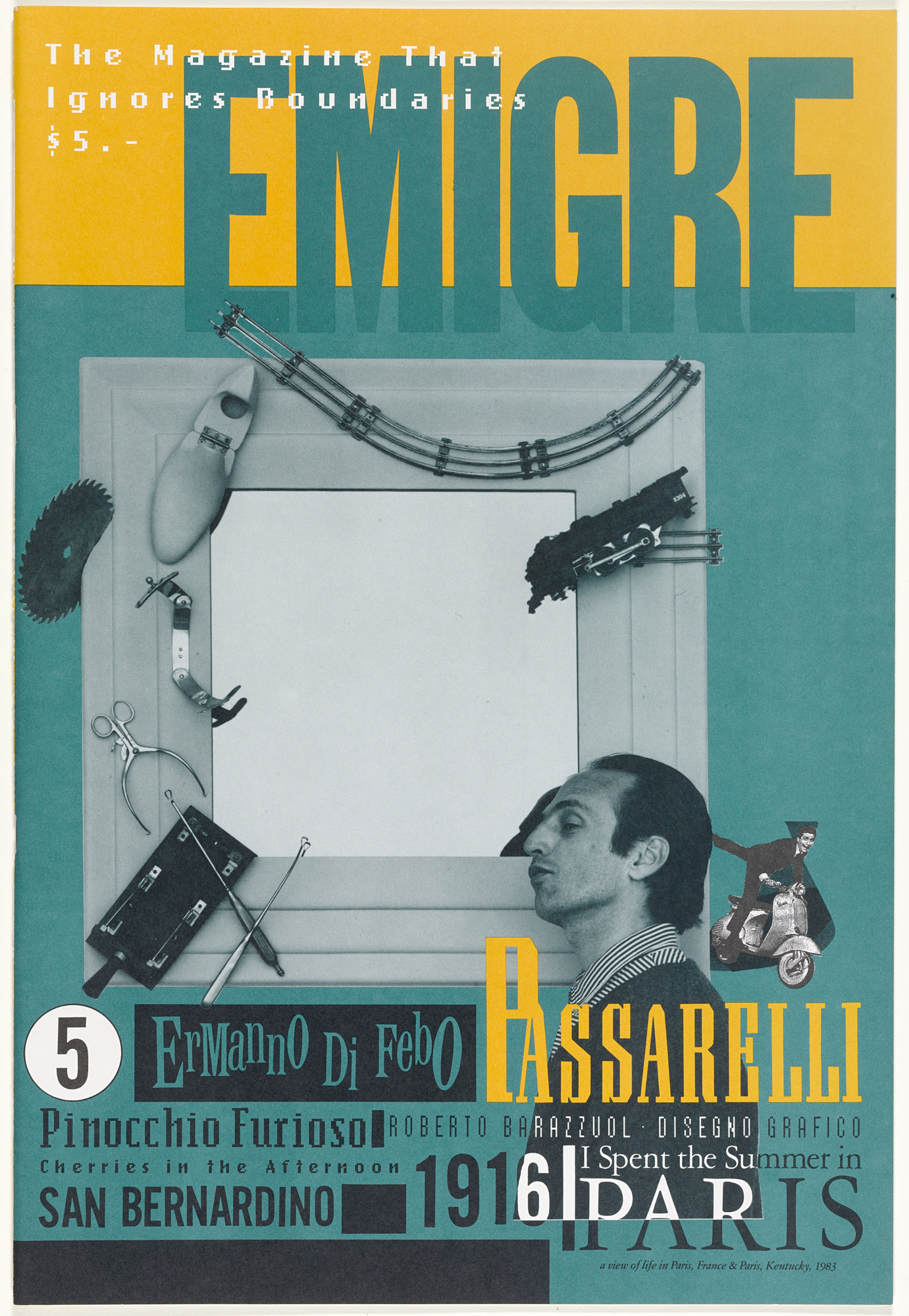
The groundbreaking Emigre magazine offered readers a new and playful way to experience printed content. And it still significantly influences graphic designers today who want to break and bend layout rules.
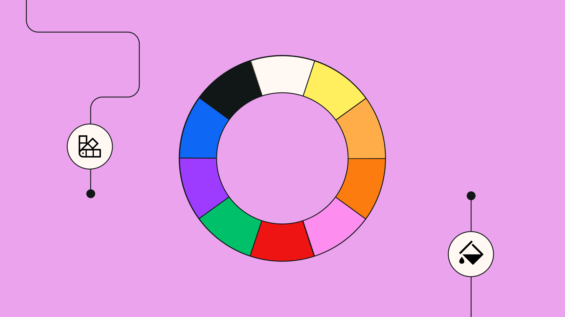
Use complementary colors
As a rule of thumb, most graphic designers are taught to limit their color palettes to two or three complementary colors.
The traditional color theory claims that complementary color schemes create visually appealing and memorable designs. However, combining “discordant” colors can sometimes be a way to make a stronger impact.
:quality(75))
:quality(75))
Discordant colors can draw a person to a visual design rather than repel them. American graphic designer Milton Glaser didn’t conform to color theory rules, and his daring and jarring designs are some of the most famous in history.
In 1966, Glaser designed a poster featured in Bob Dylan’s Greatest Hits album. It comprised a simple, black silhouette of Dylan’s profile, inspired by a Marcel Duchamp self-portrait.
However, rather than leave the composition minimal like Duchamp’s, Glaser added a series of Art Nouveau-style curls in multiple jarring colors and a custom typeface.
The psychedelic shapes not only captured Dylan’s iconic hairstyle, but the “free-flowing” forms and clashing color palette captured the freedom and high emotions of the era (which Dylan also captured in his music).
Although Dylan himself didn’t like the illustration, the album sold millions of copies. The poster became one of the most popular ever to be produced.
Use white space in moderation
White space, or negative space, is the empty area surrounding the images, text, and other elements in a design.
It doesn’t have to be a white background—it could be black, a color, or even a texture. The point of “white space” is to create gaps between motifs and guide the viewer's eye around a design. White space helps build a visual hierarchy and makes the text more readable, and as a rule, designers are often told to use it in moderation to create balance.
Rather than use white space as a tool to divide information in space, we suggest using space as a design element. Excessive empty space in a design can make a powerful statement, create a mood, and draw attention to certain areas.
Twentieth-century art director Helmut Krone (for ad agency Doyle Dane Bernbach) pioneered using white space in unexpected ways. In his campaign for Volkswagen, titled Think Small, he used white space to almost entirely engulf a tiny image of a Volkswagon Beetle in the top left corner. The fine print text at the bottom of the page also listed the advantages of owning a small car.
The Think Small campaign still brought attention to the Beetle but emphasized its compact and simple design. This style of car advertisement was the first of its kind since others at the time focused on providing as much information as possible.
Krone’s clever use of white space was a huge success. The campaign “did much more than boost sales and build a lifetime of brand loyalty [...] the ad, and the work of the ad agency behind it changed the very nature of advertising—from how it's created to what you see as a consumer today.”
Follow trends
Even expert designers are often under a lot of pressure to keep up with trends.
But what would happen if you stopped chasing the next big thing and spent time exploring your ideas? The design world would probably look a lot more diverse and interesting.
We say: don’t follow trends; set them.
A fair share of trends come and go before you even notice. Unless the trend adds value to your design and enhances the message you're trying to communicate to your audience, don't use it. Rather stick to your original idea; otherwise, you risk losing the design's overall effectiveness.
Ready to create brand assets that pack a punch?
Visit our Academy for free marketing design courses.
We published an article on corporate illustration style and discussed how flat design characters are everywhere nowadays. This trend is one example that seems to be causing frustration among design enthusiasts who want to see something different.
We encourage you to break free from following trends and go your own way in your next design project. You might be surprised to find that you have some pretty unique ideas, and you could even be the pioneer of a new trend!
Limit your colors and typefaces
So often, as a designer, you’re told to limit your colors and fonts to no more than two or three. However, the effectiveness of those colors or fonts doesn’t come down to how many you use but how they all interact.
That’s why it’s best to limit them; otherwise, they can detract from the overall effectiveness of your design. But if you’re a skilled designer who understands why these rules exist, then you should be able to break them and get away with it.
Rather than telling you how to do this, we’ll show you examples that broke the mold and succeeded in doing so.
Most logo designs use a limited color palette, which is translated to the rest of the design brief to create a uniform brand. However, one of the most famous and recognizable logos worldwide uses four colors. Who could that be? Google, of course.
Among the other globally recognized logos, the brightly colored logo of Google stands out in our minds. The colors follow a tetradic color pattern which makes the viewer feel a sense of optimism and represents the world's cultural diversity.
And Google isn’t the only one. The designer of the NBC logo also disregarded the thought of having a limited color palette. The NBC logo has not one, not two, but six different colors in it. In this case, the six different colors represent the six different divisions of NBC, so the logo is eye-catching and meaningful.
Let’s talk fonts. If you look back at the nineteenth and twentieth-century posters, many of them used multiple fonts. Today, many graphic designers have mimicked this in their modern designs, particularly regarding packaging design and labels.
When done correctly, using more than one font can draw the viewers' attention to important information and create a sense of joyful fun. Or, more obviously, it can be used to give you a feeling of the era it’s reminiscent of.
Take the Hendriks Gin bottle label as an example. The different typefaces have been used to give consumers an early twentieth-century feel and to transport them back to the time of Prohibition. A time when consuming alcohol in the US was illegal, and speakeasies provided an edge of excitement and danger.
Looking at the above examples, it should be clear that you can use more colors and fonts in your designs if you prefer. As long as they all have a purpose and add to the overall design rather than detract from it.
Did we convince you to break the rules?
Design rules are undoubtedly important, but we can't deny that amazing things can happen when a designer bends and breaks them during the design process.
If you just look at the designs around you, you'll notice that some of the most successful designs go against the basic design principles. It's this individual approach that makes these effective designs stand out.
It's time to embrace the "common mistakes" that most designers make and use them to your advantage instead.
If you're inspired to defy the grid system and shake up color combinations, Linearity Curve (formerly Vectornator) is a fantastic tool for creating innovative vector-based designs. From typography and illustrations to posters and interface layouts, you can create almost anything your mind can imagine with our intuitive tools.
To learn more about what you can do with Curve and get an overview of its key features, head to our Learning Hub.
Jumpstart your ideas with Linearity Curve
Take your designs to the next level.
Share this!
Emma Taggart
Emma is a Content Writer for Linearity in Berlin. Her hobbies include making ceramics, roller skating, drawing, and 2D animation.