:quality(75))
:quality(75))

:quality(75))
With trends like 3D design and typography, asymmetrical layouts, and open compositions coming to the forefront of the design community, there is no shortage of exciting graphic designs and graphic design projects available these days.
As a Graphic Design software company, we thought it would be a great idea to look at some of the best graphic design work done by some of the most talented graphic designers out there. Our team searched through lots of unique types of design, design styles, and graphic design trends. In the end, we discovered so many graphic design specialists with breathtaking graphic design portfolios.
It was no easy task for us to pick only 12 graphic design works, as the range of design styles and graphic design skills was quite diverse.
Jumpstart your ideas with Linearity Curve
Take your designs to the next level.
For instance, every single work we have chosen is created by a different designer, be they a publication designer, visual designer, or marketing designer.
Moreover, these artists are based in various countries throughout the world. We believe their cultural backgrounds are a vital component in the type of designs they create and their design process, as well as the colors they use and the graphic design tools they decide to work with.
No graphic designer has the exact same range of design skills or the same design style. And that's what we love the most about design! Whether a graphic designer has to create an infographic design, advertising design, icon design, or any other type of design, they have different ways of approaching the project. They also come with their unique eye on graphic design.
Some artists focused on graphic designs that emphasize women's empowerment. Others added sophisticated User Interfaces (UI) for apps to their graphic design portfolios. Now, without further ado, here are our top 12 graphic design picks:
Home by Muhammed Sajid
The first piece on our list is this fantastic design from a tremendous Illustrator in India, Muhammed Sajid.
We loved the use of bold colors in this architecturally inspired design piece. The hue and saturation combinations used in this design are so captivating. It looks like a scene from the 2009 film “A Single Man,” directed by Tom Ford, his directorial debut. There is a vivid contrast between the colors used in the foreground and the background.

They are used to create the illusion of space and emphasize the central part of the piece, usually found in the middle ground. The foreground is the first thing that viewers see. Therefore, designing an engaging foreground that can grab attention and invite the viewer to look at the rest of the design is as crucial as an excellent preface or introduction is to a book. The background is also fundamental to a good illustration since it is mainly used to emphasize the main subject. In this case, the main subject is the building. As we can see, the illustrator has used a simple lighter color for the background to emphasize the shapes of the building. He has also used some “whites” and lighter colors for some parts of the building. This balances out the saturated colors and makes the design piece tie together even better.
Additionally, the illustrator has created a juxtaposition between the darker natural life (depicted with curves) to the sharp straight-edged building to engage the viewer.
These types of architecturally inspired designs are also often used for marketing purposes and for promoting a specific building.
Never Regular by Scott Smoker
Up next in our list of the best graphic design examples is this particular piece. It grabbed our attention thanks to its use of various typefaces which are cohesively tied together by the inspirational message: “Never Regular.”
The creator of this captivating graphic is Scott Smoker. He is an avid Vectornator user who always likes to play with negative space in his works.

You might have heard the “rule” of never using “too many fonts” in your graphic designs. Scott has once again transmitted his boldness through his art by breaking this exact rule. He is showing exactly how different fonts can work well together when used correctly.
In this graphic design example, Scott is playing with different fonts, textures, and negative space (also known as white space). If you notice, the message “Never Regular,” which follows “Be Bold” and “Be Italic” combines both the italic and bold font styles along with a heavily weighted black font. This makes it stand out from the other two lines and the light-colored background.
Understanding Vectors in Graphic Design
Grasp the basics of vector graphics and their role in modern design. Our tutorial provides a clear and comprehensive introduction to vectors for all skill levels.
The illustrator capitalizes creatively on the use of fonts and their names to express the theme of individuality in a fun way. He pays close attention to details. He also keeps his designs as simple as possible. Letting a simple design speak for itself without overcrowding the eye is always a good idea.
This typography design style is perfect for creating custom text and titles on book covers or magazine covers. You can always play around with new typefaces. Or, you can create custom typography to draw attention to a particular book cover or magazine cover.
Scott also enjoys creating fun Timelapse Videos that document the journey of his design from beginning to end. So make sure to check out his creations. You will soon notice that they are bold, italic, and most importantly, never regular.
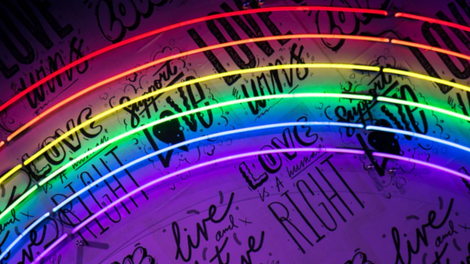
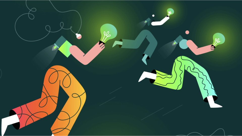
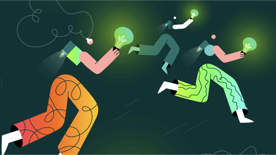
Creatopy's Let It Glow Playoff by Gyöngyi Balogh
This graphic design example is created by Gyöngyi Balogh; a Romanian artist and illustrator. She is well known for her unique style, which is defined by the use of bright colors.

The characters she uses in her illustrations are often clumsy and always in the move. She also defines her design style as experimental. The example we are showing above was recently created for "Creatopy's “Let It Glow" Playoff.
In this intriguing design, she uses partial body shapes to give the idea of three people holding light bulbs in their hands.
Since the competition was called “Let it Glow”, the artist has used the light bulbs to create a glow effect in her graphic design. The different colors she is using are also creating a soft contrast between each person. Gyöngyi’s use of abstract shapes is eye-catching. The use of neon colors in this graphic design example is also subtle. If you take a closer look at the background, you will notice that a few background parts are also reflecting light from other light bulbs, indicating there are more than three underwater explorers floating in this abstract graphic design.
MerMay by @martas_reveries
The intense color palette utilized in this dream-like piece stood out to our design team. The “spacey scenery” and use of abstract shapes genuinely attract eyeballs and draw you in.
It is titled MerMay, which intentionally sounds like the word “mermaid”. This graphic design example grabbed our attention, as it is eye-catching and introduces you to a new imaginary world.

If you’ve seen Sinbad: Legend of the Seven Seas, the animated film by DreamWorks Animation, this graphic design example will immediately remind you of Eris, the Goddess of Discord. She is the villain of the story and aims to create destruction throughout the world.
However, the hair of the mermaid creature in the design by Marta Reveries is white instead of black. She seems to be the opposite of Eris. She is aiming to create harmony throughout the world and the universe instead of creating destruction. Instead of using a lighter background to emphasize the main “protagonist” (as we saw in the very first graphic design example), this Serbian creator has chosen darker colors for the background to emphasize the mermaid.
Her white hair is also the first thing you see when you look at this graphic design. It creates a sudden contrast between the foreground and the background.
Marta has conveyed that harmony using different shapes and colors. The shadows used in this particular work are also used to convey depth. They make the whole piece feel like you are looking at a 3D parallel world where the sea and the different galaxies are combined into an imaginary universe.
She is also conveying motion through the use of various types of curves. This is especially visible in the mermaid’s hair and body. You can also see that motion and fluidity conveyed in the leaves. This way, she can transmit a feeling of “motion graphics” using a 2D setting.
Thanks to her stunning color palette, we are able to swim down with her to this magical life under the sea.
Moon by @asaadsdesigns
Most often than not, designers focus on other designers’ work for inspiration. They also check out other designers’ portfolios and keep tabs on the trends.
This may, one way or another, unconsciously influence their creativity. It may influence the way they portray motion, the way they place text into their design, how they use negative space, and so on. That is why, sometimes, when you see a graphic design for the first time, you feel like experiencing a deja-vu. You feel like you have already seen it somewhere. Or it resembles something you have seen in the past.

This may happen when you see this particular piece of graphic design. It uses the partial moon shape as part of the “ moon lights” logo.
However, what separates this piece from the rest is that the talented illustrator Asaad from Syria has designed this whole piece entirely on his iPhone. This just proves how easy it is to use Vectornator even on smaller displays! You don’t necessarily need to own expensive tools or devices to come up with creative and cool ways to incorporate logos into your designs and make them stand out.
We chose this fourth graphic design example to highlight the fact that Vectornator is not only used as a graphic design tool to create breathtaking and cool-looking illustrations. It can also be used for commercial works and can create simple yet powerful company icon designs or logo designs!
In this particular graphic design job, the illustrator has provided a touch of motion graphics by evoking motion through the fading circles of the partial moon.
This piece creates a professional aesthetic for branding purposes through the use of Guides and Boolean operations, along with the reduced opacity of the logo on the starry night background.
Graphic designers can use Vectornator to create appealing commercial work for their graphic design portfolios to impress creative directors or art directors who might be looking at their work.
Bonjour by @aurore.bay
We picked this Graphic Design piece thanks to its quirkiness and the calmness it conveys. The proportionally imbalanced oversized hands and feet contrasted with a normal-sized head seem to project a comedic feel. But at the same time, they transmit this warm, happy feeling that we also see in the face of the main protagonist. Even though it was created two years ago, this graphic design by Aurore Bay, a young French illustrator, seems to be ahead of its time. We’ve seen design trends in 2021 heading more towards people and characters that engage more with viewers by waving or smiling at them or by helping them feel more engaged.

As we see in this example, the main character is also smiling and waving. This makes the whole piece more inviting and engaging. When it comes to communication, and especially “speaking” and connecting to an audience through visual communication, graphic designers try to use different types of designs and design elements. Especially on graphic designs that contain no text, illustrators often use their imagination to find a way to convey emotions, feelings, and expressions. This is usually done with the way they design the main character, their facial features, how they position their body parts, and so on.
:quality(75))
:quality(75))
In this graphic design example, we see the smiling face and waving hand of the main character. We also see that he is seated comfortably. These factors convey a friendly and easy-going atmosphere. Furthermore, the use of dark yellow against the dark violet background makes the illustration pop even more. Aurore Bay is known for her quirky design shapes and for transmitting positivity through her creations.
She is quickly gaining popularity. Aurore believes that Vectornator will one day replace Adobe Illustrator since it is straightforward to use and allows you to make quick changes on logos or other pieces of designs you are working on.
Head in the Clouds by Jonathan Holt
Titled Head in the Clouds, this graphic design example uses several elements to depict what goes into the head of the main character. It is created by Jonathan Holt; a self-taught designer and illustrator born and raised in California, USA.
Jonathan has made three clear divisions in this abstract graphic design piece.

In the upper part, we see the main character deep in her thoughts during the day. As we move to the middle part, we now see a different background showcasing the sunset. In this part, we see that the main character’s thoughts are taking her to a faraway place. We also see that the main subject of the middle part is the lighthouse.
In the lower part of the design, Jonathan has emphasized the yellow key as the main subject. In the background, we see the moon, which means the main character is now sleeping at night. The key, therefore, may symbolize the unlocking of a new world and the dreams that the main subject is having.
He has also used negative space to create a foreground and background in each of the three parts. Another thing that grabs attention is the transition of the sun to sunset and nighttime, which helps us better understand the story behind this graphic design.
Even though we see clear divisions between the parts, the graphic designer has used clouds in each part to bring this whole piece together.
Just my Type by @albi.letters
The German Calligraphy artist, Oliver, is the talented mind behind this lettering piece. What makes this one stand out from other graphic designs using a black background and white-colored lettering? The fact that the black background looks more like a painters’ palette than a clean, boring black background.

The texture used in the background may seem like a “work in progress” at first sight. Then, you realize that the background is precisely what brings more liveliness to the graphic design piece as a whole. It emphasizes the typography and adds more nuance.
Just like the previous graphic design example by Scott (Never Regular), we can once again see how powerful typography can be when used in combination with the negative space concept. In this case, the illustrator is also playing with words. He is using a particular font type to say “just my type.” We’ve seen time and time again how creative professionals choose to play with words to make their graphic designer resumes stand out.
Another thing illustrators often play with is the shape of the words and the message that those particular shapes convey.
The text you use in such graphic designs is essential to convey a message. However, when using a simple phrase or a few words against a black background, you can also use the shape of the words themselves to your advantage and better communicate with the viewers.
From magazine covers to book covers and business cards, there is no limitation in the various creative ways you can use stylish lettering. If you plan to become a freelance designer, there are multiple fields where your creative skills will be an asset.
Mustang by @samji_illustrator
The old-school rough look of this muscle car was impossibly hard to say no to when picking out our favorites. We can’t help but admire the beauty of this rugged beast and the attention to detail in the design process, which is evident with the smokey tires.
As you first look at this graphic design piece, you may immediately notice how different it is from all the previous graphic design examples above. Another detail that communicates movement is the inclusion of several straight lines under the car. They indicate which direction the vehicle is moving.

This piece shows how different designers have different ways of creating pieces that stand out; be it a simple lettering message or an American muscle car. There is no limit to what you can design and how you convey motion in your work, even if you use the same graphic design tools and the same design software apps.
Warsaw-based artist Samji is the brain behind this vivid illustration that shows excellent communication between the artist and the viewers. He has used the smoke coming from the car as a way of communicating motion as well. The juxtaposition of the white smoke coming from under the hood and the black smoke coming from the car’s exhaust makes the car itself pop out. The way curves of the smoke are portrayed give yet another sense of movement happening in this scene.
We also love how the negative space gives it a clean look. The simple background guides your eyes to look straight to the car in the middle as well.
This graphic design example by Samji shows how designers can use Vectornator’s freehand tool to showcase their design skills with ease. It just proves how easy it is to also use Vectornator as an auto design app for iPad, iPhone, and Mac and switch between devices if you are working on the go.
Vectornator Big Bang by @jcomik
In this piece, our team loved the explosion of color with the 3D element of the art essentially spilling out of the iPad. Fittingly, the mash-up of several different smaller illustrations into this larger collage-esque work is very engaging and fun to look at. It is appropriately titled “Big Bang."
Jaye is the creator behind it. From motion graphics to 3D graphic designers, different designers have their unique ways to convey motion.

In this colorful piece, motion is not only shown through the characters and smaller illustrations inside the screen. It is also shown via the characters coming out of the screen. The only text used in this graphic design example is the word “Boom!”. It is used inside the bubble icon design to communicate that Big Bang “effect.”
The use of a wide range of color palettes may seem too overwhelming and hard to differentiate between the different characters and icon designs at first. However, the artist has done this on purpose. It is a way to communicate the message that the device used in this example has so much to offer, and a whole world of colorful and joyful things awaits the user of the device.
Another thing that differentiates this graphic design from the ones we showed earlier is that the designer gives viewers more freedom in where their eye is drawn.
Vectornator is Now Linearity Curve
Your favorite design tool has evolved! Discover the new name and look with the same powerful features you love.
Besides the characters “coming out” of the screen, which may grab viewers’ attention at first, the rest of the graphic design does not give you any other hints about where to look next. The viewer is left free to explore any part of the design without a specific order.
Another cool thing about this piece of art is that Jaye has designed it using Vectornator’s Free Hand tool. This proves once again how easy it is to create any type of graphic design using this tool.
Bird App by @scallianne
At Vectornator, we pride ourselves on being an all-in-one graphic design software. That’s why we love it when our software is not only used for creating fun and creative graphic design projects, but also for advertising design and marketing design projects to promote a particular product or service.
This particular UI design for the concept of a Bird Watching App is created by Sarah. She is a passionate UX/UI designer. Sarah has showcased how easy it is to create an intuitive user interface using Vectornator design tools such as Artboards and Masks.

She has created a nice contrast between the white background and the colorful features of the different birds.
Moreover, Vectornator includes many iOS and Android UI elements. This way, designers can focus on their visual design instead of spending their precious time implementing the iOS and Android elements themselves.
Pro tip: To create infographic designs like the map included on the right side, you can easily import images from Unsplash directly on Vectornator. You can also import free photos from other platforms that offer images that you can use for commercial and noncommercial purposes.
When working on an app design, it is essential to keep the audience in mind at all times. Also, make sure that different graphic elements do not clash with one another but complement one another. To ensure that users have no problems navigating through the app you have designed, it might be best to test the user experience with people who have not used the app beforehand.
Try to get as much feedback as possible to make the necessary changes and improve both the user interface and user experience.
Paris with the Golden Apple by @maddastic
Thoughtful design. Artistic subversion. What's not to love? Selecting this as one of the best graphic designs was an absolute no-brainer. The artist is leveraging Greek mythology. She uses the Golden Apple of Discord meant for the “Fairest of Them All” being eaten by someone who doesn’t fit Western society's conventional definition of beauty; encapsulating the womens’ empowerment motif perfectly.

The design seems similar to @aurore.bay design style, used in her work titled Bonjour. In this graphic design example by Maddy Zoli, we can see design elements blending with photographic visual elements. The main character seems like she is posing for the graphic designer to “take her photo” while biting the apple.
The talented Maddy has used negative space not only for the graphic design as a whole but also for her Brand Icon, which contains the letter “M”; her initial. To create Paris with the Golden Apple, Maddy has used Vectornator’s Masking tool.
In an interview, we had the chance to sit down with Maddy Zoli, the talented illustrator from Italy based in Brighton. We discussed her inspirations and design creation processes on our blog. She also told us more about how, through her illustrations, she is trying to represent women in all of their multidimensional power. She wants to convey the message that all women are powerful, brave, and diverse beings.
Different designers have different tastes and viewpoints regarding how they want their portfolio to look. Some of them aim to include various works to showcase different skill sets. Others try to be consistent. They keep their portfolio focused on what they want to be known for.
In Maddy’s case, we can’t help but notice that most of her portfolio is filled with female characters. We look forward to all the strong and powerful female characters “joining” her online portfolio.
Thank you!
All of us at Linearity are very thankful to all of the creators who use Vectornator. We love our community and constantly listen to your feedback to give you the best possible design app. A huge shout-out to all the graphic design artists mentioned on our list!
We tried to include as many design styles as possible. Every graphic designer is different from the other, and there was such a wide range of design styles to choose from. We tried to include various works by various designers, from UI/UX designers to publication designers, visual designers, and marketing designers. As they work on different graphic design projects, their graphic design portfolios are also diverse. It is based on what every graphic designer is trying to communicate to the viewers.
Users worldwide rely on Vectornator as a vector graphics software tool to create all types of beautiful work. Our team is delightfully surprised every day with these new creations. Keep them coming!
If you consider using a free alternative to Adobe Illustrator and other Adobe design software apps integrated on Adobe Creative Suite, Vectornator is the way to go. You don’t need to be a professional art director or an experienced graphic designer to use Vectornator. This vector graphics software is easy to use and intuitive. You will not have a hard time figuring out how it works or how to use its design tools.
So, download Vectornator today and start designing and sharing your work on social media so we can discover you! We look forward to featuring you and giving you an award!
If you have time, check out our Design Trends 2020 post. There we talk about the Graphic Design trends in 2020 worldwide! Please feel free to ask questions, give feedback, and share your ideas with us! We are always happy to connect with members of our community.
If you enjoy using Vectornator, please rate the app and share your review. Thank you for being part of our community! ❤️
Jumpstart your ideas with Linearity Curve
Take your designs to the next level.
Share this!
Emma Taggart
Emma is a Content Writer for Linearity in Berlin. Her hobbies include making ceramics, roller skating, drawing, and 2D animation.