:quality(75))
:quality(75))

:quality(75))
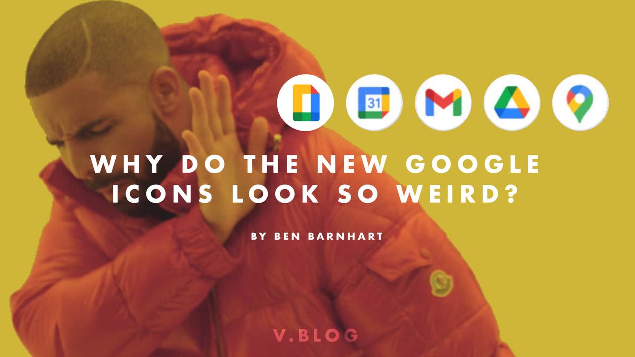
What’s the deal with those new Google icons?
.jpeg)
If you’re on social media, you’ve probably seen a few posts recently about the new suite of Google product logos for the company's newly rebranded Google Workspace; most likely expressing some combination of confusion, anger, incredulity, or despair.
Why is that? Why do these new icons look so weird to everyone? I find it hard to believe that Google, a tech giant with near-infinite money, wouldn’t have used focus groups to test the public’s reaction to these new logo changes.
Jumpstart your ideas with Linearity Curve
Take your designs to the next level.
So why would they choose to so thoroughly abandon the iconography that they’ve used for a decade when they almost certainly knew how people would react to them?
There’s a few reasons why most people aren’t fans of these new icons. Let’s start with some of the more obvious:
They all look very similar to each other
the new Google icons hurt my brain
— Dani Donovan 👩🏻🎨 ADHD Comics (@danidonovan) October 31, 2020
like
my visual processing abilities are beyond maxed out pic.twitter.com/2aIVPHUFvE
This is the main criticism that seems to be going around, and it’s absolutely correct.
Each of these new icons uses all four of the classic Google brand colors, rather than focusing on one or two colors as the previous logos did.
They all have a similar vaguely square shape. When you’re not looking directly at them, or if you look at them with your eyes half-closed, they all blend together and are hard to distinguish from each other.
They aren’t legible at a small scale
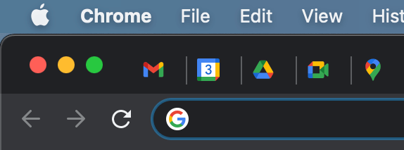
These icons seem guaranteed to make you squint. Their similarity to one another only gets more pronounced as they get smaller. When they’re at the size of a Favicon (the little icon in a web page’s browser tab), they almost disappear.
Sidenote: One thing I do like is how the new Google Calendar favicon shows the actual current date. A small detail, but it’s a good one that I haven’t seen before.
They scream “brand” over function
The design of these new icons clearly shows that Google is valuing brand recognition over their user experience. They would rather have a user be able to pick out a Google icon from a group of apps than focus on ways to improve the icon’s usability.
Explore the Power of Icon Libraries in Linearity Curve
Enhance your designs with a diverse range of icons. Our user guide for Mac users delves into the rich libraries of Linearity Curve, teaching you how to effectively utilize icons in your projects.
Why did Google choose to make them this way? It’s clear that their designers were operating with a list of strong design choices in mind while they were creating these new logos, so there must have been a philosophy behind the changes.
In my opinion, here are the main reasons why Google would want to move their redesigned logos in this direction:
Creating a cohesive brand language
.png)
Google has an easily recognizable brand, but icon design can be complicated and hard to get right. It’s possible that they felt that some of their logos weren’t instantly recognizable as Google product logos when viewed on their own.
By incorporating all four of their main brand colors into this set of logos, they are attempting to expand their brands design language.
They are hoping that this design decision will create a greater sense of coherence and trust in the Google brand itself, rather than any one product, which reflects a more Apple-like approach to brand design - focusing on the concept of a “lifestyle brand”.
These new icons are more closely related to Google’s system of “Material Design” and mimics the “folded paper” look that Google has been gravitating towards in recent years.
High differentiation from other brands
.png)
These new icons offer them a high degree of differentiation from other brand icons, such as other Calendar app logos.
Favoring brand recognition over product recognition
.png)
Say what you will about their design, but these new icons are all unmistakably Google logos. If they are successful in developing this new aspect of their brand language, then ideally when new users see these four colors in a product logo, they will instantly recognize it as a Google product.
:quality(75))
:quality(75))
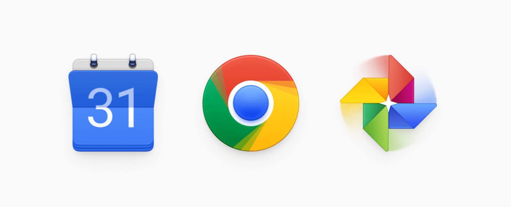
Are there ways that Google could improve on these logo designs? The internet seems to think so. Take a look at some of the redesigns that have been popping up:
A neumorphic take on the Google ecosystem
.png)
A brighter, more 3D look
So was this a good decision for Google? Will they keep these changes or backpedal? Let’s look at a summary of some of the pros and cons for these new logos:
Pros
- These changes have the potential to be good for Google in the long run.
- The new logos will help solidify their larger “umbrella brand”.
- These icons expand the Google brand language.
Cons
- The internet doesn’t like the changes.
- The icons are difficult to tell apart, and they don’t scale down well.
- Brand recognition over product usability doesn’t communicate good things to their users.
What do you think? Are these new icons a bold new direction for Google? Or a poorly-researched mistake that will have to be fixed in the future?
Jumpstart your ideas with Linearity Curve
Take your designs to the next level.
Source Cover Image: @skavalai
Share this!
Ben Barnhart
Ben is a Content Lead for Linearity living in Berlin. His hobbies include board games, cooking, reading, and writing.