:quality(75))
:quality(75))


:quality(75))

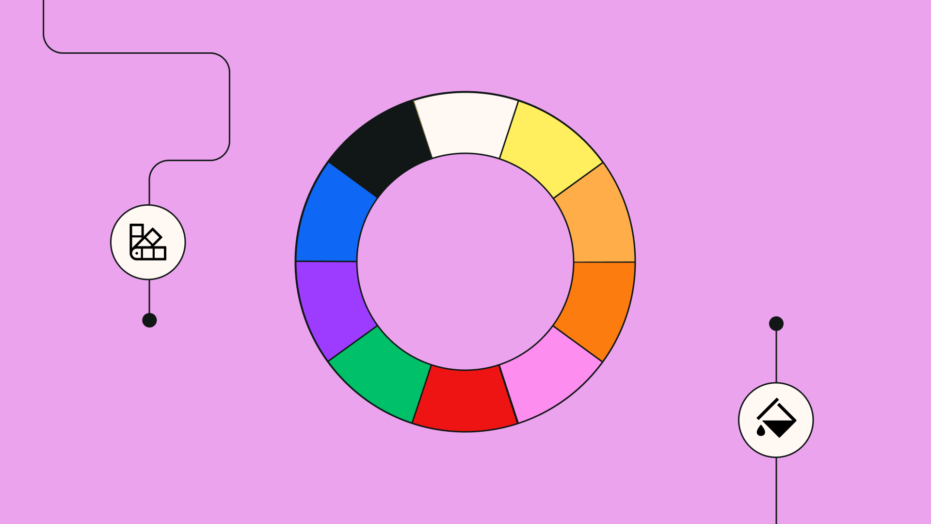
Unpacking the Fibonacci sequence-based concept in design.
Inspiration is all around us, and everyone in the world is always drawing different ideas from the art around them. So it may come as a surprise that there is one rule of nature that appears around us so often that it has been depicted in the most infamous pieces of art.
What do the Mona Lisa, the Great Pyramids of Giza, the Parthenon, and Apple's logo have in common? They all either exhibit the Golden Ratio or were designed with the Golden Ratio in mind.
The Golden Ratio is a mathematical relationship and ratio discovered and commonly found in nature, but which is visible almost everywhere, like in architecture, music, paintings, modern design, and so on. When used effectively, it creates designs that are naturally and aesthetically appealing to the eye by way of their artistic composition.
So what's the secret to this magical ratio? Let's unravel a bit more about this mathematical marvel. And let's see how you can use it to improve your designs.
Jumpstart your ideas with Linearity Curve
Take your designs to the next level.
The Fibonacci series
So, what exactly is the golden ratio?
Put very simply, the Golden Ratio (AKA the golden section ratio, divine proportion, or golden mean) is a mathematical relationship that yields the number 1.618. Imagine a rectangle where, if you cut off a square, the rectangle that's left will have the same proportions as the original rectangle. Continuing with this pattern, you will get the diagram of the Golden Ratio.
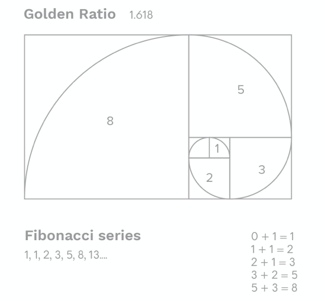
This number and the ratio itself are derived from the Fibonacci sequence, which is a sequence of numbers that occur naturally in our environment. But the number is also the solution of a quadratic formula, which we don't really need to get into right now. But you might remember the Fibonacci numbers from high school. Or from the mid-2000s blockbuster that got everyone crazy over the holy grail, 'The DaVinci Code.'
Aside from fiction, you can find the Golden ratio in nature. That is why it is also called the 'divine proportion.' Because of its frequency in the natural world. The number of petals on a flower will often be a Fibonacci number.
The seeds of pine cones twist in the logarithmic spiral of Fibonacci numbers. Even the number of sides of an unpeeled banana is usually a Fibonacci number. Even the DNA molecule inside of our bodies is an example of this logarithmic spiral shape.
Now that we're comfortable with the concept, I'm sure you guys won't mind getting a bit more technical. Let's go down the Fibonacci rabbit hole.
That's because 0 + 1 = 1, 1 + 1 = 2, 1 + 2 = 3, 2 + 3 =5 etc. The ratios of neighboring Fibonacci numbers (2/1, 3/2, 5/3, etc.) are not exactly equal to the golden ratio, but they approach it. Meaning that the higher the Fibonacci number, the closer their relationship is to 1.618. The fraction 5/3 is already quite close at 1,666666...
Since we're all designers, it's probably easier to understand this concept visually. The Golden Ratio can be explained with what is called the Golden Rectangle. A rectangle with an aspect ratio of 1:618. Now imagine a square whose height and width equal the size of the shorter segment of the golden rectangle. If you remove that square, the resulting shape will have the same proportions as the original rectangle.
Therefore, you are left with another, smaller Golden Rectangle. Continuing with this pattern, you will get the diagram of the Golden Ratio. Similarly, you can just add a square next to the Golden Rectangle with a length that is equal to the height of the rectangle, and you will achieve the same effect.
By drawing up an arc of circumference in each square, we get the Golden Spiral (also known as Durer's Spiral). Another naturally occurring phenomenon is derived from the ratio itself.
The Golden Ratio, much like the rule of thirds, can be used to create beautiful shapes and a strong composition. This rule applies in architecture, design, and art. A 17th-century astronomer Johannes Kepler, called the Golden Ratio a “precious jewel.” We think that 17th-century astronomer was right, this is a priceless tool.
Greek origins of the golden ratio
Famous Greek mathematician dubbed as the ‘founder of geometry,’ Euclid first mentions this specific ratio in his work ‘Elements.’ With Euclid at the forefront, the ancient Greeks recognized the sectioning (or dividing) property of this irrational number.
But it wasn't till 2000 years later that German mathematician Martin Ohm gave it the ‘golden’ characteristic. And it wasn't till the 20th century that the Greek Letter Phi was actually adopted as the symbol of the golden ratio by American mathematician Mark Barr.
Barr chose that specific letter to commemorate the Greek sculptor Phidias who is recognized by a number of art historians to have used the golden ratio in many of his works. The alternate notation is 'tau,' an abbreviation of the Greek tome, meaning 'to cut.' And it's a reference to the 'dividing' propriety mentioned above.
The Greeks had also observed the beauty of this ratio. They understood that the 'divine proportion' provides the most aesthetically pleasing composition. This is a notion that was augmented during the Renaissance by the famous Italian mathematician Leonardo da Vinci’s work.
Master the Concept of Aspect Ratio in Design
Gain a clear understanding of aspect ratios and how they're crucial in design. Our comprehensive guide makes it simple to learn and apply this fundamental concept.
He illustrated the famous book ‘De divina proportione’ (Divine Proportion) written by Luca Pacioli, a Franciscan friar. In this book, Pacioli writes about the mathematical relationship and artistic proportion of the Golden Ratio and Leonardo Da Vinci's famous Vitruvian Man to illustrate how even the human body respects the golden ratio.
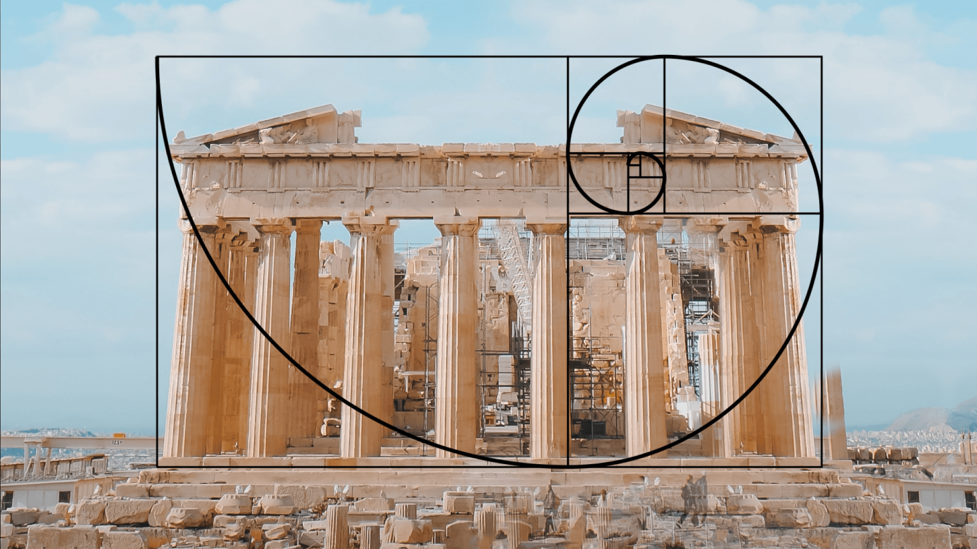
But Leonardo Da Vinci's work is not the only example. The golden proportion occurs in many other contexts. While it got its fame in the 16th century, it had been used (knowingly or not) way before that. Take the Great Pyramid of Giza, for example.
The proportion of its length and height is the golden ratio. Its harmonious proportions also create the so-called Golden Triangle (also known as the equilateral triangle or isosceles triangle). While it’s not been proven, some claim that Greek architecture was built using the phi number, including the Parthenon.

Design use cases for the golden ratio
How do you use the golden ratio in design?
This quick mathematics refresher is, of course, of no use unless you are able to successfully apply it in your graphic design work. The reason you want to apply this ratio in your work comes down to the overall aesthetic you want to achieve.
This ratio lets you create a sense of natural beauty by harnessing the natural harmony and proportions viewed in the world around us. Even our faces follow this same ratio. We are drawn to this ratio, so much so that through our evolution, human perception is naturally inclined to desire things subconsciously showing this Golden Ratio proportion. An analysis of some of the most desirable people in show-business has shown that face proportions that come the closest to this ratio ranked higher in physical appearance amongst audiences!
When push comes to shove, this ratio provides the basic science you need to know when creating a beautiful composition. Because this is one key goal as a designer, right? To create clear and understandable layouts, pages that are balanced, and illustration design that is fluid.
Using these principles will naturally result in a much more cohesive design. Or, if you think about it in UX terms, it results in a better experience for your users.
The Golden Spiral can be used via several tools in your design, like grids, spacing rules, columns, and gutters. If you're illustrating, try doing a figure study on famous natural elements that feature the Fibonacci sequence, like waves, horns, pinecones, or even the shape of our galaxy.
If you master using it, the Golden Spiral can look especially graceful, elegant, and even dramatic in your work; as its path carries the viewer's eyes to the important parts of your graphic.
More specifically, here are some of the ways you can use the Golden Ratio proportion and the Golden Spiral to your advantage.
1 - Typography and overall design hierarchy
At first glance, you might think that typography and math have nothing to do with one another. After all, typography is made of letters, and math consists of numbers. Somewhat the opposite of each other.
But the truth of the matter is, typography is a combination of artistic letterforms and rational proportions. A beautiful combination of form and function. When the proportions of your typography are balanced, you can really make your typography sing in harmony with your design.
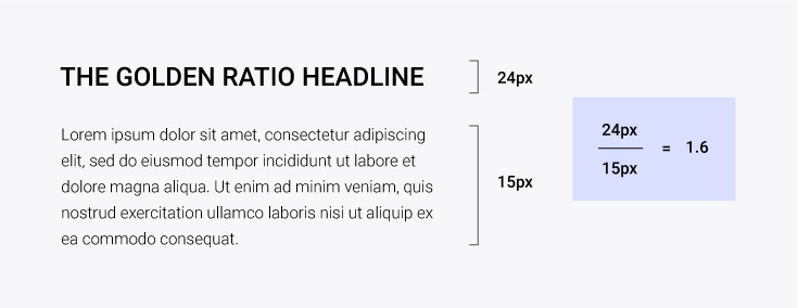
You’ll need to consider three dimensions of your text: font size, line height, and line width. Together, these dimensions that we perceive either horizontally or vertically are responsible for how we experience typography. There is a special relationship between all three.
More specifically, if your line of text increases in width, the height between lines needs to increase as well in order to enhance its legibility. And what is this relationship called? A ratio.
If you’re using any ratio, why not make it golden? It’s been proven time and time again that it improves the aesthetics of anything it touches.
This ratio can help you figure out the sizes for your headlines, your body text, and supporting copy in your designs.
For example, if your body text is 14px. Multiply that by 1.618, and you get 22.652. This means that your headline copy should be roughly 22px/23px according to the ratio to naturally balance out the text in the body below. You can even follow the opposite method to figure out your body text size if you've locked on your headline size.
2 - Editing and resizing images
While it's easy to figure out which white space to get rid of when cropping and resizing your pictures, do not forget that it will require balancing afterward.
Cropping largely depends on the composition of your image. You need to think about some key things first. What is the subject of the visual? What other elements can you include in the scene? Are there any lines or curves that naturally occur in the image? What do you want the final size of your canvas to be?
Once you know all the answers, you actually have one more question to address. Do you want to use the Phi Grid or the Golden Spiral?
The Phi Grid is a way of considering the dimensional relationship between the elements of a photo. It resembles the Rule of Thirds, but it’s not as simplistic as that. You are not dividing the frame into 3 equal segments.
The grid consists of a 1:0.618:1 ratio instead, as the center lines are closer to each other. The lines of the Phi Grid create visually pleasing proportions that people will almost automatically perceive as beautiful. If you decide to crop using the Phi Grid, then your subject will be placed close to the center of the image.
With the Fibonacci Spiral, the structure of your composition is entirely different. If you imagine overlaying the spiral on top of your image, the area with the most details will be in the smallest rectangle of the coil. But this does not have to be in a corner. It can be anywhere in your composition. Some say that the face of the Mona Lisa is also placed within that crucial area.
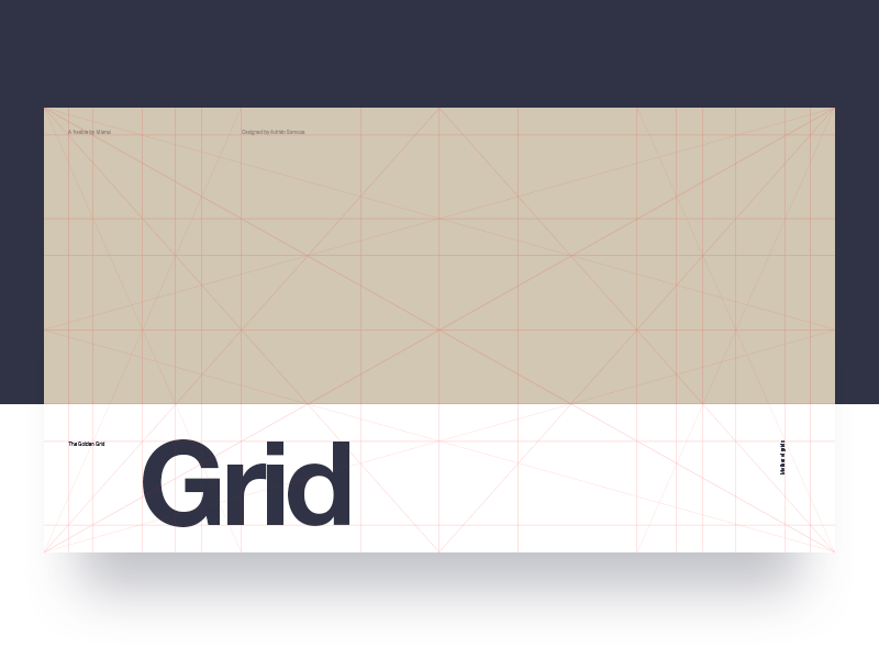
3 - Layout in UI design
Utilizing this ratio can also help in designing a naturally appealing and soothing UI experience, by drawing attention to the important things correctly.
:quality(75))
:quality(75))
Plus, using the golden ratio in your design work is simpler than you think. Since UI design is all about logical composition, you can use the formula as a tool in order to generate columns and proportional layouts.
For example, let's say you want to create a layout with a sidebar that is 1080 pixels wide. To calculate the width of the main column, simply divide 1080 pixels by 1.618. This will generate a main column that is 667 pixels wide. You want to repeat the same process for the main column in order to get the width of the sidebar. Divide 667 by 1.618 to get 412.5 px.
But of course, these dimensions do not have to always be used. The Golden Ratio formula simply provides guidance on the most pleasing balance between the areas of your design.
In fact, now that you understand it, you can view this hack in action on many websites.
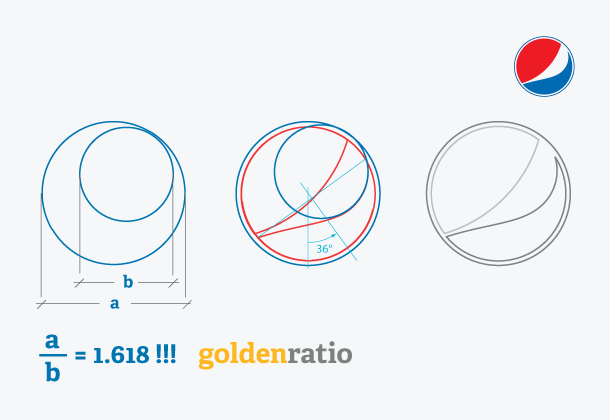
4 - Logo design
Twitter, Pepsi, and Apple. These brands and their logos are heavily inspired by the Golden Ratio and some have used the ratio in the entire design of their logo!
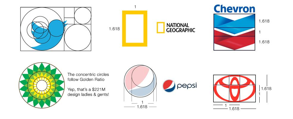
Apple's love for the Golden Ratio is well known amongst its fans and in the design world. Many of their app logos are inspired by the ratio, and the iCloud logo is a prime example of this.
A great way you can use the Golden Ratio is to determine the height and width of a logo as well as the proportions of the internal elements to the entire design.
The Golden Rectangle can also be used to place objects and define the best composition that is most pleasing to the eye. Using his simple formula, you’ll make sure all of the parts of your logo are placed harmonically.
Or, strip the Golden Spiral for parts! You can use the circles that define the Golden Spiral as the foundation of your logo.
So the next time you're grasping for a breakthrough in a logo, why not try out this handy-dandy ratio found in nature? It will open the door to some amazing design experiences, and it will sharpen your design sensibilities to apply simple fractions and proportions into your creative process.
5 - Architecture
The golden ratio applies in architecture as it does in art, and the mathematical relationship between famous architectural designs and the golden ratio is compelling.
Ancient Greek architecture often utilized the Golden Ratio to design and determine the shape of the great feats of architecture that the Greeks are known for. The ratio defines the crucial relationship between architectural designs and mathematics.
Using the golden section proportions architects are able to find the appropriate proportions regarding the height and width of buildings. This results in a building that is architecturally sound and aesthetically pleasing.
Ready to create brand assets that pack a punch?
Visit our Academy for free Architecture design courses.
This principle can also be applied to home decor and interior design. For example, the golden ratio of painting a room calls for 60 percent of your room to be painted in one shade, 30 percent in a second shade, and 10 percent in a third shade.
6 - Print design
The Golden Ratio can also improve the artistic composition of print design. Everything from magazine to book design to marketing materials can use the golden aspect ratio to create a strong composition.
There is an average ratio that most designers will use when creating their designs. However, true artists will consider the margin proportions in relation to the golden ratio. Magazine designers, for example, should fit the central rectangle image in their design perfectly with the edges of their cover.
Whether you are designing art for your university press or the next great 21st-century novelist, you need to consider this mathematical ratio. The crucial relationship between space and content is one that is hard to balance perfectly.
The Golden Ratio can be used by designers to determine the proper size of and placement of each element to create a perfectly-proportioned cover. Lining up corner rectangles with the corner rectangles of other images and allowing proper spacing is the most positive solution for this task.
7 - Photography
Artistic composition is crucial for any image, painting, or illustration. Regardless of the format, the Golden Ratio can be used to perfect your proportions and ensure your image and the margin proportions are pleasing to the eye.
Using this mathematical relationship, you can subtly draw the viewer’s eye to where you want it in the photo. To do so, split the image into three sections and use those lines to set up your photo. Sound familiar? That’s because this is also known as the rule of thirds.

The Golden Ratio for a photograph is 1: 0.618: 1. This means that the width of the first column and third column will be 1, while the width of the center column will equal 0.618. The same applies vertically and horizontally.
You can also use the rule of thirds of the golden ratio to properly crop images to be more aesthetically pleasing. To do so, align your most important elements around the center rectangle of the image. The center rectangle should then draw the viewer's attention subtly but firmly.
The final step
So today, we've learned to always keep the Golden Ratio in mind for any design projects. Be it a logo, a presentation, or even when you're doing something as simple as cropping an image.
Now that you've got the hang of the Golden Ratio, do you want to give it a try? Why not test it out on Linearity Curve (formerly Vectornator)? If you are looking for professional-level, intuitive, and easy-to-use graphic design software, we've got your back.
Jumpstart
your ideas with
Linearity Curve
Take your designs to the next level.
Share this!
Ben Barnhart
Ben is a Content Lead for Linearity living in Berlin. His hobbies include board games, cooking, reading, and writing.