:quality(75))
:quality(75))

:quality(75))
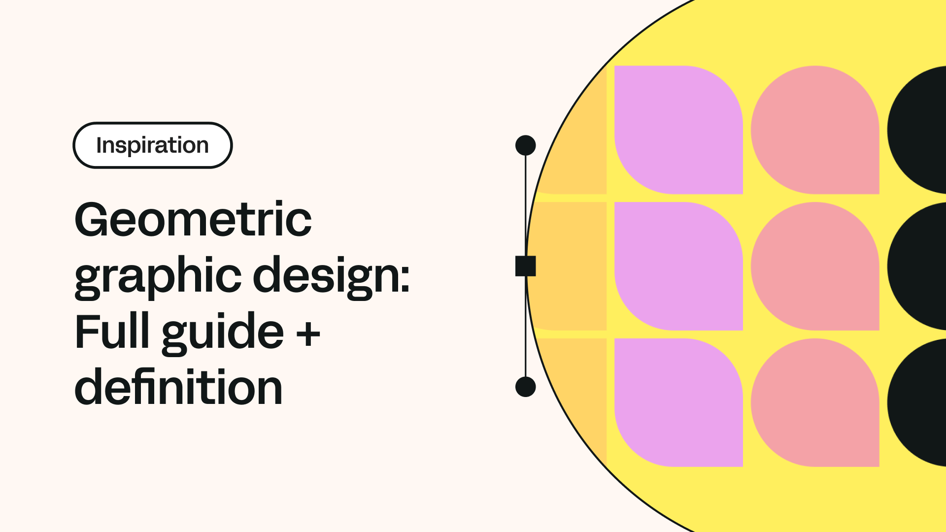
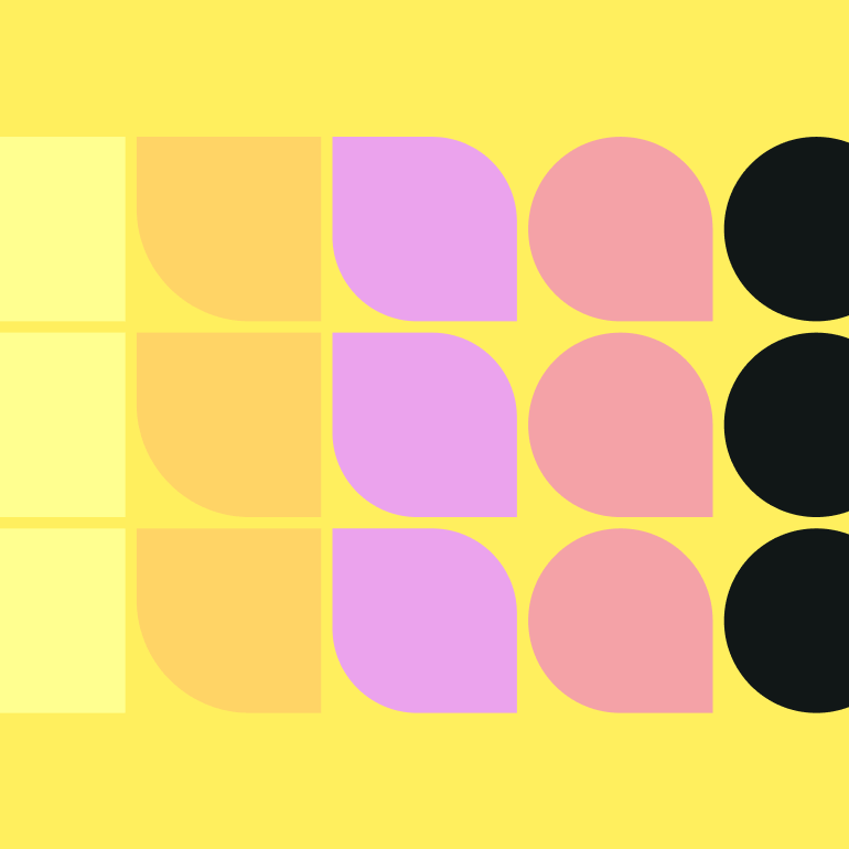
The world around us is filled with inspiring and pleasing natural and artistic designs. But few stimulate the mind and creativity more than geometric designs and shapes.
Most objects in the world and graphic design are made up of circles, points, triangles, lines, and rectangles.
Certainly, geometry is significant for art and graphic design principles in general. You might have seen geometric graphic design in website designs, product packaging, and event posters. But how did we become so fixated on geometric graphic design today?
We have many artistic resources to draw on for inspiration. A lengthy treasure trove stretches from Wassily Kandinsky's phenomenally bewildering art of the early 20th century to the Bauhaus architectural and modern graphic design movements.
This article will take you through geometric graphic design, beginning with its proper definition. We will then provide various examples of geometric graphic design inspiration and how you can implement it in your own work as a graphic designer.
We’ll finish this guide with a simple geometric graphic design tutorial to get you started with the style.
Jumpstart your ideas with Linearity Curve
Take your designs to the next level.
Unusual shape compositions, grids, and patterns might signify a geometric design, but the geometric elements have a precise standard for the most satisfying execution.
Beyond best practice, a graphic designer needs to take inspiration from geometric pattern masters like Kandinsky and make something unique in their own style. The beauty of the geometric design is that it is incredibly flexible, allowing you to create exceptional and beautiful pieces.
Geometric graphic design definition
The history of geometric graphic design
Geometric designs can be found across the world's most captivating works of art and architecture, from historical mosques to classical Greek pottery and mosaics.
In particular, the ancient Greeks are often attributed with bringing geometric design to the fore, but prehistoric sites in Scotland contain stones carved according to the Platonic Solids. Regardless of the historical period, geometry was integral to the global design and construction of countless sacred sites.
Geometrically inspired holy sites weren't just aesthetically pleasing to visitors. They were the ancient architects' ways of expressing their appreciation for the natural wonder of the world around them. The world is made up of complex patterns, and this was ancient peoples' way of understanding them.
The geometric design would eventually hold an integral place in laypeople's art too. Kazimir Malevich was one artist of the late 19th and early 20th century whose works and general contribution would be essential in developing geometric design and abstract art in general.
Wassily Kandinsky was another Russian artist and Malevich's contemporary who mastered geometric design in his works. A work like Kandinsky's Yellow-Red-Blue, painted in 1925, combined three simple shapes, a red cross, a yellow triangle, and a sizable blue circle, to create a stunningly vibrant masterpiece.
When graphic design began taking off as a commercial practice, the ancient and modern masters' beautiful works were integral to geometric graphic design inspiration.
In the 2010s, movements like Brutalism and Minimalism began trending in web design. Both brutalism and minimal design rely heavily on geometric shapes and graphic design, with clean lines and an overall flat design.
With an understanding of how fundamental the geometric graphic design layout is in modern times, let's look at some of the best examples.
Inspiring geometric graphic design examples
Geometric designs provide various options and visual styles, enabling a gentle and naturally calming decorative design. They enhance the copy of adverts and marketing projects without being too distracting.
Here is a fine selection of some of graphic design's most successful geometric graphic design layouts in no particular order.
1. A perfectly balanced design
While you can grab attention with well-executed geometric gradients, a wide gradient range should be balanced with negative space and plainer elements. Studio Plat created the following brochure emphasizing colorful shapes and bold but simple lines.
While this brochure's background has a lot going on in its columns, the graphic designer ensured they left enough white space to balance the business.
2. Die cuts
So, you've printed out your geometric pattern for a client's new and unique business card, and something seems to be missing. Why not add a bit of die-cutting to make that bold pattern stand out?
Graphic designer Smriti Kariwal used this black pattern method for some business cards that she made, inspired by linear geometric design and stained glass windows. Given that this unique pattern was the focal point of Kariwal's work, the rest could be left bare.
3. Varied combinations
You can start by interlocking a selection of colors and shapes to create a comprehensive geometric graphic design layout, as Kandinsky did in his artworks.
Thomas Kronbichler made this awesome poster design that certainly stopped people in their tracks. His composition is surreal while being pleasingly simple.
4. Geometric logos
Nothing looks quite as modern as geometric logos. You can design impactful and bold logos or crisp and clean ones like this Autumn Lane Paperie example.
While triangles are perhaps the most popular shape in geometric logos, don’t be afraid to combine elements, as Autumn Lane Paperie did.
5. Combine elements
Mixing various shapes, colors, and patterns goes a long way when designing attractive and dynamic modern displays. Visual artist Sebastiaan Knot’s “Colliding Colors” is a superb blend of red, orange, and yellow shapes swimming about a cool blue rectangle in the center.
Knot wanted to delve into the human perception of color, cleverly juxtaposing and switching complementary colors.
6. Experiment with grids
Grids are another superb design technique in geometric graphic design that often don't get enough attention. Grids might be incredibly minimalist in design, but they're also superbly flexible, as Daniel Brox Nordmo and Kirstine Gulheim proved with this work.
Master the Isometric Grid in Your Designs
Step into the world of isometric design. Learn how to effectively use the isometric grid in Linearity Curve to enhance your projects.
Kirstine revealed that their main inspiration was fashion. Given how dynamic and progressive the fashion industry is, they used simple dots and lines to create an ever-changing geometric form.
The pair of graphic designers used a conceptual design process that allowed for a myriad of logo variations. If you want to create a progressive logo, you can start with a bare grid and work on it until it becomes a cohesive design.
7. Monochromatic options
While the various contemporary design examples we've covered have mostly been colorful, sometimes a monochromatic geometric style can be equally (if not more) effective.
Check out this superb Kilo Studio monochromatic branding kit, for example. The idea behind this set was to unite a cafe's various offerings. This was achieved through the stark, black and white, and intricate patterns that crisscrossed the badges and coffee cups on offer.
As striking as the patterns are, they never become too much for the eye to enjoy, pleasingly flowing from one to another. If you want to create a cohesive design with many geometric patterns, then a monochromatic option is a great choice.
8. Make the most out of tessellation
Tessellation can be turned into an incredible geometric pattern through interlinking shapes or images.
This landscape-inspired piece by Dila Hanım Çelik shows a cool mountain range scale that gives an incredible sense of a real valley. Photographs can be used effectively in geometric designs, especially with ordered snapshots.
9. Play with type
Type is incredibly flexible and can easily be turned into all manner of geometric and visual styles. Take this Bauhaus-inspired sample from Philippe Cossette, who made a type and logo for Les Enfants de la Bolduc’s website.
10. Layer it up
You can add depth to your geometric design with layered elements, as Franklin Desclouds and Elise Muchir did with this naturally appealing poster.
As you can see, the type pops in and out of the leafy geometric pattern, bringing a jungle element that doesn't detract from the copy. The red colors contrast excellently with the cool greens and blues, making the poster intriguing.
Now that we have a better idea of what a superb geometric design looks like and what kind of elements and processes we will use, let's get the right tools and resources together.
How to include geometric design in your work
While geometric designs can become infinitely complex, let’s start with their most basic forms: the square, circle, and triangle.
We see these shapes everywhere in our world. Traffic signs, televisions, business cards - almost everything around you comprise these foundational staples.
These three shapes provide a sense of security and calm on a psychological level. Even when presented with a difficult task, you're bound to feel more confident if your mind can pick out these basic shapes.
Rectangular designs
In order to incorporate these basic shapes into a rectangular work, designers must consider The Rule of Thirds. This 3 x 3 grid reveals how the viewer will scan a design.
If you take one of your rectangular graphics and place this grid over it, then you will be able to establish the focal points of a viewer’s attention. These points are located at the corners of the grid’s central rectangle.
According to The Rule of Thirds, your eye will first be drawn to the top-left corner of the central rectangle, move to the bottom-left corner, shift to the top-right corner and then end at the bottom-right point.
Circles
Circles are powerful shapes that give the viewer a sense of completion and fulfillment.
There are countless logos and website icons that use circles as their primary forms. They represent numerous real-life objects like our planet, the sun, the moon, buttons, and balls.
Circular logos are what the brain instantly understands, making them memorable. Unfortunately, one of the downsides of circular designs is that they can come off as too simplistic to be impactful.
One of the best ways to create an effective circular graphic design or logo is to look at the world around you and see which objects and figures are circular, as well as those that could effectively fit inside a circle.
An ILLO graphic designer created this gorgeous circular piece using bold, colorful, and curved lines segmented by squares and rectangles.
Triangles
Triangles might be slightly trickier to incorporate into a geometric graphic design, but they are incredibly adaptable and dynamic shapes.
Think of where you most commonly see triangles in media. In music streaming apps like Spotify with the play button,or anything to do with mountains.
An upwards pointing triangle signifies stability and strength, as seen in many military rank insignias. An inverted triangle, however, can have an unsettling effect on the viewer.
Triangles can be effectively combined to create other shapes or tesselating effects. Many modern or futuristic graphic designs employ triangles.
This incredible inverted triangle set by Milos Bojkovic shows how creative you can get with triangular designs, from rounded slopes to hard geometric patterns.
Polygons
Any shape that has more than four sides is called a polygon. Polygons include pentagons, hexagons, and octagons. Polygons are most commonly used in logos with simple designs, inserting the logos within a pentagon or octagon.
Different polygons can be combined to create puzzle-like feeds or infographics that aesthetically organize your information or services while effectively leading the viewer or user’s eye.
Polygon designs don’t always need to bring order, as designer Ganna Sereda proved with this abstract spread. Can you imagine this design being used for an adventure gear company’s branding?
Natural shapes
Flowers, coffee spills, and leaves all fall under the natural or organic shapes category. These are the natural expressions of geometry that can be found in bodies of water, land masses, and forests.
While other geometric shapes are used subtly in design, natural shapes generally have straightforward meanings. The most obvious examples of natural shapes used in branding are with organic food products or environmentally concerned organizations.
Ilarion Ananiev made this crisp and natural design by fitting three leaves into a circle. While the recycling symbol inspired the design, Ananiev made it into something of his own.
:quality(75))
:quality(75))
Abstract shapes
Abstract shapes are often symbolic and convey subliminal meaning. You should take care when using abstract shapes in a geometric graphic design, as they can become confusing for viewers.
Abstract shapes’ unconventional nature makes them tricky to incorporate into a pattern design.
That is not to say that you cannot create a fantastic abstract piece with essential geometric elements. Serj Marco put together these vibrant compositions using squares, triangles, lines, circles, and polygons.
How to use Linearity Curve in geometric graphic design
Before you begin creating your astounding geometric patterns, it would be best to learn how to use Linearity Curve's Shape Tool. Let’s find out how to do so with a straightforward iPad tutorial.
The Shape Tool lets you create everything from simple squares and circles to more complex shapes like polygons, stars, and spirals.
The Rectangle Tool
Let’s start our Shape Tool tutorial by making a rectangle. Select the Shape Tool on the far left of your screen, near the bottom of your Toolbar. The Rectangle Tool should be the default shape in the Shape Tool.
A slider will appear to the right of the Toolbar, allowing you to adjust the corners of your rectangle’s sharpness. The lower you set this, the sharper your corners will be when you draw your rectangle.
If you set the sharpness slider to 1, your rectangle will appear quite ordinary when you press and drag the rectangle out.
If you would like to create a square instead of a rectangle, place your finger on the screen while dragging out your square, as this will keep your aspect ratio in place.
You can also fill in these shapes by selecting them, heading over to the Style tab in the top-right corner, and pressing on the Fill & Stroke switch. You can change a square or rectangle’s corner radius whenever you like with the Quick Actions menu, reopening the Corner Radius slider.
The Polygon Tool
Next up is the Polygon Tool, which you can access by pressing on the Rectangle Tool and then the three dots above the Corner Radius slider. The full list of shapes will then open up, and you can select the Polygon Tool from there.
Once you select the Polygon Tool, the Polygon Slider will open up. This slider differs from the Rectangle Tool’s one. You can specify how many sides you would like your polygon to have. The minimum number of sides for a polygon is three, which will creating and the maximum is 20 if you ever need an icon!
Let’s choose a hexagon for the sake of this tutorial, which has six sides.
You can press and drag your hexagon out using the Pencil. However, you won’t be stuck with this hexagon, as you can select it and change how many sides it has in the Quick Actions menu. Press on the Hexagon Tool and then adjust the slider accordingly.
Ready to create brand assets that pack a punch?
Visit our Academy for free geometric graphic design courses.
The Ellipse Tool
Let’s move on to the Ellipse Tool now. After selecting it from the Shape Tool selection, you’ll notice that it doesn’t have a slider.
Simply press and drag your pencil around your Canvas to create an ellipse. If you want to create a circle instead, press on the screen with your free hand while drawing with the Pencil.
The Star Tool
Our next tool is the Star Tool, which is a bit more complicated than the other shapes. Once you’ve selected the Star Tool, you will see a slider pop-up that will let you set how many points you would like your star to have.
You can shift the slider from three points to 50.
Let’s create a classic star with five points and drag and drop it into your Canvas. If you want to make a custom star, just press and hold your finger on the screen with your free hand and move the Pencil around until you get your desired star shape.
The Line Tool
It’s now time to play with one of the most useful and dynamic Shape Tools, the Line Tool. Let’s start by picking it from the Shape Tool list.
Before we draw our lines, let’s reopen the Style Tab and switch from Fill to Stroke.
Now you can press and drag with the pencil to create a crisp, straight line. If you would like to snap your line by 45-degree increments, press down on the screen with your free hand and then drag the Pencil to your desired point.
The Spiral Tool
Finally, we have the Spiral Tool. Let’s choose it from the Shape Tool selection and then play around with its slider, which will decide the level of decay in your spiral or how loose or tight it will be.
As you can see, a high level of decay creates a very wide and loose spiral. If you thought this spiral looked a lot like a shell, why not take this design a step further?
Let’s reopen the Style Tab and head over to the Fill section.
Press on the little eye icon with a line through it to reactivate the Fill for our spiral. You can then select the color you would like for your spiral.
While this was a straightforward tutorial, you can get incredibly experimental now that you have the building blocks of a geometric graphic design down. Have fun with your geometric graphic design layout, and know that the sky is the limit when it comes to geometric patterns!
Discover more about the Shape Tool in the video below.
Wrapping up
Geometric graphic design is an incredibly diverse and involving field with limitless potential.
Implementing geometric graphic design in your work takes a bit of practice. While it can be easy to include triangles, squares, circles, and more in your designs, pulling off a complex and astounding geometric pattern is no small feat.
Given how organic geometric design is, you will soon find that you naturally adapt to this style. Remember to keep taking inspiration from the living world. You will be astounded at how much beauty and order you see in the world when you use a geometric lens.
Jumpstart
your ideas with
Linearity Curve
Take your designs to the next level.
Share this!
Theodore Cipolla
Theodore is a contributing writer to the Linearity Blog.