:quality(75))
:quality(75))


:quality(75))

Are you just getting into design?
Come with us today to learn the seven most important principles of design and how to implement them into your work.
Design can feel like an echo chamber at times, with so many competing brands trying to capture consumers’ attention.
So how can you stand out? A great place to start is by being creative with your design theme.
 Hurca!™
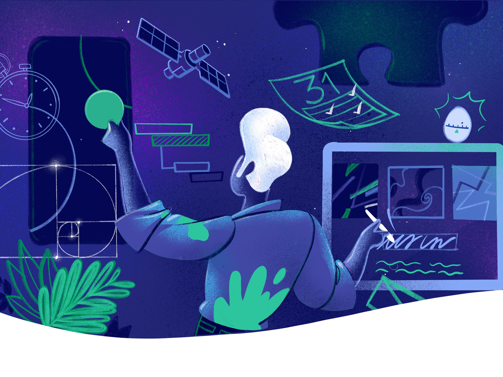
However, there are some basic design principles that designers need to be aware of in order to create some absolutely mind-blowing designs.
In this article, we will discuss some basic design principles, how they relate to graphic design, and how to use these principles of design in your own work. Plus, stick around until the end, and we’ll give you some resources for future reference.
Jumpstart your ideas with Linearity Curve
Take your designs to the next level.
What are design principles?
The principles of design are fundamental rules of thumb that should guide your design process and help you create aesthetically pleasing designs.
Design principles are formed around the general consensus on what "looks good" in a design, and what the human brain and eye respond to best.

Designers can use these principles to create designs and learn how to place design elements on websites and interfaces in order to make them more aesthetically pleasing and easier to navigate.
Brands have a very short amount of time to make a solid first impression. Visual appeal can be assessed in about 50 milliseconds.
Whether you’re a freelance designer or working with a large project team, you’ll want to consider how your designs impact aspects of user experience and the user journey. Too many design constraints can decrease creativity and impact the aesthetic qualities of a designer’s work. But keeping these simple principles in mind will help elevate your work and make it stand out.
Of course, there are more than just seven design principles, but these are our top fundamental rules.
The 7 core design principles
If you're a designer who spends time on the internet, you're constantly under a barrage of design paradigms and design tips of questionable value.
Rather than join that noise with a list of random ideas, we narrowed down our list of design principles into a handful of basic principles to follow.
Let’s get started with our first principle of design: Balance.
1. Balance

Balance is a fundamental principle of good design.
Alignment and stability in your designs can make or break the way your work is perceived.
Of course, you don’t always have to make your designs perfectly balanced. Asymmetrical designs can be incredible when done correctly.
Symmetrical and asymmetrical designs are very different; let’s talk about how they compare.
- Symmetrical design creates balance by equally weighting the elements in a design and lining them up with the center.
- Asymmetrical design does the opposite. It uses different weights for objects in a design to create contrast.
Symmetrical design and asymmetrical design both have their place in the art world, and it’s up to you to decide whether symmetrical balance and harmony are what your design needs or if you want to mix it up with some asymmetrical contrast.
2. Color

The psychology of color is crucial for good design.
Color choice can immediately impact the user's journey and their mood.
The human brain assesses the visual appeal of a design in about 50 milliseconds. And consumers tend to make a fully-formed subconscious judgment about a design or product within 90 seconds of initially seeing it, and 90% of that is based on color alone. That's a lot of responsibility on color's shoulders.
Ready to create brand assets that pack a punch?
Visit our Academy to learn how to use color palettes.
That’s why it’s crucial to pick colors for your designs that complement or contrast each other and ensure that the feeling that the colors you choose give off is what you intend.
Consider how a real user or audience will perceive the colors you select for a design and what impact the colors make on your work.
3. Spacing

Spacing is one of the core principles at the root of design that determines how your work will be perceived.
You can use negative space (aka white space) creatively to emphasize the object in your work and appear minimalist, or you can fill a piece with objects and leave very little negative space, known as maximalism.
The rule of thirds is another crucial element to consider when designing. The rule of thirds is a compositional rule that recommends aligning your subject within specific intersection points to create an aesthetically pleasing design.
Using spacing creativity in your on-screen content and designs will ensure that your audience’s attention is always drawn right where you want it to be.
4. Consistency

The human eye appreciates and seeks out patterns in design.
Because of this, using repetition in your designs can be beneficial and create a consistent experience for viewers.
Branding is another big thing to take into consideration here. When designing for a brand, it’s essential to remain consistent so that customers can recognize and better understand your brand.
This means your on-screen content like web design and socials should always match or compliment your ads and marketing collateral.
5. Contrast

Contrast is what makes your designs stand out.
Using contrast in designs captures a viewer’s attention and keeps it there long enough to take in the message of your design. This is especially important in product design and marketing ads.
Vectornator is Now Linearity Curve
Your favorite design tool has evolved! Discover the new name and look with the same powerful features you love.
Contrast can be created by using distinctive qualities, contrasting colors, or out-of-place objects.
Even in monochromatic designs, you can create contrast with the shades you pick and the placement of objects.
6. Aesthetics

The way that your design looks is important, but you know that already.
We saved this rule for one of the final rules because it ties in everything we talked about above. Together, balance, color, spacing, consistency, and contrast create an aesthetically pleasing image.
The word aesthetic gets thrown around a lot lately. But what does it mean? Essentially, aesthetics are a set of principles (much like design principles) that involve the appreciation of beauty, especially in art and design.
Your designs should have certain distinctive qualities to stand out and be visually appealing.
This is especially true in branding and product design, where your designs should adhere to branding guidelines and be automatically recognizable to customers.
7. Feedback
We get it. Feedback is hard—both giving and receiving it.
But we also know how important it is, especially for designers.
If you’re in an agency design position, you’ll surely be getting a lot of feedback. But what matters is how you use it.
As an artist, you might think you know what is best for your work. However, sometimes it takes an outsider to point out obvious flaws or strengths in a design.
To create relevant content that is creative and unique, you need to occasionally get a feel for how your design is perceived by others. Ask your project team or clients hard questions to see what they really think of your designs.
Here are some ideas:
- How does this design make you feel?
- What was your first reaction to this design?
- Does this piece introduce an idea or concept that makes you think?
- Does your opinion about the piece change the longer you look at it?
- What stands out to you in this piece?
Then, take these critiques and feedback points and incorporate them into your design. But be sure to preserve the integrity of your design. Evaluate the feedback you get and make sure you aren't just making changes because one person suggested it. Try to analyze the feedback you get with an objective mindset.
Check out the Ted Talk above for some great tips on how to give helpful feedback that others will appreciate and incorporate into their work.
Additional resources
The principles of design are something you’ll be using throughout your design career and education.
It’s important to keep developing that knowledge and experience while you grow as a designer.
You might find these resources especially helpful if you’re a freelance designer, since you don’t have a team of designers or product teams to learn from and bounce ideas off of.
Here’s a list of some additional resources and additional content to help you continue to learn about design.
- This video called Understanding the Principles of Design is a great resource that goes more in-depth about design principles, the rule of thirds, and the history of design.
- Our Learning Hub has some great information that will help you create designs in Vectornator for free.
- Our Design Tips are another great place to find more information about using design principles in your work.
- Here is a downloadable resource from Getty that can be printed off to help you keep the principles of design in mind when creating work.
- If you’re a visual learner, this video called The Principles of Design breaks down design principles in a graphic format.
Now, start designing! Make sure to download Vectornator for a free vector design tool that is both intuitive and powerful. And make sure to follow us on socials and tag us in your designs; we love to see what people create using Vectornator.
Jumpstart your ideas with Linearity Curve
Take your designs to the next level.

Share this!
Ben Barnhart
Ben is a Content Lead for Linearity living in Berlin. His hobbies include board games, cooking, reading, and writing.