:quality(75))
:quality(75))

:quality(75))
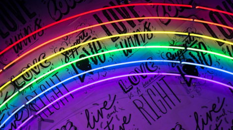
Dark color schemes can be extremely sophisticated, seductive, chic, and practical.
Colors play a massive role in visual communication. They can affect the mood of the project and impact the messaging. They're often the first thing someone will notice about your design, before their brain processes the rest of the image or the text.
Jumpstart your ideas with Linearity Curve
Take your designs to the next level.
Choosing your color palette will depend on the context of the project and what it needs to communicate. In this article, we'll explore some dark palette moods that’ll light you up with the inspiration to deepen your design projects and dabble in the dark side of color schemes.

Creating a dark palette
Dark palettes don’t necessarily need to consist of all darker colors and shades.
Vibrant and bold colors can be included too. There is a lot of variety to play with when it comes to dark color schemes. You can use black and shades of grey, as well as deepened primary colors like navy blue, merlot, or deep greens.
But your palette doesn't need to consist of entirely darker shades. Having color variations makes for a more dynamic design. Including additional, more saturated colors, like a bright imperial blue, creates visual content that communicates effectively through the clever use of color.
You could opt for the monochrome route and create muted designs that are still sophisticated, or you can throw in some bold accent colors to create diversity.
Need help creating a color palette? Check out this video on how to make one with Vectornator.
When to use a dark palette
The increasing popularity of “dark mode” interfaces has shown that many people prefer darker backgrounds because they feel easy on the eye.
A designer might choose a dark palette for practical reasons such as creating a more visible user interface or creating moods that evoke a certain feeling in the viewer.
As far as dark color themes go, though, you’re not limited to shades of black and grey. But psychologically, any color in a deeper shade automatically becomes closer to that mystery and sophistication of the color black.
Dark colors can represent various moods, from seductive and enchanting to powerful, bold, and tranquil. It’s up to the designer to choose the right moment to use a dark palette and how to combine and contrast dark colors with other more vibrant colors.
Below, we’ll explore some moods that are perfect for a dark color palette.
Ready to create brand assets that pack a punch?
Visit our Academy to learn how to use color palettes.
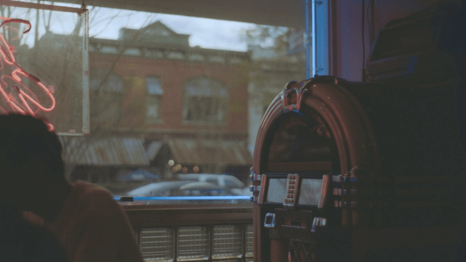
Futuristic
A dark color scheme is an excellent choice to communicate a futuristic aesthetic.
Dark backgrounds have a way of setting the tone for something otherworldly.
Think about it: things like outer space, underwater, or nighttime are associated with that which is outside of ordinary day-to-day life, so when you're trying to visually communicate something that is out of, or above, the familiar like futuristic technology or a futuristic idea, creating dark atmospheres is compelling and very alluring.
This website design for Solarin is a prime example of a dark background working wonders, especially with the dynamic system colors portraying a light emerging from the darkness; using contrasting dark blues and geometric shapes. It evokes a sense of invention, or something being brought to light.

Sophisticated
There are few colors or shades that communicate more sophistication than black.
Darker sets of background colors are perfect for communicating a suave look and feel.
Dark grey can be a stylish color scheme that screams sophistication. Many dark neutrals have this effect, as well as the ever-elegant all-black. This embossed book cover is dynamic and sophisticated, and makes up for the lack of color variety by bringing in texture.
 Joe Montefusco
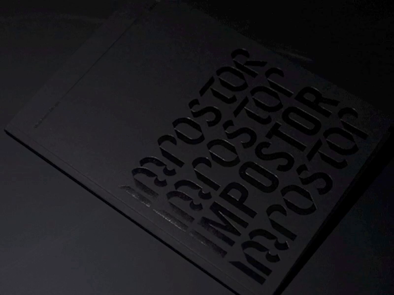
Party
When it's dark, we come out to play.
If you want to evoke the atmosphere of watching a live band or DJ and experiencing the alluring vibe of a party scene, dark base colors are the perfect thing. This works well in combination with saturated colors like neon signage or bright lights.
This music event app uses a dark interface brought to life by the vivid color present in the images to capture the ambiance of a live music gig.
Mehedi Hasan Roni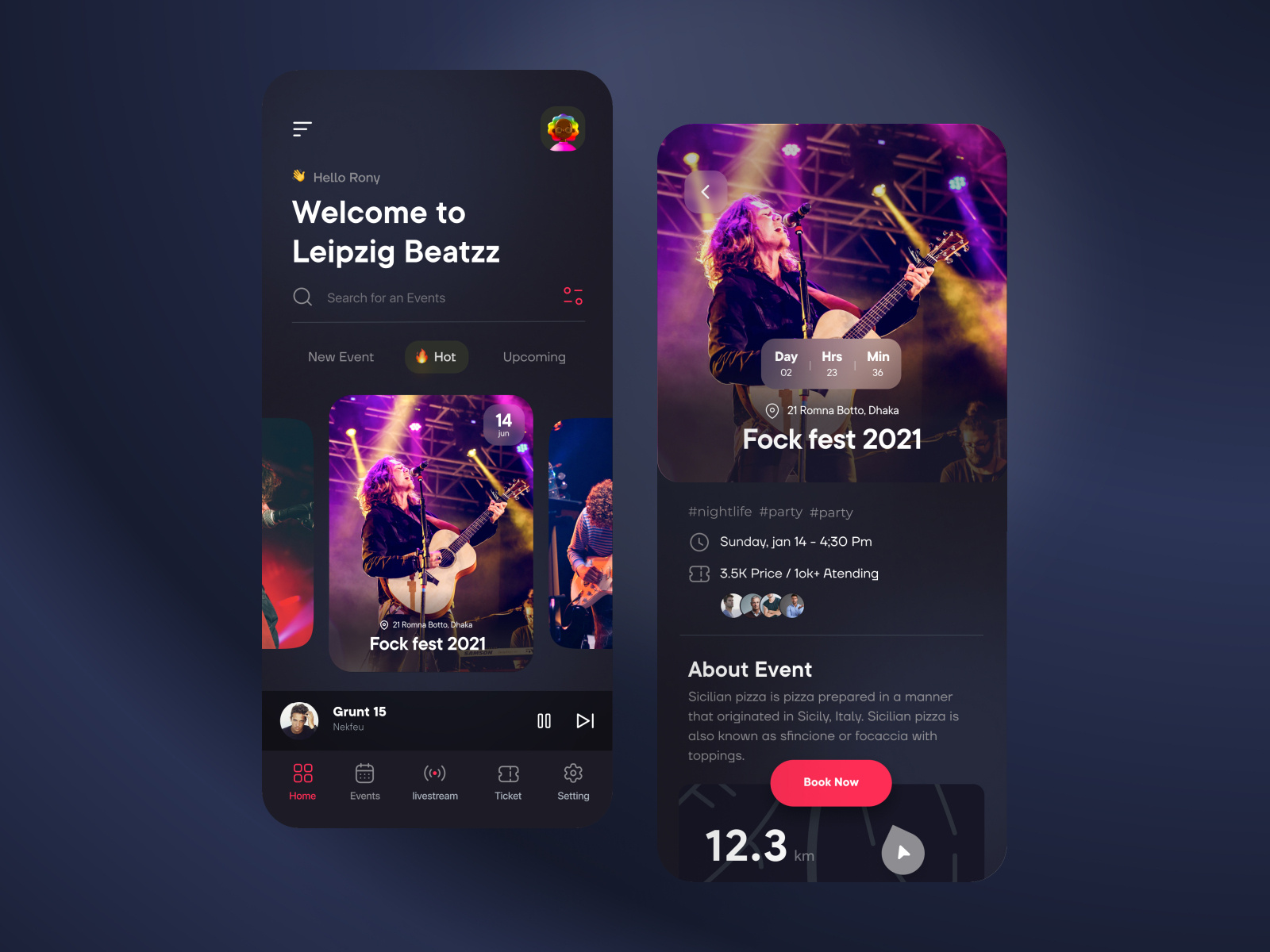
Romantic
We often associate light themes with romance, such as a blush palette or a bright spring color palette.
But dark theme colors can also be an ideal color scheme to communicate romance. Think of the deep red and emerald green of roses, a sunset cityscape, or moody shades of merlot.
These color palettes might work well for creating a gorgeous, social media theme for a lifestyle, fashion, or cosmetic brand, or an excellent option for travel, as well as wine and dining experiences.
This merlot mood board makes a beautiful color scheme that is sensual and indulgent.

Forest tranquility
The effortless beauty of nature is always a key element of our design toolkit.
The deep greens of a forest communicate tranquility, renewal, prosperity, and stability. It gives a sense of abundance and harmony.
This type of color scheme works well as branding for financial institutions which want to communicate prosperity and stability. It also works well for spas, travel experiences, or cosmetics that intend to convey tranquility.

Holiday joy
When it comes to year-end holiday branding and visual communication, there is a ton of variety.
With a lot of emphasis on consumerism and children, holiday-related branding and visual communication are often associated with bright colors and a cartoon-style aesthetic.
:quality(75))
:quality(75))
Nothing wrong with that. However, sinking your teeth into the delight of dark theme colors can make for some irresistible holiday designs that beckon to viewers with warmth and a sense of comfort, connection, and excitement.
Steampunk
Oh, sexy steampunk, the theme of so many ultra-cool video games and crafty brands.
A steampunk palette can be light or dark. This concept art for Coca-Cola uses deep shades of brown, black, red, and orange to create an ambient steampunk aesthetic that mirrors the colors of Coca-Cola itself - pretty smart! These shades make an ideal color scheme for the steampunk look.

Magical and adventurous
This magic book home page idea beautifully combines a dark background with bursts of saturated orange, purple, and imperial blue to convey magic in the form of light and color set against a dark background.
Using the contrast of a dark background helps to emphasize the lighter elements of a design, which is a technique often used in art and design to communicate magic and enchantment.
Faris Muhtadi 🧙🏻♂️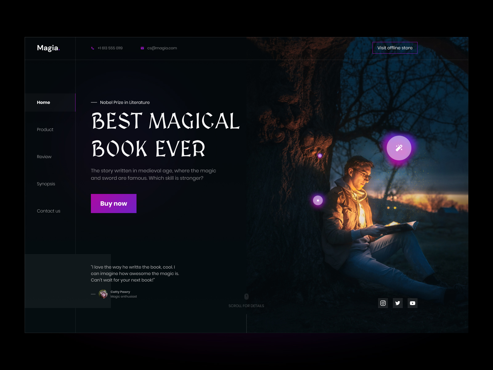
This stunning fashion showcase for Christian Dior honed the magic of a dark palette with alluring perfection in order to communicate the internal, enchanting journey of the Tarot.
Autumn cosiness
Spiced pumpkin lattes, fallen golden leaves, and chunky neutral knits are all wonderful things that create a cozy autumn nest.
This is reflected aesthetically in deep color palettes of ambers, umbers, sienna, gold, and dark green.

Astro
There's no place darker than space.
If you're going with an Astro or night sky look, you're going to need a dark theme. Successful night sky-inspired palettes often combine vivid colors like imperial blue or electric purple and bold accent colors in key areas, such as an action button, which brings life to an overall dark look and feel.
Ready to create brand assets that pack a punch?
Visit our Academy for free dark color palette moods courses.

With darkness, perhaps because it’s linked to the subconscious (i.e., memory) and maybe also because we associate evolving with increased light, as the more we move forward in time, the more comes to light, which makes the past seem darker in contrast (if you want to get really philosophical about it.)

Horror
Dark colors are pretty much standard for communicating anything to do with horror.
While they are elegant, sophisticated, and powerful, dark colors are also associated with fear, sadness, anger, and grief. If you look at some of the best horror movie posters, you’ll notice that most of them are created with a dark color palette, and if you look at illustration and game design in this genre, you’ll notice the same.
Underwater
To portray any kind of underwater theme, a dark palette is essential.
You’ll need deep greens and blues and will most likely probably draw on accents of white to portray light and other vibrant, contrasting colors for underwater life.
Do you dare?
Dark theme colors can make for some gorgeous visual content.
Dark schemes are versatile and don’t necessarily need to be associated with anything negative.
It’s up to the designer to decide how they’re going to use the colors to communicate. Any time you need to get some sophistication and sex appeal on for a design project, remember the appeal of dark colors.
Creating color palettes in Vectornator is efficient and straightforward, so you might want to give that a shot for your next project, too! Be sure to share your dark palette designs created with Vectornator with our team. We love to see (and repost) your designs!
Jumpstart your ideas with Linearity Curve
Take your designs to the next level.
Share this!
Ben Barnhart
Ben is a Content Lead for Linearity living in Berlin. His hobbies include board games, cooking, reading, and writing.