:quality(75))
:quality(75))


:quality(75))
We know how tricky it can be—sometimes even painfully frustrating—to create the perfect color palette.
You might ask yourself: What do I want to communicate with my design? Are my color choices defining my style as an artist?
We recommend starting with some color theory before diving into research and inspiration and finally, actually creating your custom color palette.
So, let's go back to school for a minute.


A walkthrough of color theory and concepts
Let's first look at the most common terms you need to know when designing or illustrating.
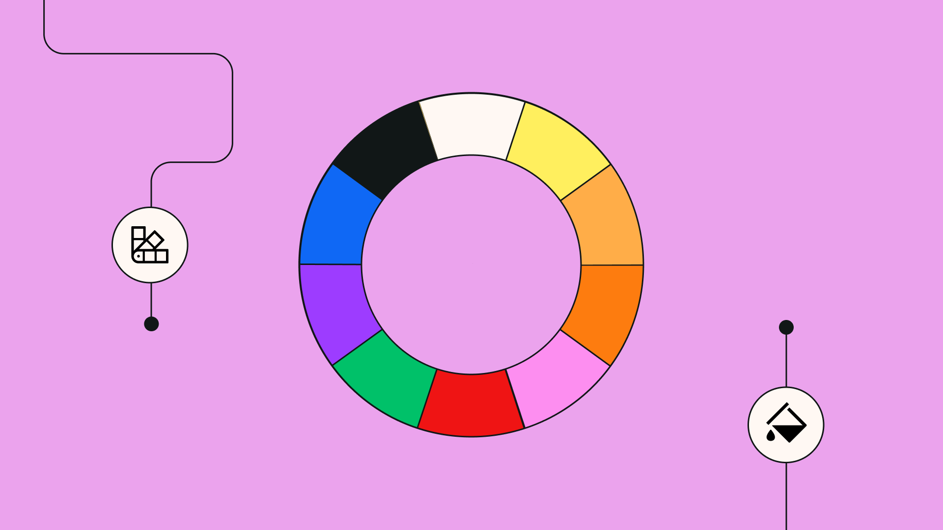
The color wheel dates back to 1666, when Isaac Newton ingeniously organized the vibrant spectrum.
This standard model shows a diverse range of colors, including primary hues, secondary tones resulting from the mixture of primaries, and tertiary shades derived from the blending of primary and secondary colors.
Color types
- Primary colors are also known as source colors, and they can't be made by mixing other colors. There are three primary colors: red, yellow, and blue. So, if we take blue, we can observe that it contains no red or yellow. The same goes for the other two.
- Secondary colors come from mixing primary colors. The secondary colors are purple (red mixed with blue), orange (red mixed with yellow), and green (yellow mixed with blue).
- Tertiary colors result from mixing primary and secondary colors. Yellow and orange combine to create amber. The tertiary colors are vermillion (red-orange), amber (yellow-orange), chartreuse (yellow-green), teal (blue-green), violet (blue-purple), and magenta (red-purple).
Color properties
- Hue is the most fundamental color term, and it's just a different way of naming an object's dominant color. When you hear “orange,” “red,” or “green,” this is when we're talking about hue. It’s represented visually as one spoke in the color wheel.
- Saturation refers to the intensity or purity of a hue. A hue in its most intense form is also considered a fully saturated dominant color. In contrast, mute or dull hues like browns or grays are less saturated.
- Value or Brightness is the relative lightness and darkness of a hue. This is arguably one of the most important things you have to master as a designer. Different hues can't exist without value, and different saturation levels can’t exist without hues. Without a hue, an image would be achromatic.
- Contrast is the degree of separation between values. The more significant the separation between the values of two colors, the more contrasting they’ll be.
Color values
- Tones are created by adding gray to your base hues. Tones also tend to be subtle and more neutral. The beauty of tones is that they don't look like pastels, revealing more complexities of the base color.
- Shades are created by adding black to a base color, which darkens it. This can create rich, deep colors that add a touch of drama to your work.
- Tints are created the opposite way—by adding white to the base hue to lighten the color. This produces softer colors, such as pastels, which can help balance out your palette.

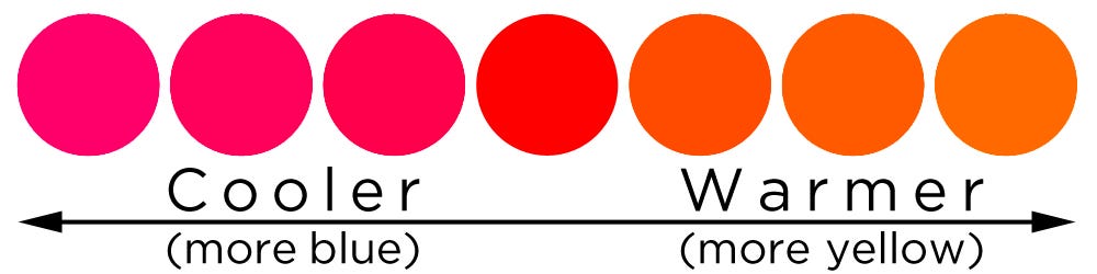
Color temperature
Color temperature refers to the warmth or coolness of a hue. Without knowing color theory, you might have noticed how some colors feel cooler while others feel warmer. Colors can evoke different moods and feelings.
Warm colors make up the red, orange, and yellow spokes of the color wheel. They’re often used to convey love, energy, and cheerfulness.
Cool colors are represented by violet, blue, and green. They convey things like peace, growth, nature, and harmony.
If we take the example of one hue, such as red, notice how warmer reds lean more towards orange while cooler reds lean more towards blue.

Now, let's see how all these terms come in handy when choosing your color palette.
Tips for better color choices in design
Colorization isn’t easy—it’s part art, part science, and part personal taste.
But these top tips can help you make better color choices:
1. Create color harmonies
It's no coincidence that the Hulk wears purple pants. The reason is explained by a part of color theory called color harmony. That's the reason behind the many color combinations you see around you.
These harmonies are based on the color wheel, which isn’t created randomly. The colors on the wheel are arranged in spectral order (like the rainbow). Each color placement helps you identify harmonious color combinations.
Here are some of the most popular color harmonies:
Monochromatic harmony is made from a single-color family with no additional colors. A monochromatic scheme will combine tints, tones, and shades of the same hue to add depth and contrast.
While it may sound like an easy color scheme, it's one of the most difficult to get right because you have to pay a lot of attention to the colors' value and contrast to give life to your work.
But when done correctly, monochromatic color harmonies are great for setting an impressionable mood.
Analogous harmony is created by three colors side by side on the color wheel. This color combination is generally relatively easy to use because of its versatility.
Diad harmony combines two colors separated by one color on the color wheel. Similar to the Analogous harmony, this is relatively easy to work with, and it looks stunning when used as an accent with neutrals.
Complementary harmony is created by using two colors positioned directly across from each other on the wheel. This harmony offers the highest degree of color contrast, which is why it’s trendy in logos, graphics, and illustrations.
Variations of complementary harmony include:
- Split complementary pairs one color with the two colors directly on either side of its complementary. This allows for a larger range of hues and has the same strong visual contrast as the complementary color scheme. But with less tension. This one’s hard to mess up.
- Triadic harmony combines three hues equally spaced around the color wheel. Be careful not to use too much of each color, as this can make your design feel too vibrant.
Play around with different harmonies and adjust to your taste. The simplest way to start is by finding one color that you like. Then, let harmonies do the rest.
2. Focus on your balance
As hinted, you shouldn't overuse specific colors to the detriment of others, as that might make your design or illustration seem too “busy.”
Each element will fight for your viewer's attention. If you only use saturated colors, the viewer’s eyes will have no time to rest.
So make sure you rely heavily on neutral tones, as they will help bring balance to your artwork. An excellent way to use saturated colors is by placing them as accents.
While this rule isn't that strict, it can help you create a sense of proportion and balance in your designs.
3. Less is more (saturation)

Speaking of saturation, this is also something that many novice designers get wrong.
Most people learn about colors in their purest format from a young age, like red, blue, green, etc. What all these base colors have in common is the fact that they’re highly saturated. Using them together in one design won't always look good.
Here’s where adjusting the saturation comes in. Less is more. Play around until you've taken the edge off your colors in a way that makes them more pleasing to the eye.
This also applies to the number of colors in your piece. As kids, we might have been told to use all the colors in the crayon box, but just make sure not to do so in one single artwork.

4. Create contrast
Alongside saturation, brightness is your other best friend.
Brightness will ultimately define how much contrast exists between your colors.
While low-contrast designs have an aesthetic of their own, they’re not always the best choice for layout design, illustrations, posters, packaging, or logos, to name a few examples.
Ultimately, color contrast is more than just an aesthetic. It’s also necessary, especially when designing for user experience.
Not everyone sees colors the same way, and this is especially true for users with any degree of color blindness.
Using color contrast is all about finding a balance between the highs and lows. An effortless way to check the contrast is to put the colors next to each other and then turn your design to grayscale.
Using Linearity Curve, you can do this quite easily.
First, create a grey rectangle. Make sure it’s on top of your colors or artwork. Then go to Style, Blend Mode, and choose Color.

If your design looks balanced in grayscale with contrasting variations in dark and light areas, you're on the right track.
Get started for free below to try this grayscale exercise in Linearity Curve:
Jumpstart your ideas with Linearity Curve
Take your designs to the next level.
5. Find inspiration
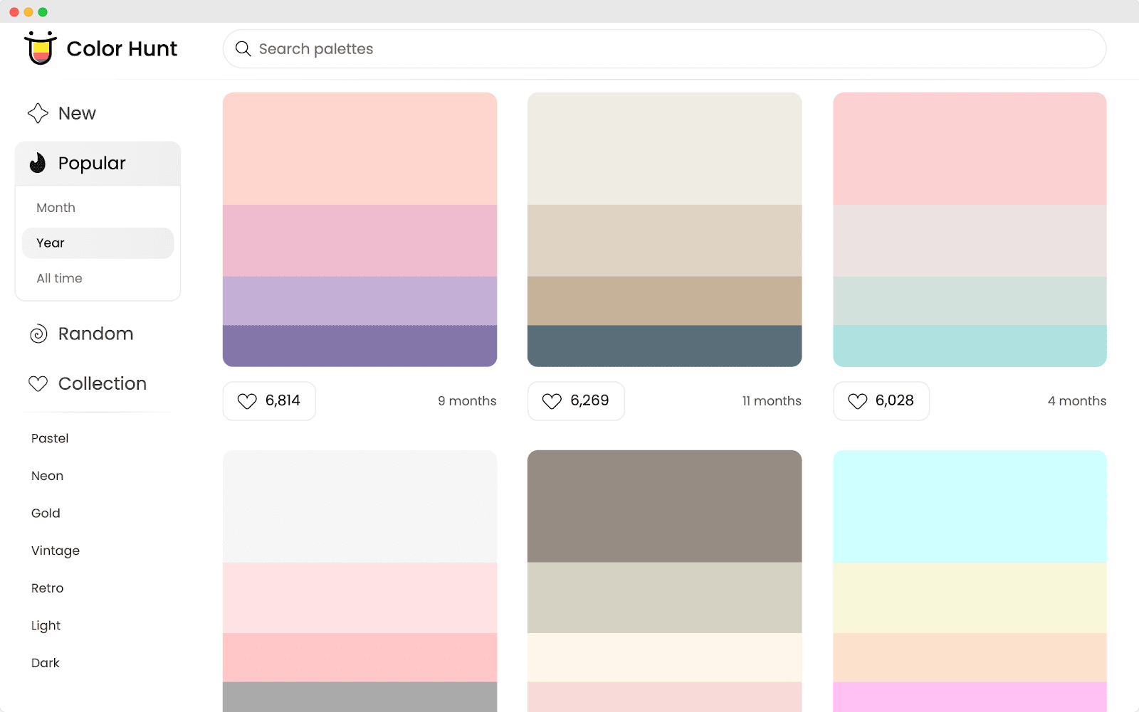
No matter how experienced or talented you are, don’t be afraid to draw inspiration from other artists or color palette websites.
One of the biggest platforms for creating color palettes is Color Hunt, a curated collection of beautiful color schemes updated daily. You can also sort colors by new, trending, random, or popularity.
Once you've found a scheme you like, simply copy the HEX codes and paste them into Linearity Curve, where you can create a custom color palette.
If you're inspired by an artist, on the other hand, be sure not to copy their style directly. Observe what you like about a particular style or artwork, what interests you about it, and what defines your artistic taste.
Then, try to translate that in your own style using colors that resonate with you.
Color psychology
Colors are often used as a communication tool on their own. Sure, having a logo and a powerful slogan won’t hurt, but the colors you use for various aspects of your brand are also important.
From the logo to the name of the brand, the slogan, and the packaging—colors play a crucial role. Your color choices can either bring together all the different brand elements or pull them apart.
Some companies and brands, after carefully researching the meaning behind each color and what it is associated with, pick just that one color and stick to it.
The graphic designers, web developers, and other employees who develop different products around the brand are advised to use the same color code everywhere, from the logo design to company flyers, to ensure consistency.
Some companies choose two or more colors that best represent them—mixing and matching as they go. Other companies combine a specific color they’ve chosen with black or white.
The reason why black and white are often selected as brand accent colors is that they can be used for various purposes, especially if the company needs to add a background color or pick a “go-to” color for any white space.
We've found that the best-looking brands employ a collection of colors, including their core brand colors, a few main accent colors, and two or three light or neutral colors that may be used for backgrounds.
What’s white space?
Also called negative space, white space is any empty area that serves as a background around the content or functional elements of your design or landing pages.
White or negative space gives your design space to “breathe.”
Before we confuse you, white space in design doesn’t necessarily mean using the color white specifically.
This “white” space can be any color you like if it works well in the main design, logo, or slogan.
Color and its associations
Several studies have shown the power of color in so many aspects, from brand identity to marketing.
Did you know that color can increase brand recognition by 80%? Color can be effective in helping customers more easily recognize your products.
Another fascinating statistic is that younger people tend to prefer brighter colors. This is important if your brand is appealing to a younger demographic.
It's clear that color matters and that it's essential to create a unique, timeless color palette that will match your brand.
Now that you know all about color theory and concepts and why color can be so crucial in so many aspects, let's look at some of the most common color associations.
What are some of the most common color associations?
Red: caution, anger, and love
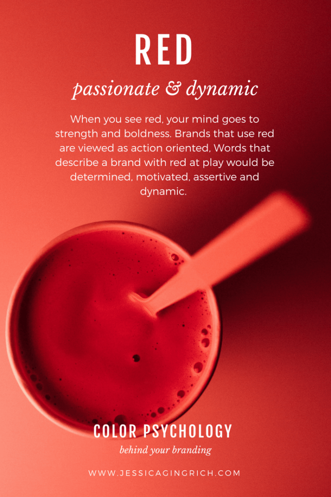
What do action, adventure, blood, love, hot, aggression, danger, caution, passion, drive, energy, and excitement have in common? The color red.
This powerful color is related to all of these and if used correctly, can make your brand stand out quite easily for all the right reasons.
This emotionally intense color can instantly grab viewers’ attention. This is why you often see “Buy Now” buttons with a red background or sale tags using numbers and percentages in this color.
Red will remain in style for the foreseeable future, so there's a high chance that you'll succeed in your design goals when creating a unique color palette that includes red in all its shades.
This color is known to stimulate appetite, which is why fast food chains like McDonald's, Burger King, Chick-fil-A, Pizza Hut, and more use this color.
These brands use red in combination with other colors, such as yellow and orange, that are known to stimulate appetite and raise people’s blood pressure.
:quality(75))
:quality(75))
Yellow: happy, fun, and youth
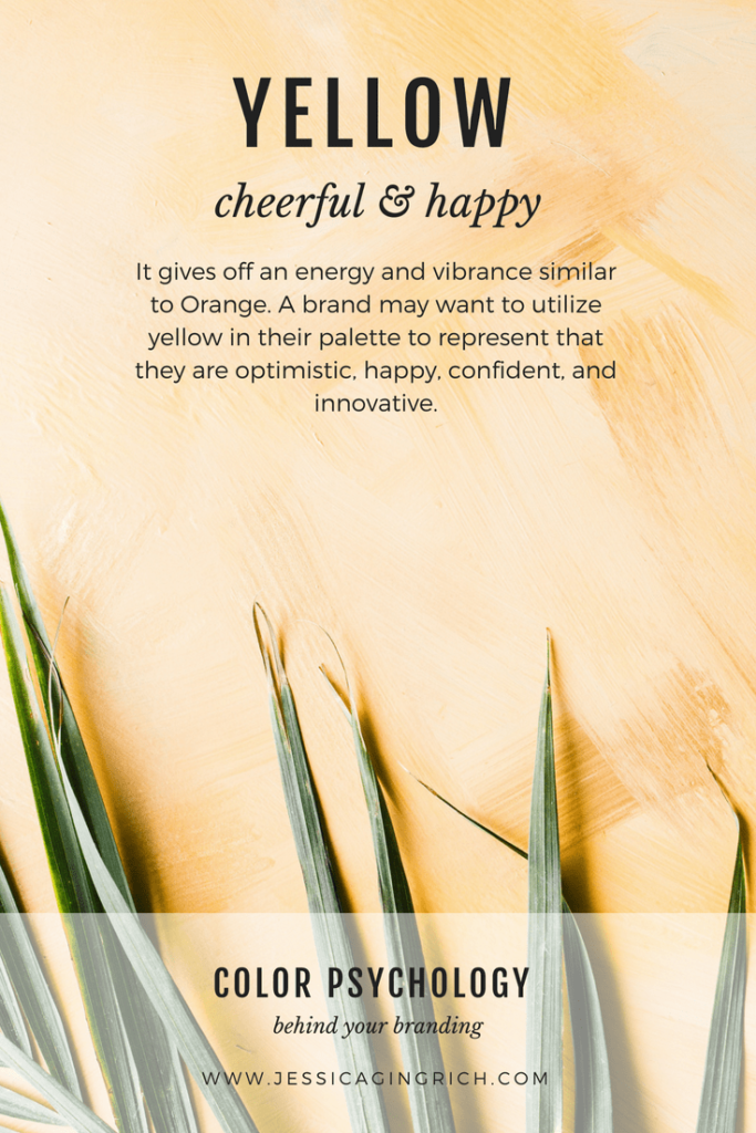
While red can be the go-to color to stand out, the power of yellow should be considered when it comes to attention-grabbing.
It's no wonder cabs in so many countries are yellow. Yellow is the easiest color to spot at a distance, so it makes sense why taxi companies use this color for their branding.
Even in countries where most cabs are black, their rooftop lights are yellow, making it easier to spot a taxi in a sea of black cars. This is why yellow is often used for caution signs.
This color is often associated with positivity, happy times, and youth. It may remind people of warmth, sunshine, joy, and curiosity. Men tend to perceive yellow as a childish color—something they associate with their younger selves.
Not many expensive clothing stores or car manufacturers advertise their products in this color to avoid association with younger (inexperienced) buyers.
And no, we didn't forget about yellow being associated with jealousy and sometimes cowardice in some cultures.
:quality(75))
:quality(75))
Blue: stability and trustworthiness
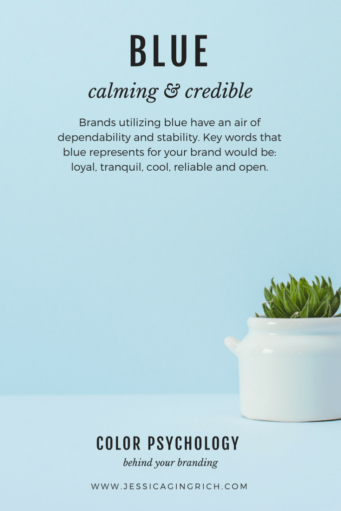
Blue. Where do we start with this one? This is the go-to color for so many tech giants and companies that want to be perceived as trustworthy, professional, and reliable.
From Facebook to LinkedIn and formerly Twitter, blue is used for many social media app icons. It is also popular with corporate institutions like IBM, Bank of America, and Citibank.
Blue is heavily used for any products related to cleanliness such as skin care products or detergents. Since this color appears often in the natural world (think of the sea and the sky), blue is also used by cruise lines, airlines, air conditioner manufacturers, and more.
If you aim to create a color palette for any restaurant or food packaging, avoid using blue since this color has been proven to suppress the appetite.
On a more unrelated note, if you're trying to lose weight and want to condition yourself to eat less, then use blue plates. Blue colors will suppress your appetite like a charm. Thank us later.
:quality(75))
:quality(75))
Green: nature and healing
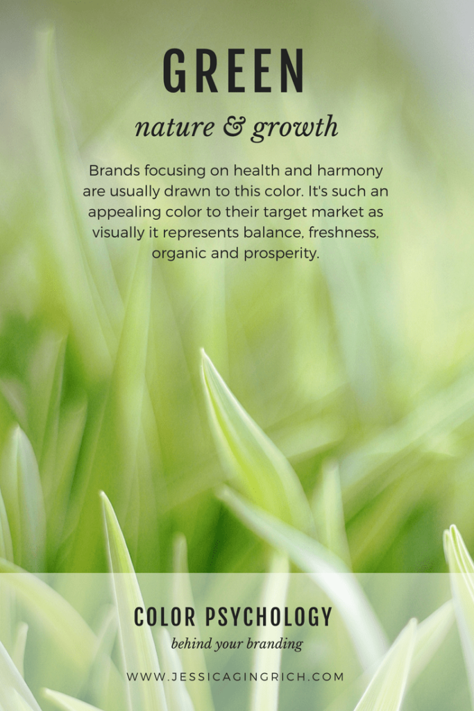
Just like blue, green is found everywhere in the natural world. That's why this color is associated with nature, freshness, healing, and serenity.
Green is also associated with eco-friendliness. Ever heard of the term greenwashing? Greenwashing or "green sheen" is a form of marketing that aims to persuade the public that the company has become more eco-friendly when it’s not entirely true.
With a simple change in their product packaging and some 'green' PR and marketing, many brands try to deceive prospective clients and current customers into thinking that the company’s policies have become more environmentally friendly.
Often associated with calmness and good luck, green is also used for healthcare products and cleaning products.
For all vegans and vegetarians out there, this color is also used for vegan and vegetarian labels or vegan-certified logos to give the impression of organic, vegetable-based foods.
Green, and especially light green, is easy to detect even if it’s surrounded by many other colors in the background. This makes it easier for customers to find a particular certification logo or label.
Some other common associations with green are growth, safety, balance, and harmony. Darker green colors are also associated with money and banking.
:quality(75))
:quality(75))
Purple: royalty and nobility
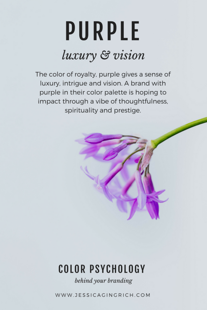
Purple isn’t one of the most favored colors, and it's not a color you can easily find in nature either (unless you happen to be near some purple flowers and butterflies).
But this color is unique and was once associated with nobility and royalty.
A few companies use purple in their branding. The ones that aim to be perceived as sophisticated, creative, and noble.
Some companies with purple logos include Yahoo!, Twitch, Milka, Premier League, Always, Claire’s, Zoopla, and NYU.
Often associated with wealth, luxury, extravagance, and mystery, purple is known to stir up nostalgic feelings in the viewer.
:quality(75))
:quality(75))
Orange: warmth and affordability
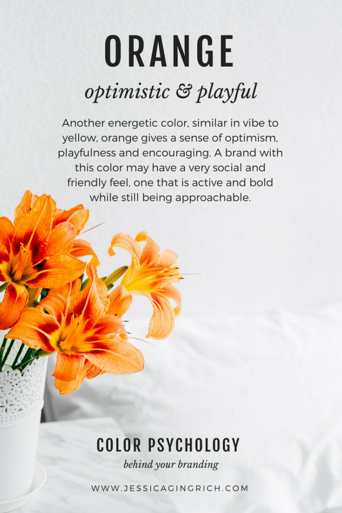
In nature, you'll see orange colors when witnessing a sunset, taking a stroll in a park during Fall, or picking oranges in winter.
As mentioned earlier, orange is known to stimulate appetite, so you'll see fast-food chains and food manufacturers using this particular color quite heavily in their logo designs and packaging.
Even though orange is less intense than red, it still transmits feelings of warmth, energy, joy, and enthusiasm.
When combined with green and yellow in analogous color harmony, orange can “shine” the most. This color combo is often seen as a source of freshness, enthusiasm, youth, and sunshine.
:quality(75))
:quality(75))
Brown: vintage and earthiness
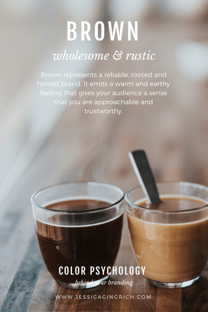
Brown is such a simple color. It doesn't “scream” at you. It doesn’t beg for attention. It instills feelings of practicality, warmth, neutrality, and old-timesiness.
For all vintage lovers, this color is candy for the eyes.
Similar to blue and green, brown is yet another color found in nature. From tree trunks to coffee beans and crunchy autumn leaves, something wholesome about the color brown makes you feel at home.
A brown color palette is a sophisticated choice, especially if you're looking to design a logo for a high-end fashion brand or aiming to pick some brown color themes for a fashion magazine layout.
Brown is rustic, rich, deep, and serious. It's no wonder that most construction logos and law firms use this color to build a reliable brand identity.
:quality(75))
:quality(75))
Black: sophistication and seriousness
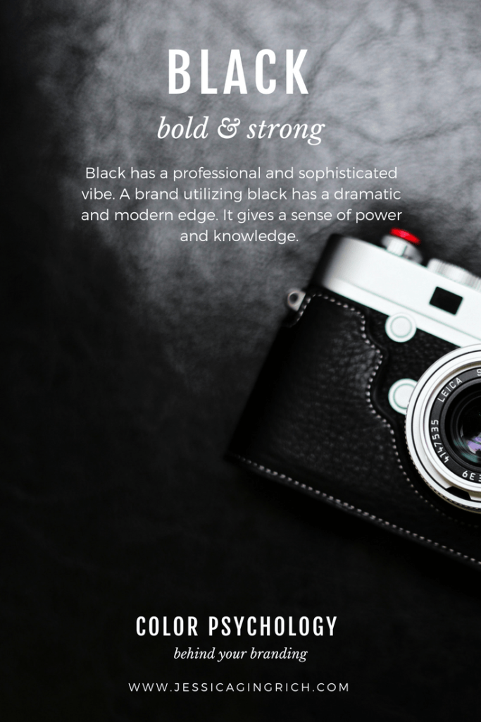
Many companies start strong with a powerful, bright color or a myriad of colors in one single logo, only to put a stop to it and go all black once they’ve gained some popularity in their market.
Take Apple as an example. Since its first iteration in 1976, the Apple logo has undergone many changes and rebranding. But its all-black logo from 1998 is one of the few logos Apple decided to return to in recent years.
With the rise of simple, minimalist design and flat logo design it made perfect sense for Apple to give its older yet classic 1998 look another life.
Black is often associated with sophistication, class, intelligence, elegance, power, and authority.
Have you noticed how most luxurious fashion brands and sports apparel logos all use black and white?
There's something about black that’s simple yet so powerful. Often, you don’t need to add more colors to it if you’re happy with what black as a color transmits to your customers and clients.
There’s a “dark” side and “negative” associations to each color. With black, we can all agree that the color is “a bad news color” often associated with death, evil, grieving, mystery, and secrecy.
But if you choose to use this color for its many great qualities, you won’t regret it. Most logos that use a combination of black and white colors are prone to stand the test of time.
:quality(75))
:quality(75))
White: innocence, peace, and truth
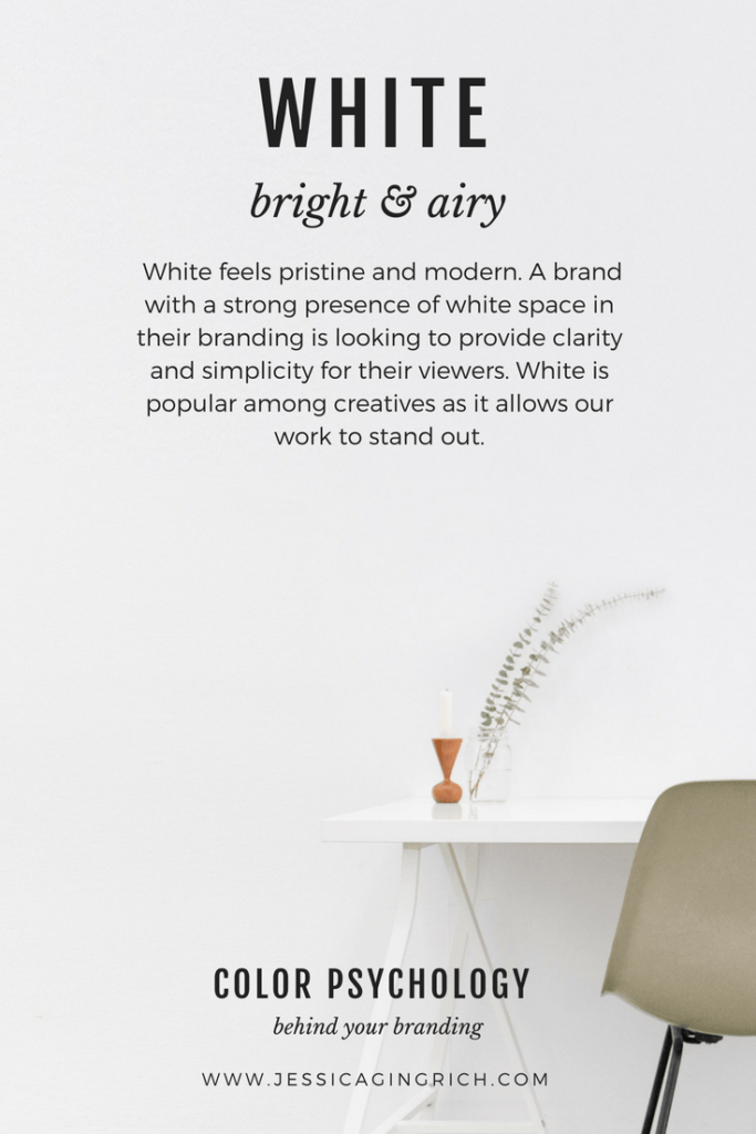
It goes without saying that when choosing white, you automatically agree to combine it with at least one more color so that your logo, slogan, or design elements are visible and legible.
As mentioned above, white and black are often linked, and a color palette that contains white as one extreme will most probably contain black as the other extreme, and vice versa.
But you don't necessarily have to pick black and white just because they might look good together or to create a contrasting negative space.
You can have any other color fill out the negative space. There's no rule that says you should stick with white or black as a background color if either of these colors doesn't represent your brand the way you want it to.
:quality(75))
:quality(75))
Multicolour: child-friendly, all-inclusive and multicultural
As more and more companies strive to become more multicultural and inclusive, a multicolor color palette that includes a variety of colors, or colors of the rainbow, is becoming increasingly popular.
Brands like Google, Slack, MSNBC, The Olympics, Microsoft, and others are well-known for their colorful logos. Toys "R" Us, the American toy, clothing, and baby product retailer, is well known for its colorful logo.
Besides being seen as international, welcoming, and all-inclusive, a multicolor palette that includes several primary, secondary, and tertiary colors is also associated with youthfulness and games.
:quality(75))
:quality(75))
Color palette generators
Do you already have a dominant color or a few core colors in mind for your brand but need some more color inspiration?
Or maybe you want to try to create primary and secondary color palettes based on some pre-selected color blocks?
Then, you should check out a color palette generator to help you create custom color palettes. Color Hunt, Coolors, Muzli Colors are popular and helpful color palette generators.
Most of these color palette generators will generate a default color scheme that you can later adapt and change to your liking. We tried Coolors and generated a moody pastel color palette—follow our steps below:
Certain color palette generators, such as Muzli Colors, require you to enter a color code or name before they can generate a palette.
Let’s say you enter “dark blue” as a primary input color. This core color will lead you to some random options and color presets that range from a monochromatic color scheme to a random color palette.
You can edit the preset colors and choose a darker shade or a lighter tint for some, or pick your preferred colors manually.
If you want to add a color scheme that evokes positivity, select yellow as a start. If you've seen a specific color combination in nature and want to replicate it, you won’t go wrong with either brown, blue, or green.
Any natural colors picked from a photograph will be easy to match with a family of other colors found in nature.
If you need to add bold, expressive colors, then red or black will be a good start. Keep in mind that some colors might not be the best for colorblind people.
If you want to pick just one color and add a lighter or darker color from the same family, you can experiment until you reach a preferable color scheme and are happy with it.
You can also use a color palette generator to get an expertly crafted color palette. Seeing as color generators are developed in a way that follows color harmony rules, they're able to automatically find good color combinations.
Color palette generators can also help you find some inspiration for alternative color combinations that you haven't considered before, besides the most well-known feminine colors or the best-selling color combinations.
How to create a color palette quickly with Linearity
After all this theory, it pays to have some quick tips to help you create a unique color palette within seconds.
Linearity Curve
Linearity Curve is our powerful vector design software. It's perfect for creating static designs for digital ads, presentations, social media, and announcements.
One of the easiest ways to create a unique color palette is to use Linearity Curve's Color Blending Effect. The blend options take the guesswork out of selecting different color values for your design palette.
Here's how you do it step by step:
Begin with an idea
If you want to design an illustration that conveys a positive mood, you should go for happier, more vibrant colors like fuchsia, yellow, or electric blue.
If you've already decided on official brand colors but want to explore darker options or complementary shades, check various color variations from the Color Wheel Menu.
Include some colors that contrast with one another to drive your audience to a specific section of your illustration or design.
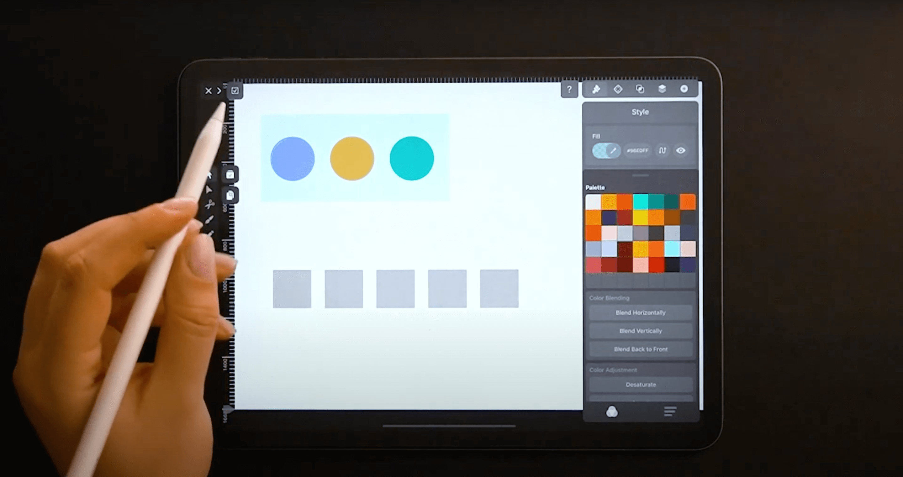
Create five shapes
Create one rectangle, then duplicate it by activating the Duplicate Mode or holding the Alt button on the keyboard while you click and drag.
Choose two colors
Open the Color Picker and choose the first and the last color for your palette. You can start with your must-have color and any precise shades that have already been pre-selected.
Then, you can check out the full-spectrum color palette and see if you can find any other colors you like.
They can be complementary, monochrome, analog, black, white, or whatever you want. As long as they reflect your concept. The color harmonies we discussed earlier come in handy here again.
Create a complete color palette
Select all five shapes and open the Color Picker Card by tapping the Color Fill. Then scroll down to the Color Blending section and tap the Blend Horizontally button.
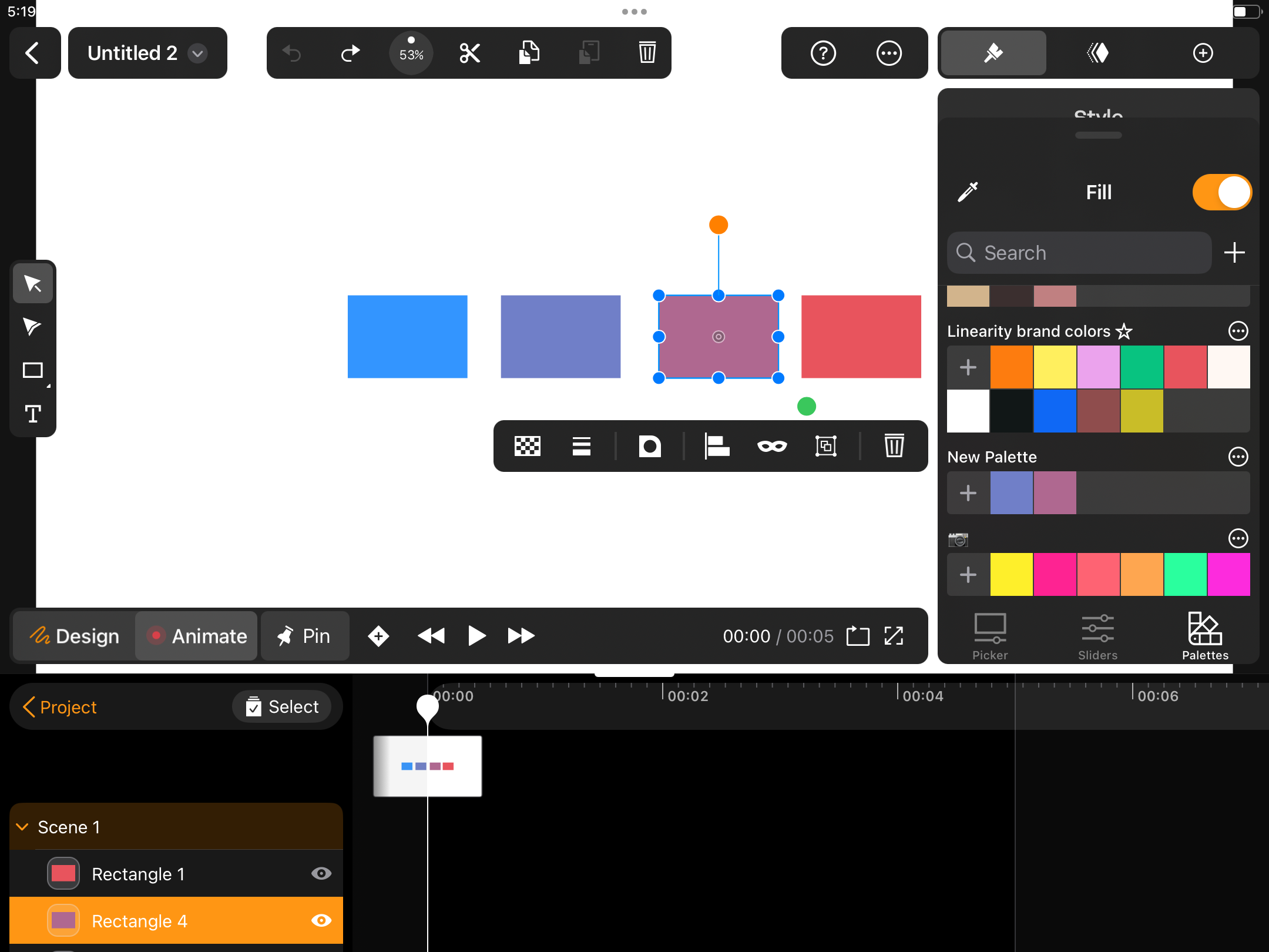
Save your palette

Once you've defined your colors, save them in your Linearity Curve Color Palette Library by selecting each shape and tapping on the “Plus” beneath the Color Wheel.
You can create and import multiple Color Palettes into Curve. You can even drag and drop Color Palettes from third-party apps like Procreate.
Every palette is customizable, too. You can add or delete singular colors—including gradients—from your Color Palette. Additionally, you can set a Primary Palette in the Color Picker menu.
Linearity Move
Linearity Move is our new, innovative animation software that makes it easy for beginners and professionals to create powerful animated designs.
You can get started with Linearity Move for free below:
Once logged in, you'll see an option to start a New Document. Click on the plus to begin creating a new color palette.
Choose a base color
You can manually enter a HEX code for your base color or use the Color Picker in the Inspector on the right.
Adjust the color settings
Linearity Move offers various settings to customize your color palette. You can use the Color Picker or Sliders or drag color values until you find just the right color for your project.
Remember to Save and Rename your Color Palette so you can quickly Search for it in Linearity Move or Curve.
Don’t be afraid to play with colors
The most effective way for designers to improve their design and color relationships is to keep exploring and experimenting.
You can explore a different color scheme generator daily and experiment with colors in your customized Color Library.
You can always use the customization option to add a neutral color or explore more tints, tones, and shades.
Finally, designing is a process, and there are no set rules. Feel free to mix and match color combinations that don't necessarily follow a grid.
Do your research, don't skip on theory, try, fail, and try again—it's a fantastic way to grow as a designer and find your unique voice.
If these tips helped you in your design or illustration, please share your work with us. We love to see what our incredible community is up to.
Frequently asked questions
What role do color palettes play in design?
Color palettes are fundamental in design. They establish the visual tone, mood, and coherence of a project. They guide the selection of colors for various elements, ensuring consistency and harmony throughout the design.
What are some common sources of inspiration for creating color palettes?
Inspiration for color palettes can come from nature, art, fashion, websites dedicated to color schemes, and existing designs that evoke the desired aesthetic.
What tools are available for creating and exploring color palettes?
Numerous tools are available, ranging from simple color pickers to advanced palette generators. Some popular options include Adobe Color, Coolors, and Color Hunt.
Linearity Move's integrated color picker and palette creation tools offer seamless integration within the design workflow.
How can color theory inform the creation of effective color palettes?
Color theory principles such as complementary, analogous, and triadic color schemes can guide the selection and arrangement of colors within a palette to evoke specific emotions or achieve visual balance.
Understanding hue, saturation, and value helps create harmonious color combinations.
Are there any best practices for using color palettes in design projects?
Yes, it's essential to consider factors like accessibility, contrast, and readability when applying color palettes. Testing color combinations for legibility, especially for text and background elements, is crucial.
Maintaining consistency across different platforms and devices also ensures a seamless user experience.
How does Linearity Move facilitate the creation and management of color palettes?
Linearity Move offers robust features for creating, exploring, and managing color palettes within its intuitive interface.
Users can easily select colors from the palette or use the built-in color picker to capture precise hues. The software also provides tools for organizing and saving custom palettes, streamlining the design process for users.
Share this!
Lavinia Aparaschivei
Lavinia is a contributing writer to the Linearity Blog.


