:quality(75))
:quality(75))


:quality(75))
Ever noticed how being surrounded by the color blue makes you feel calm?
Ever thought about how it’s a no-brainer to brand an eco-friendly product with hints of green? Have you ever been fired up by the color red?
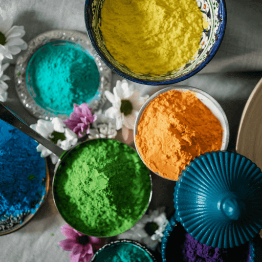
The effects of color play a crucial role in art, design, and society at large. Each color carries meaning based on its physiological and psychological effects, as well as the cultural meanings that have been associated with each color throughout history.
Jumpstart your ideas with Linearity Curve
Take your designs to the next level.
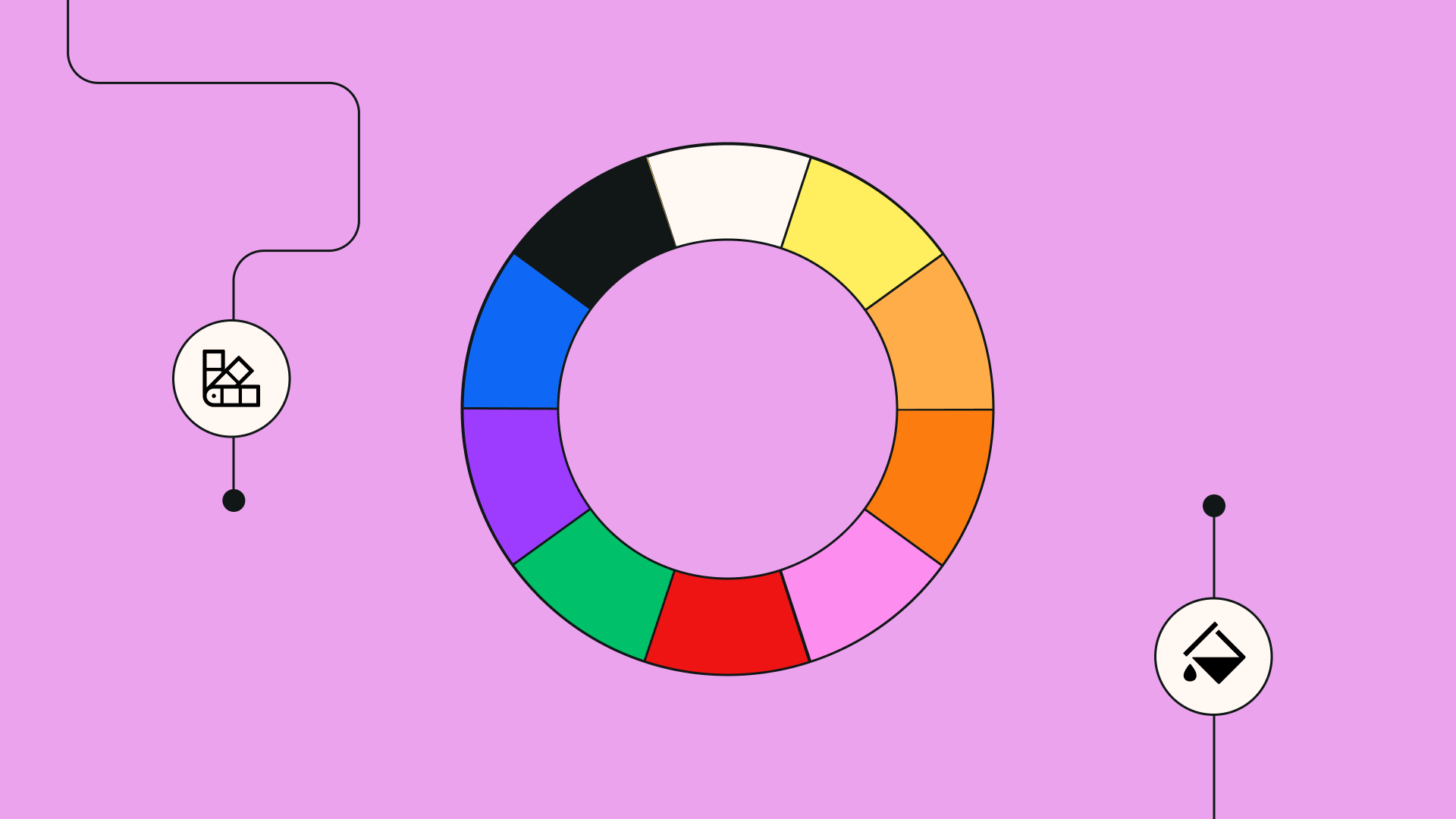
The color spectrum is vast and includes countless shades and variations of primary colors, secondary colors, tertiary colors, and every shade in between.
If you’re looking for ideas on how to color your designs, whether it’s graphic design, illustration, web design, or UX/UI, read this article to find out about the meaning of colors from psychology to culture. Save the article so you can revisit it anytime you need it!

Warm colors
The color wheel can be divided into warm and cool colors. Warm colors include red, orange, yellow, gold, and various shades of these colors. They are powerful colors that are usually bold, eye-catching, and full of energy.
We’ll dive deeper into the meaning of each of these colors later on, but if your intention is to portray warmth, power, energy, vibrance, and fun in a design or artwork, then warm colors will be the way to go.
Cool colors
The other half of the color wheel consists of “cool” colors, including blue, green, purple, silver, and various shades of these colors. These deeper tones evoke a sense of tranquility, stability, and depth in contrast to their warmer counterparts. If you intend to portray peace, relaxation, and trust in your design or artwork, cool colors will be the way to go.
Shades
What are shades?
Shade is a term to refer to variations of color. Black and white are shades, and adding either of these to a color will make it a lighter or darker shade.
Adding white creates a lighter color, and adding black creates a darker color or shade. Shades can affect the meaning of a color. For example, pink is a lighter shade of red and has much gentler symbolism in contrast to powerful, striking red.
Pink stands for romance, kindness, and femininity. It is a gentle and calming color. Similarly, lavender, a lighter shade of purple, symbolizes healing, purity, and tranquility, whereas purple has much more depth in its symbolism (as you’ll find out later in the article). You can adjust the intensity and meaning of a color by experimenting with lighter and darker shades.
The shade also affects the mood of a color. Pastel colors are light shades and therefore create a much lighter mood that’s often fun and bubbly. Dark colors like navy blue or burgundy bring depth and intensity to the mood of an artwork or design.

A comprehensive look at color meanings
Every color has some universal truths about what it means and how it makes us feel, and each color also has varying cultural meanings in different parts of the world.
We’re going to explore all of it, including personality traits associated with each color! Are you ready?
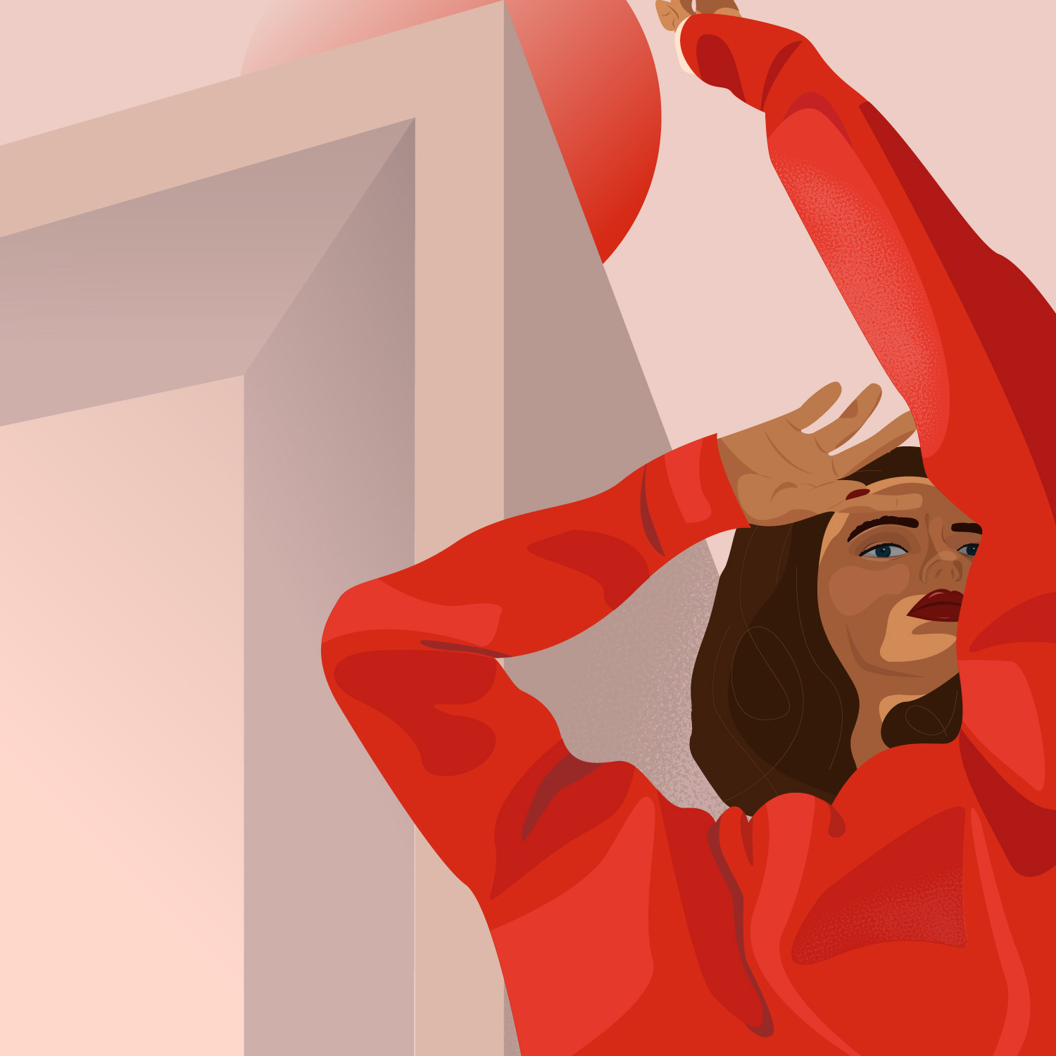
Red
From love to anger, red has a wide range of meanings that span across the spectrum of emotions. Red is known to represent:
- Desire
- Romance
- Lust
- Anger
- Danger
- Love
- Passion
- Seduction
- Dominance
Cultural meanings of red
Red is a warm, vibrant, and energizing color—it even has the power to increase a person’s heart rate!
Out of all the colors, red has the most powerful effect on our emotions. Wearing red makes us feel powerful and can boost our self-esteem.
In Western culture, red is the color of Christmas and Valentine’s day—both times of celebration and love. It is also, however, associated with horror, gore, and bloodshed.
As it is the color of blood and the heart, it represents life, death, and love all at the same time. It represents both the devil and desirability. It is also strongly associated with desire in the West—we paint fast, sexy sports cars red, we roll out a red carpet for celebrities, and we consider red lips a symbol of beauty and desirability.
Ready to create brand assets that pack a punch?
Visit our Academy to learn how to use color palettes.
In Chinese culture, red represents good luck and prosperity. It is the color of celebration and happiness. Chinese brides wear red and monetary gifts are given in red envelopes called lycee. Red is generally worn on significant holidays and is the dominant color in Chinese celebrations.
In India, red sometimes symbolizes purity and plays a significant role in representing womanhood. Indian brides wear red to symbolize the transition into the new role they are stepping into as the female leader of a household. Traditionally, an Indian bride will dip her feet in red-stained water before entering her new home and walk red footprints inside to symbolize her arrival in a new role.
In South Africa, red symbolizes mourning and bloodshed. The red in the flag represents the violence and sacrifice that occurred during apartheid.
In Hindu culture, red represents the root chakra, or the “Muladhara,” which is connected to stability, safety, and basic needs.
Historically, red has also been associated with communism, which came from the French Revolution in 1871, where the red flag was used as a symbol of defiance. Its meaning evolved into representing sacrifice and courage.
Universally, red is understood to mean “stop” and is used in traffic lights across the globe.

The psychology of red
In psychology, those whose favorite color is red or who associate their personality with red tend to be confident, enthusiastic, bold characters.
They are competitive, passionate, and can be impulsive. They are often leaders, and not afraid to stand out. They can be charming and charismatic, yet may also have a short temper that they need to learn how to tame.
Studies have shown that wearing red or looking at the color red can cause physiological symptoms such as elevated blood pressure, increased heart rate, enhanced metabolism, and increased respiration rate.
In marketing, just like in fashion or any art form, red makes a statement. It catches the eye and grabs attention. Brands use it to encourage action and excitement. This is why sales are often marketed in red—it creates a sense of urgency to take action and purchase a product now.
When using red in design, be aware that, for some, it can be an overwhelming color. Be mindful of its context and use shades to your advantage. Red is safer for established brands that have earned a sense of authority and certainty. You can use it in small doses and lighter shades to bring excitement, energy, and passion to a design.
Orange
Orange is a vibrant color alive with energy.
It calls to mind citrusy fruits and outdoor activities. It is associated with things like:
- Energy
- Social connection
- Optimism
- Activity
- Youth
- Creativity
- Flamboyance
Cultural meanings of orange
Universally, orange symbolizes light and fire.
In various shades, it can represent the peach of summer or coral of the undersea. It also represents safety in the form of life jackets, buoys, and some common road signs keeping us aware of safety.
In Western culture, orange is most commonly associated with autumn, harvest, and Halloween. It is said that the orange and black of Halloween represent the warmth of life (orange) and the darkness of death (black).
In the Netherlands, orange represents royalty. The House of Orange-Nassau is the reigning royal house of the Netherlands. Orange is the country’s national color and is worn on major holidays such as the king’s birthday and major sporting events.
In India, orange represents courage and sacrifice.
In Hindu culture, the sacral chakra (the “Svadhisthana”) is represented by orange, and is connected to creativity, sexuality, intuition, joy, power, and emotions.

The psychology of orange
A combination of red and yellow, orange contains some traits of both these colors as well as its own set of meanings. Orange is associated with enthusiasm, optimism, and being active. It is also associated with rejuvenation and is known to restore balance to physical energy.
Orange is the color of courage, responsibility, and action, as well as the color of change and vitality. It’s not as passionate and intense as red, but it still contains that sense of energy and vitality.
In psychology, people who favor the color orange are said to be optimistic, cheerful, independent, extroverted, adventurous, creative, and warm. They are said to move on easily from setbacks and are sometimes indecisive and unpredictable. They are said to be incredible social group-oriented people.
In marketing, orange works well to communicate activity, socializing, and learning new things. It’s a fantastic color for sports brands and activity-related products and products related to education and connecting socially.
Yellow

Yellow is another warm, energetic color that we often associate with summer and fun.
It is the color of sunshine and delicious summer fruits. Meanings associated with it include:
- Optimism
- Cheerfulness
- Fun
- Logic and intellect
- Youth
Cultural meanings of yellow
In Western culture, yellow is associated with happiness, sunshine, and summer.
It calls to mind childhood characters like Mr. Happy and Winnie the Pooh. It is generally thought of as a light-hearted, fun, cheerful color and sometimes represents wealth as it is close to the color gold. It is also sometimes associated with cowardice in Western culture.
In China, the first emperor was called the “yellow emperor.” Yellow became a color associated with royalty and could only be worn by the emperor. Similarly to the red carpet in Western culture, important guests in China were honored with a yellow carpet.
In Polynesia, yellow is a very sacred color. It is thought to be the color of the divine.
:quality(75))
:quality(75))
Similarly, yellow is associated with divinity in Christianity. It was the color used to depict halos around the heads of divine beings.
In Egypt, yellow is the color of mourning.
In Hindu culture, yellow is the color of the solar plexus chakra, or the “Manipura,” which is associated with confidence, self-esteem, and personal power. It also represents birth, new beginnings, and a person’s connection to the sun.
The psychology of yellow
In psychology, yellow is, in fact, the color of intellect, logic, and analytical thinking.
It can also be associated with happiness and optimism. It inspires new ways of thinking and can direct a view towards the orientation of problem-solving and solutions. It is a less emotional color and more focused on the intellectual realm. It also promotes confidence and fun.
Studies have shown that the brain releases more serotonin when surrounded by yellow, which is why yellow is associated with happiness and positivity.
Personality types who are oriented towards yellow are confident, positive, and cheerful. They are sometimes known to be perfectionists and prefer smaller circles of friends as opposed to large social gatherings.
It has been found that people have a higher chance of remembering something when it is written on a yellow background.
When using yellow in branding and marketing, it’s important to use it wisely as too much of it can become overwhelming and frustrating. In the right amount, though, it can evoke optimism and warmth. Yellow is an extremely visible color known to be the most attention-grabbing color above red. This is why it’s often used for warning signs. So if your intention is to be noticed immediately, yellow is certainly the color to go for.
Green
Green is the color of life and growth.
We associate it closely with nature, and its common meanings include:
- Life and vitality
- Nature and eco-friendliness
- Security and safety
- Renewal
- Balance
- Envy
- Luck
- Wealth
- Harmony
- The word "go"
Cultural meanings of green
In Western culture, green has many different meanings, both positive and negative—ranging from vitality to sickness; from wealth to envy.
As green is the color of American money, it also came to be associated with money.
Because it is the color of many natural surroundings, green is associated with vitality but also sometimes with sickness due to the discoloration of someone’s skin when they are feeling sick. It is also known as the color of envy in Western culture, but its strongest association in recent years has evolved to symbolize nature and environmental friendliness.
In Ireland, green is an important cultural color. Ireland is known as “the emerald isle” because of its lush green landscape. The color is associated with good luck and magical beings—such as the Leprechaun. On St. Patrick’s day, Irish people dress up in green to celebrate their cultural heritage.
The Quran depicts people wearing green and sitting on green cushions in paradise, and it is also said to have been the favorite color of Prophet Muhammed.
In Hindu culture, it is not red but green that is associated with the heart. “Anahata,” commonly known as the heart chakra, is symbolized by the color green. It is associated with empathy, compassion, love, and forgiveness.
Universally, and especially in design, green has come to represent eco-friendliness. It stands for kindness, empathy, and care as well as relating to nature, so it has been adopted as the go-to color for communicating anything pertaining to the environment and products that are kind to the environment.
If you are creating a design for organic products or eco-friendly products, green is the perfect color to work with. It also universally represents the word "go." A green light in any place indicates that you are free to go or move ahead—thus the common saying to give something the "green light."
Psychology of green
In psychology, green is known to be the most restful and relaxing color for the human eye, as it’s largely associated with nature.
It has a soothing effect that supports stability and endurance. It evokes renewal, optimism, growth, and balance. It is a therapeutic color. As green is associated with lush nature, we associate it with stability as it’s a place where all our needs are met- finding food, water, and shelter.
Ever heard of “the green room?” In media and television and performance, guests, personalities wait in what’s known as a “green room” before they make their appearance, as this waiting space would often be painted green in order to relax them and help calm nerves.
People whose favorite color is green or who associate their personality with green are said to be stable, calm, logical, and thirsty for knowledge. They can be visionaries and leaders. They are reliable, intelligent, and adaptable. They are loyal and make good friends and partners.
In marketing, branding, and business, green symbolizes prosperity and transparency. It also represents growth, trust, and security. It’s a great color for financial institutions, healthcare, and food. Green evokes a sense of freshness and a healthy lifestyle. It also works well for branding that needs to communicate relaxation and tranquility. It is also associated with organizations that stand for peace.
Green has become associated with eco-friendliness, and this has come to play an important role in branding.
Blue

The color of the ocean and sky, blue, is dreamy and tranquil.
Its meanings include:
- Serenity
- Calm
- Responsibility
- Loyalty
- Trust
- Support
- Intelligence
- Truth
Cultural meanings of blue
Blue makes up a significant portion of the colors we see on Earth; being the color of oceans and the sky (on a good day).
In ancient times, blue was a costly color to source, and because of this, it became associated with the sacred and valuable. In ancient Egypt, blue was associated with the divine. It is the color of the lapis lazuli stone, which was a sacred stone associated with the soul, immortality, and truth. Cleopatra famously wore finely crushed lapis lazuli as eyeshadow.
In Roman Catholicism, the Virgin Mary was depicted as wearing blue because of the color’s value. Subsequently, the color became associated with virtue, purity, and holiness in much of the West.
In Hinduism, important deities such as Krishna, Shiva, and Vishnu are depicted with blue skin because of its association with peacefulness and intuition- both valuable and sacred characteristics in this culture. It is also associated with the throat chakra, known as “Vishuddha,” which is linked to speaking your truth, communication, self-expression, and peacefulness.
In West and Southern African cultures, blue is a vital color that represents love, harmony, and togetherness. It is often used in beautiful clothes to create traditional garments.
The psychology of blue

Blue promotes peace, tranquility, and serenity.
It is pure, soothing, and healing. In contrast to red, the physiological effects of blue include slowing the heart rate and lowering blood pressure which results in relaxation.
Blue is said to increase productivity and is associated with trust and dependability. It is calm and confident but can also be authoritative, especially in darker shades such as navy blue, which is known to be a color of authority.
People who favor blue are said to be loyal, confident, and calm. They are often introverted and spend time analyzing their thoughts and emotions. They are good listeners and good friends and enjoy deep relationships and honest communication.
Blue could also be associated with sadness such as “the blues” or feeling blue.”
In branding, marketing, and business, blue communicates loyalty and integrity, security, and peacefulness. Some companies choose to have their offices painted in blue to promote business partnerships. It is also a relaxing and comfortable color to be surrounded by.
Blue is used a lot in web design because it promotes both power and safety. It works well for a range of industries, from wellness to travel, technology, finance, and law. It is used in social media logos because it represents communication and trust. It is both professional and friendly.
Did you know that many airplane interiors are blue to relax people?
Purple
Purple is a deep, mystical, regal color that commonly symbolizes:
- Imagination
- Magic
- Royalty
- Mystery
- Wealth
- Independence
- Pride
- Devotion
Cultural meaning of purple
In Western culture, purple is most commonly associated with magic, mystery, royalty, and faith.
Like blue, purple used to be very expensive and rare, which is how it came to be associated with royalty and holiness. In contemporary western culture, purple has also come to represent bisexuality and is used as the bisexuality pride flag- which combines pink and blue to create purple.
Ready to create brand assets that pack a punch?
Explore our Academy for complimentary courses on the significance of color in design.
In Thailand, and amongst devout Catholics in Brazil, purple is the color of mourning. Widows from these cultures will wear purple during their mourning period. The color is also strongly associated with death in Italy and a common color seen at funerals (and a big no-no color to wear to the Italian Opera, FYI).
In Hinduism, purple represents the crown chakra; “Sahasrara,” which is considered to be where the soul meets the physical body. It represents enlightenment and awareness and brings peace, joy, and serenity. This has influenced purple's universal symbolism as the color of wisdom and spirituality.
The psychology of purple
Purple is also a soothing color that can lower blood pressure and heart rate, similarly to blue.
In color psychology, it is associated with dignity, wisdom, and spirituality. Because of its association with royalty and luxury, many royals throughout time having adorned purple robes, its association with dignity and nobility was passed on to other honorary roles such as in the military and public officials.
People who favor the color purple are said to be creative, imaginative, visionary, intuitive, and wise.
In marketing and design, purple is often used as an accent color. Too much of it can be said to be frustrating and arrogant. As an accent color, it can communicate just the right amount of luxury, mystery, power, wisdom, and nobility. It is the perfect color for communicating magic and the unknown and might be perfect for branding a spiritual-related business.
Color in action
We see color working its meaning-magic in marketing and design constantly. Here are a few examples of color symbolism in action.
Red
This interactive music video uses the power of color to communicate a visual story about lust, desire, pleasure, and pain.
Red is a prevent color used to communicate these feelings. The project's rationale says, “using the red-blue overlay effect represents both pleasure and pain in modern-day relationship.” If you play around with the interactive feature of the video, you'll notice that red represents pleasure and blue represents pain. Check out the interactive version here.
Orange

This online bicycle store makes excellent use of orange as an accent color without disrupting its minimalist approach. Orange portrays the activity, energy, and movement of cycling in this context.
Green

FoodGanic is a healthy food company whose branding captures the spirit of nature through the color green.
Purple
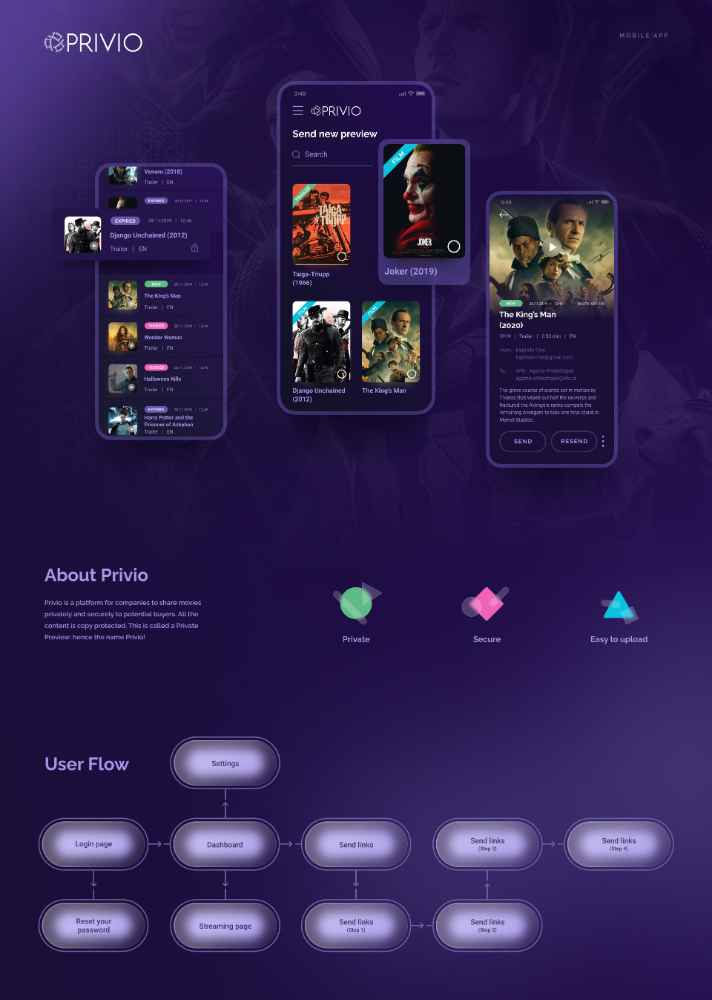
Privio is a platform for companies to share movies privately with potential buyers. The platform’s interface has a purple background, which successfully gives a sense of exclusivity and luxury.
Blue

You'll notice that many social media companies see blue in their branding.
Signifying both communication and trust. Blue is a color that makes sense for these platforms.
The communication app Telegram uses blue in its logo to represent security and trust as well as communication. It also works well as a background color for the paper plane symbol—standing for the sky.
How to use color meaning in your designs
Has learning more about each color affected how you feel about them?
All of these color meanings can have a profound impact on your own designs. You should always take this into account when designing something of your own. Here are some questions you can ask yourself to help you choose colors for your own designs.
Who is my audience?
This is the biggest question, which you should already know the answer to even before you start working on your design.
Who are you designing for? Is it a customer? A friend? Yourself? Depending on what your design is for, this question can have infinite answers. But you should identify the answer clearly because your design will take a lot of key points from it.
Once you've identified who your audience is, use the color meaning theory you just learned to narrow down some of the color choices for your design. Are there any that are off-limits for your topic, or your audience?
What do I want to communicate to them?
Next, think about what you want your design to communicate to your audience.
The most important thing is that your design achieves its purpose clearly. Ask yourself—how can I use color theory to make my message clear?
Your audience should be able to understand your design's key message within about three seconds of looking at it. Color is the first thing people notice, before their brain processes images or text, so make sure that your color choices are helping you start off on the right foot!
How do I want them to feel?
This is the last component of color meaning—how do you want your audience to feel when they look at your design?
Sometimes the answer to this question is obvious, but other times it isn't immediately clear. Try to take a step back and think about your design conceptually. When a viewer looks at it or uses it, what do you imagine the ideal user experience to be like? What are they wanting? What are they feeling? What is hindering them? All of these questions can have a big impact on the success of your design.
Wrap up
What colors do you find to be most impactful in your designs?
Ultimately, you should think of color choice as an efficiency question. How are my color choices helping my design achieve its goal? If you can answer that question, you'll be using color meaning effectively.
Hopefully, you might have learned something new today, and you will have expanded your understanding of color so that you can bring an added element of understanding and intention to your art and design and truly hone the power of color in your own designs.
Don't forget to download Linearity Curve (formerly Vectornator) and put this information to the test in your next design.
Jumpstart your ideas with Linearity Curve
Take your designs to the next level.
Cover image source: Alena Darmel
Share this!
Adí Aviram
Adí is an SEO developer working for Linearity in Berlin. Her hobbies include drawing comics, yoga, swimming, infinite scrolling, and birdwatching.


