:quality(75))
:quality(75))


:quality(75))
Chic, classic, edgy, bold, simple, elegant, complex, and effortless all at once- you can’t go wrong with black and white (unless you’re totally new to design, in which case you’re in the right place to learn more. Keep reading.)
The classic color combination of black and white eliminates the complexities of working with multiple colors, while allowing plenty of space for limitless creative possibilities and enhancing other design elements in your design project.
 Tanvir Alam Hira
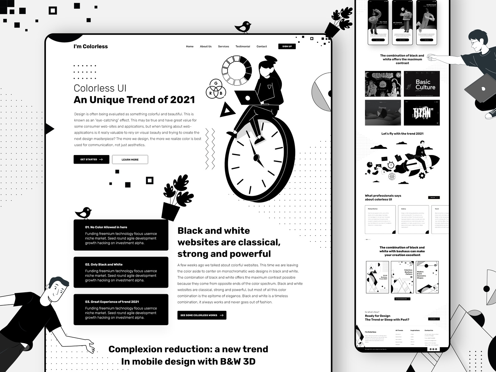
This signature color palette, often referred to as an achromatic color palette (as in devoid of color), allows for a lot of experimentation with the use of space, texture, and how you combine graphic elements. This is because the simplicity of the color scheme means there is more freedom to play without overcomplicating your design. In this article, we’ll look at some inspiring ideas for using this classic color scheme in your designs.
Jumpstart your ideas with Linearity Curve
Take your designs to the next level.
There are many shades of black
Is white a color? Is black a color?
No. Those of you who’ve studied art, design, and color theory will know this but it’s still a common question among many people.
Black and white are, in fact, shades. They are devoid of color. So we would actually refer to black and white as an achromatic color scheme. In between the brightest white and the deepest black are countless shades of gray. Shades of black? Shades of white? You could technically name it any of those, but you get the picture.
An achromatic color palette is not as simple as black and white; there’s a ton of variety to work with here. In this article, however, we’ll look at a few varied examples, but we’ve focused mainly on black and white for simplicity.
Why we love black and white
Black and white are ultra-versatile in all forms of design, from fashion to graphic design. It’s the ultimate contrast - polar opposites - and at the same time, the perfect match.
- It’s both elegant and edgy
- It’s modern, yet traditional
- It can be both sophisticated and grunge
There are a lot of practical perks to using a black and white palette in design, too, such as:
- It’s an excellent alternative to color graphics for printing that's more affordable
- Using white space and negative space makes for fantastic visual communication
- Classic colors (or shades, rather) immediately resonate with the eye and capture attention.
Looking for more cool drawing ideas?
Check out our list of 25 easy tutorials.
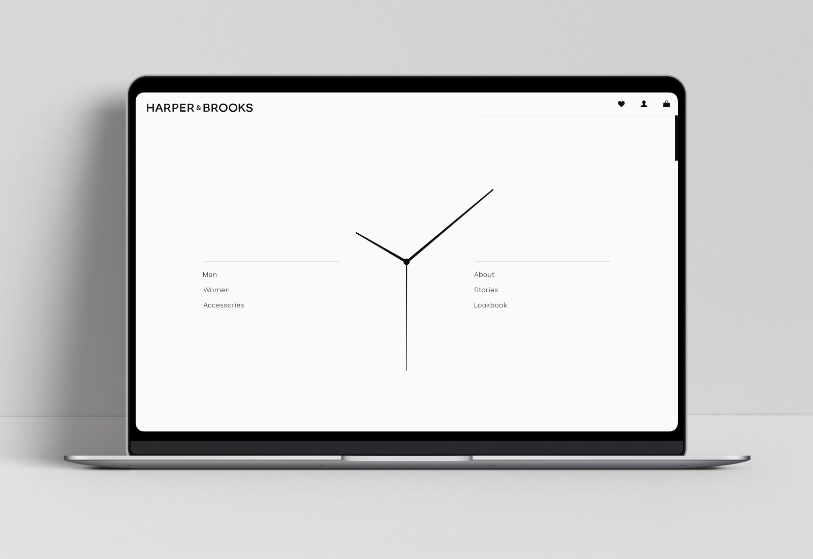
Maximize minimalism
Minimalist design is exceptionally chic and effective. We are big believers in the beauty of simplicity. By using white space, elegant typography, and clean lines with a black and white color palette, you can create some striking designs that are irresistible to the eye.
This website design by Larry V is serious minimalist eye candy. The sharp lines of the central image strike into white space and create a perfect, minimalist vortex for the eye.
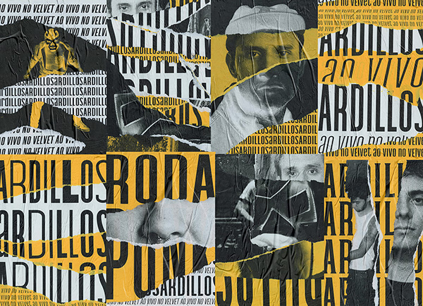
Captivate with contrast
High contrast images bring a moody, noir, or retro feel to a design.
It adds artistic flair and attracts the eye. High contrast is visually captivating, and by using images of this style in your design, you immediately create a focal point around that image because this is where the eye is immediately drawn. You can have quite a lot of fun playing with layout by using this technique.
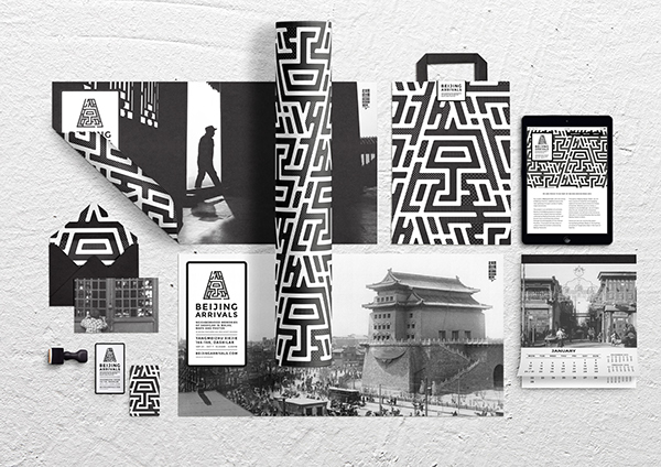
Brand like a boss
Creating a brand identity in black and white leaves a lot of space for versatility.
This design by GH Lim combines an innovative pattern with beautiful photography in a black and white palette to create a brand identity that’s simultaneously sophisticated and playful.
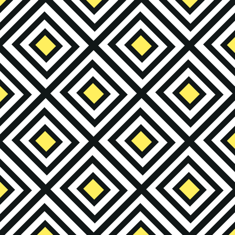
Play with patterns
Black and white lines, geometric patterns, and polka dots work beautifully in black and white to create unique designs.
This design by Tyler Spangler combines simple stripes with a circle and an image to create a captivating surrealist artwork.
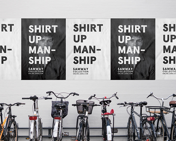
Be bold
The contrast of white on a black background and vice versa in big, bold type is extremely striking.
This is a good option when you really want to make a statement and allow the words to stand out in a design.
Get noir with Illustration
Black, white and grey is the signature color palette for moody noir illustrations.
If this is the look you’re going for, an achromatic color palette will absolutely set the mood.
Dive into depth and texture
This seductive branding created for the Word’s Eye event by Crtomir Just is an inspiring example of some seriously bold graphics that pop in black and white.
Using text to give the design texture is both innovative and effective.
The logo for the Tate museum is an excellent example of texture working well.
This logo strikes the perfect balance between edge and elegance by using textured typography. When the color palette is as simple as black and white, you can enhance other design elements like texture without compromising balance and overcomplicating the design.
:quality(75))
:quality(75))
Simplify your illustrations
These comic strip-style illustrations done in black work exceptionally well for editorial and UX design.
They have an artistic flair and connect beautifully with audiences while providing a simple solution for visually communicating content. The absence of color in illustrations also helps to keep the focus on the story. These are pretty trendy at the moment, so it wouldn’t hurt trying your hand at developing some in your own style- your clients might love it!
If you’re new to illustration and have been looking for an inroad, this style might be a not-too-intimidating way into the field. Try it out today in Vectornator!
Kristiana Vellucci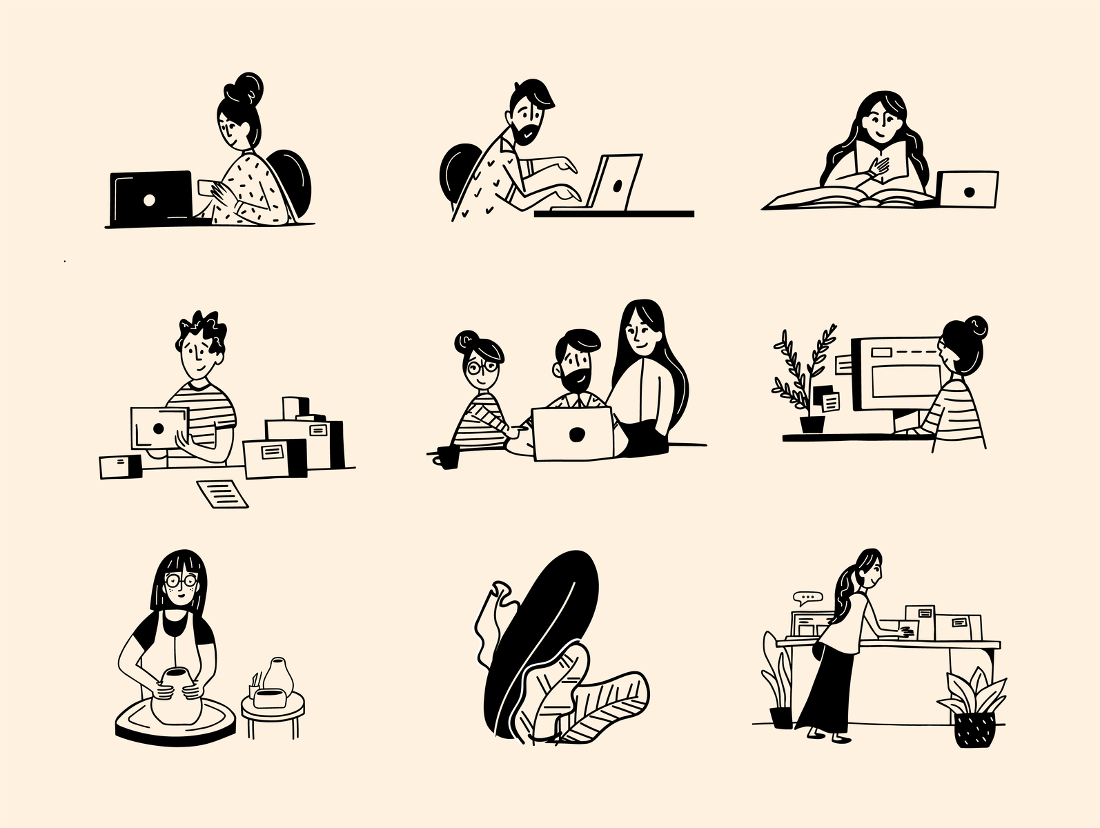
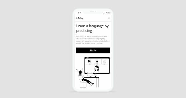
Create sophisticated interfaces
Nothing beats a white background.
It’s the ultimate canvas. This interface design by Tymur Miekieev for the language learning app Talky is deliciously clean and easy to navigate. Black cartoon-style illustrations make it fun and engaging while maintaining an elegant overall look and feel.
White is the perfect background shade for creating interfaces that feel light, airy, and spacious.
Go monochrome
Monochrome refers to a color palette made of varying shades in one hue (we have a whole article on it if you’d like to find out more).
Since black and white aren’t exactly colors, we mentioned earlier that you’d refer to the pallet as achromatic when working with shades alone.
You can apply the “monochrome” approach to black or white by experimenting with shades that use an all-white color scheme or an all-black color scheme. White graphics effectively portray the surreal and magical, while black graphics feel more grounded and intense.

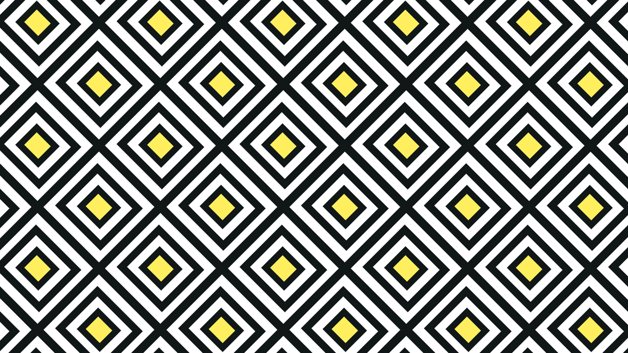
Orchestrate optical illusions
Try creating an optical illusion with black and white stripes.
These make for highly engaging visual content that can be used in many innovative ways, from drawing an audience in on social media to innovative design elements within a user experience.
Sergi Delgado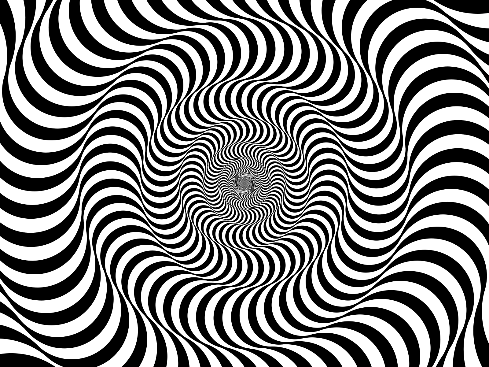
Ready to create brand assets that pack a punch?
Visit our Academy for free marketing design courses.
Push the boundaries with photography
Photography is all about playing with light and shadow.
Grayscale allows you to experiment with all kinds of cool shadows and highlights, as these elements will be emphasized when color is eliminated.
Black and white photography has the potential for so much depth, sex appeal, and sophistication. How could you resist?

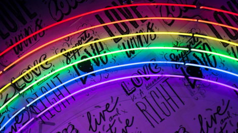
Add a splash of color
Adding a splash of bold color to a predominantly black and white design is extremely visually appealing.
Bright colors stand out even more against grayscale and are a great way to make a statement and liven up the design.
Wrap up
A slick black and white design is something every designer should have in their portfolio, or at least experiment with.
And for new designers, black and white is a gentle way to focus on your skills before diving into the complex (albeit exciting) world of color.
At the other end of the spectrum, when you’re ready for some color inspiration, check out this piece on the colors of the rainbow- or perhaps pastel colors might be more your thing?
Try creating your next black and white design with Vectornator and send us your image! We’d love to see your art and reshare it on our platforms!
Jumpstart your ideas with Linearity Curve
Take your designs to the next level.
Share this!
Lavinia Aparaschivei
Lavinia is a contributing writer to the Linearity Blog.