:quality(75))
:quality(75))


:quality(75))

Every layout begins with a blank page.
Then come the design elements—a logo, menus, text sections, photographs, illustrations, etc.
The placement of elements can determine how successful the design will be. That’s why one of the first things designers do when they start working on a new page is to decide what the arrangement of elements will be on that page.
.jpg)
There are two basic approaches to space elements on a page. Designers can either lean toward a more symmetrical arrangement of elements or an asymmetrical one.
Now we’re going to look at two powerful design principles that may, at first glance, seem too simple and second nature to us to warrant too much thought. However, we would be wise not to underestimate their capabilities and the benefits of their effects.
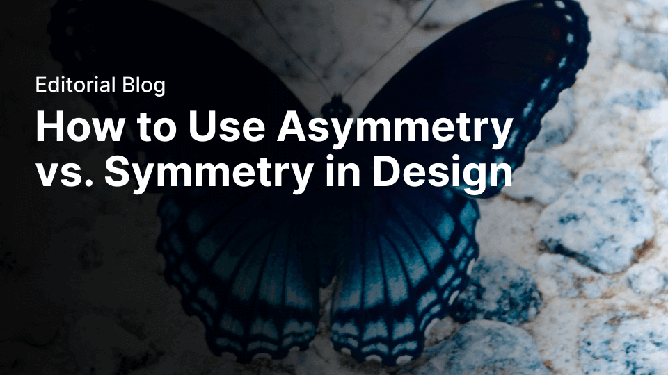
Whenever we distribute compositional elements evenly around a central point or axis, we make a symmetrical design. A good example of symmetry in nature is the butterfly—its right and left sides are highly similar to each other (although not identical).
We find symmetry when two mirrored sides are exactly the same, as it creates a perfect mirror image. Poke a finger of your right hand up against the surface of your bathroom mirror, and look at it and its reflection from an angle. Assuming that our mirrors are clean, we’ll always notice that the real right hand and its mirror image (which flips to look like a left hand) are perfectly symmetrical.
Fortunately, symmetrical design does not depend on identical mirroring. It’s only important to get close to the effect – exactitude is not necessary. Remember, you can manipulate the user’s eye easily without worrying about geometric perfection as a consideration in your design.
Conversely, asymmetry is the absence of symmetry of any kind. Whenever we make a design that consists of elements that we’ve distributed unevenly around a central point or axis, we’ll consequently have an asymmetrical design. We can exploit asymmetry, using it to draw attention to areas in the design or to convey dynamism or movement.
As in biology, elements are like cells or parts of an ecosystem. Ultimately, we need to keep in mind that building balance, which we can do through the use of symmetry, makes for a ‘healthy,’ more effective design.
In this article, we’ll see how symmetry and asymmetry work for design. We’ll cover the basic techniques, tips, and best practices for each approach.
Jumpstart your ideas with Linearity Curve
Take your designs to the next level.
What is symmetry?

For a long time, symmetry (formal balance) was thought of as the gold standard of design. The preference for selecting a symmetrical layout is especially noticeable in architecture. A good example of this is one of the most beautiful buildings in the world – the Taj Mahal. The Taj Mahal has a lot of properties that make it so aesthetically pleasing, but its symmetrical balance is one of the main ones.
The benefits of using symmetry in design didn’t arise out of thin air. Same as many design principles. It emerged from the Gestalt Principles, a human behavior theory that describes how the human mind structures and arranges visual data.
Our mind naturally creates order out of the things we see. That’s why symmetry is so powerful. Symmetrical design is a design that has order and stability and is therefore easy on the eyes.
Types of symmetry

There are three types of symmetry: reflection, rotational, and translational symmetry.
Reflection symmetry
This is probably the first thing people think of when they hear the word ‘symmetry.’ Also known as the mirror effect, reflection symmetry occurs when everything is mirrored around a central axis.
The axis can be in any orientation – it can be horizontal, vertical, diagonal, and anything in between, as long as what’s on one side of the axis is mirrored or reflected on the other.
Designers often use reflection symmetry to give equal weight to either side, or to create an entertaining visual effect.
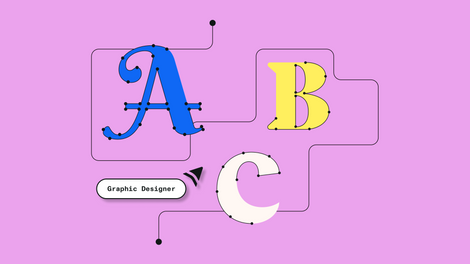
Master Node Types in Vector Editing
Explore the versatility of node types in Linearity Curve on iPad. Our user guide delves into the essentials of vector editing, empowering you to refine your designs with precision.
Rotational symmetry
This type of symmetry occurs when everything rotates around a common center. Rotational symmetry can occur at any angle or frequency as long as there’s a common center around which everything is rotated and elements are equally spaced around a central point.
Rotational symmetry is quite common in real life. For example, the arms of a starfish radiate out from the center. The ceiling paintings of many churches also use rotational symmetry.
Web designers incorporate rotation symmetry in their work to portray motion (such as to infer progress or movement) or to visualize data in a fascinating way.
Translational symmetry
This type of symmetry occurs when an element is repeated over different locations in space while maintaining its general or exact orientation. Translational symmetry can happen in any direction as long as the element's orientation is maintained.
The same object is moved several times at even intervals. A picket fence is a good example of translational symmetry.
Proper use of translational symmetry can create rhythm in design. Web designers often use translational symmetry as a passive element to create background patterns. But in some cases, it’s possible to use translational symmetry as an active element that conveys a message.
Don’t try to achieve perfect symmetry
When it comes to design, symmetry is not the same as identical mirroring. Perfect symmetry is rare both in web design and in real life.
When we think about our environment, most natural objects and creations around us are not absolutely symmetrical. For example, we are used to thinking of our face and body as two mirroring parts. However, the left side of the face is not absolutely identical to the right side.
Designers can create a symmetry by playing with the user’s perception of the layout, and it’s totally okay to have slight variations on each side as long as viewers get a sense of symmetry from the finished product.
What is asymmetry?

Asymmetry is naturally the absence of symmetry. In nature, we can see asymmetry almost everywhere, such as in the branches of a tree, or the shapes of clouds, to name a few.
In design, asymmetry is often used to create visual tension. At the same time, asymmetry can be a difficult concept to master because the relationships between elements in an asymmetrical design become more complex. It might be hard to create a whole, cohesive design.
This is why many designers go for predictable symmetrical layouts. But designers who master asymmetry have greater freedom of expression.
Symmetry and balance
Many designers believe that balance is something that can be achieved only in symmetrical layouts.
It happens because the term ‘asymmetry’ implies a lack of balance. While the definition of asymmetry is the lack of symmetry, it is not a lack of balance, as some wrongly assume – designs that lack symmetry still need to be balanced.
In other words, no matter what layout you create, whether it’s symmetrical or asymmetrical, it’s vital to achieve balance because an unbalanced composition feels uncomfortable for the viewer.
A proper technique for mastering balance (both symmetrical and asymmetrical) is to think of each element on a page as having a visual weight to it. Visual weight depends on the size of an element (smaller objects might weigh less than larger objects) and visual properties such as contrast (contrasting elements might weigh more than neutral elements).
Designers need to play with the weight of elements until they reach an efficient equilibrium.
Of course, it’s fairly easy to achieve a balance in a symmetrical layout. All you need to do is put the same weight on the right and left parts of a page.
When it comes to asymmetrical design, the task might be harder. You might need to have several small items on one side to balance a large object on the other side.
Van Gogh's The Starry Night (1889) is an excellent example of asymmetrical balance. Van Gogh creates a balance by using different-sized objects and playing with color and contrast.
Another type of balance includes:
- Mosaic balance (or crystallographic balance) results from chaos examples of balance. Think: Jackson Pollock's paintings. The composition lacks distinct focal points, and the elements share a uniform emphasis. The lack of hierarchy leads to visual noise at first glance. Somehow, though, it all works together.
Overall, the same principles of balance that we have in paintings apply to web design.
A formula for perfect balance
“Can I measure balance?” is a fairly common question among designers. In the attempt to find an answer to this question, many designers search for a specific formula that allows them to calculate whether everything is in balance. Bad news: there’s no formula for calculating balance. Good news: we can use a powerful tool to determine whether a composition is balanced or not – our own eyes.
Experienced designers are able to notice unbalanced layouts at a glance. But to reach this goal, you need to train your eye by working on practical projects and by being inspired by the work of other designers. The more you do that, the more you'll trust your own judgment when it comes to any design decision you have to make.
Symmetry vs asymmetry

Ultimately, when it comes to designing a layout, you need to decide whether you want to create a symmetrical or an asymmetrical design. There’s no universal answer to this question – the choice depends on the project’s specifics. Let’s see how symmetry and asymmetry can be used in designs.
When symmetry works best
Here are a few general cases when it’s better to follow a symmetrical approach for layout design:
- You are seeking a more serious aesthetic (you want to convey classicism)
- You want to enhance recognition and recall (symmetrical forms make it easier to recall information)
- You want to achieve more order and structure
- You don’t want to put a lot of thought into the arrangement of elements, but still want to achieve a balance (symmetrical layouts are inherently stable and balanced).
Now let’s review how these cases look in real life.
Conveying a sense of trust
Symmetrical layouts work well for designs that want to portray an aura of trust. Not surprisingly, many companies that prioritize trust use symmetry in their design. Many car manufacturers use symmetry in their designs to create a sense of steadiness.
Symmetrical design is predictable. Thus, if you’re designing a website that calls for stability (such as a site for a bank or an insurance company), a symmetrical design may be the right choice for you.
Ready to create brand assets that pack a punch?
Visit our Academy for free asymmetry and symmetry design courses.
A page has a single interaction object
Symmetry works well for pages that have a single interaction object. A typical example is the login or signup page. By placing a key interaction object or critical message in the center, you have a focal point centered on the page.
The Google Search page is a good example of a symmetrical layout with a single interaction object.
A page has two (or more) equally important options
Symmetrical design allows you to draw attention to all areas of a page equally. One typical example is an online store that sells products both for women and men. Symmetry helps designers deliver two equally important messages in the same space.
When asymmetry works best
Symmetry is usually seen as stable and harmonized. However, for some people, stability might be predictable and boring. Asymmetrical layout tends to be more interesting and dynamic.
Go for asymmetry when:
- You’re ready to spend extra time arranging elements to find unique ways of achieving balance
- You are seeking a more playful layout to convey user interest
- To make the layout stand out.
Today, when users have so many different options to choose from, a site needs to be something special to stand out from all the others and reduce bounce rate. When designers master asymmetry, they create more memorable products.

To convey dynamism
When web designers use the term ‘dynamic,’ what they are referring to is a design in which the viewer’s eye is moved around and through the design. Asymmetrical designs can evoke feelings of movement. That’s why so many sports brands use asymmetrical layouts and asymmetry in individual elements (such as the logo).
To draw attention
Asymmetry grabs attention. A proper asymmetrical layout automatically brings the viewer’s eye to the focal points – the gaze naturally settles on the critical pieces of the design first. By positioning and adjusting elements on a page, you can direct the eye to the different areas.
When choosing focal points, remember that the primary goal of any design is communication. With each web page you design, you tell a story to your visitors, so be sure to choose focal points that help you tell this story in the most effective way.
Here are a few things that allow you to draw attention:
- Contrast. Contrast can be used both to highlight a particular element or to hide it. By increasing the contrast of a particular element, you make it stand out. Conversely, by lowering the contrast, you can make an element fade into the background
- Whitespace. Use whitespace to isolate one element from another
- Movement. The human eye is hardwired to pay attention to moving objects
- Directional cues. The eye will follow directional cues (for example, a directional cue might be an arrow that points in a particular direction)
- Human faces. The eye will follow the path of eyes in the photo, so a site’s visitor will look in the same direction as a person in the design.
Combine symmetry and asymmetry in design

Symmetry is not always an either/or decision. It’s possible to create the most engaging and aesthetically pleasing designs by combining symmetry and asymmetry.
You can break the layout into smaller sections and try to achieve a symmetrical or asymmetrical balance in each section. For example, you can have a symmetrical layout in which asymmetry is used to create points of interest and organize visual hierarchy within a group of similar elements.
Symmetry (or lack thereof) can be a powerful tool in the designer’s toolbox. Symmetry naturally evokes a sense of orderliness, while asymmetry, on the other hand, can help designers achieve uniqueness and character in design. Combining the two helps create designs that are unique and memorable to viewers.
How to use Linearity Curve's (formerly Vectornator) Shape Tool to create balance


When it comes to mastering the balance of asymmetry and symmetry, the use and placement of the shapes you use in your designs make the biggest difference. For example, balance from eye direction is achieved by playing with the visual direction in the design using shapes.
Pointed shapes or shapes flowing to one point in the image can all be used to instantly shift the user’s attention to a desired area.
That’s why it’s important to have an innovative shape tool to ensure your designs take shape the way you want them to.
Linearity Curve's (formerly Vectornator) Shape Tool allows you to create the easiest premade geometric shapes, such as rectangles, circles, polygons, or straight lines, but also stars and spirals.
Here’s a step-by-step guide on how our tool works.
How to draw premade shapes
To add any kind of premade shape onto your canvas, hold and drag anywhere on the canvas while you have the Shape Tool selected. You’ll then hold a second finger on the canvas to make your shape's width and height equal. This allows you to draw a perfect square or circle.
To draw rectangles, circles, lines, and spirals, position your pencil (or finger) where you want the top left corner of your shape. Whereas polygons and stars will be automatically drawn from the center of your shape.
How to edit the corner radius
Any corner point in a vector shape can have sharp or rounded corners, and in Linearity Curve (formerly Vectornator), you can use the corner radius slider to adjust any individual corner’s radius on a shape.
To change the radius of your shape's corners, simply drag your finger or pencil on the corner radius inside the style tab.
To change one single corner point of your shape, select it using the Node Tool and then slide your finger along the corner radius slider to adjust it.
:quality(75))
:quality(75))
How to edit the corner radius of a polygon
You can adjust the radius of your shape's corners by using the Quick Actions menu anytime you select your shape. To do so, tap the corner radius icon in the menu and then slide left and right to change the value.
How to draw straight lines
Activate the Line Tool by selecting the line icon in the toolbar. Place your pencil or finger where you want the line to begin, and then drag to where you want the line to end. Hold a second finger on the canvas to snap your line horizontally, vertically, or in 45° intervals.
How to create stars
Creating stars in Linearity Curve (formerly Vectornator) can be easily done by using the Star Tool. To activate it, simply tap the shape icon inside the toolbar and then select the star. To draw a new star, simply tap where you want the center of the star to be.
To the right of the star tool, you’ll find a slider that allows you to control the number of points in your star. The number displayed in the slider corresponds to the number of points.
When drawing with the Star Tool, you’ll activate a couple of gestures that will help you modify your shape's points and direction:
- Change the direction of the spikes – Hold and drag up and down to modify the direction of your star's spikes
- Change the star shape – While drawing your star, hold a second finger to edit the star's point radius by dragging your fingers.
How to draw spirals
Creating spirals in Linearity Curve (formerly Vectornator) can be created by using the Spiral Tool. To activate it, simply tap the spiral icon inside the toolbar.
At the right of the spiral, you can control its decay value. The decay specifies the amount by which each wind of the spiral should decrease relative to the previous wind.
To draw a new spiral, hold and drag your pencil anywhere on the canvas. Place your stylus (or finger) where you want the line to begin, and then drag from bottom to up or vice versa to set its direction.
In conclusion
A balanced composition feels right. It feels stable and aesthetically pleasing.
While some of its elements might be focal points and attract your eye, no one area of the composition draws your eye so much that you can’t see the other areas.
Balancing a composition involves arranging both positive elements and negative space in such a way that no area of the design overpowers other areas. Everything works together and fits together in a seamless whole. The individual parts contribute to their sum but don’t try to become the sum.
An unbalanced composition can lead to tension. When a design is unbalanced, the individual elements dominate the whole, and the composition becomes less than the sum of its parts. In some projects, unbalanced might be right for the message you’re trying to communicate, but generally, you want balanced compositions.
Symmetry is beautiful. That’s how most of us see it. Symmetry leads to a sense of harmony and pleasing aesthetics. Symmetry is also often associated with being formal and static. Asymmetry, on the other hand, while lacking in inherent beauty is often seen as more exciting, more dynamic.
Successful graphic designers know that mastering the visual concept of balance is the key to effective communication. When your designs achieve balance, which can happen with both symmetrical and asymmetrical designs, they’ll achieve greater unity, and your audience will use less energy to take in the information.
Understanding symmetry versus asymmetry isn’t difficult, but getting it just right can be tricky at first. But using a leading tool like Linearity Curve (formerly Vectornator) will empower you to design anything you can imagine up to 30% faster. You can create sophisticated illustrations, spectacular layout mockups, and balanced visuals on the go whenever you want.
You can edit, customize, or even create your own brushes. Each brush stroke is pressure-sensitive, making your entire drawing experience truly feel like pen on paper. Prototyping and mockup design has never been faster, and infographics are a breeze. The possibilities are literally endless.
As the saying goes, “Balance is not something you find. It’s something you create.” So, get your creative juices flowing and get started creating the balancing act of your perfectly symmetrical and imperfectly asymmetrical designs.
Jumpstart your ideas with Linearity Curve
Take your designs to the next level.

Share this!
Ben Barnhart
Ben is a Content Lead for Linearity living in Berlin. His hobbies include board games, cooking, reading, and writing.