If we asked you to think of a company with people lined up for hours and days every time it launches a new product, which company comes to your mind?
In most cases, that company is Apple. Year after year, its fans, long-time clients, and new customers get in line as early as 4am or even the day before the launch date to be the first ones to get their hands on the latest product.
For many of the “regulars” who have been at launch events other times, the wait in line is part of the whole experience and symbolizes the waiting for something that will revolutionize their world. Plus, who wouldn’t want to stay in line with fellow Apple fans, socializing and taking care of one another until the time finally comes and you have the new iPhone in your hands.
We understand the need for Apple fans to be there as early as possible and experience the product’s launch in the most authentic way possible.
Maybe the entire period of tirelessly waiting makes receiving the product even more special and physically shows their support for the people behind the company and their love and need for the new product. For many people who get in line, it is not their first time doing so.
If you plan to enjoy this experience first hand, be prepared to stay there for many hours or even stay in line during the entire night.
This article will take a journey through the history behind the Apple logo, the logo's meaning, Apple's design influences, the logo's evolution, and what is expected from the Apple logo soon. We will look at the history behind Apple’s name and the rise of flat logo design. In the end, we will also look at how Apple compares to some of its competitors, not only regarding mobile devices but also personal laptops and tablets.
Jumpstart your ideas with Linearity Curve
Take your designs to the next level.
Why “Apple”?
Before we take a deep dive into the history of the logo and its evolution, it is essential to look at the history of the brand’s name to better understand how the logo came to be.
Apple Inc. was founded on April 1, 1976, by Steve Jobs, Steve Wozniak, and Ronald Wayne. This year, Apple Inc. celebrated its 45th anniversary. But even though the company has been around for decades, there are still a lot of speculations regarding the origin of its name and the meaning behind its logo.
In the following, we will look at the most plausible reasons why Apple was called “Apple.”
Reason #1: connection with Isaac Newton
It is believed that Apple’s name is inspired by the folk-tale "event" that led Isaac Newton to discover the law of universal gravitation. While there's no evidence to suggest that an apple landed on Newton’s head, there is a lot of evidence to support the theory that the first Apple logo was all about Isaac Newton’s connection with apples. But we'll get into that later.
Reason #2: Steve Jobs loved apples
During a 1982 press conference, Jobs revealed his love for apples. Walter Isaacson’s biography of Steve Jobs confirmed this “confession.” Jobs revealed that during one of his fruitarian diets, he went to an apple farm, which caused him to take a “second look” at the name "Apple". His intial thoughts were that the name sounded “fun, spirited, and not intimidating.”
This may be one of the strongest reasons why Apple is called Apple—Jobs hoped that customers would also see the company as a fun company that doesn't intimidate people but instead inspires them to think differently.
Also, can we just mention that there is a weird coincidence that Jobs confessed his love for apples to Walter Isaacson, whose last name is almost the same as Newton’s first name?
Reason #3: Steve Jobs was a aan of The Beatles
If Apple Corps sounds familiar to you, it’s because Apple Corps is a multimedia corporation founded by the members of The Beatles in 1968. As a fan of The Beatles, it is also speculated that Jobs picked this name for the company as an homage to the band.
Reason #4: so that “Apple” would appear near the front of the phone book
Back in the 90s, when phone books were a thing, it was essential to have a name that would appear as near the front page as possible. It would make it easier for customers to find them. Any company starting with the letter A would, this way, automatically appear in front of all the other companies.
At the time, Apple had a strong rival called Atari, a computer company where Jobs had previously worked. In 1980, Jobs admitted during a presentation that besides liking apples, another reason why they chose this name was to appear before the name Atari in the phone book.
Reason #5: the name “Apple” was the best they could come up with
According to the biography of Apple's Co-Founder Steve Wozniak, Apple’s founders decided to stick with this name as all the other suggestions were not better, even though they did their best to come up with a name that would sound more “techy.”
Apple logo evolution and history timeline
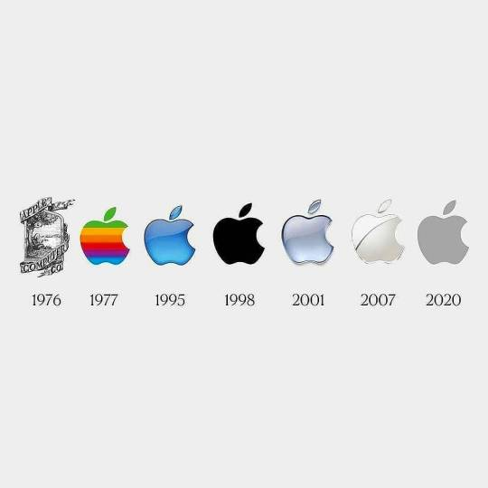
Original Apple logo design (1976)

If you came across the original Apple logo today, you probable wouldn't recognize it. It looks outdated and nothing like the Apple logo we are used to or the concept of the logo that comes to our mind when we think of Apple.
The original Apple logo was designed in 1976 by Ronald Wayne, one of Apple’s co-founders. The ribbon included the name of the company at the time, “Apple Computer Co.”, while the frame of the plaque included a quote by romantic English poet William Wordsworth: “Newton… a mind forever Voyaging through strange seas of Thought, alone.”
Inside the plaque, we can see an illustration of Newton sitting under an apple tree; the apple right above his head, and a picturesque view. This logo is enough proof of the connection between Apple and the discovery of the gravity law.
As Newton was one of the figures that revolutionized science with his discoveries, so Apple’s founders aimed to revolutionize the world with their discovery and futuristic products. As you can imagine, this original logo was short-lived. Jobs, rightfully so, thought that the logo was complicated, lacked clarity, and was too old-fashioned even for that time.
Ready to learn something new?
Check out our list of great design courses online.
The logo was not in harmony with the modern feel Apple wanted to convey. Jobs predicted the scalability problems of that logo, considering it had a lot of design elements and text, which could not be visible if anyone used the logo in a small size.
Therefore, he decided to explore something new. He wanted the logo and the name to be fused into one. And as you can see, the presence of the apple itself was pretty minimal in the initial design by Wayne.
Rainbow Strip Apple (1977-1998)

Only one year after revealing its original logo, Apple introduced a new logo with a fresh feel and a modern look, fusing its name with the logo into one. The Rainbow Strip Apple was designed in 1977 by Rob Janoff and coincided with the introduction of Apple II, Apple’s first personal computer.
The new logo design contained a rainbow spectrum to symbolize the launch of the world’s first computer that supported colors. The logo fit very well, and Apple used the now-famous “rainbow version” for 22 years.
The design process
It took Janoff about two weeks to finish the design process of the Apple logo with multi-colored stripes. When asked how he approached designing the Apple logo in an interview, Janoff said: “It was very simple really. I just bought a bunch of apples, put them in a bowl, and drew them for a week or so to simplify the shape.”
Janoff has admitted that there was no specific reason behind the use of those colors or their order. The only color requested to be at the top was green since it was closer to the leaf, and Jobs wanted to connect those two design elements.
The apple bite
There are many theories regarding the addition of the bite to the logo. Some say it was added to play around with the word ‘bite’ and ‘byte.’ Others say it was inspired by Adam and Eve and the bite of “the forbidden fruit.”
Apple has previously said that they added a bite to the logo design to make it clear to the viewers that the fruit was an apple and not a cherry or a cherry tomato.
False association with Alan Turing
One of the most common associations is the apple bite and Alan Turing, a computer scientist and mathematician who died after biting into an apple laced with cyanide in 1954. Turing’s version is almost like a real-life version of Snow White since he was poisoned by biting an apple. This association, however, is not correct and was confirmed as an urban legend by Janoff in 2009.
Another false misconception is that the leaf fits perfectly into the apple bite and can make a complete Apple. This is not true since the size of the leaf is much smaller than the bite.
The rainbow colors
There is no denying that Apple was ahead of its time with rainbow colors since many companies nowadays are using rainbow colors to stand out and to show support for LGBTQ rights. Even though today’s logo does not contain any rainbow colors, it maintains basic design and imagery.
Current apps by Apple also use a color display initially used on its ‘rainbow colors’ logo, so we can say that that’s one way the colorful version still lives on Apple products. There are other ways Apple has tried to keep the “Rainbow Colors” concept alive even in 2021, but we will get back to that later on.
The translucent Apple (1998)

This version of the Apple logo is probably the least popular one since Apple used it only briefly. The birth of this logo took place in 1998, one year after Jobs rejoined the company after being gone for twelve years.
As was expected, his return was accompanied by a rebranding of the company. It started with the re-design of Apple’s logo and its packaging. These two changes reshaped Apple’s personality at the time.
After Jobs’ return, Apple disregarded the rainbow colors and used a new translucent blue logo. As mentioned earlier, this new logo was as short-lived as the original Apple logo. The company decided to go with a solid color to better complement a metallic casing during the same year.
The monochrome black Apple (1998-2000)

As mentioned before, Apple needed a monochromatic logo to go well with the new design of the products and iMac. Therefore, in the same year, Apple introduced a new logo, all black, and discontinued the translucent logo. Apple used the monochrome logo for all its products until 2000. Just like the translucent logo, the apple shape remained unchanged.
Aqua Apple (2001-2007)

The company used the black monochrome logo until 2000. It was discontinued when the company rebranded itself with a new logo that had a more glassy look.
As the popularity of Apple was increasing, its products were becoming more and more expensive as well. Apple needed a new logo to represent that change. The new look of the logo symbolized Apple’s unique goals and aimed to transmit a sense of innovation, class, and seriousness.
The new glass logo was perfect for giving the logo a classy look. The addition of the gradient shade gave the logo a sense of sophistication. Apple used this logo from 2001 until 2007.
Metallic chrome Apple (2007-2015)

In 2007, Apple decided it was about time to give its brand a new look that would better fit Apple's branding shift towards renewability. While the metallic chrome is not a significant change from its predecessor, considering they both have a glassy look, the logo has a more “expensive” look.
We should also consider the time when the logo was changed, which was during the same period Apple shifted its focus towards renewable, energy-efficient building construction.
Apple introduced a new logo in 2007 to reflect its change in mindset and principles. The company used the Chrome version until 2015. Since it was not long ago since Apple used this logo, it is still instilled in people’s minds and is one of the most sophisticated Apple logos looks.
Flat design Apple logo (2015 - Present)
As times change and there is a global shift towards minimalistic logos using a flat design, it is no wonder Apple changed its glassy, metallic chrome look to a flat design. Today, Apple uses a minimal logo in three colors, white, silver, and black.
The company uses different colors in various products such as Apple TV, Apple Watch, and multiple iPhones such as iPhone 7 and iPhone SE. While the metallic chrome logo is one of Apple’s most beautiful logos, its minimalistic look is Apple’s sleekest design.
Apple revives its 1977 rainbow logo?
While Apple did not introduce any new logo on its products or website, Apple fans could not help but notice Apple using a revived version of its 1977 rainbow logo on its iMac ad in April 2021.
If you look at the entire ad, it is understandable while the Apple logo contained the colors of the rainbow. Since Apple is introducing iMac in several different colors, it filled its logo at the end of the video with each of those iMac colors. That does not mean that a new logo is introduced.
Several articles and Reddit threads were created to “complain” about the new logo. People also noticed the logo does not have the same fresh colors as the 1977 rainbow logo. However, it is essential to mention that the seven colors of the iMac use bolder colors. This is why the “revamped” logo uses the same bolder colors.
As mentioned earlier, colors of the rainbow have become trendy nowadays and are used in various logos and designs. Will a new rainbow logo be used in Apple products? We will never know, but there is a high chance we will see a more colorful logo soon.
Especially since the current black logo using a flat design is similar, if not the same, as the 1998 monochrome black logo. As we have seen, Apple does not rule out the possibility of reusing previous logos.
Isaac Newton and colors of the rainbow—yet another coincidence?
Even if this has not been intentional by Apple, we would like to think that there is a special meaning behind Apple’s decision to use colors of the rainbow for its 1977 logo and the new “revived” logo in 2021. Newton, who discovered the visible spectrum of light in the 17th century and separated the spectrum, made it easier to understand and differentiate between the rainbow colors.
Suppose Apple wanted to use a colorful logo in 1977 to symbolize the launch of the world's first computer supporting colors. Why use precisely the colors of the rainbow and seven different colors?
Moreover, since Apple’s first-ever logo made the connection with Newton, we have more reasons to believe the use of rainbow colors had something to do with Newton’s discovery as well. It remains to be seen if Apple will officially use the revived 1977 logo for its new products.
Any new Apple logo changes in sight?
With the rise of minimalist design, Apple is not expected to change its logo soon, especially since it is already using three different colors.
Furthermore, since the “flat” logo craze is still ongoing and relevant, the chances of Apple changing its logo any time soon are pretty slim. There is, however, a possibility of adding other flat logos using either a monochrome design or, as indicated above, a colorful flat logo design.
The fall of skeuomorphism
Your logo can make or break your brand. This is why companies, including Apple, pay close attention to its logo and revive it any time the company feels the logo is an outdated representation of its latest and current advancements.
The majority of the famous logos we know and admire today took a long journey to arrive where they are today. Some were changed drastically, while some had minor changes throughout the years.
Brands like Cartier are the exception for this topic since its logo has not changed since it was first designed in 1900. This is rarely the case with most brands out there since goals change, tastes change, and trends come and go.
Sticking with a unique, simple, and eye-catching logo that will remain future-proof is becoming harder for companies. The logo also needs to be scalable, impactful, and a good representation of the overall brand. Checking all of these boxes is becoming harder and harder since new “requirements” pop up every few years.
However, when it comes to logo design nowadays, skeuomorphism (referring to graphics that look like real-life objects or any 3D versions of any logo) is a dead concept. Creating logos that mimic real-life experience is outdated, and companies are already switching to flat logo designs.
Nevertheless, remember that skeuomorphism is not yet dead in other design trends such as user interface design. In this direction and any other cases where skeuomorphism makes it easier for users to interact with any tools they need to use, this type of design is not expected to be dead soon.
The rise of flat logo design
The rise of flat logo design, for instance, is proof that brands nowadays need to think about trends that the future will favor. It requires a great deal of research and predicting skills. Nevertheless, we have repeatedly seen that the simpler and more minimalistic the logo, the better it will stand the test of time.
Other companies switching to a flat logo design
Many other companies decided to change their design to a flat aesthetic, a two-dimensional minimalistic approach. You can find the roots of flat design in the Swiss Style and the Bauhaus movement. Returning to basics and combining aesthetic with function is what a flat design promotes.
Companies such as Airbnb, Facebook, BMW, Warner Bros, and Revolut have switched to a flat design once they understood the importance of following a minimalist approach. Other brands that use a flat design in their logos are Nike, Netflix, Microsoft, and HP.
Become a Logo Design Pro
Master the art of logo design with our comprehensive course. Perfect for all skill levels, learn to create memorable and effective logos for any brand.
Simple steps on how to create a flat design
Strip away complex design elements
If you need to make your logo as simple as possible, remove any design elements such as texture or gradient from the logo. Anything that makes the logo more lifelike should be removed if you need to make a flat design.
Keep scalability in mind
Scalability may be one of the most important things to keep in mind no matter what type of logo you design since you will use your logo in many different sizes and formats.
Therefore, it is crucial that the logo is scalable and can be seen whether it is used on a billboard or a business card. Scalability is critical when designing a flat logo, so keep it simple and easy to scale up and down.
Straightforward yypography for the win
Removing complex design elements includes typography. A flat design logo works best with simple and straightforward fonts such as sans serif ones or other fonts that are easy to read. Also, make sure to include as little text as possible.
Even if you have not passed the maximum character limit you have set, you must use as few letters as possible. If your brand is popular enough to remove all text, the flat design will look even better. Do you feel it is too early for the logo to stand out on its own without any text? Then, keeping a simple word or a two-word logo will be the best way to move forward and improve your logo’s simplicity.
Use clean, geometric shapes
Using circles, triangles, ovals, and other clean geometrical shapes will make your logo stand out. Flat designs usually include straight lines, so keep that in mind if you are in the process of creating a flat logo design or need to redesign your old logo.
Win extra points by using bold and solid colors
While a flat design encourages the removal of shading, texture, and gradient colors, it favors bold and solid colors. You are more than welcome to use vibrant colors and a bright color palette.
If you are not sure whether multiple colors will work well when designing a flat design, know that as long as you keep in mind all the “rules” above, using various colors shouldn’t stop you from creating a perfect and unique flat design.
Less is more, always
As cliché as this may sound, when designing a flat logo, less will always be more—stripping away all the things that might make your design complex will help you create an eye-catching and timeless design.
The Apple logo, for instance, had all the correct design elements to be easily turned into a flat logo. Once the gradient was removed and a bold color replaced the glassy look, the logo was simple enough to be easily switched to a bold logo that stands out without having to “scream” for attention.
How does Apple logo compare to that of its competitors?
Apple’s logo and its success have paved the way for many other companies, whether in the tech industry or other industries that are not direct competitors of Apple.
The journey of Apple’s logo, but most importantly, the journey of the company from 45 years ago until today and its ever-lasting success have become a source of inspiration for other startups and big companies trying to replicate its success.
From its upbeat and cheerful ads to its landing pages using bold statements and copy, Apple Inc. has become a reference point for many companies, especially tech startups trying to follow in its footsteps.
Apple’s biggest competitors
Leading competitors of Apple in the smartphone market:
- Samsung
- Xiaomi
- Huawei
Leading competitors of Apple in the personal computer market:
- Lenovo
- HP Inc.
- Dell
- Asus
- Acer
Leading competitors of Apple in the tablet market:
- Samsung
- Amazon
- Huawei
- Asus
Unlike Apple, the majority of its competitors use company names attached to the logo. Nevertheless, all of these companies have stuck with simple logo designs. Almost all of them are now also using a flat design to keep up with the latest trends.
Final notes
While many deep mysteries surround the origin of Apple Inc.’s name and logo, one thing is for sure: Apple-branded products have become a symbol of sophistication and wealth.
Several Apple products have also become breakthrough products; inspiring startups in tech, marketing communications, and more.
The way the company uses its symbols on products and uniquely advertises its trademark symbols has helped Apple become a “referential phrase” for various companies inside and outside the US.
Apple has become a success story from the logo design that has kept its original shape since the beginning to its inspiring journey of staying present and relevant for so many years. It has paved the way for many companies, including some of its competitors. Will the company introduce a new logo soon or re-use some of its previous ones? It remains to be seen.
Are you looking to create a modern logo for your business or a flat logo design that will withstand the test of time? There's no better tool to use than Linearity Curve (foremly Vectornator)! And here are twelve modern logos to get your inspiration flowing.
You can use Curve to create any modern logo, from a minimalist design to an abstract one. And as always, don’t hesitate to share your designs with us on social media.
Jumpstart your ideas with Linearity Curve
Take your designs to the next level.
(Cover image source: Unsplash)
Share this!
Adí Aviram
Adí is an SEO developer working for Linearity in Berlin. Her hobbies include drawing comics, yoga, swimming, infinite scrolling, and birdwatching.


:quality(75))
:quality(75))

:quality(75))
:quality(75))
