:quality(75))
:quality(75))


:quality(75))
The eighties were a fun decade of the bold, metallic eyeshadow that reached up to your brows, tasteless fanny packs, Polaroids, VHS videotapes, landline telephones with dialers, pastel colors, neon colors that burned your retina, and shoulder pads that almost touched the door frame every time you entered a room.
Add to that a crazy sticky hair mane kept up with tons of hairspray, aerobics performed with leg warmers, mullets, cassettes, acid wash jeans, BMX, breakdance, and, oh yes: watching videos on MTV or listening to music or your Walkman.
If you had a mobile phone, you had to carry a brick-sized device. There was no social media and mostly no Internet; the best you could do was a TV and a personal computer.
Everything was extra; the clothes, the hair and make-up, and the music. But let's look at 80s graphic design a little closer.
Jumpstart your ideas with Linearity Curve
Take your designs to the next level.
The technical progress of the 80s - a new graphic design
To better understand how the graphic design of the 80s decade developed, we’ll need to take a closer look at the incredible technical advancements at that time that made the visual design of this decade possible in the first place.
The first mobile phones
Mobile phones were a rarity, used mainly by politicians or business people and not by the general population. Old mobile phones existed even before the flip-phone models from the mid-nineties!
The first cellphone ever was designed in 1973 by Martin Cooper. It was a prototype.
He later designed the first cell phone for mass publication for the brand Motorola, the Motorola DynaTac 8000X, lovingly called "the brick" in 1983.
The device weighed a whopping 2.5 pounds and had a concise battery life of approximately 30 minutes. The price was $3,995, which equals about 10 000 dollars in 2022. The charging of the device took about 10hrs.
The phone reached iconic status when it was used in the 1987 film Wall Street by the main protagonist Gordon Gekko. This was twenty years before Steve Jobs announced the first iPhone in 2007.
Below you can see the mobile phone model, the 'Nokia Mobira Talkman,' which was built in 1984, and unfortunately, the battery endurance was as short-lived as the "brick" model.
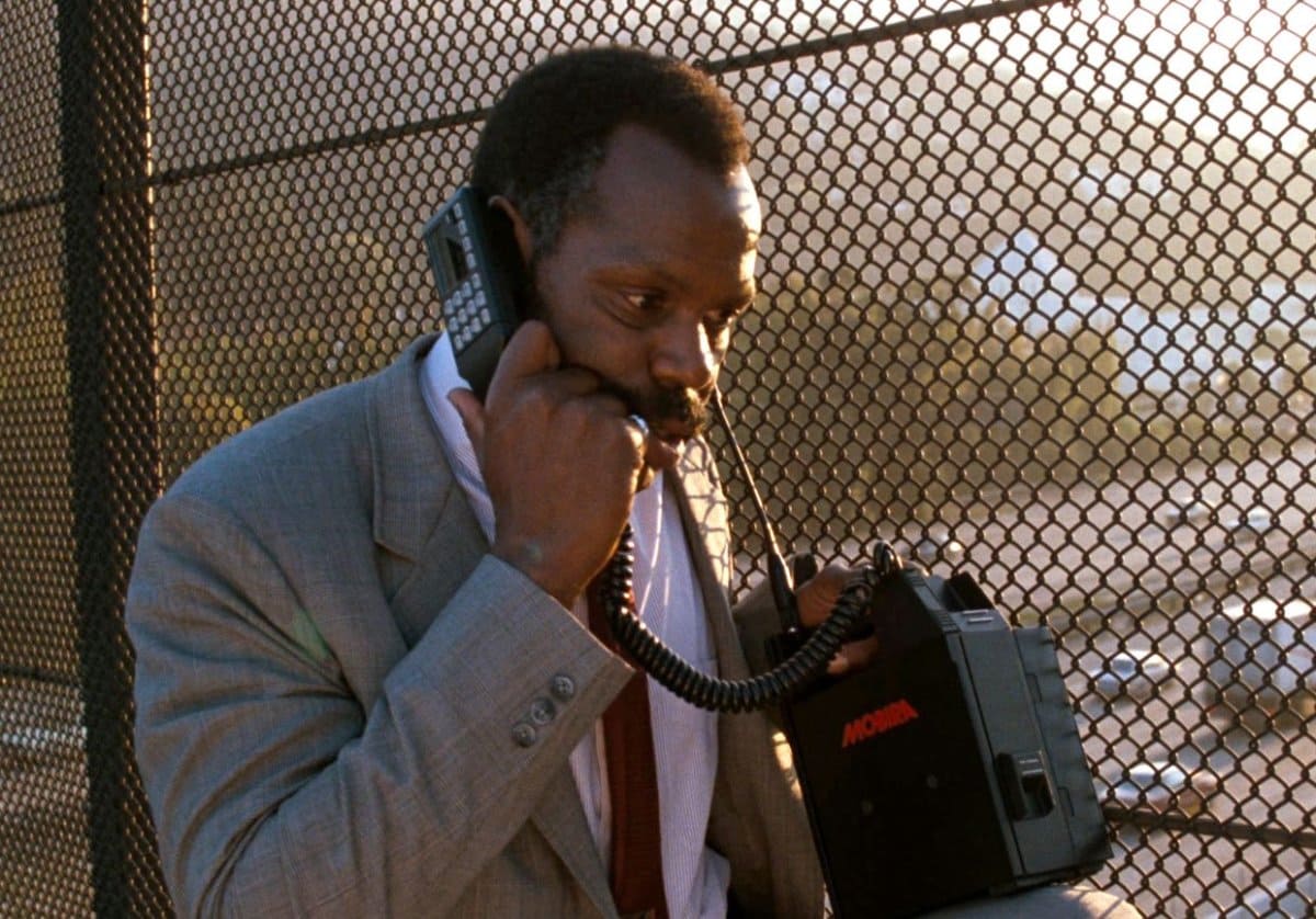
It wasn’t possible to send any text messages or take pictures. Due to these limitations, photography, image editing, or graphic design played no role in the consumer market of mobile phones. The only design aspect that had to be considered was the device's design.
The internet of the 80s
During the 1920s, developed Newswire services in the 1920s could technically be called the first modems. The first Digital modems were created during the 1950s to transmit data for the North American Air Force.
The Internet was first created in 1969 by a group of scientists at UCLA. They made the first network connection. They connected two different machines on the campus virtually. This system was known as ARPANET and was the prelude for the Internet.
Ray Tomlinson sent the first e-mail in human history in 1971. He invented the commonly known @ symbol to signify the recipient's e-mail address. Nevertheless, the e-mail exchange was still elusive to the public then.
Tomlinson wanted to send messages between computers connected to the same network. At that point, the so-called intranet had no websites or public access to these internal networks.
In the 80s, you had to use the pre- dial-up system USENET. It was a dial-up that used a modem to access the Internet.
The Internet during the decade of the 80s was still in its developmental phase. The global Internet further developed in the academic space and for commercial use in the latter half of the 80s or the data exchange via the Internet, Fidonet, USENET, and the Bulletin Board System. In 1989, Tim Berners-Lee developed the concept of the World Wide Web, which he had been developing since 1980. In 1989, the Internet and networks of most first-world countries were linked to a global system of transatlantic satellites. These were the first commercial internet services available.
However, until the early nineties, the first website ever went online. On August 6, 1991, the first website in human history went online. The website was developed and published by Tim Berners-Lee.
Graphic design for website content during the 80s was nonexistent, as no websites were online. The only aspect of the internet influenced by graphic design was the font types and graphical user interface. Graphic design for the internet was mainly used in print ads to advertise the advancements of the internet.
The first generation of personal computers
In the early to mid-80s, the first mass-produced Personal Computers were introduced. The first color displays with mid to high res resolutions were developed then.
The display with a significantly higher resolution than the previous models and a color display, the first generation of Personal Computers, opened the door to a whole new world of graphic design.
The IBM personal computer
One of the most significant dates in Computer history was August 12, 1981. IBM released on this day the first mass-produced Personal Computer, the model 5150.
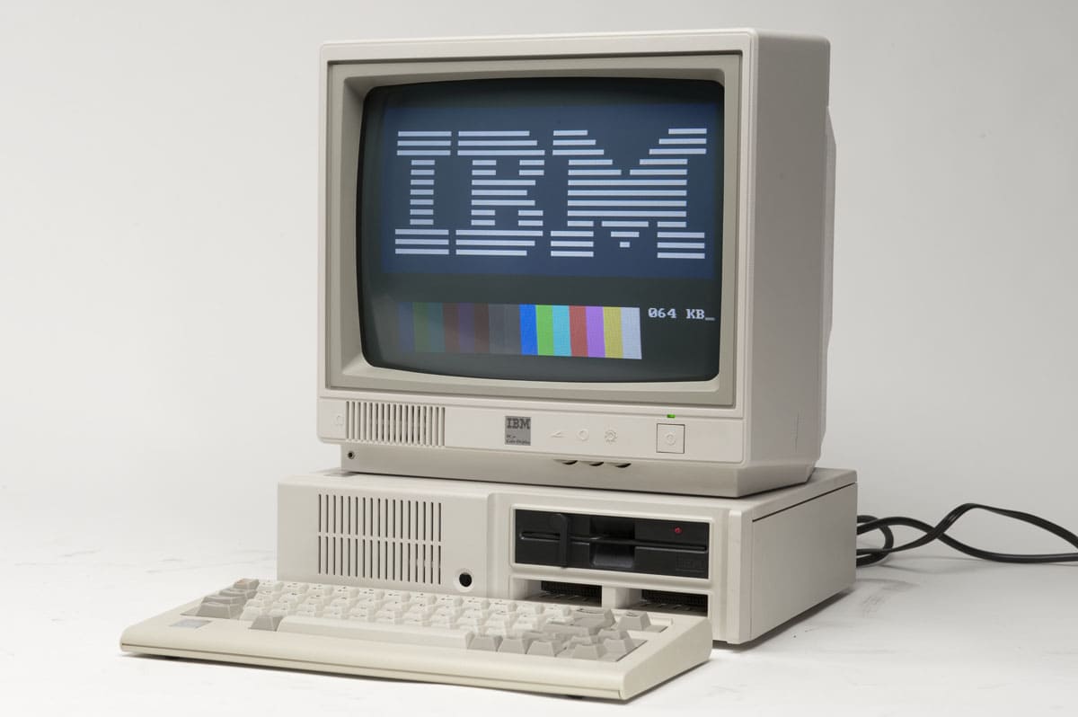
The model was available with a CGA (16 colors) or monochrome display adapters (MDA). It was very unusual at that time to offer two different graphics options.
The MDA option could display high-res monochrome text, and the card included a printer port. The CGA version could display low to medium res color graphics and text. It had the same scan rate as NTSC, meaning it could be used with a TV or composite monitor.
The model significantly influenced the PC market and became the industry standard. The majority of current PCs are based on this industry standard. At that time, Apple was the only competition from a non-compatible platform for IBM.
Get creative with our ready-to-use templates.
Linearity Curve offers templates for every social media platform and various use case templates for posters, business cards, slides, app store screenshots, and more.
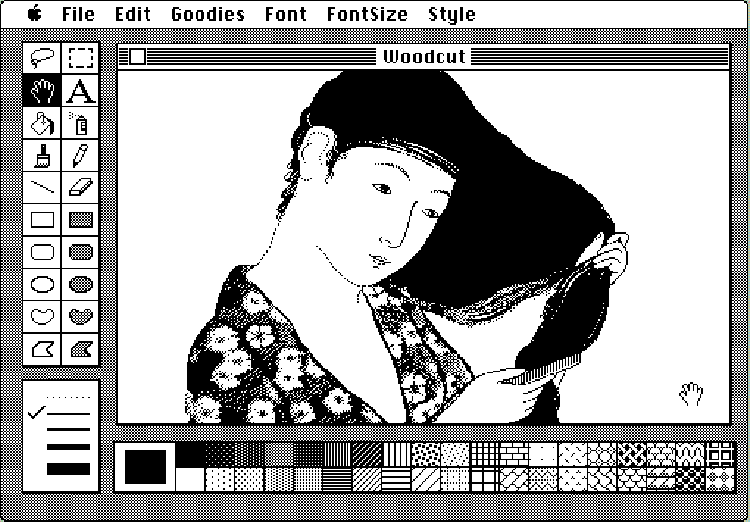
The Quantel Paintbox
Quantel released 1981 the Paintbox, a graphical color workstation that supported a mouse input oriented for graphic tablets. Additionally, it was the first model that implemented pop-up menus.
The model was aimed at TV and commercial use, but also professional artists. One of the most well-known uses of Paintbox is the promotional music video from 1986, “money for nothing” by Dire Straits. It became one of the most often played videos in 1987.
The Paintbox was the primary tool used in producing the graphics for the 1985 British television series Max Headroom.
The Apple Macintosh personal computer
During the 80s, a significant breakthrough in the history of computers occurred. On January 24, 1984, Apple, led by Steve Jobs, introduced the Macintosh 128k.
It was the first mass-produced personal computer that featured a mouse and a graphical interface.
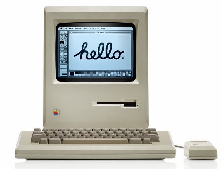
This is the first home computer that was available to the masses. In the late 70s, computers were primarily used by scientific and governmental institutions. The 80s opened the door for the public to use a home computer.
The brilliant American graphic designer Susan Kare designed the interface of the Macintosh. She drew inspiration from the pointillistic art movement, mosaics, and needlepoint. She designed desktop symbols still used today: The Grabber, the Lasso, and the Paint Bucket. She was also responsible for the design of the typeface Chicago.
It was the first commercially successful device with an integrated multi-panel window interface, a desktop with desktop symbols. The term desktop was first coined for this interface as it displayed many desktop accessories such as an alarm clock, a calculator, and a notepad.
The first Apple Macintosh home computer paved the way for the use of graphic design software by the public.
The Commodore personal computer
The commodore company was one of the other major players in the personal computer market segment. In 1983, the first portable computer, the commodore SX-64 with a 5-inch color monitor and one or two 5.25-inch floppy drives, was introduced by Commodore.
In 1985, commodore introduced its first Personal Computer, the commodore 128.
The device contains three functions in one: It’s a Commodore 64, with a new 128kb and CP/M mode. One of its major competitors, Apple, was Commodore in the Personal Computer market segment. The company declared bankruptcy in 1994.
Printers and tablets
Printers
The printer technology in the 80s progressed from the inkjet to the laser printer model. Laser printers had several advantages over the previous inkjet printers: They were significantly faster than inkjets and more precise. Inkjet printers print just a section of a page, and laser printers print the entire page at a time. This technique is much better suited to printing graphic images combined with text created with computer software.
The Xerox Star 8010, the first laser printer designed for use with a single computer, was released in 1981. It was an innovative but expensive device ($17,000) purchased only by a few laboratories and institutions. The first laser printer manufactured for the mass market was the HP LaserJet 8ppm, launched in 1984 and using a Canon printer controlled by HP software. The HP LaserJet was quickly followed by other laser printers from Brother Industries, IBM, and other manufacturers.
The Apple ImageWriter, a dot-matrix printer launched in 1984, could impressively put Mac screen graphics on paper. The incomplete output of the ImageWriter, while outstanding for the time, could never compete with professional typesetting.
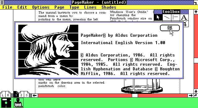
As Apple developed the LaserWriter for the Macintosh and Aldus PageMaker software in 1985, the laser printer played a critical role in popularizing desktop publishing. It allowed users to create documents that previously would have required professional typesetting.
In 1985, Apple presented the LaserWriter, the first laser printer. Today, few can remember the impact of this heavy printing machine from Apple on the way the world uses computers, much like the Macintosh itself. Along with Apple's famous PC, the LaserWriter brought the personal computer to the world of graphic design and publishing.
By 1985, the Macintosh represented a quantum leap for graphic designers in terms of the ability to edit graphics and text dynamically. But without a tool to put these designs into print, the Macintosh could only be dismissed as a fancy toy with little real-world application.
With the LaserWriter and a Mac, a person could sit down, type text into a computer-designed page layout, and get a printed copy in minutes. From there, the user could either print a few copies, make photocopies for distribution, or send the design data to a printer for mass reproduction after checking an accurate test print on site.
Using the Aldus Pagemaker page layout program and the Laserwriter, you could design letterhead, business cards, and product data sheets for a small business and print them.
Tablets
In the 1980s, several manufacturers of graphics tablets offered additional functions, such as handwriting recognition and the integration of menus on the tablet. In the 1980s, the first color graphics tablets were launched.
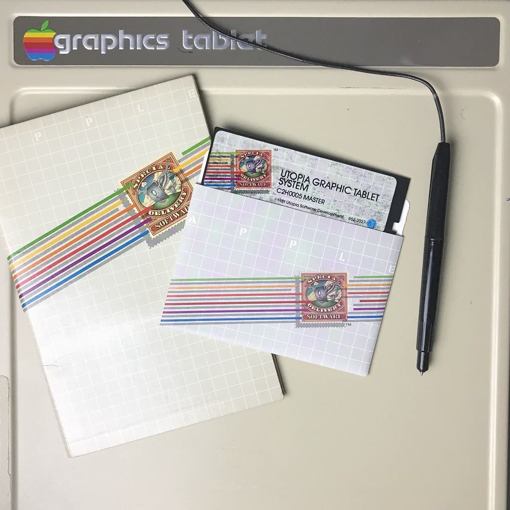
The Utopia Graphic Tablet System
In 1981, musician Todd Rundgren developed the first color graphics tablet software for the personal computer, which was licensed to Apple under Utopia Graphic Tablet System.
In 1981, the Quantel Paintbox color graphics workstation was also launched; it was the first model equipped with a pressure-sensitive tablet.
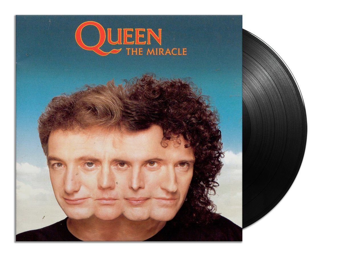
Some of the most impressive graphic design work created with the Quantel Paintbox Workstation and tablet include Dire Straits' 1985 Money For Nothing video and the album cover for Queen's 1989 Miracle album.
In 1985, the famous American painter David Hockney released the documentary film "Painting with Light", demonstrating his painting process using the Quantel Paintbox tray.
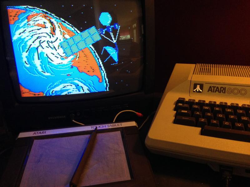
The KoalaPad tablet
The first graphics tablet for home computers was the KoalaPad, launched in 1983. Initially developed for the Apple II, the KoalaPad was eventually extended to virtually all home computers with graphics support, for example, the TRS-80 Color Computer, the Commodore 64, and the Atari 8-bit family.
The Wacom tablet
In 1984, Wacom introduced its first tablet, the WT-460M. (The company had been founded in Japan the previous year.) The company had initially made a name for itself by offering tablets with wireless pens rather than the wired devices for which competitors like Summagraphics were known at the time. The company was founded when many companies entered the computer-aided design (CAD) boom, and the company's initial offerings focused on the drawing device market.
Atari was one of the competing tablet producers whose devices were considered of high quality.
The first video game consoles
The first home console was created in 1972 by Ralph Baer and manufactured by Magnavox. The console was called the Magnavox Odyssey. Baer also created the ping pong game for Odyssey.
During 1980 -1989 video games progressed dramatically, and with that, the graphic design possibilities for video games too. The big players in the video game console market were Commodore, Atari, Nintendo, Mattel, and Sega.
The golden age of arcades
The 80s were the golden age of the Arcades, free-standing coin-operated towers with built-in screens and control elements. For a few bucks, you could play a video game such as Donkey Kong, Space Invaders, Super Mario Bros, and Pac-Man. Arcade machines were installed in public places such as bowling alleys, restaurants, shopping malls, airports, laundromats, and movie theaters. Arcade halls were explicitly built to install multiple Arcade devices. Arcade games somewhat replaced the beloved pinball machines from the 60s and 70s.
The top 10 Arcade games for every year from 1980 to 1989.
The outer cladding of the arcades was painted entirely with scenes and figurines from the film with strongly contrasting colors.
The interface menu of the arcades was designed with a pixel font that was very prominent during the 80s.
It was common for kids and teens to gather to play Arcade games together. Gaming was a social event, often occurring in public spaces. Arcade video games accounted for the largest share of video game market revenue until the late nineties. This happened because home consoles such as Sony PlayStation and Microsoft Xbox dramatically increased their gameplay options and graphics resolution in the early 2000s.
Graphic design in the 80s
The 1980s were sensational. The bright neon colors, jagged typography, and hair-raising designs caused a stir.
Thanks to the introduction of design software, graphic designers could create 3D images and easily edit layout, color, and shape. Graphic designers were able to experiment and try new things. This led artists to move away from the earlier contemporary typefaces. They combined type families, sizes, and weights to create a disordered, spontaneous typeface. This "new wave" approach led to the development of the Deconstructive Typology movement, characterized by a non-linear typeface incorporating a spacial layout.
As a result, the design in the 1980s was progressive and cool. Designers developed their style. People used different geometric patterns, complementary color schemes, and new technologies to give the design a "futuristic" expression. In the 1980s, people were forward-thinking and wanted to visualize the future.
The focus of the 80s was on flashy, eye-catching colors that drew attention. PCs became accessible to all and made design tools available to all. In 1985, Microsoft introduced Windows, which meant people no longer had to learn MS-DOS to operate a computer. With only a few clicks you could design anything.
The decade was also known for its large, blocky text. Imagine cartoon text reminiscent of graffiti, and you have an idea of the typography of the decade. Apple released MacPaint for Macintosh computers in 1984, which allowed designers to use computer graphics effortlessly, such as with a mouse or graphics tablet. Postscript allowed designers to place types and pictures on the same page and send them to print rather than assemble designs at the drawing table.
:quality(75))
:quality(75))
The graphic design software of the 80s
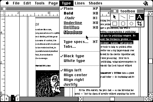
The first image editing program, SuperPaint, was created by Richard Shoup, Alvy Ray Smith, and Thomas Porter for Xerox PARC in 1973. The program was based on a frame buffer system that was pixel-based. The second breakthrough in the use of graphic design programs occurred with the introduction of the Macintosh personal computer in 1984. During the 80s, pressure-sensitive tablets with color monitors were accessible to the public. They made it possible to use the first commercially available design software programs such as Page Maker (1985), Illustrator (1987), Freehand (1988), and Photoshop (1990).
Before Adobe assimilated the competition to become the current graphic design market leader it is today, the 80s were dominated by software companies such as Aldus, Altsys, Macromedia, Xerox PARC, and Quark. Let's dive deeperThe corporate brochure was designed with MacPaint and printed with the Apple LaserWriter in into the first commercially available Graphic design software developed in the 80s!
SuperPaint
Although first published in 1973 by Yerox, SuperPaint, was the first image editing program and paved the way for the following graphic apps developed in the 80s. It was the earliest software with a#graphic interface that could use computer technology to digitally edit images or video and offer the features of Image and video editing and computer animation.
SuperPaint could change the Hue, Saturation, and Value of image and video data, applying a preset color palette and drawing custom polygons and lines, and was the first application to feature anti-aliasing.
The software was used in the TV and film industry and industrial design. NASA used SuperPaint in 1978 to illustrate the Spacecraft missions to Saturn and Venus.
In the 80s, Shoup left Xerox and founded the graphic design company Aurora Systems; Smith joined Industrial Light and Magic, responsible for the special effects of Lucasfilm. Later, this division became the foundation for the establishment of Pixar.
Shoup, Smith, and Thomas were awarded an Academy Award for the groundbreaking development of SuperPaint.
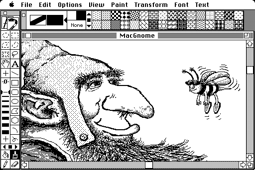
Mac Paint
MacPaint is a raster graphics software developed by Apple Computer and released with the original Macintosh 128K in 1984.
The Macintosh was released in 1984 with two programs, MacPaint and MacWrite. In November 1984, for a special post-election issue of Newsweek, Apple spent more than $2.5 million to buy all 39 advertising pages in the issue. Numerous pages of the Newsweek ad explained how MacWrite and MacPaint worked together.
What made MacPaint special was that it could create graphics that other programs could use.
MacPaint worked with two off-screen memory buffers to avoid flickering when shapes or images were dragged across the screen. One of these buffers stores the existing pixels of a document, the other the pixels of the previous state. The latter was used as the basis for the software's undo function.
The original version was developed and written by Bill Atkinson, a member of Apple's original Macintosh development team. Working for the Macintosh team, Susan Kare designed MacPaint's user interface. Kare also beta-tested MacPaint before its release.
The software was later developed further by Claris, Apple's software subsidiary, founded in 1987. In 1988, the last version of MacPaint, version 2.0, was released. Due to declining sales, the program was discontinued by Claris in 1998.
Adobe Illustrator (AI)
Adobe started developing the Software Adobe Illustrator for the Apple Macintosh in 1985. The software was published and shipped in 1987. Adobe Illustrator was conceived as a companion product for Photoshop. While Photoshop was created for raster-based digital photo manipulation, the vector-based Adobe Illustrator was explicitly designed for typesetting and Logo Design.
The vector-based approach allowed the user to draw cúrves and adjust them with the Bézier Curve function, the perfect tool to create sharp and evenly curved lines.
The vector-based approach of Illustrator made the designs created with it infinitely scalable, contrary to the raster-based software programs.
Below, you can watch the first ever published tutorial for Adobe Illustrator in 1987:
In the video, you can see the Pen Tool, already equipped with the Bézier curve functionality, and the Text Tool, elements that are the primary stake of graphic design apps even in current times.
Pagemaker
In 1985, Aldus introduced PageMaker as one of the first desktop publishing programs. A graphic software initially developed for the Apple Macintosh and, starting in 1987, for PCs running Windows 1.0. Programmer Paul Brainerd saw a gap in the market for a product that could take advantage of the Apple Macintosh's graphical user interface.
When Aldus Corporation launched PageMaker 1.0, it marked a revolution in the publishing industry. Suddenly, anyone could now design brochures by creating a layout containing text and images. Publishers needed to become computer-literate, so Apple began selling Macintoshes and LaserWriters in large numbers.
PageMaker is an application based on a graphical user interface and helped establish the Macintosh platform and the Windows environment. The PageMaker program is based on Adobe Systems' PostScript page description language.
Postscript
To appreciate PostScript, you must know how the market worked before it became available. In the early 1980s, if you needed a typesetter, you went to Acme Typographers, who would sell you an Acme system with an Acme output device. Then you had to take a two-week training course to learn how to use the system. The Acme system is incompatible with other manufacturer's devices. Data exchange with other systems was difficult or impossible in most cases.
Owners of a personal computer could connect it to a dot-matrix printer, which outputs only inferior bitmap images. Graphics could be created, but the quality was acceptable only to the nerds who bought computers at the time.
PostScript was introduced to the market in 1984. Originally it was called PostScript. The addition of "Level 1" was later added to distinguish it from the newer Level 2 version.
It is a potent language that looks like Forth, another computer language. From the beginning, PostScript required a reasonably robust system on which to run. In fact, in the early years of its existence, PostScript printers had more processing power than the connected Macintoshes.
Postscript offered tremendous advantages unavailable to other systems. It is independent of devices. The PostScript file can run on any PostScript device. You get 300-dpi output on a laser printer, while the same file delivers excellent, crisp 2400- or 2540-dpi output on an image setter. Users were thus no longer tied to one manufacturer and could choose the devices that best suited their purposes.
Thus, any manufacturer could purchase a license for the PostScript interpreter and use it to build an output system.
And since the PostScript specifications (syntax) were freely available, anyone could write software that supported them.
PostScript was a considerable risk for Adobe, and the company might not have managed to convince the market of its value if Steve Jobs of Apple Computer hadn't supported it.
In 1985, sales of the Macintosh computer began to decline, and Apple needed a top application for its new model. Apple needed a killer application for the new model. Enthusiastic about Adobe's technology, Steve Jobs invested $2.5 million in the company and convinced Warnock to develop a PostScript controller for the Apple LaserWriter.
FreeHand
James R. Von Ehr founded Altsys Corporation in 1984 to develop graphics applications for personal computers. The company initially produced font editing and conversion software: Fontastic Plus, Metamorphosis, and the Art Importer. In 1986, Fontographer, the first PostScript font design package, was released, making it the first such program on the market. While Fontographer laid the groundwork for PostScript, Altsys was also developing FreeHand (originally called Masterpiece), a PostScript-based illustration program for the Macintosh that used Bézier curves for drawing and was similar to Adobe Illustrator, announced as a Macintosh graphics program with all the features of Adobe's Illustrator, plus drawing tools identical to those in Mac Paint and Mac Draft and special effects similar to those in Cricket Draw. Aldus Corporation made a licensing agreement with Altsys Corporation to market FreeHand and its flagship product, Pagemaker. In 1988, Aldus FreeHand 1.0 was released.
Altsys developed FreeHand, while Aldus controlled marketing and distribution. After 1988, the Macintosh platform saw competition between Aldus FreeHand and Adobe Illustrator, with both programs developing new tools, achieving more incredible speed, and adapting significant features. Thanks to the development of Windows PCs, Illustrator 2 (also known as Illustrator 88 on the Mac) and FreeHand 3 were released to the graphics market as Windows versions.
In 1988, FreeHand 1.0 was sold for $495. The program included the standard drawing tools and features of other drawing programs, including special effects for fills and grids, text editing tools, and support for CMYK color printing. It was possible to create and insert PostScript processes anywhere in the program. In 1989, FreeHand 2.0 was sold for $495. Not only did FreeHand 2 improve on the features of FreeHand 1.0, but it also offered faster workflows, Pantone colors, dotted text, a flexible fill pattern, and an automatic import of graphics from outside programs. And it added precise control over what was displayed on a color monitor, only limited by its resolution.
Adobe Photoshop (PS)
Adobe, a raster-based image and photo editing software, was first developed in 1987 by the brothers Thomas and John Knoll, who sold the license and distribution rights to Adobe in 1988. The first official Adobe 1.0 Photoshop version was published in 1990. Adobe Photoshop had no significant impact on the graphic design of the 80s, but its foundation was laid in the late 80s.
80s color palettes
Every decade has its distinctive color palette or even several color palettes. Let's take a look at the colors that visualized the 80s aesthetic.
The neon color palette
The bright colors of the 80s design styles were dominated by bold and saturated neon colors and jewel colors. The background was often kept in dark blue, dark purple, and black and contrasted with saturated neon pink, neon yellow, neon green, neon orange, and intense saturated blue and purple hues.
The clash of the black background with the bold and contrasting colors created a color-blocking solid effect.
During that period, you could observe a complete lack of earth-toned colors that were more prevalent during the 70s and to some degree in the 60s.
These intense colors of the neon style reflected the orientation to the future and progress by displaying the bold colors of fluorescent lights, chemically produced materials, and artificial coloring of modern times.
The 80s featured a color palette that symbolized artificial colors that completely opposed the earthy colors of nature. These Artificially created colors represented artificial, fluorescent lighting, synthetic coloring processes, and materials.
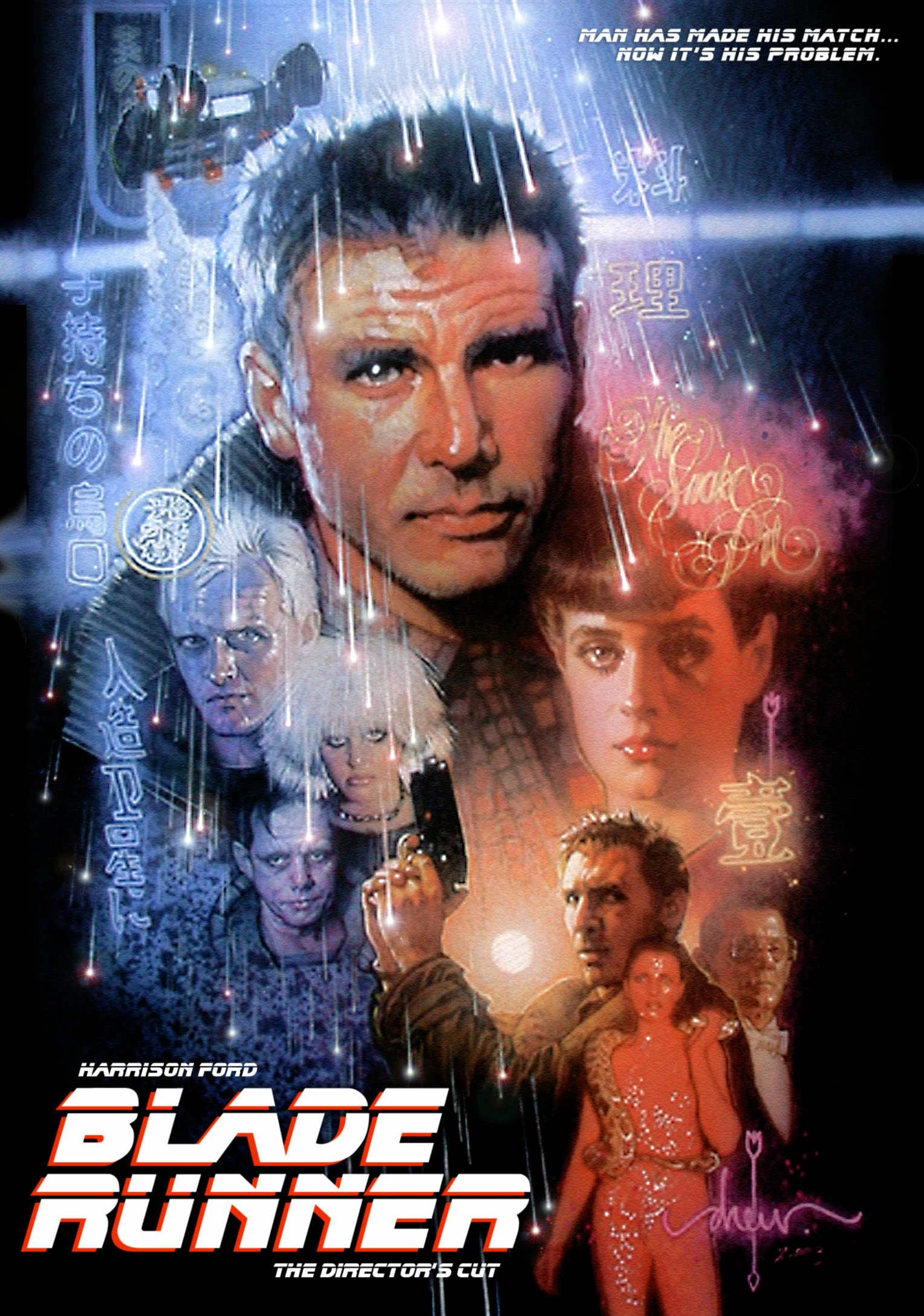
It is no coincidence that the palette was used primarily in the cyberpunk film genre that emerged during the 80s decade, such as Tron (1982) and Blade Runner (1982).
Interestingly, the color pendulum swung back in the decade of the nineties to a deeper, more earth-toned, and subdued palette during the grunge period.
The 80s pastel colors
Another prominent 80s color trend was pastel colors. Especially during the early 80s, the pastel color trend peaked, and the intense neon color palette later contrasted with the pastel color palette in the mid-to-late 80s.
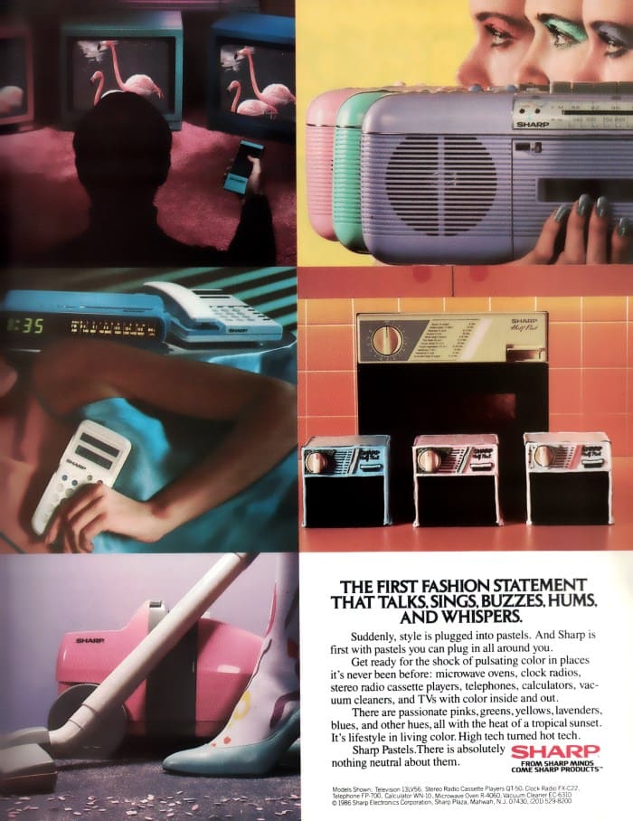
It was a more subdued look than the bold neon palette. The focus was on softness and delicacy instead of progress and technology. One of the favorite patterns to combine with the pastel trend was flowers. Especially in interior design, the pastel trend was initiated by the home decors of Laura Ashley. The color mauve was one of the most popular colors.
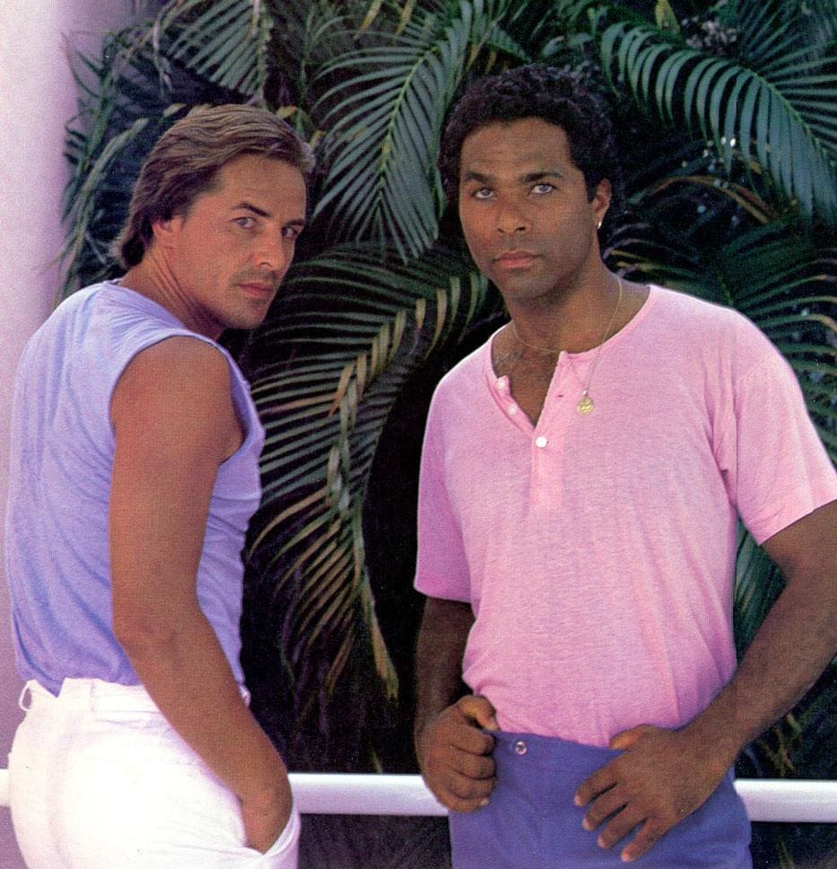
The movement for pastel colors, especially pastel pink combined with a pastel turquoise, was further initiated in the 1980s television series Miami Vice. The series paved the way for pastels in men’s fashion.
80s typography
Typography in the 80s was crazy, bold, and experimental. Before the technical advancements made available in the 80s, graphic designers had to go to a typesetter and get their marketing ads, magazines and newspapers printed. These graphic designers now had a personal computer, a laser printer with new graphic design software, and layout programs, which offered many options to align and stylize their lettering in ways that weren't possible before.
The typical bold 80s neon color palette was contrasted sharply against a pitch black or a dark blue or dark purple background, making the bold letters pop even more.
"The idea that the average person on the street might have a favorite font was a radical thing."
Thomas Phinney, senior product manager for typography with Extensis
And boy, they went wild with all these new options in digital layout and typesetting!
The software and hardware were now finally available, and all lacking were modern, accessible fonts! The challenge was to design stylish but simultaneously readable fonts.
Crucial in the process of the development of modern layout fonts are Steve Jobs and his highly skilled Apple team.
With the release of the first Macintosh in 1984, Jobs became a groundbreaking pioneer by offering his users a great variety of digital fonts to choose from.
Jobs' new designs had a certain quality to their appearance and naming. They were given names of cities he loved, such as Chicago and Toronto. They were meant to be as distinctive and beautiful as the calligraphy he had encountered a decade earlier, and at least two of the typefaces-Venice and Los Angeles-had a handwritten look.
The biggest sensation was that the users could choose from various fonts, with or without serif. It was even possible to set varying spaces between the letters.
This was one of the greatest revolutions in digital lettering.
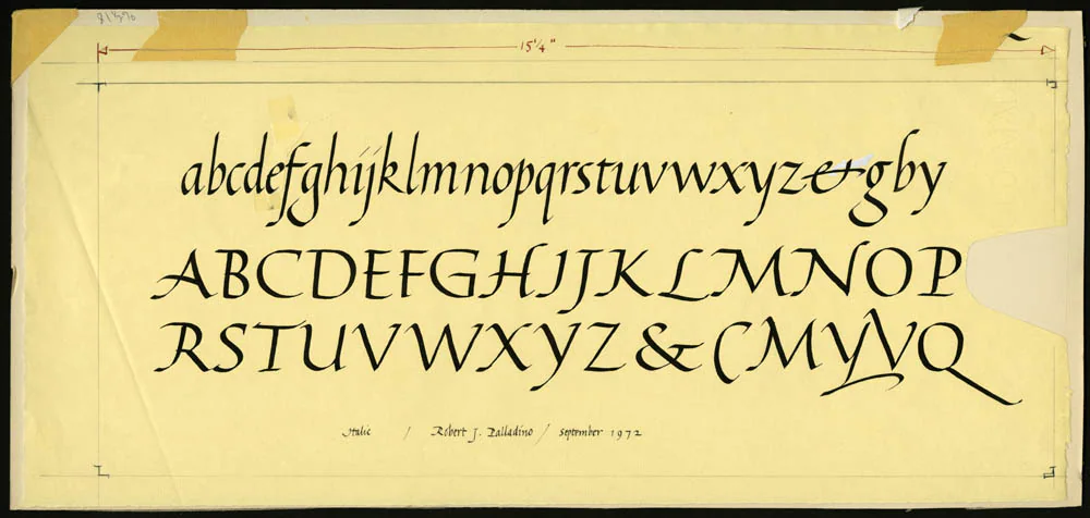
Legendary is the story of Jobs attending Reed College in Oregon and meeting the brilliant Trappist monk, calligrapher, and academic Robert Saladino.
Steve Jobs
Saladino, who never owned a computer during his life, taught Jobs the importance of aesthetics and skillfully using curves and lines in lettering.
Jobs hired the brilliant designer Susan Kare who not only designed the first desktop, including the desktop icons, but also developed several fonts for Apple, such as Chicago, New York, Geneva, Los Angeles, and Cairo, to name only a few.
The Cairo typeface
For the design of the typeface Cairo, Kare took Ancient Egypt hieroglyphs as a source of her inspiration. She designed it in the early 80s on a bitmap grid. The font was first published with the Macintosh 128k in 1984.

Kare sketched a grid of 32 by 32 squares. The 1024 squares each represented one pixel and were supposed to simulate the bitmap display of the early Apple interface.
The font elements of the Cairo typeface and the desktop icons designed by Kare were the first digital Dingbats, for many, even the precursor of the emoji design that is omnipresent today.
The art deco typefaces
The '80s saw a strong revival of elements of art deco in design. This was also noticeable in a bold typography. The Art Deco revival typography of the 80s was sans serif, had thick, additional strokes, and displayed strong ornamentation, angles, and curves. Hard edges and chevron patterns were omnipresent.

The most beautiful 80s Deco fonts have double, triple, or multi-line stroke details. 80s Art Deco typefaces can be angular or curved, elegant or playful. Still, all have the sophisticated sophistication we associate with the original era of Art Deco at the turn of the 20th century.
Many 80s Art Deco-inspired typefaces use only uppercase letters, and almost all display typefaces because they are highly decorative.
:quality(75))
:quality(75))
The chrome metal typeface
Typical for the type design was the chrome metal type design, block-like, solid letters with light reflections that imitated the chrome material. During the '80s, this chrome lettering was seen everywhere, in toy commercials, video games, and movies.
The letters were reflective with detailed shadows, making them look like extruded 3D objects.
These letters were preferably arranged in futuristic space backgrounds, often covered with grids and glowing neon-colored background elements.
The chrome look reflected advanced technology and progress, the euphoric look to the future because that is what the 1980s advertising wanted to convey, progress and the excited anticipation of the future.
LCD digital fonts
LCD digital fonts were all the rage during the 80s decade. The digital aspect of the font rode the wave of the 80s enthusiasm for all things progress and future related. The popularity of this font type symbolized the switch during the 80s from classic analog to digital watches.

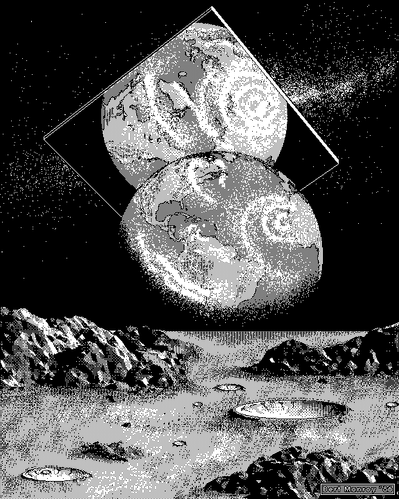
The 80s graphic design styles
The form language of the 80s
Every Decade has its distinctive language of favored signs and objects. During the Decade of the 80s, there were several distinctive style elements:
- Glowing grids with a space background
- Neon colors, often imitating fluorescent lighting
- Sunset with blinds
- Fast cars racing on neon grids
- Dramatic lighting bolts
- Greek sculptures and columns
- Tropical style elements such as palm trees and flamingos
- Blinds
- Art Deco-inspired zigzag lines and geometric 80s patterns with pronounced angles
- Glass cubes
- Aviator glasses
- Chrome metal and LCD digital display typography
- Gradients
- Exotic animals such as flamingos and panthers, mythical creatures such as unicorns
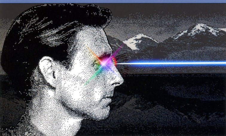
- Prisms with reflecting rainbow-colored light rays
- Neon-colored glow or laser beams
The neon noir/tech-noir style
The neon-noir/tech noir style took the gloomy and dark tone and chiaroscuro lighting of the film noir of the 40s and 50s period and developed it further into the 80s aesthetic by adding fluorescent neon lights, futuristic style elements, and palm trees. It was an evolution of the old black and white film noir style with the addition of bold neon colors and futuristic elements.
The movie poster for the 1988 film License to drive is an excellent example of the neon noir style, with its fonts with partial script in neon colors. It is a perfect example of the Neon noir aesthetic, with its dark background creating a bold contrast against the neon colors. Typical for the 80s is the sports car combined with palm trees and a gradient background.
Tech-noir, also known as cyber-noir, future-noir, cyberpunk, and science fiction-noir, is a hybrid genre of fiction that combines film-noir and science fiction in particular, represented by Ridley Scott's Blade Runner (1982) and James Cameron's The Terminator (1984).
Technology is portrayed as a destructive and dystopian force that threatens all aspects of our reality.
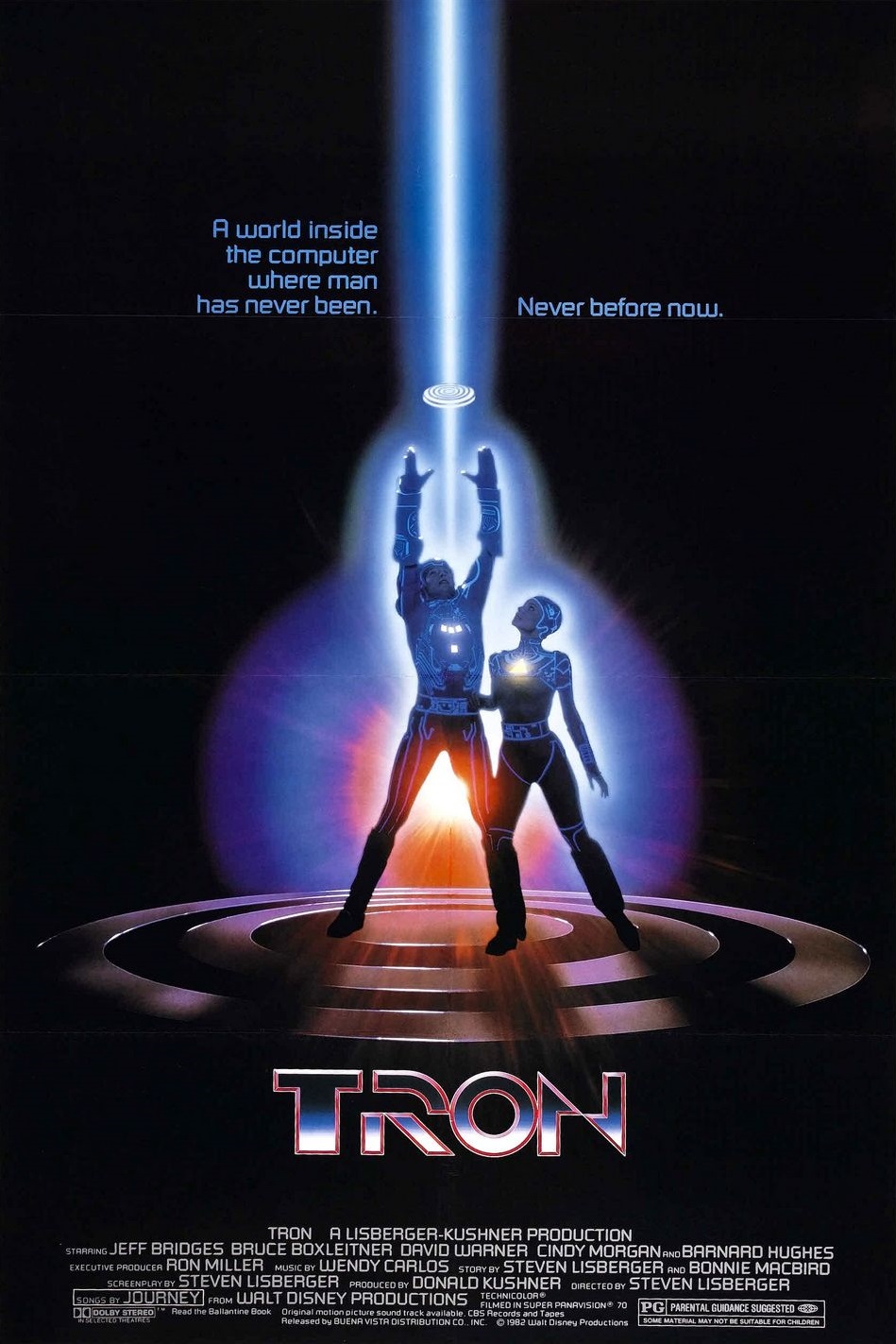
One of the films that captured the topic of speed and progress in film noir aesthetics is the film Tron from 1982.
The film featured dark backgrounds with superimposed film material and contrasting neon-colored accents on the protagonists' clothing and background elements.
It was one of the first movies to extensively use any form of computer animation, and it is regarded as a milestone in the film industry.
Retro Art Deco (The Memphis-Milano Style)
The Memphis group, also known as Memphis Milano, was founded by Ettore Sottsass and was an Italian design and architecture group. The group worked actively together from 1980 to 1987. The group designed postmodern furniture, lighting, fabrics, carpets, ceramics, glass, and metal objects.
The group was heavily influenced by the geometric form language of the sharp and geometric shapes of the Art Deco design period.
Geometric shapes were arranged in bold contrasting colors, creating a color blocking effect. Interestingly, the design movement swapped over into the graphic design realm. Patterns with geometric shapes were suddenly used everywhere; there could be found on posters, magazine ads, merchandise, and TV series title design.
80s graffiti and street art
During the 1980s, graffiti and street art gained substantial momentum with the Hip Hop movement in America. The subways of New York were covered in graffiti lettering proclaiming political statements.
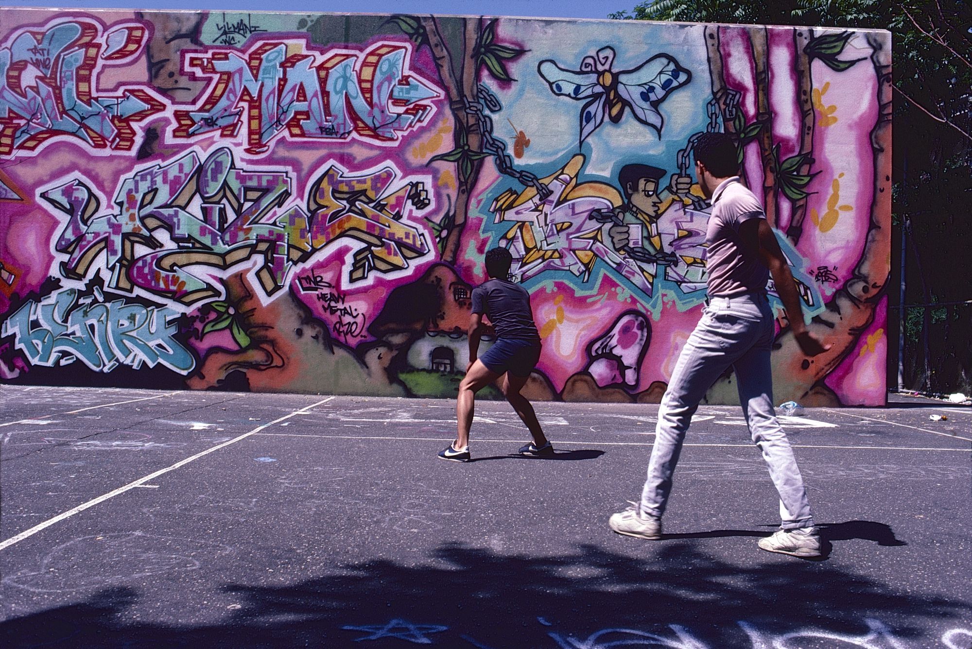
The block-like bold colored lettering of graffiti street art with its vibrant colors, sharp, wild, and geometric angles and bold patterns significantly influenced the lettering style and fonts of the 80s. Technology finally made it possible to recreate the bold graffiti style and incorporate it into commercial graphic design.
One of the most famous American artists and mural painters was Keith Haring. He created a visual language of simplistic elements with thick black outlines that were heavily influenced by the bold outlines of the cartoon style and geometric shapes and the Pop art movement of the 80s.
Haring was deeply connected to street art as he created many public murals still intact today and wanted to convey social and political messages against discrimination due to race, gender, or sexual orientation.
Graphic design in 80s video games
Physicist William Higinbotham developed the first video game, the game "Tennis for Two," in October 1958; yes, you read that correctly. This was a simple tennis game, similar to the classic video game Pong from the 1970s, and it was quite a success at Brookhaven National Laboratory's open house.
Nevertheless, video games had to come a long way to be available to the public. The first mass-produced video game consoles were available to the public during the early 1980s.
The video games during the 80s decade consisted of either LCD, vector, or raster graphic displays. Each display had its distinctive look.
The LCD display
Originally, LCDs (or liquid crystal displays) were used in many handheld games, mainly in Nintendo's Game and Watch series. LCDs contain a pre-made set of images that do not overlap but represent every possible combination of visual data in a given game. This type of display has historically been best suited for smaller screens and simple games with limited functionality, as they use the same technology as digital watches.
Raster graphics
Probably the best-known visualization system is the grid graphic. A grid or bitmap graphic consists of a grid-like arrangement of square pixels. Each pixel is assigned a color; if you put them together, you get powerful, color-intensive images. However, these raster images are not scalable and appear blocky and pixelated when zoomed in.
The arcades had introduced raster graphics very early in the 80s. The spectrum of colors was not extensive (unlike today), and the color palettes were limited.
Until the mid-eighties, the colors were limited to black and white and 8-bit; around 1986-87, it was possible to use 16-bit.
The first big games with raster graphics were Pac-Man, Frogger, and Space Invaders. The retro, pixel, and brightness aesthetic that these games embodied has since gained cult status and is still used in many designs today.
Mostly used were tiny sprites of 16×16 or 32×32 max. All the graphics were grid-based, and the backgrounds were constructed with small repeating tiles, each tile representing one pixel.
Usually, no alpha channel was available, so there was no possibility of visualizing a character or object translucency.
The whole character had to fit into a 32x32 square. That's why the characters had giant heads, as the facial area had to be memorable and recognizable.
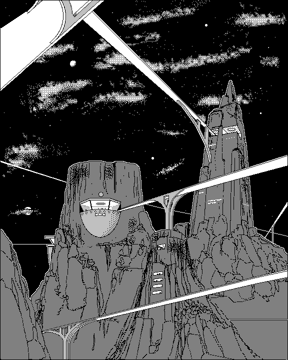
Vector graphics
Although the raster graphic or LCD was the most prevalent during the 80s, you might learn to your surprise that there were already vector-based vector games. One of the more known examples is the Battlezone vector graphics from 1980.
In games, vector graphics use an x, y coordinate system, like today's designs. These systems made rotation and scaling easier. For example, tanks in Battlezone could appear more prominent as they approached due to the scaling feature.
Nevertheless, it was only possible to draw the vector outlines, but it wasn't possible to fill the object with color at this point. You could only draw vector lines inside the object, which was only segmenting it internally but wasn't filling the internal part of the vector shape with color.

Thus, vector graphics pioneered modern 3D graphics by opening up ways to visualize solids and animations through these initial commands.
The first 3D video game was released in 1983. It was a Star Wars 3D rail shooter. Displayed were only wireframes without any texturing or shading, only the wireframes consisting of connected vectors. The 3D polygons consisted of connected vector shapes.
To display vector graphics, specific vector monitors had to be used that weren't divided into pixels like a standard television screen; they were covered in a layer of phosphor that emitted light whenever stimulated by electron impact.
80s entertainment graphics
During the 80s, Music Videos were an integral part of pop culture. At that time, you didn't go online to watch music videos on YouTube or create your playlist; you had to - gasp - sit in front of your television to watch MTV, which was first broadcast in 1981.
The MTV Logo was the most famous logo during the 80s and perpetually changed its look.
The most excellent videos to symbolize the progress made in 80s digital design are "Money for Nothing" from the dire straits and "Boing Boom Tschak" from the German group Kraftwerk.
"Money for nothing" was created with simple shaded polygons created and animated with the Quantel software.
In the 3D video "Boing Boom Tschak" from the German group Kraftwerk (1986), rotating heads of the band members were featured while simultaneously lip-syncing to the lyrics. The heads were modeled with polygons that were shaded with colors.
This was one of the most progressive music videos of the 80s decade and anticipated the advancements in 3D graphic visualization that led to the first fully 3D animated feature film, Toy Story by Pixar, in 1995.
Ready to create brand assets that pack a punch?
Visit our Academy for free marketing design courses.
One of the most striking symbols of technological advancement was the Max Headroom series that aired briefly in the mid-80s on American ABC.
It showed the actor Matt Frewer with prosthetics made to look like a computer-generated AI character. Frewer was superimposed on a digitally created background. Max Headroom symbolized the progressive 80s Zeitgeist and the merging of video, computers, and TV.
The effects were created with Commodore Amigas and the Quantel design software, as IBM or Apple could not handle graphics at such an advanced level.
The character Max Headroom was presented as an AI-generated character, a TV presenter making cynical comments about the 80s Zeitgeist.
Interestingly, the series mentioned topics that predicted future technical developments, such as computer viruses, firewall security systems, online shopping, identity theft, remote data transfer, AI, and remote video camera control.
80s retro design in the 2000s until today
Most aesthetics of a particular decade often return in cycles, and retro designs are picked up and further developed with a twist.
In marketing, the term nostalgia marketing was coined. Especially the 80s nostalgia trend was targeting early millennials, as this decade represented their mostly analogous childhood. In this pre-internet time, you came home and watched MTV or played a heavily pixelated video game with a repetitive soundtrack.
Vaporwave
Vaporwave is the design language of the 80s transported into the 2010s years but this time designed with modern design apps and a much higher resolution.
The neon colors, glowing grids, sunsets with blinds, and sports cars were back, but this time made with the design apps of the 2010s. The implementation of the design language and symbols was so brilliantly done that often, the only way you could distinguish the vaporwave artwork from an original 80s one was by the image resolution.
Ironically, the vaporwave artworks from the 2010s often had artificially created wear and tear or a VHS glitch applied to the artwork to make believe it was an original from the 80s.
It was one of many Internet microgenres that emerged in this era, alongside Witch House, Seapunk, Shitgaze, Cloud Rap, and others. Coinciding with vaporwave was a broader trend of young artists harkening back to their 1980s childhoods in their work.

During the vaporwave period, three films paid homage to the 80s, the Tron sequel, Tron Legacy (2010), Drive (2011), and Blade Runner 2049 (2017), the sequel to the first Blade Runner film from 1982.
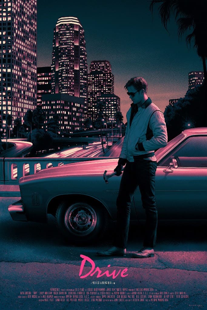
Drive wasn’t set in the future but was a film inspired by the chiaroscuro neon-noir look of the 80s decade and a classic neon noir plot full of crime, violence, and revenge.
Tron Legacy and Blade Runner 2049 featured the dystopian 80s cyberpunk tech-noir aesthetic of fluorescent neon lights in a modern city contrasted against a dark background.
Blade Runner 2049, like its precursor, Blade Runner, is the epitome of tech noir. A dystopian technical world with an outlier hero that fights against a potent corporate antagonist, filmed with a masterful use of shadow and light.
Stranger Things
The 80s craze suddenly perked up again with the launch of the super successful Netflix series Stranger Things. The series plays during the 1980s and is about a group of American teenagers confronted with supernatural forces.
Almost all the posters paid homage to the classic 80s sci-fi blockbuster poster design during the Netflix marketing campaign for the series.

Choose or Die
The series choose or die is the most recent Netflix series to hop on the 80s trend. The series is set in our current time, the 2020s. The main protagonist of the series is a cursed 80s video game that, when played, offers a $125,000 prize. Soon, the game players realize they are playing the game with their lives at stake.
The producers of the series consulted an 80s retro game specialist to make the scenes where the video game is displayed on the screen believable.
Memphis retro design
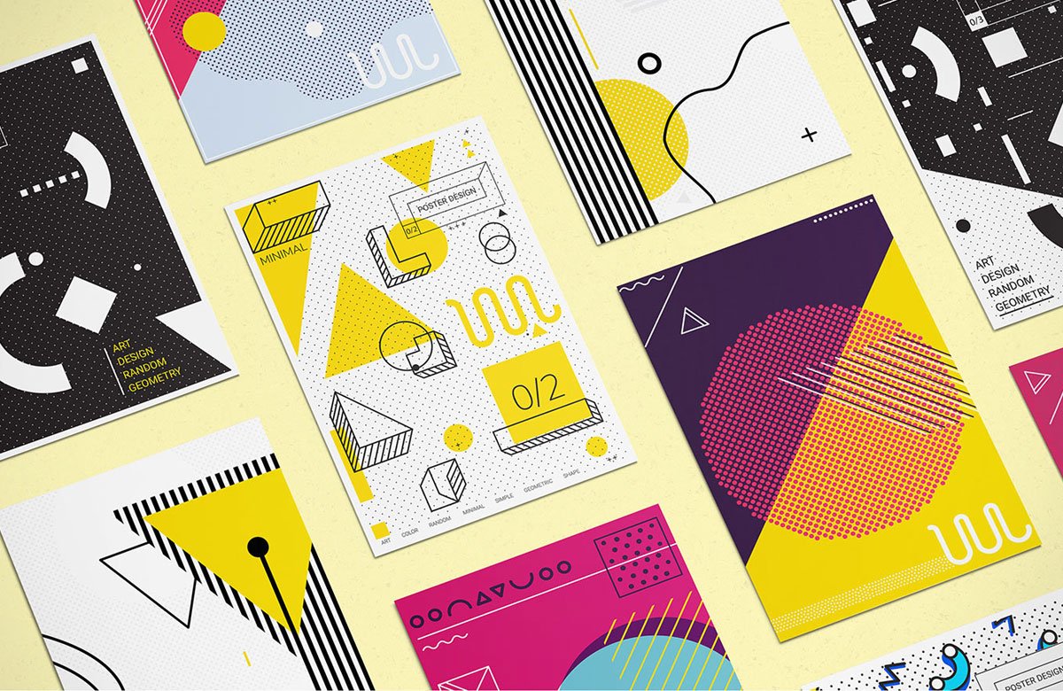
The geometric form language of the Memphis group, with its bold colors contrasted against white and black, and the blocky typography, are still relevant in today’s graphic design.
The neon colors and geometric patterns are still frequently used in mockups and graphic templates.
Wrapping up
We hope you enjoyed the little time travel to 80s graphic design with us as much as we did. Why don’t you use the inspiration for some 80s-inspired retro designs?
Create sharp and clean geometric vector shapes with the precise tools from Linearity Curve (formerly Vectornator). Go wild on the neon color or the more subdued pastel colors. Create typical 80s neon and pastel gradients in Curve's Gradient Editor. You can even create 80s minimalist seamless patterns in seconds!
Our in-house illustrator Aysel has prepared for you two free downloadable color palettes in the swatches procreate format that you can import directly into Curve.
Watch the video below on how you can import a color palette:
Just download Linearity Curve for free, import the two color palettes, and then go neon or pastel, geometric and bold! Don’t forget to share your 80s retro creations on our social media channels and community forum!
Jumpstart
your ideas with
Linearity Curve
Take your designs to the next level.
Share this!
Marion Gerlinger
Marion is a contributing writer to the Linearity Blog.


